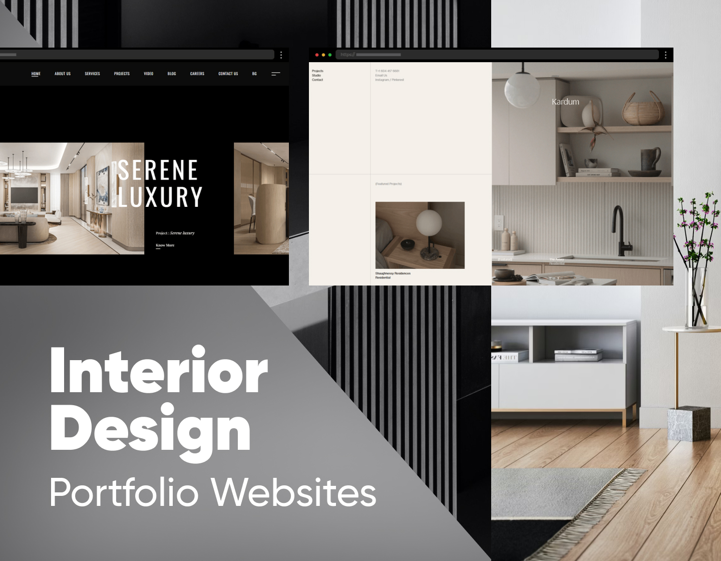
Like any other creative professionals, interior designers need an effective way of presenting their work to the public. And what better way is there to achieve this than optimizing their online presence? Creating an impressive interior design portfolio website is essential for showcasing the designer’s skills and attracting potential clients. These websites are like visual resumes, highlighting the best projects and demonstrating the studio’s design capabilities.
So, in today’s article, we will explore 19 inspiring and professional interior design portfolio websites that stand out from the crowd, quickly grabbing their visitors’ attention and successfully winning more clients. Oh, and make sure to stay to the end, where you will find our tips for crafting memorable interior design portfolio websites. Enjoy!
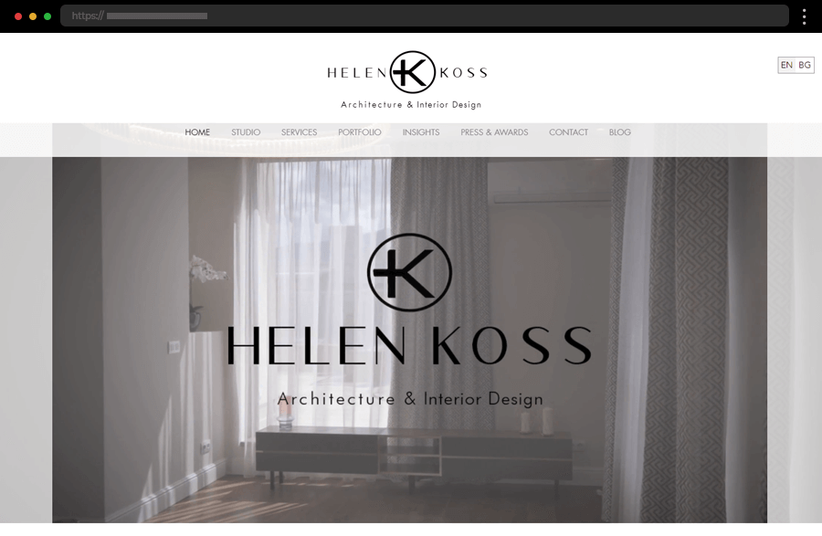
1. Helen Koss
Helen Koss sports a website with a modern design that captures her studio’s essence and style. The impressive background video immerses us in the world of interior design while the homepage highlights also the site’s most important sections and the integrated Instagram publications, ensuring engagement. Further, the designer’s portfolio is conveniently divided into three categories, each of them presenting the projects in a beautiful grid with high-quality imagery. All combined results in a website design that is stylish, user-friendly, easily navigated, and informative, providing a delightful user experience.
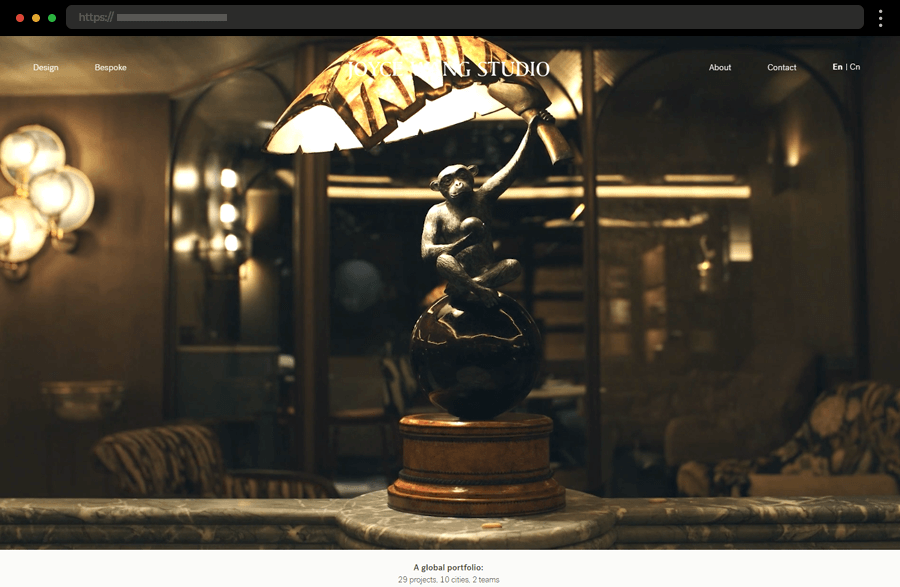
2. Joyce Wang Studio
With captivating videos and imagery, Joyce Wang Studio grabs our attention right from its site’s homepage and keeps it through the whole web journey. Sharing the portfolio in a three-column grid results in a beautiful project gallery where each project has a dedicated comprehensively presented page. In addition, the facilitated navigation helps the users to stay focused on the studio’s work and portfolio and evokes a sense of easiness. In general, this is a perfect example of how to make a strong impression and instill credibility in your services.
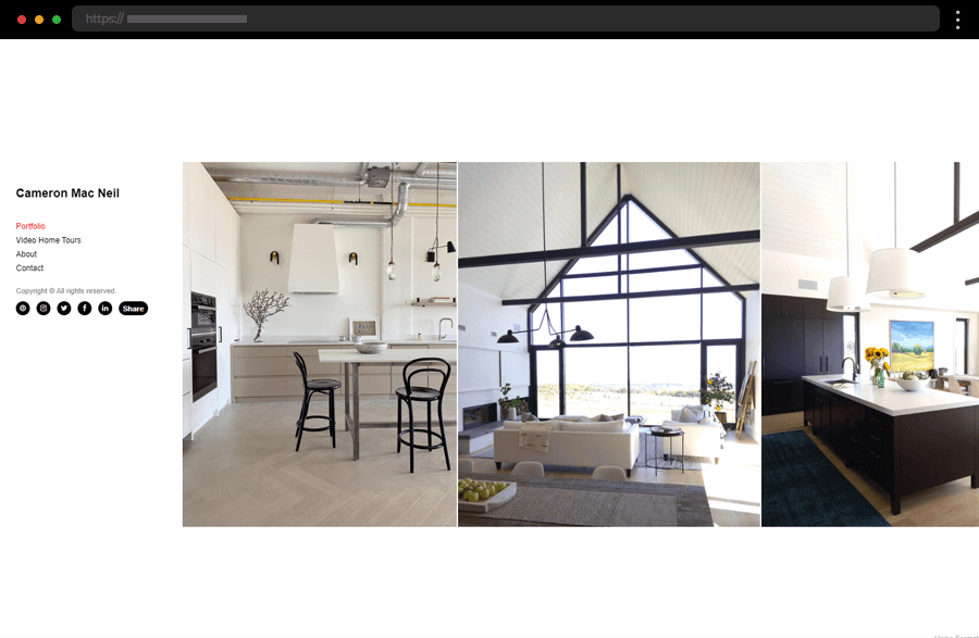
3. Cameron Mac Neil
Highly minimalistic, Cameron Mac Neil’s website greets us with a design accentuating his portfolio. The site’s horizontal scrolling makes browsing the images more interesting while the sticky menu facilitates navigation. Once the visitor’s interest is grabbed, the designer’s introduction and the integrated contact form ensure an easy way to get in touch. In addition, adding social media links works towards increasing the studio’s reach and better engaging with its target audience.
Want to have a professional portfolio website like these? Get a free design audit → with our friends at htmlBurger.
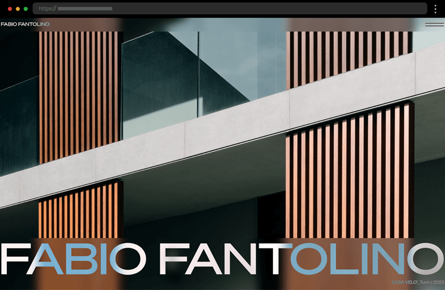
4. Fabio Fantolino
Modern, professional, elegant. These are the definitions that come to mind when we see Fabio Fantolino’s website. With a slideshow of amazing full-screen images with blurred header and footer, the homepage is enough to win over the users. Still, the discreet navigation icon leads the way to the studio’s portfolio of impressive projects. Offering filtering by categories and presented with impactful high-quality photos, it embodies the studio’s neat and stylish approach to its work and services.
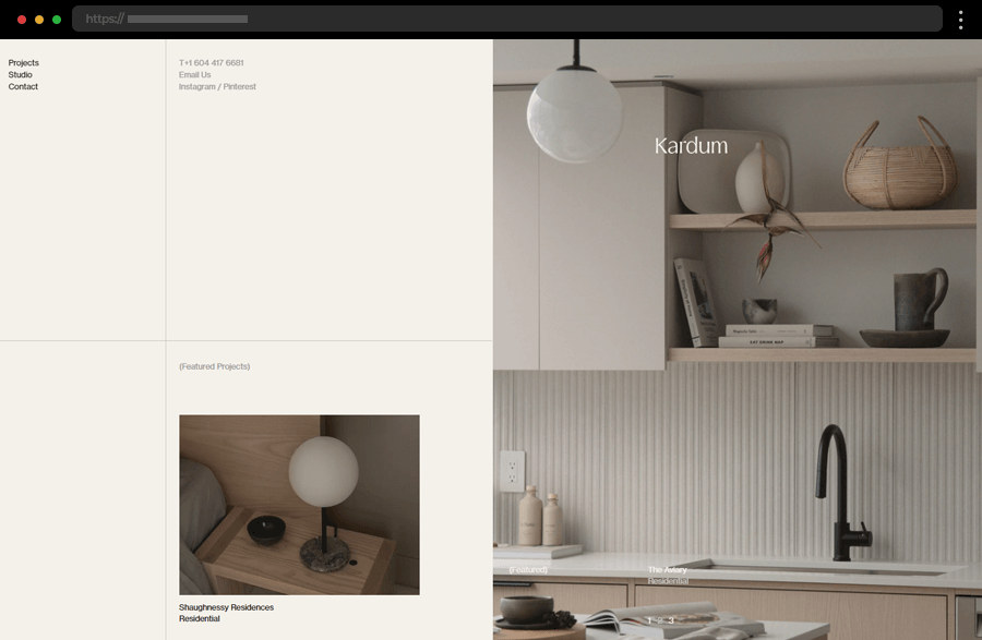
5. Studio Kardum
With its layout’s simplicity and fine line segmentation, the whole website of Kardum Studio resembles a project presentation. The homepage highlights featured works and straightforwardly provides the studio’s contact information. Meanwhile, the discreet navigation keeps in line with the stylish design while also ensuring a smooth and pleasurable user experience.
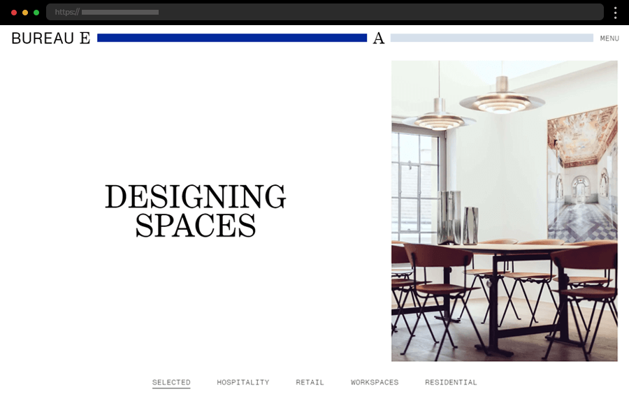
6. Bureau Eugenie Arlt
The website of Bureau Eugenie Arlt has a modest appearance at first sight yet still produces a great effect on the viewer’s mind. The site is also engaging and interesting to explore with its horizontal scrolling and clear project categories. Focused on presenting the designer’s work and featuring just a small amount of text, the portfolio website exudes professionalism with its high-end interior photographs and overall clear design.
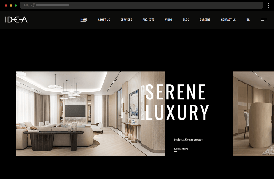
7. IDEA Interior Design Studio
An extensive homepage highlights all important sections of the IDEA interior design studio’s website. Greeting us with a slideshow of selected works on a black background it exudes professionalism and luxury, in line with the studio’s style and type of projects. Comprehensiveness is at the heart of this web design as it features lots of details, images, and information, thus ensuring every visitor of the site finds what he needs and is ready to employ the studio’s services.
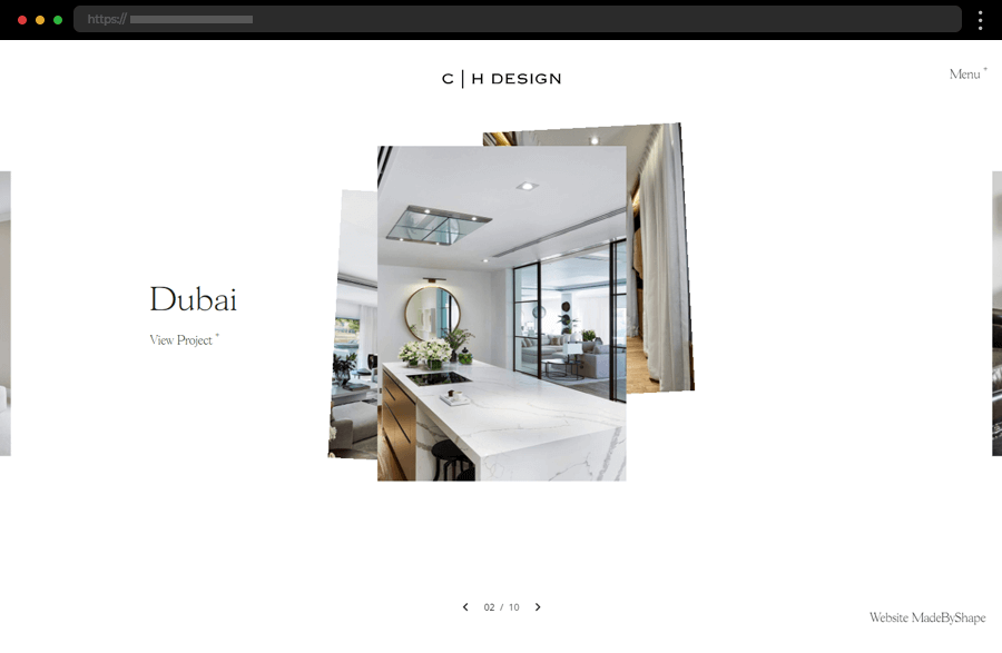
8. Charlie Horner Design
Next, we have Charlie Horner, who provides an eye-pleasing example of how to focus your website on your projects by keeping the text to a minimum. The white background and the discreet lettering leave the user’s attention on the creatively presented portfolio and form a sleek and refined brand image. The dedicated About page keeps in line with the neat design approach, introducing the interior designer with only a few sentences and maintaining the website’s smart and impactful style.
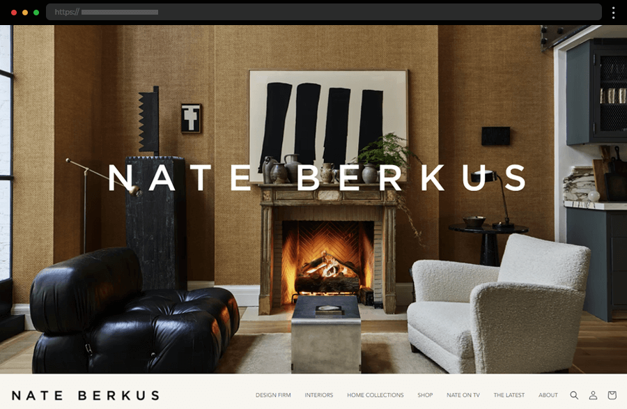
9. Nate Berkus
The animated background image of Nate Berkus Studio’s website immerses so deeply in its cozy atmosphere that one almost forgets to explore further. Accommodating the navigation right under it ensures a quick way for visitors to get around the broad menu options, facilitating them with a search bar while keeping the homepage stylish and neat. The portfolio is also easily digested thanks to its horizontally scrolled gallery and comprehensible descriptions. All combined makes this a great example of an interior design portfolio website presenting a lot of information while keeping the site’s appearance uncluttered, impactful, and elegant.
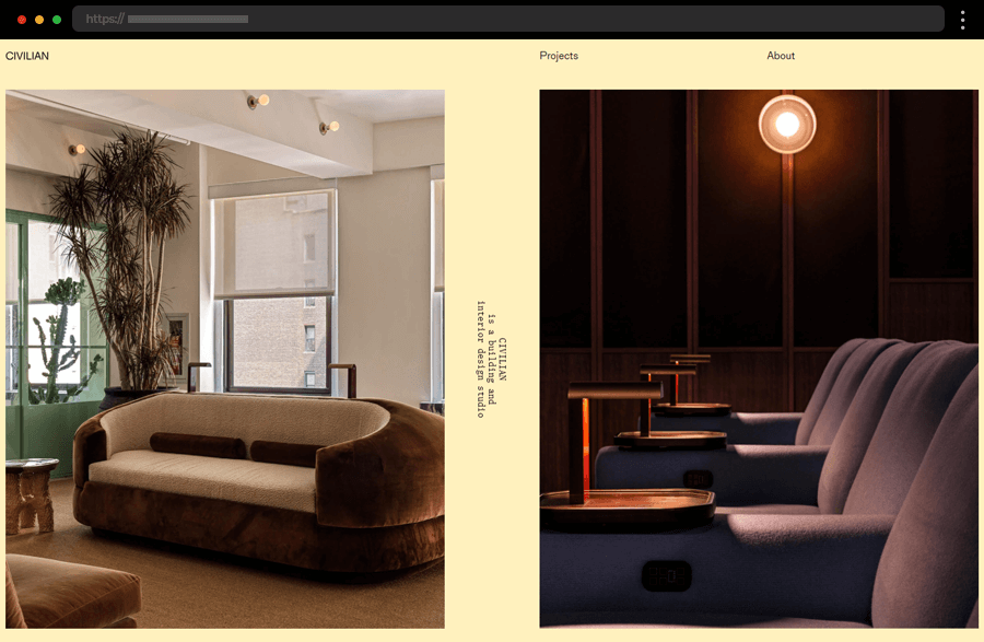
10. Civilian Studio
Simplicity is at the center of Civilian Studio’s web design. Its single-colored pale yellow background creates a calm and positive atmosphere while also leaving the featured project photos to stand out. The homepage’s split screen gives visitors the chance to interact with each of its parts by clicking the images to browse further. In addition, the two drop-down menu options share the studio’s details and an extensive presentation of its portfolio. Overall, this example beautifully epitomizes user-friendliness and straightforwardness in its design.
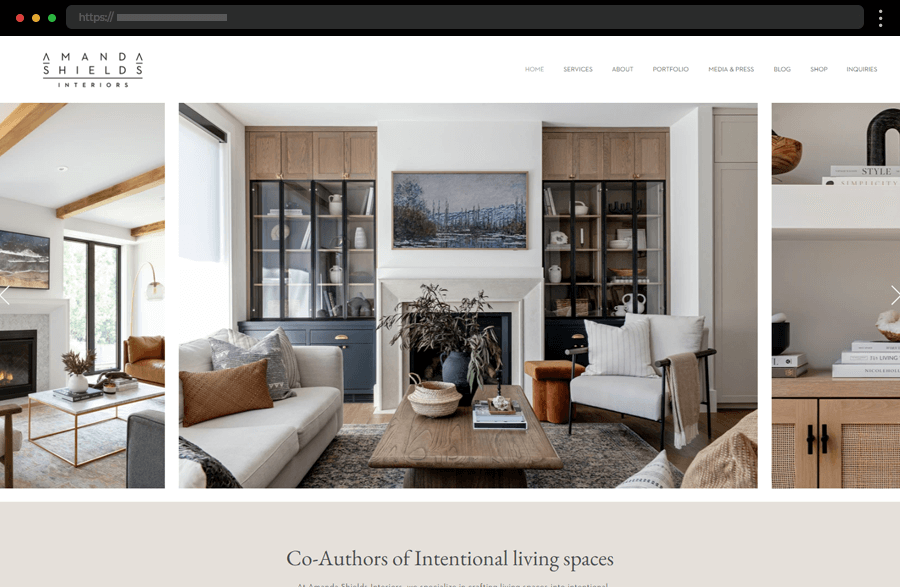
11. Amanda Shields Interiors
The next example is another one that embraces the beauty and style of the white and beige color combination. Its homepage engages us with a carousel of impressive images from the studio’s projects and also highlights some of their other works. In addition, the website’s comprehensively presented information and portfolio easily satisfy every user’s needs and interests. And to top it all, the site has a super convenient integrated inquiry form with options facilitating the contact process.
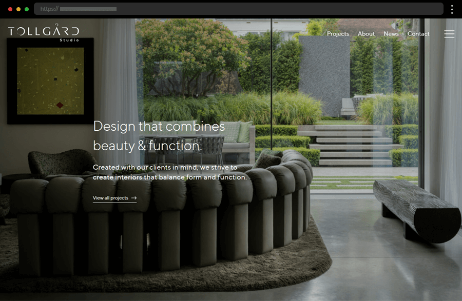
12. Tollgard Studio
Employing a contemporary design, our next standout example captivates us with its slideshow of images, easy-to-follow layout, and overall user-friendliness. The two-column grid of the portfolio page and the filtering by project categories allow users to enjoy the studio’s work in a visually appealing and convenient way. In addition, the featured flattering testimonials greatly contribute to the studio’s credibility and positive brand image.
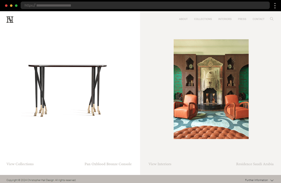
13. Christopher Hall Design
The website of Christopher Hall gives an inspiring example of how to get the most out of a split screen. The slideshows of images in its two sections present the designer’s impressive interior and furniture design. Further details and the studio’s entire portfolio can easily be found through the website’s top navigation. In addition, to win the user’s trust the site smartly makes room to showcase press and magazine publications where Christopher Hall’s work is featured.
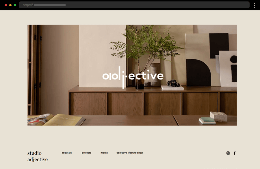
14. Studio Adjective
Next, we have studio Adjective, which shows how a simple beige background combined with beautiful imagery can create an impression strong enough to win the client’s interest. Combined with the navigation and social media links in its footer, the site ensures ease of use and high engagement. This portfolio website example successfully depicts the interior design studio as one that would be a pleasure to work with.
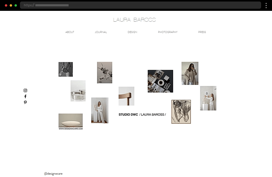
15. Laura Baross
Laura Baross provides another website example that follows a minimalistic white concept. The sticky menu at the top facilitates users with navigating the site, offering a look at the designer’s diverse portfolio. Aligned in the center of the screen, the projects’ imagery is beautifully presented in a two-column grid. In addition, press publications and integrated Instagram posts help users get to know and trust the designer’s work.
16. Studio Maayan Zusman
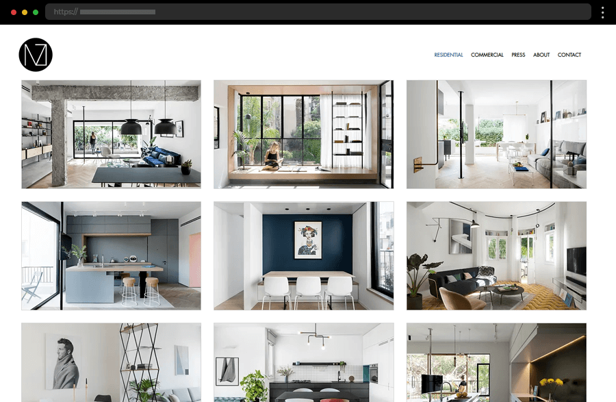
Based on minimalism and clarity, the next web design accentuates the three-column grid in which Maayan Zusman’s portfolio is presented. The light background helps the images stand out while also keeping the distraction to a minimum. Despite its unadorned appearance, this portfolio website example makes a strong impression and beautifully introduces the interior designer and her work.
17. Paul Latham Design
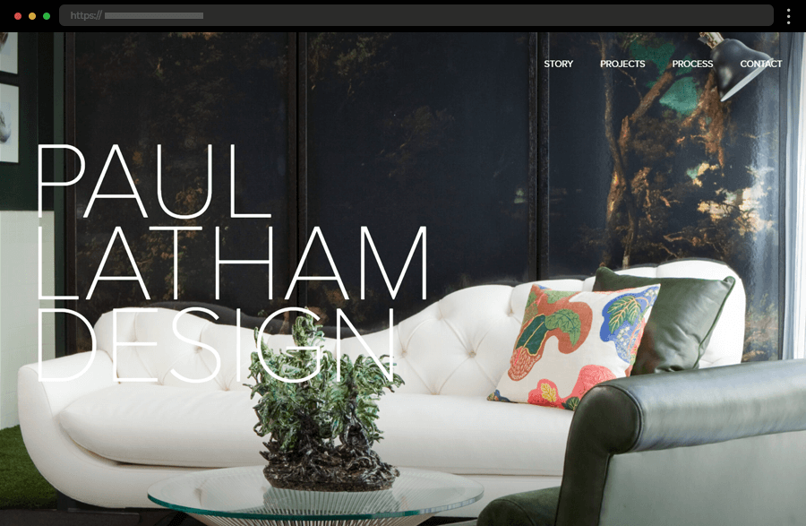
Full-screen images of his interior designs are the stars of Paul Latham’s portfolio website. Concisely summarizing the information about himself and his studio, the designer leaves his projects to do most of the talking. Also, featuring comparisons between the designer’s sketches and real images of the idea execution is a sure way to impress visitors and gain their trust quickly.
18. Ore Studios
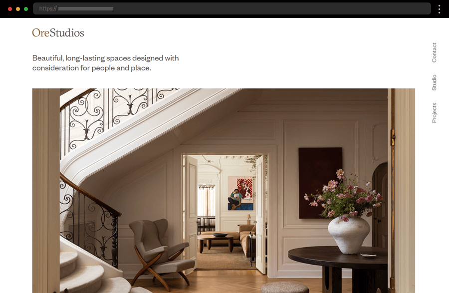
Light and airy, the Ore Studios website focuses on introducing the studio, the people behind it, and its portfolio. The homepage highlights briefly each of these sections while the navigation in the right sidebar offers a detailed view of them. The project presentation is stunning with its magazine-like appearance and perfectly embodies the studio’s style, credibility, and professionalism.
19. Sybrandt Creative Interior Design
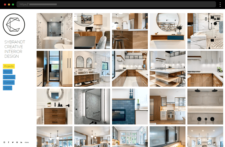
If any interior designer’s portfolio website can be called straightforward it should be Sybrandt Creative’s. The site greets us with a gallery featuring attractive imagery displayed in a visually appealing five-column grid. Accommodating more information about the designer, his services, contact form, and links to engage with the studio on social media platforms ensures everything essential for such a website is in place.
Tips on crafting impressive interior design portfolio websites
- Since you’re crafting your portfolio, invest in professional photography to capture your work in the best light. High-quality images are an absolute must when showcasing your design’s details and beauty. Also, don’t forget to optimize the images for fast loading times, but be careful not to compromise their quality.
- Ensure your website has intuitive and straightforward navigation. Also, organize your projects into clear categories to facilitate visitors with finding specific types of work.
- When doing your project descriptions, provide brief but informative texts for each project. Include details like the project’s scope and your approach to its design to give your potential clients an insight into your process and skills.
- A well-written About Me section is truly important, for the personal touch it carries helps build a connection with your audience. For example, you can introduce yourself and your background and highlight your qualifications, experience, and design philosophy.
- Adding testimonials from satisfied clients and press publications about your studio always helps build credibility and trust. Remember that positive reviews can significantly impact your potential clients’ decisions.
- Make it easy for visitors to get in touch with you. Include a contact form, email address, and links to your social media profiles. And, also make sure this information is easily accessible from any page on your site.
- Ensure your website is mobile-friendly and looks good on all devices to improve the user experience and keep visitors engaged.
Want to have a professional portfolio website like these? Get a free design audit → with our friends at htmlBurger.
Final words
Interior design portfolio websites are a must-have tool for any studio wishing to showcase its work and attract new clients. To highlight your skills and projects effectively, though, it has to be well-thought-out and done right. The well-designed portfolio site will not only enhance your online presence but also increase your opportunities and make you stand out among the competition. So, if you’re already feeling inspired, the only thing left is to start designing.


