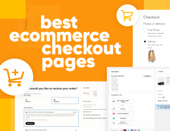


Creating the perfect eCommerce landing design is the holy grail of online marketing. Everybody is trying to do it but there really isn’t a definitive way to do it.
There is no doubt that a great eCommerce landing page that converts well is one of the most important aspects of your ad campaigns. The landing page is the second biggest conversion milestone that a user needs to go through after clicking on an ad.
So it is super important that your landing page can convert customers or you will be wasting a lot of money in the beginning.
This is why we wanted to create a guide that focuses on how to optimize your eCommerce landing page design for your target and your market.
If you don’t have time to read an entire article here’s a quick summary of some necessary steps needed to optimize your eCommerce landing pages. Although we strongly encourage you to go in-depth.
- Make A/B testing a common practice
- Limit the number of actions a user can take on a page
- Match the expectation of the user that was set before they came to the landing
- Prove that you are credible and build trust
- Decrease Page Load Time
- Improve your Page Quality Score
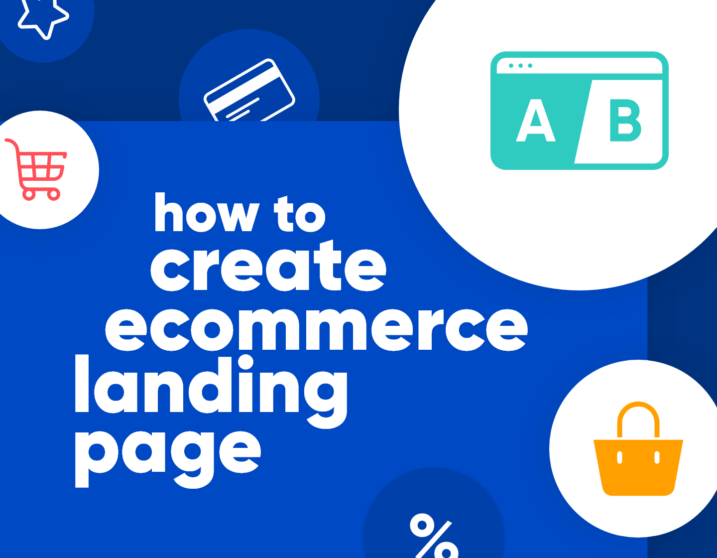
Make A/B testing your eCommerce landing pages a common practice
The difference between a good landing page and a bad landing page is how many times it was tested and perfected.
The entire reason why there still isn’t a concrete way of building pages is that every audience reacts in a different way to different landing pages.
Depending on your customer demographic the industry and the products or services that you are selling you will need to follow different rules. To find out what these rules are you will need a good A/B testing strategy.


You may find that some audiences prefer large landing pages with loads of information proving the value of the product. You may also find that a quick shopping experience without too many details and distractions can help engage your customers more and make decision-making easier.
During testing, you may find a lot of surprises and you may see results that contradict your thoughts on how a landing page should look like but that is all a part of the process. Without proper A/B testing, however, you will never reach those conclusions.
The second most important thing about A/B testing is to ensure that you are doing it properly. There are 3 main things you need to remember about good A/B testing.
- Only test one thing at a time
- Create a test based on a hypothesis
- Make sure your data holds up statistically
Limit the number of actions a user can take on a page


When creating a landing page design you need to keep in mind that you are creating with a certain goal. Too often we see landing pages that aim to do multiple things all at once and too often they fail in accomplishing them.
You should use your landing pages as tools that serve only to accomplish one thing. If you want a landing page to collect emails then that’s all it should. If you want a landing page designed to drive sign-ups for a webinar that’s all the landing page should do.
Yet it is surprising that a lot of the landing pages we’ve landed on will often try to sell us something and capture our emails at the same time.
The reason for this is something called “The choice paradox” a term coined by Barry Schwartz. The idea behind it is that too much choice overwhelms the user and makes it harder for him to make a decision so he ends up making no decision at all. Bary goes really in-depth about this in his book – The Paradox of Choice.
Match your landing pages to the expectation that the users have before landing on them
This step involves eCommerce landing page optimization even before the user has landed on the page. The main idea is that you set an expectation for what’s going to happen when people go to your landing.
You can set these expectations by modifying the thing that drives users whether it’s an ad on Facebook, a video ad on Youtube, or a Google search ad. The format isn’t as important.
What is important is that there is a clear continuity from one to the other.
Continuity is also important in the design of your landing page. Make sure the design and feel match the ad and the landing page. This includes everything from the color scheme, font to the main CTA.
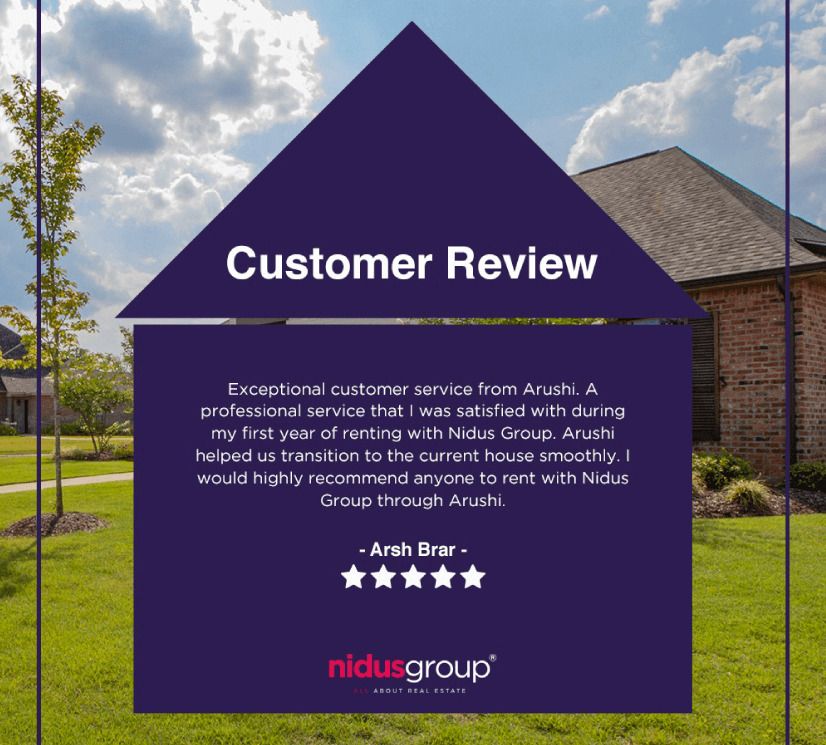
Prove your credibility and build trust with reviews and testimonials
The next big design element that every landing should include is a section that helps build trust between the user and the company.
The easiest way to do that is to always dedicate a part of your eCommerce landing page that showcases all of your happy previous customers.
For more service-oriented websites this will often take the form of a testimonial section where past clients share their experiences about using services.
When designing a testimonial keep these 3 best practices in mind:
- Include the full name of the person giving the testimonial. Avoid things like – John D. Jane A.
- Include a picture of the customer – Nameless faceless people don’t do anything.
- Provide information about the role, company, and use case – this will give a good background and make the testimonial more relatable

For more product-based landing pages the section will look more like a review section like the ones on popular websites like Amazon.
When designing a review section keep these 3 best practices in mind:
- Make sure reviews are from verified buyers.
- Include even lower-rated reviews.
- Make sure that every review has a reply from your company.
If you want to see some great examples of product review sections head to our article on eCommerce product page design.
Decrease Page Load Time
How fast your page load is directly tied to how good a user experiences your visitors. It’s true that this is a strictly technical optimization step but it is essential that you don’t skip it.
A study conducted by Cloudflare found a clear connection between conversion rates and page load times.
Improve your Page Quality Score
Since you will most likely be using your landing page in advertising funnels we should mention the page rank score.
The Quality Score is Google’s rating of the overall user experience that your ads and landing pages provide when users search for your keyword(s). This is represented on a scale of 1-10, with 1 being the lowest and 10 being the highest.
Improving the page rank score of your website will directly decrease the money you have to spend to get users to land on it. This itself brings a host of other benefits.
Overview
With these tips in mind, you will be able to confidently upgrade your landing page creation. If there is one thing to remember about good eCommerce landing page design is that the best design is always hidden behind of handful of A/B testing.
In the meantime, why not take a look at the related articles to get some more inspiration or grab a couple of freebies: