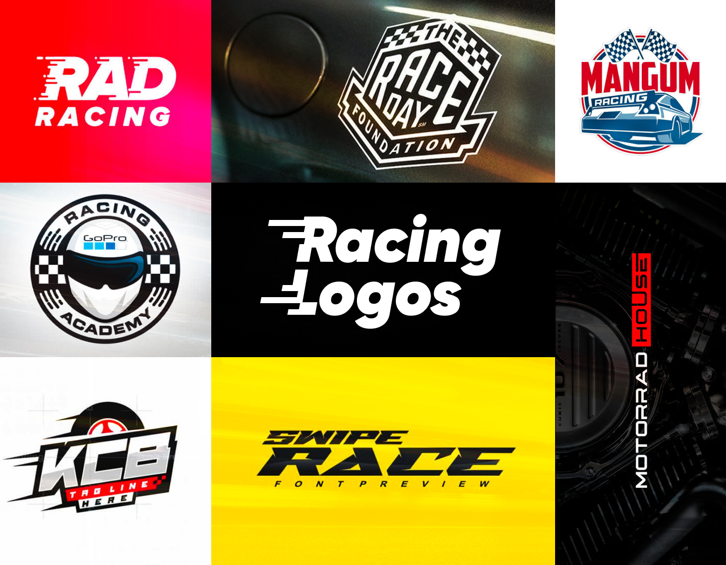
Racing logos are an indispensable element in the branding of any motorsport team or event. That is because they not only represent the club’s identity and spirit but also serve as a graphic connection with fans and sponsors. If done the right way, the emblem helps the audience identify with their favorite team. Furthermore, the well-designed racing logo can evoke associations with speed, power, and excitement, helping to establish a strong and recognizable brand.
In today’s article, we will browse 19 of the most effective racing logos and see what makes them special. Make sure to stay till the end where you’ll find our tips to help you guide your design process. 3, 2, 1…Go!
1. Race Team Logo Design Example
This race team logo example impresses immediately with its depiction of a tire on fire. The streamlined silhouette as well as the bold and strong typography emphasize the speed and motion associated with motorsports. Using red and black colors for the design provides a dynamic contrast and represents the power and passion of racing. Overall, this concept effectively captures the essence of a race team.
2. Race Car Logo Design Example
This is the logo for Five Star Race Car Bodies, a high-quality racing car parts manufacturer. Carrying a retro vibe this design can be easily adopted as an emblem for any race team, too. Further, with its slightly italicized lettering, the line elements, and the dynamically displayed star, the logo effectively conveys the feel of speed. As a result, all elements combined compose one professional and eye-catching design.
3. Retro Racing Logo Design Example
The Mangum Racing logo exudes a classic racing vibe. It skillfully incorporates a sleek sports car and checkered flags into its encircled design. The powerful retro font style and the combination of red and blue enhance both the concept’s strength and nostalgic feel. Its muted color palette reinforces the vintage theme, helping this logo effectively communicate the beauty of classic motorsport.
4. Off-Road Racing Logo Design
Designed for an off-road racing shop, this logo impresses with its dynamic and adventurous look. The bold italicized typography, with its sharpened accents, suggests toughness, endurance, and speed. Adding the checkered background reinforces the race theme and makes the logo a strong and fitting representation of off-road racing.
5. Modern Race Logo Design Concept
This one is a minimalist design that depends only on the effect of its strong, straightforward font. The essence of racing here is depicted through the italicizing of the logotype and the little lines that seem to be flying away from the letters because of the speed. These characteristics make the concept a contemporary take on racing logos.
6. Festival for Racing Logo Design
The United Soul Circuit emblem is one that incorporates a banner-like element with racing flags and a star on it, thus emphasizing the competition and the racing theme. Further, the wings in the design represent flying and respectively high speed. And, to sum it up, the color palette and the overall design look energetic and successfully convey the essence of such a festival.
7. Motor Sport Logo Design Example
This concept combines elements and colors that enhance excitement and work together for an effective and solid motorsport logo. The design uses sharp lines for the lettering and the streamlined tire icon to successfully convey the feel of speed and motion. In addition, the bold, sans-serif font adds a modern touch and strengthens the overall design’s stability.
8. Inspiring Racing Logo Idea
Havoline is a brand specializing in premium performance motor oil. Its logo concept, though, can be easily adopted by any racing team or motorsport event. Featuring the popular checkered pattern, which also looks like tire tracks, it instantly gets into the motorsport theme. And, the tilted letters with their sharp details add even more to the overall race feel.
9. Modern Blue & Red Racing Logo
This logo also utilizes the stylized racing flag idea for instant recognition. Besides the black-and-white theme, the design incorporates two more colors. The deep blue background creates a striking contrast with the bright red helping it to pop even more, thus emphasizing the word “racing”. Overall, the minimalistic and neat approach keeps the concept clean and impactful.
10. Racing-Themed Logotype Design

This is an example of how an effective logo can be created even by using only lettering. All the effect here comes from the design of the typeface, which is bold, powerful, and edgy. The intense slant and the slit-like details of the letters create the dynamic feeling of fast movement. In addition, using black and vivid yellow colors emphasizes strength, competition, and fun.
11. Clean Race Logo Design
The Raines Racing logo stands out with its clean lines and neat approach. Its typography is modern, strong, dynamic, and easily readable. What grabs the attention is the “R” used as a double capital first letter and also as the starting point of a stylized speedometer. And, using a black and red color scheme adds motion and style to the design’s sleek and professional look.
12. Great America Racing Logo Example
Racing America’s logo incorporates patriotic colors and themes making it appealing to American racing fans. Its bold, straightforward, sans-serif top font conveys strength and unity, while the one for “America” seems dynamic and decisive. As a result, the logotype-centered design is both eye-catching and meaningful for the US motorsport.
13. Cute Racing League Logo Design
This playful logo features a stylized illustration of a driver on a racing simulator, along with a logotype with a straightforward font. The text, depicted plainly, leaves the focus on the icon, which appears exciting and in motion. The design’s bright, cheerful colors add to the fun and approachable feel making the whole concept seem charming and inviting.
14. Motor Road Race Branding Example

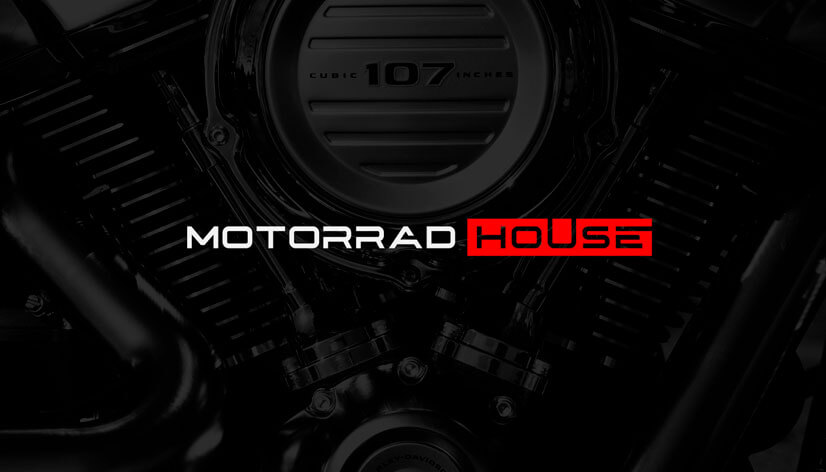
Motorrad House’s logo is composed of only a wordmark but that doesn’t stop it from being impressive. Its modern typography is strong and suggests stability, innovation, and professionalism, enhancing the brand’s image. The palette is simple, consisting of only black, red, and white, but the very use of the colors is what gives the design this bold and eye-catching look.
15. Black & White Race Logo Idea
This example is the logo of a foundation providing one-of-a-kind automotive experiences to children. The geometric design is composed in such a way that it seems we look at it from a perspective view. Further, the logo sports a monochromatic palette with high contrast and classic racing elements, making the concept simple yet memorable.
16. Cool Canoe Racing Logo Design
This unique symbol features a canoe and paddles, setting it apart from traditional motorsport racing logos. The design’s chosen typography is playful and modern, with the name written in cursive, and the informative text in a simple, yet beautiful sans-serif font. All elements combined make this concept perfect for its purpose, effectively representing the competitor in his canoe racing event.
17. Racing Mascot Logo Design Example
The emblem here was created to represent a team riding dirt bikes. As a central element, it uses the stylized image of a cougar, thus suggesting speed, determination, and strength. The bold contrast of the colors makes the design even more powerful and memorable. The logo’s font is plain, leaving the focus on the icon, and making the concept ideal for youth or community racing events.
18. Racing Academy Logo Design
The circular design of this racing academy logo is built around the sleek, stylized depiction of a helmet. Subtly using blue as an accent to the black and white color scheme, gives it a professional feel. The modern, straightforward typography and the typical racing elements keep the concept simple yet effective and impactful.
19. Great Racing Event Logo Design Example
This logo was created for a race of the official charity of The British Army’s Parachute Regiment. As such it masterfully communicates this information through the incorporated elements. Its banner-like appearance is complemented by adding flags and speed lines, that underline the racing event’s essence. The typography is simple, ensuring readability and leaving the engaging design to do the talking.
Tips on creating impressive racing logos
- Try keeping it simple for a racing logo should be straightforward yet distinctive. Also, avoid complex designs that can be difficult to comprehend. Simple shapes and bold lines ensure that the logo is easily identifiable.
- Incorporate elements that convey movement and speed, such as racing flags, checkered patterns, and stylized speed lines. These symbols instantly communicate the nature of the motorsport and add an element of excitement to the logo.
- Choose the right color palette, knowing that bold and contrasting colors can make a racing logo stand out. For example, red, black, white, and blue are commonly associated with racing and can create a memorable visual impact. Ensure the colors complement each other and enhance the design’s feel.
- The typography you choose should match the overall tone of the logo, whether it’s modern, classical, or vintage. Also, select fonts that are clean, strong, and legible.
- Before finalizing make sure your logo looks great in various sizes and applications. It should be adaptable for any need – like small stickers and large banners, as well as for web use and team garments.
Final Words
Creating effective racing logos requires a blend of simplicity, dynamic imagery, and bold colors that all work for an easily recognizable and memorable design. The greatest racing logos are more than just symbols – they are the emblems visualizing the heart of a team or a brand.
So, pack up your inspiration, remember our tips, and go craft the next successful example encapsulating the spirit and excitement of racing!
If you found this article interesting, you may also enjoy our other inspiring logo collections: