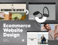
Have you ever visited a website and immediately thought, “This product is so cool, I need it in my life now!”? I know I have, many times! That’s the power of a great Shopify landing page. But what makes it truly stand out?
We all know how crucial it is to make a strong first impression. After spending a lot of time looking at different landing pages, I’ve found that a blend of eye-catching design and user-friendly elements is key to keeping visitors engaged. So, how do you balance both?
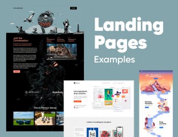
In this article, I’m going to share 24 of the most inspiring Shopify landing pages that nail it – combining stunning design with high conversions. Trust me, these examples will give you all the inspiration you need!
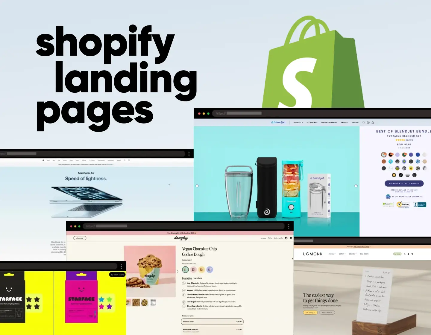
1. MacBook Air – Immersive Shopify Product Landing Page

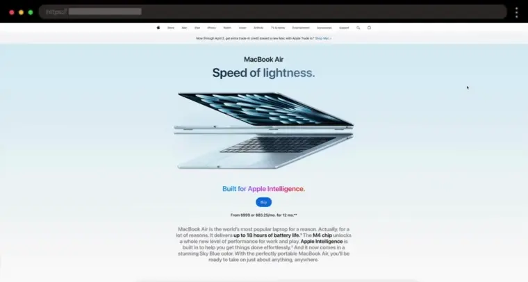
Will you agree with me that Apple just gets good design? The moment you land on this page, you’re met with stunning product shots, slick animations, and a scroll experience that feels effortless. Every section flows perfectly, breaking down the MacBook Air’s power, battery life, and display without ever feeling overwhelming.
✨ What I like:
- Gorgeous visuals and smooth animations
- Clean, premium, minimal design
- Thoughtful sections that highlight product features
2. Native Poppy – Dreamy Flower Subscription Landing Page

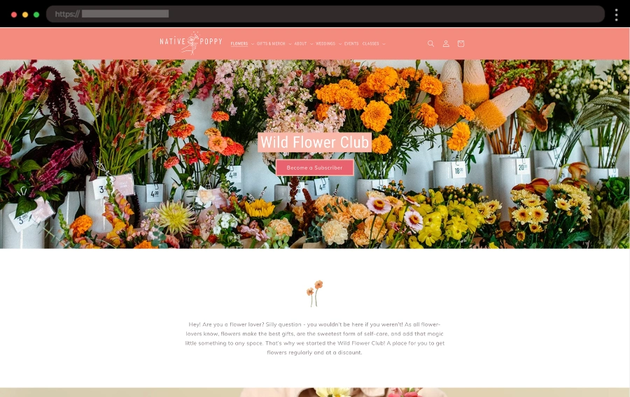
What I like about Native Poppy’s Wild Flower Club landing page is the way it draws you in with its dreamy pinks and floral vibes. The design is simple yet elegant, with everything you need to know right at your fingertips. The testimonials and FAQ section really help build trust and make the experience feel personal.
✨ What I like:
- Clear “How It Works” section
- Cute Wild Flower Club merch links
- Helpful testimonials and FAQ
3. Doughy – Creative Landing Page for Chocolate Chip Cookies

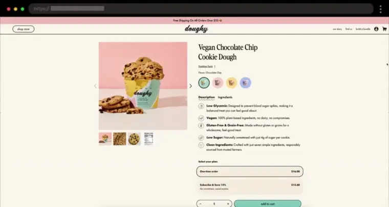
I can’t help but admire how Doughy’s landing page combines mouthwatering visuals with smart design. Right from the start, you’re greeted by vibrant product images and a seamless layout that guides you from the cookie description to purchase in just a few simple steps. It’s a fantastic example of using clean design to evoke desire and make the user experience both easy and irresistible.
✨ What I like:
- Stunning product images that immediately draw you in
- Clear options to buy once or subscribe for repeat orders
- Smooth integration of customer reviews and related products
4. BlendJet – Shopify Landing Page for Portable Blenders

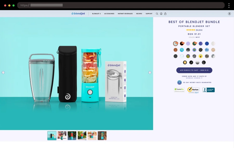
I’m loving how BlendJet’s landing page blends style and simplicity. The high-quality images and clear product features make it easy to understand what you’re getting, and the organized menu keeps everything streamlined. What really stands out for me is how they use user-generated content to build trust and show the product in real-life scenarios.
✨ What I like:
- Vibrant colors and engaging images
- Easy-to-navigate menu for quick product discovery
- User-generated content and recipes for authenticity
5. Grind – Modern Shopify Landing Page for a Coffee Brand


Grind’s landing page has this perfect balance of sleek design and a strong focus on sustainability. The scrolling banner grabbed my attention right away, and the interactive map showing where they source their coffee is a nice personal touch. I think playful headlines like “We take coffee seriously” really show off their brand personality.
✨ What I like:
- Eye-catching scrolling banner
- Interactive ethical sourcing map
- Fun, laid-back headlines
6. Brand Breeder – Elegant Wine Landing Page

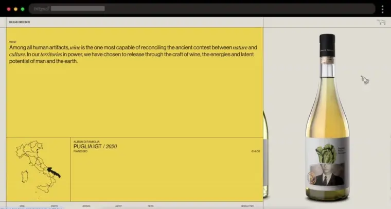
I think that Brand Breeder’s wine collection landing page is a perfect blend of elegance and user experience. The interactive slider on the right is a standout feature: as you scroll, it changes both the bottle image and the map with wine details on the left. I love how the image is clickable, taking you directly to the individual wine pages for an effortless experience.
✨ What I like:
- Interactive scrolling slider of the images and details
- Clean design focused on product presentation
- Smooth navigation with clickable images leading to wine pages
7. Shopify POS – Smart CTA Hierarchy for Conversions

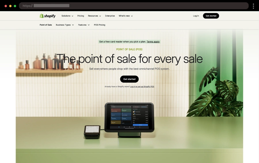
Ever landed on a page with too many buttons and no clue where to click? Shopify’s POS landing page avoids that by using smart CTA design and a clean layout. The high-contrast “Start Free Trial” button grabs attention, while the slogin options are still there but more subtle. Scroll down, and you’ll find sections breaking down the POS system’s key features, neatly presenting what it offers.
✨ What I like:
- Smart use of button colors to prioritize CTAs
- Clear sections highlighting POS system features
- Clean, neutral design
8. Shopify Plus Demo Store – Interactive Landing Demo Page

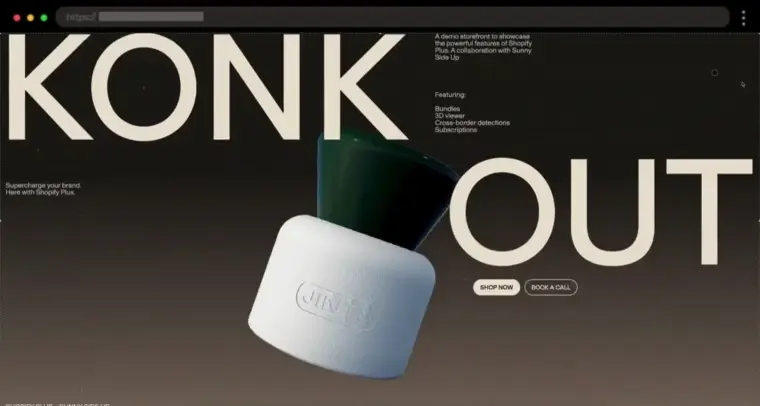
I love how this Shopify Plus demo store doesn’t just tell you what’s possible – it shows you. The smooth scrolling, 3D elements, and slick animations make exploring features like bundles, subscriptions, and cross-border detection actually fun. It even wraps up with an FAQ and a smart CTA offering a free report on revenue growth.
✨ What I like:
- Engaging animations and 3D effects
- Showcases key Shopify Plus features in action
- Valuable report download CTA
9. Muji – Clean and Engaging Rewards Program Landing Page

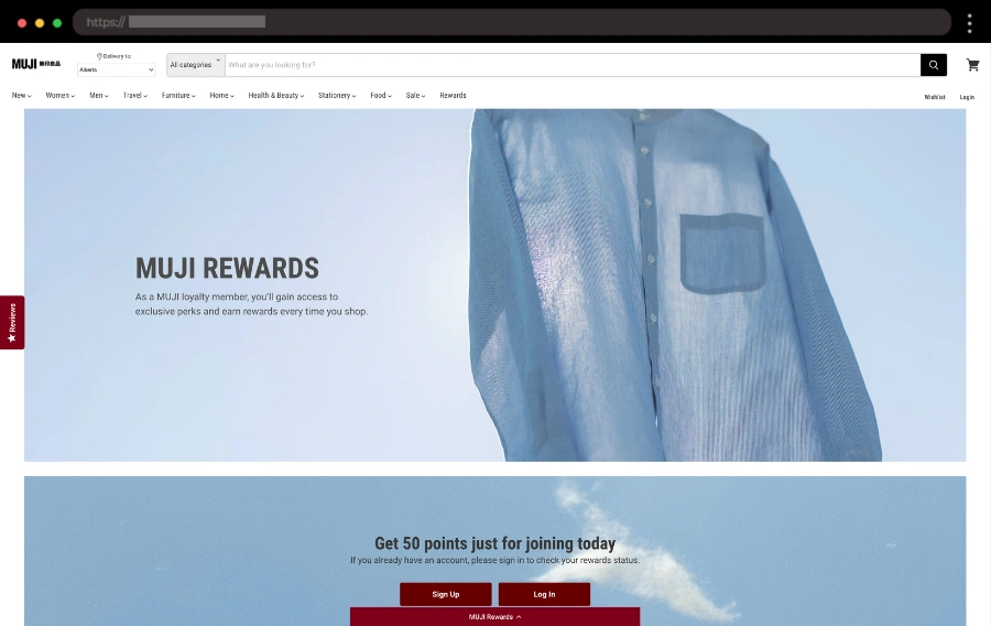
Muji’s rewards page makes it clear why users should join – from birthday coupons to redeemable points. I love how the colorful table compares membership levels (Classic, Insider, VIP, Elite) and how easy it is to navigate. The “Refer a Friend” section adds a fun twist, letting you earn points while giving friends discounts.
✨ What I like:
- Easy-to-read membership comparison table
- “Redeem for Products” section makes rewards simple
- Clever “Refer a Friend” program with form for extra perks
10. Path – Clean Shopify Landing Page for Newsletter Sign-Up

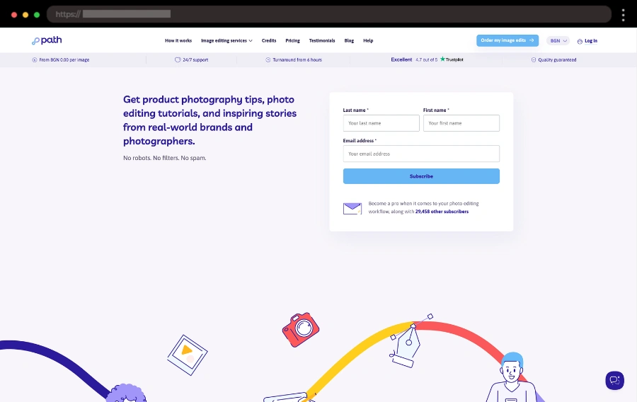
Path’s landing page is all about simplicity, and I’m here for it. Their design is clean – just a simple sign-up form and a clear call to action to join the newsletter. It’s not easy to find on the main site, but that makes it perfect for targeted campaigns focused on boosting sign-ups.
✨ What I like:
- Simple design that drives conversions
- Clear CTA for easy sign-ups
- Perfect for targeted campaigns
11. Money with Katie – Minimalist Newsletter Signup Page
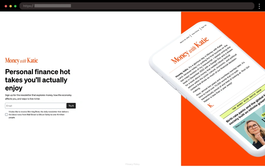
I love how simple and effective this landing page is. No scrolling, no distractions—just a clear headline, a strong visual, and a signup form front and center. It gets straight to the point, making subscribing effortless.
✨ What I like:
- Fiery red color that instantly catches the eye
- No-scroll design that keeps the focus on subscribing
- Clean, distraction-free layout for max conversions
12. Jones Road Beauty – Shopify Landing Page for Their Beauty Quiz

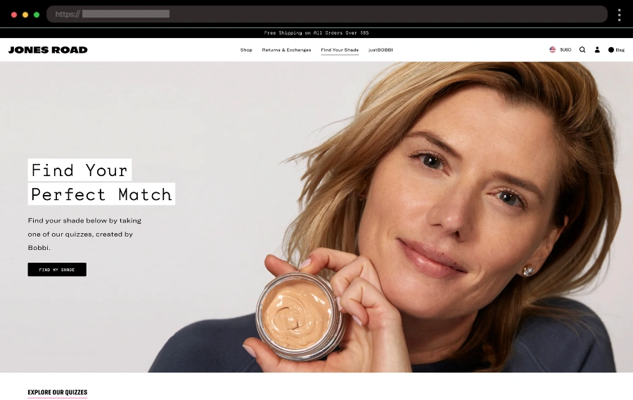
This next example nails it with their beauty quiz landing page, making it easy to find the perfect shade for your skin. The design is simple, with clear instructions on how to use the quizzes, and the CTAs keep you focused on finding your perfect match. I love the star rating which adds extra confidence that these quizzes really work.
✨ What I like:
- Separate quizzes for different makeup products
- Clear “How to Use” instructions for each quiz
- Effective star rating
13. BeHuppy – Effective Holiday Shopify Landing Page for Toothpaste

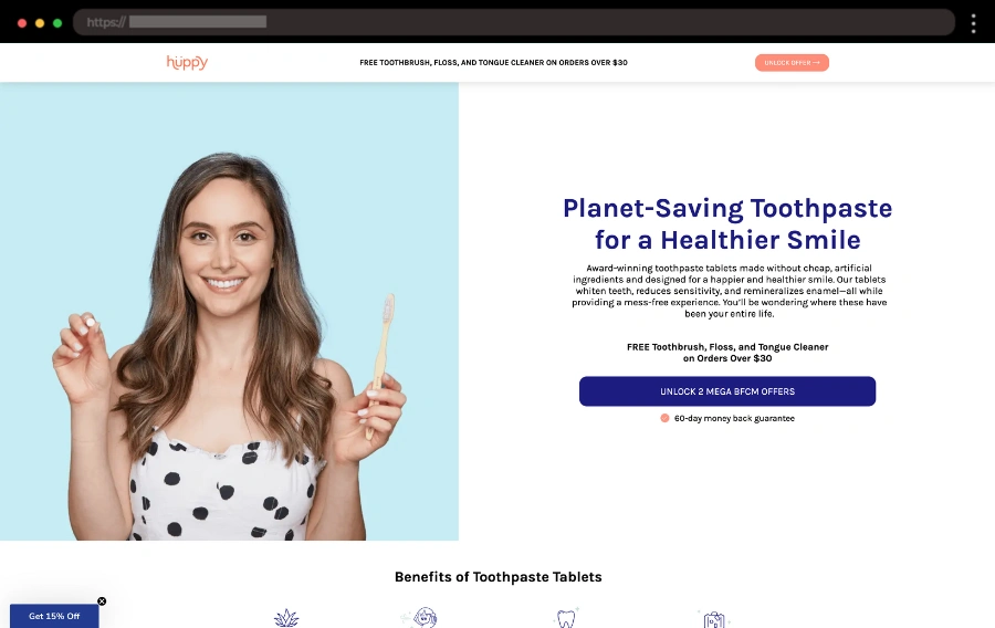
What really stands out to me on this landing page is how much awesome information it packs in! It’s got everything from a clear US vs. THEM comparison table to TikTok reviews. The subscription section is a breeze to navigate, and the FAQ section is spot on for answering all the burning questions.
✨ What I like:
- US vs. THEM comparison table with other brands
- Real TikTok reviews
- Easy-to-use subscription section
14. Zendure – Landing Page for High-Powered Energy Solution

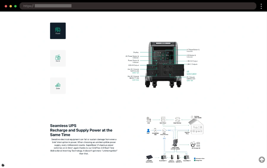
I like how this page makes serious power look sleek and simple. The centered, clean design keeps all the focus on the SuperBase V, with crisp front, back, and side images that show off every detail. Everything you need—specs, FAQs, and just how much power this thing can handle – is laid out clearly, making it easy to explore.
✨ What I like:
- Centered layout with detailed product images
- Clear specs and FAQ for an easy deep dive
- Customer reviews and a seamless purchase section
15. Ugmonk – Sleek Task Management Shopify Landing Page

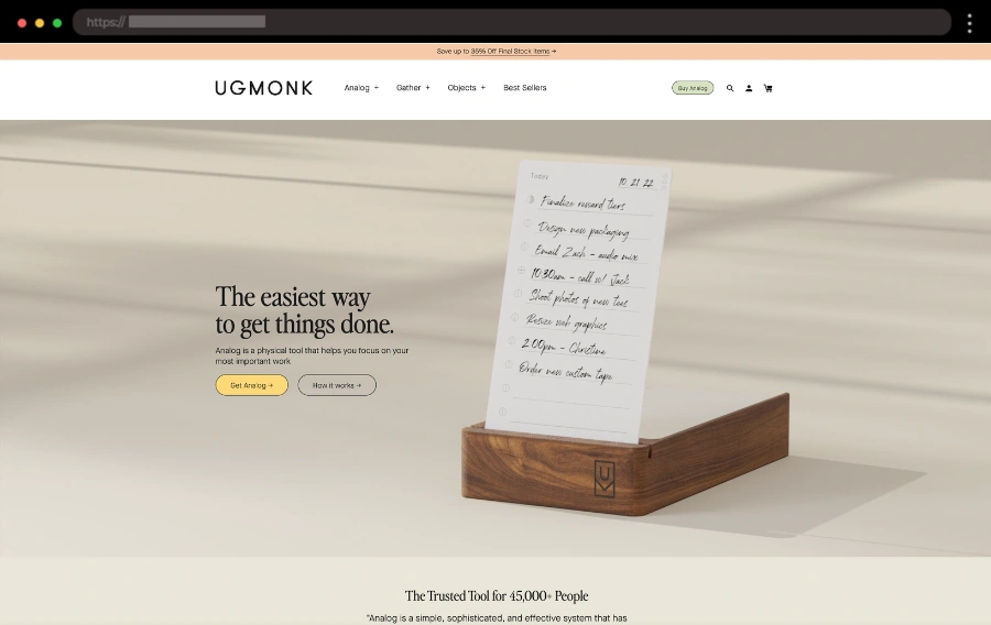
I absolutely love staying organized, and Ugmonk’s Analog landing page makes it so easy and stylish. The beige and olive green design keeps things calm and focused, and those task cards? Product branding done right! Plus, the customer reviews and Instagram feed make it feel like being part of a community.
✨ What I like:
- Sleek design with calming colors
- Fun videos showing Analog in action
- Customer reviews and Instagram for added trust
16. Starface – Playful Skincare Product Landing Page

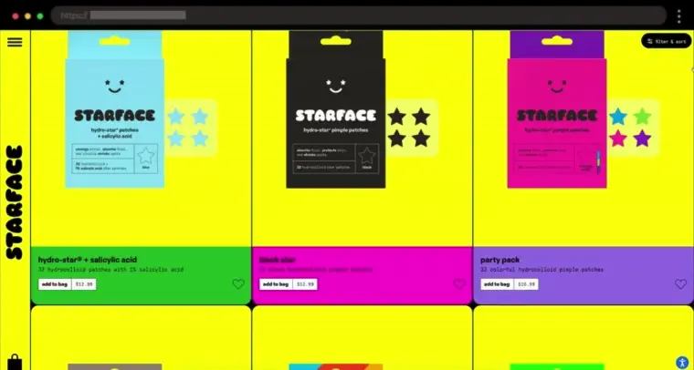
I believe make-up and skincare should be fun and this landing page proves to be as fun as the product itself! Bright colors and bold typography give it an energetic, youthful vibe. Users can filter and sort through products and scrolling reveals customer reviews with real images of people for more credibility, which is an additional point for Starface in my book.
✨ What I like:
- Playful, colorful design that matches the brand’s personality
- Clear product benefits and customer reviews for easy decision-making
- Smooth scrolling experience with engaging animations
17. Wild – Shopify Landing Page for Lip Balm Product

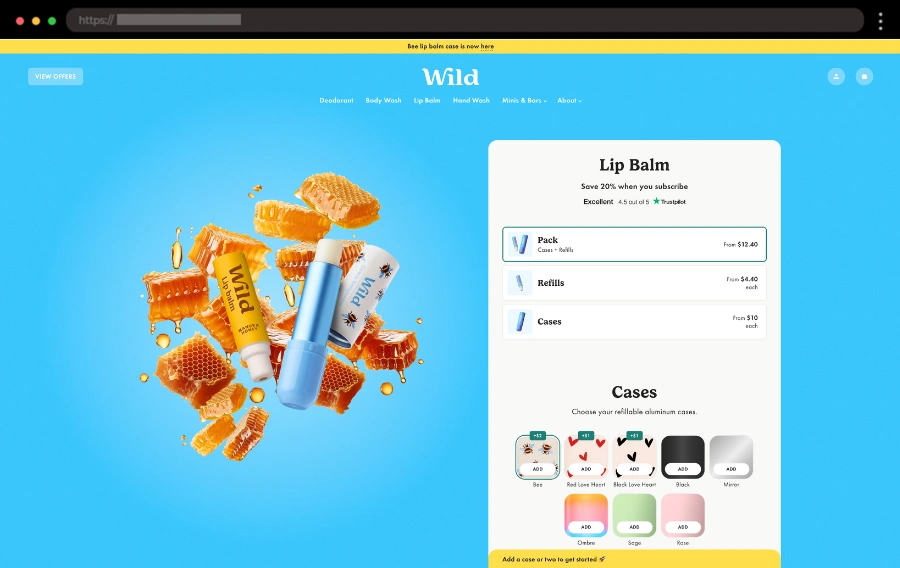
The fun vibe around Wild’s landing page is so cool! With bright colors and an engaging layout, it’s impossible not to get people excited about their subscription options. The helpful reviews and Trustpilot widget build confidence in purchasing their products.
✨ What I like:
- Fun product video
- “Choose Your Scent” section for customizing orders
- Clear reviews and Trustpilot widget for social proof
18. Brightland – Elegant Landing Page Design for Premium Honey Collection

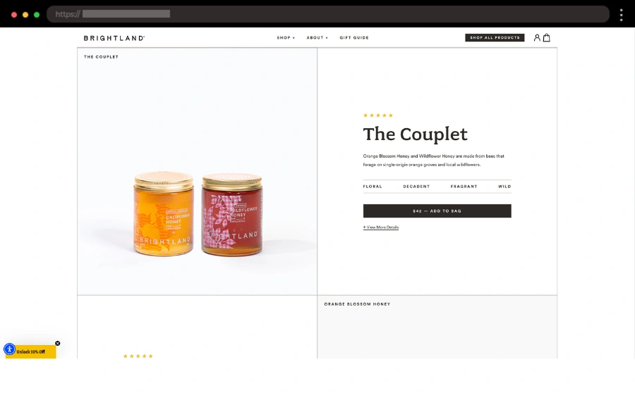
I love how this page makes honey feel like pure luxury. The rich, golden tones and stunning photography make each jar look like a piece of art. Everything flows so smoothly, from the product details to the glowing reviews, that it’s impossible not to appreciate the craftsmanship behind it.
✨ What I like:
- Gorgeous product photography
- Clear descriptions and storytelling
- Link to a separate customer reviews page
19. Vacation – Retro Landing Page for Celebration of Raven’s 50-Year Run

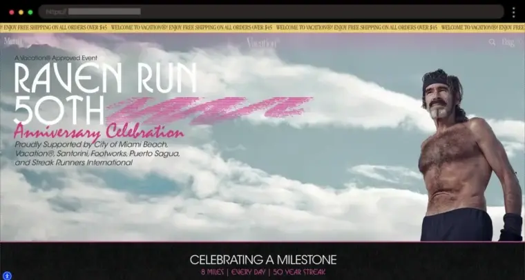
I think the cause of this landing page is awesome – it celebrates Raven’s amazing 50-year daily run streak, and it has the perfect retro vibes to match. It features bold colors, playful visuals, and catchy copy that brings the whole story to life. Plus, you can shop for merch and music with all profits going to Raven, making it even more meaningful.
✨ What I like:
- Retro design that sets the perfect mood
- Clear sections for merch and music purchases
- A story-driven approach that highlights Raven’s journey
20. Little Chonk – Playful Landing Page for Portable Dog Bottle

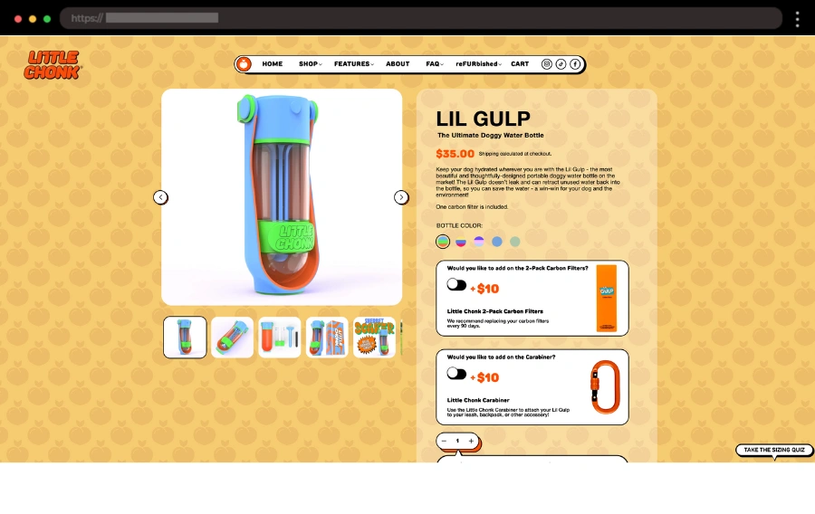
I’m definitely a cat person, but for all the dog lovers out there, this portable dog water bottle page will grab your attention instantly! It has a fun, colorful design and quirky fonts that match the vibe of the product. With product images, videos, and all the essential info like features, FAQs, and customer reviews, it’s designed to boost conversions and make purchasing as fun as it is easy for pet parents.
✨ What I like:
- Bright, eye-catching design with quirky fonts
- Detailed product info, including videos and images
- Easy-to-navigate sections like FAQs, reviews, and a signup form
21. Patrick Origin SS25 – Trendy Sneaker Collection Shopify Landing Page

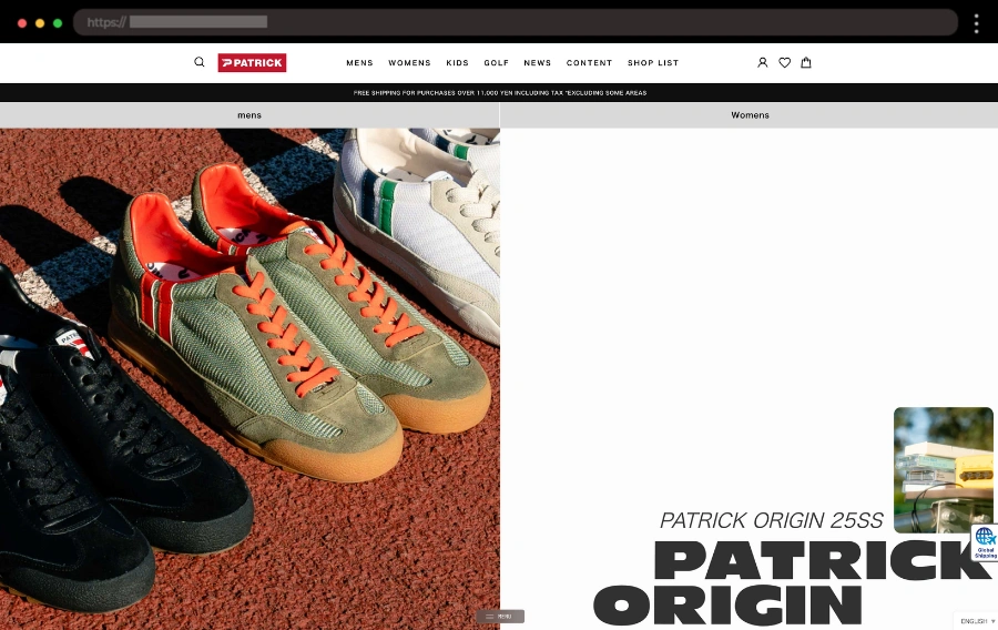
Patrick’s new sneaker collection landing page is all about showcasing their fresh kicks with style. The full-screen videos and images are the perfect way to get a closer look at each pair. Plus, those easy “Shop Now” CTAs make grabbing a pair a breeze.
✨ What I like:
- Simple, stylish layout
- Full-screen videos and images of the sneakers
- Clear “Shop Now” CTAs for each model
22. Groove Tabs – Landing Page for Instant Mood Boost Pr with a Fun Twist

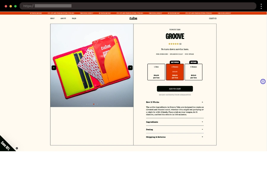
Groove Tabs’ landing page is simple and clean, but it clearly explains how their mood-boosting tabs work. The design is modern, with easy navigation through ingredients, testimonials, and pricing options, plus a fun section with people trying the product. I love how they use an ingredients slider and discount packs to keep it engaging and drive conversions.
✨ What I like:
- Simple, fun design that showcases the product’s benefits
- Real user testimonials for added trust
- Clear sections with ingredients and discount packs
23. Packd – Effortless Landing Page Subscription for Healthy Meals

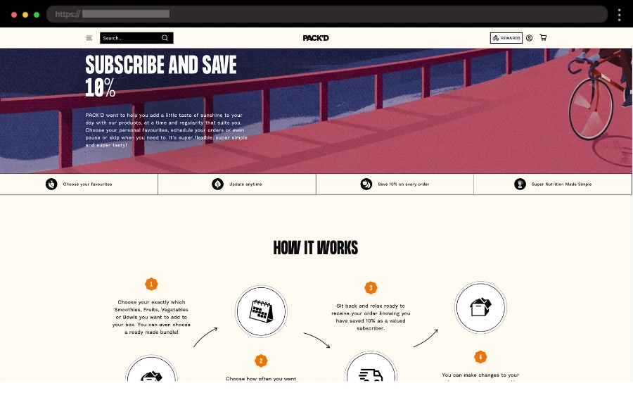
Packd’s subscription landing page nails it by focusing on simplicity and ease. The clean design and smooth UI/UX make it super easy to customize your subscription, pick meals, and save 10% on every order. It’s a great example of how a well-designed page can make the user experience effortless and enjoyable.
🤩 What I like:
- “How It Works” section with simple steps
- Flexible subscription with easy options to choose and update products
- Focus on convenience, with a great deal (10% off every order)
24. Wholier – Organic Protein Shopify Landing Page

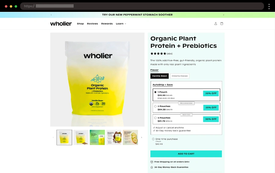
Wholier’s landing page makes it crystal clear that their organic plant protein is all about quality and is a product you can actually trust. With easy-to-find details about ingredients and sourcing, plus a helpful “buy-more-pay-less” deal, buyers should feel confident about their purchase every step of the way.
✨ What I like:
- Clear info about ingredients and sourcing
- “Buy-more-pay-less” subscription savings
- Easy to find sticky add-to-cart bar
Final Words
To wrap things up, I’ve learned that the best Shopify landing pages strike a perfect balance between eye-catching design and user-friendly features. It’s actually the thoughtful details, like clear CTAs, engaging visuals, and simple navigation, that make the biggest difference. I hope these examples spark some fresh ideas for your projects. And remember, it’s all about making a memorable first impression that leads to conversions.