Designing a great high-converting landing page is almost as important as designing a good product. The landing page serves the very important purpose of pushing a customer from the consideration stage to the decision stage of the customer journey
A while back we wrote an article on how to create a high converting landing page. This time we’re bringing you some examples of landing pages that followed those rules and are considered the best.
All of the high-converting landing page examples we are going to present to you today have had multiple versions over time and will probably continue evolving. This greatly captures the most important thing about a landing – the constant need for optimization and testing.
13 Excellent High Converting Landing Page Examples
- 1. Branch Furniture
- 2. Doordash
- 3. Epicurrence
- 4. ExpressVPN<
- 5. Goby
- 6. Milanote
- 7. Netflix
- 8. Roomeze
- 9. SEMrush
- 10. Sendinblue
- 11. Spatium
- 12. Spotify
- 13. Udemy for Business
- 14. Wix
1. Branch Furniture
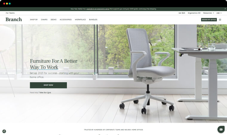
Branch Furniture is a furnishing company that offers solutions for design and furnishings for office spaces.
What we like about it. We really like how prospects can get so much information by simply going to this landing page. Just from the heading section we already have a good idea of the services provided and how those services we’ll be delivered.
The landing page goes over the services, the starting prices, how they compare to other companies, who will handle the customer, and even answers some top questions that customers may have.
We feel this landing handles all of our objections and makes us feel confident about our decision.
2. Doordash
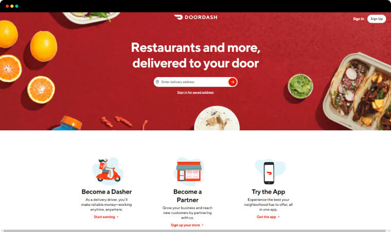
Doordash is a food delivery that aims to disrupt the common way food delivery services work. Instead of hiring their own delivery drivers, Doordash allows anyone to become a delivery driver and work however they want whenever they want.
What we like about it. The main goal of this page is to inform new users of how the company works and make them sign up for door dash. The simple design of the page reinforces the idea of how simple it is to work with them.
They start the landing page with a big promise to the user and use the rest of the landing to explain how they can fulfill that promise. This process of setting expectations and then meeting them is what we like to see on a landing page.
The images of the app in use on the landing also make us feel like we already know how to use it. This transparency makes it easy for anyone to quickly make a decision and convert on the spot.
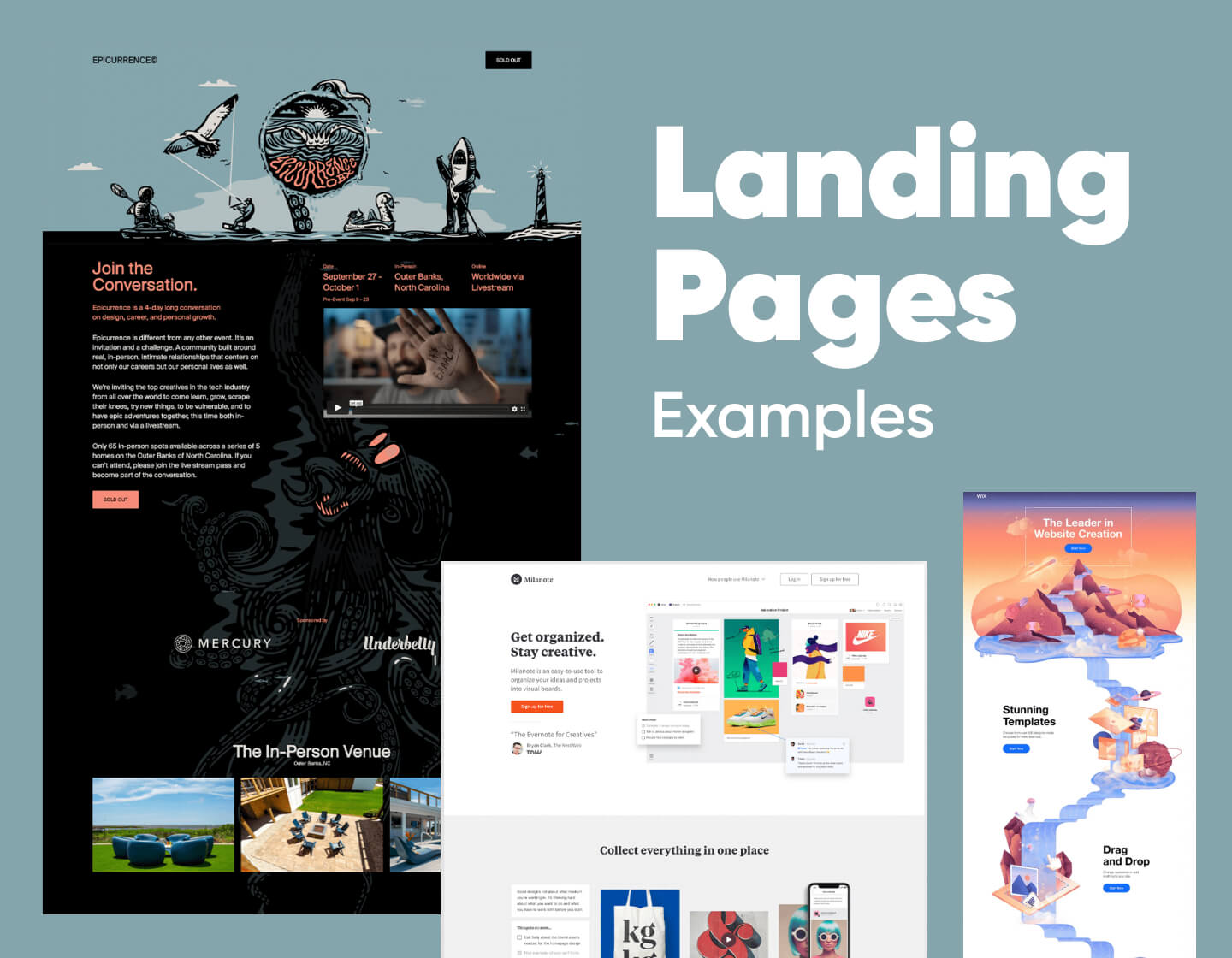
3. Epicurrence
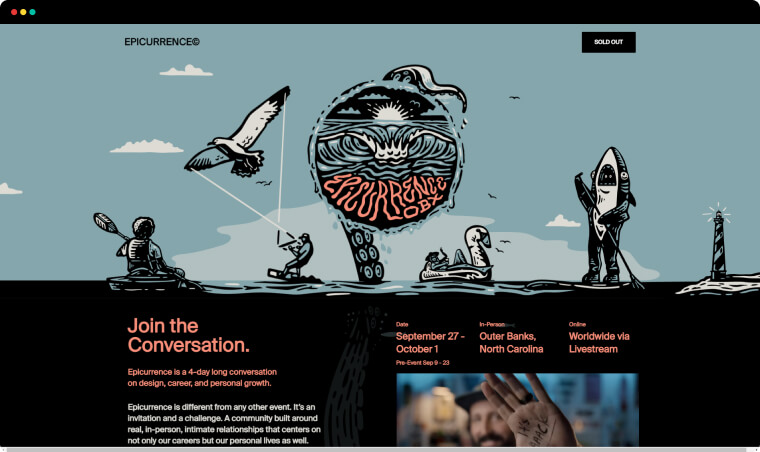
Epicurrence is a live event that brings together individuals for a couple of days to have discussions, share their experiences, and network.
What we like about it. The highly stylized nature of this landing page is definitely what catches the eye. Of course, the creators of the landing page also haven’t forgotten about the main goal of the landing. The information is short and concise and most of the content is in video format. This allows the artwork and color design to shine without taking away the main purpose of the landing page.
4. ExpressVPN
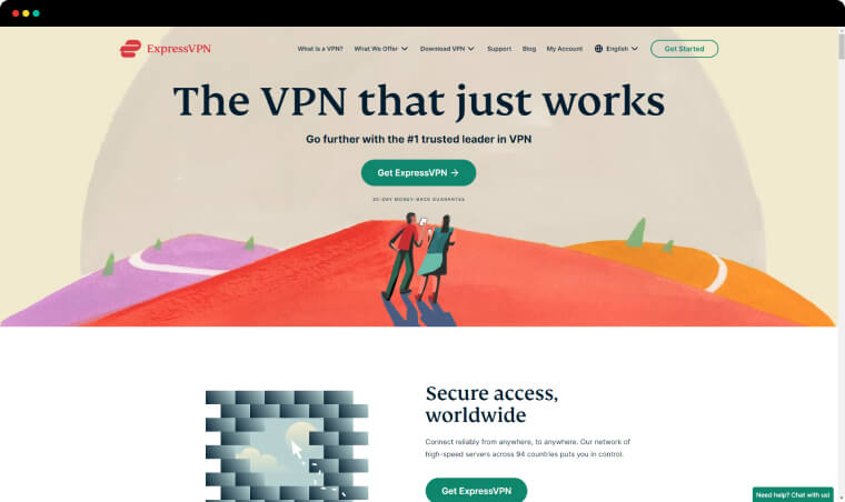
ExpressVPN is a technology solution that allows utilizing a virtual private network to securely connect to the internet and keep your data safe. The product provides flexibility and security to anyone whose work is highly dependent on staying online.
What we like about it. We really like how the company has managed to build such a visual landing page about a product that has pretty much no visual aspect. Just like the name suggests a VPN is a virtual product that does most of the work in the background without much need for a large user interface.
While the inner workings of a VPN can be very confusing to the average user, this landing market has managed to sell the benefits of its service without going deep into the boring technical side.
5. Goby
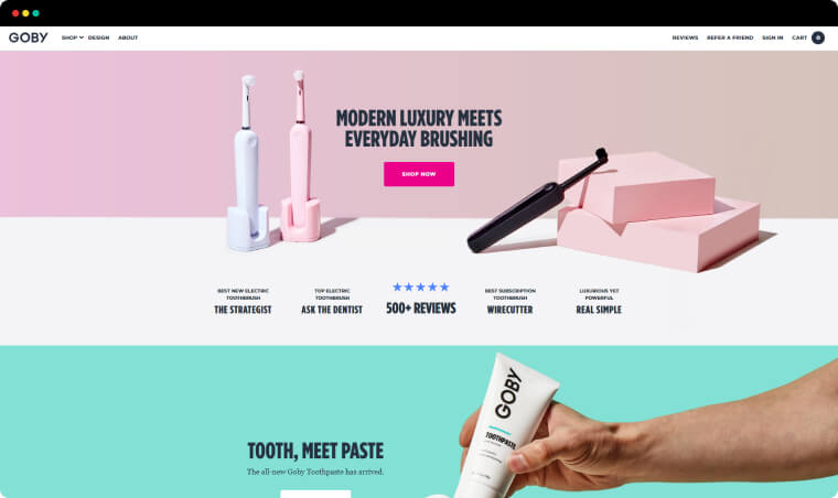
The next high-converting landing page example comes from Goby, a company that provides electrical toothbrushes. Their product’s main selling point is the affordable price while still maintaining a good quality of the product.
What we like about it. This landing page is a great example of how to do a single product landing page. At the start of the landing page, we get a clear value proposition. Throughout the rest of the landing page, the value statement of the product is reinforced and there is lots of social proof both from big-name brands and customers who have purchased the product.
Any eCommerce store should take notes from this page and use them to create their own single product landing for their best-selling product.
6. Milanote
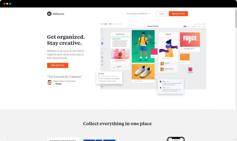
Milanote is a solution for artists that allows them to create mood boards or inspiration boards and keep them organized.
What we like about it. The website does a great job of combining promotional material with in-use images of their web app. This is something a lot of SaaS companies miss out on. We’ve seen way too many applications try to sell themselves without even including one image of the user interface.
The problem with that is that it is very hard for users to imagine themselves using the app. Milanote has taken care that even before sign-up they already know what’s to come.
7. Netflix
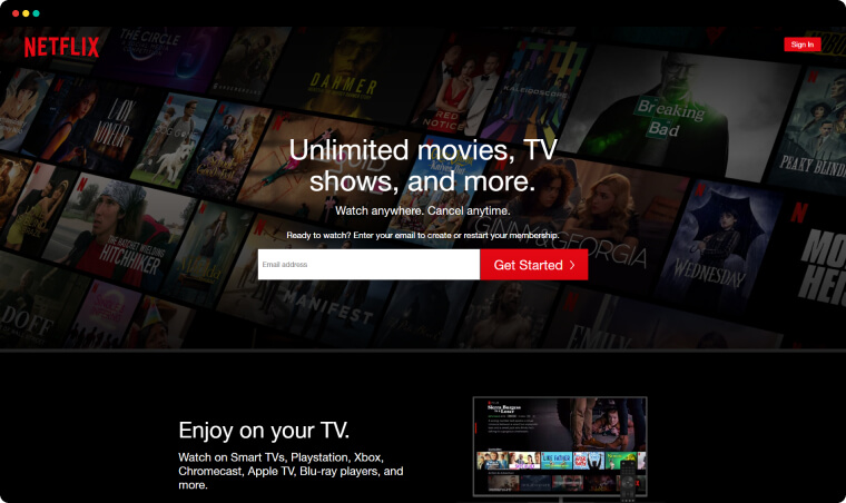
Netflix is a streaming service that gives users the freedom to watch whatever they want whenever they. This new approach to content delivery has been so successful that anyone who is reading this article probably has a Netflix subscription.
What we like about it. Netflix has created a landing page that manages to say so much with so little actual text. In just 8 – 10 sentences anyone will understand the benefits of the service. The focus of Netflix is to let their service do the talking and it clearly shows in their landing page design.
8. SEMrush
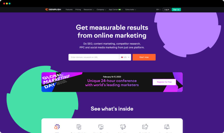
SEMrush is an online suite of tools designed to aid marketing experts in anything from keyword research, backlink analysis, competition analysis, and paid advertising research.
What we like about it. This landing page is a great example of laser-focused advertising efforts. While SEMrush suite offers many features this landing page is aimed at a specific purpose and problem that they solve.
With a landing page it is important to keep in mind the audience and the goal it needs to achieve. If they tried to cram every single feature of their product on a single page you would probably get a convoluted and overwhelming amount of information.
Instead, we have a clean straight-to-the-point offer and solution.
9. Sendinblue
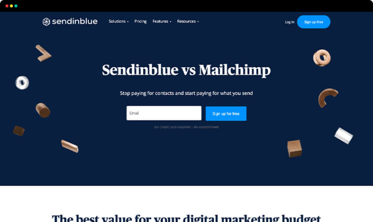
Sendinblue offers an email marketing solution to companies and individuals who want to automate a large part of their email marketing efforts.
What we like about it. This landing page is probably the best small landing page we’ve seen. The purpose of the landing page is to compare Sendinblue’s product against a competitor and prove to customers their value. That’s it.
To do that they just offer a simple comparison chart that does a great job to prove their point.
10. Spatium
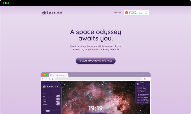
Spatium is a chrome plugin that offers sky images and skymap information. This one is for all space lovers.
What we like about it. The color scheme is definitely the most interesting thing about this landing page. It’s pretty rare to see a landing page use a purple color scheme and pull it off successfully. Spatium has managed to do it perfectly.
We also enjoy the images of their plugin in use. We can already imagine ourselves using it.
11. Spotify for Podcasters
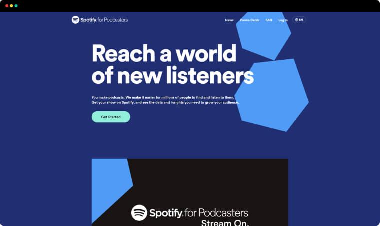
Spotify is the most well-known music streaming service in the world. Recently they decided that they also want to branch out into the lucrative marketing of Podcasting.
What we like about it. We really enjoy the effort that was made to differentiate this service from the normal Spotify services. Instead of the iconic green that is synonymous with Spotify, this page uses a blue color scheme clearly showing that this is a different product aimed at a different audience.
12. Udemy for Business
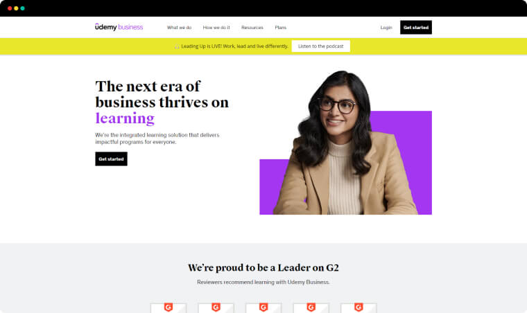
Udemy is well known as the biggest e-learning platform providing courses on all kinds of topics to end-users. With Udemy for Business, they aim to target business and become their platform for educating teams.
What we like about it. We really like how Udemy has managed to walk the fine line between a colorful design while still keeping the clean and professional look that is expected of most services in the B2B sector. The landing page manages to pull off the professional look without losing its formal tone.
13. Wix
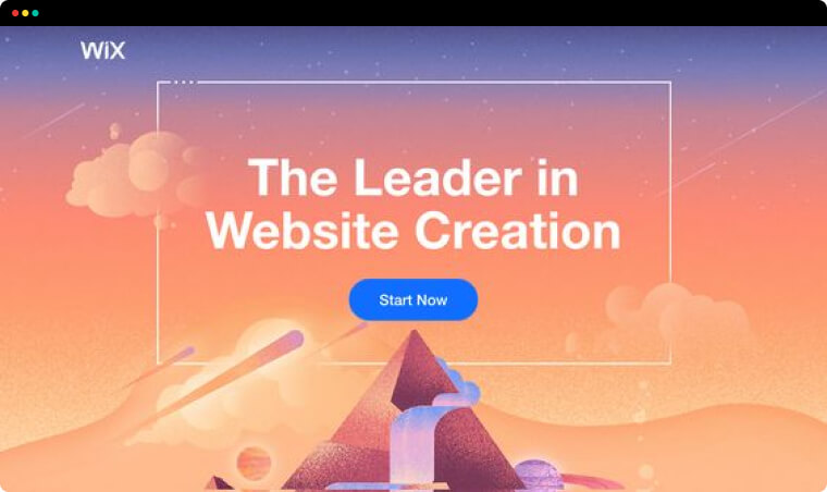
Wix was one of the earliest platforms where users could build their websites without any coding knowledge. The company actively supports the idea of the No Coding movement and aims to allow anyone the creative freedom to design their own website even without web developer skills.
What we like about it. The graphical design of this landing page is absolutely stunning. This is definitely one of the prettiest landing pages we’ve ever seen. If you take out the text and the buttons you can just print it and put it on your wall.
Final Words
These were our 13 favorite high-converting landing page examples that use different techniques and best practices to stay effective and make users feel interested in what they offer and confident in their action choice.
In the meantime, why not take a look at the related articles to get some more inspiration or grab a couple of freebies: