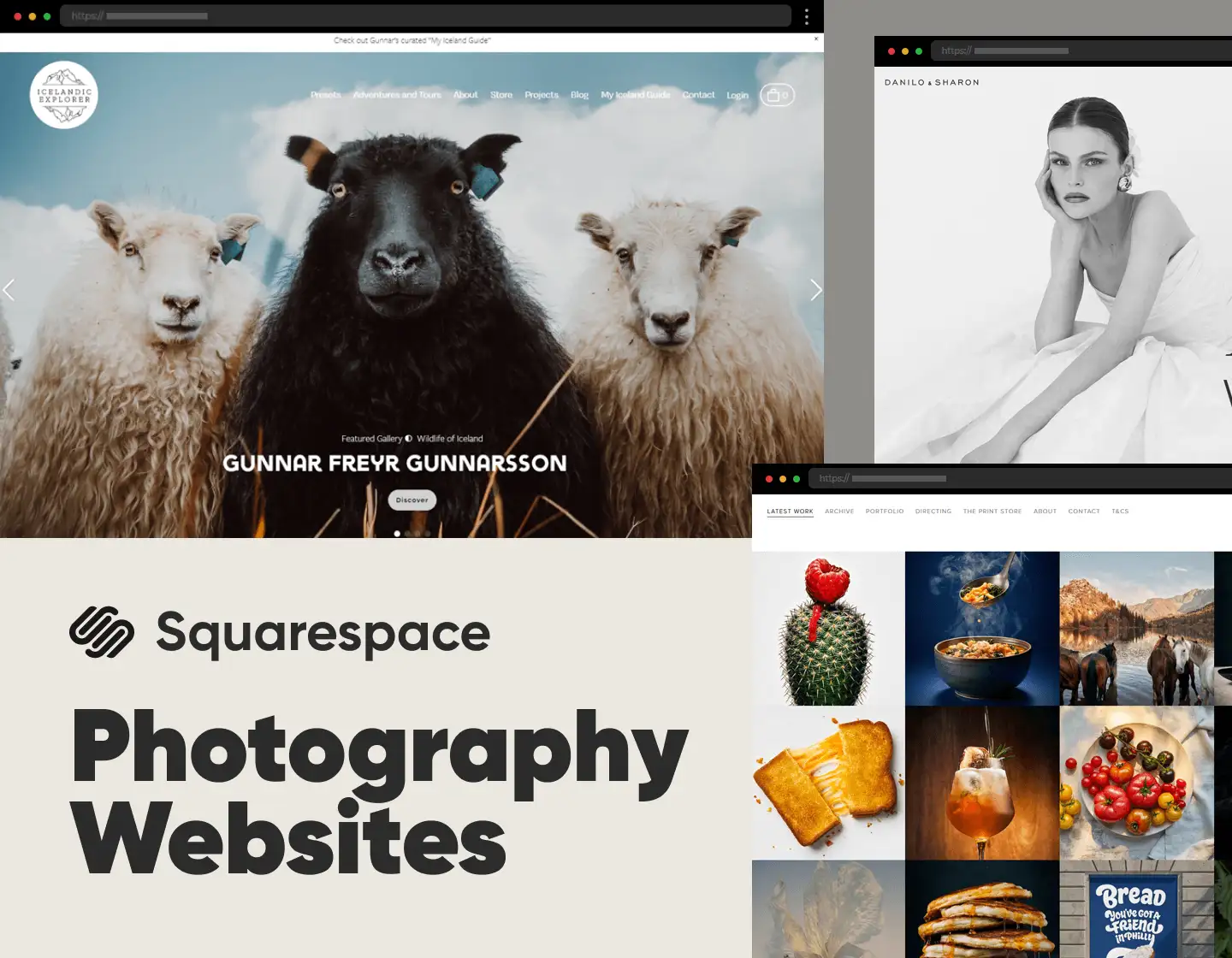
Every photographer expresses their view of the world through their work. Still, reaching out to the public to showcase it is truly important for gaining popularity and winning more clients. And how is this achieved? By building an impactful online presence, of course. And building Squarespace photography websites is one of the best and easiest ways to do it.
Squarespace provides web users with the opportunity to build their photography website while having no coding skills. Facilitated and convenient, the platform makes creating an amazing website seem like a child’s play. Anyone can do it, so, maybe now it’s your time to immerse people in your photography endeavors through an amazing Squarespace website.
So, that’s why, in today’s article, we present to you our cherrypicked set of 22 top-notch Squarespace photography websites. They are impactful, stylish, and truly impressive, and are here to help you gather ideas and gain inspiration for your own design. Enjoy!
1. Johnatan Gregson Food Photography
Jonathan Gregson, an acclaimed photographer, sports a website exuding professionalism and style. Its homepage elegantly displays his newest projects in an eye-catching, clean grid of lively images. A straightforward navigation with clear categories and plainly presented bio and contact details shed more light on the photographer and his photo and video work. Overall, this site is effectively showcasing Johnatan Gregson’s skills through an attractive and easy-to-use design.
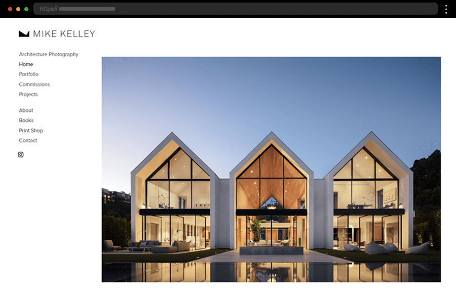
2. Mike Kelley Architecture Photography
Mike Kelley’s website is a masterclass in minimalistic design, emphasizing his high-quality architectural and aircraft photography. Its homepage features a full-width image slider that instantly draws the visitor’s attention to the stunning images. The non-obtrusive sidebar menu with clean typography and plenty of white space ensures the photos take center stage, creating an immersive user experience. Moreover, the site’s intuitive navigation facilitates visitors to explore the photographer’s various projects and galleries.
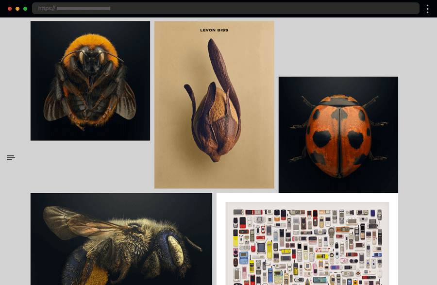
3. Levon Biss Macro Photogaphy
Levon Biss’s site showcases his exceptional macro photography with a straightforward, minimalist layout. Large, high-resolution images take the most of the homepage, helping viewers dive into the complex details of his work. Also, the use of a subtle, neutral background accentuates the vibrancy and contrast of the photographs. This Squarespace photography website is a perfect example of how a plain design can effectively highlight the artist’s unique style.
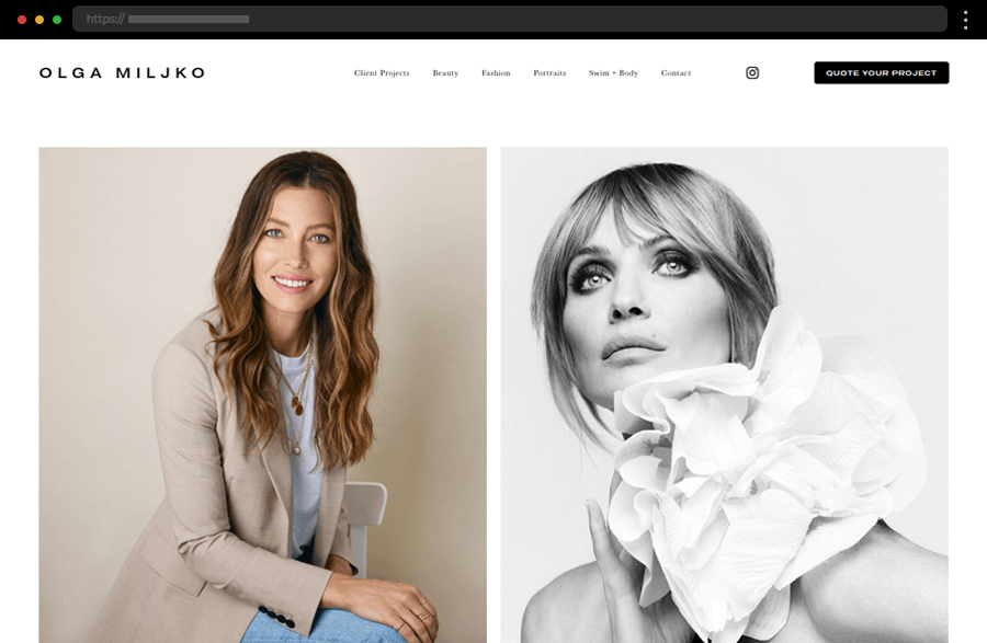
4. Olga Miljko Commercial photography
Olga Miljko’s website is all elegance and sophistication, perfectly mirroring her photography style. Its homepage features a dynamic grid layout that beautifully displays her diverse portfolio. The clean, modern design is both visually appealing and easy to navigate, making it a pleasure to explore her work. Olga Miljko’s Squarespace photography website is a perfect example of how simplicity can truly be stylish and enchanting.
5. Okie Dokie Creative Photography
Okie Dokie Studio’s website stands out with its playful and vibrant aesthetic, reflecting the studio’s creative approach. Using bold colors and catchy animations adds to the site the photographer’s unique personality while deeply engaging visitors. The portfolio section is beautifully presented in a stylish grid, allowing web users to browse through the various projects effortlessly. As a result, thе Okie Dokie’s Squarespace photography website effectively represents the fun and energetic spirit of the studio’s work.
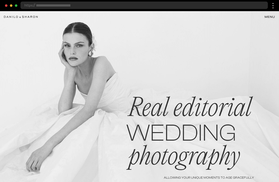
6. Danilo And Sharon Wedding Photography
The sophisticated design of Danilo and Sharon’s site beautifully encaptures their elegant view and approach to wedding photography. An engaging, dynamic layout with a minimalistic design and alternating background colors helps present the highlights of the studio’s best work in a truly classy way. The well-organized galleries and easy-to-use navigation also add to the pleasant and immersive browsing experience. As a result, this Squarespace photography website beautifully represents the couple’s passion for stylishly capturing love stories.
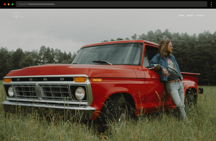
7. Peter McKinnon Photography & Filmmaking
Peter McKinnon’s website immediately captures visitors’ attention with its homepage’s stunning full-size background image. The navigation is streamlined to a personalized Home button with his signature, and three additional options. Featuring also a shop, the site offers a broad array of presets, packs, and tools for sale. In addition, the convenient form on the contact page and the About section with integrated social media links work greatly towards ensuring engagement.
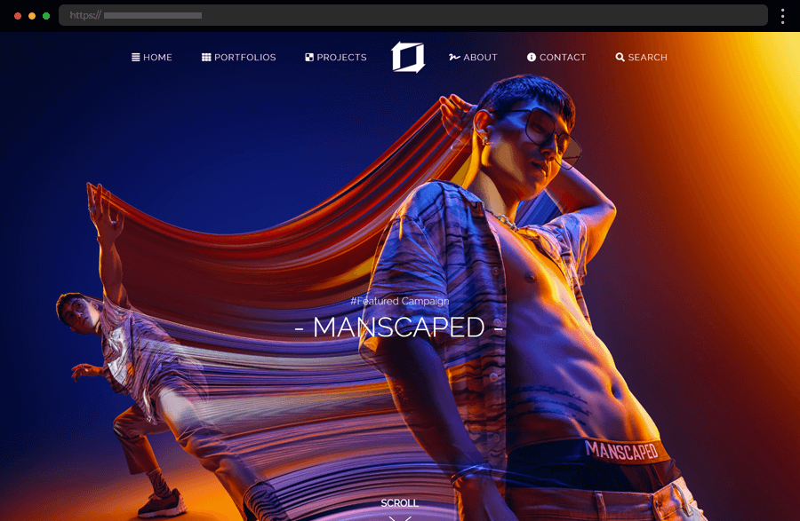
8. Tim Tadder Advertising Photography
Tim Tadder offers users an immersive experience with his bold and modern site, perfectly complementing his innovative photographic style. The amazing full-screen images and video backgrounds create an engaging, compelling atmosphere, drawing visitors into his world. Thus, this Squarespace photography website beautifully exemplifies how powerful imagery combined with a sleek design can create a memorable online presence.
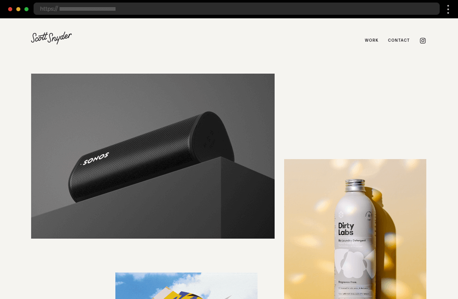
9. Scott Snyder Product Photography
Scott Snyder, a self-described “photographer of objects”, showcases his stunning portfolio on a beautifully crafted website. The homepage features colorful highlights of his impressive work, a client list, testimonials, and the site’s sole bio. Each project page immerses visitors in his creative vision through brief descriptions and captivating images arranged in an engaging grid. Thus, Scott Snyder masterfully exemplifies how to create an outstanding Squarespace photography website.
10. Jessica Chou Photography
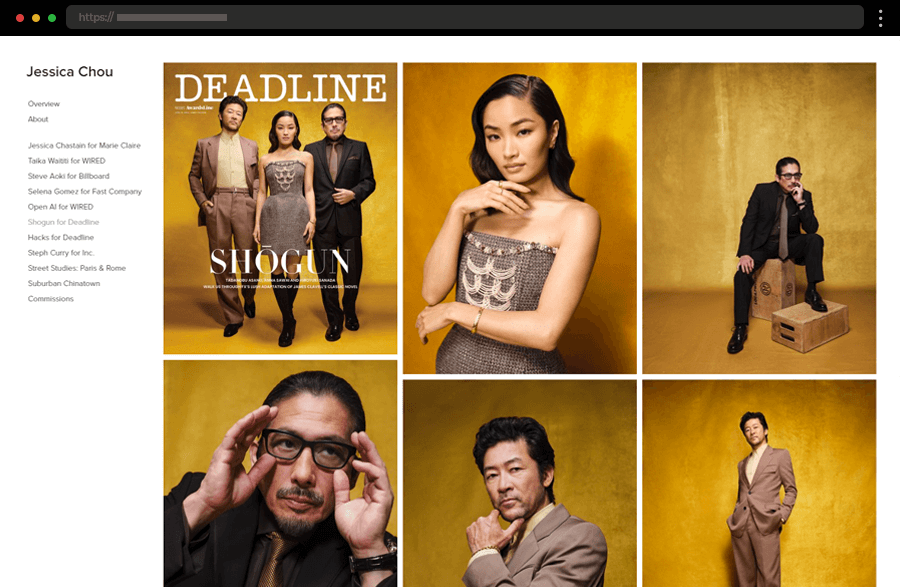
Jessica Chou’s Squarespace photography website is the epitome of elegant simplicity. Its homepage features a colorful selection of her best work, set against a clean, white background. Further, intuitive navigation and well-organized galleries ensure user satisfaction, facilitating visitors with exploring her impressive high-profile portfolio. As a result, the site serves as an example of how to leave your work to present your skills by enhancing its impact with a minimalist design.
11. Kimberlin Gray Portrait Photography
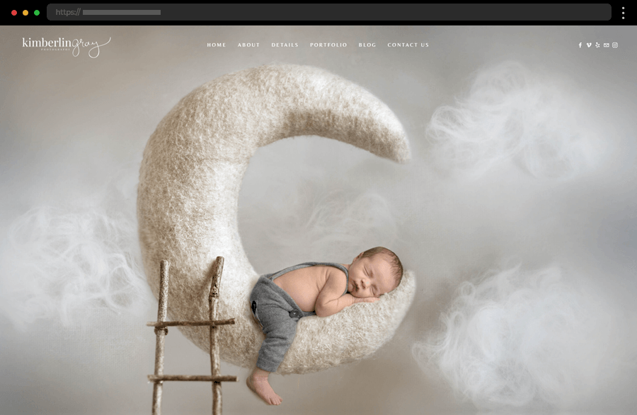
Kimberlin Gray’s website creates a warm, serene, intimate atmosphere, perfectly resonating with the essence of her family portrait photography. The straightforward navigation and well-organized galleries make it easy for visitors to get to know the photographer’s work. Meanwhile, an engaging layout with a dynamic grid, parallax scrolling, and impressive high-quality images keep the users’ interest high and show how impactful and professional can a delicate design be.
12. Cliff Endsley Artistic Photography
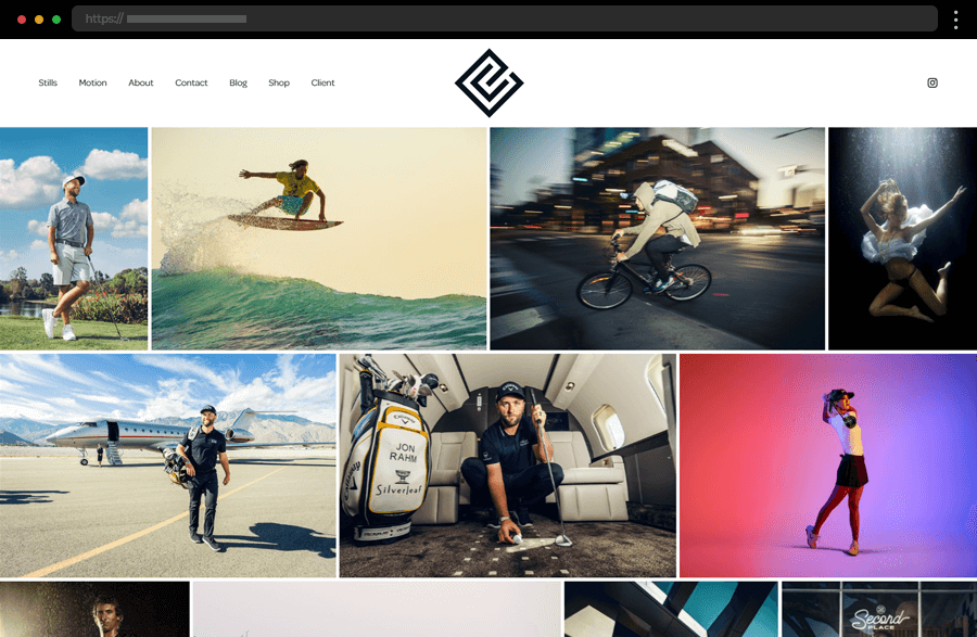
Cliff Endsley lets his work speak for his skills on his Squarespace photography website’s homepage, reserving his presentation for the About section. Sporting a minimalist design with a dynamic layout and a streamlined navigation highlighting his portfolio and additional features, the site is easily navigated encouraging visitors to explore further and discover the photographer’s artistic vision.
13. Tayler Smith Pet Photography
Tayler Smith’s website stands out with its playful use of color and quirky typography. The homepage features a vibrant full-width background image that immediately immerses visitors in Tayler’s love for dog photography. Coming with straightforward navigation and clear project categorization, the studio’s online portfolio is easily explored. Also, the site’s use of colorful and dynamic layouts throughout its pages, and overall bold design choices perfectly represent the photographer’s creative vision.
14. Will Bremridge Photography
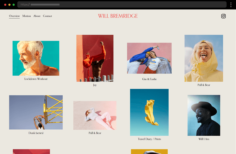
Will Bremridge’s website, with its calm background color, attractively presents his heavy emphasis on bright colors in his work. The homepage features a dynamic grid showcasing his latest work and engaging visitors to browse further each highlighted project. The minimum amount of text, the straightforward navigation, and the focus on high-quality, colorful images enhance the viewing experience and compellingly display the photographer’s portfolio.
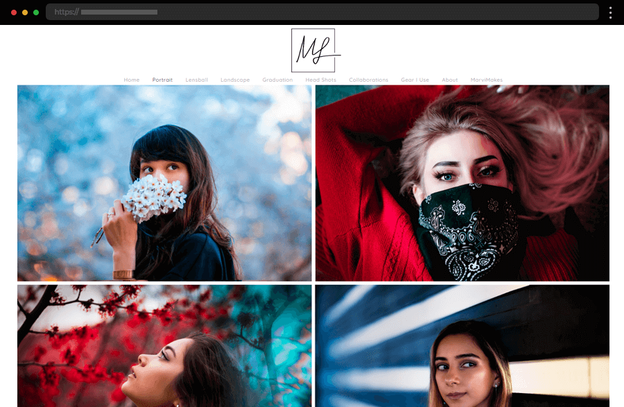
15. Marvin Lei Creative Photographer
Stunning photographs captivate visitors on Marvin Lei’s website. Arranged in a visually appealing grid against a white background, the striking images beautifully present the photographer’s skills. Complementing the captivating display of photos, the anchored menu helps users navigate the site easily. Marvin Lei includes also a humorous About section and details about his equipment to create a more approachable brand image and encourage visitors to contact him.
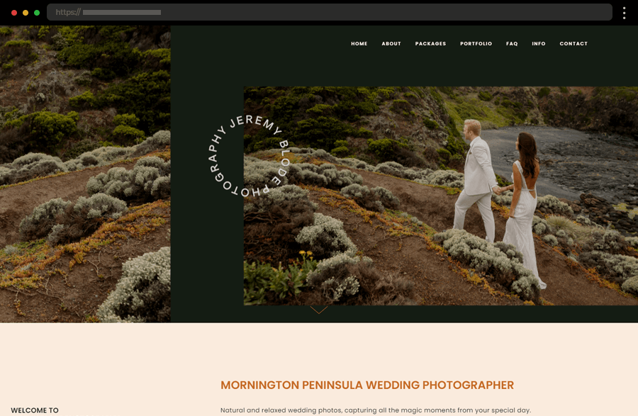
16. Jeremy Blode Wedding Photographer
Next comes Jeremy Blode, providing us with another great Squarespace photography website example. The homepage emphasizes his wedding photography services while concise descriptions and links to the featured wedding galleries enhance its appeal. Moreover, the simplified navigation promises users a smooth and comprehensive web journey with access to additional information and various convenient inquiry forms, reinforcing the photographer’s professional yet approachable image.
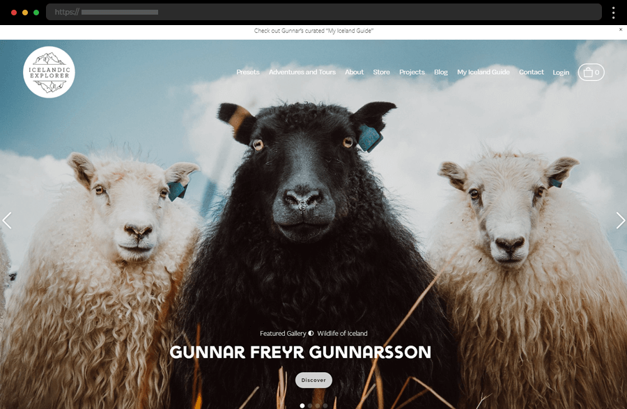
17. Icelandic Explorer Professional Photographer
Showcasing remarkable highlights of his work, Gunnar Freyr Gunnarsson offers an engaging online experience through his site. His various undertakings, personal views, and an online shop are comprehensively presented within the broad content range available on the site. Every piece the photographer features is captivating and stylishly displayed on his website, incorporating all the components necessary for a seamless user journey.
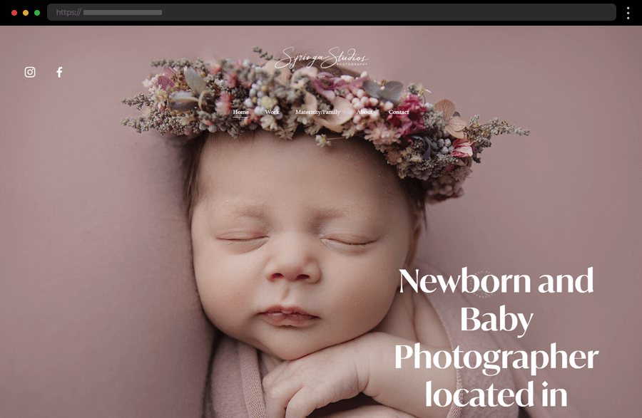
18. Syringa Studios Photography
Syringa Studios Photography sports a Squarespace website exemplifying how to target your preferred audience right from your homepage. With a stunning background image and a headline describing the services provided and their location, the studio’s hero section is straight to the point. In addition, the site’s navigation is excellent, leading to the portfolio and detailed photographer information, and ensuring a convenient and satisfying user experience.
19. Anni Graham Wedding Photographer
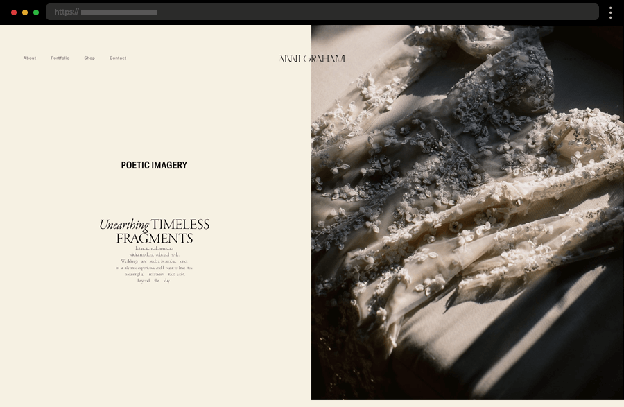
Anni Graham’s Squarespace photography website encaptures visitors with its sophisticated design. An impressive split screen with a short text alongside a highlighted image subtly depicts the studio’s services. The homepage showcases stunning pictures from Anni Graham’s wedding photography portfolio. In addition, the simple menu, providing access to the photographer’s work, shop, and contact pages ensures a smooth and user-friendly web journey.
20. Pedro N The World Photography Portfolio
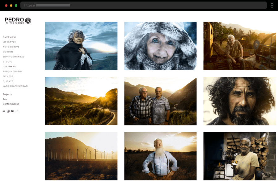
Pedro Oliveira’s site’s homepage features a vibrant and engaging slideshow of his striking images. The photographer’s portfolio, divided into clear categories, is presented in a dynamic grid showcasing the essence of his compelling work. Using a clean layout allows the photographs to speak for themselves while the intuitive sidebar navigation ensures a smooth browsing experience. Overall, this site succeeds in delivering an amazing user experience while highlighting the photographer’s passion for exploring the world through his lens.
21. Alex Tran Photography Website
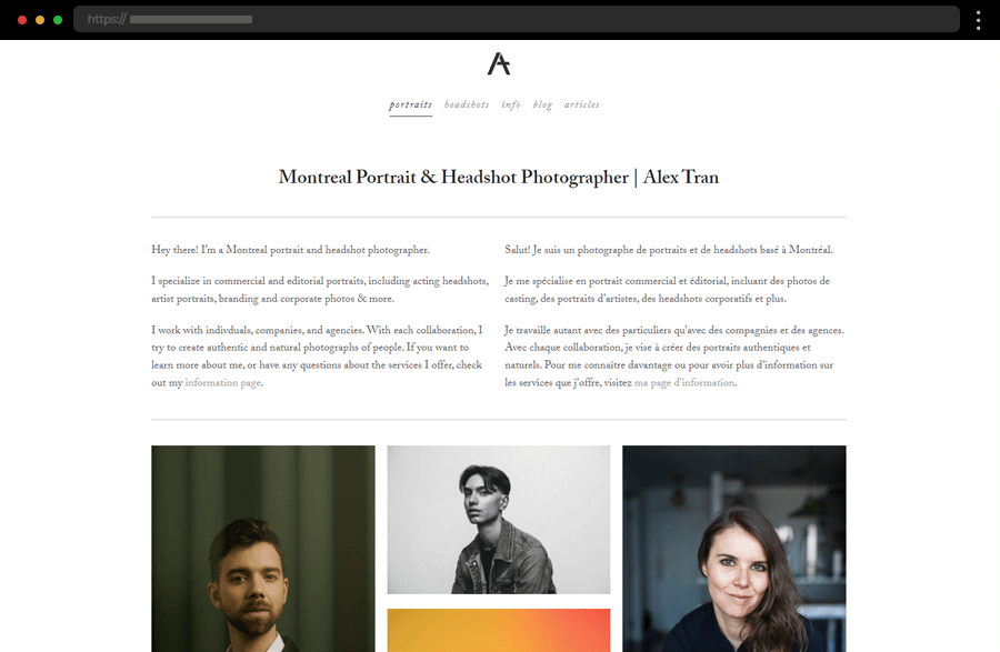
Next comes Alex Tran with a clean and straightforward web design, showcasing the photographer’s work in a centralized three-column grid. The site beautifully demonstrates how to leverage large negative spaces and plain typography to keep the focus on the photos. With a simplified navigation leading the way to the featured work, a catchy Info section, and a blog, this site comes as an example of how embracing simplicity can result in an impactful and user-friendly design.
22. Sean McCoy Storytelling & Photography
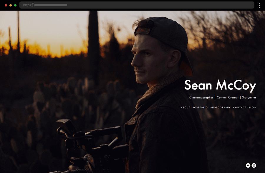
Sean McCoy’s Squarespace website combines a smooth and simple design with an elegant presentation of his photography and video portfolio. The site is engaging with a dynamic layout and a minimalist grid of images, inviting visitors to explore further. In addition, the facilitated navigation with clear categorizations ensures people can easily find what they’re interested in or contact the photographer. Thus, Sean McCoy gives us another great example of how less can be more in web design.
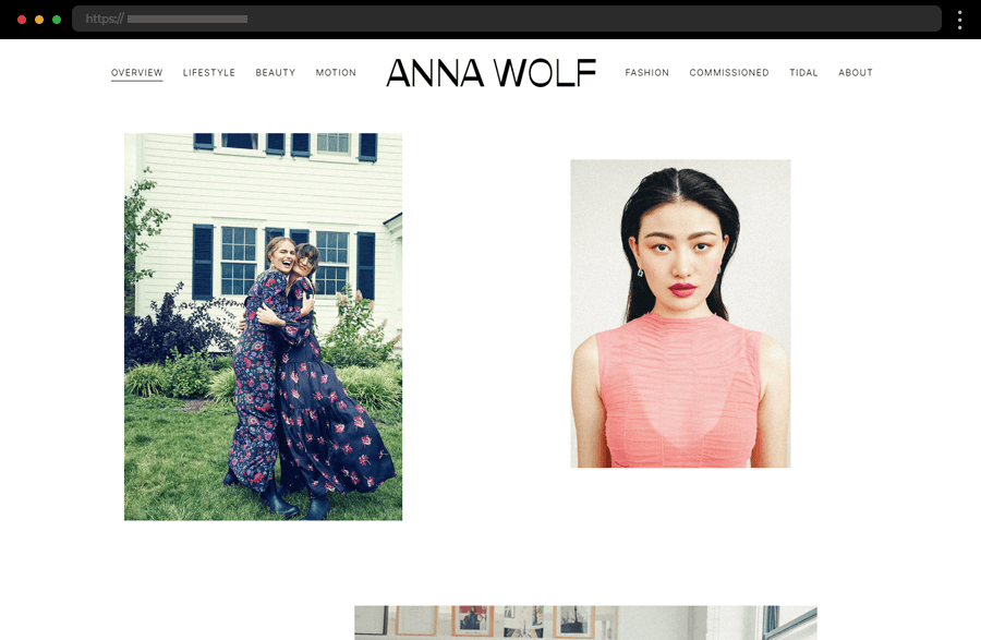
#Bonus: Anna Wolf Creative Photographer
Anna Wolf provides us another example of how impactful a combination can bold imagery and minimalist design be. The site’s homepage, with its clean, white background, leaves her vibrant photography to take center stage, immediately capturing the viewer’s attention. With its intuitive, clearly structured navigation and plain design, this Squarespace website demonstrates how to create a visually impactful and user-friendly photography portfolio while ensuring a seamless browsing experience.
Tips on how the best Squarespace photography websites are created
- Firstly, and maybe most importantly, ensure your images are high-resolution and optimized for web performance and present them accordingly. For example, full-screen images and dynamic grids can effectively showcase your work and create an immersive experience for visitors.
- Then, let your unique style and personality shine through your website design. Use colors, fonts, and layouts that reflect you as a brand and represent your artistic vision and view of the world.
- Also, as you see, minimalistic designs are the preferred choice for most photographers. So, you can think about using a clean, minimalist layout, too, to allow your photography to take center stage.
- Next, a straightforward and intuitive navigation structure helps visitors explore your work effortlessly. For instance, consider categorizing your portfolio into distinct sections to guide users through your site and ensure a pleasant experience.
- Further, ensure your website has a responsive design and looks great on all devices. This, along with quick loading times, elements like animations or hover effects, and integrated contact and inquiry forms, certainly adds a touch of professionalism and style to any site.
- Last, but not least, continuously take care of your Squarespace photography website’s SEO(Search Engine Optimization). Update your portfolio and blog content regularly, and make sure it is all relevant to your target audience, thus working towards your site’s success.
Want to have a professional portfolio website like these?
Get a free design audit → with our friends at htmlBurger.
Final words
Creating a captivating online portfolio is so important for photographers seeking to showcase their work and win over potential clients! Good thing that with Squarespace anyone can create photography websites that beautifully combine aesthetic appeal with functionality and also showcase the creatives’ work in the best light possible. With the right approach, a well-designed Squarespace photography website can attract, engage, and inspire visitors, thus helping photographers grow their brand and reach a wider audience.
Don’t go yet! If you enjoyed our set of Squarespace photography websites you may also want to:
-
Check out these 20+ Minimalist & Photography Portfolio Websites, or
-
Dive into our complete collection of WordPress Website Examples.


