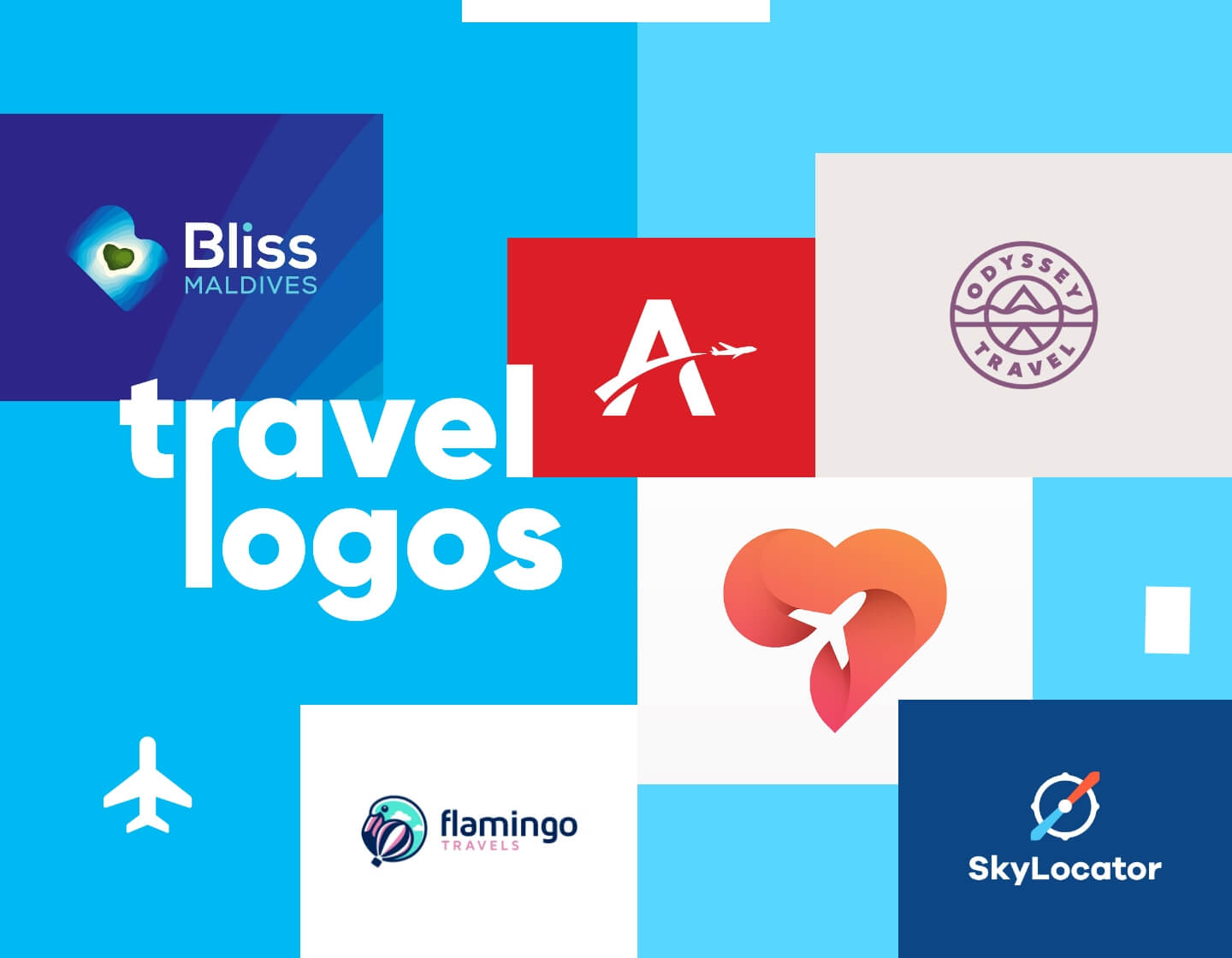
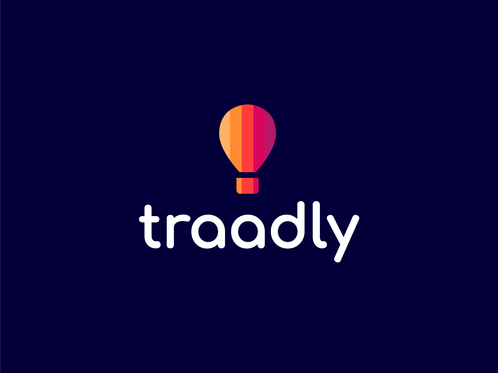
Travelling is one of the most enjoyable and favorite activities for us all. As for the traveling service providers, it is of the central importance to fulfill customers’ needs. But first of all, what’s in your business so attractive that customers choose you over other players on the market? Your company’s logo may be one of the most significant ways to tell that story. Let’s see how it works. In this article, I’ve prepared 30 lovely travel logo examples made by designers for indie travel agencies.
Stylish and Classic Travel Logo Ideas
When you create your logo, there are several things you might want to consider. Firstly, what’s your brand mission? Secondly, what’s it all about? The classic logos usually the slogan of the company that highlights the values and purpose of the agency. The message your logo delivers to the target market should be straight to the point. Keep in mind that while traveling, customers want to create great memories. Perhaps this is where your brand identity positions itself. Below are some lovely examples from Dribble.
Modern Travel Logos
One of the most common features of all modern travel logos is that they include the means of traveling, such as trains or airplanes. Graphic designers have new and creative solutions to convey the message of traveling by implementing those into the design. Think of a logo design that has an airplane in it, and your brain will immediately think of traveling. That’s how these symbols are positioned in the customers’ minds. However, don’t overcomplicate your logo design by putting too many symbols that are associated with traveling.
Cartoony Travel Logo Ideas
For each of us, traveling is always fun and enjoyable. Think of traveling as a color, what would it be for you? Probably very bright and happy, cartoon-like. Many travel agencies want to highlight their brand value at bright and colorful elements to capture consumers’ attention. This is also a great way to gain positive brand awareness.
Flat, Minimalist and Simple Travel Logos
Other practical idea is the minimalistic and straightforward approach. Currently, the market trend accomodated minimalistic yet powerful logos. When you simplufy your logo design, customers get attached to the brand identity easily and recognize your logo among million others.
Other Cool Travel Logo Examples
By following the current market trends, companies develop exciting and creative logos that gather all features. They are fun yet very simple, colorful, yet minimalistic.
Final Words
In conclusion, traveling is undoubtedly one of the most enjoyable and happiest times of our lives. In today’s competitive market, travel agencies try to create brand values that will appeal to their potential customers. With that being said, every minor detail is essential. The color, shape, and the message. Those powerful tools not only communicate your message but also have a massive impact on your business activities. What makes my business unique? The answer to this question leads to the development of your brand identity.
What to browse next? You could also check out some of these related articles:
- 80+ Free Map Infographic Templates to Use In Your Next Design
- 24 Out-of-This-World Hotel Website Design Examples
- 21 Beautiful Landscape Logos Bringing Nature Into Design
- 50 Free Advertisement Poster Templates to Print for Your Special Events
- 50 Free Templates for Flyers to Customize and Print for Every Occasion
- 18 Great Promotional Email Designs & What Makes Them Work


