Ever struggled to come up with a fresh, eye-catching promotional email? Yeah, me too. With inboxes more crowded than ever, creating emails that actually get opened is no small task.
The good news? You don’t have to reinvent the wheel. Some of the best brands have already figured out what grabs attention and drives results. So, today, I’ve rounded up 18 great promotional emails that do just that. Let’s break them down and see what makes them so effective!
1. Madewell
Subject: Extra 40% off all Sale Styles
Madewell keeps it minimal yet stylish with outlined “SALE” text as the focal point, a sleek black “Shop Now” CTA, and a promo code that makes the deal even sweeter, all set against a cool beige background.
2. Tiffany & Co.
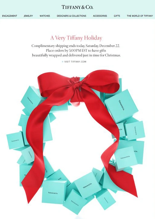
Subject: A Very Tiffany Holiday
Tiffany & Co. makes holiday shopping extra special with a festive wreath made of Tiffany boxes and a simple message about complimentary shipping ending today, perfect for those last-minute gifts!
3. Escape
Subject: Mother’s Day Gift Guide
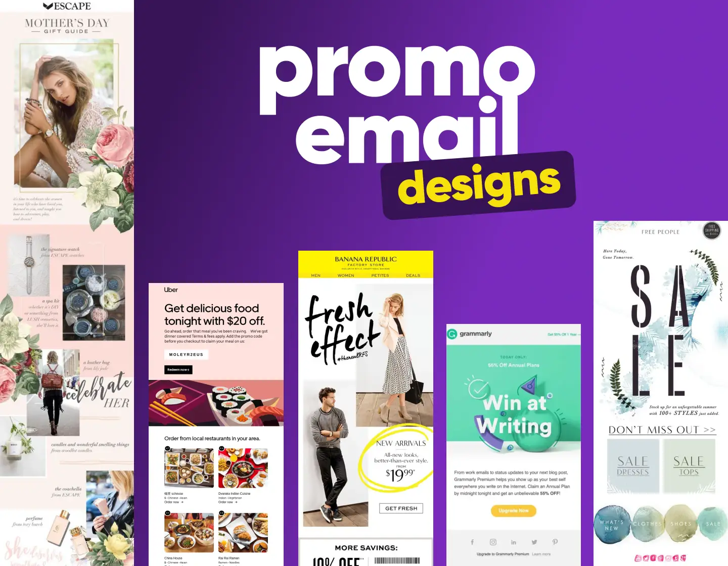
Soft pastel tones, delicate floral ornaments, and elegant fonts give this Mother’s Day Gift Guide a dreamy, sophisticated feel, perfect for celebrating moms in style.
4. Grammarly
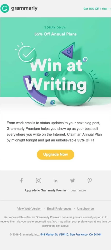
Subject: TODAY ONLY: 55% OFF Annual Plans
Grammarly adds urgency with the subject line, and that bright yellow “Upgrade Now” button really stands out, pushing you to take action right away.
5. Free People
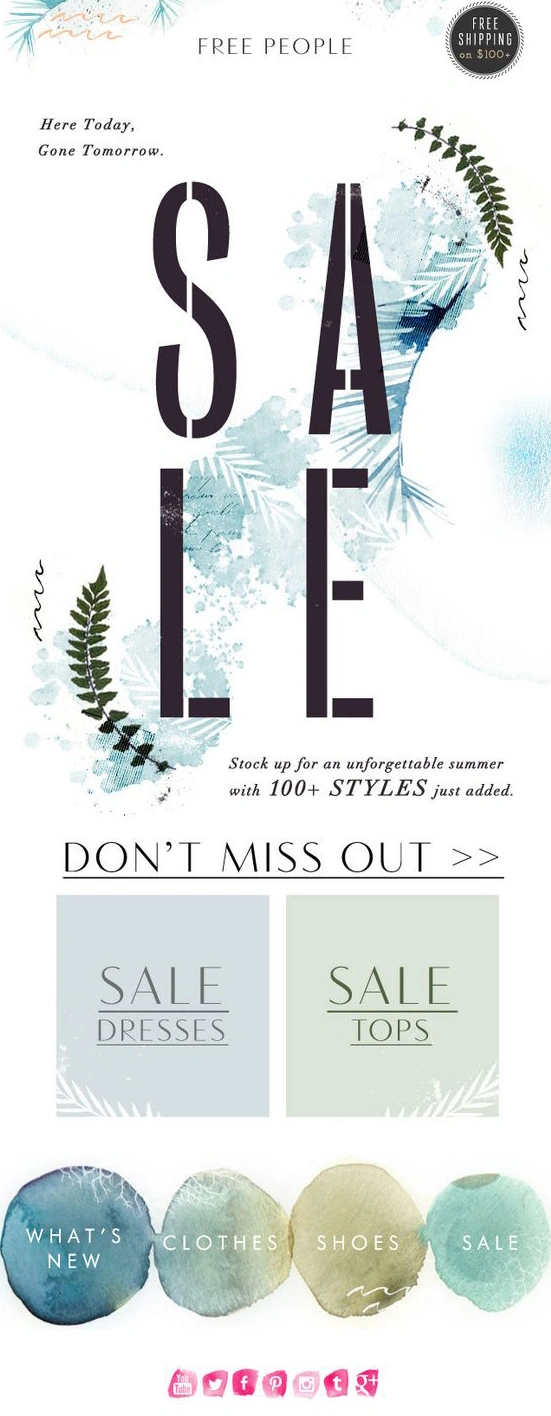
Subject: Sale. Here Today, Gone Tomorrow
What I like about Free People’s email is the bold “SALE” text that immediately grabs attention, paired with refreshing spring-like blues and greens, and watercolor elements that make the dresses and tops on sale feel extra inviting.
6. Godiva
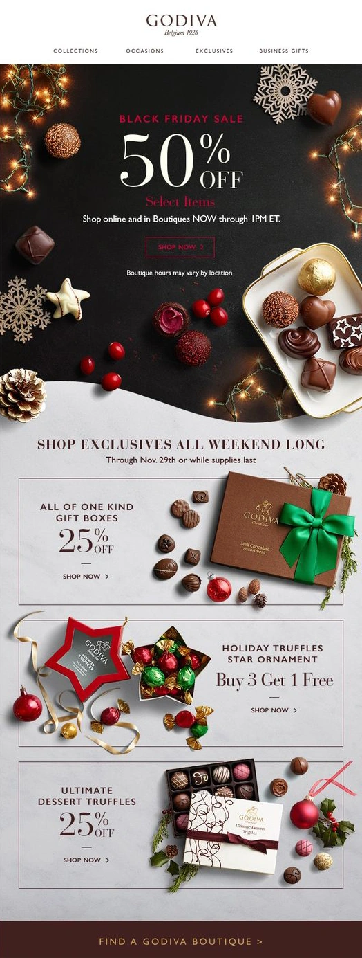
Subject: 50% Off Black Friday Sale Select Items
I love chocolate, and this Godiva email makes it even more irresistible with twinkling lights, snowflakes, and a festive box of treats, all wrapped in warm holiday colors, with a bold 50% Off stealing the show!
7. Banana Republic
Subject: Fresh Effect, New Arrivals
What I Like here is that Banana Republic’s email shines with a vibrant lemon-yellow color, dynamic content for personalized engagement, and a clean design that guides you straight to the call-to-action.
8. Ann Taylor
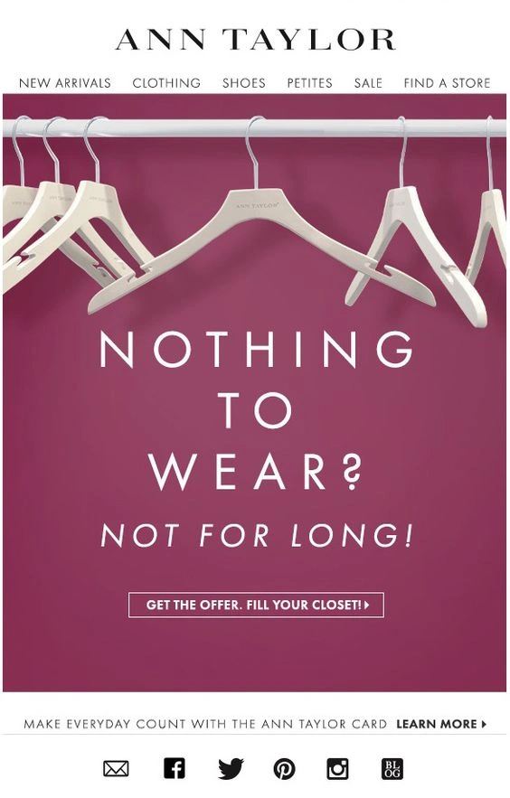
Subject: Nothing to wear? Not for long!
Ann Taylor’s email shows a simple image of empty hangers on a purple background that immediately catches your eye and makes you want to fill those racks with new styles.
9. Uber
Subject: Time for a FREE meal up to $20
Uber makes this offer feel extra tempting with a bold pink section, a clear “$20 off” message, and a handy list of local restaurants, making it easy to grab an affordable meal with just one tap!
10. Luciana
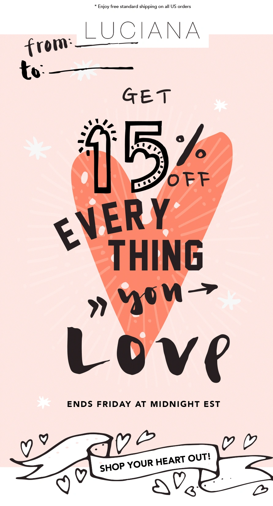
Subject: 15% Off Everything You Love
This email feels like a thoughtful gift, with its soft pastel pink background, a charming heart illustration, and a “from: … to: …” card-style design that makes the 15% off feel even more personal.
11. Grand Tree
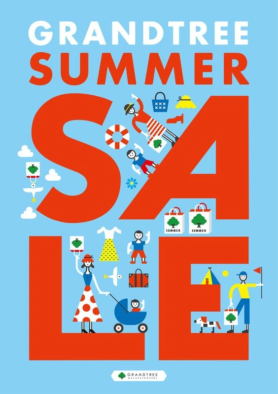
Subject: SUMMER SALE
For this next example, I like how the bold red text pops against the blue background, while fun flat illustrations add a playful touch to the design.
12. Whistlefish
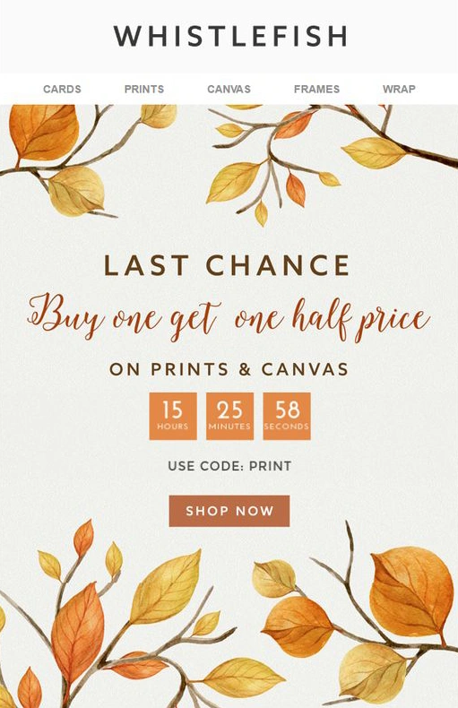
Subject: Last Chance. Buy one, get one half–price.
Whistlefish really grabs your attention with bold fall colors, a clear design, and that countdown timer – it’s the perfect nudge to make you act fast!
13. Jack Threads
Subject: The Jacktober Sales Event Starts Now
Jack Threads makes this email pop with stunning product photos and multiple CTAs, making it easy to shop for the latest styles and top sellers right away.
14. J. Crew Factory
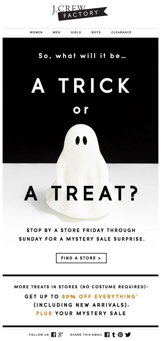
Subject: A trick or a Treat?
J. Crew Factory builds excitement for Halloween with a playful “Trick or Treat?” teaser, while the real treat, 50% off everything, shines in bold gold, making it impossible to miss.
15. Bonobos
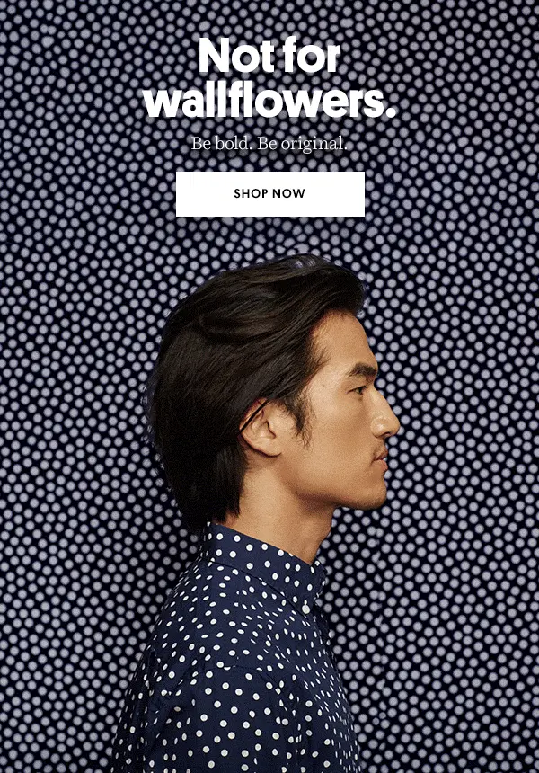
Subject: Not for wallflowers
I love how Bonobos embraces bold style with matching prints, where the model’s shirt blends perfectly with the background, really bringing the “be bold, be original” message to life, and that clean white “Shop Now” CTA makes it easy to dive right in!
16. Ban.do
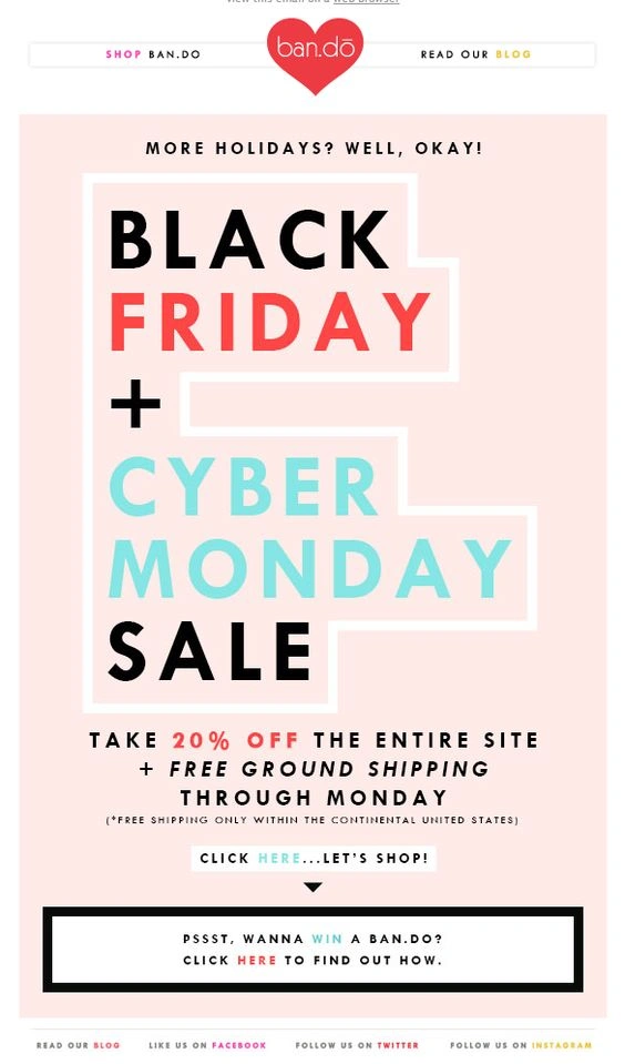
Subject: Black Friday + Cyber Monday Sale
Ban.do makes this sale pop with “Friday” in bold red and “Cyber Monday” in cool blue, using color contrast to highlight both events while keeping the design clean and easy to scan so shoppers don’t miss a deal.
17. Chamberlain Coffee
Subject: try your luck
This email feels so fresh with vibrant matcha photos, a subtle “Try Your Luck” CTA, and fun product picks, using curiosity to drive engagement while the clean design makes everything look extra tempting.
18. Terrain
Subject: A Party as Easy as…
I love how Terrain makes party planning effortless with an “A Party as Easy as…” theme, using a step-by-step format that helps shoppers easily find what they need while stylish product images make everything feel curated and inspiring.
Don’t just go yet, because I have some additional tips and tools prepared for you so your promotional email campaign shines bright!
Best Practices for High-Converting Promotional Emails
Want more opens, clicks, and conversions? Keep these best practices in mind:
- Clear, engaging design – Use bold headlines, eye-catching images, and a strong CTA.
- One main goal per email – Keep your message focused to avoid overwhelming your readers.
- Personalization matters – Use first names, dynamic content, or tailored offers to boost engagement.
- Mobile-first approach – Since most emails are opened on phones, ensure text is readable, buttons are tappable, and images scale properly.
Testing for Responsiveness Across Devices
Your email looks great in Gmail but is broken in Yahoo? Yeah, I know the feeling. Unfortunately, emails can look different across inboxes, so always test before sending:
- Use testing tools – Platforms like Litmus and Email on Acid let you preview emails on multiple devices and clients.
- Check for broken layouts – Watch out for issues with fonts, images, and CTA buttons that may not render correctly.
- Send test emails – Always send test versions to yourself and teammates on different devices to catch last-minute fixes.
Bonus: Handy Tools for Email Design & Optimization
Designing and optimizing emails can be a breeze when you have the right tools. Here are a few of my favorites!
- For design: Canva, Figma, Stripo – Create polished, on-brand email visuals.
- For inspiration: Really Good Emails – Browse a huge collection of top email designs.
- For optimization: Google Optimize, Klaviyo A/B testing – Test subject lines, CTAs, and layouts to improve performance.
Final Words
At the end of the day, crafting awesome promotional emails is about connecting with your audience in a fun and meaningful way. I hope you find these examples and tips helpful and that they inspire you to create even more engaging campaigns. Keep it simple, test, tweak, and don’t be afraid to experiment. You’ve got this!
Want some more marketing ideas? Check out these articles:


