

Here are the 6 core web design principles that always work, even when you purposefully break them, with real examples to show why.
When I’m designing a website (or even just staring at a blank layout, not sure where to start), I always come back to a few tried-and-true principles. Not because I think rules are sacred, but because they help me get out of my own head. Stuff like hierarchy, white space, accessibility, and mobile-first… these are going to keep a site from turning into a chaotic mess before you even start.
With this being said, I’m not going to throw a bunch of dos and don’ts at you, but I’ll go through the design principles I actually use with a few thoughts on how you can aesthetically break them.
Let’s begin.
Rule 1. Alignment Keeps Things Tidy
Starting with Alignment, when things line up (text, images, or buttons), it feels easier to read and navigate. Good alignment keeps a page from looking like a messy artboard, especially when there’s a lot of content involved.
It also makes things predictable and builds a flow, which means your visitors won’t feel lost.
Here’s where grid systems help a lot, as they create that predictability. No matter how much you change alignments in the layout, it will always look in perfect order and logic, because it follows a grid.

Centered or edge-aligned layouts can work too, but it would require more work to create consistency.
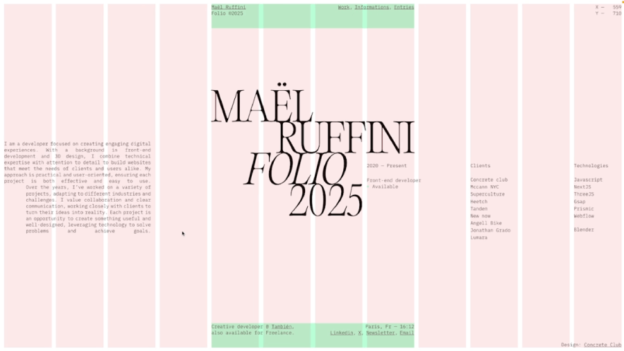
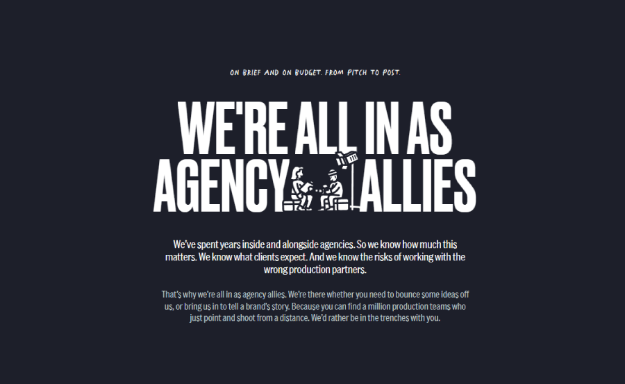
Like, for example, this characterful portfolio site Thinreel, uses centered alignment only in some of their sections to put the attention on specific sections like the introduction and CTA.

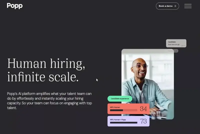
In most cases, designers prefer to use left-aligned text and layout following the logic of how the human eye processes visuals. Such is the case with the Popp platform‘s website.
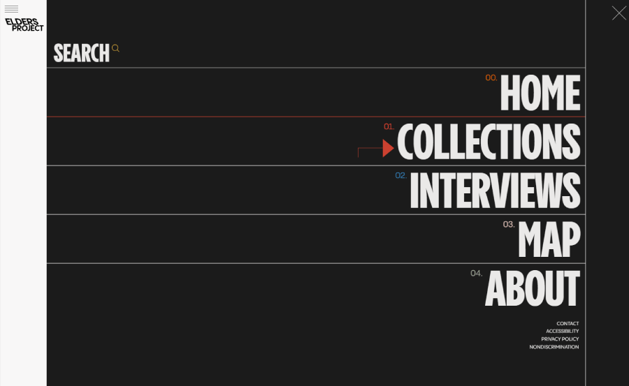
In extremely rare cases (unless we’re talking about RTL websites, of course), designers would spice up a website with right alignment. Such exceptions usually work only for sections with minimum text and oversized fonts; in most cases, this would be a full-screen navigation, like it’s the case for Elders Project‘s menu.

How to break it:
Now, I’ve already mentioned the word “predictability”, which is a great thing for creating a straightforward flow that users can follow naturally. But we don’t like our designs to be too predictable, do we?
That’s where purposeful misalignment comes in. You can break the grid to draw attention, push one section off-center, and overlap some elements. In short, throw a curveball in the layout right when users expect things to fall in line.
But it works best when it’s intentional, similar to breaking the rhythm in a song to make a chorus hit harder. Keep the rest of your layout clean, then let one area break loose.
Ottografie, for example, does a splendid job with this as they align the main elements ( intro, logo, and navigation) at the centre and keep them fixed while the content is broken, overlapping and scrollable.

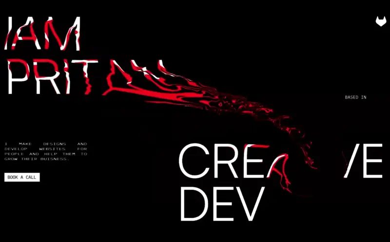
Here’s another awesome example by Pritam of a brojen grid that doesn’t look disruptive at all even with the distortion hover effects, because it uses huge typography so the important info doesn’t “run away” from the user’s eye.
Rule 2. Visual Hierarchy Guides the Eye
Another thing that creates a flow and helps with predictability, aside from alignment, is visual hierarchy. This is basically the art of showing people what to look at first, second, and so on. You can guide people through your content just by adjusting size, weight, color, or positioning. As usual, bigger stuff grabs attention first and bold colors “pop”.
The way things are arranged can make someone perform a certain action, like signing up, exploring more, or hitting the “buy” button.

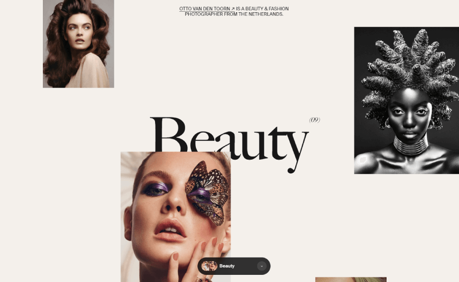
I specifically wanted to include this text hierarchy design by Srotimi Design to show how everything, including the specific skills of the creative, is secondary to the cool motto. Naturally, you will read the bigger fonts first, so the arrangement of the copy doesn’t even matter here.

How to break it:
Designs that flip the usual order can feel fresh. For example, a tiny heading with a huge image below it might throw people off in a good way. Or a CTA that’s almost hidden until the user interacts with the page can add surprise and playfulness.
The idea here is to make it deliberate when the content still makes sense but feels unexpected. It’s a way to get users to pause, look again, and stay curious.

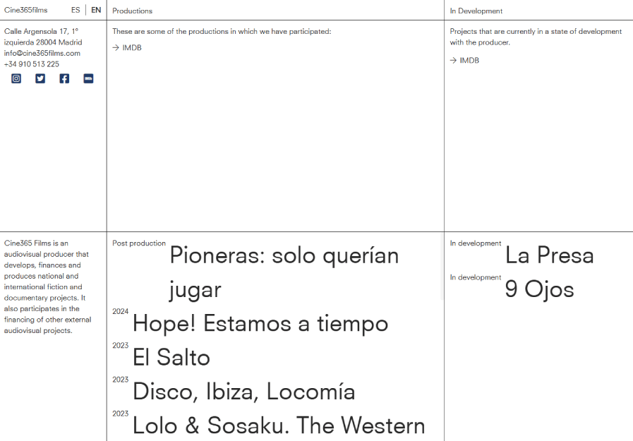
For example, Cine365films chunks the screen into equal blocks, ditching hierarchy. Every section screams “equal importance”.

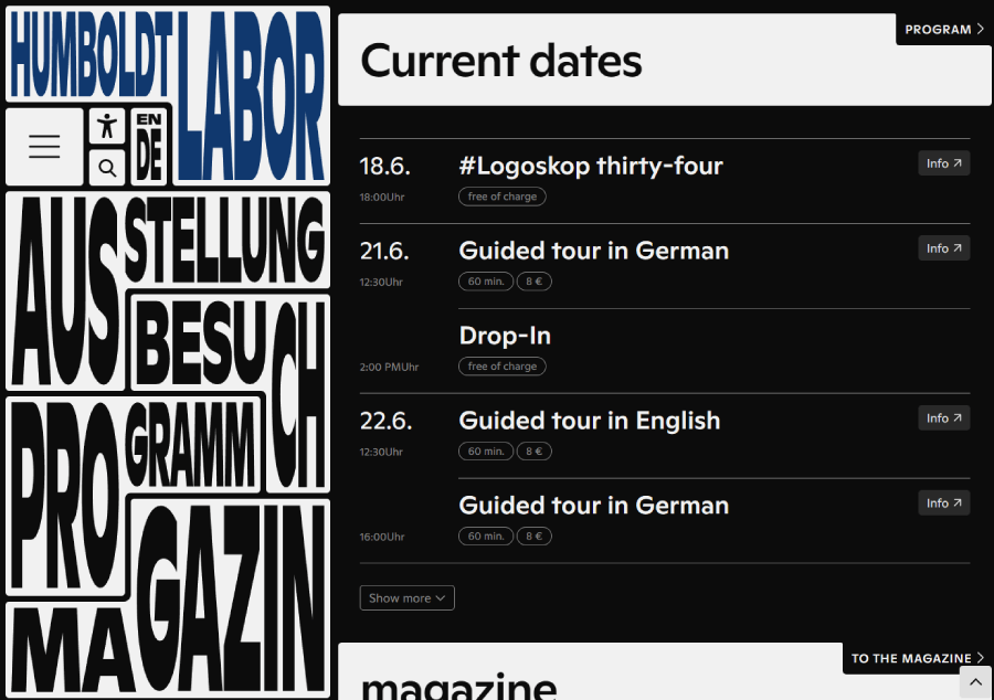
Breaking visual hierarchy works especially great in navigation, like in this case with Humboldt Labor, as a fixed sidebar, where everything besides the colored text is of equal importance.

Just don’t go too wild too often, or the whole layout could start feeling confusing instead of cool.
Rule 3. Rhythm and Repetition
Rhythm in design works a lot like rhythm in music; it pulls your eye through a layout using repetition and spacing. When patterns, shapes, or colors repeat in just the right way, they create a sense of movement. Not chaotic movement, but one that feels intentional and brings structure that directs the user’s attention, and can give your layout a consistent vibe.
Groteskly Studio does just that with white spacing between the different sections. Notice that each section has a completely different layout, but the rhythm itself when you scroll is consistent, 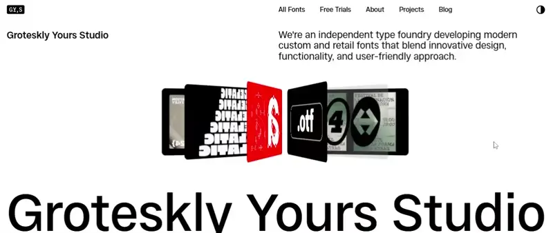
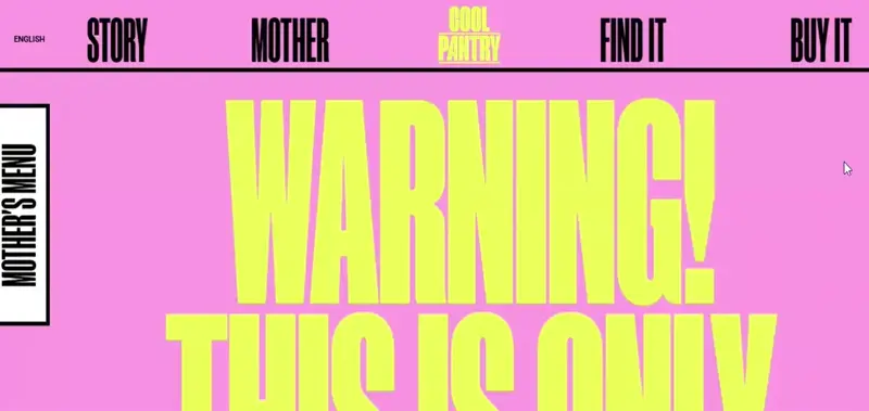
Repetition, on the other hand, is the quieter sibling of rhythm that creates unity, like repeating a color or shape throughout a page so things feel like they belong together. A good example would be when a website repeats the same corner radius with all the buttons, cards, and images. For example, The Cool Pantry does repetition by alternating pink nd yellow background colors for the sections and using a melting effect for the pattern.
How to break it:
Say you’ve repeated the same kind of card layout for six rows, but then throw in a full-bleed video or a huge contrasting headline right in the middle. That interruption can draw attention to something you really want people to notice.
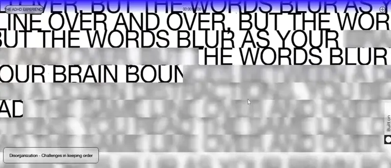
The ADHD Experience website does exactly that to illustrate its point and show users what having ADHD may look like. They change scrolling, spacing, and the layout constantly.
Skipping the beat on purpose can shake up the pattern and keep things interesting as long as it’s intentional and not random.
Rule 4. Create Balance
You don’t want all the visual weight stuck on one side of the page, or your layout starts to feel off, even if viewers can’t put their finger on why. There are three types of balance to choose from.
Symmetrical balance. This is when the same weight is on both sides of a centerline and the layout looks stable and formal.
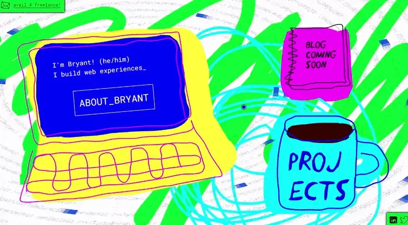
The second one is asymmetrical balance. This one is looser, and it usually works when one big thing on one side gets “balanced” by a few smaller things on the other. Here is an obvious example of asymmetrical balance by Bryant Codes where the heaviest element is the laptop and this one is balanced by two smaller elements, in this case, the journal and the coffee mug.
There’s also the radial balance, where everything fans out from a center point, like spokes on a wheel.

How to break it:
A touch of imbalance can be a powerful move because it adds tension. It can make a design feel unpredictable and even edgy. Maybe you pile everything toward one side of the screen and leave the other almost empty. It might seem wrong at first, but when done well, it draws the eye exactly where you want it. As usual, make it feel purposeful.
Rule 5. Make It Accessible
Ok, this one is pretty obvious, but mandatory to be on the list. Accessibility is the default here. If someone can’t use your website properly because they’re visually impaired, color blind, or navigating with a keyboard, the design isn’t doing its job, because ultimately it doesn’t consider real people with needs.
Think about the basics: screen readers need alt-text for images and audio content; color contrast shouldn’t leave anyone squinting; the layout needs to work equally as good when someone scales the text size or uses the tab key to move through links and buttons; and links should sound like what they actually do (none of that vague “click here” stuff).
How to break it (not recommended)
This may be the only rule not really worth breaking. Sure, some designers might go low-contrast or layer text over noisy images to get an edgy, rebellious look but this kind of design usually works only for campaigns or concepts where pushing the limits is the whole point.
But even then, be sure to build in a safety net where the original design shows at 100% zoom, but once someone starts zooming in, the contrast and readability kick in properly.
Rule 6. Web Design is Marketing
In the end of the day, every website is trying to accomplish something like selling a product, building a mailing list, showing off a project, etc. Design is just part of the pitch, so any website’s layout, typography, colors, and images need to send messages long before someone reads a single word.
This is why the last rule is simply to think like a marketer. Before you even sketch anything out, think about what the site needs to accomplish and who it’s for. This usually involves some research, maybe even a few chats with users or customers. Once you know what they care about, you’re in a better position to organize the content and decide what goes above the fold.
How to break it:
Here’s where things get interesting. What if you threw out the typical marketing playbook? Imagine a portfolio site that doesn’t show any work on the homepage but a single line of text that says, “I don’t do average”. That might scare off some folks, but it could also pull in exactly the kind of client the designer wants. After all, any bold design that doesn’t try to be for everyone can become a marketing tool in itself, because it filters and sets a particular tone of exclusivity.
So yes, web design supports marketing, but ignoring a few “best practices” can sometimes help you stand out more than following all of them.
And there you have it!
These principles help me keep things clean and user-friendly most of the time. I’ll be honest, though, I don’t follow them like a checklist. Sometimes breaking one (on purpose) is exactly what a design needs to stand out or feel more human. The trick is knowing why a rule exists before deciding to mess with it.
In the meantime, you can visit some of the UI/UX-related articles for some more insights and inspiration: