

![14 Really Bad Graphic Design Examples [& How To Fix Them]](https://reallygooddesigns.com/wp-content/uploads/2023/01/bad-graphic-design-193x150.jpg)
Learn the basics of what design ethics really means, how to avoid dark patterns and how to start applying design ethics into your UX.
When you design something, your decisions can actually affect how people think, feel, and behave. And since with great power comes great responsibility, we as designers have the responsibility to design ethically. Some rules of ethics in design are carved in stone (UXPA), but most of them rely on you asking yourself: is this design helping people, or is it taking advantage of them?
You’ve probably seen dark patterns before, like a sneaky unsubscribe button hidden in light gray text, or a free trial that quietly turns into a monthly bill. That’s design without ethics. On the flip side, think of apps that make consent super clear, or websites that were initially built around accessibility from the first wireframe. Those choices come from designers who care about the impact of their work.
If this is a topic you want to get into in more detail, I’ll walk you through what design ethics really means, and how you can start applying it.
The principles of ethical design
Ethical design in UI/UX means building digital experiences that treat people fairly. Instead of tricking users into decisions (like the dark patterns I’m going to explain in detail in the next section), ethical design makes interactions straightforward and respectful of privacy.
Usability (easy to use and enjoyable)
Usability is the baseline of ethical design. Basically, if a product is confusing or frustrating, it wastes people’s time and energy. Jakob Nielsen from Nielsen Norman Group defines usability with five pillars: learnability, efficiency, memorability, error handling, and satisfaction.
Accessibility (design for all)
This means digital products work for everyone, including people with disabilities. Of course, this refers to far more than businesses just complying with the WCAG standards online and call it a day, but also to make sure everyone gets equal access to information and functionality. According to the World Health Organization, at least 1 billion people worldwide live with vision impairment or blindness.
Privacy (respects user data)
When your design follows this principle, it means the product only asks for information it truly needs and makes it clear how that data is used. Concerns about surveillance and data misuse are growing each year, so designing for privacy has become an ethical necessity.
Transparency (honest and no hidden traps)
Transparency in design means that you won’t include any hidden catches, or fine print that flips the deal, or “gotcha” charges in your online business. People want to know exactly what’s happening, so they can make informed choices.
User involvement (listening to real people)
As a designer, you already know everything you do is for users. When you design ethically, it means you will involve users at every stage to solve real problems instead of guessing.
What does it look like in practice? Here, the first product I can think of is Kitchen.co. This is a project management platform that has so many features and integrations, and I think most of those are purely by popular request.
The team behind the tool is very active on Facebook, constantly sends newsletters with updates, change logs, tests and calls for feedback and suggestions, and reads and replies to all of it. You can read literal conversations between users and coders on their page, where users request a particular feature and get replies with specific dates and confirmations. And depending on the complexity, you will see that feature a month to few months later.
Another product that immediately comes to mind is Figma. They also actively involve their community, letting users vote on new features and give feedback directly in forums. Many interface updates (like dark mode and auto-layout) came from user requests, not top-down decisions.
Focus (respects user time and attention)
People’s attention is limited. Ethical design avoids manipulative tactics that keep users hooked for the company’s gain. Instead, it helps them accomplish their goals and step away when they’re done.
Sustainability (environment)
All digital products have an environmental footprint like energy-hungry servers, electronic waste, (or in the case of mass usage of ChatGPT) water consumption. Ethical design considers sustainability by minimizing resource-heavy features and encouraging reuse.
Do no harm (putting people first)
The UXPA Code of Conduct puts it simply: “UX practitioners shall not expose participants to any unreasonable physical, mental or emotional stress”. It also asks you to double-check special needs with groups like older adults, kids, or people with disabilities, and be crystal clear with clients about what steps you took to protect them. https://uxpa.org/uxpa-code-of-professional-conduct/
Integrity (moral code)
The same UXPA document I linked in the “Do no harm” section also reminds you to “work in a spirit of respectful collaboration without compromising personal or professional integrity” and “not discriminate on any proscribed basis.”.
Honesty (avoiding conflicts of interest)
This refers to avoiding conflict of interest, and “promptly informing their employers or clients” and flagging anything that might bias your work.
Privacy
And last, but not least, it’s critical to respect confidentiality and anonymity. The UXPA states clearly that designers must avoid revealing identifying info about users without permission and must get informed consent before using data.
Design ethics rejects dark patterns
Those are design tricks that push someone toward choices they wouldn’t naturally make, or make it way harder to do otherwise. Think fake countdowns, sneaky costs revealed at the last second, subscribe-everywhere defaults, or unsubscribe options hidden five levels deep.
The UX designer Harry Brignull coined the term “dark patterns” back in 2010, when he launched darkpatterns.org to call out and shame deceptive design interfaces.
As soon as people identified how manipulative these designs are, researchers and regulators started ringing alarm bells. For example, Purdue’s Colin Gray and his team broke dark patterns down into categories like nagging, obstruction, sneaking, interface interference, and forced action, all especially prevalent in privacy settings.
Turns out, these tricks aren’t rare. A 2022 European Commission study found that a stunning 97% of popular EU websites and apps included at least one dark pattern.
And when shopping sites were crawled globally (around 11k sites and 53k product pages), 11.1% had at least one dark pattern, and a subset used outright deceptive tactics.
Not to alarm you, but things get even creepier with subscriptions, because after reviewing 642 platforms for subscriptions, researchers found out that 76% used at least one dark pattern and 68% used multiple. A very popular trick is hiding the auto-renewal option outside the purchase flow.
What does it mean for you as an ethical UI/UX designer?
Basically, this means to actively and consciously refuse to use dark patterns. These are the most popular categories of dark patterns with some practical examples for each one:
Attention tricks
Those are dark design patterns that manipulate where users look or what they notice.
Misdirection > Highlighting one option while hiding another. (A bright “Accept All Cookies” button vs. a faint “Reject” link.)
Visual interference > Layouts or colors that create confusion. (Gray “Decline” button that looks disabled.)
Nagging > Constant pop-ups or reminders that break the flow. (Apps that repeatedly ask for reviews.)
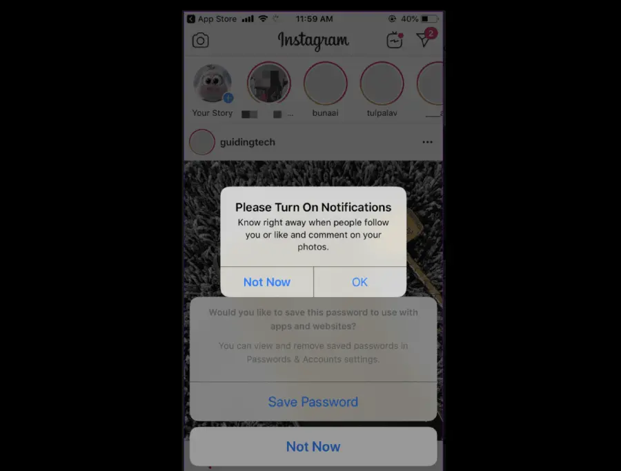
Nagging example by Instagram. Source: Deceptive Patterns
Fake Social Proof > Invented stats, reviews, or activity. (The “John just booked this hotel!” pop-ups that are obviously fake.)
Choice manipulation
These designs skew user decisions by limiting or twisting options.
Confirmshaming > Guilt-tripping with negative phrasing. (“No thanks, I hate saving money.”)
Entrapment (trapped choices) > No clear “No” option. (A game that forces you to either pay or watch ads.)
Overchoice > Too many options to deliberately overwhelm users. (40+ vague toggles on a privacy page.)
Preselection > Defaults set to benefit the company. ( Pre-checked “Subscribe to offers” box.)
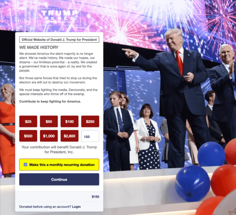
Preselection example by Donald J Trump for President Campaign. Source: Deceptive Patterns
Obstruction
These patterns make the path users want harder than it should be.
Roach Motel > Easy to enter, hard to leave. (Canceling a subscription requires phoning support with specific work hours, a queue and all the pain that comes with trying to reach any kind of support)
Obstruction and labyrinth design > Hiding or burying key actions. ( Account deletion hidden under five menus.)
Trick questions > Confusing wording to trip users up. (“Uncheck this box if you don’t want emails.”)
Forced action > Requiring an unrelated task first. (To sign up for a newsletter, you must download the app.)
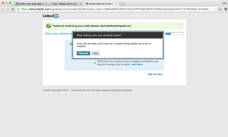
Forced action example by LinkedIn. Source: Deceptive Patterns
Hidden costs and pricing games
This is the category for dark patterns that can manipulate transparency in checkout or subscriptions.
Hidden costs > Fees revealed at the last step. (Surprise “handling fee” at checkout.)
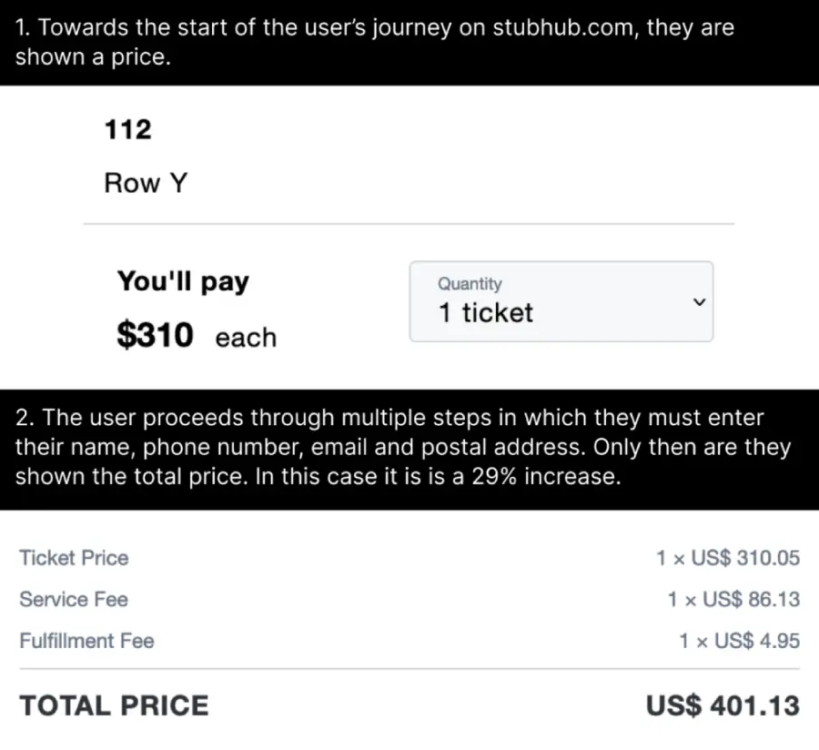
Design ethics hidden costs example by StubHub. Source: Deceptive Patterns
Drip pricing > Adding charges gradually. (Cheap flight that balloons once luggage and taxes appear.)
Bait and switch > Promised one thing, delivered another. (Clicking “X” to close an ad installs software instead.)
Scarcity and urgency cues > Pressure with fake timers or stock alerts. ( Fake “Only 1 left!” countdowns that reset after refresh.)
Pay-to-skip > Free option is frustrating, paid option is smooth. ( Long unskippable ads unless you upgrade.)
Privacy & data exploits
These are the most harmful tricks that push users to overshare or lose control of data.
Disguised ads > Ads dressed as normal content. (A fake “Download” button that’s actually an ad.)
Privacy Zuckering > Forcing users to share more than they intended. ( Default privacy set to “public” unless changed.)
Friend spam > Exploiting access to your contacts. (Apps sending invites to your friends without consent.)
Obfuscated consent > Making it harder to reject than accept. (Cookie banners where “Reject” takes 4 clicks, “Accept” takes 1.)
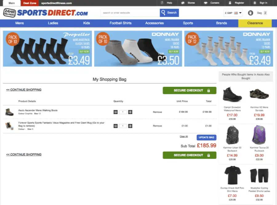
Design ethics obfuscated consent example by SportsDirect sneaking an unwanted magazine subscription. Source: Deceptive Patterns
Inconsistent terminology > Confusing or contradictory labels. (“Ad free” app that actually serves ads.)
And there you have it!
Design ethics revolves around remembering the people on the other side of the screen. If your work respects their time, privacy, and trust, you’re already moving in the right direction.
And if you’re curious about more design tools or need inspiration, we’ve got plenty of guides worth checking out, just like the following: