![14 Really Bad Graphic Design Examples [& How To Fix Them]](https://reallygooddesigns.com/wp-content/uploads/2023/01/bad-graphic-design.jpg)


Graphic design is the envelope of the message between the sender and the receiver, the connection between the companies and the audience. You can find it everywhere – branding, marketing, product packaging, etc. websites, books, and more. A good graphic design may not be even noticed, a bad graphic design on the other hand can ruin a project.
In this article, we will take a look at some graphic design mistakes, figure out what went wrong, and how to be fixed. Let’s get started.
Failed Graphic Design – bad company logo
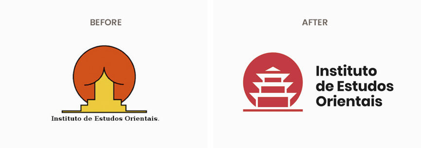
Nothing can say more about messed up graphic design as a bad company logo. The example on the left shows the logo of OGC which provided a different vibe than expected in the vertical version of the logo. You will agree, that no company wants to deliver that message to its potential customers. Luckily, Emanuele Abrate got his vision of the logo to fix the inappropriate association (on the right). This proves, that some really bad mistakes can be fixed only by changing the typography and adding strokes.
Graphic design bad logo letter spacing
![]()
![]()
![]()
![]()
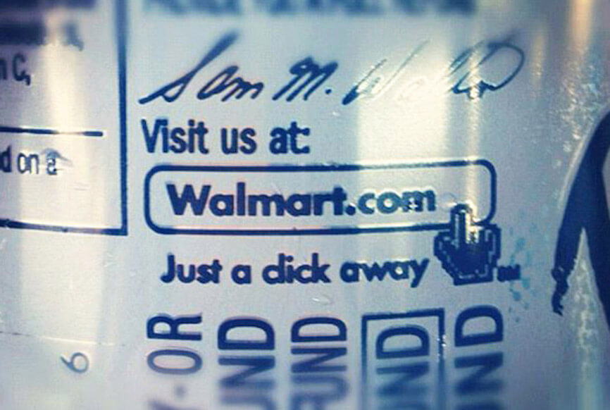
To be honest, we are not sure how this graphic design example of a bad logo could happen for real. But there is a lesson to learn here – make sure you read the logo twice before you go with it. The owners of BULL TITAN US learned that lesson the hard way.
Really bad graphic design logo
As with the previous example, here we also see an issue with typography kerning, which gets clients away for sure(and possibly got some legal issues). The space between the characters is one of the basic things in the graphic design that apply everywhere from simple paragraph writing that can be hard to read, to a company whose image can be ruined with a bad graphic design logo.
SLIX Logo – bad graphic design fail
https://digitalsynopsis.com/design/funny-letter-spacing-kerning-fails/
We continue with one more logo in the bad graphic design examples list. Notting can affect your image like wring SUX on your logo. Well, we are sure that it is not intentional, but don’t wonder why the sales are running low whit a logo like this. Once again – pay attention to the typography kerning and take a look at your logo with fresh eyes before sending it to the client.
Bad example of alignment in graphic design
Let’s dive into more serious design mistakes. This example of graphic design can be pointed out as bad for many reasons, but the most noticeable is the reading issues. The design can be improved drastically with better alignment of the elements in the poster and some hierarchy in the text. Don’t forget, that people are scanning your design with their eyes for a second before deciding if they want to read the full text. With that being said, structure your design with readable headlines with a clear text hierarchy structure, and align the elements to help viewers understand the order of things to be read.
Bad graphic design ad example
We suppose this ad is made for a nice sport event, that would be nice to be seen. Anyway, with the 10+ fonts used and all the rainbow colors we see, it kind of hurts the eyes. Make sure to use 2-3 colors in your designs, and no more than 2 fonts, so you don’t provide your client with something like this.
Bad graphic design advertisement

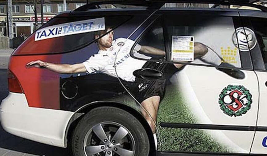
This one fail is hilarious. Anyway, it reminds us that we should always keep in mind the placement of our designs. Don’t design anything before getting the information about the plans for the design – you should always know where you design for, so you can get the most out of your design(and not become part of a list like this).
Bad graphic design poster
This one almost looks like it is made on purpose. It’s an epic mix of fonts and colors, like the discussion of the project was “what fonts and colors do you want us to use?” and the answer was “Yes!”. If you look a bit closer, you will notice that there isn’t any white space – you can even find the same logo 3 times. Anyway, there is a lot to learn from this poster example:
1. Make a structure and hierarchy with headlines – it is not possible for everything to be a headline.
2. Get a color palette, and use no more than 3 colors.
3. Reduce the used fonts to 2 or 3 maximum.
4. Praise the white space – it’s the soul of any successful design.
5. Don’t place your logo everywhere possible.
Graphic design bad color combination example
To be honest, this one can look really nice with a bit of touch. The color scheme is actually not so bad, but we’ve chosen this example as it mixes the background colors with the text colors. Make sure, the message of your design is easy to read and contrasts the background to stand out.
Example of bad fonts in graphic design
Speaking of fonts, we cannot miss this graphic design example. We already talked about how easy-to-read text is crucial to every graphic design, but this typography-based design takes the font play to the next level. Having too much text to include in the design is a common situation to deal with. But putting all the text with bold fonts and coloring letters with different colors doesn’t help at all. In order to fix the problem, first make a hierarchy of the text, bold the headlines, use thinner font for the rest of the text, leave more white space, spend more time choosing the colors, and focus on one call to action.
Graphic design bad typography example

This hilarious fail case is showing how important is to make print tests before ordering huge amounts of print copies. Looking at your design on a monitor is quite different than the printed version. Printers are using different color systems than monitors and they are placing real paints to achieve your design instead of your visualizations. So issues with color differences, meshed words, and blurry elements can often appear. Make sure to print a small amount of copies to test how your design will be printed.
Funny bad graphic design TikTok channel
@emilyzugay Putting my degree to use
Let’s break things with something more fun. The popular TikTok-er @emilyzugay makes a quite fun series of videos redesigning famous logos. Her funny approach was noticed even by famous brands like Mcdonald’s and Adobe, which asked her to redesign their logos. You will have fun with that, for sure.
Good vs bad graphic design comparison
Combining an image, a headline, and a paragraph can look quite easy, but in this example, we see two versions of the same idea with different approaches. On the left side, we see a stylized caption, a well-crafted paragraph, and an image with shoes on transparent background. On the right, we see the same text, with a different visualized headline that is fighting with the image title, different font for the paragraph that is harder to read, and a different image of shoes. Which version do you like more?
Good vs bad graphic design example

Design is all about emotion and feeling – what emotion do you want your audience to feel when looking at your design? The original logo example(left side) gets you in a completely different mood compared to the alternative version of the logo made by Emanuele Abrate. Note, that we are talking about the same company. It is amazing how a logo can affect our opinion about a company, right?
Good graphic design vs bad graphic design
We will finish with one video showing how bad or not-so-catchy designs can be turned into professional ones by following the principles of design.
Final Words
We hope you’ve learned something new from our insights and it will help you to improve your designs for good. If you want to learn more design essentials, take a look at some of our other articles: