Hey there! Have you ever opened an email and thought, Wow, this looks amazing!? Or maybe you’ve seen one so cluttered that you hit “delete” instantly? Truth be told, I certainly have!
The way an email looks is just as important as what it says. So, how do you create an email that’s easy to read, visually appealing, and actually gets people to take action? It all comes down to smart design choices that grab attention, guide the reader, and drive clicks – without overwhelming them, of course.
Today, I will share with you 10 tips for creating awesome-looking emails people would want to read. Let’s break it down!
1. Start with a Strong Subject Line
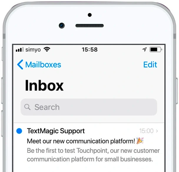
Your subject line is everything. It’s the first thing people see, and if it’s boring, confusing, or too long, your email might never get opened. You’ve got seconds to grab attention, so keep it short, clear, and intriguing. Here are some subject line styles and examples you can try:
➡️ Curiosity-Driven Subject Lines
- “You’re missing out on this creative opportunity… 👀”
- “What if this one change could level up your projects? 🚀”
➡️ Personalized Subject Lines
- “Hey [First Name], let’s bring your vision to life!”
- “[First Name], we’ve got the perfect design for you 🎨”
➡️ Urgency & FOMO (Fear of Missing Out)
- “Last chance! Our design services are booking fast ⏳”
- “Only 3 spots left for our next creative project – grab yours!”
➡️ Number-Based Subject Lines
- “5 design trends you need to know this year”
- “3 ways to elevate your brand’s visual identity”
➡️ Question-Based Subject Lines
- “Is your brand standing out in the crowded market?”
- “Want to make your next project unforgettable?”
➡️ Casual & Fun Subject Lines
- “Ready to take your brand to the next level? 💡”
- “Let’s create something amazing together! ✨”
✨ My Pro Tips for Writing Subject Lines:
- Keep it under 50 characters (Shorter = better on mobile)
- Avoid spammy words like “free money” or “100% guaranteed”
- Test different styles – what works for one audience might not work for another
- Use A/B testing – try two subject lines and see which one performs better
2. Keep It Short and Sweet
I don’t have the time to read a long email unless it’s work-related, and I assume you don’t too – especially not in an inbox with hundreds of others waiting for your attention! People skim emails, so your job is to get to the point fast. Short emails are easier to read, look cleaner, and are more likely to get a response.
💡 How Short Exactly?
Aim for 50-125 words if you’re driving a quick action (like a sale or event). For newsletters or updates, keep paragraphs 2-3 sentences max.
🧵 Make It Skimmable:
- ✅ Use bullet points to highlight key info (just like in this example!)
- ✅ Add bold headings for important sections.
- ✅ Break text into small paragraphs.
📝 Example of a Short, Sweet Email:
Subject: “Your Exclusive Invite Awaits 🎉”
Body:
Hey John,
Join us for an exclusive webinar on [Topic]! You’ll learn:
✔️ [Key Benefit 1]
✔️ [Key Benefit 2]
✔️ [Key Benefit 3]
Spots are limited—save yours now!
[Reserve My Spot CTA]
See how quick that was? Nothing unnecessary, just value.
❌ Avoid This:
“Hello John, We are writing to let you know about an upcoming event that we think you might be interested in. It will be on Thursday at 5 PM, and during the webinar, we will cover several important topics that we believe could help you. We hope you can attend and look forward to seeing you there.”
Yawn… 😴
✨ My Pro Tips for Keeping It Short:
- Write your email – then cut it in half. I am not kidding. You’ll remove filler words and fluff.
- Stick to one goal. Don’t cram 5 CTAs into one email.
- Use short, punchy sentences. Think tweet-length.
3. Make It Easy to Scan
Let’s be real, you don’t read emails word for word, right? Because I don’t. And neither do most people. They usually skim, looking for key info fast. If your email is a wall of text, they’ll bounce before they even get to your message.
So, how do you make your emails quick to navigate? Easy: Break it up, highlight the good stuff, and guide their eyes. Here are a few helpful tips:
➡️ Use Headings and Subheadings
Think of them like chapter titles in your email. They help readers instantly find what they care about. Example:
👋 Welcome to Our Community
✨ Here’s What You’ll Get:
➡️ Bullet Points for Quick Info
Bullet points are a reader’s best friend. Use them for lists, features, or benefits. Example:
Why You’ll Love Our App:
✔️ Easy to use 📱
✔️ Saves you time ⏳
✔️ Works on all devices 💻
➡️ Short Paragraphs (1-2 Sentences)
Keep your paragraphs tiny. Long blocks of text are intimidating – and they won’t get read! Example:
Instead of:
“Welcome to our platform! We’re excited to have you here. Our tool offers powerful features that will help you achieve your goals. In this email, we’ll walk you through everything you need to know.”
Try:
“Hey there! We’re thrilled you joined us. Ready to get started? Here’s everything you need to know:”
➡️ Highlight Important Words (With Bold or Color)
Use bold text or different colors to emphasize what matters most. Just don’t overdo it – one highlight per paragraph is enough. Example:
“Get 20% off your first purchase only until Friday!”
❌ Try to Avoid:
- Long, unbroken paragraphs
- Too many fonts or colors as it gets chaotic fast
- Excessive bolding or ALL CAPS
✨ My Pro Tips for Making Emails Easy to Read at a Glance:
- Put your main point in the first sentence
- Use buttons for calls to action
- Add icons or emojis to guide the eye (but keep them minimal)
4. Emojis Are Your Secret Weapon
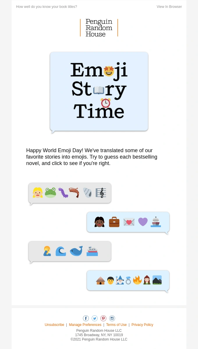
Who doesn’t love a good emoji? They’re not just for texts – emojis in subject lines or email copy can boost open rates. Just make sure they match your brand vibe. For example, a 🎁 for a holiday sale or a 🚀 for a product launch. But there’s a fine line between creative and cringe.
✅ Why Emojis Work:
- Grab Attention 📈: Emails with emojis in the subject line can increase open rates by up to 56%!
- Add Personality 😎: They help your brand feel more relatable and fun (just like this article!)
- Break Up Text 👌: A little emoji here and there makes your email easier to scan
💡 Where to Use Emojis:
Subject Lines:
- “🎉 Flash Sale! 50% Off Only Today”
- “👀 Don’t Miss This Sneak Peek!”
Pre-Headers:
- “✨ New arrivals you’ll love…”
- “🔥 Hot tips for your next project”
- Body Text: Use emojis to highlight points (sparingly):
✔️ Feature 1: Lightning-fast checkout ⚡
✔️ Feature 2: Free shipping over $50 🚚
✔️ Feature 3: 24/7 support 🧑💻
📌 Call-to-Action Buttons:
- “🚀 Grab Your Spot”
- “💥 Shop Now”
❌ When NOT to Use Emojis:
- Don’t replace words with emojis entirely because it might be too confusing.
- Don’t overdo it – one or two per email is usually enough.
- Don’t use emojis that might feel off-brand or too playful for your audience.
✨ My Pro Tips for Using Emojis:
- Match your brand voice: Fun brands can go wild, and professional brands should keep it subtle.
- A/B Test your subject lines: Try one with emojis and one without to see what your audience likes.
- Use emojis that support your message: If they don’t add meaning, leave them out.
5. Use an Engaging Pre-Header
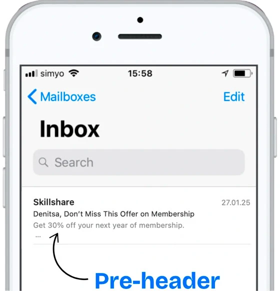
A strong pre-header can be the difference between an opened email and one that gets ignored. It’s your chance to build excitement like a sneak peek before the main event. When paired well with your subject line, it can seriously boost open rates.
Think of your subject line and pre-header as a power duo: The subject line grabs their attention, and the pre-header seals the deal. They should work together, not compete or repeat each other.
✨ My Tips for Strong Pre-Header
- Keep it short and punchy: Aim for 40-100 characters, so it displays fully on mobile.
- Support your subject line: Add context or a little extra detail without repeating.
- Create intrigue: Give the user a reason to open, without spoiling the surprise.
- Use emojis sparingly: Just one or two can make your pre-header pop without cluttering it.
- A/B Test: Experiment with different approaches to see which style gets opened more.
💡 Pre-Header Ideas by Style:
🎉 For a Sale or Offer:
- Subject: “Huge Weekend Sale – Up to 50% Off!”
- Pre-header: “But hurry – deals vanish at midnight!”
📅 For an Event Invite:
- Subject: “Join Us for a Special Webinar!”
- Pre-header: “Expert tips + a live Q&A session – save your spot!”
🎁 For a Freebie or Bonus:
- Subject: “Your Free Guide to Email Marketing”
- Pre-header: “A quick read packed with powerful tips!”

6. Experiment with Color
Colors can make your emails pop, evoke emotion, and guide your readers’ attention – but only if you use them wisely! The trick is to experiment with colors while staying true to your brand’s personality.
Think of your email like a mini website: it should feel cohesive and on-brand. You don’t want to include random or clashing colors, absolutely no. Always go for consistent colors that reflect your style, instead.
➡️ How to Use Color Effectively:
- Stick to Your Brand Palette
Your email should look and feel like you, so use your brand’s primary and accent colors. Don’t include random shades that clash with your style. - Make Your CTA Buttons Stand Out
Use a bold, contrasting color to make your call-to-action buttons pop – they should demand attention! - Use Color for Hierarchy
- Headings: Use a bold brand color to make them stand out.
- Important info: Highlight with a colored background.
- Buttons: One consistent, eye-catching color for all CTAs.
➡️ Examples of Color Use in Emails:
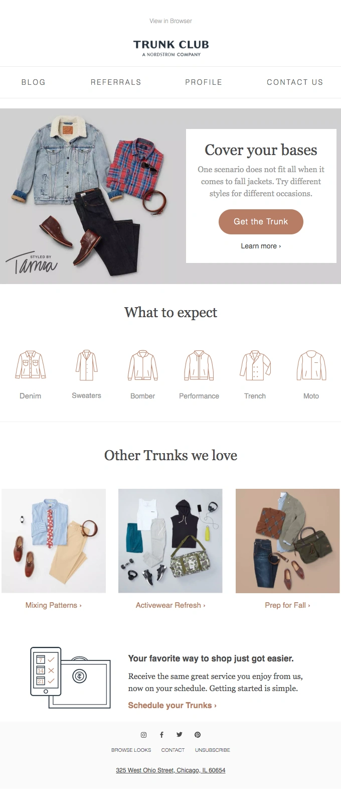
- Minimal & Elegant: Soft backgrounds with one bold accent color for buttons.
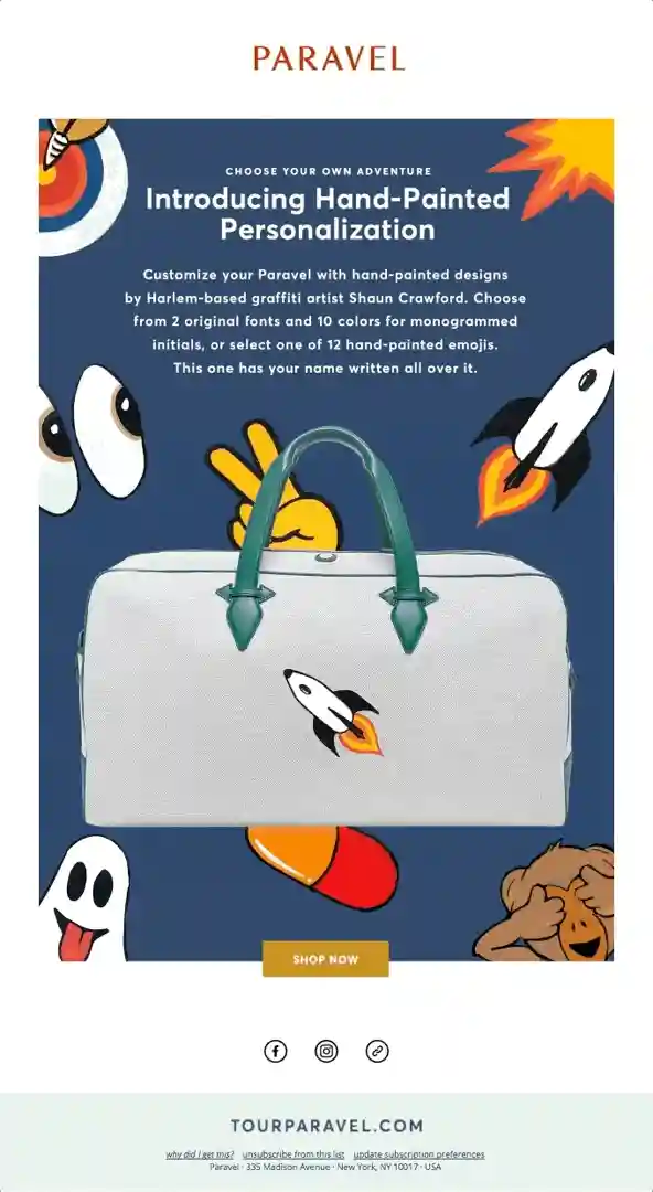
- Playful & Bold: Bright colors for headlines, but a clean layout to avoid chaos.
- Clean & Professional: Neutral tones with a strong CTA color, like blue or green.
❌ What to Avoid:
- Too many colors: Feels chaotic and unprofessional. Stick to 2-3 core colors.
- Low contrast: Light text on a light background is a nightmare to read.
- Overly bright backgrounds: They strain the eyes, especially on mobile.
✨ My Pro Tips for Color Magic:
- Use contrasting colors for buttons (e.g., a blue button on a white background).
- Make sure your text passes color contrast accessibility standards (e.g., black text on a pastel background).
- Stay consistent with the color of all CTAs, so readers instantly know where to click.
7. Give Your Footer Some Love
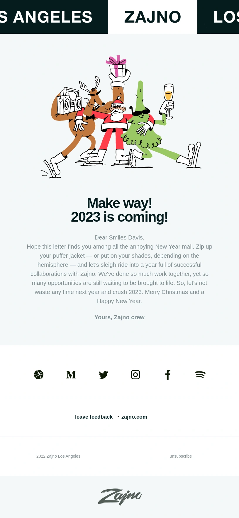
Your footer might be at the bottom, but it’s as important as any other section in your email. Too many brands just add a copyright notice and call it a day – but a thoughtful footer can leave a lasting impression and even drive conversions. So, I suggest to show it some love too!
➡️ What to Include in a Great Footer:
- Contact Information: Make it easy for people to reach you! Add your email, phone number, and social media links.
- Unsubscribe Link: This is a must (legally and ethically). Make it clear and easy to find.
- Social Media Icons: Drive traffic to your other platforms, just don’t overdo it. Keep it simple with small, branded icons.
- Quick Links: Think of your footer as a mini navigation bar. Add links to your website, help center, or FAQ page.
- Legal Info & Preferences: Include your company name, address, and privacy policy link. It shows you’re legit.
💡 Extras for a Shiny Footer:
- A Friendly Note or Brand Sign-Off: “Thanks for being part of our community 💙” feels warmer than “© 2025 All rights reserved.”
- Referral or Loyalty Program Plug: “💸 Earn $10 for every friend you refer!”—because footers can sell, too.
- Social Proof or Awards: “🏆 Rated #1 by [Industry Name]”—build trust right up to the last scroll.
✨ My Pro Tips for Footer Design:
- Keep it clean and organized, nobody likes a cluttered footer.
- Use your brand colors, but go subtle. Footers should feel like a natural finish.
- Make your unsubscribe link visible but polite and friendly – “Don’t want to hear from us? You can unsubscribe here.”
8. Optimize for All Devices
It’s a fact that most people browse their emails on their phones. To be honest, my email app isn’t even set up on my desktop computer. So, if your email doesn’t look great on every device, you’re losing clicks and conversions. A responsive design ensures your email shines on desktops, tablets, and smartphones alike.
➡️ How to Make Your Emails Responsive:
- Use a Mobile-First Design: Start with a layout that looks amazing on small screens. If it works on mobile, it’ll scale up nicely for larger screens.
- Keep Your Layout Simple: Stick to single-column designs. They’re easier to scroll through and adapt well to different screen sizes.
- Make Buttons Big & Clickable: Tiny buttons cause frustration. Aim for buttons that are at least 44×44 pixels—thumb-friendly size!
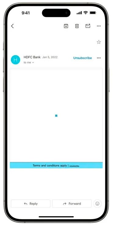
- Use Responsive Images: Use images that automatically resize to fit the screen. And always include alt text for accessibility.
- Short Subject Lines & Pre-Headers: Mobile inboxes cut off longer text, so keep subject lines under 40 characters and pre-headers under 100 characters.
✨ Best Practices for Mobile-Optimized Emails:
- Font sizes should be at least 16px for body text and 20px+ for headings.
- Give your text room to breathe – use 1.4–1.6 line height.
- Optimize images to load quickly on mobile networks.
- Use tools like Litmus or Email on Acid to preview your design.
- Make sure your colors work for users who prefer dark mode.
- Stick to one-column layouts – multi-columns get messy on mobile.
- Check your email on different devices and apps (Gmail, Apple Mail, Outlook) before you hit send.
❌ What to Avoid:
- Tiny Text: Hard to read on small screens.
- Too Much Scrolling: Try to get to the point as quickly as possible.
- Overlapping Images or Buttons: Poor spacing ruins the mobile experience.
🎨 Design Tools That Make Our Lives Easier:
Creating fast-loading, beautiful emails starts with using the right design tools. Here are some of my favorites:
- Figma: Great for team collaboration and building reusable templates. You can export optimized images right from the tool.
- Adobe XD: Perfect for designing email layouts and sharing interactive previews with your team. Use the “Export for Web” option for fast-loading assets.
- Sketch: Good option for creating email templates with easy-to-export assets. Plus, you can use plugins for responsive design previews.
✨ My Pro Tip:
Set up templates in these tools with proper sizing and export settings from the start. It’ll save you time and keep your emails speedy!
9. Ensure Fast Loading
Waiting for something is one of the things I particularly dislike, especially when it comes to a slow website or an email to load. A slow email can frustrate your readers and send them straight to the trash. When your emails load fast, your audience stays engaged, and you see more clicks! Plus, emails that load quickly perform better, especially on mobile. Therefore, let’s make sure your emails are lightning-fast.
➡️ Ways to Speed Up Your Email Load Time
- Compress Images Without Losing Quality: Use tools like TinyPNG or Squoosh to shrink image sizes. Stick to JPEG or WebP for photos and PNG for graphics with transparency and these file size limits:
- Header images: Under 150KB
- Product images: Under 100KB
- GIFs: Under 500KB
- Keep GIFs Short and Small: GIFs are fun but can slow things down. Limit them to 2-3 seconds and compress them using tools like EZGif.
- Use Image Placeholders Carefully: Don’t rely on heavy banners – get your message across with text first, then images.
- Minimize Code Bloat: If you’re using HTML, remove unnecessary inline styles and scripts. Tools like HTML Minifier can help.
- Host Videos Externally: Don’t embed videos directly in your email – they load slowly and can break in some clients. Instead, use a thumbnail with a play button linking to YouTube or Vimeo, for example.
- Reduce the Number of Fonts: Limit usage to 1-2 web-safe fonts. Multiple fonts increase load times and can cause rendering issues.
- Use alt text for images: If they don’t load, people still know what they missed.
- Preload important assets: Load banners or key images first with proper HTML attributes.
❌ What to Avoid:
- Large, Unoptimized Images: They’re the #1 cause of slow emails.
- Too Many External Links: Every external request slows things down.
- Heavy Tracking Pixels: Use only what you need for analytics.
Tip 10: Work with Your Team for Seamless Emails
Smooth collaboration between designers, developers, and marketers is key to creating emails that look great, perform well, and deliver results. Here’s how to keep everyone in sync:
- Share Developer-Ready Designs: Use tools like Figma, Sketch, or Adobe XD to create templates with clear specs, web-optimized assets, and reusable components.
- Align with Marketers on Goals: Make sure your design supports their campaign objectives. Review CTAs, headlines, and branding together to stay consistent.
- Test Together Before Sending: Work with developers and marketers to preview emails on different devices using tools like Litmus or Email on Acid.
- Use Shared Workflows: Collaborate through tools like Trello, Asana, or Slack, and store templates in a shared design library for easy future updates.
Bringing It All Together
When you combine eye-catching visuals with smart strategy, you’re not just sending emails, you’re building actual relationships. There’s no single “perfect” design, but when you stay true to your brand, focus on clarity, and test what works, you’ll get closer to the sweet spot with every send.
Let’s hit the highlights one more time:
- Start with a strong subject line – it’s your first (and maybe only) shot to grab attention.
- Keep it short and sweet – because nobody’s got time for long-winded emails.
- Make it easy to scan – clear headings, short paragraphs, and plenty of white space.
- Emojis are your secret weapon – they add personality (just don’t overdo it).
- Use an engaging pre-header – it’s like a little teaser for what’s inside.
- Experiment with color – bold where it matters, but still on-brand.
- Show some love to your footer – it’s small but mighty.
- Optimize for all devices – because most people are checking on their phones.
- Ensure fast loading – slow emails lose readers fast.
- Work with your team – collaborate with developers and marketers to ensure everything looks and works well.
I hope you found my tips helpful. Now, go ahead – experiment, have fun with it, and watch your emails start to connect with your readers. I know you’ve got this!


