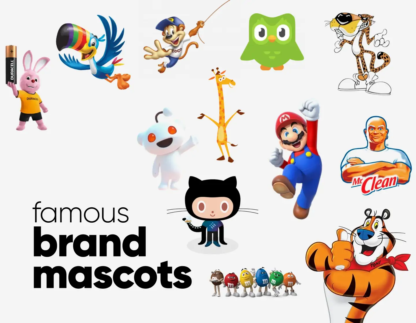
Ever wondered why some brands stick in your head forever? I know I have! It’s not just their products, it’s their mascots! These lovable (and sometimes wacky) characters make brands unforgettable.
A great mascot doesn’t just represent a brand, it also tells a story, builds trust, and creates an emotional connection. Today we will review 30 legendary brand mascots that have shaped advertising history.
Whether they’ve evolved over the years or stayed true to their original design, these mascots have stood the test of time and continue to leave a lasting impression. Sounds exciting? Let’s proceed then!

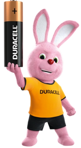
1. Duracell Bunny
📅 Debut: 1973
If there’s one bunny that just won’t quit, it’s the Duracell Bunny! I’ve always thought this little pink powerhouse was a genius way to prove a simple point – Duracell batteries last longer. And what better way to show that than a bunny that just keeps going?
What makes this mascot so effective is how effortlessly it tells a story. Instead of just claiming their batteries are better, Duracell showed it in action. The bunny’s endless energy makes the brand’s message impossible to forget. In my opinion, this example proves that a simple, well-crafted mascot can become a symbol of reliability.
💡 Fun Fact: Many mistakenly think the Duracell Bunny and Energizer Bunny are the same, but they’re actually competitors!

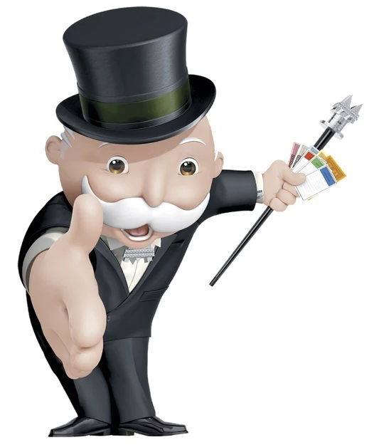
2. Rich Uncle Pennybags
📅 Debut: 1935
When I think of Monopoly, I can’t help but picture the top-hatted, tuxedo-wearing Rich Uncle Pennybags. His refined look and monocle perfectly represent the game’s theme of wealth and success. Over the years, he’s become more than just a symbol of money; he embodies the fun and competitive spirit of the game.
What I love about Pennybags is that even decades after his debut, he continues to be a recognizable figure, proving that a mascot can stay relevant and iconic while evolving with time. Whether in the game, movies, or merchandise, he remains a key part of the Monopoly experience.
💡 Fun Fact: Rich Uncle Pennybags is actually known by several names, including “Mr. Monopoly,” but his full name is Milburn Pennybags!

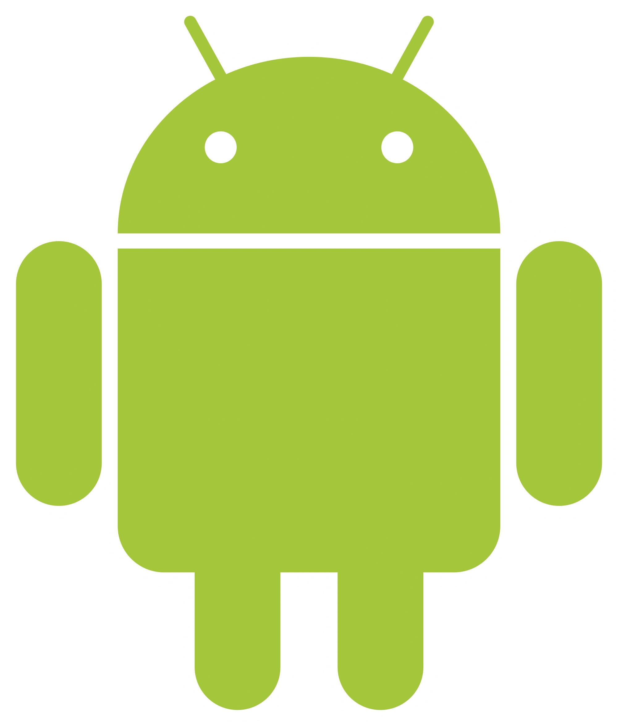
3. The Bot
📅 Debut: 2007
When I think of Android, I can’t help but picture “The Bot” – the little green robot that has become the face of the operating system. I love how the simple design of this mascot made it stand out in the tech world, where sleek and minimalist logos often dominate.
What’s especially cool about the Android bot is how it’s evolved over time. While the design has stayed mostly the same, its versatility has allowed it to be adapted for various purposes, including countless branding, ads, and app icons.
In 2023, Google introduced a 3D version, aiming to give it a more dynamic and adaptable presence. This change reflects Android’s evolution as a brand, while still keeping the mascot’s playful, approachable vibe.
💡 Fun Fact: The Android mascot was originally named “Bugdroid,” but in 2024, Google officially gave it the name “The Bot.”

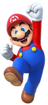
4. Super Mario
📅 Debut: 1981
Which character do you think of when you hear “video gaming”? For me, Super Mario immediately comes to mind. This Brooklyn plumber’s unmistakable red hat, mustache, and blue overalls have made him a beloved figure in gaming, representing Nintendo in ways few other mascots have.
What I think is so impressive about Mario is how he’s evolved from his humble beginnings to become a global icon. Mario’s journey began with simple platformers, like Super Mario Bros., and grew into full-blown adventures, such as Super Mario Odyssey, and even kart racing in Mario Kart.
Mario’s whimsical world has captured the hearts of generations. Even as the games expanded into new genres, Mario’s friendly, everyman character has stayed constant, making him one of the most iconic video game mascots of all time.
💡 Fun Fact: Mario wasn’t always called Mario, he was first known as “Jumpman” in Donkey Kong!

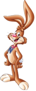
5. Quicky the Nesquik Bunny
📅 Debut: 1973
Quicky the Nesquik Bunny has been a playful and energetic figure for decades. With his fun, loving personality, he quickly became the face of Nesquik, bringing excitement and a sense of adventure to the brand. His original role was to promote the joy of making chocolate milk, but over the years, he has evolved into a symbol of fun for kids and adults alike.
But what makes Quicky such an enduring mascot? I think it’s his ability to stay true to his youthful spirit through the years. Even though his design has slightly evolved over time, his playful and approachable character continues to make him a beloved figure in Nesquik’s marketing campaigns.
💡 Fun Fact: Quicky was originally a bunny named “Quickster” before the brand officially gave him its current name.

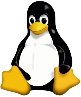
6. Tux
📅 Debut: 1996
Tux, the friendly penguin, is the symbol of the Linux operating system. He quickly became the face of open-source software, representing the friendly and approachable nature of Linux. His adorable, round shape and signature pose made him an instant hit within the community, giving the operating system a fun, relatable identity.
What’s so special about Tux is how playful, inclusive, and all about community he is. He’s also a part of the brand’s philosophy, showing that technology doesn’t have to be intimidating or complicated. Over the years, Tux has appeared in countless versions, from games to software icons, and he remains a symbol of the power and freedom that comes with using Linux.
💡 Fun Fact: Tux the penguin was chosen as the Linux mascot after a fan suggested the idea during a mailing list discussion.

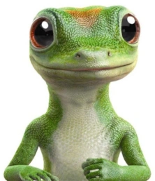
7. Geico Gecko
📅 Debut: 1999
This little green lizard quickly became synonymous with Geico’s catchy “15 minutes could save you 15% or more” slogan in the insurance world. He is great at combining humor, wit, and a quirky personality into a character that makes insurance feel more like a fun conversation.
The cool thing about Gecko is that he’s remained fresh over the years. His clever lines and distinctive British accent have kept him both relatable and memorable. This character has proven that a well-designed mascot can build trust while still being entertaining.
💡 Fun Fact: The Geico Gecko’s accent was inspired by a British voice actor, giving him a distinctive and memorable personality.

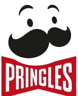
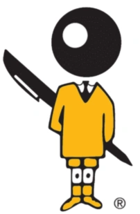
8. Julius Pringles
📅 Debut: 1967
Julius Pringles, the face of Pringles, has become one of the most iconic snack mascots of all time. With his signature mustache, bowtie, and bright smile, Julius embodies the playful and fun nature of Pringles. He’s been through several redesigns over the years, but his original personality, charming and a little quirky, has always remained.
What’s great about Julius is how he’s always maintained that instantly recognizable look. His friendly and approachable persona matches the brand’s focus on enjoyable, snackable moments. Whether he’s in commercials or being the face of Pringles, Julius continues to be a symbol of fun and, of course, great snacks.
💡 Fun Fact: Julius Pringles was originally designed with a thick, plump mustache and red eyes, making him a unique and recognizable figure in snack branding!

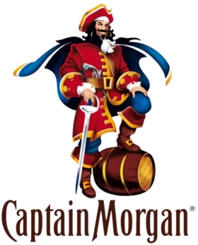
9. Captain Morgan
📅 Debut: 1984
Captain Morgan is pretty much the life of the party. Since he first appeared in 1984, he’s been the face of the rum that’s all about fun, adventure, and a little bit of mischief. With his iconic pose, one knee up on a barrel, he’s become synonymous with living life to the fullest.
What I find interesting about Captain Morgan is that he’s not just a mascot; he’s an embodiment of the carefree, adventurous vibe that comes with cracking open a bottle of rum. Over the years, his bold, fun-loving character has made him a perfect fit for any party or celebration, and he’s still a favorite today.
💡 Fun Fact: Captain Morgan is based on a real pirate, Sir Henry Morgan, who was known for his wild adventures on the high seas!

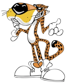
10. Chester Cheetah
📅 Debut: 1986
Chester Cheetah has been the face of Cheetos, and let me tell you, this cheetah’s got style! With his sleek, orange fur, sunglasses, and smooth talk, Chester screams confidence and a “cool” factor that was ahead of its time. His job? To remind us that eating Cheetos isn’t just a snack, it’s an experience!
What’s awesome about Chester is that he’s got that playful vibe that makes Cheetos so much fun. Over the years, he’s kept his swagger and continued to bring a sense of humor to the brand. With his catchphrase “Cheetah it out,” Chester’s laid-back attitude has made him a beloved mascot for decades.
💡 Fun Fact: Chester Cheetah was one of the first snack mascots to have a “cool” attitude, which made him stand out from other mascots of the time.

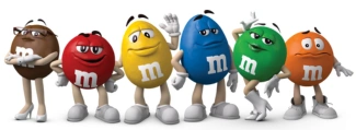
11. M&M’s Spokescandies
📅 Debut: 1995
The M&M’s Spokescandies are some of the most iconic and recognizable candy mascots out there. With each character having its own distinct personality, from the sassy Red to the sweet and caring Yellow, these Spokescandies brought a whole new level of fun to candy commercials.
For me, M&M’s Spokescandies stand out with how their personalities make the brand feel more human and relatable. These characters have appeared in countless ads, delivering humor, charm, and even some life lessons along the way. They’ve become part of pop culture, and their evolution keeps them fresh and fun for all ages.
💡 Fun Fact: The M&M’s Spokescandies were initially introduced as a way to give the brand a more relatable and engaging personality through the voices of the candies themselves.

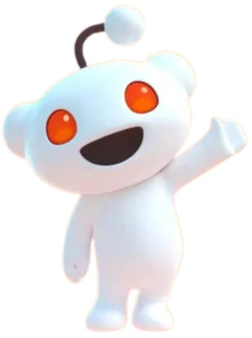
12. Snoo
📅 Debut: 2005
Ever wondered how a simple, alien-like figure can become so iconic? That’s Snoo, the minimalistic, quirky mascot of Reddit, which has been a symbol of the platform since its early days in 2005. With its big eyes, tiny body, and playful vibe, Snoo represents the creativity and endless possibilities of Reddit.
Snoo perfectly embodies Reddit’s ethos of curiosity, exploration, and community. Despite its simple design, it has grown to symbolize everything from memes to serious discussions. Over time, the mascot has evolved in fun ways (like wearing themed outfits for special events), keeping the community engaged and bringing that Reddit magic to life.
💡 Fun Fact: Snoo was created by Reddit’s co-founder Alexis Ohanian as a simple, friendly mascot to represent the Reddit community!

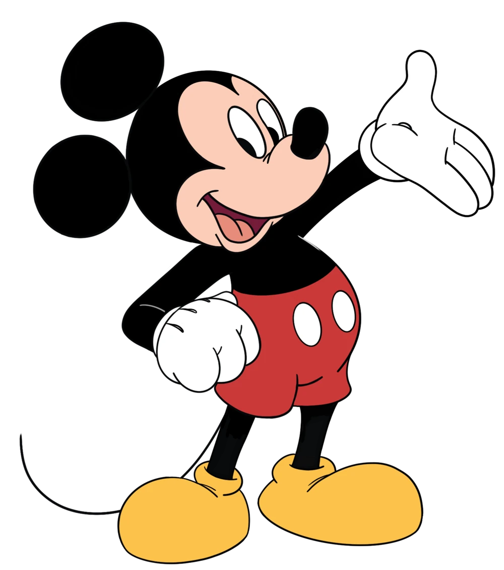
13. Mickey Mouse
📅 Debut: 1928
When you think about iconic mascots, Mickey Mouse is probably the first one that pops into your mind, right? For me personally, it’s him and Snow White. Since Mickey’s debut, he has become a global symbol of Disney and an everlasting figure in pop culture. With his large ears, red shorts, and cheerful personality, Mickey is the embodiment of childhood imagination and magic.
Mickey’s evolution is incredible too. He’s gone from simple black-and-white cartoons to appearing in movies, theme parks, and even video games. No matter where you encounter him, Mickey’s magic remains the same – he’s always bringing joy and excitement for generations to come!
💡 Fun Fact: Mickey was originally going to be named “Morty the Mouse,” but Walt Disney felt Mickey had more personality!

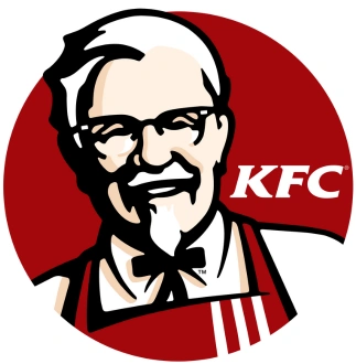
14. Colonel Sanders
📅 Debut: 1952
If you’re a fan of KFC, Colonel Sanders, the face of the brand, probably comes to mind immediately. With his white suit, black bowtie, and signature goatee, Colonel Sanders is all about family, tradition, and, of course, finger-lickin’ good fried chicken.
What’s amazing is how his character has become so much more than just a mascot. Over the years, he’s been portrayed by different actors and celebrities, and his personality has evolved while keeping that same familiar vibe. No matter how many changes KFC goes through, Colonel Sanders always remains at the heart of the brand.
💡 Fun Fact: Colonel Sanders wasn’t a real colonel! He was awarded an honorary title by the Governor of Kentucky in 1936!

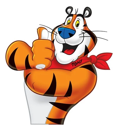
15. Tony the Tiger
📅 Debut: 1952
Tony, the fun-loving Tiger, has been the face of Kellogg’s Frosted Flakes and is one of the most recognizable mascots in the breakfast world. With orange and black stripes, cheerful grin, and the iconic “Grrreat!” catchphrase, Tony has become a symbol of energy, positivity, and excitement.
What makes Tony stand out is his enduring appeal to kids (and adults) alike. His sporty, energetic persona makes him a perfect fit for the delicious cereal brand. Tony’s role is to inspire kids to get up and start their day with a bowl of Frosted Flakes, becoming a true breakfast legend.
💡 Fun Fact: Tony’s famous catchphrase, “They’re grrreat!” was introduced in the 1950s and instantly became a hit!

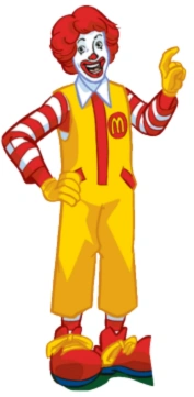
16. Ronald McDonald
📅 Debut: 1963
Ronald McDonald is as synonymous with McDonald’s as the their infamous logo. This clownish, red-haired figure has been the face of McDonald’s, bringing smiles and fun to kids (and adults) everywhere. With his bright yellow jumpsuit, red wig, and oversized shoes, he’s been a central figure in creating the family-friendly image of McDonald’s.
Ronald stands out with how much he’s done beyond just commercials. Ronald has visited countless schools, hospitals, and communities. His commitment to spreading joy and kindness has helped make him a beloved figure worldwide beyond just fast food.
💡 Fun Fact: Ronald McDonald was first introduced in a commercial that aired on TV, but his big debut as a mascot came when he started visiting hospitals to bring joy to children!

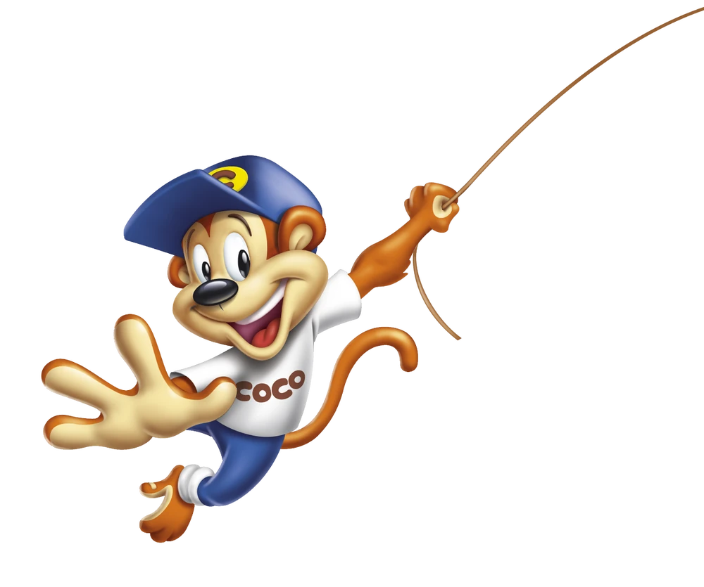
17. Coco the Monkey
📅 Debut: 1963
Breakfast just got more exciting when Coco the Monkey swung onto cereal boxes in 1963. Personally, I have never tried this breakfast item in particular, but I am sure it’s delicious! As the cheerful mascot of Coco Pops, he embodies energy and fun, making kids excited to start their mornings with a bowl of chocolatey goodness.
Coco has been at the heart of the brand for decades, starring in commercials, games, and even animated adventures. His energetic personality and catchy jingles have made him one of the most recognizable cereal mascots around.
💡 Fun Fact: Coco Pops changed their name to “Choco Krispies” in the UK in 1998 but switched back after fans insisted Coco Pops was better!

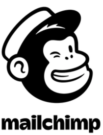
18. Freddy MailChimp
📅 Debut: 2011
I never thought an email marketing tool could have personality until I saw Freddy MailChimp. This friendly monkey with a mischievous wink isn’t your typical corporate mascot. He reflects MailChimp’s creative, lighthearted approach to marketing, making the world of emails feel a bit more exciting.
Unlike traditional mascots, Freddy doesn’t just appear in ads. He pops up across the platform with little surprises, playful messages, and a lighthearted touch. He’s proof that even B2B brands can have a little fun.
💡 Fun Fact: Freddy’s signature winking face represents MailChimp’s fun approach to email marketing.


19. Starbucks Mermaid
📅 Debut: 1971
I’ve seen the Starbucks Mermaid so many times that I almost forget how iconic she really is. She’s a symbol of warmth, comfort, and that first sip of morning coffee. Her siren-like design hints at mystery and adventure, making every cup feel like part of a bigger story.
Over the years, she’s gone through several redesigns, becoming sleeker and more minimalist. But no matter how much she changes, she remains unmistakable. She’s a familiar sight in every coffee shop, printed on cups, signs, and merchandise.
💡 Fun Fact: The Starbucks mermaid, or siren, was inspired by a 16th-century Norse woodcut of a twin-tailed mermaid!

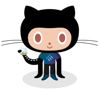
20. GitHub Octocat
📅 Debut: 2005
I love how the GitHub Octocat perfectly captures the spirit of the developer community, quirky, creative, and a little unconventional. This half-cat, half-octopus creature represents the flexibility and adaptability that GitHub provides to coders around the world.
What makes the Octocat even cooler is how it’s been embraced by the community. Developers have created endless variations, dressing it up in different themes and styles. It shows that a well-executed mascot can become part of a great community and spark imagination.
💡 Fun Fact: The Octocat wasn’t actually created by GitHub. It was a stock illustration by designer Simon Oxley that they adopted as their mascot.

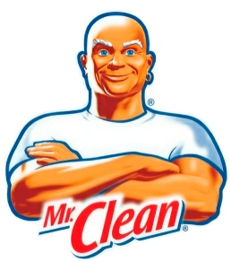
21. Mr. Clean
📅 Debut: 1958
There’s something about Mr. Clean that makes him instantly trustworthy. Maybe it’s the spotless white shirt, the shiny bald head, or the confident arms-crossed pose. He’s the guy you call when you need serious cleaning power, and he’s been a household staple for decades.
What I love about Mr. Clean is how he makes scrubbing floors and wiping counters look almost effortless. Over the years, he’s barely changed, proving that some mascots are so well-designed, they never go out of style.
💡 Fun Fact: Mr. Clean was so popular that he even had his own theme song, which became a hit on the Billboard charts the year it was released.

22. BIC Boy
📅 Debut: 1961
BIC might be known for pens, lighters, and razors, but its mascot, the BIC Boy, has quietly been part of the brand’s identity for over half a century. With his round head and short limbs, he looks simple but perfectly reflects BIC’s functional designs.
Even though he’s not the most animated mascot out there, the BIC Boy has remained a subtle and effective part of the brand. He’s proof that sometimes, a minimalistic approach is all you need to create an enduring brand image.
💡 Fun Fact: The BIC mascot, often called the “BIC Boy,” was created to represent the brand’s focus on simplicity and reliability in everyday writing.

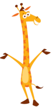
23. Geoffrey the Giraffe
📅 Debut: 1957
I see Geoffrey the Giraffe as the perfect symbol of childhood fun. His friendly smile and playful energy make him impossible to forget. This friendly giraffe became the face of the Toys “R” Us retailer, making every visit feel like an adventure.
Geoffrey has had a few makeovers, going from a more realistic giraffe to a full-blown cartoon character. Even when Toys “R” Us faced tough times, Geoffrey stuck around, proving just how much a beloved mascot can mean to people.
💡 Fun Fact: Geoffrey wasn’t always his name. He was originally named “Dr. G. Raffe” before getting his now-famous name!

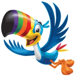
24. Toucan Sam
📅 Debut: 1963
There’s something about Toucan Sam that makes him one of the most charming cereal mascots out there. With his colorful beak and British accent (at least in early ads), he brought a sense of adventure to breakfast time.
His famous catchphrase, “Follow your nose! It always knows!” became just as memorable as the cereal itself. Even after a few redesigns, he remains a bright and cheerful character that instantly reminds you of the fruity flavors of Froot Loops.
💡 Fun Fact: Toucan Sam’s nose isn’t just for looks, his incredible sense of smell is part of his character, leading him to delicious Froot Loops!

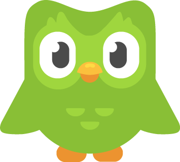
25. Duo the Owl
📅 Debut: 2011
Duo the Owl is the face of Duolingo, the language-learning app that has made studying new languages more fun. He is the perfect reminder that learning doesn’t have to be a chore! When I think of Duo, I instantly picture that green, wide-eyed little guy encouraging me to keep up with my language lessons.
What makes Duo so effective is how the mascot is both cute and clever. His playful design and constant reminders to “practice” have created a relationship with users. It’s like having a little, supportive owl watching over your language-learning journey, one lesson at a time.
💡 Fun Fact: Duo the Owl became so popular that people started making memes about it, especially those “Did you practice your Spanish today?” reminders!

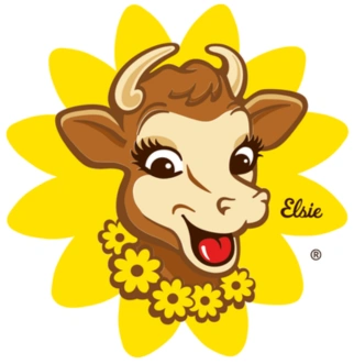
26. Elsie the Cow
📅 Debut: 1936
Elsie the Cow is one of those mascots that instantly gives off wholesome, nostalgic vibes. As the face of Borden Dairy, Elsie became the epitome of a trusted, family-friendly brand. With her cheerful and approachable design, she helped cement dairy products as fresh and natural in the minds of consumers.
What I love about Elsie is how she’s stood the test of time. Over the decades, she’s been updated to fit new branding, but her charm remains. Whether you’re enjoying a glass of milk or spreading some butter on toast, Elsie’s friendly face always makes you feel right at home.
💡 Fun Fact: Elsie was once the star of a Broadway musical in the 1940s!

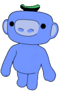
27. Wumpus
📅 Debut: 2015
If you’ve ever used Discord, you’ve probably seen Wumpus around. The cute, purple, round creature with its big eyes is a symbol of the playful, welcoming community that Discord has built. Originally just a placeholder for some of the platform’s early interactions, Wumpus quickly gained a life of its own.
What I personally like about Wumpus is how it represents Discord’s quirky and fun culture. With often popping up in memes or representing Discord in various events, Wumpus adds a sense of light-heartedness to a platform that connects millions of people around the world.
💡 Fun Fact: Wumpus was originally a simple placeholder character, but now it’s become one of the most beloved icons within the Discord community!

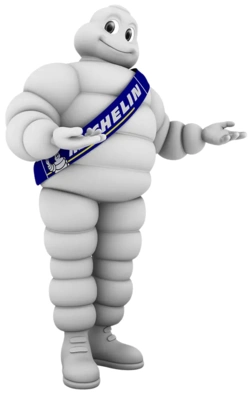
28. Michelin Man
📅 Debut: 1894
The Michelin Man is one of the oldest and most iconic mascots in the world. With his plump, tire-shaped body, he represents the durability and reliability of Michelin tires. Over the years, he’s evolved from a simple figure to a dynamic character with human-like traits.
What I think is remarkable about the Michelin Man is how he’s remained relevant and easily recognizable through the decades. His image has stood the test of time, becoming a symbol of quality and trust for the brand.
💡 Fun Fact: The Michelin Man’s original name is Bibendum, from the Latin phrase “Nunc est bibendum,” meaning “Now is the time to drink,” referring to the brand’s early association with beverage cans.

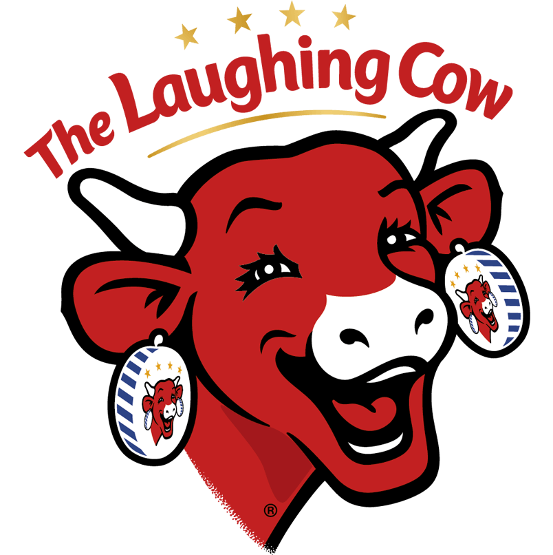
29. The Laughing Cow
📅 Debut: 1921
The Laughing Cow is one of those mascots that immediately makes you smile. With her bright, red earrings and her ever-cheerful expression, she represents the creamy, spreadable cheese that’s become a favorite for snackers everywhere.
What makes The Laughing Cow so effective is how her friendly and approachable design perfectly matches the product. She’s an embodiment of comfort and joy, making a simple snack feel a little more fun.
💡 Fun Fact: The Laughing Cow’s famous red packaging wasn’t always so vibrant. She started with a simpler design that evolved to match her cheerful personality.

30. Charlie the Tuna
📅 Debut: 1961
If you’ve ever seen a StarKist tuna ad, then you’ve likely heard Charlie the Tuna‘s catchy, optimistic voice. With his suave personality and love of gourmet food, Charlie was a clever way to market canned tuna as a top-tier, quality product.
Charlie is one of those characters that manages to blend humor with branding. His ongoing quest to prove he’s “the right fish” for StarKist has been an essential part of their advertising for decades. Even though he’s a bit of an underdog, Charlie’s persistence and charm have kept him relevant in the minds of consumers.
💡 Fun Fact: Charlie’s voice was originally provided by the famous voice actor Mel Blanc, who also voiced iconic characters like Bugs Bunny and Daffy Duck!
Trends in Mascot Design: What’s Happening Now?
Mascots have come a long way and continue evolving. I think it’s exciting to see how brands are keeping them lively, fun, and even more interactive in today’s digital world.
Right now, there are some cool trends that are changing how we see our favorite characters. Let’s check them out!
- 🎬 Animated Branding
More and more brands are bringing their mascots to life with animation. Think of the Geico Gecko or Coca-Cola’s Polar Bears – these mascots aren’t just static images anymore; they’re moving, interacting, and having fun across ads and digital platforms. It’s a great way to keep them fresh, relevant, and engaging. - 🤖 AI-Generated Mascots
Yep, AI-generated mascots are becoming a thing! These digital personalities are created by artificial intelligence and can evolve quickly to stay on top of trends. Brands can adapt them in real-time, keeping them in tune with their audience. How cool is that? - 📱 Social Media Engagement
Mascots aren’t just on TV anymore, they’re on social media, too! Snoo from Reddit and Duo the Owl from Duolingo are great examples of mascots getting involved on platforms like Twitter and Instagram. These mascots chat with fans, post memes, and even share updates, making them feel way more personal and connected with their audience.
Final Thoughts
Mascots have a unique ability to transform a brand’s identity, making it memorable and instantly recognizable. Understanding the power of mascots is key to creating characters that not only represent a brand but also resonate with audiences on a deeper level.
As we’ve seen, mascots go beyond just being cute. They actually build trust, spark engagement, and tell stories that stay with us for years. No matter your task, the goal is the same: create something that can stand the test of time.
So, as you take on your next creative project, think about what makes these mascots so iconic. How can you design a character that not only represents a brand but also engages and inspires? Here’s to crafting the next iconic mascot that will leave a lasting mark on the world!
Don’t forget to check out these related articles: