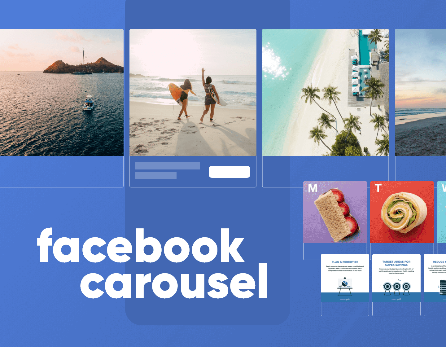
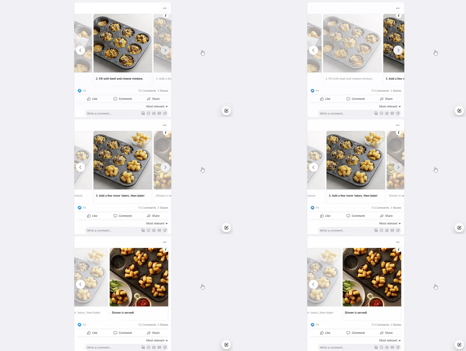
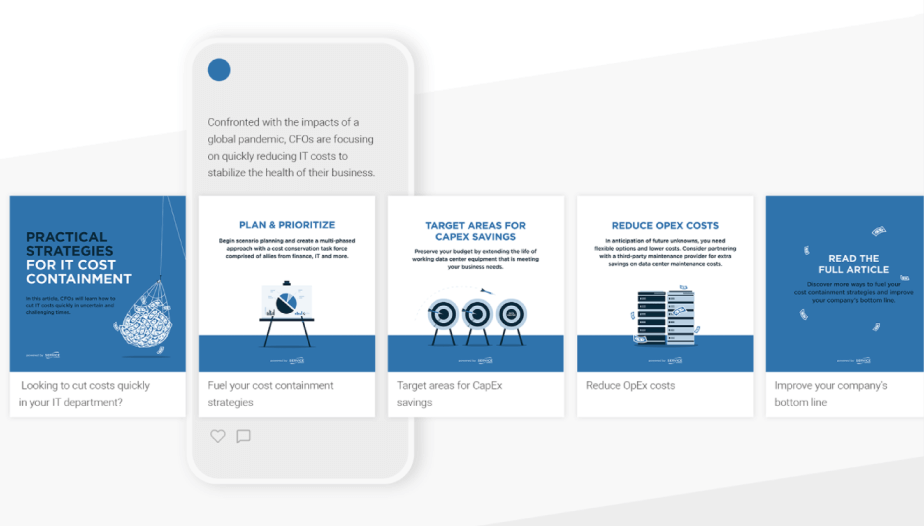
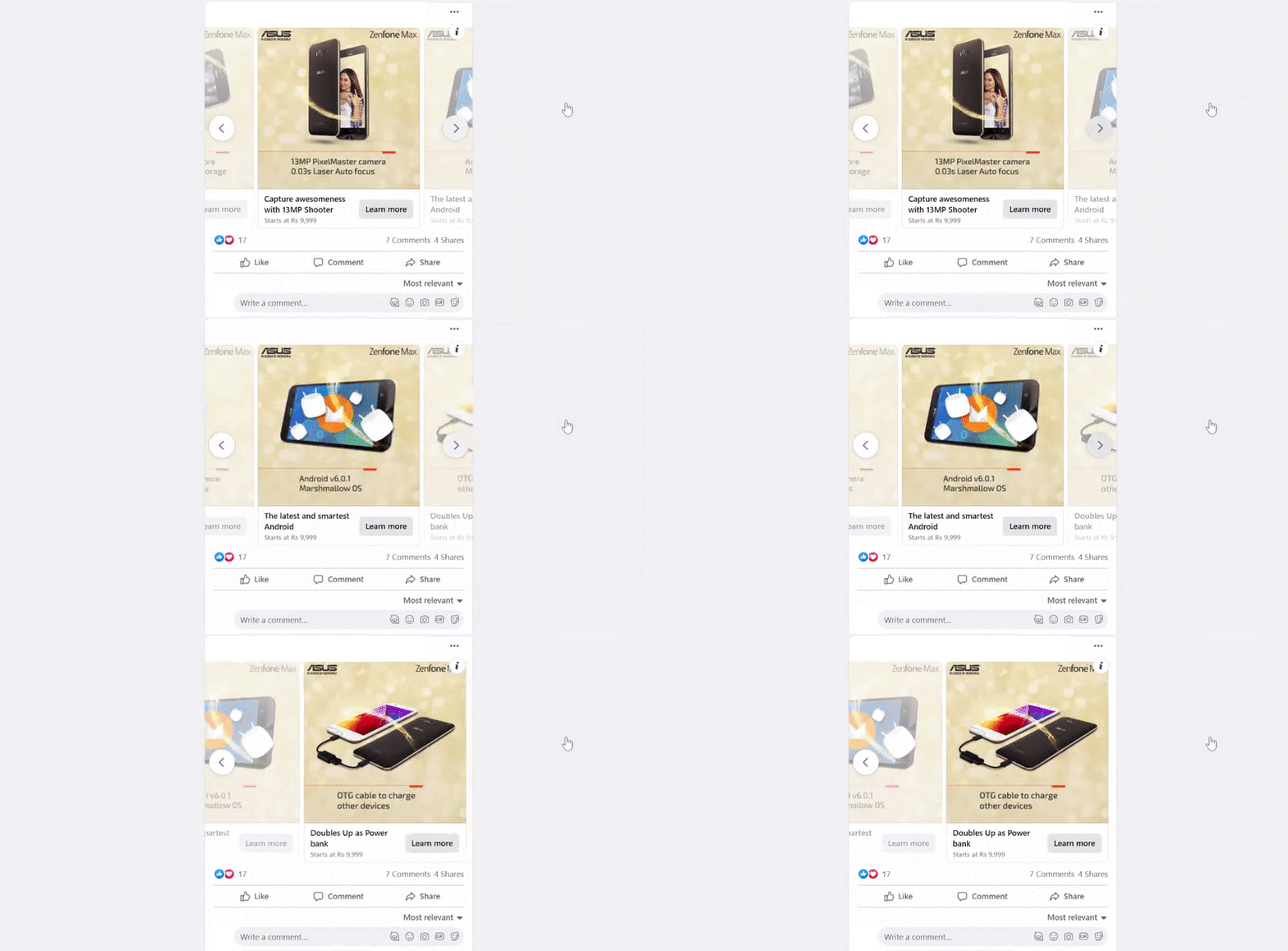
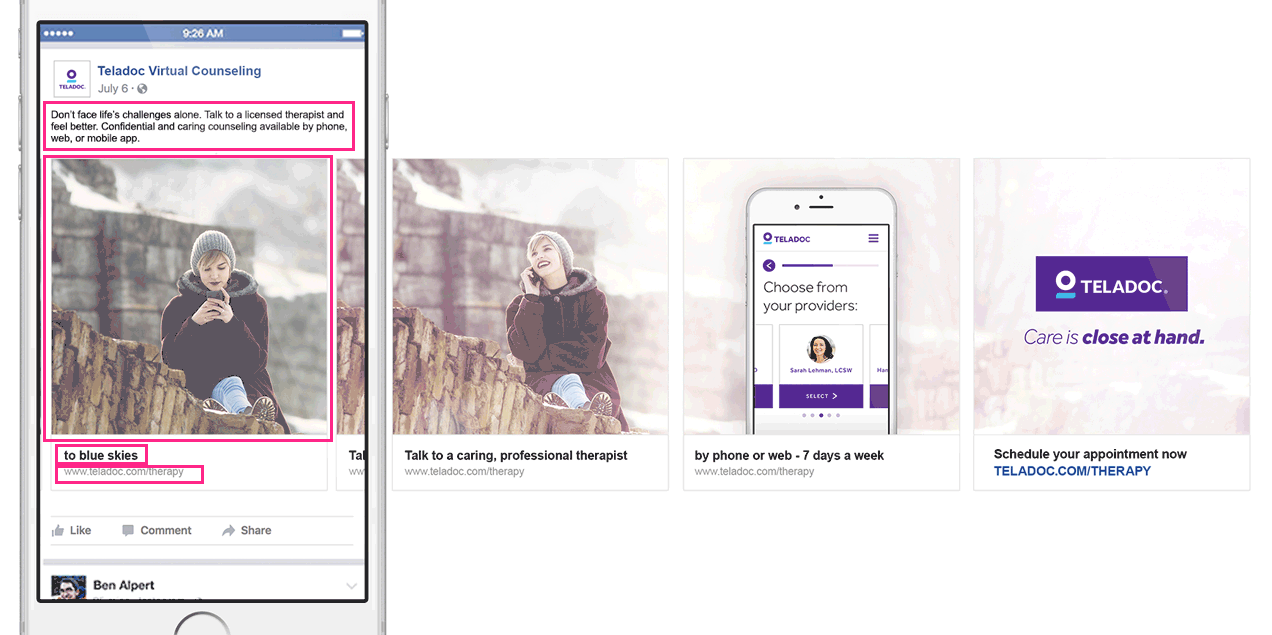
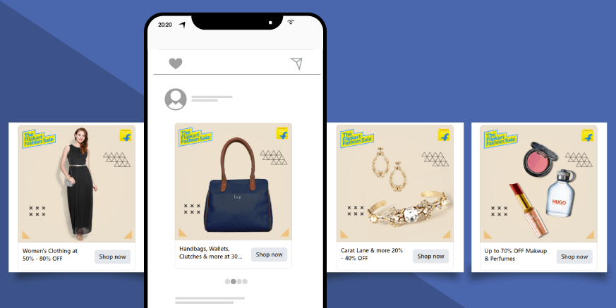
If selling products online is your thing, look no further, because Facebook Carousel ads are an ideal medium to showcase multiple products and services to multiple audiences. With plenty of formats and options to convert your audience into users, however, comes plenty of things to trip on. This is why today we’re going to discuss Facebook carousel ads: a short, but complete guide with best practices and great examples.
Facebook Carousel Ads: Overview
- What is a carousel ad?
- The 10 benefits of using the carousel ad format in Facebook
- Best practices for creating effective carousel ads on Facebook
What is a Carousel Ad?
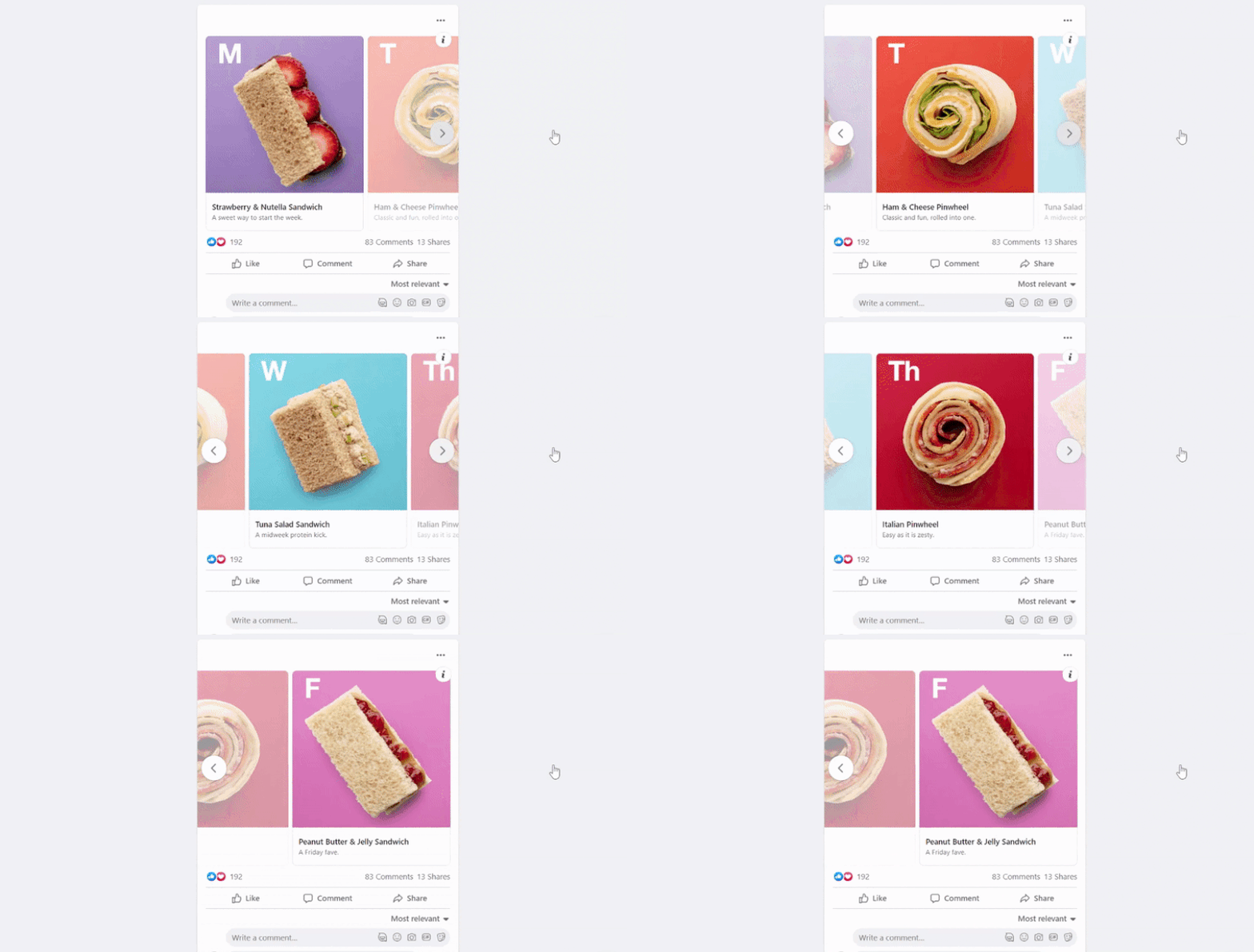
The carousel ad format combines multiple videos and images into one ad, allowing users to see everything the advertiser wants them to see, all in one place. Each slide in a carousel ad can feature its own image, headline, links, and CTA. It’s important to note that the user moves the slides by swiping, unlike with classic website carousels, where the moving is often automated.
You can use carousel ads in a variety of ways, depending on the purpose:
- You can tell a story, or explain a process, revealing more of it with each slide
- Tell the benefits of becoming your client or a partner
- Highlight multiple features and capabilities of a single product you’re advertising
- Feature multiple products by including one product and a link to its landing page on each slide
Since this format is ideal for the mobile experience due to the convenience of swiping the slides, it’s no surprise the most popular places to display your carousel ads are Facebook and Instagram, where brands can take advantage of the social network’s algorithms.
There are two ways you can create your own Facebook carousel ad:
10 Benefits of Using the Facebook Carousel Ad Format
Facebook and Instagram made it pretty easy to create dynamic professional ads just in a few clicks. Their ability to show multiple images and link to actions not only makes them visually more interactive but also drives 10 times more traffic to websites.
1. More Traffic to Advertiser’s Website
According to data from Kinetic Social report, 1 percent of users are clicking through on carousel ads compared to 0.1 percent on non-carousel ads. In addition, advertisers have seen carousel link ads drive 30-50% lower cost-per-conversion and 20-30% lower cost-per-click than single-image link ads.
2. Extended Customization
Thanks to the extended size and features of the Facebook carousel ad, you don’t have to choose just one product and think of how to communicate your message in one square image. In fact, what you can accomplish in a single ad is 10 times more in a carousel format.
3. More Interaction for Users
With single video ads and static ads, the users view and read what’s in front of them and this places them in a more passive role. The reason why carousel ads bring more traffic is that they invite users to play a part in the process by giving them control over the ad to experience each slide at their own pace.
4. Listing Benefits
Sometimes your product is so good, it serves multiple purposes and meets multiple needs. If you use a carousel ad format, you don’t have to pick the most important benefit. Instead, you can list every attractive and useful aspect of your product or service.
5. Product Highlight and Demonstration
Your product or services might have more complicated features and applications. Instead of creating a complex design that your users will have a hard time reading, why not use multiple slides to present each feature separately. This setup will let you give your product or service a comprehensive demonstration.
6. Step-by-Step Guides
The best wait to make your target audience aware and familiar with your products and services is to demonstrate them. You can use the Facebook carousel ad format to make a step-by-step guide or a how-to to showcase the strengths of what you’re advertising. This will help you show the drastic changes from “before” to “now”, or a creative process to highlight the benefits.
7. Storytelling
You can also tell your audience a story through images. Especially in cases where you wish to communicate your values and mission, this format will help you explain what you wish to achieve.
8. You Can Add Previews to Publications
Let’s say you have a blog, or you’re selling a book. Another benefit of using the carousel ad format is that you can build interest by sharing a series of short aspects of your publication. By the time your viewers reach the last slide, they will be more interested to click the link and land on your blog.
9. There is Something For Everyone
When you showcase different products of types of services, there’s a bigger chance for the viewer to pick a product they like enough to make them visit your website. In general, you display several of your top picks in one scene.
10. Creative Triptych- Type Look
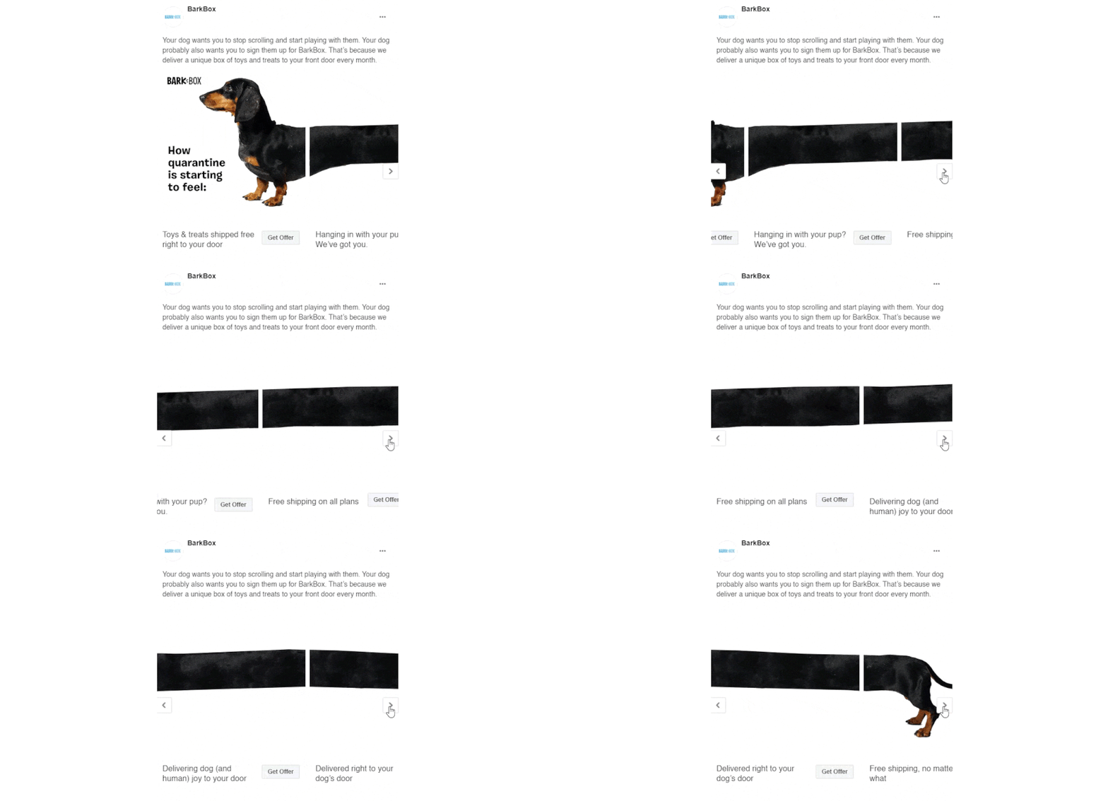
You can take advantage of the multiple slides to show a large image divided into smaller chunks. Your viewers would be curious to reveal the bigger picture by swiping through each slide.
Best Practices for Creating Effective Carousel Ads
With more creative space within the format, you can add up to 10 images or videos, each with its own link, within a single ad. In order to use that creative space, however, it’s important to know the current recommended specifications for your images, text, and technical requirements.
Image Specs:
- File Format: JPG, PNG
- Resolution: 1080 x 1080 pixels
- Aspect Ratio: 1:1 (square)
- Number of cards: 2-10
- Image file size: 30MB max
Video Specs:
- File Format: MP4, MOV, GIF
- Aspect Ratio: 1:1 (square)
- Number of cards: 2-10
- Video length: Up to 240 minutes
- Video file size: 4GB max
Text Specs:
- Text: 125 characters
- Headline: 40 characters
- Link description: 20 characters
Use All Available Components
Images and videos will instantly grab the attention, however, don’t ignore your option to put a catchy headline and an insightful description. Your copy will give more context to your visuals and will encourage viewers further to click the CTA button.
Customize the Text
The default text design for carousel ads looks generic. Instead, unveil the full potential of your ad with the text customization options and take advantage of the description and headlines to make your design more appealing and custom.
Use Visually Similar Images
One of the best ways to communicate professionalism through your visuals is to use images and videos that look and feel similar to each other. They might have the same background, the same colors, or come from the same photoshoot. This way you give logic and consistency to your slides.
Show Your Best-Seller Cards First
The carousel format allows you to test different products in terms of performance. This will give you valuable insight and you will be able to replace or remove low-performing carousel cards. Of course, this practice doesn’t refer to cases when you use sequential stories or multiple images as part of a larger image.
Grab Attention with the First Image
People do judge the book by its cover, so it’s only natural for them to get attracted by the very first image you show them. You can either show the main goal and major benefit of your services or start an interesting story that your audience can’t help but swipe to see where the story goes. A perfect example of such a visual story is the dachshund from Bark Box’s ad.
Use a Mixture of Video and Still Images
Some of the best-performing Facebook ads are ones with a video. Short interesting videos are extremely engaging and serve as a great story-telling medium. Using a video as your first slide, followed by images will give you extra space and to share more info with your audience.
Final Words
Facebook carousel ads have become a great digital marketing tool for businesses to get high click-throughs and engagement rates. It’s a great way to showcase multiple products and services, the benefits of your brand, and tell your story in an engaging way.
In the meantime, why not take a look at the related articles to get some more inspiration or grab a couple of freebies:


