Having a blog for your e-commerce site is proven to be beneficial on many levels. Today, we will show you 16 successful Shopify blog examples that help boost conversions and naturally increase sales.
Educating and caring for your audience, along with giving free advice and resources is proven to strengthen the customer-brand relationship. That’s what blogging is about. But it also gives you an opportunity to gain a lot of organic traffic and turn potential leads into real clients.
Luckily, e-commerce platforms like Shopify support having a blog. So, today we’ll talk about the successful tactics you can use to make this blog a winning machine for conversions and sales. Among these Shopify blog examples, you’ll find different blog structures that work in your favor, as well as witty tactics you can apply. Let’s begin!
Marble Shopify theme – a classical blog grid structure

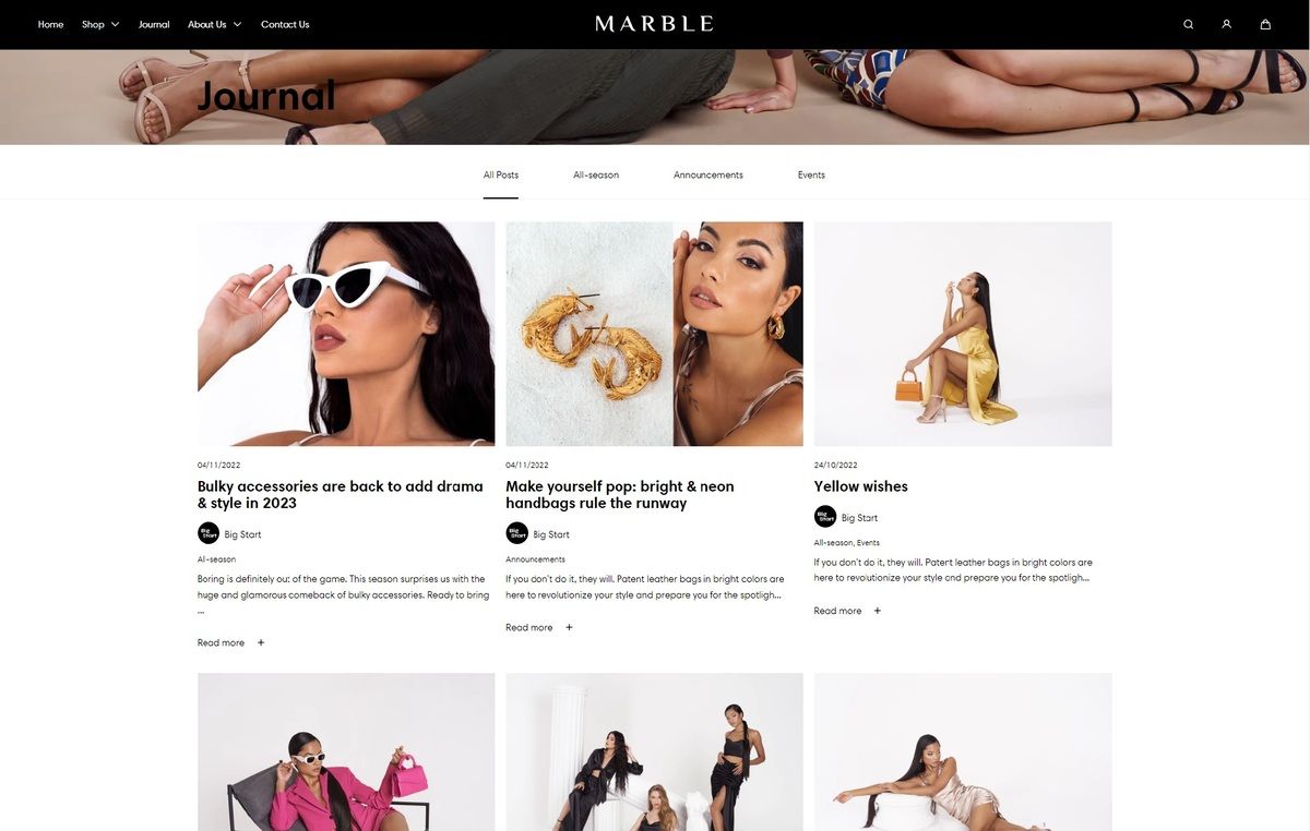
The Marble Shopify theme has a clean and minimalist design, suitable for brands in the fashion and clothing industry but you’re not limited to that, really. The theme is flexible and offers a variety of sections and features, so you can customize and adapt it exactly as you’d like.
Following the pattern of the site, the blog design also offers a clean and tidy look – a classical grid that keeps the content organized and highlights the key points of each article.
Gymshark – an example of ad sections in the grid

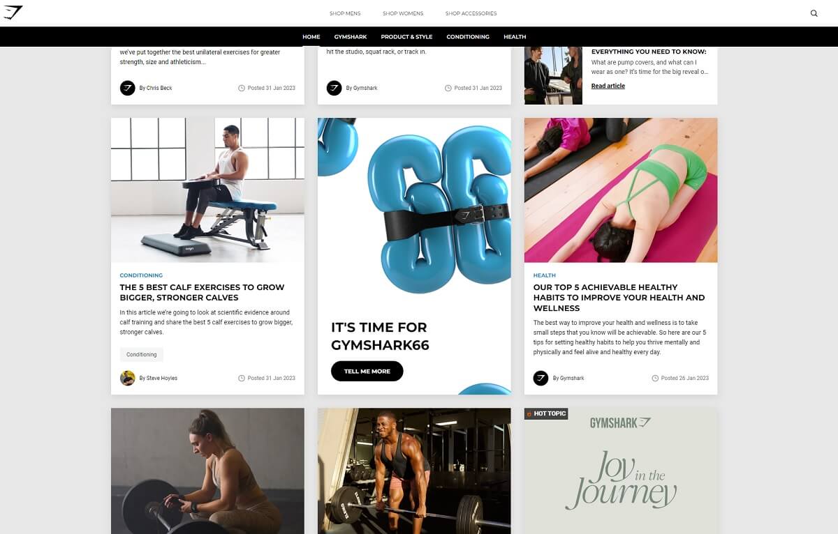
The famous sportswear brand Gymshark maintains a successful blog that provides customers with valuable content and helps increase sales. The content is rather oriented toward providing value rather than hard-selling your stuff. That is a plus – the majority of the visitors are not ready to buy, yet. They are still at the top of the sales funnel, and some visitors may not even be aware of Gymshark’s existence once they organically land on an article.
Not pushing the sales part helps build trust and authority and the engaging posts bring the readers closer to purchase.
An interesting fact about their blog structure is that they put ads within the grid, in line with their articles. Bold and effective move that “tells” visitors Gymshark not only tells you how to achieve results but provides you with the tools and equipment to do it. It’s a gentle way to prompt to a purchase once the customer feels ready.
Luxy Hair Blog – an example of a hierarchy blog structure

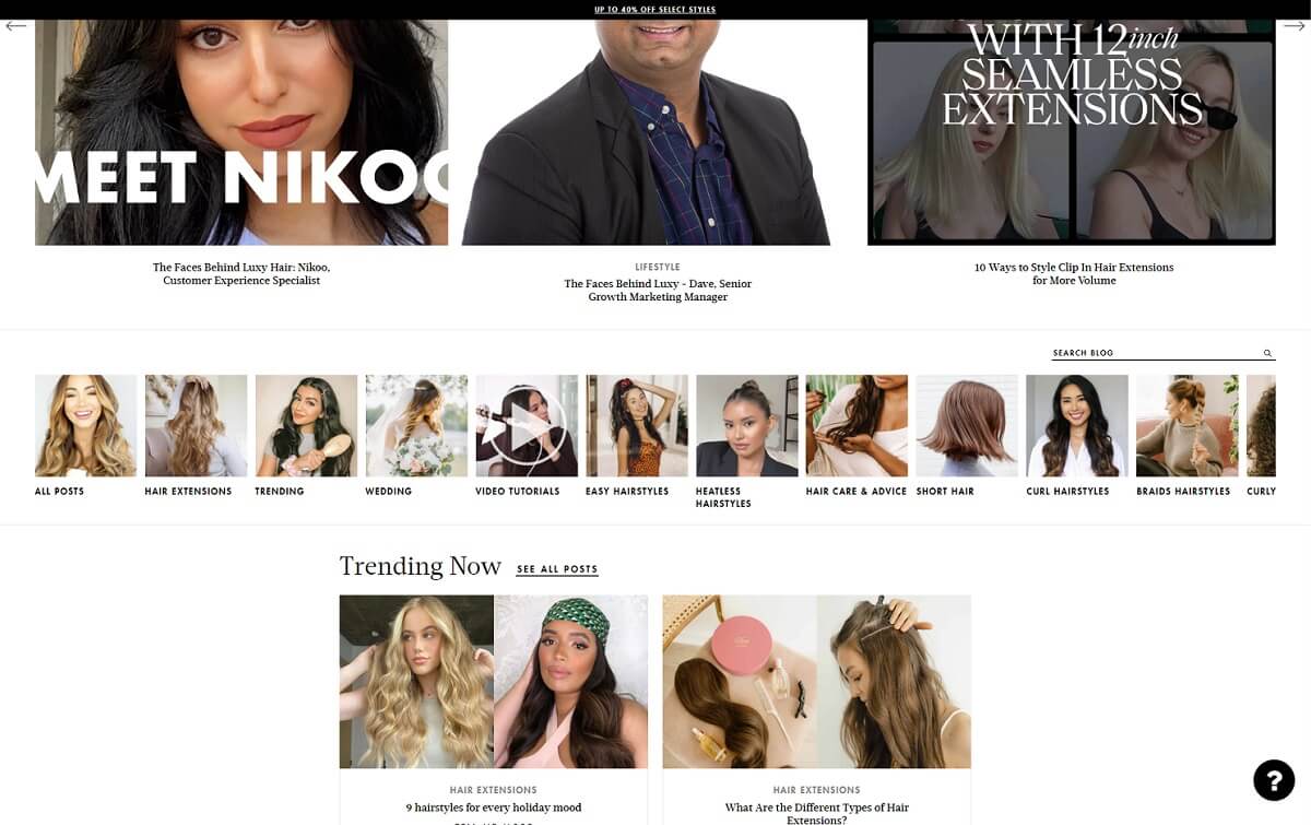
LUXY is a brand that deals with selling clip-in hair extensions. The blog is focused mainly on themes such as hairstyling, hair care, and tutorials. When it comes to the blog, the brand is focused on creating very useful content which organically gains traffic. We see great link-building within the posts and a heavy amount of Youtube video tutorials which is good for SEO.
The design of the blog itself creates a hierarchy you cannot miss. Right on top, you are welcomed by a big-size slider presenting you with the latest 5 articles. Just below it, you see icons that direct to different categories. And then, you scroll down to two more sections: “Trending Now” and “Latest Posts” to choose from. When it comes to the sales part, you’ve got elegant “Shop the look” links in the last section of the page.
Alchemy Fine Home – article structures with CTA buttons

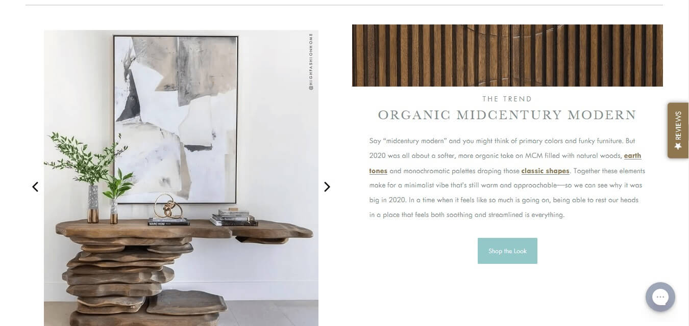
Alchemy Fine Home is a brand that offers its customers luxury furniture. Their blog is very clear and stylish, and the main focus falls on the products they offer.
This Shopify site blog uses a 3-column structure with oversize images, each acting as a link to the article itself. The articles themselves are very informative and detailed but what impresses the most is the perfect positions of call-to-action buttons. This Shopify blog is a great example that you can elegantly sell your products while educating your potential clients in your professional field.
Of course, there are plenty of pictures with instructions that help the visitor decide on buying a new table, for example. The brand has provided images from every angle of the item, along with combination ideas with other items. That simplifies and eases the purchasing process.
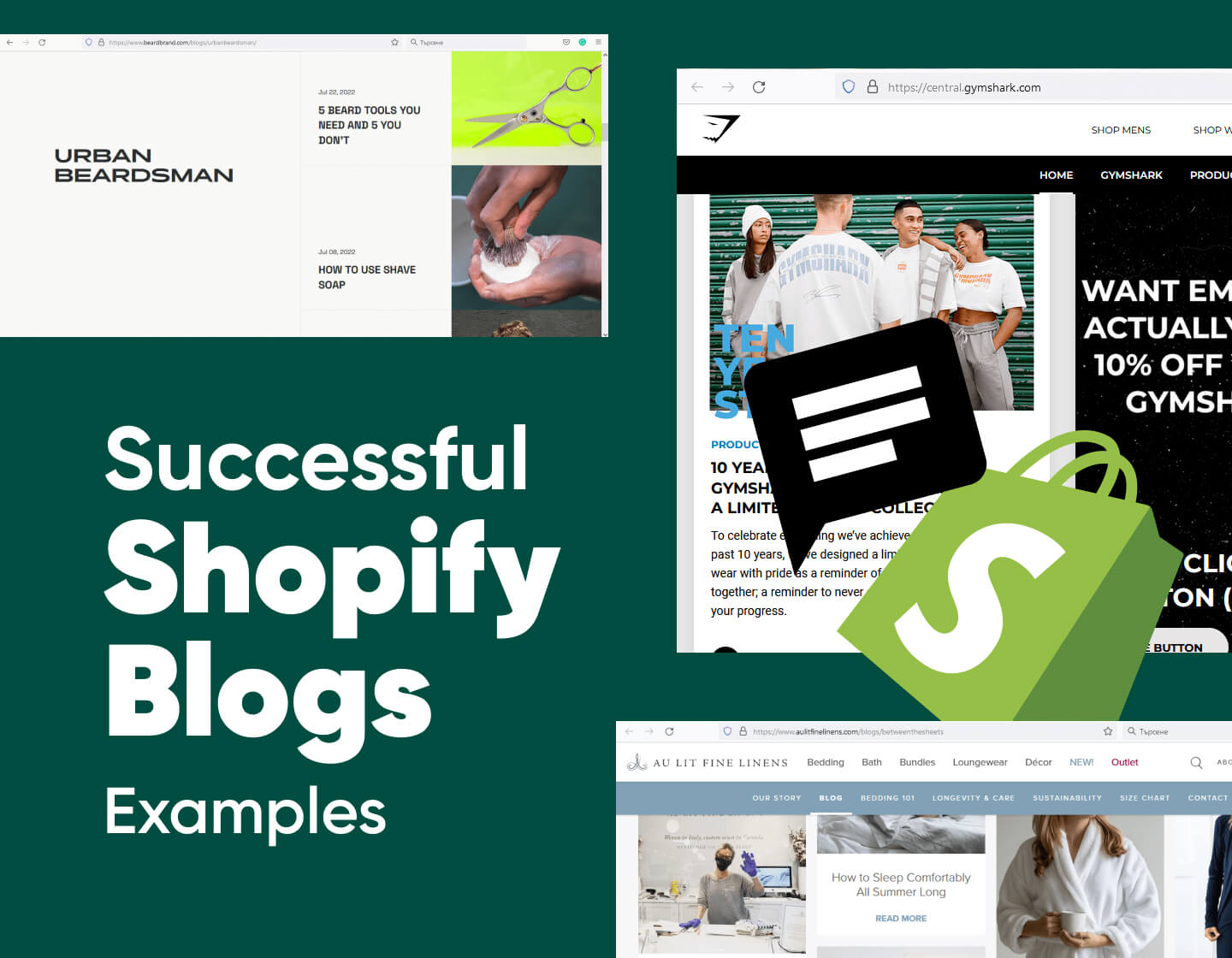
BeardBrand – a right-sided Shopify blog structure

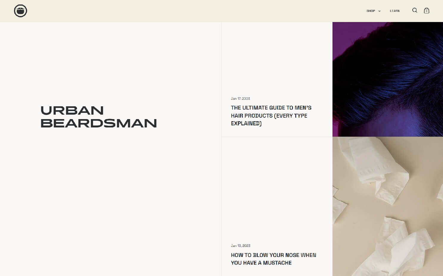
BeardBrand’s blog structure is quite interesting and not very often seen – a table-inspired design with a right-sided structure where all the articles are arranged on the right side of the page.
The brand produces and sells products for facial hair care, as well as fan accessories. Their blog also has a name – “Urban Beardsman” that occupies the whole left area of the blog structure.
The key benefit of the brand’s blog is that they create content with its customers and find new and unique ways to interact with the audience. Posts like “5 beard tools that you need and 5 you don’t” or “How to use shave soap” make great and natural SEO, bringing the blog to the first pages in Google searches.
Press – an example of a single-article focus

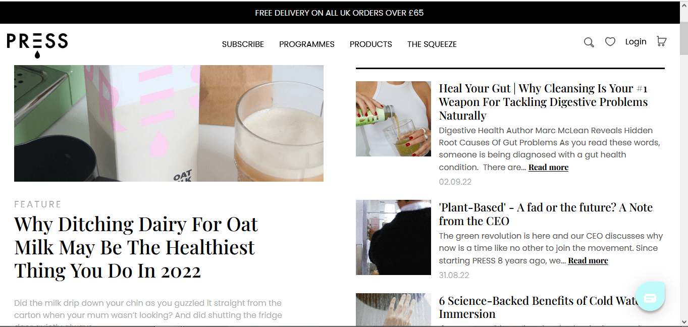
People quite often lose focus when presented with too many options. The Press brand here has found a great solution to make it easier for visitors to choose which article to click on.
Press is a brand that deals with promoting healthy foods and juices such as milkshakes, kombucha, soups, meals, etc, specially created for traveling. The one thing that instantly catches your eye is the huge feature article on the left – one highlighted content you just cannot miss. In case you aren’t looking for something specific, you know you’ll click on this article exactly.
Regarding the content, not all posts are necessarily dedicated to selling the brand’s products. The blog contains a lot of informative articles and external links to other brands’ products, as well. The main focus is giving value on the subject of people’s health and this is a way to build trust. In addition, Press uses diverse content types like videos and interviews with influencers to drive traffic to the website.
Amandean – a full-width featured article section

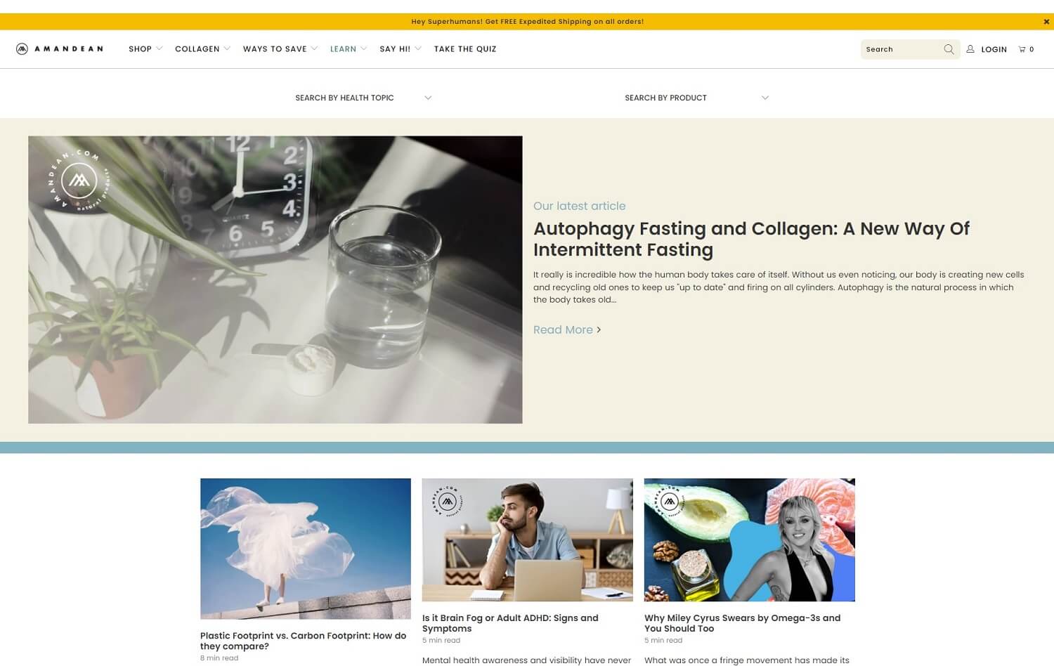
Amandean is an online shop for different kinds of vitamins. The thing that makes the brand special is its blog.
You’ve got a friendly, personal, and even somehow funny “tone of voice” which easily breaks the ice with the audience. You’ll see sentences like “I am what some may call an insomniac. It sounds like a 90’s heavy metal band, doesn’t it?”. In addition, the articles have a straight structure and are very well-organized.
Wildflwr – an example with large category tabs

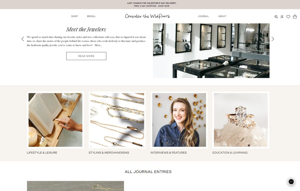
Wildflwr is a fine jewelry company. They call their blog a “Journal” and it is designed as a magazine. The first thing that makes an impression is the beautiful script font they use for the article headings. Script fonts are perfect for brands that are occupied with jewelry — they capture the elegance and delicacy that this kind of product emits.
The writing style of the blog is also impressive. It feels like a dialogue with the visitor, yet it has a lot of specialized information about the creation of the jewelry. This brand’s blog is really focused on providing advice rather than selling you stuff, which is always a win-win formula.
AuLitFineLinens – a Shopify blog example with an infinite grid

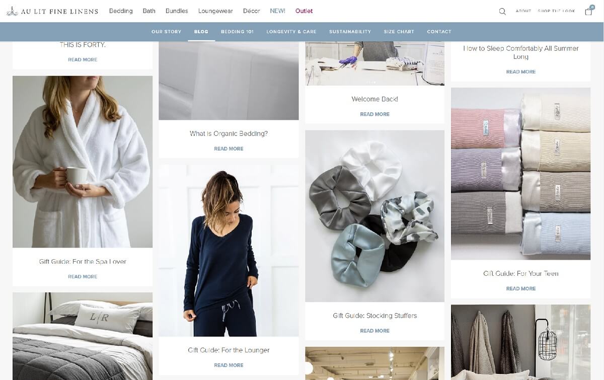
You scroll and scroll, and have the option to “Load more”, even when you’ve reached the end. Yep, this Shopify blog gives a classical example of an infinite grid. What makes the visitor keep scrolling are the non-aligned sections. You always have the urge to scroll down a little bit more in order to reveal the full section. Once you do, another section is still partially revealed and you scroll down a little bit more to reveal it, either. That’s why this type of grid is called “infinite”.
The site itself is a brand Shopify site that sells bed linen and bed lingerie. On the blog, you will find a variety of articles that answer questions we all ask, for example, “How to wash and whiten your towels” or “Gift ideas for…”. All articles contain internal links that lead to the blog’s shop. This tactic helps redirect traffic to the shop, making the visitors buy or at least take a look. In the article, products are represented as ideas, so the sales technique is not that pushy.
BellaBoutique – a minimalist 3-column blog structure

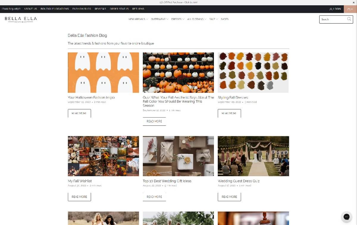
Everything about this blog screams “clean and minimalist”. Indeed, the minimalist style in graphic design has been on the top of the charts for the latest years. It looks neat and tidy, and is quite useful, especially when you want to highlight your products and content, without distracting the viewer with unnecessary design elements.
Regarding “Bella Ella Boutique” itself, this is a fashion store whose blog is targeted towards the mid-aged woman audience. You will see a lot of engaging content like quizes that prompts into action and keeps the customer engaged. When taking a quiz, the result will link you to one of the boutique’s products. You can see a lot of non-fashion-oriented posts, such as “What movie to watch tonight? Quiz” or “Do it yourself – valentine cards”. This is something most women like, so it helps attract organic traffic and popularize the brand.
Galvan London Journal – the one-article blog

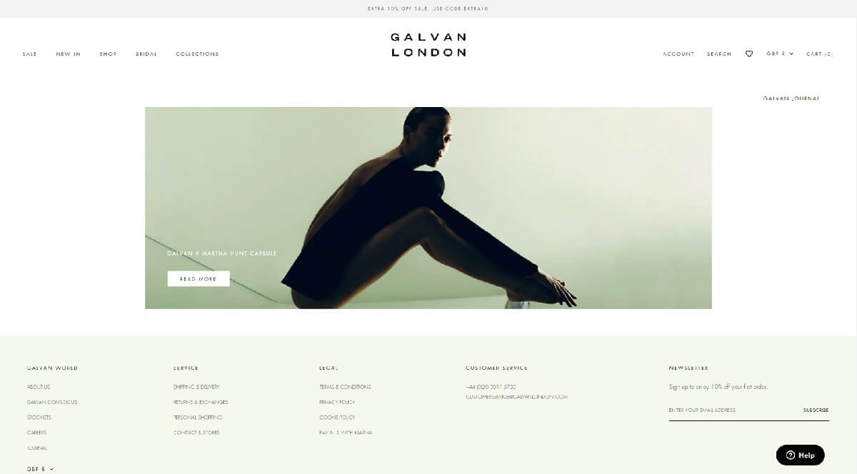
Galvan London is a luxury clothing brand. As such, the whole website and the blog have a clear and elegant design, so the main focus falls on their clothing line and their brand philosophy.
This blog is quite different from what you’d expect from a blog. You won’t see a lot of posts in there. Actually, you will see just one. Not the best in terms of SEO, but otherwise – genius really. These people put the accent on creating a high-quality article, such as an interview with Martha Hunt. The pictures and the text is something that keeps the user’s interest and makes them scroll more.
The topic they chose is also genius – the fact that we all have scars that we shouldn’t feel embarrassed about it. This builds the feeling of friendship, understanding, and trust.
KeyToFashion – the “homepage-blog” example

“Key to fashion” uses an interesting approach to engage their audience. The homepage of the site is actually a blog while you can navigate to the store by using the menu on top.
While browsing, it feels like the sales are not the general idea of the blog. This creates a good customer-brand relationship. We see a lot of useful tools such as links to e-books, Key to Fashion TV YouTube links, event information, and more. The implemented videos for sure drive a lot of traffic to the blog. The topics are pretty various, as well – lifestyle, styling advice, and more.
HealthyHumanLife – a material design Shopify blog example

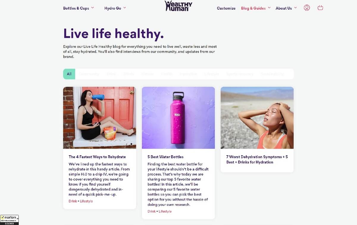
This vitamins and bottles store’s blog is ten out of ten. Most of the articles look exactly like help articles, mainly focused on giving good advice to visitors about their health or how to take care of nature. We love the excerpts, as well – they give you quite a good idea of what content to expect once you click through a card.
Speaking of cards, the first thing that makes an impression about this grid-style blog is how much it reminds of material design. The cards have depth effects like lightnings and shadows and rounded edges that are pretty close to what the material design is.
MyWifeQuitHerJob – an example of a search bar in the blog

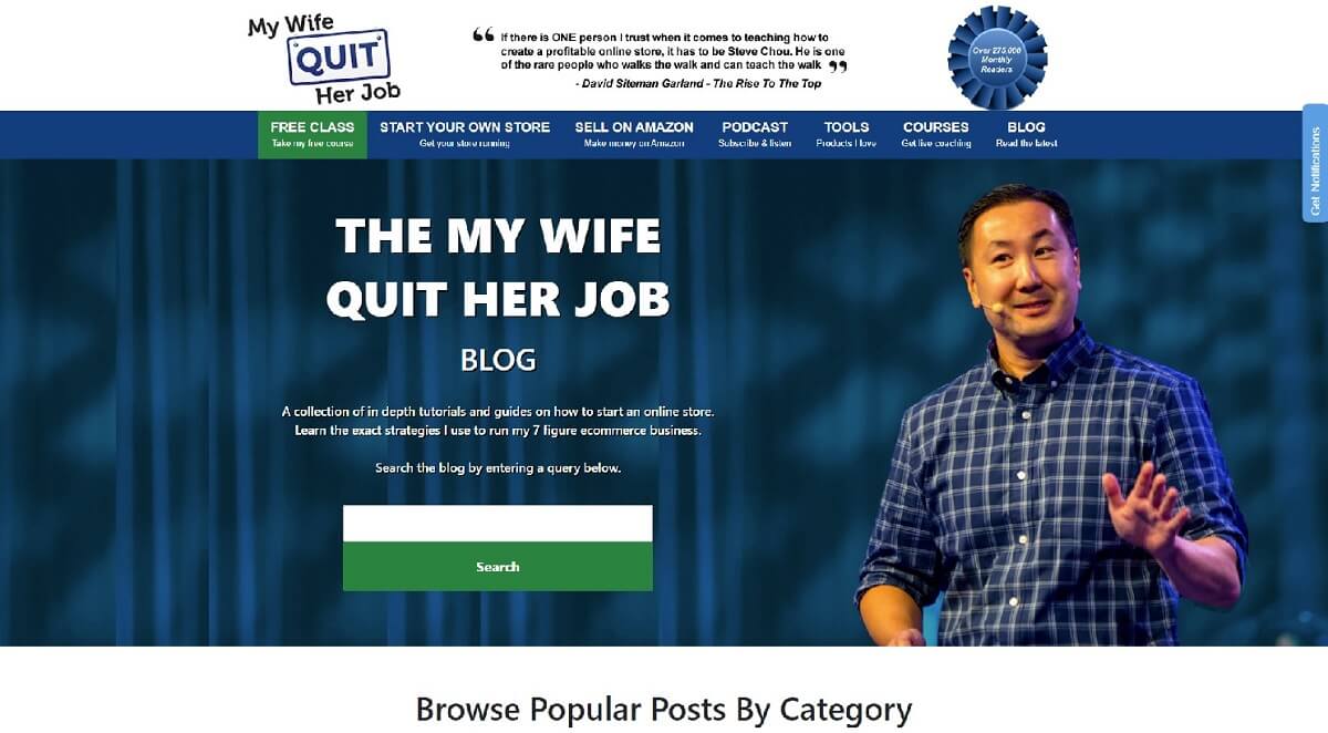
Here is a classical blog design with a lot of different blog posts, all connected with trading and sales. There is no way – while browsing this blog, you will be tempted to sign up for their online courses. But what is even more convenient and impressive is that you can use the search bar to find the exact topics you are interested in.
The site focuses on the content deeply – the article includes a lot of details. You will see uploaded Youtube videos, images, and different internal links, which is good for optimization. The headline and even the single paragraphs’ headlines are designed as questions. Under each publication, you will see information about the blog owner and probably the article’s author – Steve Chou. He is an influencer and that is one easy way to popularize himself and his coaching methods.
NuunLife – a Shopify blog example with tags navigation

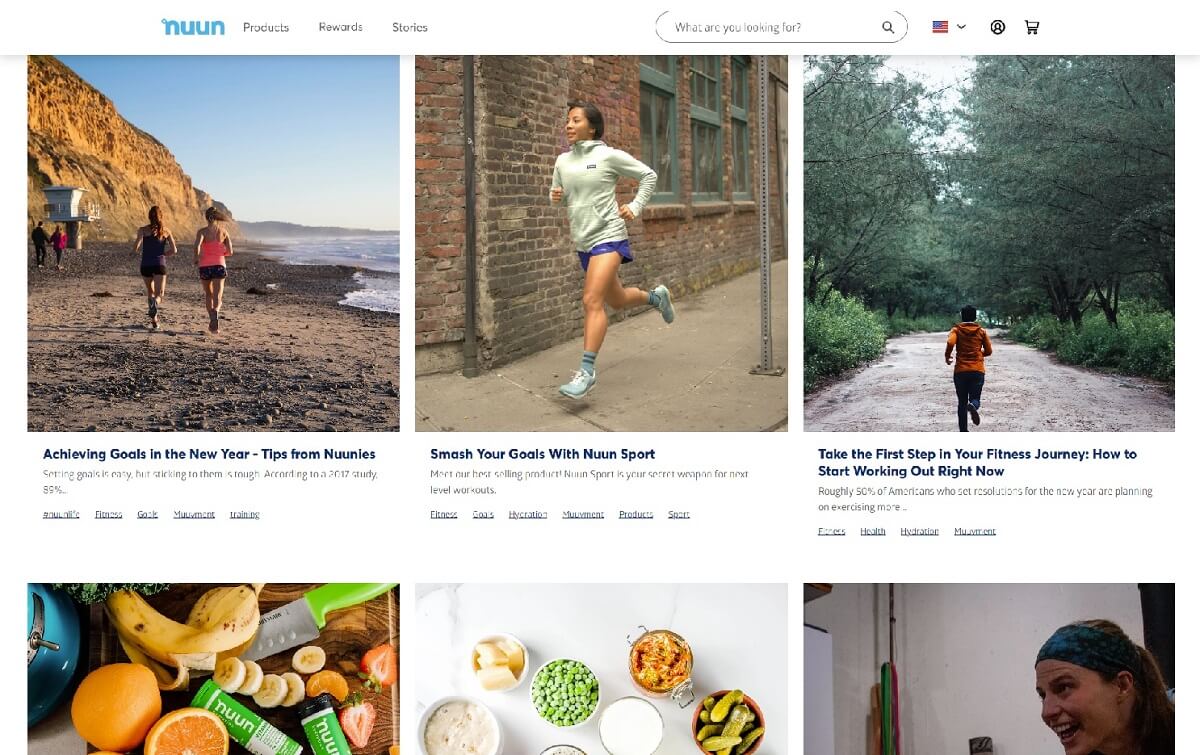
“Nuun Life”‘s blog is designed in a 3-column structure, familiar to the user. What makes it different from the rest is how they utilize tags. You will see navigation of tags, as well as tags under blog posts to search for similar content.
Most of the posts feel more like telling a story rather than selling products. You can find articles that are not connected to vitamins at all but to well-being in general. This creates a great impression on the visitor, as it feels like the blog is not solely all about sales but about caring for its clients. In the vitamin and health-related posts, you will see internal links at the end of each article, definitely positioned in a non-intruding way. It looks like the blog is working more on the psychological part – the business appearance and what people think about the brand.
InTheFrow – a left-sided slider with a right-sided grid combo

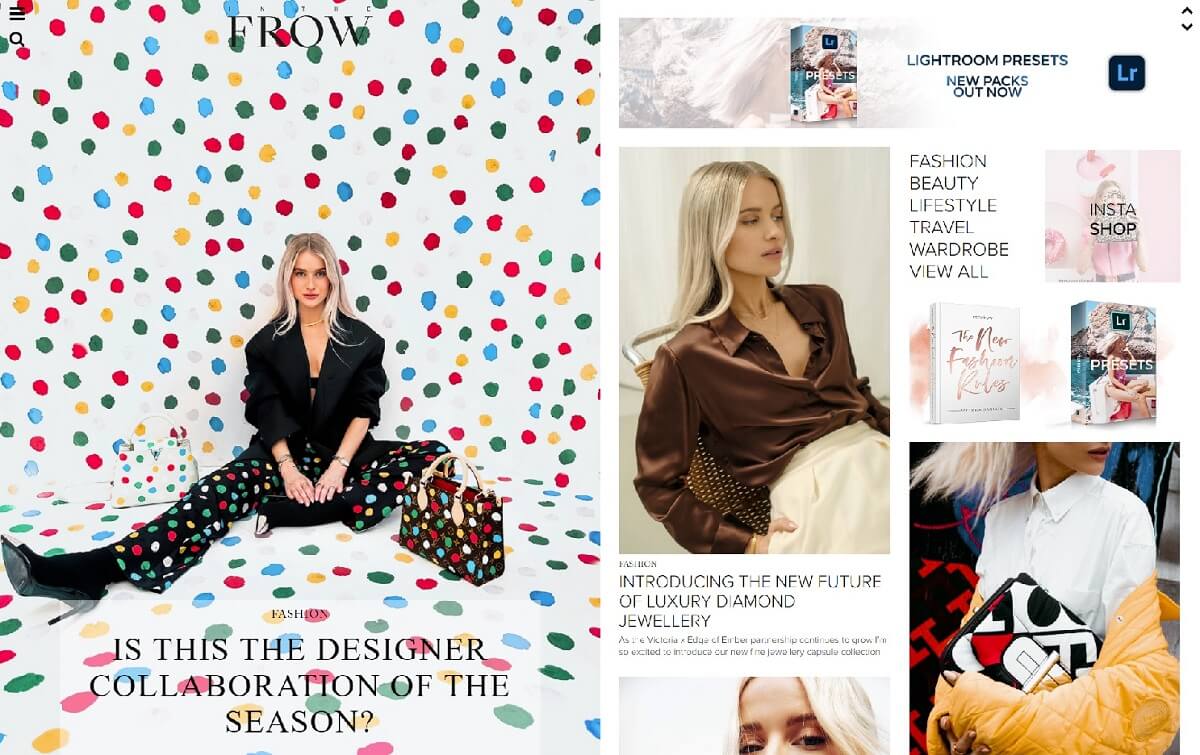
A beautiful and elegant blog structure which takes you away from first sight. Visually, the blog is divided into two columns with the left side being a slider that stays fixed even if you scroll. On the left you have a grid article structure – not aligned to make the visitor keep on scrolling.
The blog really looks like an exquisite magazine you can wait to unravel. You see a lot of different articles and a lot of animations that prompt you to “buy the look”. These links direct you to the clothes’ brand sites. One of the best things we notice is the interaction with the visitors – there is an open discussion below every article, where you can write your thoughts in a comment.
How to start and manage a Shopify blog?
Blogging can help you to develop your business in many different ways. It makes a room for your creativity – design images and web pages, write content to tell different stories, and rank yourself higher in Google search by using keywords or phrases. Blogging is very beneficial as it can help you to promote your product while developing a strong relationship with your customers and generating inbound traffic.
If you are thinking about starting a blog or improving your, here are a couple of videos worth watching:
Conclusion
Developing a Shopify blog will help you promote your products and gain organic traffic while building a strong relationship with the audience. We hope that this article was helpful whether you were looking for interesting blog structure designs or practical ideas that boost conversions.
In the meantime, why not take a look at the related articles to get some more inspiration or grab a couple of freebies?