Welcome to the world of barber logos – the symbols embodying the essence of the barber’s craft!
In the world of barbering style and precision are everything. That said, the emblem that represents a barber shop and its services also carries a great weight. In this article, we will enjoy the art of barber logos that are beautifully done and memorable. Let’s dive!
1. Unique Barber Logo Design Example
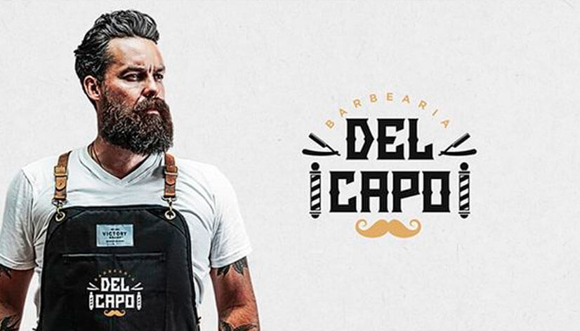
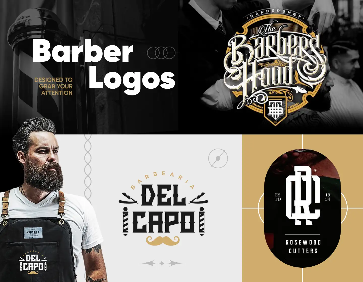
“Barbearia Del Capo” means “The barber shop of the boss” in Spanish. The gates-reminding logo design, along with the moustache nicely complements the name. Keeping the symmetry and incorporating the classic symbols of barber poles and razors, add even more value to the beauty of this design.
2. Vintage Barber Logo Design
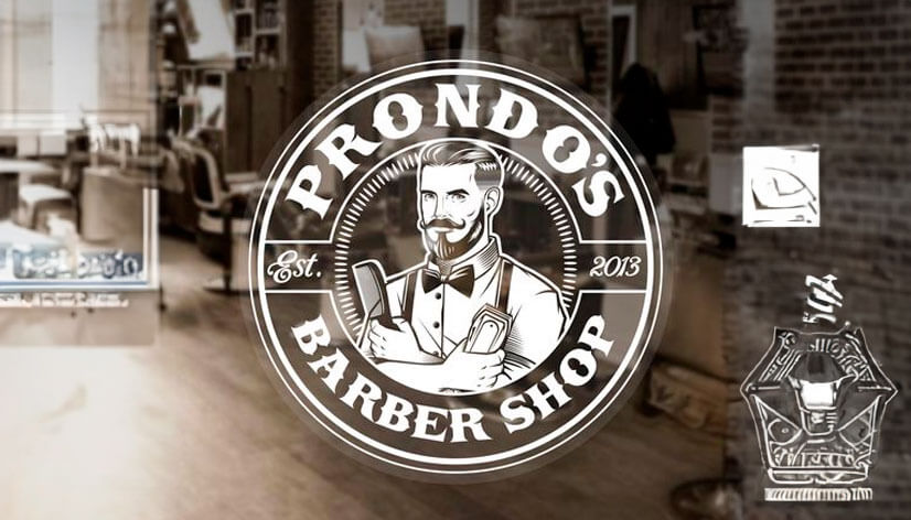
The circle shape when creating a logo is always a good idea. It is timeless and well-established in the logo design industry, thus instilling trust in clients. The fonts and the barber image give off a masculine vibe, and as a bonus, the transparent background helps the well-chosen elements to shine.
3. Minimal Barber Logo Example
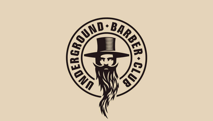
The design of this logo deeply resonates with the barber club’s name. The stylized image of the man with deep shadows, the long, overflowing beard, and even the hat – they all speak “underground”. It is a really good example of how to focus on one central element and make the best of it.
4. Stylish Barber Logo Idea
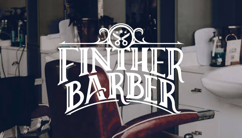
This barber logo is an example where the lettering is used as the main element of the design. The customized serif typeface, along with the scissors accent above the “T”, successfully recreates an old-timey look helping clients believe that they are about to receive the care they deserve.
5. Colorful Barber Mascot Logo
Choosing a colorful barber logo design like this will certainly make your business stand out. Still, the design sticks to the colors most commonly connected with barber shops – white, blue, and red. The logo illustrates everything there is to know about the place, leaving no doubts about the services or their quality.
6. Classy Barber Logo Design
Carrying a more sophisticated look this logo design really is classy. While the customized lettering is also the focal point of the design here, the ornaments and the scissors at the top are the key elements making the design elegant and inviting.
7. Barber Monogram Logo Example
Implementing the barber pole as an “I” for the IC monogram barber logo and accentuating it with the red color for more clarity is a well-executed idea, that adds to the classic vibe of the design. A nice touch is also the way the razor on the right has already shaved the graphic element to transform it into a “C”.
8. Great Barber Logotype Example
In this barber logo example, the accent falls again on the name of the business. The custom font adds to the brand’s personality, while the featured text and moustache ensure clarity about the purpose of the brand. As a result, this design keeps it classy by using just a few elements.
9. Creative Barber Logo Idea
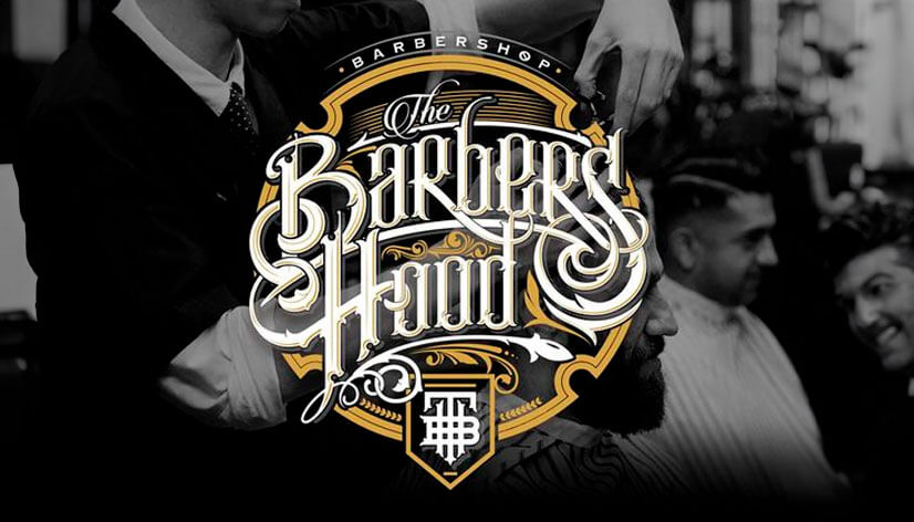
The Barbers Hood logo bets on another way of expressing the brand’s personality. Designed as an emblem of the barbershop, this design will look great on everything it is put on. The intertwined lettering and the choice of colors give a sense of vintage luxury and exclusivity, while the included monogram makes it seem like it’s years old.
10. Modern Barber Logo Design
This example comes to show that modernity has its place in barber logo design, too. Featuring a stylized monogram and the barbershop’s name, the logo stays away from detailed ornaments. The added date of establishment is the perfect way to gain the client’s trust.
11. Clean Barber Branding & Logo
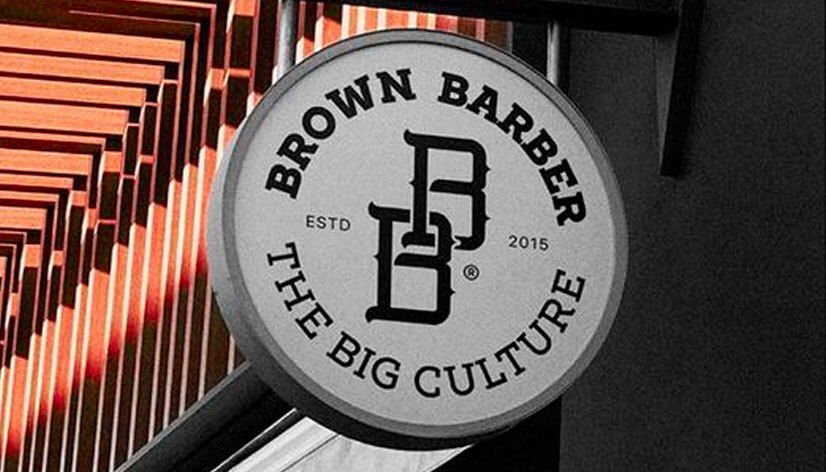
The text used to frame the monogram of the Brown Barber in the shape of a circle helps the perception of the logo as a trademark sign, thus adding credibility to the brand’s image. Also, utilizing only text and a monogram is a sure way to keep things classy.
12. Barber Shop Royal Style Branding
This logo design is going for a royal look with all the details included in it. The text placed in the stylized papyruses, the ornaments, and the royal lily all work well together to achieve that. Choosing a simplified serif font when having many decorative elements is a good way to ensure the design doesn’t seem overcrowded.
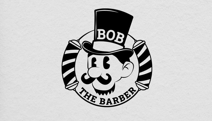
13. Vintage Character Barber Logo
This design screams vintage! The stylized, animation-like illustration of Bob the Barber, looks like the old-time cartoons and even reminds one of the Monopoly game’s mascot. The barber poles and the well-shaped moustache and beard of the character, though, ensure no one mistakes the brand’s essence.
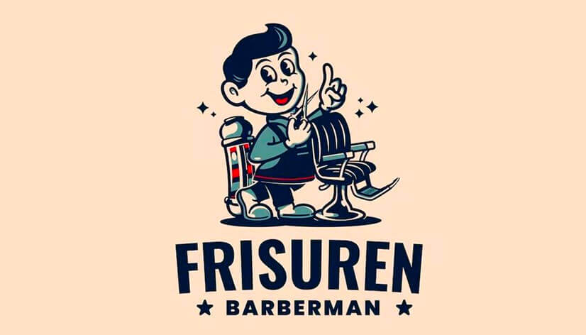
14. Cartoon Barber Character Logo Example
The fact that barbershops have existed for a very long time inspires a lot of opportunities for retro design. While this design focuses on a cartoon-like character, it also features key elements such as the barber chair, scissors, and pole. This design can be a great idea for family-oriented barbershops due to its funnier and more approachable appearance.
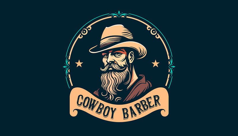
15. Cool Cowboy Barber
The Cowboy Barber looks like he’ll pull out his gun if you don’t use their services. Joke aside, this design nicely implements the cowboy idea, and the well-shaped facial hair of the man illustrated promises quality services. This cowboy barber image, along with the non-intrusive ornaments shaping a circle around him, inspires trust and seriousness.
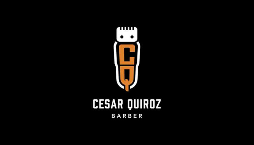
16. Modern Simple Barber Logo Design
This modern barber logo example is well executed in so many ways. The barber’s initials implemented in the clipper seem just in the right place. The simplified style of the design is in so much contrast with the ornamental and illustrative usual logos for barbershops, and that’s exactly why it presents the idea of a modern barber so well.
17. Abstract Barber Logo Design
In this design concept, the attention is attracted by the simplicity of it. The stylized razor illustration, along with the uncomplicated, sans-serif text, work together to show that minimalized designs have their place among the barber visual branding, too.
Tips for Creating Memorable Barber Logos:
- Blend classic barber motifs with modern design elements to create a concept that stands out.
- Every barber shop has its own vibe. Let the logo mirror its personality to attract the right clientele.
- Be careful with details. A cluttered logo can confuse rather than captivate.
- Play around with the typography. Whether it’s bold and masculine or sleek and sophisticated, the font choice can make a significant difference.
- Use iconic barber symbols, be it barber poles, scissors, or razors – these timeless symbols instantly remind you of the barbering profession. Incorporate them creatively into your logo for instant recognition.
Final Words
Crafting a standout barber logo requires a balance of tradition and innovation. By following our tips, you can ensure your logo sets your shop apart in the crowded market. Embrace the fun of creating barber logos, and watch as your brand becomes a synonym for style.
If you enjoyed this article and found it helpful, you may also like our other logo collections:



![20 Modern Logos For Memorable Branding [Inspiring & Creative Ideas]](https://reallygooddesigns.com/wp-content/uploads/2024/08/modern-logos-193x150.webp)

