Candy logos are more than just colorful designs; they’re the face of sweet delights and the brands behind them. Even more, they tell the company’s story or work well on the client’s mind and tempt him to taste their sweets. That’s why crafting a memorable candy logo is crucial for brand recognition and maintaining interest in it. By following the best practices in design, brands can create logos that not only capture attention but also establish a strong identity in the competitive candy market.
Let’s explore our collection of candy logos and gather inspiration for your next logo creation!
1. Candyality Store
Based in Chicago, Illinois, Candyality is a candy store offering all types of candies and sweet treats. In their logo, they have chosen to present their business name with a design inspired by candy canes. As a bonus, using a lollipop instead of the letter “I” makes things even sweeter.
2. King of Candy
King of Candy is a Greek family business offering handmade candies. The stylized logo is obviously a reference to the brand’s name, but the little details are what makes it special. Plus, the king has a wrapped bowtie worth eating.
3. River Street Sweets
River Street Sweets is an American company that started as a family candy shop and turned into a multimillion-dollar franchise. Тheir logo inspires confidence and manages to convey the company’s love for classic desserts as well as its long-standing presence on the market.
4. Leon’s Candy Handcrafted Sweets
Leon’s Candy is a Nashville-based candy company that continues a decades-old family sweets-making tradition. They offer an array of handcrafted sweets still sticking to their old recipes. Their logo seems to encapture all this history as it looks vintage, mainly thanks to the use of classic fonts.
5. Milk Bar Store
Milk Bar is a sweet shop started in New York that takes familiar recipes and turns them into something new. Their obsession to make people happy can be seen even in their logo design with the pink color they chose and the font used.
6. Dylan’s Candy Bar
Dylan’s Candy Bar is the world’s largest confectionery emporium merging fashion, art, and pop culture with candy. Choosing the circle form of a lollipop and using it to illustrate an ice cream, a gift, and a cocktail is a genius way to present their ideology in their logo.
7. Sugarfina
Sugarfina – what a beautiful name for a luxury candy boutique for grown-ups, offering unique desserts! Having in mind this idea they have chosen simplicity for their logo smartly deciding to use only the brand’s name, thus strengthening the sense of exclusivity.
8. Lolli & Pops Candy Store
Lolli & Pops is a US nationwide candy store where sweets are not only sold, but also given the power to say Thank you, I love you, and even express the impossible. Limiting the logo elements to the name of the brand and the lollipop containing the “&” symbol is an example to look after, for it is a classical one.
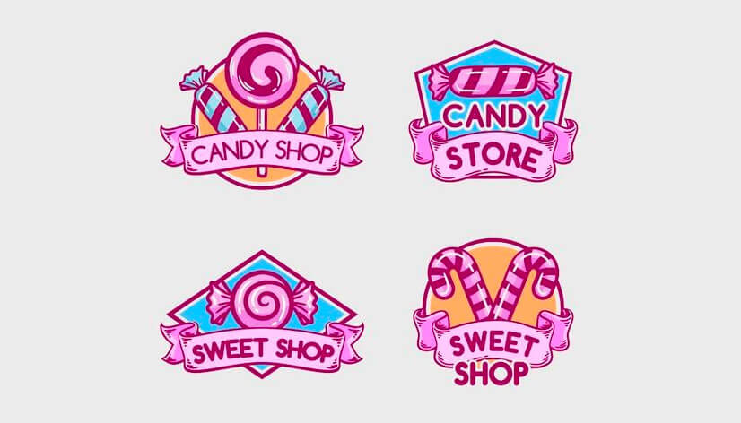
9. Pink Candy Shop Logo
These are perfect examples of candy store logos, for they use the most common elements connected with the idea of sweets. The candy cane stripes, implemented even in the bonbons, and the lollipop swirl, along with the sweetness that the prevailing pink color represents, all ensure that people will want to taste the sweets offered.
10. Muth’s Candies Store
Muth’s Candies is a family business started more than a century ago, that survived wars, the Great Depression, and other crises. Their handwritten font logo expresses exactly that – a character that stands up to the challenges of time, always ready to please people with something sweet.
11. Laura’s Candies Store
The classic vintage logo for Laura’s Candies says everything important about the company, successfully inspiring reliability. Established in 1913, it is the oldest candy shop in New Orleans, and this surely is something to be proud of and consider including in their brand’s face – their logo.
12. Shane Confectionery Candy Store
Being America’s oldest candy store has its own advantages. Like, for example, the freedom to make your logo out of your brand’s name and nothing else. Plus, seeing that the sweets shop was established in the far 1863, it is clear why they decided to use this old English font style, which truly suits them well.
13. La Maison Du Fruit Confit Sweets
La Maison Du Fruit Confit, or The House of Candied Fruit in English, is a sweets shop, located in Apt, France. As the brand’s name states they offer candied fruits and confectionery, cooked mainly with local ingredients. That said, their logo perfectly embodies these two main characteristics. Their French heritage is honored by including the nation’s flag, and the use of such a classy font hints that these treats are something really special.
14. Papa Bubble Caramelos Artesanales
Papabubble is a candy shop born 20 years ago in Barcelona, Spain. To this day they have become the world’s No. 1 in their category and have grown their network all over the world. Their logo choice is logical and strategic as they open more stores. The text logo with only a lollipop for an accent can be understood pretty much everywhere around the globe.
15. Minimal Bean to Bar Chocolate
Knowing that this is a Japanese chocolate specialty store, and knowing their love for minimalism, the brand’s name comes as no surprise. Their slogan – “Bean to Bar Chocolate”, describes their innovative approach to chocolate-making. And all this is beautifully represented in their logo with the help of the stylized circle and square.
16. Totti Candy Factory
Located in Harajuku, Tokyo, the Totti candy factory pleases people with their special cotton candy and other sweets. Round shapes are especially popular when making logos for confectionery businesses because they add gentleness to the design. Here, they used rounded frames to emphasize the initial of the brand name, even slightly resembling the shape of the cotton boll of the plant.
17. Japan Candy Store
Japan Candy Store is the world’s No. 1 Japanese online store. They sell tasty sweet snacks and treats, and fun Japanese candy flavors. And fun is what their logo is also radiating. The choice of this playful font is a good one for a candy store logo design. It is playful and attractive to young customers, plus, the milky purple color brings up the association of sweetness.
18. Plaza Japan Candies
Plaza Japan Candies is an online Japanese candy store, offering one of the most extensive selections of authentic Japanese snacks online. Choosing different colors for the letters gives the logo a playful vibe. In addition, the inclusion of the other elements pays tribute to their beautiful country, as they depict the famous cherry blossoms and Mount Fuji.
19. Maison Boissier Paris
Maison Boissier is a confectionery store, that was founded in Paris almost two centuries ago. The logo of the confectionery consists simply of the name of its founder – Boissier, and Paris, the city they conquered with their sweets, which was a common practice in the 19th century. The custom font is typical for that time and it beautifully captures the great history behind this brand.
20. Chomp Sweets Brand
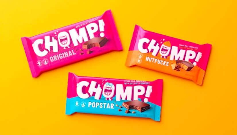
Chomp is a chocolate brand, with an Oregon-based factory, offering plant-based milk chocolates and concentrating on sustainability. Promising love at first bite, they also have incorporated this idea in their logo. The “O” has obviously already chomped on the letter “H” next to it and is pretty happy about it. The “O” also slightly resembles a raw cocoa bean – another fine touch to the design!
21. Cotton Candy Store Logo
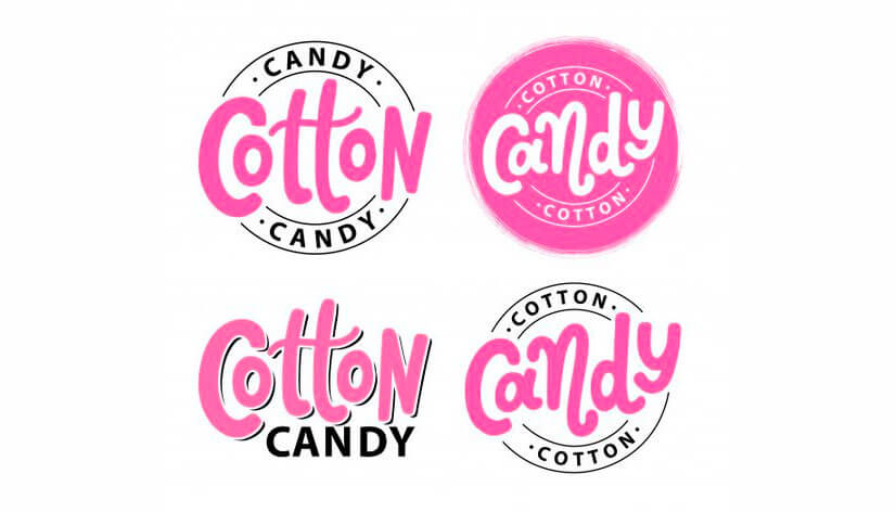
This example is a Cotton Candy store logo set and the design here is focused again mainly on the lettering. Surely, using this playful font grabs the attention of people who have a sweet tooth. Also, the pink color is the one most often associated with cotton candy, making it a perfect choice. Adding the stamp-like, circle shape is a touch that nicely finishes the design.
Tips for creating beautiful candy logos:
1. Make it fun and appealing! Select vibrant and eye-catching colors that evoke the sweetness and excitement associated with candy.
2. When doing your candy logo design choose playful and legible fonts that reflect the brand’s personality.
3. If you’re not going for a fun, rounded sans-serif, focus on choosing a font representing tradition and personal style.
4. Think of incorporating candy-inspired elements such as swirls, wrappers, or lollipops into the logo design. They are easily recognizable and communicate the product offered instantly.
5. Keep the design straightforward to ensure easy recognition but aim for a distinctive logo that sets the brand apart from competitors.
Final Words
Whether it’s through vibrant colors, playful typography, or well-chosen iconography, crafting unforgettable candy logos is essential for brand recognition. Through them, brands aim to attract customers and make them remember their products. That’s exactly why it’s important to take the time and attention you need when coming up with your new confectionery logo.
So, dive into the world of sweets and let your candy logo sweeten the world!


