Black logos can be so classy! When it comes to branding, the color of a logo plays a crucial role in shaping the identity and perception of a company. So, whether it’s one of your favorites or not, аmong the spectrum of colors, black stands out for its elegance, sophistication, and versatility.
In this article, we’ll have a look at 21 inspiring black logos of brands across various industries, that serve as examples of how to craft a timeless look!
1. Nike
The Nike swoosh is a simple yet powerful design that embodies the spirit of athleticism and perseverance. It’s fluid and dynamic, suggesting movement and speed, which perfectly aligns with the brand’s identity in sports apparel.
2. Apple
Apple’s logo is minimalist and sleek, representing the brand’s focus on clean, innovative design. Most importantly, the bitten apple is iconic and easily recognizable, symbolizing knowledge, creativity, and discovery.
3. Medium
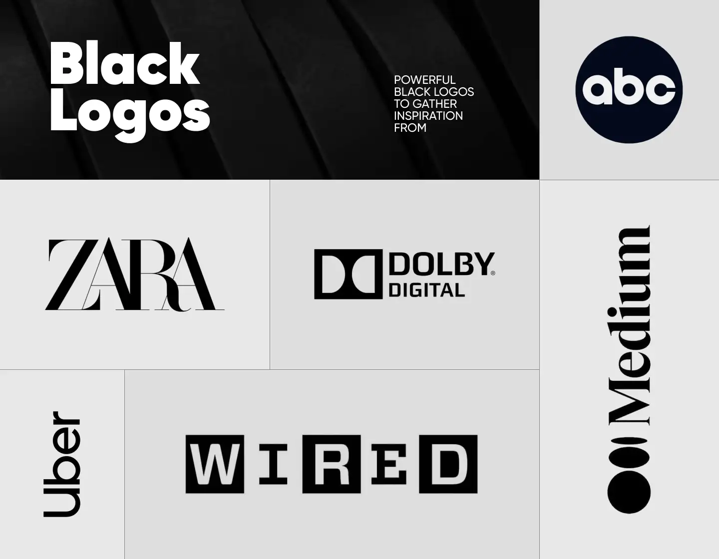
Medium’s logo is straightforward and modern, using clean, serif typography to suggest openness and clarity. In short, it represents the platform’s emphasis on sharing thoughtful and substantive content.
4. The New York Times
Known for its classic serif typography, The New York Times logo conveys credibility and authority. It’s straightforward and strong, reflecting the newspaper’s commitment to serious, impactful journalism.
5. Uber

Uber’s logo is modern and straightforward, featuring a sans-serif typeface, designed especially for the brand, that suggests accessibility and efficiency. In addition, the black-and-white color scheme complements the logo’s simplicity and confidence.
6. Ralph Lauren
The Ralph Lauren logo features a polo player on horseback, capturing the essence of luxury, class, and the sporty elegance that the brand is known for. Also, it pays tribute to its history, because producing clothing for polo sports was the beginning of the brand. Nowadays, its detailed imagery serves as a status symbol.
7. Under Armour
Under Armour’s logo consists of two mirrored overlapping U’s, which results in forming the shape of an ‘A’ below. It’s bold and aggressive, echoing the brand’s focus on high-performance sportswear.
8. CBS
The CBS eye logo is an enduring image that captures the brand’s mission to keep a watchful eye over the world of entertainment and news. Its design is simple, yet effectively communicates a sense of trust and reliability.
9. HBO
HBO’s logo uses bold, clear, customized typography to convey straightforwardness and confidence in its services. Consequently, it appeals directly to mature audiences looking for quality entertainment at home.
10. Adidas
The Adidas logo features three stripes that form a mountain, symbolizing challenge, perseverance, and achievement. It’s simple yet memorable, encapsulating the brand’s dedication to sports performance.
11. Dolby
Dolby’s mirrored double D logo is one of the most recognized black logos in the world. It is abstract and modern, signifying the brand’s technological focus and innovation in delivering superior sound quality. Moreover, it is both intriguing and sleek.
12. Gucci
Gucci’s logo uses two mirrored interlocking Gs that represent the founder’s initials – Guccio Gucci. It looks luxurious and timeless, thus reflecting the sophistication and high fashion the brand is known for.
13. Zara
Zara’s logo features a custom serif typeface with high contrast and interlocking letters. The design has a stylish appeal while maintaining a clean and modern look, resonating with fashion-loving clients.
14. Montblanc
The modern and bold Montblanc logo features the brand’s name in a timeless sans-serif typeface. The “A” doesn’t have a horizontal line, thus resembling a stylized mountain peak, which seems natural knowing that the brand is named after the Alps’ highest mountain. The decisiveness of the font hints at the highest standards of quality, making it elegant and prestigious, aligning with the brand’s image.
15. ABC
The American Broadcasting Company’s logo features a black circle with bold, white, lowercase lettering. As a result, it is straightforward and effective, representing clarity and confidence in broadcasting.
16. WWF
The monochrome panda has been a symbol for The World Wildlife Fund from its very start. Thus the logo is not only endearing but also symbolizes the organization’s commitment to wildlife conservation. And, the use of only black and white in the logo is in synchrony with the panda’s natural colors.
17. BBC
The world’s oldest and largest broadcaster’s logo consists of three square blocks with bold, white lettering inside them. As a result, its simplicity makes it highly visible and recognizable. And it certainly symbolizes the brand’s stability and straightforward approach to delivering news and entertainment.
18. Sony
Sony’s logo uses a simple black serif typeface which makes it look clean and uncluttered, and it also never goes out of fashion. It also emphasizes functionality and dependability, reflective of the brand’s innovation in electronics.
19. Playboy
Playboy’s bunny logo is bold and playful, but still sophisticated. The logo features the silhouette of a rabbit with a bow tie to create a logo that is both iconic and suggestive, perfectly capturing the brand’s essence.
20. Wired
Wired’s logo uses a custom, hal-serif, half-sans-serif typeface that suggests a connection with technology and the digital world. It looks modern and edgy, aligning as a result with the publication’s focus on future trends in technology.
21. Squarespace
Squarespace’s logo is so clean and minimalistic! Above all, it reflects the simplicity of the brand’s platform for creating sleek, user-friendly websites. In addition, the sans-serif uppercase typeface and the brand emblem communicate accessibility and elegance, encouraging creativity.
Tips for creating memorable black logos:
- Emphasize strong contrast between the black elements of the logo and the background or other elements, so you can ensure readability and a bigger visual impact.
- Simplify the design, because as you see – black logos often rely on simplicity to convey their message effectively. And certainly, avoid details that may get lost or overshadowed in black.
- Play with the negative space to create depth in your black logo design.
- Ensure your black logo retains its clarity and legibility when scaled down or reproduced in various sizes and formats.
- Utilize the black color in your logo to reflect the brand’s personality, and let it express it, whether conveying luxury, authority, or modernity.
Final Words
To sum up, crafting a black logo demands attention to detail, thoughtful design choices, and an understanding of the brand’s essence. In other words, by embracing the black color, brands can create logos that stand the test of time. Whether evoking style, sophistication, or strength, black logos will forever be a personification of reliability and an ongoing presence in today’s competitive market landscape.
Not sure if black logos are what you are looking for? Then check out our other collections of colorful logos: