The pocket guide to how to build a brand and visual identity step-by-step, with real-world examples, visual inspiration, and top book picks.
If you’re already knee-deep in branding work, you know that brand identity runs deeper than just a logo or a punchy color palette. But if you want to get a more detailed view of how to actually build a strong brand and visual identity, stay with me and this pocket guide. I’m going to cut through the generic talk and give you a clear, step-by-step structure for building a cohesive brand identity that works both visually and strategically.
For the sake of the guide, you’re building a small-batch coffee roaster brand for a client throughout the guide, just to see all the steps in actual practice.
In the end, you will also see a collection of brand and visual identity concepts for inspiration and 5 recommendations for popular books on the topic, where each brings different insights.
Without further ado, I’ll get straight to the guide with the first step.
Step 1. Define what the brand stands for
Everything starts here. Before you start sketching anything for your client’s brand, map out the foundation:
What does this brand believe in?
What promises does it make(and keep)?
How should it make people feel?
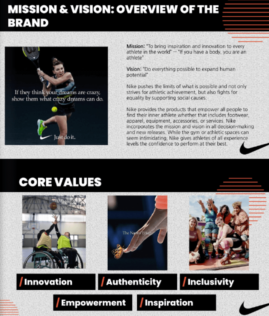
Nike doesn’t need to scream Just Do It anymore. The tone, the visuals, and the messaging are all built on that emotional association of confidence, movement, and drive.

Practical example:
Basically, the brand you’re working on should aim for that same level of clarity. Let’s say you’re designing a brand for a small-batch coffee roaster. Your client tells you they source beans directly from farmers and roast in tiny batches. Of course, they most likely also care a lot about sustainability. Cool, but that’s not a brand yet! That’s just what they do.
Now, ask the bigger questions: What does this coffee brand believe in? Maybe it stands for slowing down and appreciating the little things. What promise does it make? That every cup supports fair farming and tastes like someone actually gave a dang. How should it make people feel? Like they’re part of a thoughtful, modern ritual that is calm, connected, and maybe even a bit spoiled.
This gives you enough of an emotional foundation to build on. Suddenly, your client’s brand stands for more than just selling beans and brews. It has values now. And once you lock those in, every choice (logo, packaging, etc) gets way easier to design.
Step 2: Identify your people
Of course, a brand that appeals to everyone is doomed to get lost amongst stronger ones with a specific target. Drill down on:
Who they are(demographics help, but psychographics are better)
What they need and value
Where they hang out (online and off)
How they talk
If your brand speaks Gen Z but you’re using stiff corporate language, the disconnect will show. A skateboard brand will sound and look very different from a SaaS analytics tool, etc.

Practical example:
Now, I’ll continue with the small-batch coffee roaster example. You’ve nailed what the brand stands for in the previous step, so it would be easier to figure out who it’s actually for, because it’s not everyone who drinks coffee.
Maybe your client’s ideal customer is a 30-something creative who works remotely, spends too much time on Instagram, and shops at farmers’ markets. They are the type of people who care about where their food and drinks come from and they’ll gladly pay extra if it means ethical sourcing and a great experience. They are also the type of people who read the label on their oat milk. That’s your person.
So now, think like that person. Who are you, what do you need, and where do you hang out? You’re not hanging out on LinkedIn, but you can see yourself scrolling Pinterest for cozy kitchen inspo, browsing indie brands on TikTok, and maybe reading thoughtful newsletters. You’re not impressed by unimaginative cliche buzzwords of promise, such as “premium blend” and “robust flavor”, because you want a story and a vibe. Like something you’ve discovered that’s worth slowing down for.
The way you write, design, and market this brand should speak the language of this person. And what could that be? Perhaps relaxed, thoughtful, slightly playful with a touch of hipster. Maybe. But definitely not corporate.
There are ways for you to research who this person is:
🔍 Start with Instagram and TikTok.
Look at what people are saying in the comment sections of similar brands. You’ll spot patterns quickly such as what they’re obsessed with, what annoys them, or questions that come up again and again.
🔍 Next, head to Reddit.
Subreddits like r/Coffee and r/Barista do have real talk from passionate coffee lovers, but you’ll need to find them amongst the flood of sponsored and AI posts. You’ll still be able to find unfiltered, genuine threads and get a sense of what matters to coffee lovers, what gear they use, what they want from a coffee brand, and even the little daily frustrations you could help solve. Here you’ll definitely find the type of people who specifically care about their beans being sourced directly from farmers.
🔍 Then jump into Google Trends.
Type in things like “pour over coffee” or “coffee subscription” and see what’s getting attention. The tool shows how interest changes over time and where it’s coming from. Great for spotting hot topics or niche terms you didn’t even think of.
🔍 SparkToro takes it a step further.
If you use tools like SparkToro, type something like “third wave coffee” and it you will see what your audience reads, watches, listens to, and talks about online, basically what shapes their worldview and habits.
🔍 And finally, if your client already has an audience
Even a tiny one, use it. Run a quick poll on Instagram Stories, send out a one-question Typeform, or include a short survey in the next newsletter. Ask them what they care about, how they take their coffee, where they like to hang out, and offer a little perk if you can.
Step 3: Protect the work (trademarks & legal stuff)
Steps 1 and 2 will give you enough to work with to think of a name, draw some rough visuals, and know what the messaging direction will be. Now, before you start designing anything specific, pause and look up any existing trademarks to make sure you’re not stepping on anyone’s toes. It’s way easier to tweak early than go through a full legal battle or a rebrand six months in.
Also, especially when you’re building this brand for someone else, give them a heads-up about trademark registration. No one wants a cease-and-desist letter out of nowhere.
Step 4: Design the visual identity
This is where most designers start, but the visuals should grow out of the strategy. Here’s the breakdown:
🎨 Logo
Whatever logo you design, think about its flexibility, how it scales, how it works in one color, and how it will look on a business card and a billboard.
Take Airbnb, for example, whose logo Belo feels abstract at first glance, however, it’s scalable, and very meaningful once you understand the story behind it. What does this mean about your coffee brand project?
🎨 Color Palette
Stick with 2–4 core colors max, but aim for contrast and accessibility. Spotify’s green works just as well on black, white, or photo backgrounds and it’s instantly recognizable.
🎨 Typography
Pair two typefaces at most, something clean for body copy and something distinctive (but legible) for headers. I can think of Mailchimp as an example and its rounded sans-serif fonts that support its playful monkey mailman mascot.
🎨 Imagery
Create clear rules for photography, illustration, iconography, or whatever visual format fits. Are your photos candid and natural or polished and posed? Are illustrations flat, isometric, or 3D?
Step 5: Define the brand voice
Tone of voice gets overlooked, but it’s just as much a part of identity as color or type. Is your brand friendly? Dry and technical? Confident and punchy?
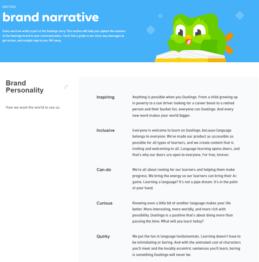
Duolingo, despite its current social media branding crisis, doesn’t just look bold, but it sounds bold. Its push notifications feel like a slightly overbearing friend who wants you to learn Spanish, often meme’d as threats from a mob boss. They have true consistency across copy and visuals and managed to create an absolutely unhinged personality do to that.

So, when you create a short brand voice, think about:
3–4 adjectives that describe the tone
Do’s and Don’ts for language
Example sentences that feel on-brand
Practical example:
I’ll use this exact template for Oak & Ember:
The tone of voice for such a brand shouldn’t be loud but confident in a calm, grounded way, like the friend who shows up early with pastries and always knows where to find the best croissant in town. Oak & Ember doesn’t try to impress the coffee snobs, but it is serious about the craft.
3–4 Adjectives:
Warm. Honest. Unpretentious. Curious.
Do’s and Don’ts:
Do speak like a human with short, clear sentences. If you wouldn’t say it out loud, it probably doesn’t belong on the bag.
Do explain the coffee process in a way that feels interesting, not condescending.
Don’t use buzzwords. If you’re rolling your eyes if you read about another “meticulously hand-foraged single-origin varietal with soulful undertones”, the targeted coffee lovers will also do that.
Don’t sound like a textbook, but explain it like you’re chatting over a brew.
Example sentences:
We roast in small batches, so every cup tastes fresh and exactly how it should.
This one’s bright and citrusy, perfect for slow mornings and long playlists.
This voice is casual, thoughtful, confident (but not pushy), and talks like someone you’d want to grab a cup with. It can easily create a steady rhythm across the site, packaging, socials, and videos.
Step 6: (Optional) Add a tagline
If your brand’s messaging has a core idea that can be distilled into a punchy phrase, try a tagline.
“Think Different” and “Because You’re Worth It” still hit hard and you didn’t even need me to specify which brands these belong to.
Practical example:
What type of tagline could you think of for your client’s Oak & Ember? A few directions might feel right, depending on how bold or understated you want to go.
“Quietly Obsessed with Coffee” can show there’s much to the care and craft behind the scenes. It doesn’t scream or sell as it simply reflects the truth in a calm and confident tone.
You can surely go more casual with “Nothing Fancy. Just Great Coffee”. This works well if the brand has a slightly dry, matter-of-fact voice and when you’re speaking to people who want authenticity over aesthetics.
If you want some more warmth, something like “Built for Mornings Worth Remembering” can bring some storytelling as it immediately paints a picture of someone sitting on their porch, hands around a mug, sun barely up, comfortably enjoying their morning ritual.
Although creating a tagline isn’t mandatory, it’s very helpful for a brand as it tells people what its values are and makes them feel part of it. But don’t force it. If nothing clicks, leave it.
Step 7: Build consistency
I already mentioned consistency in a few of the previous steps, but this is where you create the brand guide and fix any inconsistencies you may have with the visuals, tone, strategy, etc.
You can make a checklist for your brand guide to make sure everything you created is consistent:
What are the different logo versions, where do they belong and how should they be used?
Which fonts make the cut, and what sizes are okay?
Do I have the right hex codes? (These are the official brand colors.)
What style of photos or illustrations actually fits the vibe?
And what kind of messaging fits and what doesn’t?
This will also help everyone involved (designers, marketers, writers, developers) keep the brand consistent.
Practical example:
For Oak & Ember, for example, this is how a hypothetical brand guide would look like that is also clear and practical for anyone working on the brand.
Oak & Ember Brand Guide
“For Mornings Worth Remembering”
Logo Usage
- Primary logo. Full lockup with flame icon and Oak & Ember name. Use this on packaging, website headers, and storefront signage.
- Secondary logo. Flame icon only. It works as a favicon, social media profile image, and merch tags.
- Spacing. Always keep at least half the icon’s width of breathing space around the logo.
- Don’ts. No shadow effects, no stretching, and never swap in other fonts.
Typography
- Headers. Recoleta Bold. Use for product names, section titles, and callouts.
- Body text. Inter Regular. Use for body text across print and digital.
- Sizes. H1: 36px; H2: 28px; Body: 16px
- Text rules. Sentence case across the board. Never use ALL CAPS unless for tiny product labels or stamps.
Color Palette
- Primary. Ember Orange #D35400; Oak Brown #5D3A1A
- Accent. Ash Gray #CCCCCC; Smoke White #F9F9F6
- Background default. Smoke White
- Contrast. Always make sure buttons and text meet accessibility standards (AA minimum). Ember on Oak works for accents, not for body copy.
Imagery
- Photography style. Natural light, cozy shadows. Candid shots of people brewing or sipping. No over-polished, staged product shots.
- Illustrations. Line-drawn, hand-textured icons for brew methods, roast profiles, and coffee origins. Slightly irregular lines preferred.
- Don’ts. No glossy mockups. No sterile white backgrounds unless showing packaging.
Tone of Voice
- Voice keywords. Warm, thoughtful, grounded, not too serious.
- Do say. “Roasted in small batches”, “Mornings deserve something better”, “Brew it slow. Enjoy it slower”.
- Don’t say. “Premium”, “Innovative solutions for coffee lovers”, “Unlock your morning potential”
Tagline Options
- “For Mornings Worth Remembering”
- “Roasted close to home.”
- “Warm mornings, every time.”
- “Built for slow sips and second cups.”
Use the tagline on packaging, social media bios, and the top of the homepage. No need to push it everywhere if it doesn’t fit the context.
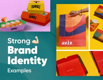
Real-world branding and visual identity examples
After taking in all this info, you might feel like looking at some actual examples of visual identities, so here are a couple of excellent real-life brands and concepts.
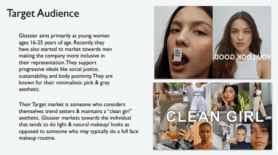
Glossier

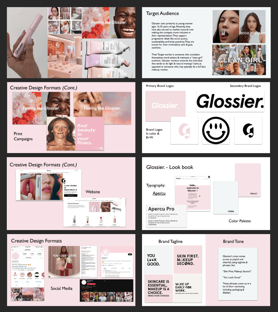
Glossier uses millennial pink and minimal fonts and its identity reflects a very specific aesthetic where everything feels casual but curated. The brand speaks in a warm, direct voice that makes skincare feel like a personal ritual instead of a chore.
TikTok

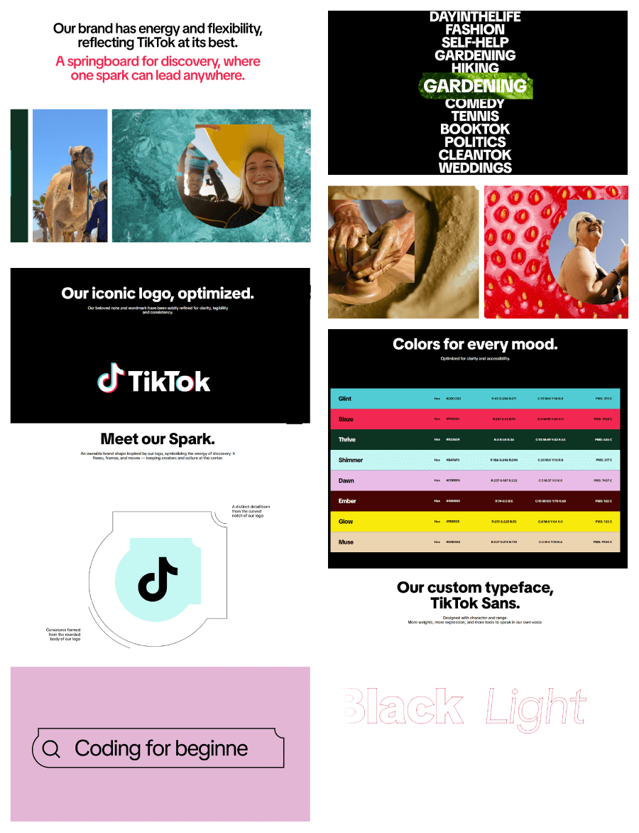
TikTok’s style guide feels more like a full-on brand toolkit, and it breaks down the logo, color, type, and co-branding with all assets ready to download right there. There’s even a whole section on how to design content in the TikTok app, which is smart and super helpful.
I especially love the logo presentation:
![]()
![]()
![]()
![]()
Discord

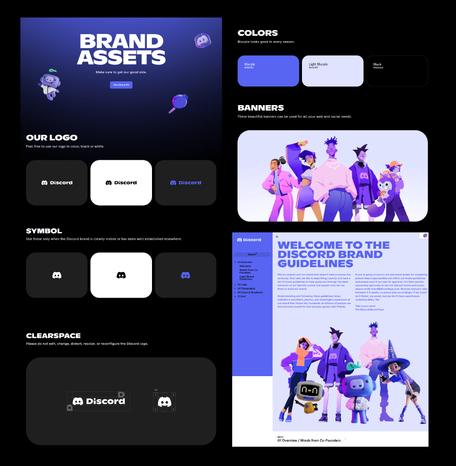
Discord’s brand guide matches is fun and totally in tune with its community. Motion graphics center around a simple dot, symbolizing users connecting across servers.
They’ve also named their colors things like “Blurple”, which adds charm without losing clarity. The guide covers important details like how the logo scales and what not to do with it, which is something a lot of brands forget to include.
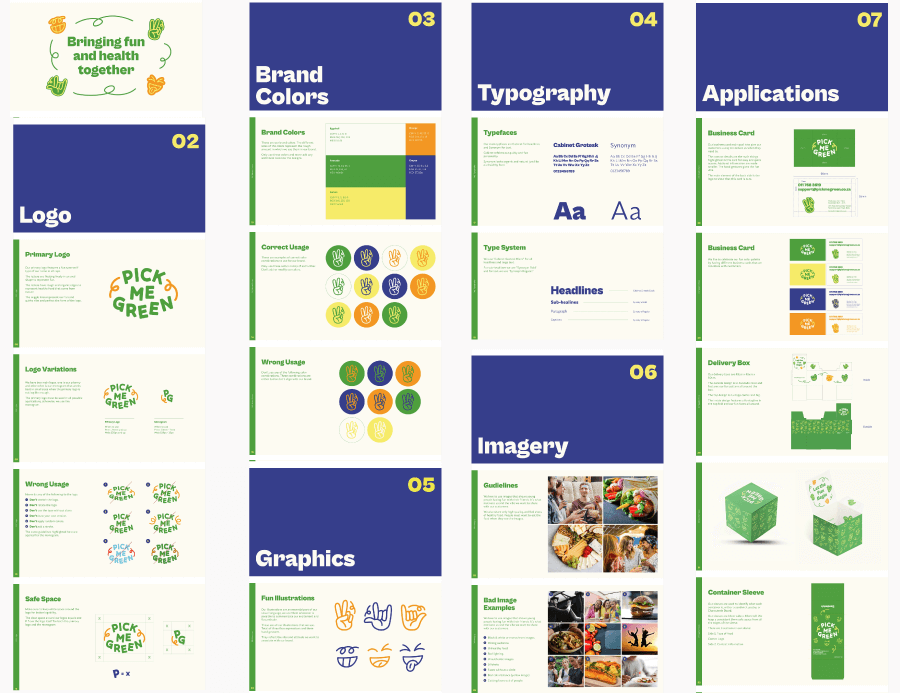
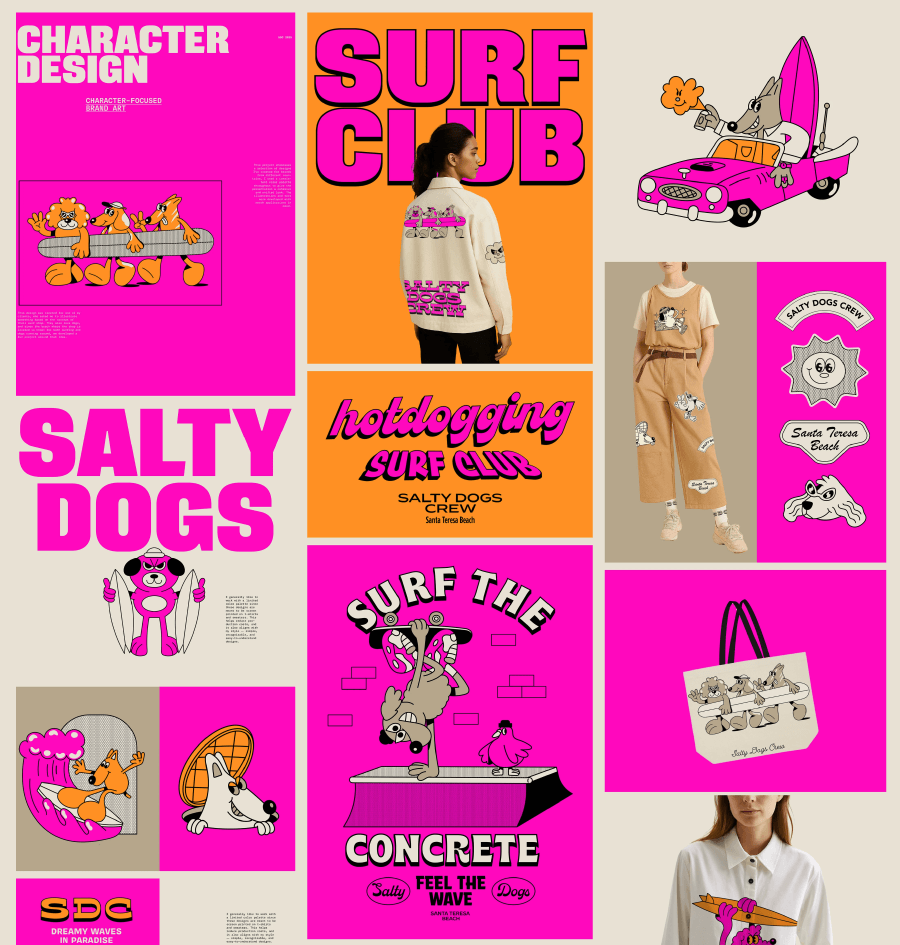
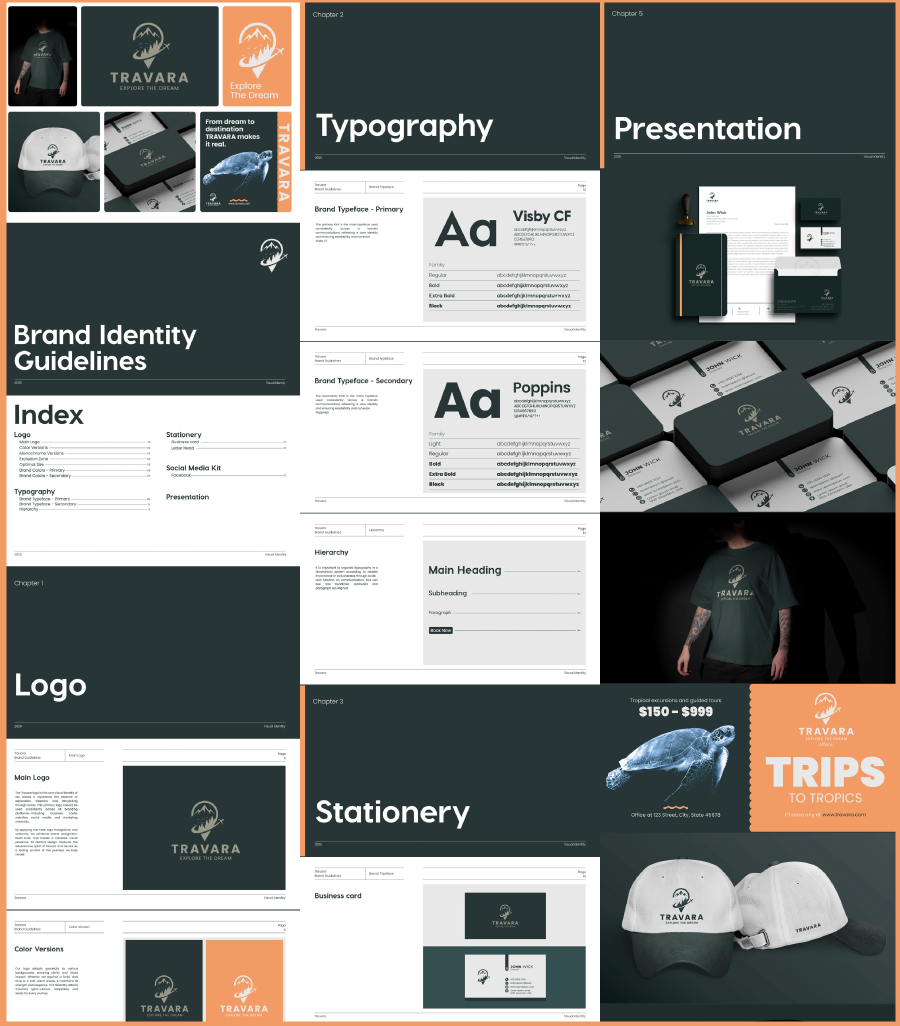
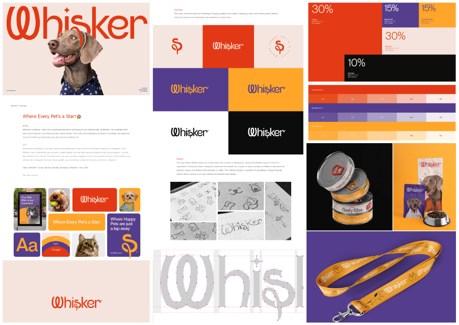
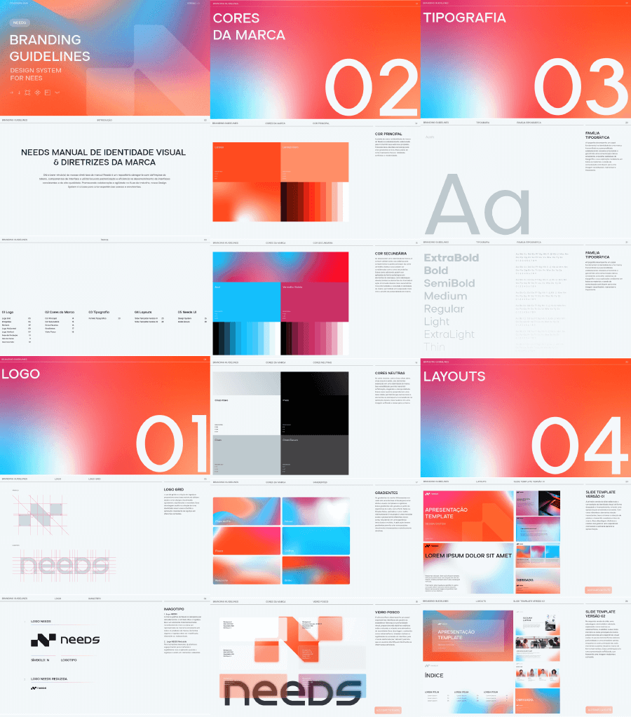
and some really good brand identity concepts:


5 Books about visual identity you should check out
The books below helped a lot of designers and marketers better understand how branding actually works beyond surface-level design, at least according to the multiple reviews when researching. Since I’ve read two out of five of these, I can say the reviews are accurate at least for The Brand Gap and the Archetypes in Branding, so you may find this collection worth checking out. Each one brings something different to the table depending on where you are in your brand-building process.
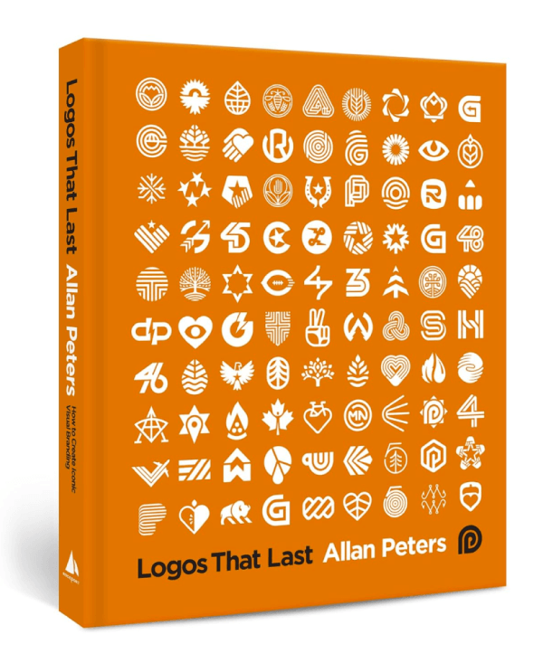
1. Logos That Last
I chose this one because it’s a straight-to-the-point guide on what makes a logo stick. Peters is a designer with decades in the game, and lays out a process that shows how logos can grow into something people recognize and trust.
Most people love the book for how hands-on it feels. It gives real examples, it’s especially helpful if you’re someone who needs structure or finds yourself stuck at the “what should this logo even be?” phase.

2. Identity Designed
David Airey talks about branding and shows it with case studies from design studios around the world. This book is a walkthrough of the full branding process, but in a way that’s clear and not overwhelming.
Many people went in thinking they knew the basics and claimed to have come out rethinking how visual identity works on a much deeper level, because the book is practical and inspiring.


3. The Brand Gap
This one’s a short read (great news if you prefer your books straight to the point), but it’s full of “aha” moments. Neumeier explains how strategy and design should work together without sounding preachy or overcomplicated.
I recommend it if, while building a brand, you’re struggling to connect the dots between business goals and creative work, because it helps clear the fog. It’s one of the first books I’d hand to anyone starting a brand or launching a product.

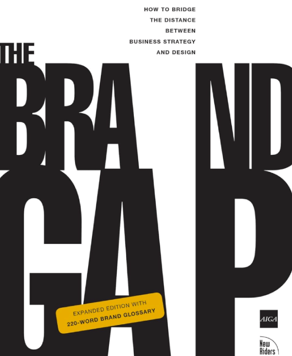
Neumeier talks about how a real brand is actually the behavior that aligns with who the company actually is. One line that stuck with me was the duck metaphor: if a brand looks, talks, and acts like a duck, it feels real. But if it suddenly swims like a dog, people notice the disconnect.
That’s exactly what I’ve tried to avoid with the Oak & Ember brand in the guide. The tone, the visuals, the way the coffee is sourced and talked about all come from the same place: slow mornings, warmth, small-batch care. If I’d paired that with stiff language or glossy, sterile packaging, it would’ve felt fake. A total frankenbrand, as Neumeier puts it.
4. Archetypes in Branding
Brand archetypes sound like something you would use for writing characters for your novel,but aren’t brands just that? This book breaks down universal character types (like The Rebel, The Sage, The Caregiver) and shows how they can influence everything from tone to design.
It also comes with a deck of archetype cards, which sounds gimmicky, but honestly, it’s super useful for workshops or just getting unstuck when a brand feels mid.

It’s a good practice and exercise when you try to create a brand that feels more human, or should I say, create a character.
For the hypothetical Oak & Ember brand from the step-by-step guide, it lands somewhere between the Caregiver and the Explorer. There’s warmth, comfort, and care in the brand, but also a quiet sense of freedom in how it’s not trying to keep up with flashy trends. That combo works perfectly with the tone, visuals, and even the kind of messaging in the end.
As for the downside of the book, the font is tiny. Still worth it though.
5. Designing Brand Identity
This appears to be more of a go-to manual than a one-time read. Wheeler covers everything: brand strategy, naming, design, research, and how to keep everything consistent.
Readers really love how it’s structured. You can flip to any section and quickly find what you need. It also has updated case studies that reflect how branding is shifting with tech, social issues, AI, and global trends.

And there you have it!
Strong brand identities sometimes happen by accident, but most of the time they need consistent work. Once the tone, visuals, messaging and voice click together, you’ve got a system that has a character and sticks with people. I hope this guide gave you exactly what you need to create brands that hit just right.