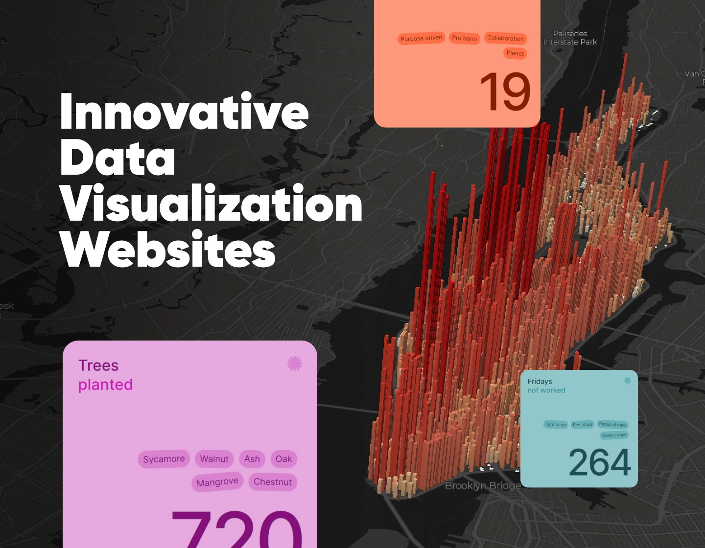
Data visualization has the power to transform how we understand the world. Gone are the days of boring charts and static numbers—today, data comes to life through interactive, engaging visuals that make complex information both accessible and exciting. Whether it’s tracking real-time data, uncovering hidden trends, or simply telling a story through design, the possibilities are endless.
In this article, we’re showcasing 18 innovative data visualization website examples that will truly amaze you. These sites use creative design and cutting-edge technology to turn boring statistical analysis into interactive, immersive experiences. Whether you’re a designer, a data lover, or just someone who appreciates unique online experiences, these examples will show you how data can be transformed into something visually stunning and surprisingly captivating.
Ready to be amazed? Let’s dive in and check out these creative data visualization examples that push the boundaries of what’s possible with data.
1. Kikin – User-Friendly Financial Data Visualization
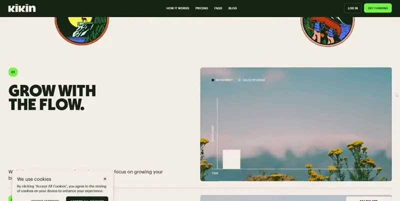
Kikin offers a clean, minimalist platform for visualizing financial data, especially useful for startups and investors. Its standout feature is the funding calculator, which allows users to model different funding scenarios and visualize financial projections.
The sleek, user-friendly interface ensures that complex data is displayed in an accessible way. Kikin makes financial data analysis feel less overwhelming, offering users the ability to make informed decisions based on dynamic visualizations.
What we like:
- Interactive funding calculator for modeling financial scenarios.
- Clean, minimalist design that’s easy to navigate.
- Simple interface that simplifies complex financial concepts.
2. Depositphotos – Vibrant Visualization of Creative Trends
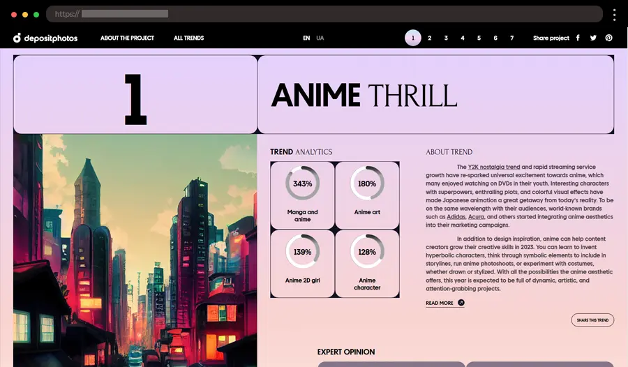
Depositphotos’ Creative Trends 2023 brings the hottest creative trends to life in an interactive format. This site breaks down the year’s leading visual trends, including design, photography, and art, through vivid animations and colorful visuals. It’s a feast for the eyes, with each trend explained through dynamic visuals that keep you engaged and informed.
What we like:
- Bold, colorful design capturing the essence of creative trends.
- Smooth, interactive animations that highlight key insights.
- Well-organized sections that make it easy to navigate.
3. Selfie City – Fun Selfie Interactive Data Visualizations
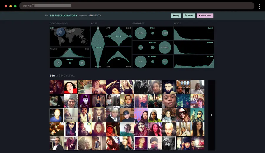
Selfiecity offers a unique and fun approach to exploring selfie trends around the world. By analyzing over 3 million selfies, this interactive website visualizes selfie-taking habits.
The website is colorful and engaging, presenting a wealth of information in a playful format. You can dive into various categories, exploring how different regions take selfies or see the relationship between demographics and selfie habits.
What we like:
- Interactive graphs that break down selfie data by region.
- Vibrant, user-friendly design with easy-to-navigate features.
- Filters that allow users to compare data by location, age, and more.
4. NASA Asteroids – Fascinating Asteroid Tracker Webpage
NASA’s Asteroids Tracker is a mind-blowing way to explore near-Earth objects. This interactive tool lets users track asteroids’ paths, sizes, and speeds in real time, giving you a sense of how active our solar system really is.
The interface is sleek and visually engaging, with easy-to-understand diagrams and real-time updates. It feels like you’re getting a front-row seat to space exploration, with up-to-date data on potential threats or discoveries.
What we like:
- Real-time asteroid tracking with detailed data.
- Interactive map that lets you follow asteroids’ orbits.
- Color-coded indicators for different asteroid sizes and risks.
5. NYC Trees – Innovative Urban Tree Data
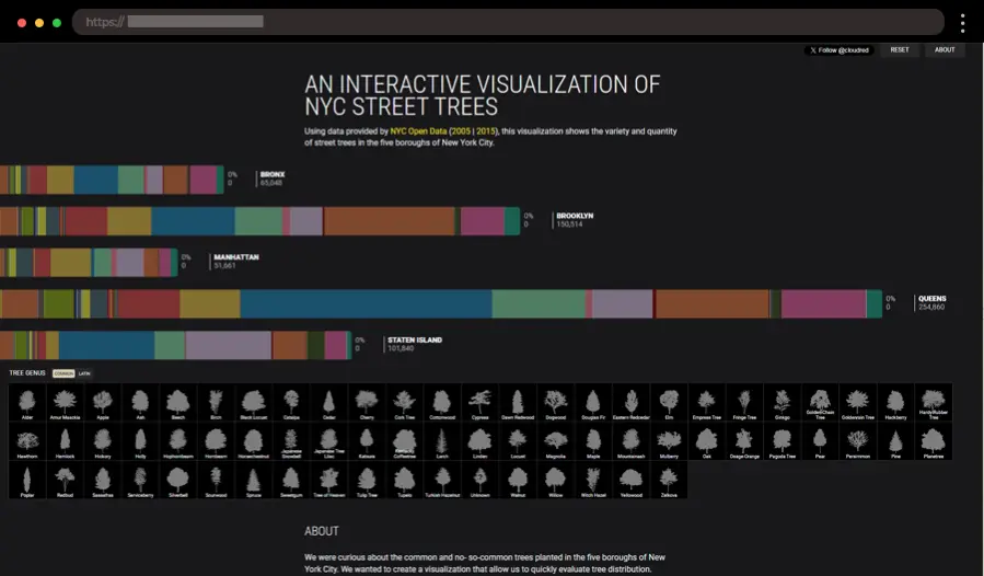
Cloudred’s NYCTrees is a visually engaging exploration of New York City’s urban tree canopy. It uses interactive maps to visualize the location and types of trees throughout the city, offering insights into green spaces and environmental health.
The map is beautifully designed, with color-coded markers that represent different tree species. This interactive tool gives users a new way to engage with the city’s ecology, showcasing how data can highlight environmental awareness.
What we like:
- Interactive map that highlights tree locations across NYC.
- Color-coded markers for different tree species.
- Innovative use of tree data for environmental awareness.
6. ManpopEx – Cool Data-Driven Population Insights in Manhattan
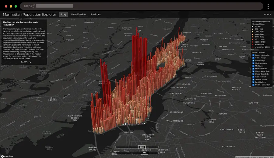
ManpopEx offers a unique and interactive look at Manhattan’s population patterns, focusing on how the city’s demographics shift depending on the day of the week and time of day. By visualizing real-time data, the platform reveals how different areas of Manhattan experience varying population densities throughout the week, providing insights into commuting trends, busy hours, and the overall movement of people across the borough. The site uses dynamic charts and maps to track population fluctuations, offering a fascinating view into the daily ebb and flow of Manhattan’s residents and visitors.
What we like:
- Population data based on time of day and day of the week.
- Interactive maps that highlight population density across Manhattan.
- Data breakdowns that reveal trends in different neighborhoods.
7. Breaking – Bright Plastic Degradation Data Visualizations
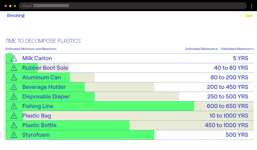
This data visualization project provides valuable insights into the ongoing issue of plastic degradation. Through interactive maps and charts, it tracks the environmental impact of plastic waste and its gradual breakdown over time. The visualizations offer an engaging way to understand how plastic accumulates in ecosystems and highlights areas where efforts to reduce plastic pollution are making a difference.
The design uses vivid colors and dynamic graphs to show the progression of plastic degradation, for a more accessible environmental data. This powerful tool raises awareness and encourages action by using helpful visual analytics.
What we like:
- Visual tracking of plastic degradation and its impact on ecosystems.
- Engaging visuals that bring environmental data to life.
- Usage of bright colors and large font sizes.
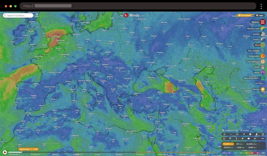
8. Windy – Stunning Weather Data Visualization Tools
For anyone fascinated by weather, Windy offers one of the most captivating ways to explore real-time data. With dynamic 3D animations, you can track wind speed, temperature, and pressure across the globe, all in vivid detail.
The sleek, interactive map allows you to zoom in on different regions, adjusting weather overlays to explore detailed data points. It feels like a living, breathing simulation of the Earth’s weather patterns.
What we like:
- Interactive global weather map with real-time data.
- Multiple data layers for a comprehensive view of weather.
- Detailed zooming and data granularity at your fingertips.
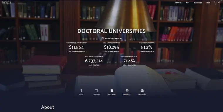
9. Data USA – Comprehensive University Data Visualization
DataUSA is a massive platform that visualizes a variety of data, and its section on doctoral universities is a perfect example of its capabilities. It breaks down a wide array of statistics on universities, from student populations to funding sources.
The platform’s design is sleek and data-driven, offering easy navigation through a range of visualizations. DataUSA makes complex information accessible with well-organized sections and interactive features that let you explore university data in depth.
What we like:
- Clear data breakdowns for a variety of university-related metrics.
- User-friendly interface with easy navigation.
- Accessible, downloadable data for further analysis.
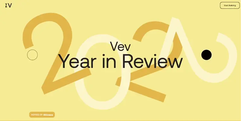
10. Vev – Creative Year-in-Review Data Visualization
Vev’s Year-in-Review 2022 page elevates the traditional year-end recap with an interactive, visually stunning design. It’s like flipping through a digital yearbook, but with a modern, dynamic twist.
This site takes you through a smooth, scroll-triggered journey that highlights key moments from the year. The layout uses bold colors, seamless animations, and cohesive design elements to create a highly engaging experience. It doesn’t just present data – it invites you to experience it.
What we like:
- Interactive timeline that highlights key events of 2022.
- Bold color choices to visually separate themes.
- Seamless transitions and smooth scroll animations.
11. Hip-Hop Vocabulary – Interactive Vocabulary Evolution Data
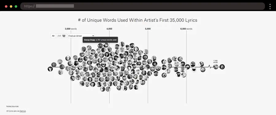
Vocabulary is an eye-opening project that ranks rappers by the number of unique words used in their lyrics. With data from 75 additional artists, the interactive visualization provides a fascinating look at lyricism in hip-hop.
The project analyzes the first 35,000 lyrics from each artist, leveling the playing field between prolific veterans like Jay-Z and newer stars like Drake. With clean visuals and a compelling focus, it offers a unique perspective on the artistry of hip-hop through a data-driven lens.
What we like:
- A unique approach to comparing lyrical creativity using data.
- Clear and easy-to-read visual rankings of hip-hop artists.
- Focused analysis of 35,000 lyrics per artist to ensure fair comparisons.
12. Get Your Guide – Travel Experience Trend Tracker
GetYourGuide’s 2024 Travel Experience Trend Tracker takes a detailed look at how travel experiences are shifting and which activities are gaining traction globally. The page offers interactive visualizations of travel trends, helping you see what’s hot and what’s not in the tourism industry.
The design is sleek, with color-coded data and interactive elements that make exploring travel trends both fun and informative.
What we like:
- Real-time data on popular travel activities for Fall 2024.
- Beautiful design that makes trend exploration easy.
- Color-coded visuals that show trending experiences.
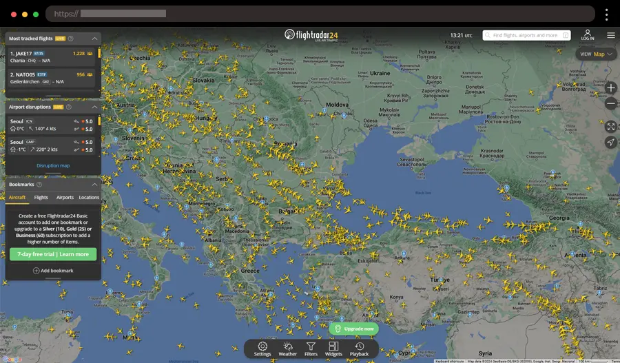
13. Flight Radar 24 – Real-Time Flight Data Visualization
Next, we have one of the most interesting interactive data visualization examples – Flight Radar. It offers a dynamic, interactive experience for tracking live flights worldwide. The map shows real-time flight data, including aircraft type, altitude, speed, and even the path the plane is taking.
The design of Flight Radar is fast, intuitive, and visually engaging. It is a fascinating experience for anyone curious about aviation. It is constantly updated, giving users a front-row seat to the world’s air traffic.
What we like:
- Live flight tracking with real-time updates.
- Interactive map that shows flight paths across the globe.
- Detailed information about each flight, including altitude and speed.
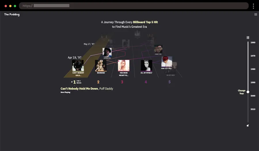
14. Best Year in Music – Music History Interactive Data visualization Example
For music lovers, The Pudding’s Music History project is a visual treat. The interactive timeline tracks the evolution of music, showcasing how different genres and artists influenced one another throughout the decades.
With vibrant, color-coded visuals, the page makes it easy to dive deep into music history. The design is both informative and visually pleasing, inviting users to click through and explore decades of musical evolution.
What we like:
- Interactive timeline that maps the evolution of music.
- Colorful visuals to highlight major genres and trends.
- Fun and engaging animations that enrich the experience.
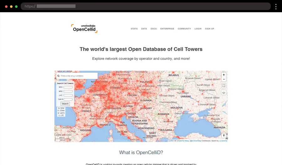
15. Open Cell ID – Global Cell Tower Location Visualization
OpenCellID offers an interactive map of cell towers around the world, allowing users to visualize their locations and coverage. It’s an incredible tool for those interested in telecommunications, offering insights into network coverage and geographic distribution of cell towers.
The website’s interface is simple yet powerful, offering an interactive map that allows users to zoom in on areas of interest. It’s a niche but highly useful tool for anyone in the telecom industry or curious about cell tower distribution.
What we like:
- Interactive map showing global cell tower locations.
- Zoomable interface for easy exploration of coverage areas.
- Color-coded markers to distinguish tower types.
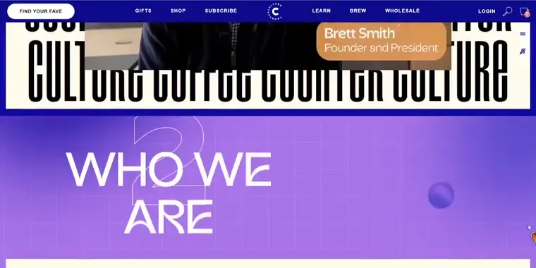
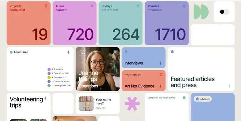
16. Counter Culture – Transparent Coffee and Team Data Website
17. The Drake Equation – Cosmic Data Visualization
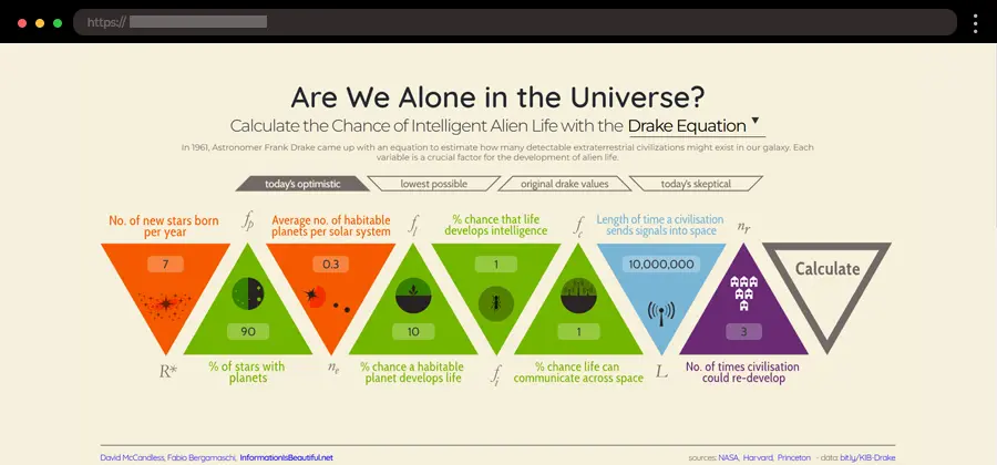
Information is Beautiful’s The Drake Equation visualizes the probability of extraterrestrial life based on various scientific factors. This interactive design uses easy-to-understand visuals to break down the complex equation and explore how likely we are to encounter alien civilizations.
The page’s clean design and engaging visuals allow you to interact with the data, adjusting the factors in the equation and seeing how the probability changes based on different assumptions.
What we like:
- Interactive Drake Equation with adjustable data points.
- Visually engaging and easy-to-understand breakdown of a complex concept.
- Simple sliders to adjust the factors and see real-time probability changes.
18. Driftime – Impactful 2023 Report Visualization
Driftime’s Impact Report 2023 sets a high bar for social responsibility reports. The site takes you through the company’s accomplishments in social and environmental impact, turning raw data into a compelling narrative.
The design combines storytelling with hard numbers, using bold visuals to highlight key achievements. The minimalist approach lets the impact speak for itself, providing a clear and visually appealing experience.
What we like:
- Clear, narrative-driven structure that guides users through the content.
- Bold color palette that adds visual interest and focus.
- Perfect balance between storytelling and data.
Tips for Designing Data Visualizations
Creating compelling data visualizations isn’t just about making them look good – you need to ensure they communicate insights clearly and engage your audience. By integrating these tips, your data can become much more effective, engaging, and informative, showcasing the best data visualizations that stand out in the digital world.
► Know Your Audience
Understanding who will view your data visualization is key. Are they data-savvy professionals or casual readers? Tailor your visuals and complexity level to match their needs and preferences.
► Choose the Right Visualization Type
Not every dataset is suited for the same visual representation. Make sure you select the best data visualization type to clearly present your data and avoid confusion.
- Bar Charts work well for comparisons.
- Line Charts are ideal for trends over time.
- Heat Maps highlight patterns and relationships.
- Scatter Plots show correlations between variables.
► Keep It Simple and Prioritize Interactivity
Clutter can overwhelm your audience, so avoid cramming too much information into one visualization. Instead, focus on the most relevant data points and present them in a clean format. Interactive data visualization charts with tooltips, clickable filters, or hover-over highlights make your visualizations more engaging and give your audience more control over the information.
► Use Colors Strategically
Color is powerful, but it can also distract if overused. Stick to a consistent palette that emphasizes important data and ensures accessibility for colorblind viewers. Tools like ColorBrewer can help you pick palettes that work well for visualizations.
► Don’t Forget Labels and Context
Your audience should never have to guess what a chart or graph means. Always include clear labels, a legend, and context about the data (e.g., the source, timeframe, or methodology).
► Test for Mobile Responsiveness
With more people consuming content on mobile devices, your visualization should look just as good on a small screen as it does on a desktop. Simplify elements and ensure interactivity remains functional on touchscreens.
► Focus on Accessibility
Ensure your data visualizations are inclusive. Use contrasting colors, provide text alternatives for visual elements, and ensure compatibility with screen readers to reach a wider audience.
► Validate Your Data and Test
Inaccurate data will discredit your work so double-check your sources, calculations, and analysis to ensure accuracy before presenting it. Once your visualization is ready, test it with others. Gather feedback to understand if it’s clear, impactful, and easy to interpret. Refining your design based on input can take it from good to great.
► Be Mindful of Scale
Scaling your charts appropriately is crucial for accurate interpretation. Always start axes at zero and avoid misleading proportions that exaggerate differences.
► Incorporate Dynamic Updating
For data that changes frequently, consider creating visualizations that update automatically with new data. Dashboards or tools linked to live datasets can save time and keep your insights fresh.
► Add Time-Based Interactions
If your data spans across timelines, consider adding sliders or play buttons to allow users to navigate through the changes in a dynamic and engaging way.
Conclusion
That wraps up our journey through 18 incredible data visualization websites that are pushing the boundaries of how we interact with information.
We hope this list has inspired you to think differently about data and how it can be presented. Whether you’re a designer, a data enthusiast, or just someone curious about the possibilities, there’s always something new to explore in the world of data visualization.
Thanks for joining us – now go ahead and explore these websites, and who knows? You might just find the next big idea to bring your own data to life!
Make sure to check out some of our other articles:


