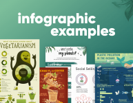
Infographics are not new, we all did bar graphs, pie charts and timelines throughout school, often with tedious regularity. We know how useful they are in providing visual representations of information quickly and clearly. We can see the patterns and trends at an instant. What is new is the cool way in which these infographics can add style to your data. Our collection of timeline infographic examples will show you some of the techniques the best designers are using and hopefully inspire you to create your own.
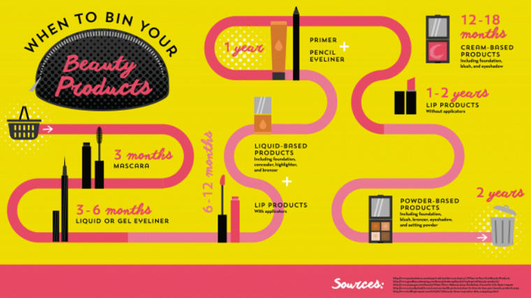
1. Is It Time To Trash Your Makeup?
This timeline uses a simple style varying the traditional straight line by regular curves. This keeps the organization clear and allows full use of the page. Consistent typography and color add to the look, with a pink handwritten font for the times, and black standard fonts for the products. Simple and effective.

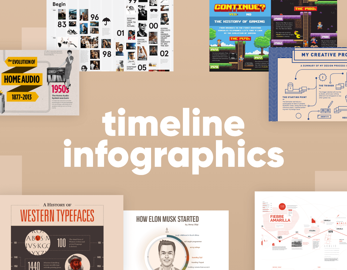
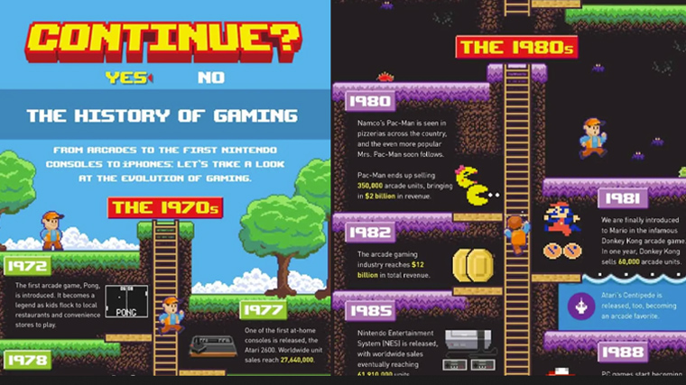
2. The Evolution of Video Games Timeline Infographic
This timeline takes you on a tour of the history of gaming via a lookalike classic Mario game. The ladder takes you through the overall data and splits the graphic to keep a clear separation of key events. Each decade comes on a new stage in the game through color, and each event matches perfectly with an appropriate icon.

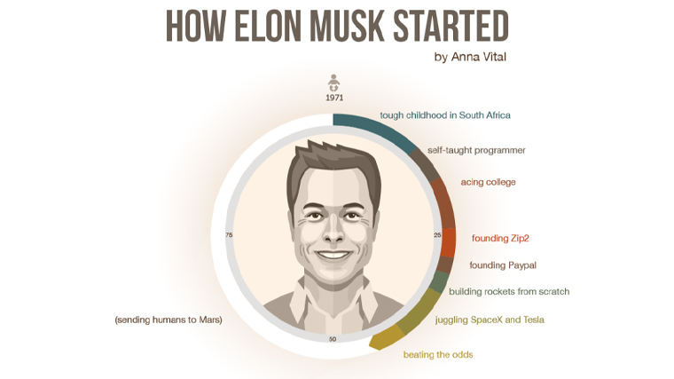
3. Elon Musk Timeline
Another timeline sweeping you chronologically down the page leads you through the life of Elon Musk. The infographic opens with a circular timeline around a stylized image of Musk himself, representing the circle of life. Below we start the journey and experience it through effective vector icons at each major event and a bullet point legend of the 3 key categories, decisions, circumstances, and results.

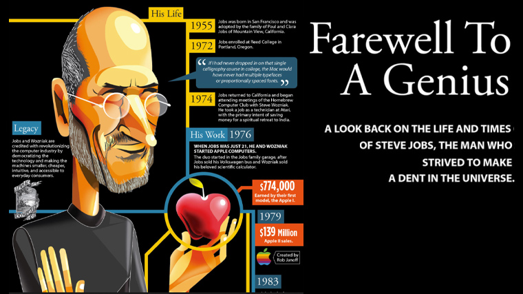
4. The Life and Times of Steve Jobs
The life of Steve Jobs in an infographic starts alongside a full-length caricature of the man himself. His lookback uses a double timeline of yellow for his life and blue for his work. Both lines run side by side taking the same timescale with the information in speech bubbles working outwards from the central lines.

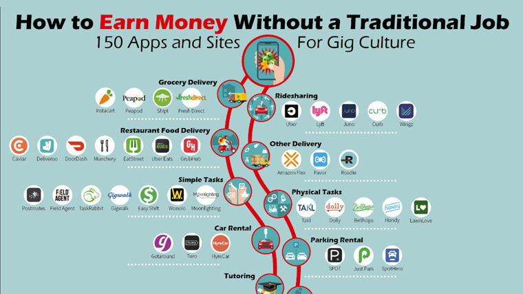
5. Why You Don’t Need a Traditional Job
An infographic about potential opportunities in the gig economy and the appropriate apps to use. The graphic is split into two by a wavy central band with simple icons and a bold heading to specify key areas of possible income. Along with each band are app icons, accompanied by the name.

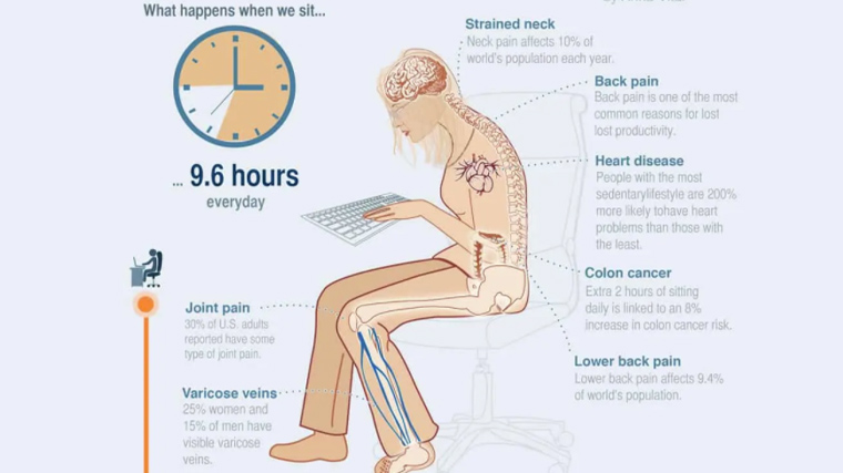
6. How Sitting Can Harm Your Productivity
A guide to good posture. We get the immediate feeling that this graphic has scientific rigor. To emphasize this each individual issue is also illustrated with clear text and in diagram form.

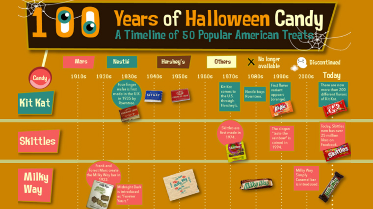
7. 100 Year of Halloween Candy Timeline Infographic
An interesting reworking of the timeline theme. The timeline here moves from left to right along the top of the graphic with the main types of candy running vertically down the left side. Each candy is color coordinated via a legend at the top. This gives the viewer chance to skim down to the candy of choice rather than working through the whole list.

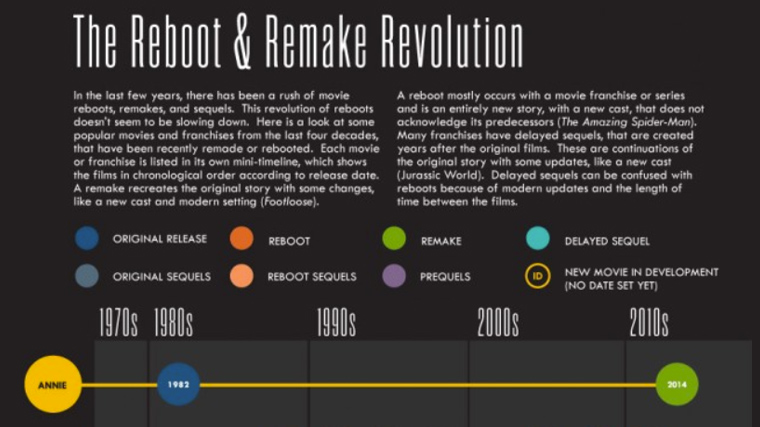
8. Movie Reboot and Remake Revolution
Similarly to the Halloween Candy infographic is this reboot and remake film piece. Again a quick skim down the left allows you to find the films. A clearly dated colored legend furnishes the details. The dark background with brightly colored dates focuses the eye on the important information.

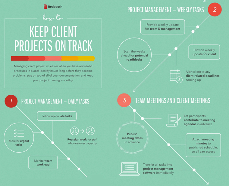
9. Easy Ways To Keep Client Projects On Track
This project management guide splits into 5 clear sections with bullets on a soft green background. Presumably, this is the color you’ll feel if you follow the process. Straight lines illustrate the smooth running expected. The feel is business-like, the tone is detailed and the overall effect is that everything is in hand.

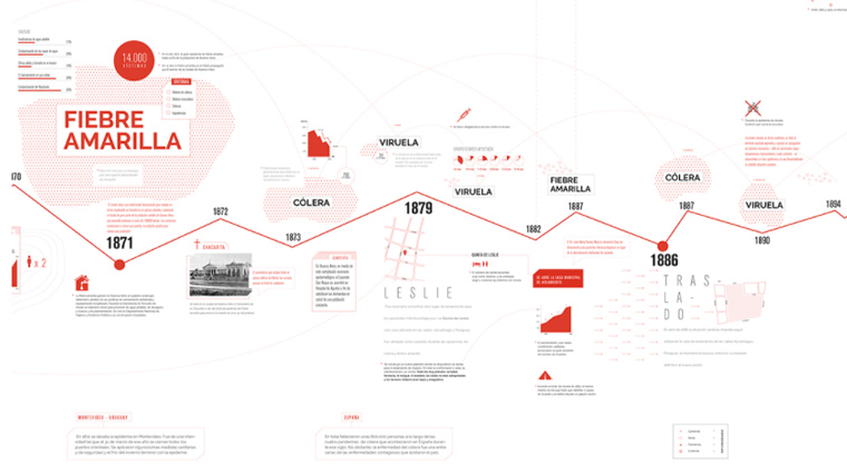
10. Hospital Muñiz Timeline Timeline Infographic
This graphic by Florencia Souto illustrates a timeline of diseases. Here the genius is the consistency of the medical theme that uses an ECG line to bring you from the 1800s to the present day. Added to this is the sparing use of color with red and black on a white background. A great piece of design.

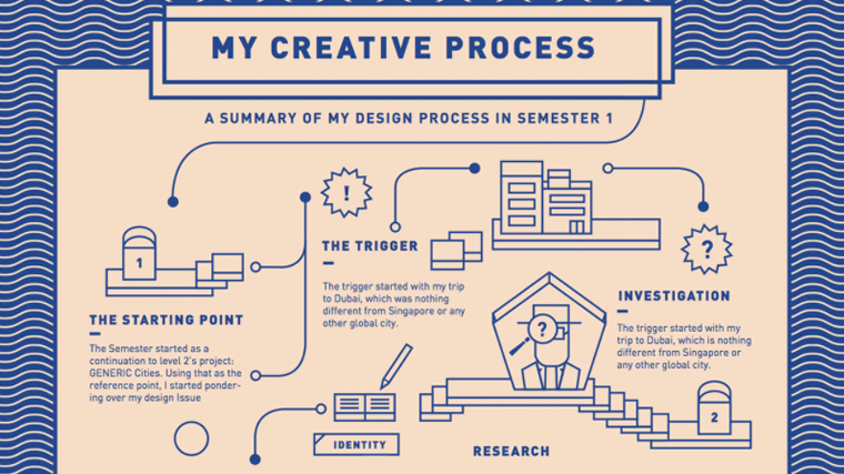
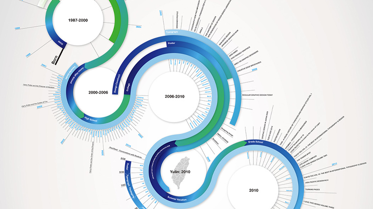
11. My Creative Process Timeline Infographic
The designer used vector illustrations to create a timeline of their designing process in their first semester in university. The result is very neat and easy to read.

12. Evolution of Business
Here we can see how clever use of space and illustration can make an infographic stand out from the crowd. The timeline itself is straightforward enough but the area of blank space to the side of the information gives us time to breathe. Stylish comic illustrations visualize key areas.

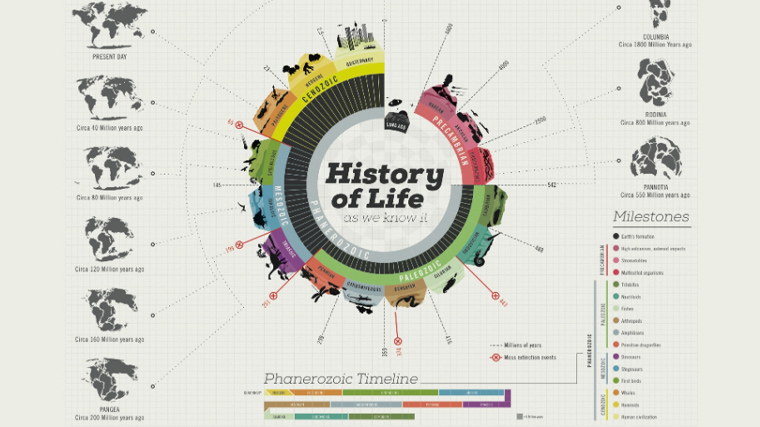
13. History Of Life Timeline Infographic
This circular timeline infographic illustrates the history of life as we know it from the formation of the continents and the very first lifeforms on earth through all milestones till the present day. The heavy data looks way simpler and easy to read thanks to the great structure.

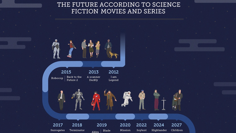
14. Future According To SciFi
This infographic takes us on a journey to the future according to science fiction. A dark blue background recognizes the input of space in many of these films and series. All characters from these shows are illustrated in a consistent style. Immediately recognizable visualization.

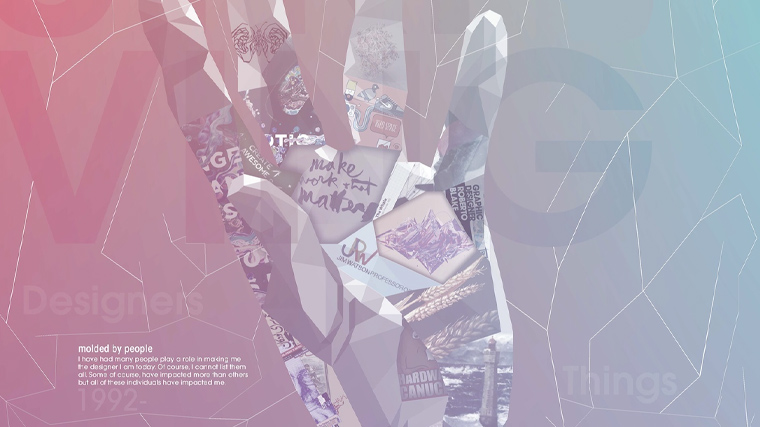
15. Personal Timeline
This abstract form of a timeline infographic shows the personal story of faith and the growth of a man on his path to becoming a designer. The geometric imagery and soft gradient lighting are simply mesmerizing.

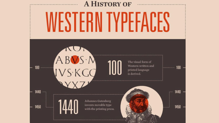
16. A History of Western Typefaces Timeline Infographic
This infographic relies on shapes and beautifully selected and combined fonts.

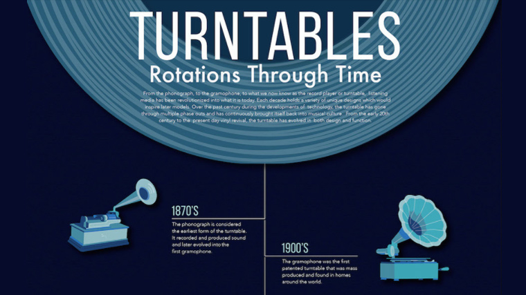
17. The History of The Turntable ???
This history of turntables uses shades of blue to grab us. Classic illustrations of different record players are all stylized, the blue tones giving them a certain ghostly quality, intriguing you. The pictures take you to the time, and then the details are there for you.

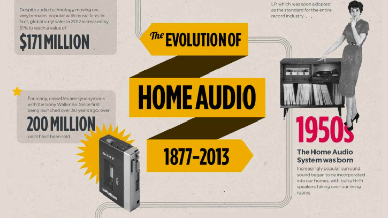
18. Evolution of Home Audio Timeline Infographic
This history of home audio systems is brought to life with black and white photos symbolically depicting key events. The decidedly aged washed grey background lets the photos take center stage and each is labeled with a contrasting bold red year, popping out of the page.

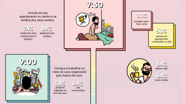
19. Creative People Timeline Infographic
Here is an example of how humor can work well in these kinds of infographics. Each part of the day is accompanied by a cartoon illustration of the central character. Here we can also see great use of background color gradual shading from the pink of the early morning sunrise to the darker purple of the evening.

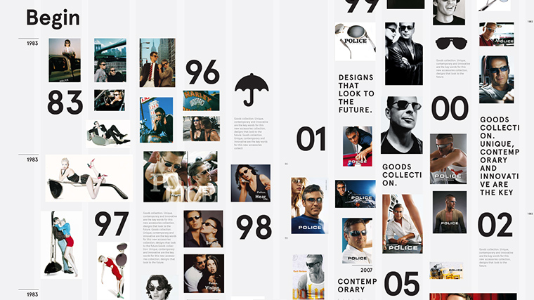
20. Police Sunglasses
This timeline of sunglasses uses fashion magazine shots and setouts in the columns of these publications. It reads like a newspaper article, with the dates breaking the page like headlines. Very cool indeed.

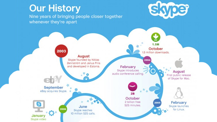
21. History of Skype Timeline Infographic
This history of Skype lays on a cloud against a sky in the signature skype blue. The timeline curves go from 2003 to the present day in a repeated skype blue S pattern. Branding is clear throughout.

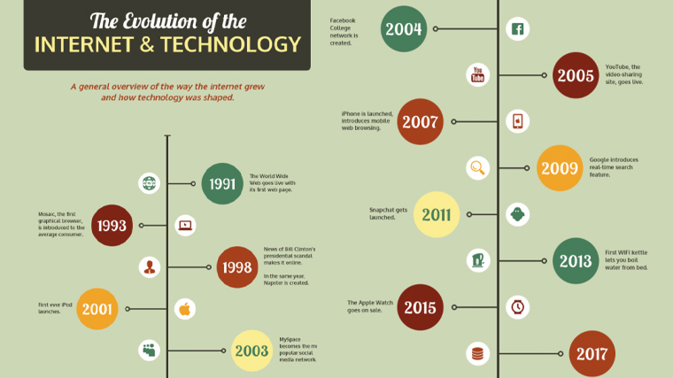
22. Evolution of the Internet and Technology
Here’s a gorgeous retro look for this educational infographic about the evolution of the internet & technology. Strong geometric shapes and colors, straight direct lines, and classic retro font. Each point is illustrated with a very simple vector icon. Cool in its simplicity.

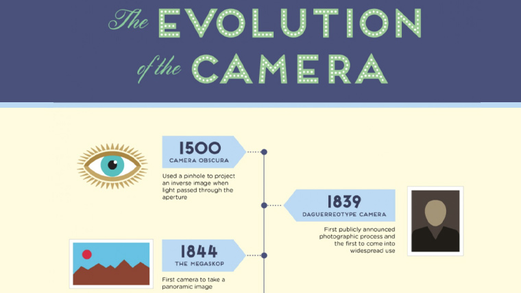
23. Evolution of The Camera
The evolution of the camera is brought to us with the help of some very cool icons which simply punch out of the page.

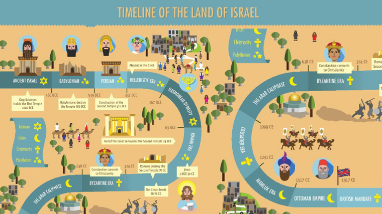
24. History of Israel Timeline Infographic
The history of Israel is made to look like a retro computer game adventure. The timeline road cuts through the desert, with heavily pixelated characters and scenes. Each historical era is also given a bright yellow symbol signifying its religious leanings. Simple yet beautiful.

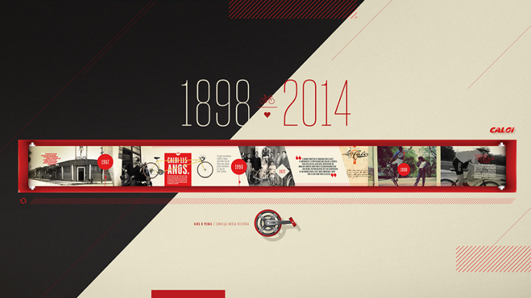
25. Caloi Expo
This timeline uses a collage of beautifully retouched images, high-contrast colors and shapes, and patterns that finalize the design.

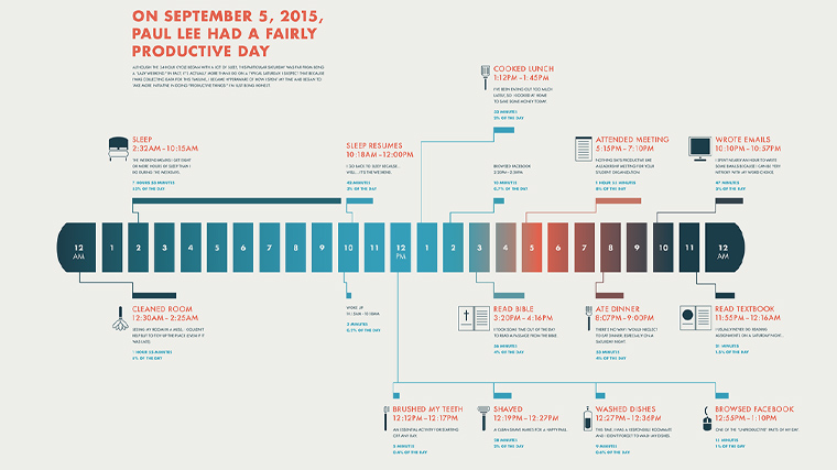
26. 24-Hour
On September 5th, 2015, Paul Lee had a fairly productive day and it’s all there in the 24-hours timeline that uses color gradients to nail the time of the day and night.

27. Self-Promotion Design Timeline Infographic
In this infographic, the designer Chen-Wen Liang showcases her graphic design skills through a masterfully-crafted futuristic timeline. The design is smooth, clear, and combines colors well.

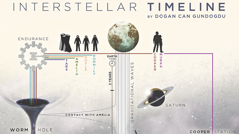
28. Interstellar Timeline
In case you found it difficult to follow the timelines in the movie Interstellar, Dogan Can Gundogdu has you covered. This futuristic imagery is well combined with simple almost silhouette-like graphics and explains the plot in a very creative way.

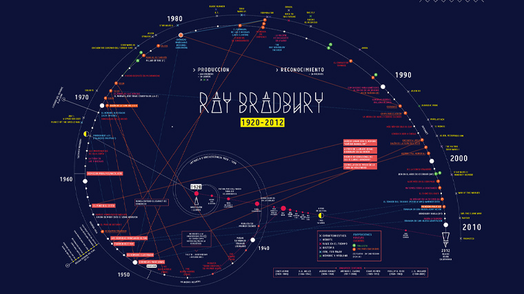
29. Ray Bradbury Timeline
Another futuristic design, this time uses the divine ration to organize the data. The overall feeling is of a space map.

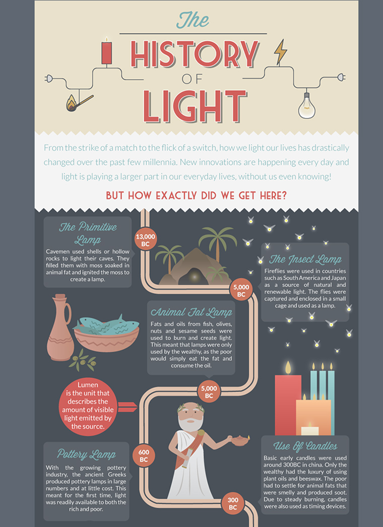
30. The History of Light
And last, but not least, here’s a fun little infographic dedicated to the history of light. The graphic uses lovely flat illustrations and small text boxes with facts. Simple, creative, and lovely.

Final Words
We hope this collection of timeline infographic examples inspired you. The common theme is the ability to enable the viewer to visualize often complex information in a simple way while experimenting with creative design and color. The designs add to rather than dominate the information and give the reader access to the story with ease. Timelines don’t have to be boring, and these examples certainly prove there is life in the old techniques yet.
In the meantime, why not check another inspirational gallery on the topic, such as these awesome 28 Infographic examples.
Share this article