

If you’re looking to design or update the homepage of your online store, I’ve got a simple guideline you can follow. It includes the 6 golden design rules of a successful eCommerce homepage with real-life examples from active and thriving stores from all over the web. These rules are practical and pretty easy to implement, so hopefully you will get some awesome ideas for your next eCommerce project.
Now, with this out of the way, let’s start with rule number one:
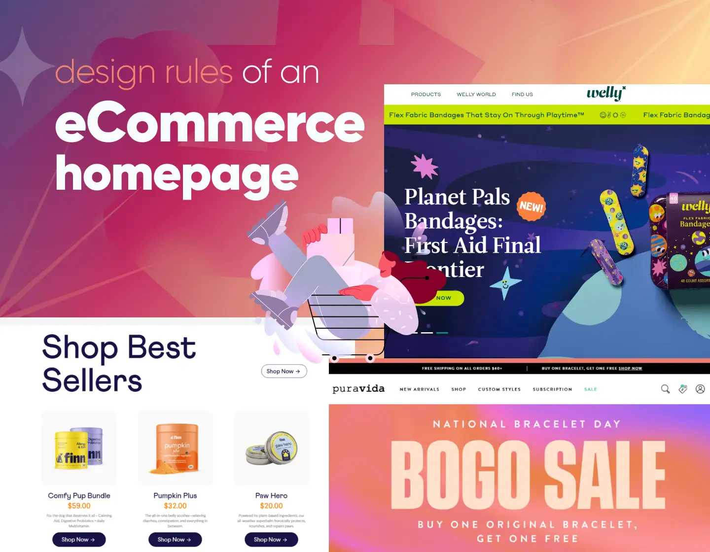
Rule 1: Start off with a big hero image
Go into the landing page of any modern eCommerce store and you are almost certain to be met with a big hero image taking up your entire screen. In most cases, these hero images will either showcase the latest product or a sale that is currently ongoing.

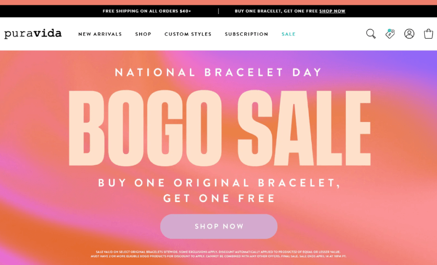

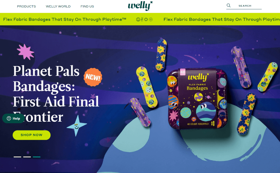

The main reason for this is that every store wants customers to take action and immediately start browsing items. Your homepage should serve the purpose of quickly directing customers to start their shopping journey.
On top of that, most customers who visit your landing page will probably already know about your brand and are interested in buying again or checking for any new items you may have added since their last visit.
Overcrowding your homepage with too many options for the user to click can lead to harder decision-making. Caltech a research company published their findings on how too much choice confuses the shopper – Choice overload reduces neural signatures of choice set value in the dorsal striatum and anterior cingulate cortex

Rule 2: Include your product categories
The next most common thing I found on most eCommerce homepages is the product category section. This is a simple element that showcases all of the top-level categories of products that your store offers.

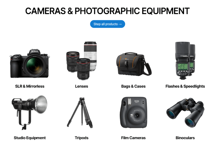

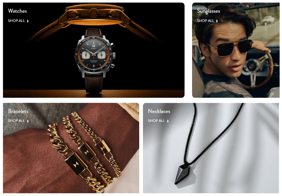

This section is meant for buyers who already have an idea of what product they want but still haven’t decided on the exact product. The main goal of this section is to quickly get customers to start browsing products in a specific category.
Including this section will also allow your visitors to quickly get an understanding of the full range of items that your store offers.
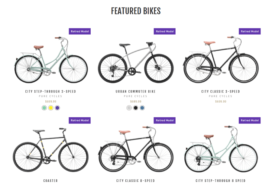
Rule 3: Curate selected or trending items
As a store owner looking at the sales numbers, you will notice that with time some items sell better than others. These items will be your main revenue drivers and with time your customers will start associating your store with them.

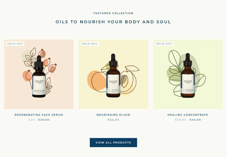


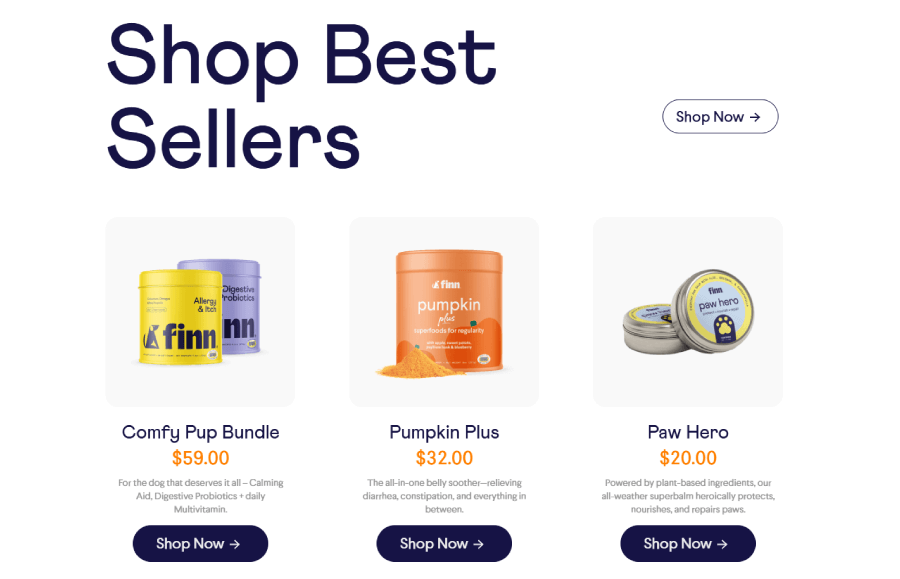
Make sure that these high-demand items get their own place on the homepage. There is a reason why most of your shoppers are buying them and there is a high chance that new customers will also be interested in them.
Rule 4: Don’t include too much
Up until now, I’ve mostly focused on what to put on your eCommerce homepage. However, it is important to note that you have to keep things clean and minimal. Unlike other websites where the homepage serves as an introduction and gives multiple choices to the user about which section should he look at, the eCommerce homepage has only 1 main goal – make the user start the buying journey.
When thinking about what to include on your homepage remember it’s a best practice to have one main goal that your homepage needs to fulfill and don’t overwhelm the user with too much.
Rule 5: Invest in a good Navigation
A large percentage of your users will probably just ignore your eCommerce homepage as a whole. What they’ll do is head directly for the navigation and get where they want to be.

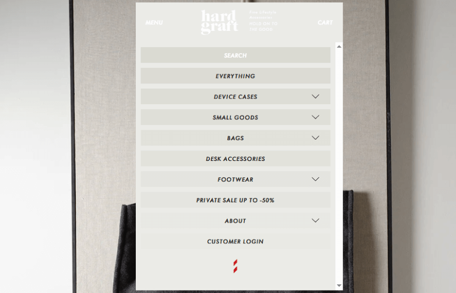


This is why you should invest in a good navigation solution. The traditional navigation options simply won’t work. An eCommerce store will probably have a lot of categories and subcategories from which users can browse so make sure you have something that is clear and easily navigable.
Rule 6: Don’t forget about speed and mobile
Now that you know all of the steps you need to create a great online store homepage, you need to make sure it only looks great but runs great as well. Make sure to run your website through some speed check tools like Google Lighthouse. If your score is low (below 50) then your design efforts will be wasted. You should be aiming for scores higher than 50 and always try to improve that number. Here is a great resource on why website speed matters – Why website speed is important?
As a final tip, take a good look at your website on your phone. Make sure all the functionality is working and everything is accessible and clickable on the small screen. A large part of online shopping is conducted on a mobile device so always keep that as one of your top priorities.
And there you have it! If you follow these rules you are sure to have an awesome homepage that will get your visitors straight to buying.
In need of more practical tips and inspo, check out what’s cooking in our blog, or jump straight into some of these articles:
- 18 Great Promotional Email Designs & What Makes Them Work
- 45 Trendy Website Color Schemes for Eye-Catching Designs
- Shopping Cart Designs That Will Make You Want to Hit ‘Buy Now’
- 24 Shopify Landing Pages Blending Great Design & High Conversions
- 24 Minimalist eCommerce Websites With Creative Twist
- 26 Best Single Product Website Examples That Exist