Coming up with fresh ideas for food and beverage brands online can be a bit of a brain-squeeze, right? You want something that looks good, not just in the product but in the branding, UX, copy, and everything in between. I get it! That’s why I went on a scroll-deep dive through the ecommerce world to find brands that tick all boxes. These are the ones that make you pause, screenshot, and maybe even order a snack mid-project.
In this article, I’ll walk you through 30 ecommerce food and beverage examples and, more importantly, why each one works. I personally believe that food and beverage brands have some of the most fun, bold, and beautiful online experiences out there. I am really excited to share these with you, and I think you’ll agree once you see them!
1. Primavera Avocados – Organic Avocado Ecommerce Website

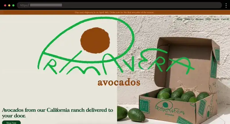
Primavera Avocados has one of the freshest-looking sites I’ve seen, and it actually made me crave an avocado on toast! The warm photography and earthy tones just hit right.
What I like:
- Beautiful natural product photography
- Rustic color palette and soft textures
- Personal storytelling included into the design
2. Olipop – Retro-Inspired Ecommerce Design for Modern Soda Brand

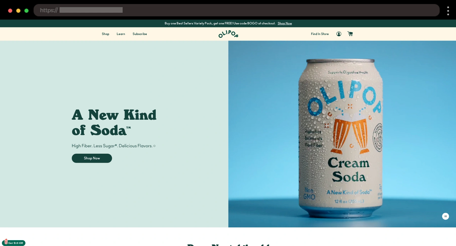
OLIPOP’s site feels like a cool, fizzy time machine. I love the vintage vibe – retro fonts, bold colors, and old-school flavours that make gut-friendly soda feel like a party.
What I like:
- Bright color palette
- Bright lifestyle photography
- Fun scroll effects and storytelling throughout
3. Wildgrain – Artisan Baked Goods Subscription Design

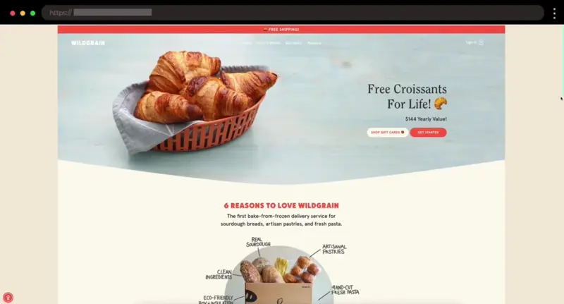
I love how cozy and honest Wildgrain’s site feels like. It leans into texture, storytelling, and warmth with its delicious-looking photography of bread, pasta, and croissants!
What I like:
- Organic handmade-looking design
- Inviting colors and rustic photography
- Honest, human-focused copy
4. Magische Chocolade – Whimsical Design Example for Delicious Japanese Chocolate

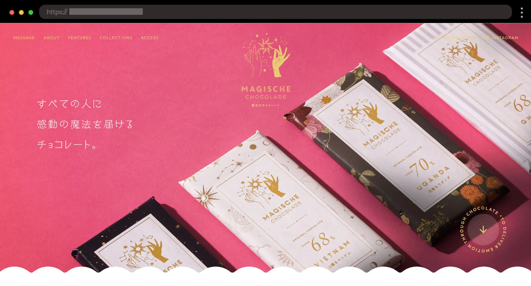
This artisan chocolate brand feels more like a dreamy escape than an online shop. The soft pastels, floating elements, and subtle details pull me right into its magical world.
What I like:
- Dreamy layout with gentle transitions
- Delicate typography that fits the vibe
- Thoughtful touches, like the charming map in the Access section
5. RIND Snacks – Bright Fruit Snack Ecommerce Website

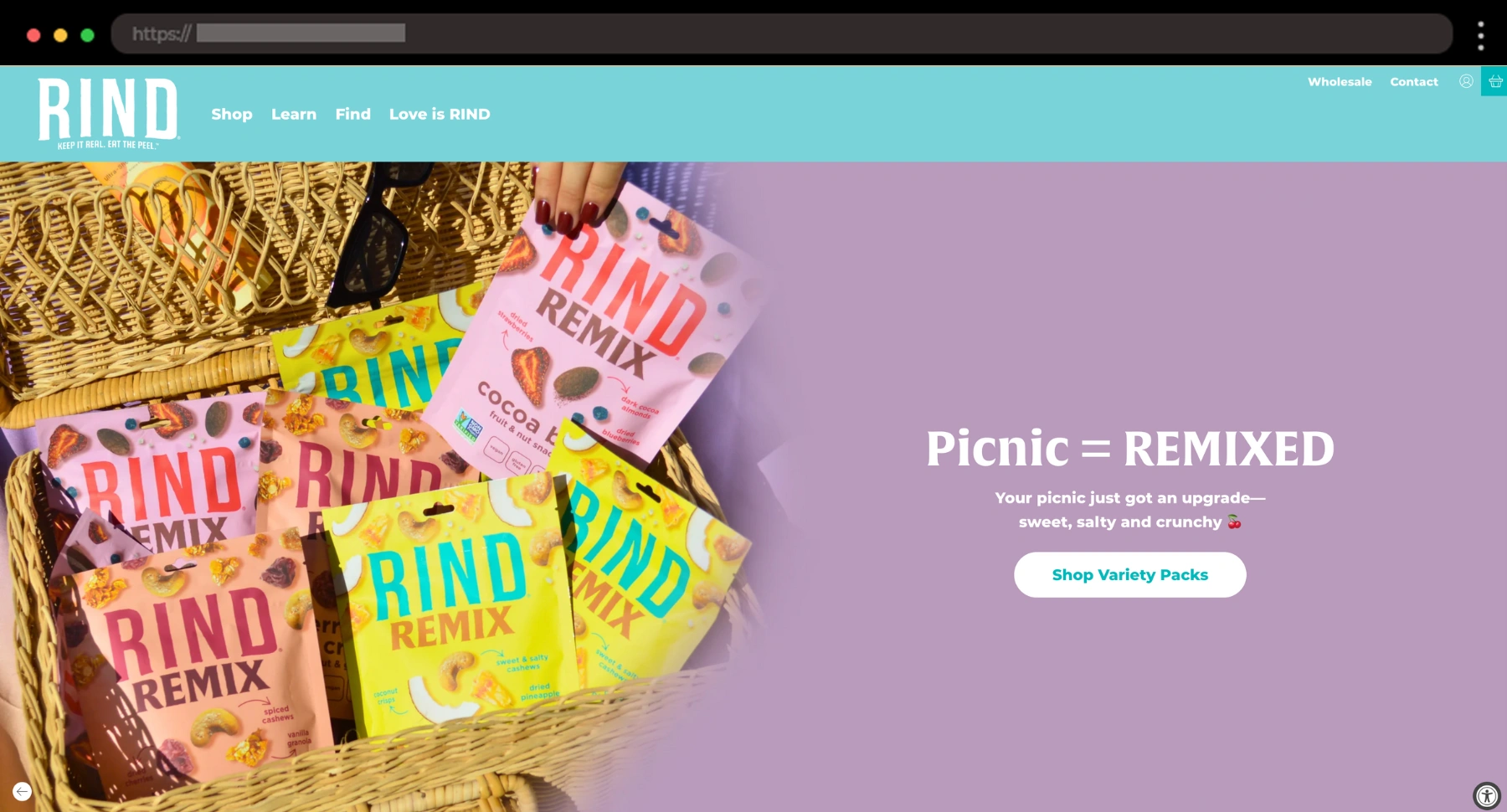
RIND’s site is just the right kind of loud—colorful, energetic, and super easy to shop. Everything from the fonts to images and brand logos is enlarged to capture attention, and I’m into it.
What I like:
- Punchy visuals with strong appeal
- Clear messaging about the “keep the peel” mission
- Bright fresh color palette
6. Spylt – High-Protein Milkshakes Website Example

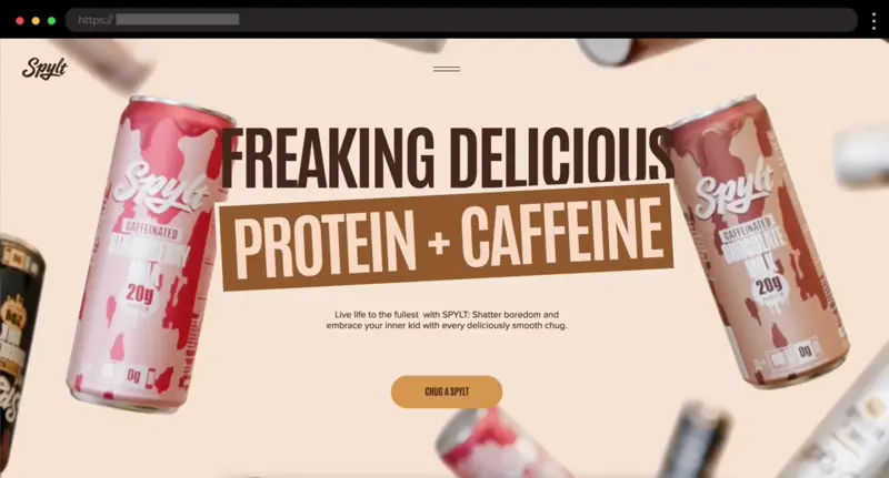
Spylt’s site is bold, clean, and full of attitude – just like their dairy-free shakes. Everything from the fonts to the scroll effects screams confident and cool.
What I like:
- Strong brand voice with punchy messaging
- Bold typography and slick scroll interactions
- Clean product pages showing key benefits clearly
7. ButcherBox – Modern Ecommerce Website for Meat Delivery

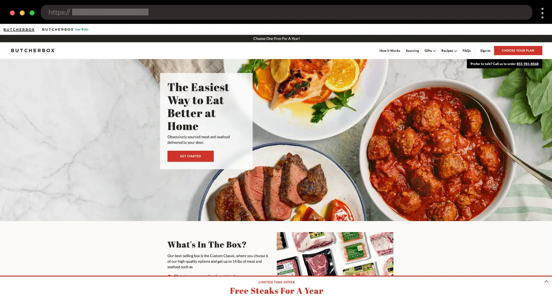
I like how ButcherBox makes something as primal as meat feel modern and accessible. It gets straight to the point with calm visuals and messaging that builds instant trust.
What I like:
- Dedicated FAQ and Recipes pages
- Modern design with neutral tones and natural textures
- Clear subscription flow with helpful visuals
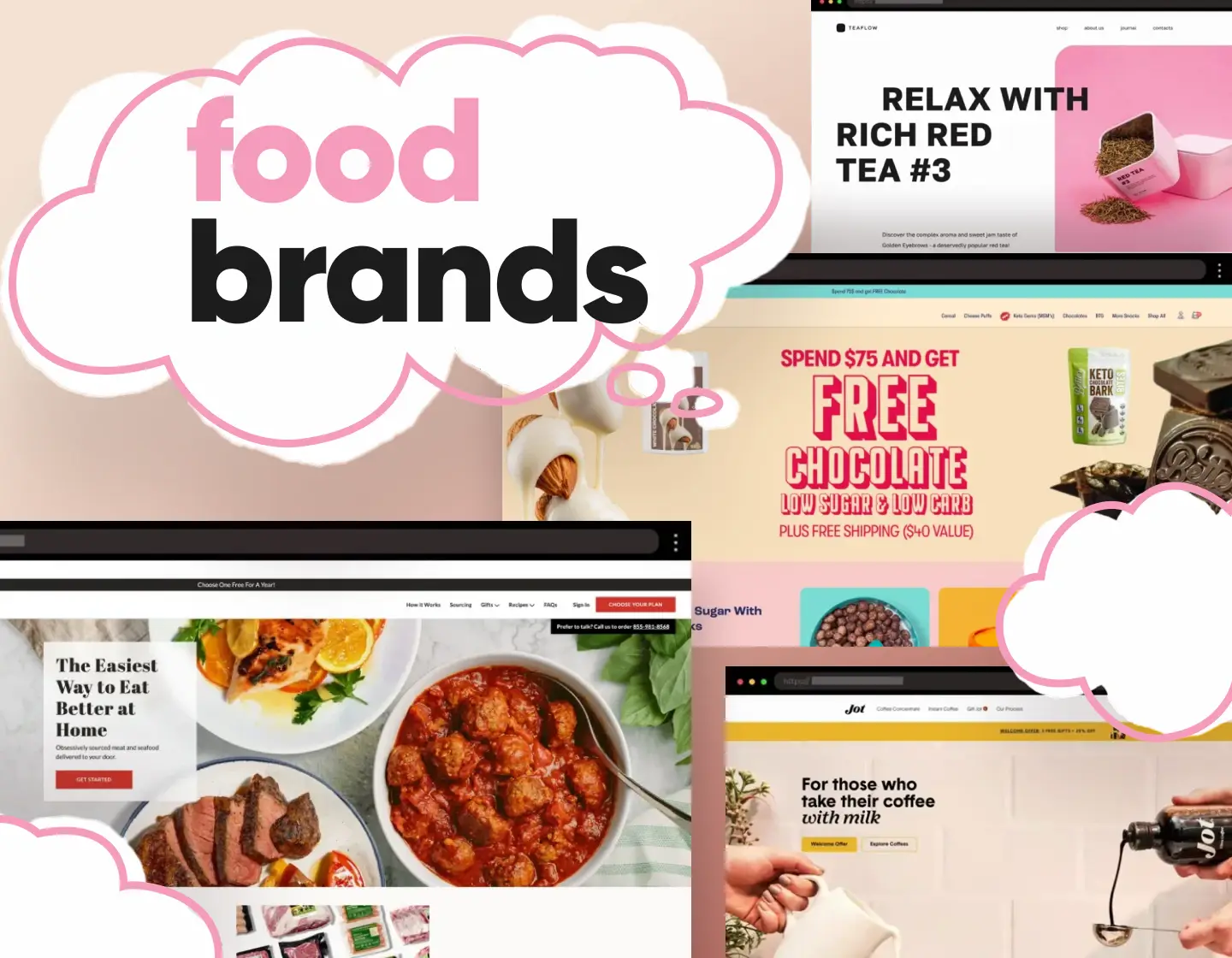
8. Jot – Sleek Website for Fresh Brewed Concentrated Coffee

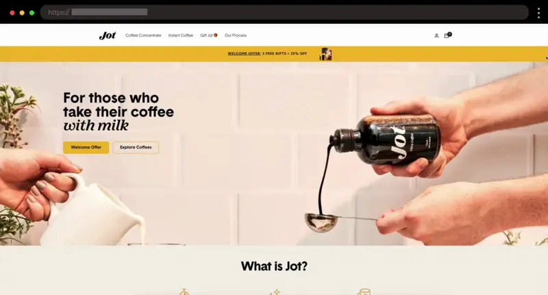
Jot keeps things simple but sharp. I personally love how clean it feels—big fonts, dark tones, and beautiful product shots that let the coffee speak for itself.
What I like:
- Black&yellow color palette with rich contrast
- Clear, bold product messaging
- Reviews section with testimonials, and videos of people using the product
9. Schoolyard Snacks – Colorful Snack Food Website with Modern Touch

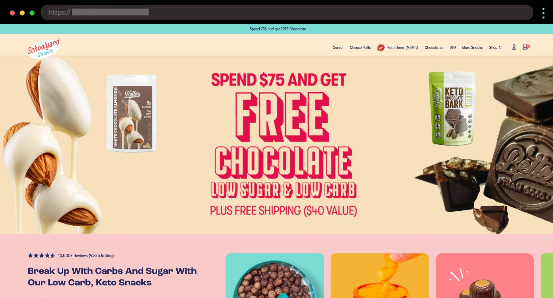
Schoolyard Snacks takes childhood cravings and gives them a grown-up, keto-friendly touch. I love that the site feels like a bright and cheeky Saturday morning cartoon.
What I like:
- Reviews section with tons of client feedback
- Fun, snackable messaging throughout
- Playful product pages
10. Ujji – Sleek Science-Backed Modern Wellness Drink Website

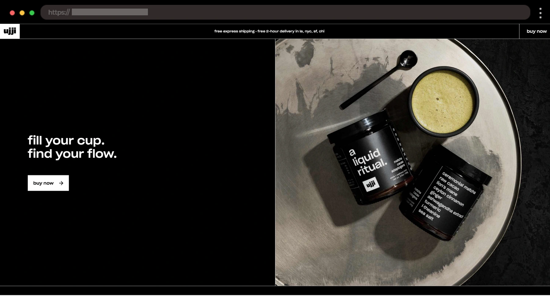
Ujji’s site is clean, confident, and all about clarity, just like the drink itself. It focused on the science, tradition, and design and doesn’t overloade the page with too much information, which I appreciate.
What I like:
- Bold black-and-white layout
- Big product visuals
- Focused messaging around benefits and ingredients
11. Charlie’s Organics – Fresh Website Design for Sparkling Fruit Water

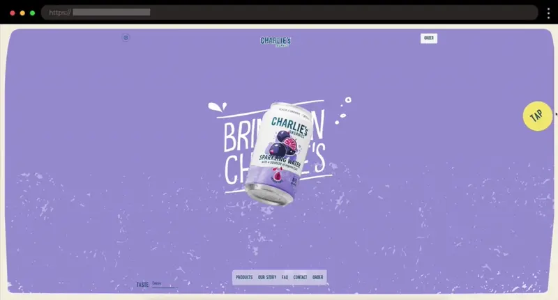
Charlie’s makes sparkling water feel as fun and refreshing online as it is in a can. The playful layout, soft colors, and clean structure totally sold the product to me.
What I like:
- Smooth scroll animations and transitions
- Playful fruit illustrations
- Clear “Order” CTAs
12. Pretzel Snacks – Premium Pretzel Food Website

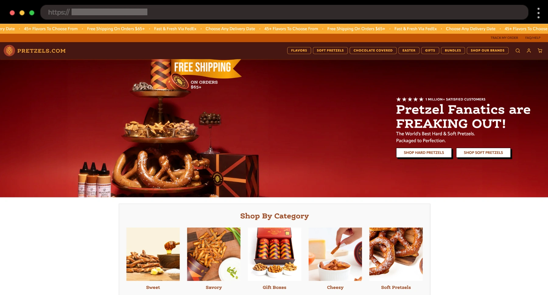
This example turns pretzels into something fancy, and I’m here for it. The slick design, deep colors, and rich product shots give everything an indulgent edge.
What I like:
- Red/orange color palette and luxe layout
- Beautiful close-up product photography
- Lots of product categories for every choice
13. Naked Life – Vibrant Non-Alcoholic Spirits Website

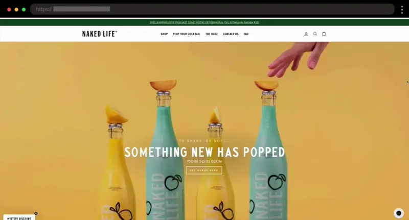
This one just pops! Naked Life Spirits feels like summer in a bottle. I love the color-blocked layouts and bold photography that bring serious appeal to zero-proof drinks.
What I like:
- Bright, tropical color palette
- Strong product storytelling
- Eye-catching homepage visuals and animations
14. Aloha – Clean Website Design for Plant-Based Protein Products

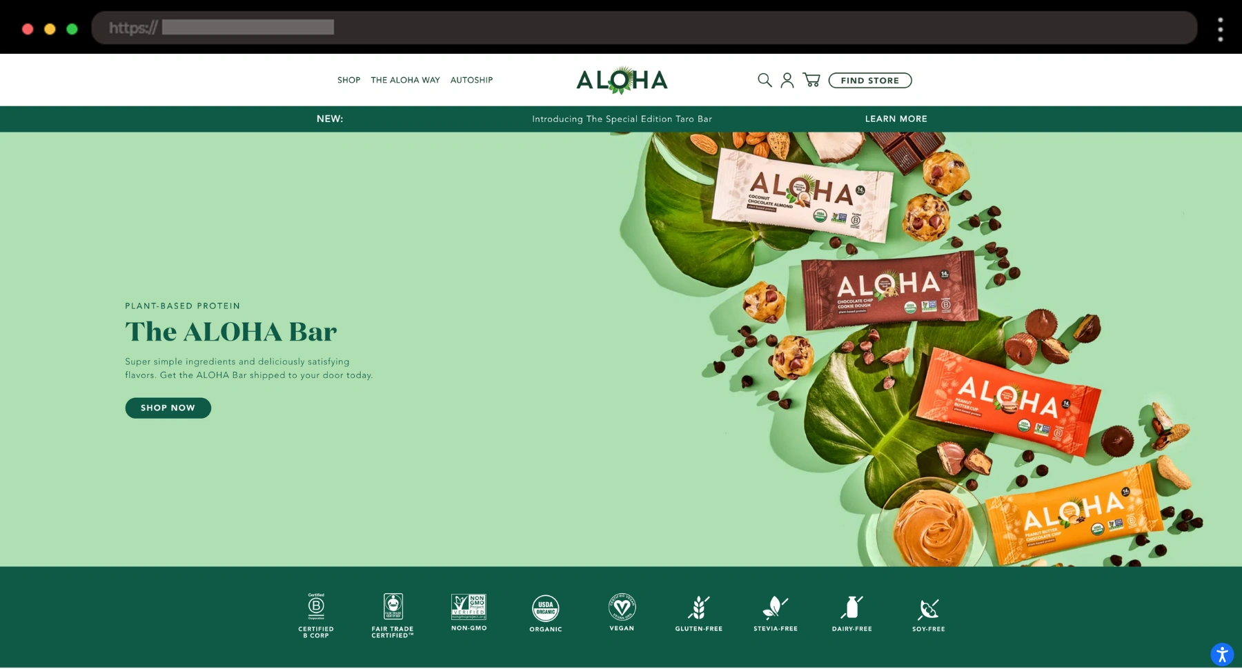
ALOHA feels like wellness on autopilot – light, airy, and clear. For me, everything feels nice and easy to explore.
What I like:
- Breezy, minimal design with lots of whitespace
- Product pages with info like ingredients, nutritional facts, client reviews
- Soft colors for a laid-back vibe
15. Teaflow – Calm Website Design for Loose Leaf Tea

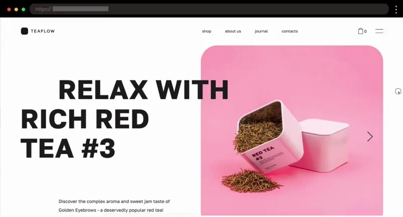
Teaflow’s site feels like a deep breath – peaceful, slow, and beautifully simple. For me, the whole experience is like stepping into a quiet tea shop online.
What I like:
- Serene modern layout
- Elegant, minimalist design with soft pastel tones
- Thoughtful product descriptions
16. Bokksu – Elegant Japanese Snack Subscription Website with Cultural Flair

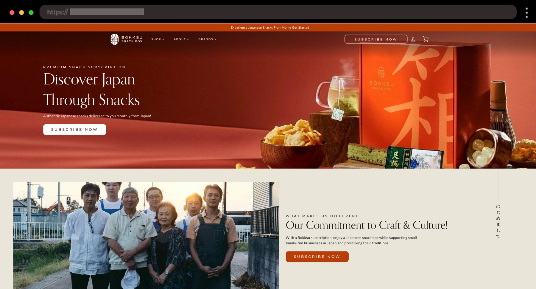
Bokksu blends tradition with modern ecommerce beautifully. I personally love how the site tells a story, and their slogan confirms it: “Discover Japan Through Snacks”. This brand doesn’t just offer snacks, but a whole experience.
What I like:
- Editorial-style layout with enough space
- Cultural storytelling through the design
- Red color accent and refined product photography
17. Droplet – Soft Sparkling Water Ecommerce Website

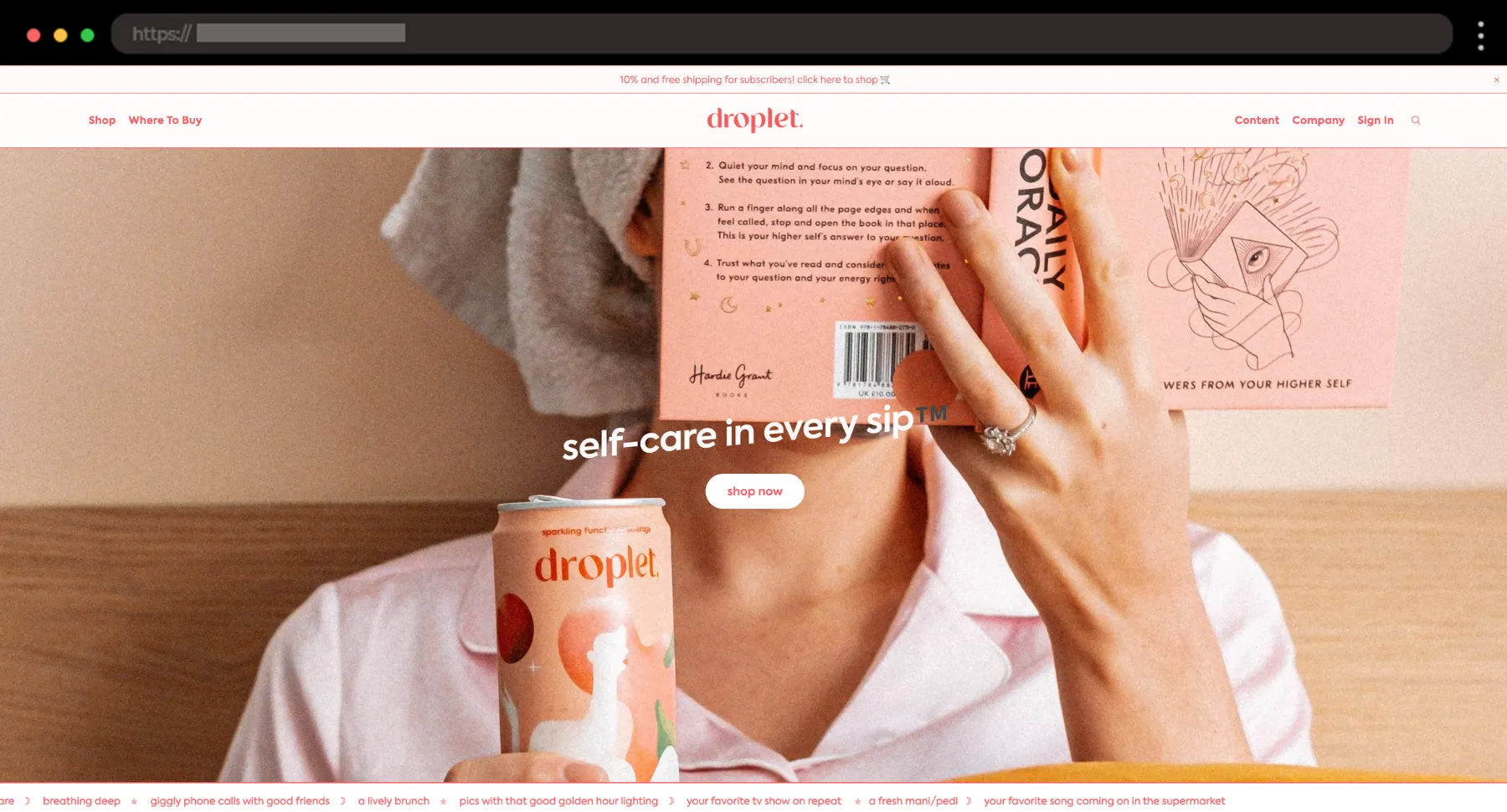
I personally love the balance of function and feeling in Droplet’s site. It feels so visually appealing with calm, pastel tones and dreamy design everywhere you scroll.
What I like:
- Soft, airy design with pastel gradients
- Editorial-style product shots
- Wellness-forward copy and packaging
18. Omsom – Bold Asian Pantry Staples Design

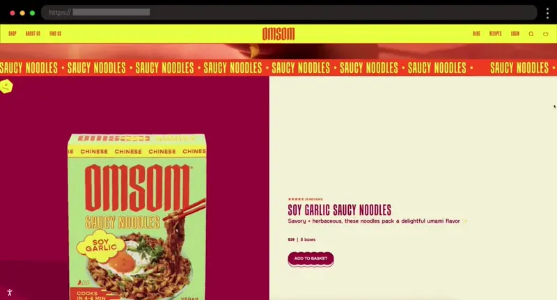
I love how Omsom celebrates flavor and heritage with awesome features: bold fonts, vibrant colors, and a loud, proud voice throughout.
What I like:
- Maximalist design with bold colors and fonts
- Strong brand personality in every headline
- Real cultural storytelling
19. Outstanding Foods – High-Energy Snack Food Brand Example

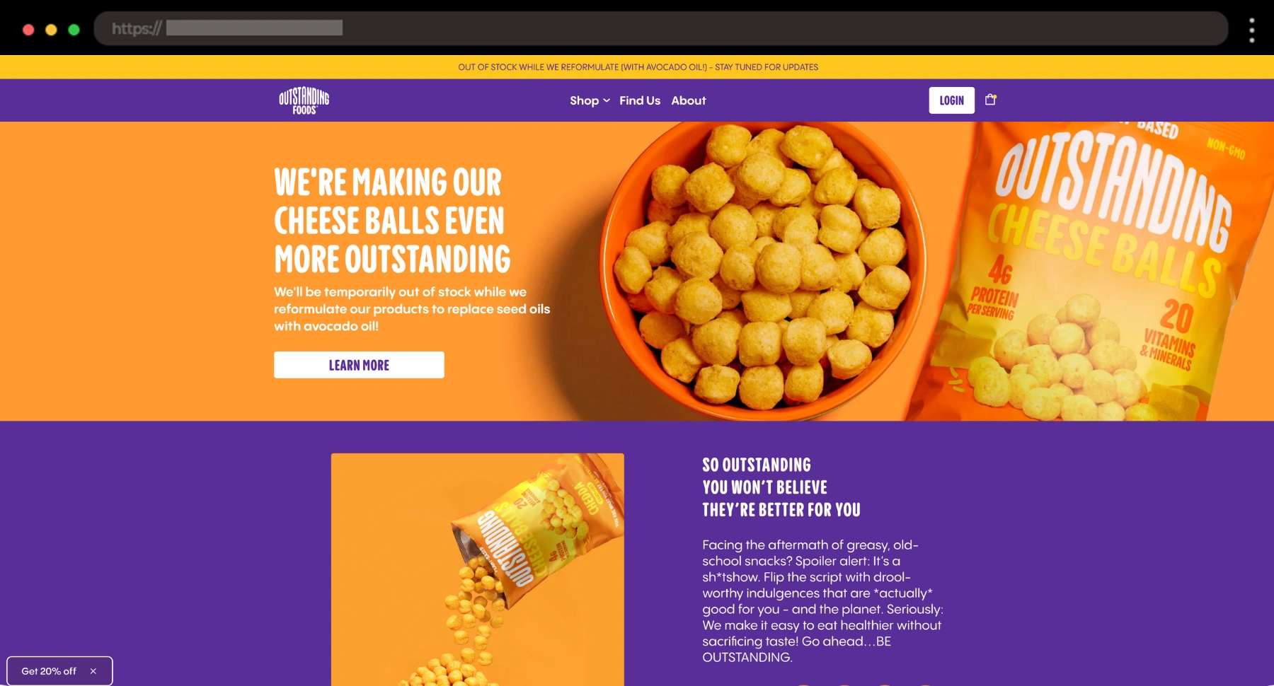
Outstanding Foods’ site is loud, bold, and totally owns it. It’s one of those examples I always bookmark for energetic, fearless branding.
What I like:
- Bold color palette and typography
- Bold messaging and fun product callouts
- Customer Reviews section with videos
20. Tea Drops – Eco-Friendly Design for Tea Brand

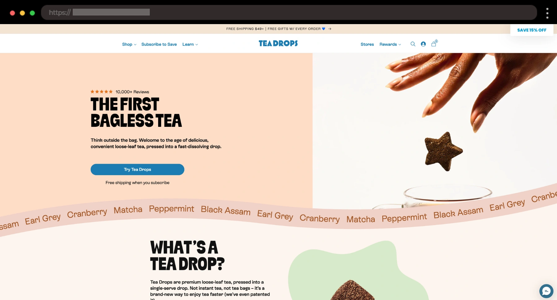
Tea Drops feels warm and handmade, just like their dissolvable tea. The site uses friendly fonts, soft textures, and earthy colors to create a cozy, feel-good vibe.
What I like:
- FAQ section
- Strong personal product story
- Clear CTAs and fun packaging presentation
21. Fellow Creatures – Playful Chocolate Brand Ecommerce Website
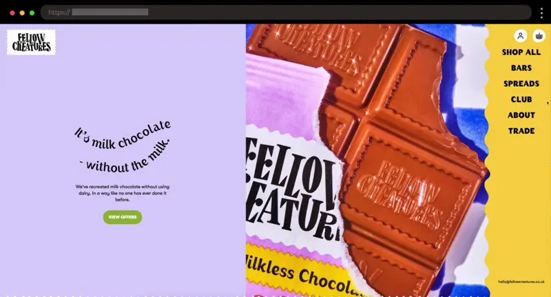
I love the bold visuals and cheeky copy that give the whole site of Fellow Creatures this fun, rebellious energy. With all the colors, shapes, and cool fonts used, they sell vegan chocolate in a whole other level of fun.
What I like:
- Confident branding with loads of character
- Bright color palette that pops
- Fun voice that makes the whole site feel alive
22. Rossini Caviar – Luxurious Design for Premium Caviar

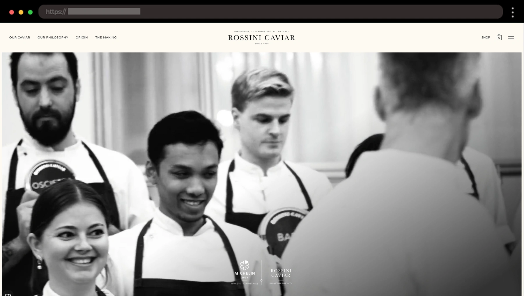
Rossini Caviar knows exactly what it’s doing. I personally like how the entire site leans into luxury without overdoing it – it’s elegant, confident, and so polished.
What I like:
- Polished photography that highlights the product quality
- Sophisticated beige/black theme
- Premium feel from homepage to checkout
23. Belvita – Energizing Snack Brand Website with a Light, Breezy Feel

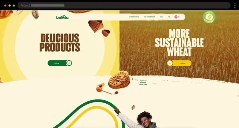
Here’s one of my favorite examples of how a big brand can still feel approachable – BelVita. Its site is like a morning boost – it’s fresh, clean, and full of energy without trying too hard.
What I like:
- Crisp, uplifting visuals with lots of whitespace
- Clear product categories and CTAs
- Fun green and yellow color scheme
24. Best of the Bone – Rustic Ecommerce Design for Bone Broth Supplements

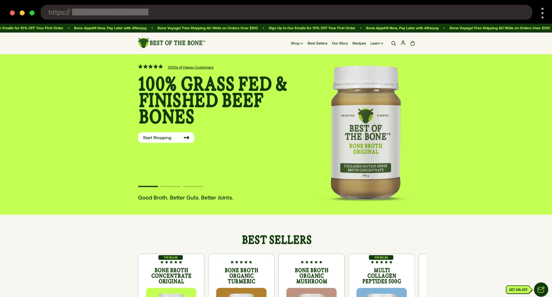
This site leans earthy and informative, like a wellness blog meets an online store. It’s packed with details, but to me, it still feels approachable and grounded.
What I like:
- Before/After New Look Image Slider
- Lots of educational content
- Earth-toned color scheme
25. Waterdrop – Fun Ecommerce Site for Microdrink Hydration Cubes

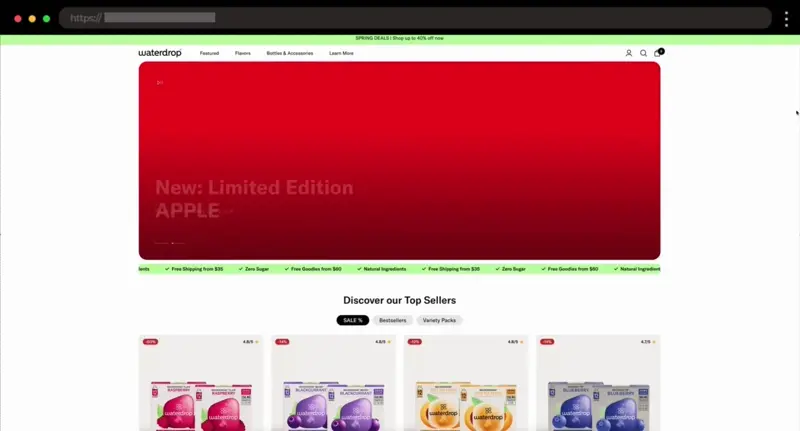
“Daily hydration, made simple” – what a cool slogan! Waterdrop’s website is just as fun and punchy as the product – vibrant blocks of color, playful icons, and easy-to-digest info.
What I like:
- Fresh modular layout
- Bright, cheerful color palette
- Quick product education
26. The Bettering Company – Colorful Snack Foods Website Design

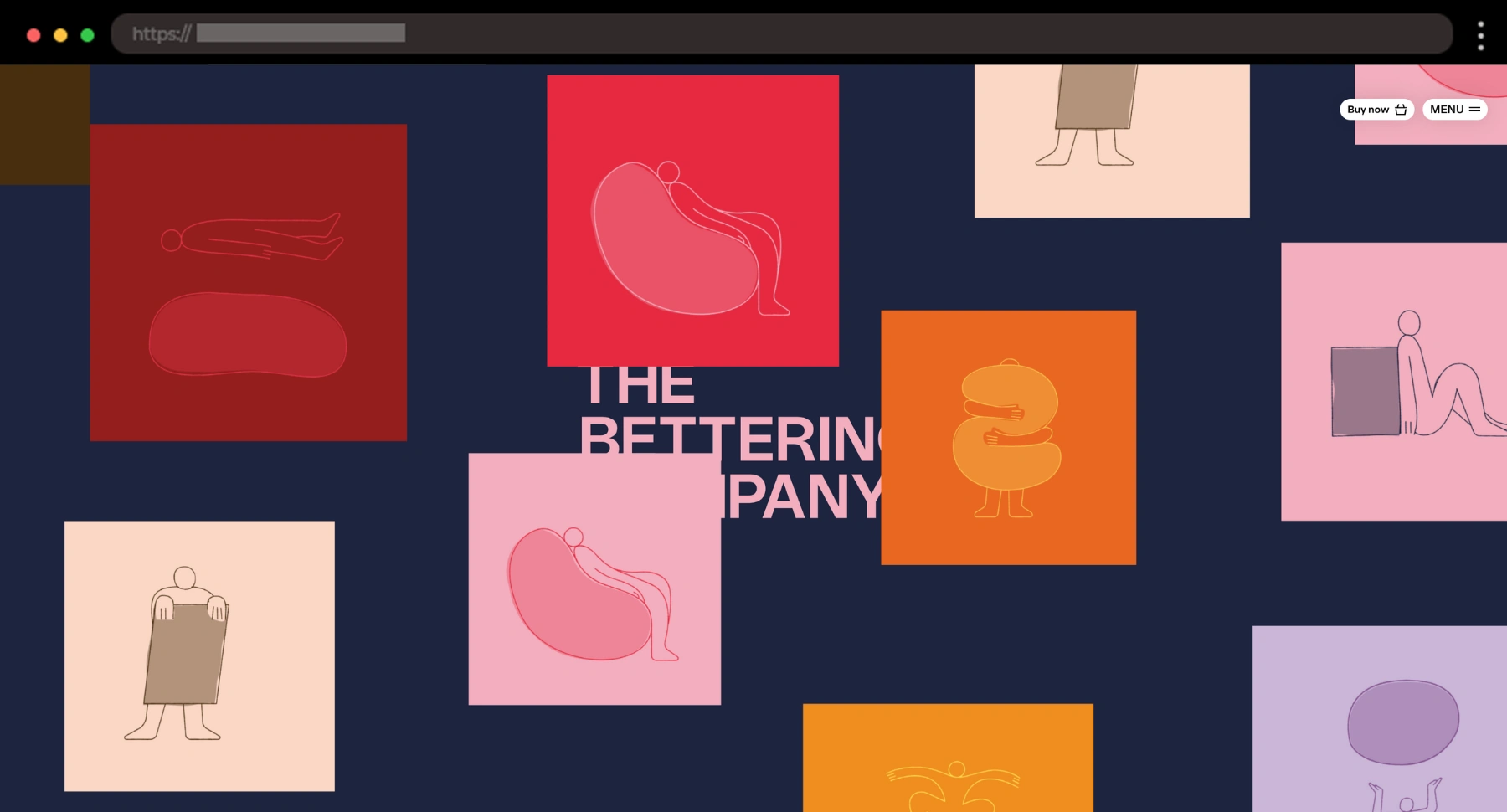
This one’s a sugar rush in design form in the best way. Loud colors, a playful layout, and joyful chaos make the site just as fun as the snacks it sells.
What I like:
- Horizontal + vertical scrolling layout on the homepage
- Bold typography and cheeky copy
- Vibrant, energetic color palette
27. Philadelphia – Fresh Cream Cheese Food Brand Website

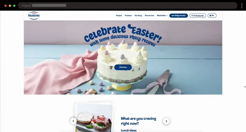
Philadelphia’s site feels as smooth as the product – soft tones, simple structure, and a bit of elegance throughout. I enjoy how calm and confident it is.
What I like:
- Creamy, muted color palette that matches the brand
- FAQ section with “There are no silly questions” quote
- Balanced mix of lifestyle images and recipes
28. Wandering Bear Coffee – Bold Website for Strong Cold Brew Coffee

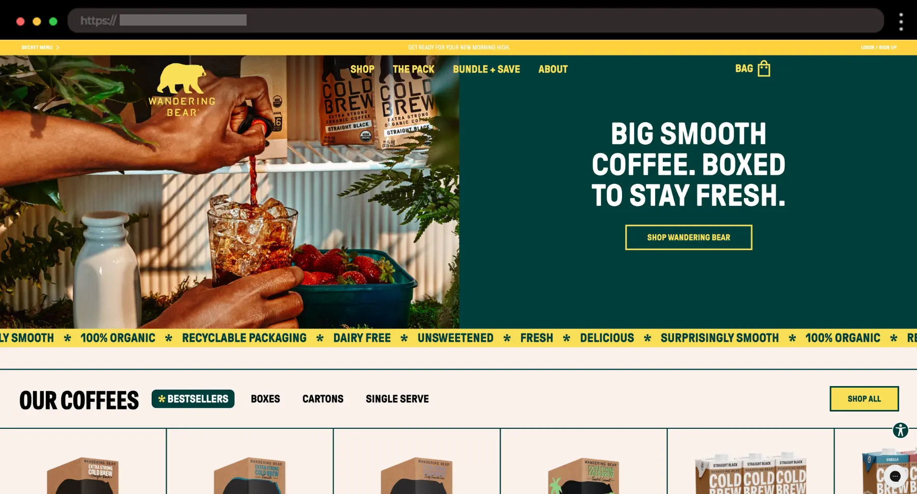
Wandering Bear hits with a bold tone and even bolder caffeine claims. I like how the site leans into big typography, bear branding, and fun color accents.
What I like:
- Big fonts and bear-forward branding
- Clear product pages with FAQ and review sections
- Bundle + Save and Membership methods available
29. Mila – Bold Website for Plant-Based Dumplings

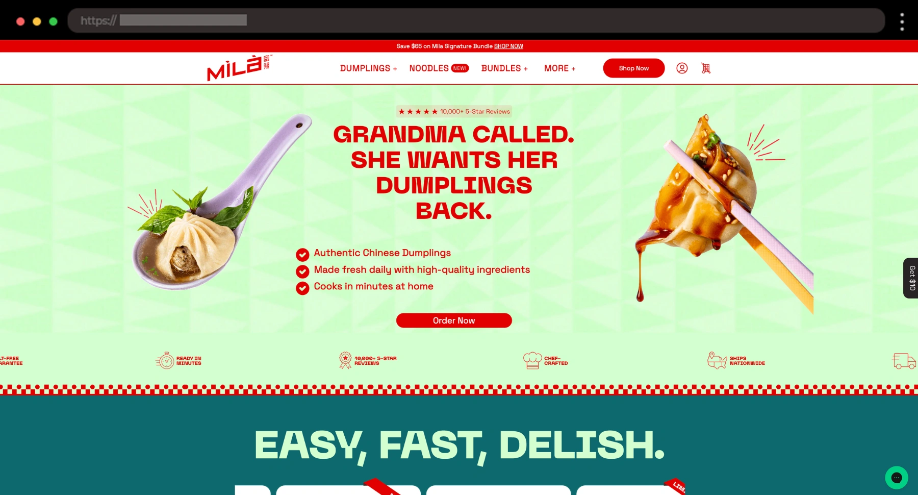
Mila’s site is playful, colorful, and full of motion! I like how it’s definitely not your average frozen food brand, as it mixes bold fonts, quirky copy, and animated flair without feeling chaotic.
What I like:
- Energetic layout with lots of movement
- Bold typography and standout headlines
- Fun touches like press quotes and playful product descriptions
30. Lay’s – Fun Website Design for a Global Snack Giant

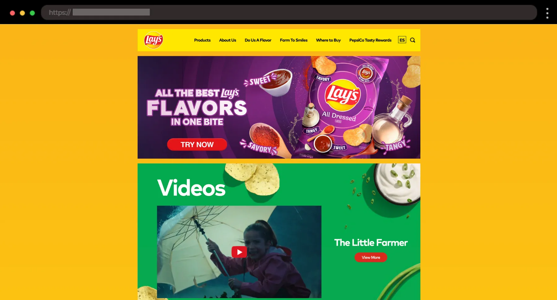
You probably know Lay’s and their great flavors and energy! The site leans into its global personality with bold visuals, snack quizzes, and playful on-brand storytelling.
What I like:
- Bright, engaging visuals
- Interactive elements like the flavor quiz
- Consistent, high-energy branding throughout
Quick Design Takeaways for Creatives
After spending way too much time exploring these 30 brands (worth it!), here are a few things that stood out to me, little things you might want to steal for your next project:
- 🎁 Let the packaging shine. If it looks good on a shelf, it should look good on the homepage, too.
- 🔠 Big fonts are in. The louder, the better, as long as the message is clear.
- 🧭 Scroll with purpose. Add movement that guides, not distracts.
- 🎨 Color = personality. Don’t be afraid to go bold, even in the health and wellness space.
- 🗣️ Brand voice matters. Cheeky, refined, calm, chaotic – whatever it is, own it!
- 🛒 Make it shoppable fast. Clear CTAs, quick add-to-cart, minimal distraction
Need help building a professional website like these? Get a free design audit → with our friends at htmlBurger.
Final thoughts
I think we can all agree by now that really great food & beverage ecommerce sites engage, connect, and make the whole experience memorable. Bold design choices, unique copy, and smooth shopping flows can transform a simple purchase into something exciting. These 30 brands show how the right digital experience can take a brand to the next level.
I hope this list sparks some new ideas for your next project! I think that the best designs often come from stepping outside the box. So don’t be afraid to experiment, push boundaries, and showcase what makes a brand stand out.
Next steps:
-
Check out these 24 Minimalist eCommerce Websites, or
-
Head back to our complete WordPress Website Examples Hub.