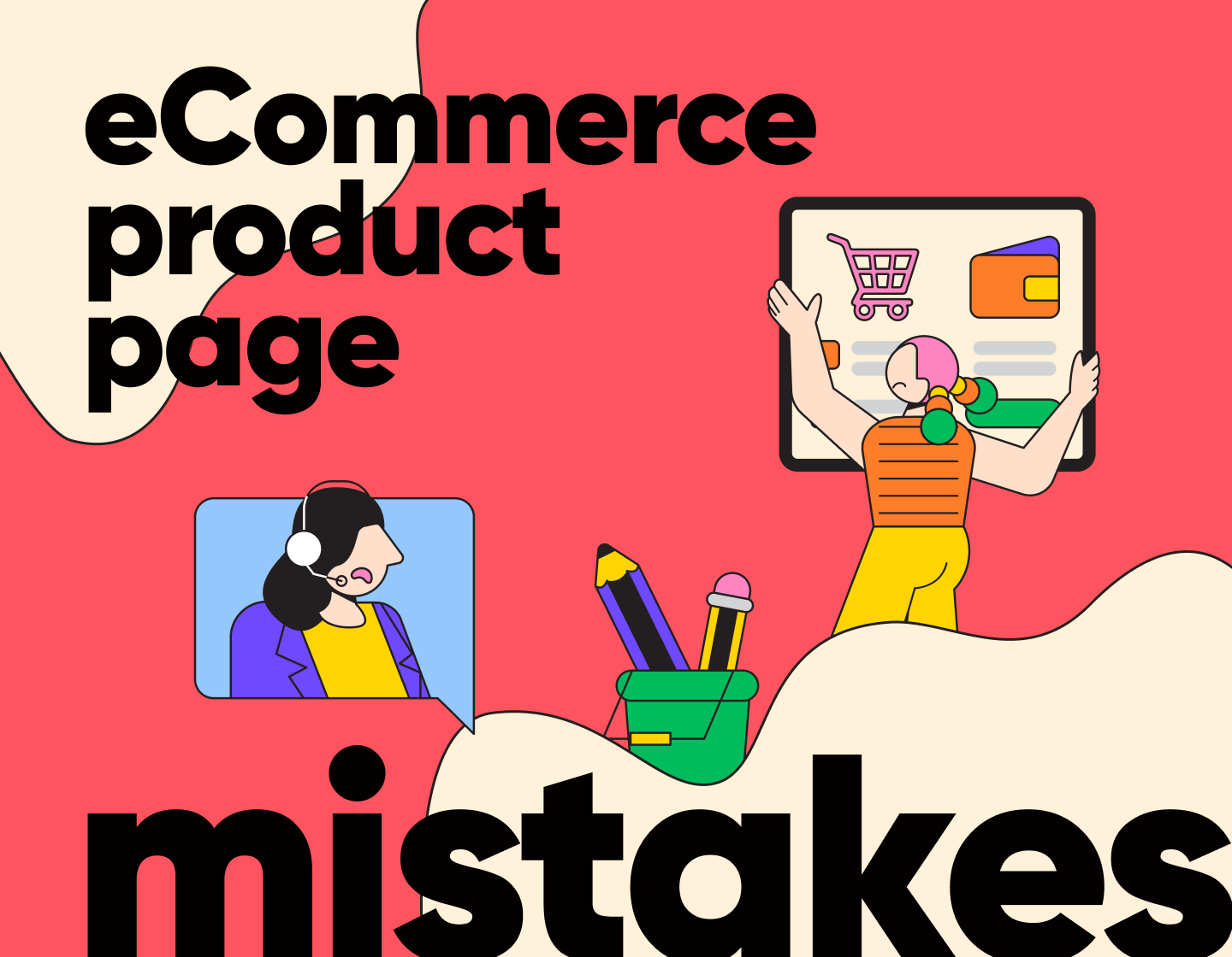


Here are 8 mistakes to avoid when designing an eCommerce product page. Things that are easy to overlook, but can definitely prevent your page from reaching its goal.
Online shopping has become a massive part of our lives, and it’s only growing. There are so many stores out there, so standing out can feel tough.
Many stores stick to the basics, but you’d be surprised how often they miss the mark on simple things. This is why I gathered those mistakes and turned them into practical tips that are pretty straightforward and easy to apply.
Avoid these mistakes, and you might notice improvements in:
- How smoothly your site runs
- The overall look and feel of your pages
- The trust your customers place in you
Ready? Then let’s start with the first one…
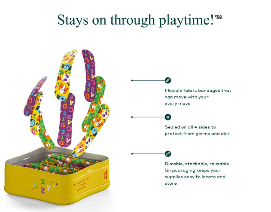
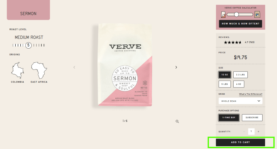
1. Not Having Enough Images
It’s safe to say that in 2025, every single e-commerce store uses images. However, not everyone makes the most of them. Having a single product image or a couple of images in a slider isn’t optimal anymore.
Your entire page needs to be filled with images of the product.


Here are some good ideas on what images to include in your eCommerce product page:
- Showcase its use case.
- Showcase the environment in which it will be used.
- Show people using it. If you can make videos show a video of your product.
- Show features of your product if it’s physically possible.

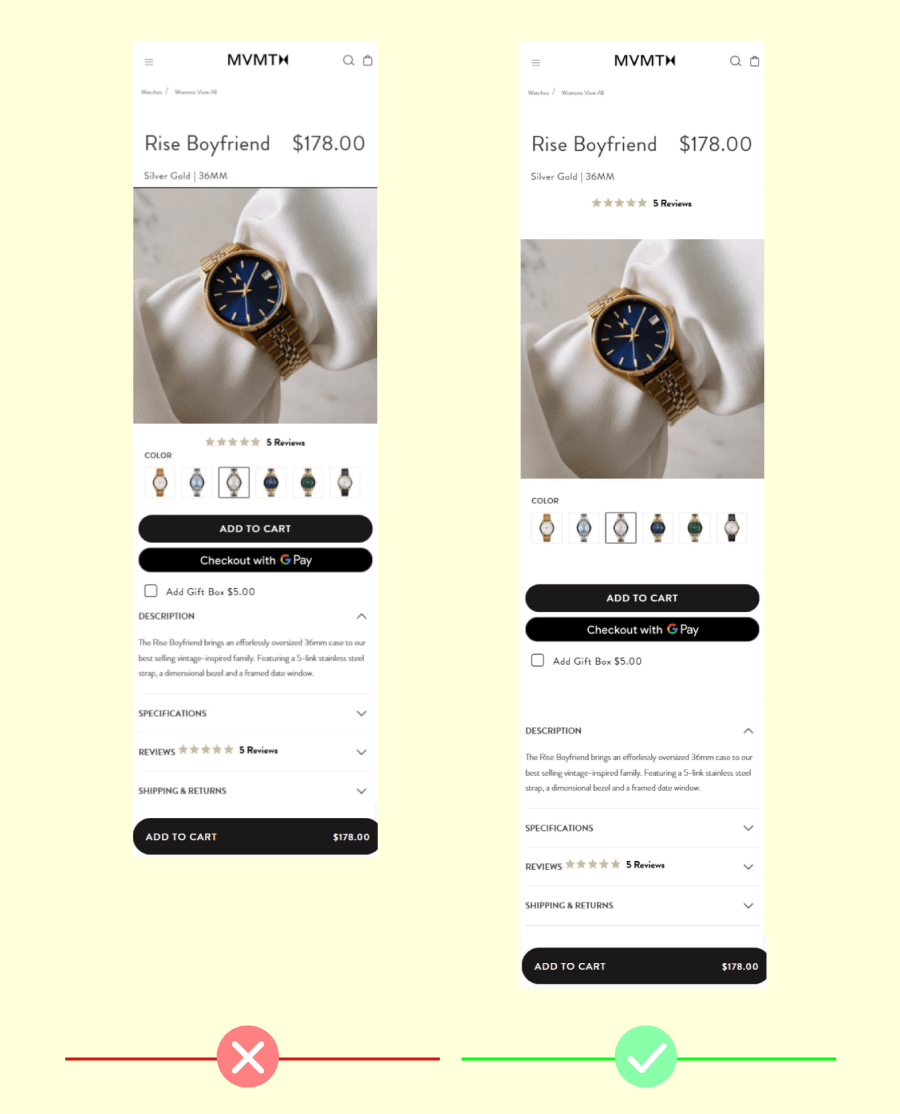
2. Using Small Images
Did you know that there is a correlation between image size and value? The bigger the image looks on your website and the more space it takes the more valuable it looks to the customer.
This technique comes from way back when advertising was mostly billboards, posters, and catalogs.


This is why most food items will look way bigger in the promo and packaging images than they actually are. People will also make a connection with size and value per dollar. This is because, for the longest time, XL or Super packs in supermarkets have always been the best value-per-dollar option.

3. Not Using Enough White Space
Proper white space is what separates a good website from a professional website. When you place elements on a web page you have to make sure that they have enough white space between them to let them breathe and stand out.
Placing too many elements like buttons, buying options, discount notices, and descriptions next to each other can make them blend into each other and make them hard to individually stand out.

Make sure all the items on your eCommerce product page have enough space to stand out for themselves.
4. Faking “Limited Time Promotions”, “Limited Stock” or “Exclusive Discount”
This mistake is a common staple of e-commerce stores. At one point a couple of years ago every single online store had a timer at the top counting down and making you feel like if you don’t buy right away you will miss the deal of a lifetime.

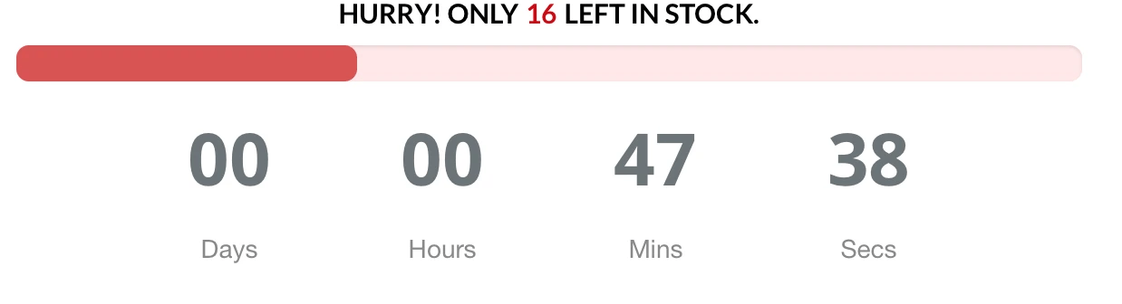
Don’t get me wrong having a limited-time offer and taking advantage of the FOMO effect works. Exclusivity really makes items more valuable, no question about that. But when every day you have a limited-time offer for every product you are just cluttering your website.
Make sure that when designing your product page, the Limited time promos are really limited.
Just like Limited-Time offers that last forever, limited-stock offers try to achieve the same result.

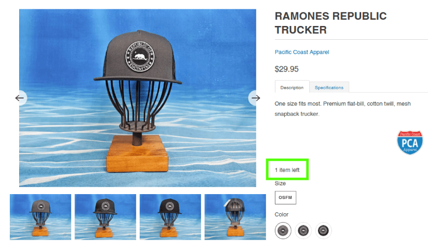
There really isn’t much to say about these. If you use them correctly you will see results. If not you will just make your returning customers not take you seriously.
5. Burying The CTA Button
This is a design mistake that is super easy to make if you’re not careful. Remember that when someone lands on your page the main goal is to get them to buy.
This is why the buy button needs to stand out.
You will find a lot of online shopping websites use the same color for their buttons like the rest of the websites. You probably want to avoid this. The buy button should stand out and draw attention. The first thing a user should learn after landing on your product page is where the buy button is. Don’t make it blend in with the rest of the website and don’t clutter the space around it.

6. Featuring Only 5-Star Reviews
Your customers will not expect to find one on your website. In fact, most customers will become wary if a product or a service seems too good. Pretty sus! Even though everyone knows that it is still very common to see websites selling only 5-star products with not a single negative review or really anything even remotely negative about them.
Having a few negative reviews is not bad. No business was brought down because 1 out of 100 people didn’t like their product. If you have bad reviews, address them, reply to them and move on.
7. Completely Forgetting About SEO
SEO always seems to be an afterthought for most e-commerce stores, especially new ones. Since SEO usually yields results rather slowly most e-commerce stores leave it as something to figure out later down the line.
The earlier you start your SEO efforts the earlier you will start reaping the benefits. This is especially true if your online store utilizes Google Ads to promote specific product pages. A better-optimized page in terms of SEO will pay less for ads. This will help you reduce some of the costs you spend on ads.
There are way more than enough resources online that give a detailed overview of how to do SEO for e-commerce so I won’t be focusing on them in this article.
8. Not Implementing Product Schema Markup
Schema markup is one of the biggest things no one is talking about. It helps search engines understand your website better. This can lead to more detailed search listings, making it easier for people to find what they’re looking for.
It also prepares your site for voice search and AI technologies, so you will be rest assured that your content is accessible in various formats.
Basically, schema markup improves how users interact with your site. For example, Google’s Speakable feature uses schema to identify content suitable for audio playback, expanding your reach to users who prefer listening over reading.
Local businesses can also benefit from schema markup by highlighting details like contact information and reviews. This helps the business stand out in local search results.
And there you have it! Any eCommerce product page has one job—show off products in a way that makes people click “Add to cart” without overthinking it. If the page feels clunky, confusing, or kind of meh, chances are one (or a few) of these mistakes are hiding in plain sight.
Tidy them up, keep things focused, and don’t forget that good design and smart content work together.
For more insights, practical tips, and inspo, check out what else is cooking in our blog or jump straight to one of these articles: