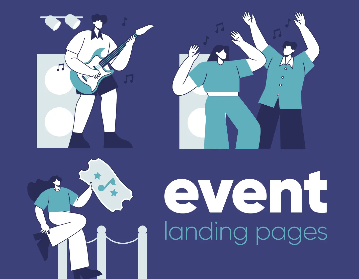
You know that feeling when you land on an event page, and within seconds, you just know this is something you can’t miss? I get excited every time I stumble across a cool concert or a quirky convention!
That’s the magic of a well-designed event landing page. It builds excitement, makes the details crystal clear, and most importantly, gets you to hit that “Register” button without a second thought. But not all landing pages pull this off. Some are messy, dull, or leave you wondering, “Wait… what’s this event even about?”
So, what makes an event landing page truly stand out? In my book, it’s a mix of eye-catching visuals, clear messaging, and a top-notch user experience. And lucky for you, I’ve rounded up 15 killer examples that tick all of these boxes. Let’s check them out!
1. Taipei CodeFest 2024 – Exciting Landing Page for Tech Conference

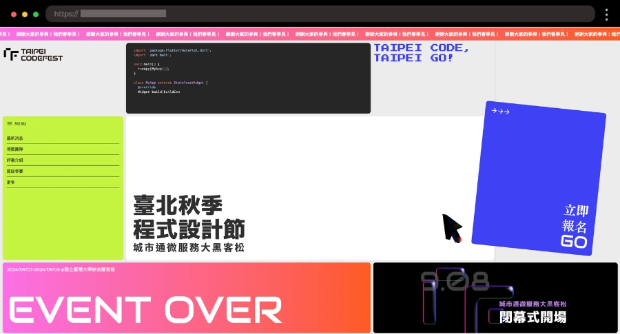
How cool and colorful is this landing page? Its vibe totally matches the programming and tech scene, with a high-energy design and visuals. I love how it lays out everything you need – from frequently asked questions to event info and schedule.
Features I like 😍:
- Bold and modern design that fits the tech theme
- Color theme toggle
- Strong call-to-action for registration
2. ETHCC – Fresh Blockchain Conference Event Page

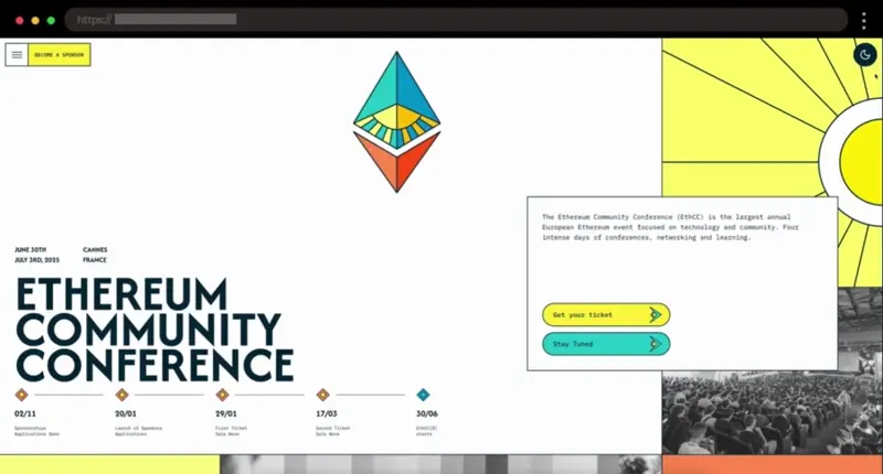
I like the fresh vibe of ETHCC’s landing page, with its pastel yellow and teal accents and modern fonts. It’s easy to find key details like event info, sponsor links, tickets, FAQs, and blog posts – all very well-organized.
Features I like 😍:
- Quick access to event info, sponsors, tickets, and helpful links
- Pastel color accents
- Modern clean fonts
3. Artist Project – Vibrant Event Page for Art Lovers

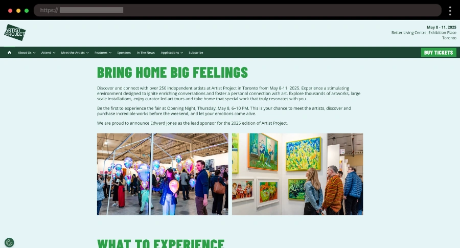
What I find cool about the Artist Project landing page is how the green tones create a vibrant fresh atmosphere. Each important section, from artists to sponsors and installations, has its own dedicated page, and the newsletter sign-up form is easy to spot.
Features I like 😍:
- Engaging design with fresh green tones
- Dedicated pages for artists, features, sponsors, installations, etc.
- Easy access to the newsletter sign-up form
4. DesignThinkers – Bold Landing Page for Graphic Design Conference

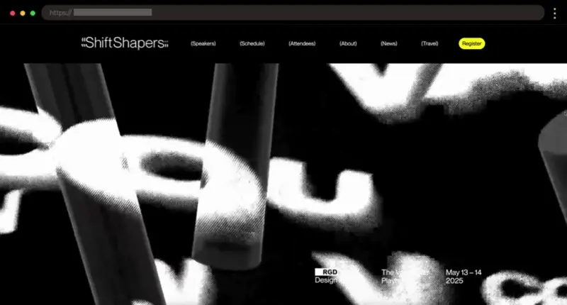
This landing page has such a cool, energetic vibe that instantly grabbed my attention. With bold colors, fun animations, and a simple layout, it’s easy to see why this event is a must for graphic designers!
Features I like 😍:
- Bold black, white, and yellow color theme
- Fun animations and effects
- Easy sign-up form to stay updated
5. Unfold Event – Unique Landing Page for Creative Business Conference

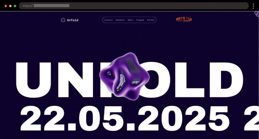
I really enjoy how the Unfold Event page grabs attention with creative animations like the 3D object in the intro and the animated countdown. The tickets button in the navigation is also a unique touch, standing out visually to guide users to the most important action.
Features I like 😍:
- Creative animations
- Unique tickets button in the navigation
- Sections for location, partners, and event info
6. Bonnaroo – Energizing Event Page for Music Festival Fans
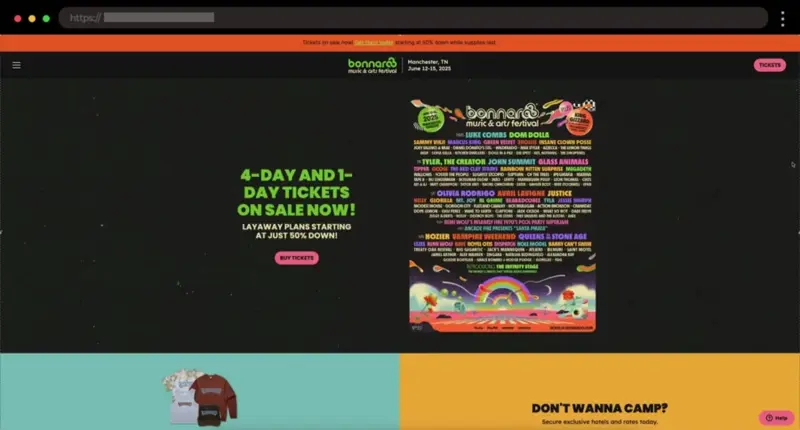
I’m all about the fun energy of Bonnaroo music festival! It immediately gets you excited with its bold design, and everything you need, like tickets and the lineup, is well presented.
Features I like 😍:
- High-energy design with bold visuals
- Clear access to ticketing, lineup, and sponsors
- Easy-to-navigate layout
7. Nihonbashi Sakura Fes – Beautiful Landing Page for Japanese Spring Festival

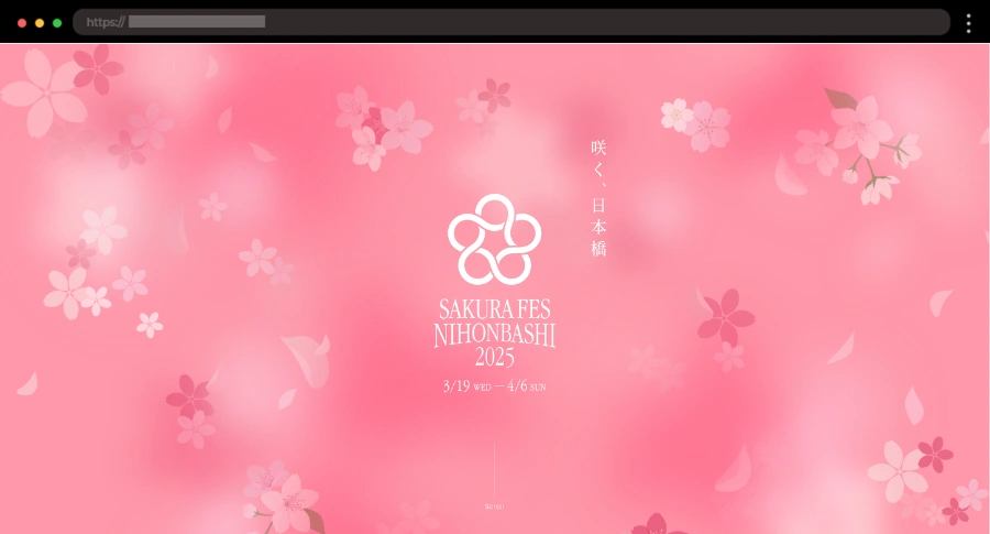
Pink is my favorite color, so I absolutely love how the Nihonbashi Sakura landing page incorporates soft pink tones with floral ornaments. The site includes stunning event photos and lots of useful information about this exciting spring festival!
Features I like 😍:
- Soft pink and floral accents
- Event photos and downloadable brochure
- Map, access info, and sponsor details
8. Formula 1 Japan Grand Prix – Exciting Event Page for Racing Fans

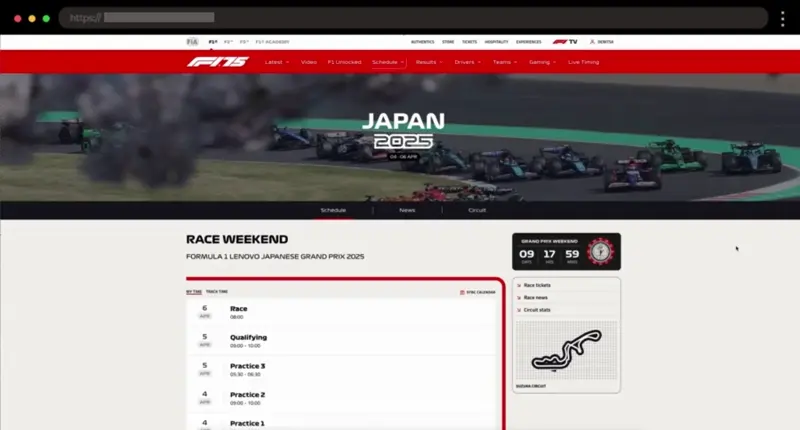
I’ve become a real Formula 1 fan over the past year, and this Japan Grand Prix landing page really excites me! It captures the energy of the race perfectly, with vibrant visuals, a detailed circuit map, and bold typography that makes you feel like you’re already at the track.
Features I like 😍:
- Map of the circuit with all sectors included
- Easy-to-navigate tabs for schedule, news, and circuit info
- Full schedule listed and articles about the event
9. CreativeWorks West – Inspiring Creative Professionals Event Landing Page

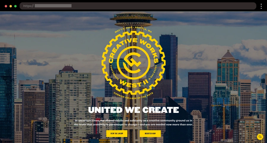
What I think works well about the CreativeWorks landing page is its clean, modern design and interactive features. I really appreciate how the speakers lineup, schedule, and locations are clearly laid out.
Features I like 😍:
- Bold design with yellow accents
- All useful info in one place
- FAQ and Testimonials sections with videos
10. ApeFest – Exclusive Event Page for Bored Ape Yacht Club Gathering

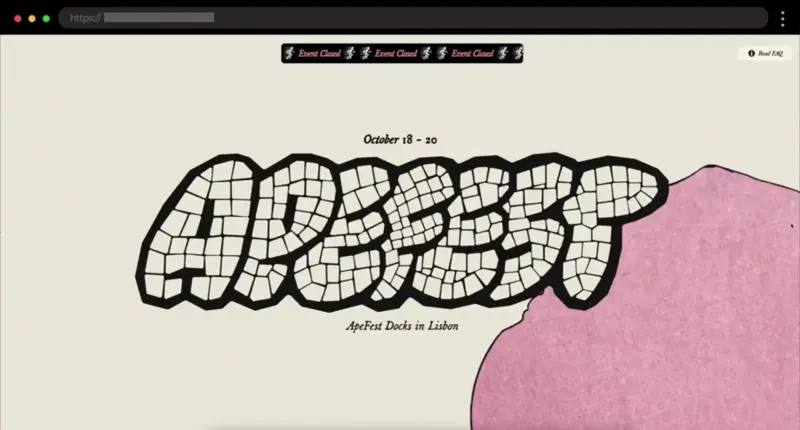
ApeFest’s landing page captures the exclusive vibes of the Bored Ape Yacht Club, with bold typography and eye-catching animations. Scrolling through the page feels like an experience itself, thanks to smooth parallax effects and the interactive map that makes you want to be there.
Features I like 😍:
- Engaging event schedule
- Smooth parallax effects
- Interactive map with event location
11. Summer Game Fest – Vibrant Event Page for Gaming Festival

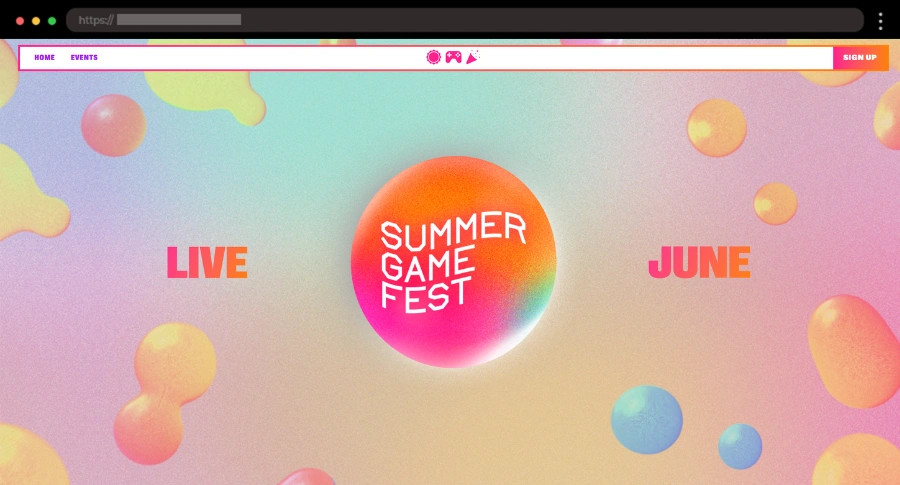
If you’re working on a gaming event, Summer Game Fest’s landing page is a great example of how to energize your design. What stands out to me here is the clear CTA and easy sign-up form – everything’s laid out so well for a great browsing experience.
Features I like 😍:
- White background with vibrant color accents
- Bold fonts and action-packed visuals
- Clear CTA and sign-up form for easy updates
12. MCBW – Fun Munich Creative Business Week Landing Page

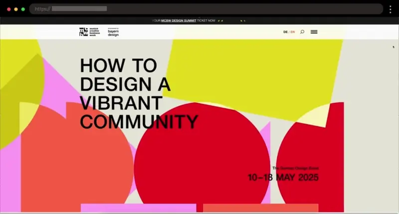
What I love about the MCBW landing page is how it combines trendy design with vibrant color accents and cool touches like online magazine articles. The creative spots list is a great addition, plus the social media section keeps the event connected with its audience.
Features I like 😍:
- Bold design with vibrant color accents
- Online magazine articles and creative spots list
- Social media section for audience engagement
13. SunFest – Country Music Festival Landing Page

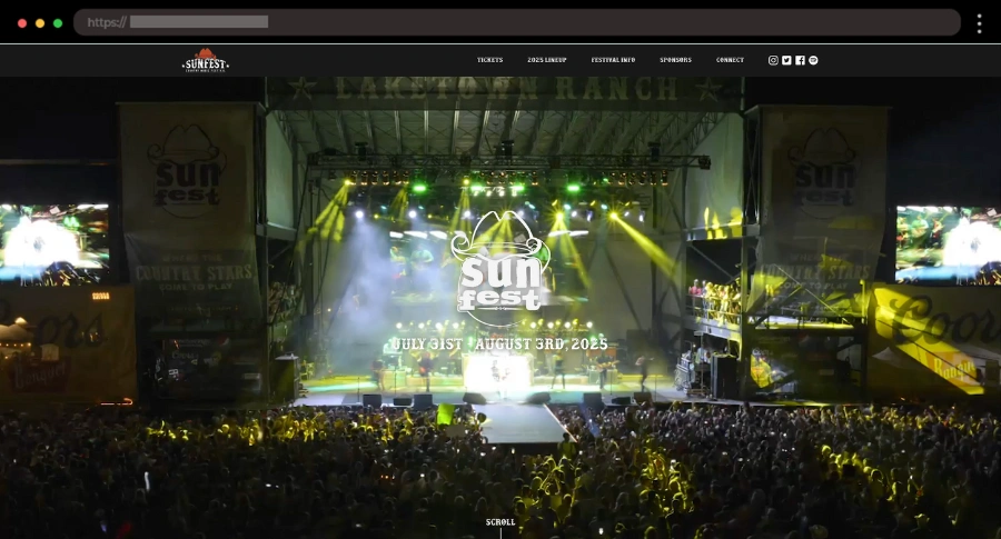
Honestly, country music isn’t really my thing, but I appreciate how well the SunFest landing page captures the energy of the event. The intro video is a standout, and the layout provides access to the festival’s lineup, location, and sponsor details.
Features I like 😍:
- Cool intro video
- Direct access to lineup, festival info, and location
- Sign-up form and sponsor highlights
14. Autonomous Ecologies – Art and Science Exhibition Landing Page

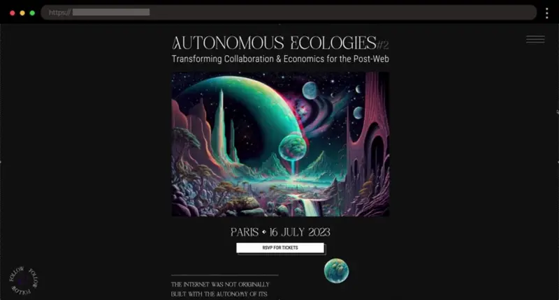
Next, we have the Autonomous Ecologies page, which I think really stands out with its creative, futuristic design. It offers an insightful blend of art, science, and technology, all in a simple and clean layout.
Features I like 😍:
- Futuristic and creative design
- Engaging, thought-provoking content
- Clear schedule and venue details
15. Expo Belgrade 2027 – Engaging Landing Page for Global Expo

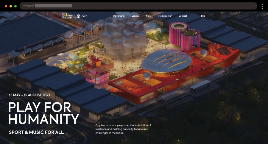
I appreciate how this expo page builds excitement with a countdown and a focus on Serbia’s Expo history. The interactive timeline and footprint sections are a great addition to get to know the idea behind the event.
Features I like 😍:
- Countdown to the event
- Interactive timeline of Expos
- Detailed visitor and event info
Want more homepage inspiration?
Explore the full collection in our WordPress Website Examples Hub
Must-Haves for a High-Converting Event Page
A great event page should sell the experience and reflect the brand behind it. I really believe that if you get these right, it will do the marketing for you. Let’s see what I’m talking about:
- Bold visuals & branding ✅ – Eye-catching images, videos, and colors that set the right mood.
- Essential event details ✅ – Date, time, location, and what attendees can expect.
- A clear ticket & registration section ✅ – No one should struggle to sign up.
- Strong CTAs ✅ – Make buttons for tickets, sign-ups, or more info pop.
- Speaker or performer lineup ✅ – Highlight key names to build excitement.
- Social proof that sells ✅ – Sponsor logos, past event highlights, or testimonials.
- An email sign-up form ✅ – Capture leads and keep potential attendees in the loop.
Wrap-up Time
I think a great event landing page should make visitors feel the excitement of the event right away. It makes information easy to find and pushes you to take action without thinking twice. That’s what separates a forgettable page from one that actually works.
If you’re creating a page for an event, think about how it feels to land there. Would you be excited to attend? If not, tweak the visuals, simplify the layout, and make the CTA impossible to ignore. Done right, your landing page won’t just inform, it’ll convert.
What to do next:
-
Check out these 13 high converting landing page examples, or
-
Jump right back into our complete WordPress Website Examples Hub.