So, after battling through an army of Google search results, a visitor finally lands on your one-page website. And just like Eminem said, you’ve got one shot. No pressure, right?
These days, user experience (UX) matters—a lot. The way people interact with your site, their first impression, and whether they stick around (or bounce faster than a bad WiFi connection) all come down to design. The good news? User behavior is pretty predictable, so you can actually plan for success.
Is your one-page site easy to navigate? Does the content flow like a good story? Will your CTA button get the attention it deserves, or will it be ignored like an unread email? Should you use a pre-built one-page Bootstrap template, or go full DIY mode? These are the big questions, and they all play a major role in turning visitors into fans, followers, or customers.
I’ve done the digging, so you don’t have to. Check out these 33 one-page websites that absolutely nail it—scroll on and get inspired!
1. Roma Domestic Workers
“Roma” is a storytelling website that may blow your mind. The web design colors fully correspond to the seriousness of the site theme. The main idea is not only to represent Roma Domestic Workers’ movie but to make people pay attention to one enormous problem.
2. All N One House Of Beauty
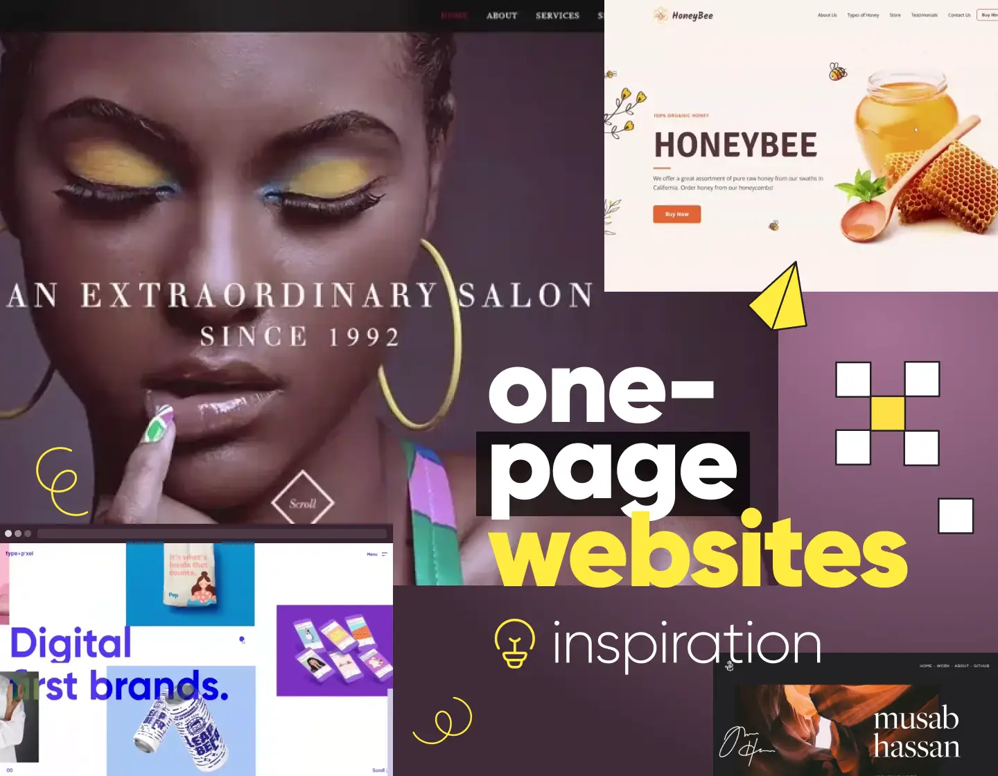
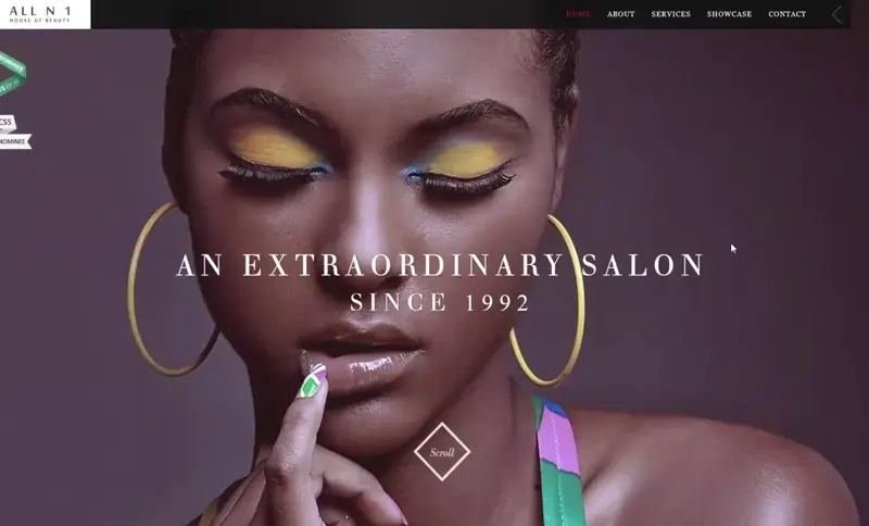
This is a WordPress-built website. It is one of the great examples of a one-page website, as it is stylish and fully corresponds to the “beauty” theme. The colors they used to design the website are bright and contrasting, womanish. The way it is animated makes it look high- technological and eye-catching. The used images are high-quality photos, much darker than anything on the website, which gives a luxurious outlook.
3. We Ain’t Plastic
This site gives a simple yet useful customer experience to its visitors. The animations in the very first opening of the link leave the feeling that you are watching a movie. The website design is all black, grey, and white, which makes you pay real attention to the text.
4. HoneyBee
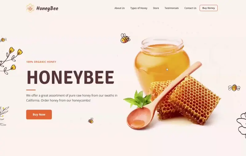
This one-page website is a great example of how colors, textures, shapes, fonts, and icons can work together like a well-rehearsed band—everything just clicks. It proves that a single-page layout can grab attention, showcase a product, and bring a brand’s identity to life, all in one smooth scroll.
5. Musab Hassan
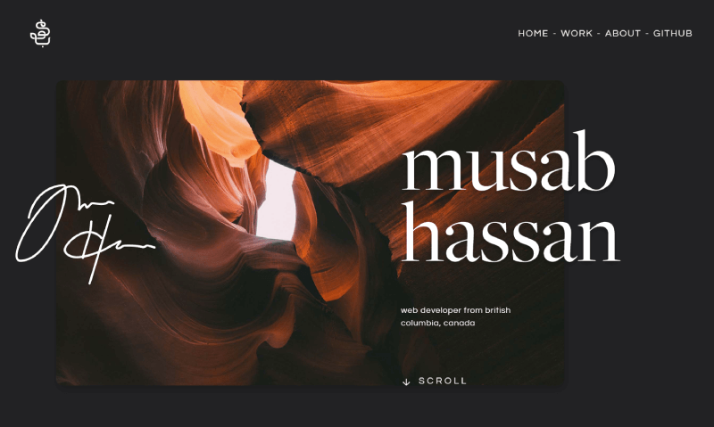
This is a really impressive one-page website design of a person’s portfolio. The background design is simple, yet looks modern using these dark colors. The slow-motion animated pictures fit well as they present the person’s work, making the customer stop and scroll to see everything.
6. Clever Birds
“Cleverbirds” is a great example of a one-page website as it is well-designed and high-technological. The animations are simple but well picked and the only used colors for the text are black and white. That contrasts and makes the customer pay more attention to the visual content.
7. Type And Pixel
This brand bet on animation a lot while creating a website. The text is keeping it short and simple, giving not much, but enough information on the main important points. The whole website is colorful and keeps the customer’s attention.
8. Cre8tive Revolutions
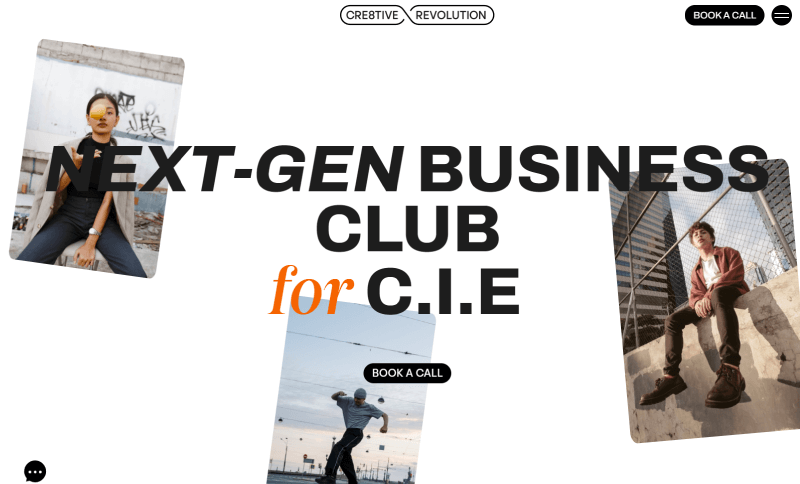
This site is well structured with a white background, black text, and pops of orange. There’s just one main button (Book a Call), but plenty of sections: solutions, about, testimonials, and programs. Even with all that content, the layout stays clean and keeps visitors scrolling. The text-heavy sections are broken down into button lists to avoid overwhelming users, making everything easy to scan.
9. Hourly Task Manager App
This one-page site from a Russian startup knows how to keep things stylish without going overboard. The bold typography grabs your attention, and the smooth animations add a little movement—without making you feel like you’re on a rollercoaster. Sticking to just three main colors keeps everything looking clean, organized, and easy on the eyes. Simple, sharp, and straight to the point!
10. ATMOS
This page is an experiment of LeeRoy Playground – a creative space that web artists use to experiment technically and visually. I have to admit that this is one of the most interesting web pages, not only one page but in general that I have ever seen. The 3D Videogame way that the website is built and designed, makes us scroll to discover more and more interesting facts about something that the whole world uses in common – aviation. The website has relaxing music implemented (it can be turned off by a button in the top right corner if needed), which makes the customer’s experience fantastic.
11. Bek Store
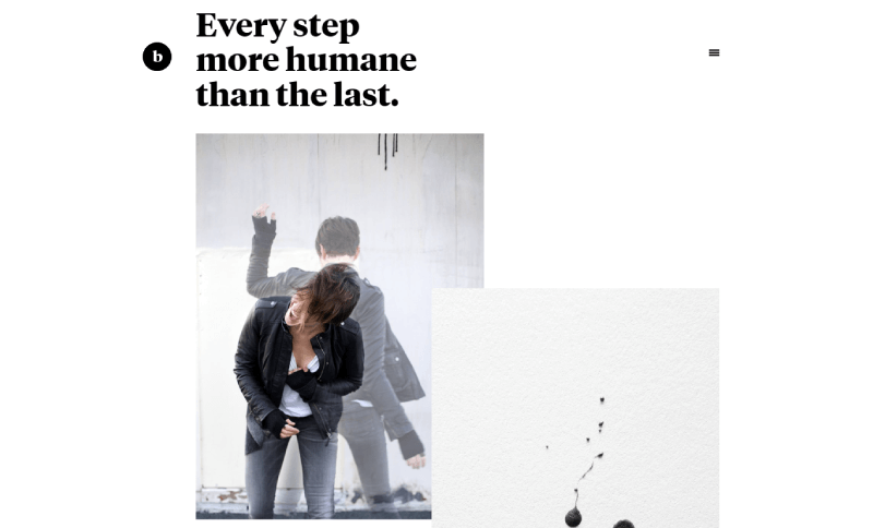
This one-page website design looks nice and it represents the creativity of its owner. The background is white and the text is only black, which makes you pay attention both to the text and the implemented pictures. The text is simply and creatively written and it leaves the feeling of real communication to whoever reads it.
12. Sweet Rice Coppe Milk
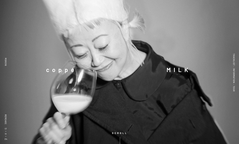
This one-page site from Japan is very cool with a minimalist monochrome color scheme. The clean, no-fuss design fits perfectly with its target audience, giving off a modern and stylish vibe. It’s just what you’d expect from a music event organizer who knows its crowd. Simple and straight to the point—they absolutely nailed it!
13. Genesis
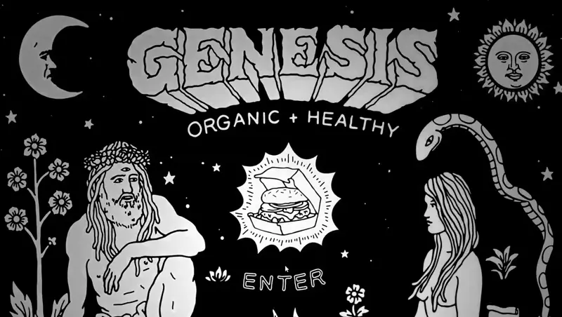
This one-page site is a great example of storytelling. Instead of breaking things into blocks, it lets the content flow naturally, pulling visitors in as they scroll. The artistic design keeps readers engaged, making the whole experience feel more like a visual novel than just another website visit.
14. Baron Bar
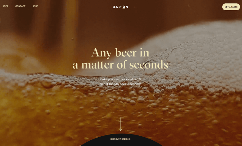
The implemented video banner in the very first opening of the one-page website makes a great impression. The site in general is very well animated with sliding text and moving details looking like beer molecules. The background is simple but gorgeous, looking like a starry sky. The text is bright and dialog-like, so it leaves a feeling of communication with the audience.
15. Beaver Home The Rafael
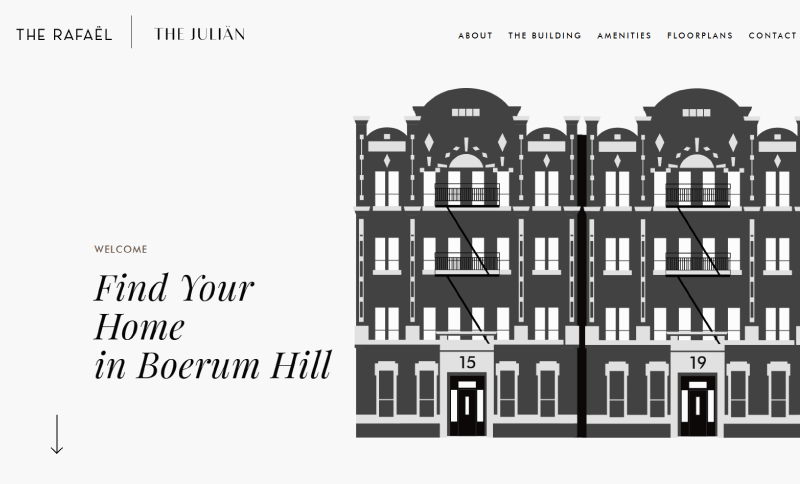
This property site keeps things stylish and straightforward, showcasing modern housing in a quiet New York neighborhood. A cool interactive touch? The building illustration in the top right—hover over it, and the windows light up! The site also packs in all the key details—floor plans, amenities, and a quick look at the area’s history, while staying easy to explore.
16. Neverland Agency
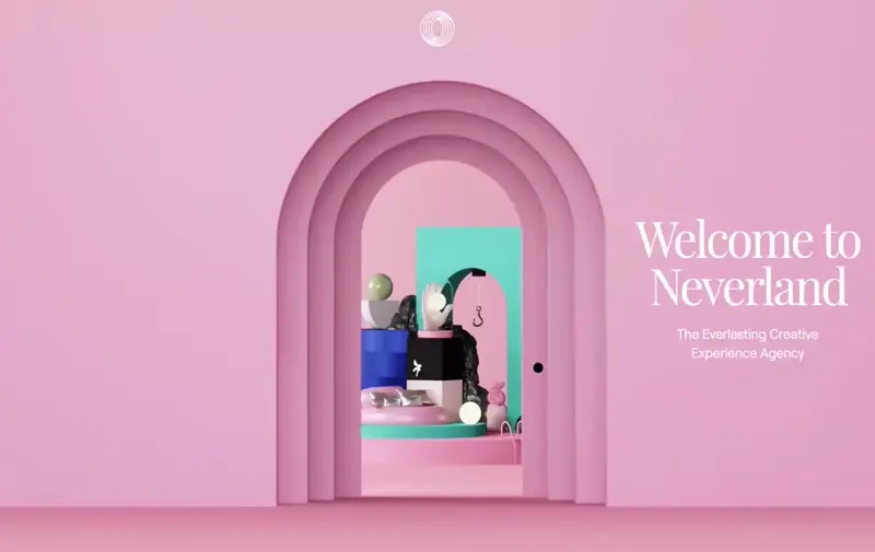
I would like to show you this webpage as one of the examples of a one-page website with a very nice design. The interesting moving animations without any doubt will make the customer stay and browse the whole website. The web designers bet on using pastel colors, which gives the website the ideal symbiosis between contrast and calmness, leaving the customer with a warm feeling for the brand.
17. Rimini Wedding Music Voice Violin and Piano
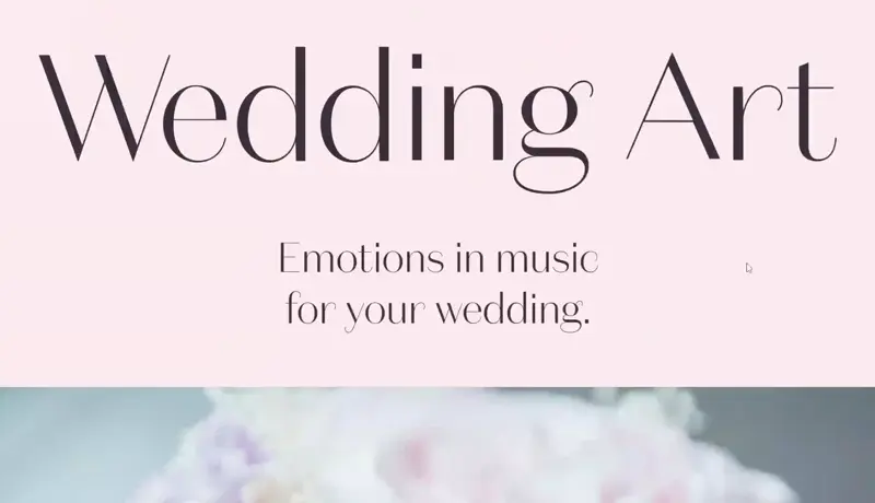
“WeddingArt” is a beautiful one-page website, which is slideshow animated. The thing that makes an impression is the way they decided to represent their portfolio – you can find YouTube videos attached to the website. The colors they used for the design fully correspond to the brand product. The text information on the website is very short but it is straight to the point.
18. Seth Hampton Portfolio
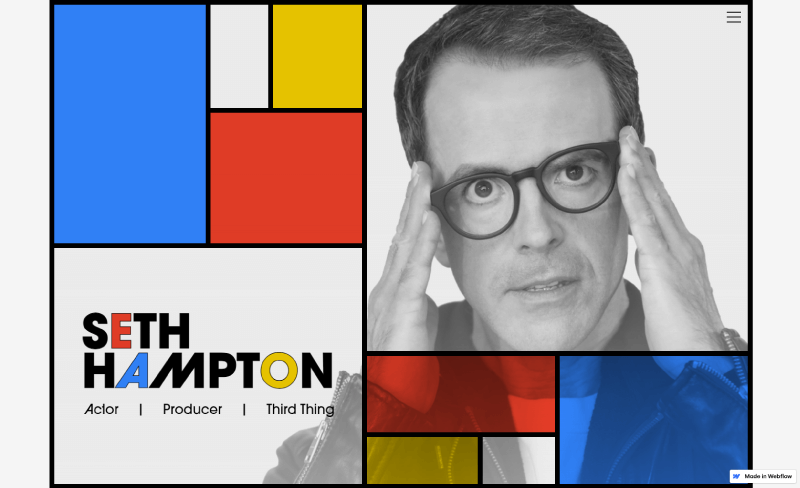
The website is an example of a one-page website that is simple-designed, but it makes a great impression of creativity as it looks exactly like a magazine article. There you can find a rich and nice animated portfolio, as the photos turn colorful from black and white and also modern because the web designer fitted two Youtube videos very well into it.
19. The Joy of React
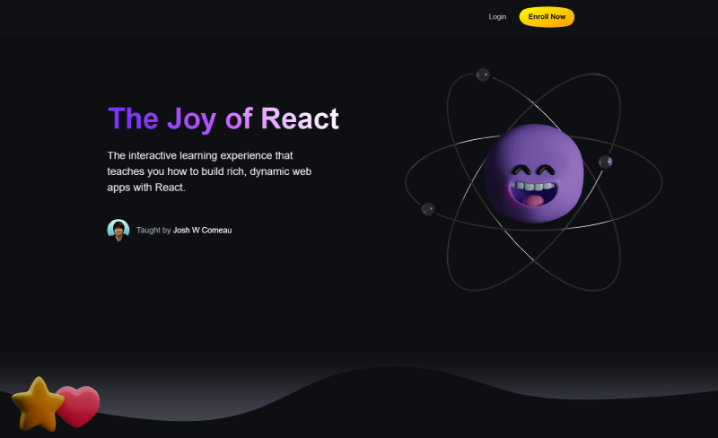
This is an example of a really simple, clear, non-animated website, yet it looks modern and interactive due to the design. The creator bet to the usage of a dark-colored background with contrasting white text, which he highlighted on some points, so the reader can pay attention to the most important things he has to say. The information is detailed.
20. Cook Collective Kitchen
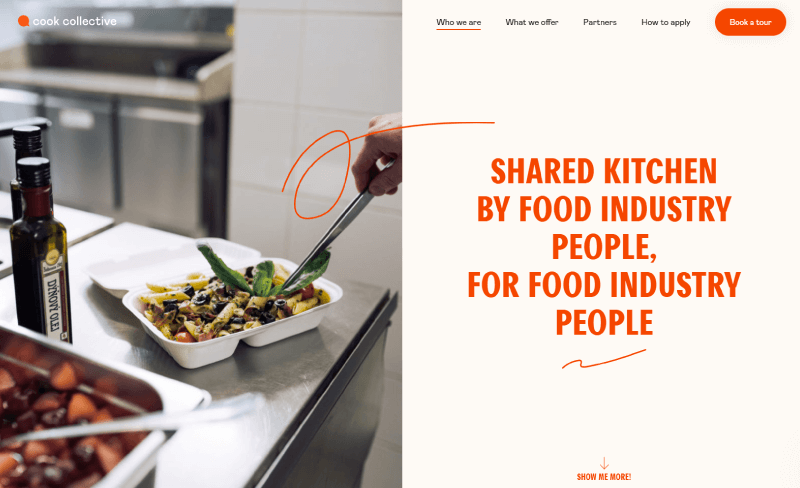
Cook Collective’s one-page site keeps things simple, warm, and to the point. It guides visitors through what they offer and how to get started without clutter, or distractions. It has clear sections and an easy flow, which makes it a great example of a service-based website done right.
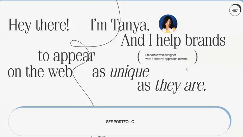
21. Dyo Tanya Web Designer Portfolio
Here you can see a one-page website portfolio of a web designer. The whole website, in general, can be considered a representation of the person’s work and I think that it looks very well. You can see a really good clear and girly design. There are a lot of interactive animations and implemented videos as well but they are not intruding at all. There are voice-overs attached, presenting some customer references.
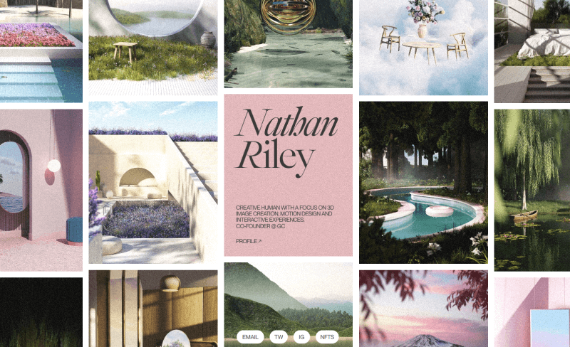
22. Nathan Riley Portfolio
There is almost no text at all. Only a small paragraph. The only thing you can see there on this website is a light floating animation that represents the 3D images, which are the brand’s business. On the bottom sidebar, you can find four ways to make online contact for detailed information.
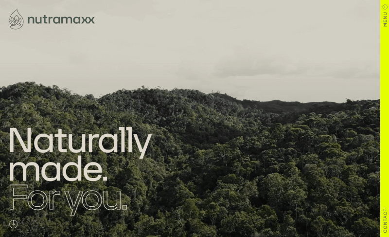
23. Nutramaxx
Looking exactly like a brochure, “Naturally Made” is one of the good examples of a one-page website. The colors contrast, but they are not eye-irritating as well as these genuine moving animations which look like mountains, which perfectly fit in the brand’s image. The video banner on the very first opening of the website leaves a calm feeling in the visitor.
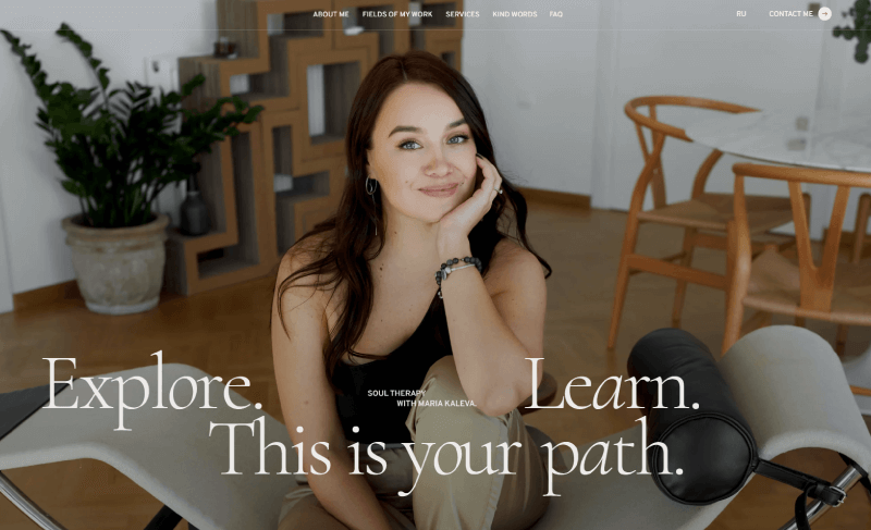
24. Psychotherapist Maria Kaleva
Opposite all the other examples of one-page websites, this one decided to bet on a completely different vision. The site is all black and white – everything, including the photos. The only animated thing I can see in there is two or three pictures and small texts. The main accent is on all the information that the website gives about the business.
25. Sakari Gin
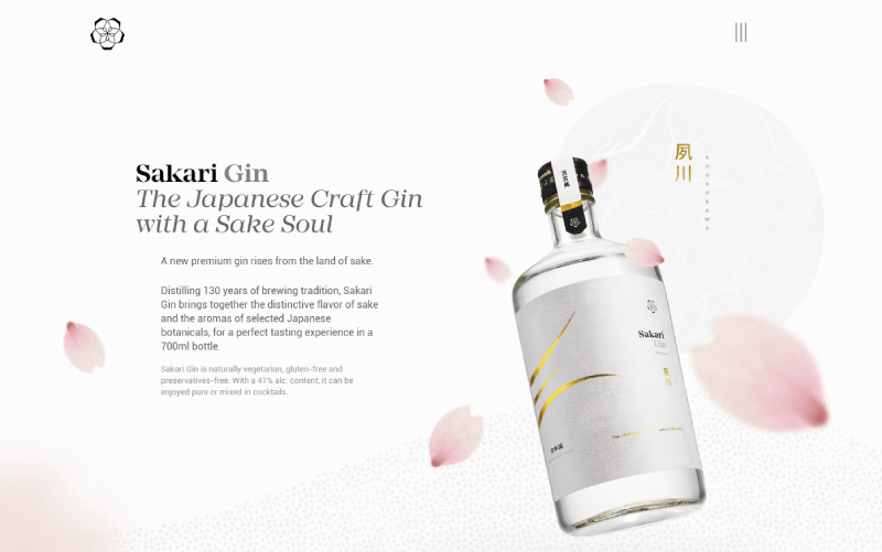
The website is just as interesting as the brand product is – Sake-inspired Gin. The text is impressive, it looks like some kind of a story and grabs the visitor’s interest. The colors are bright and non-contrasting, all the text is black. There is an image that looks like a painting, bringing the visitor extra calmness. There are animations like the floating bottle in the beginning, but they are not intruding at all.
26. Studio Ping Pong
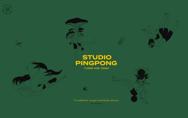
As a digital marketing agency, this brand bet a lot on making a catchy website. If you take a look you can see one of the examples of a one-page website that is modern and creative. The whole page is animated and the animations are impressive. You can find a lot of funny gifs that will leave you with the impression that these people are friendly and having fun together working on different projects. The site looks like it is representing their story and adventures rather than trying to “sell” the business.
27. Bettershotz
“Bettershotz” is a one-page website of a brand, which deals with website creation, maintenance, and design. On this occasion, the website is the one thing that has to impress the customers. The brand did its job well, as here you can see one user-friendly website with exactly the right quantity of information – you won’t be bored with non-useful additional details. The sliding animations look interesting and the design is simple yet looks modern – dark background and a lot of impressive photos.
28. Ribata Traditional Pizzeria
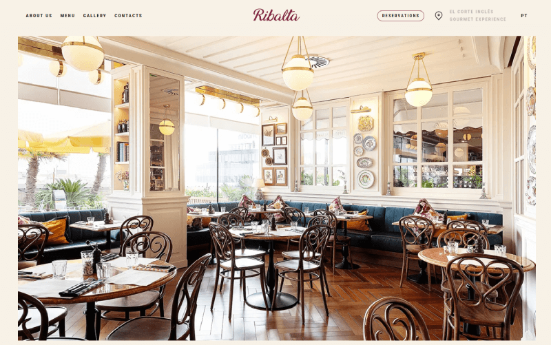
This is a website for a totally offline-based business. Here you can see a cafeteria’s representation. The selected colors and animations make the page one of our favorite examples of a one-page website’s design. Everything looks very aesthetic. The website is greeting customers with an animated cup of coffee and flowers at its very first opening. The pastel colors fit very well in the design. There is plenty of information, but all of it is useful – such as a menu, address, etc.
29. Malicide Trash Metal Band Site
“Malicide” is a trash-metal band. The website fully corresponds to the art they are making. The banner on the very first opening is totally in this “metal” style. You can see great animations there and a lot of useful tools, such as the social media buttons in the top right sidebar. You can find links to many channels on which to listen to their songs or play their videos. There is music directly implemented on the website as well and it is not bothering the visitor. He can turn it himself only if he wants. You can see a lot of appropriate things, such as a subscribe button, info about upcoming events, group and contact details, and a shop. All designed in black, white, and red. It looks organized and trash-metalish.
30. Typo Hard Seltzer
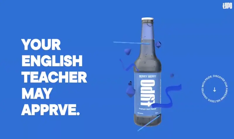
Spirited Saltzers can be anything else but boring. This business bets on good design to make the website interesting to browse. The moving animations make the site look modern. The colors are contrasting but not irritating.
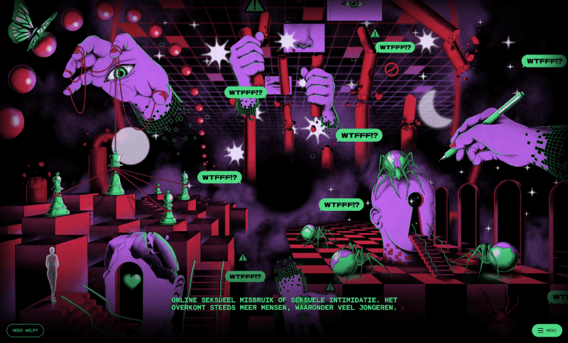
31. All About Online Se*ual Ab*se
Sexual abuse is something that most people prefer not to speak about, but it is actually a thing that deserves a lot of attention paid for. It is a big, universal problem and even more – online se*ual abuse is something that is even harder to control.
I saw a lot of examples of one-page websites while doing the research for the causes of the article, but I think this is the most fascinating one. There is no written information or included pictures. You do not have to scroll below. The designers made the website look interesting. There is a full expression of the outrage and the anger that sexual harassment causes. The most impressive thing is the voiceover. The stories that they have recorded are actual stories of sexual abuse victims. While moving into the animated site and clicking different buttons, you unlock a different story, just like in a game. The only buttons you will see are one info button on the left side of the game, which lets you see the story’s info and allows you to share your story too and two buttons on the bottom left sidebar after every story’s finish, which also offer you help and again – the opportunity to share your story.
32. Neftali Loria Webflow Development
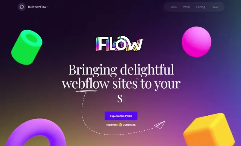
These web-builders look creative from the very first sight. When you open the website, you can see a fully animated page with custom cursors and many other features. The main design colors are different than all I have seen up to this moment. All the small details and the moving geometrical animations bring the feeling of something modern.
33. Aprile Hand-Crafted Hanging Chair
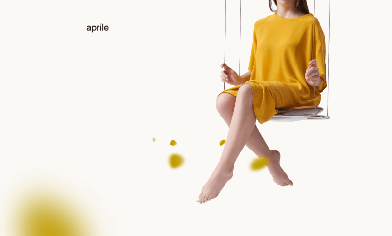
This page is one of the examples of a one-page website, which has a very clear design. It has the brand product and fair enough information about it. The product is a thing which helps your calmness, exactly like the page. The images are very detailed and they beautifully fit on the website.
And there you have it! Who knew something so simple as a one-pager could pack so much punch, right? Hopefully, these examples got your creative juices flowing and gave you some fun ideas.


