For a very long time in history, the color purple was considered regal and was reserved for royalty. At present, anyone who wishes and associates himself with quality, luxury, and prestige can use it. It also brings a sense of exclusivity, for there aren’t that many companies that have embraced this color for their visual brand identities. This overall impression is exactly what brands, who have chosen purple logos to present them, want to convey as a message.
Today, we will explore our selection of the 17 most memorable and impactful purple logo designs, that wear the color like a silk glove! So, let’s dive!
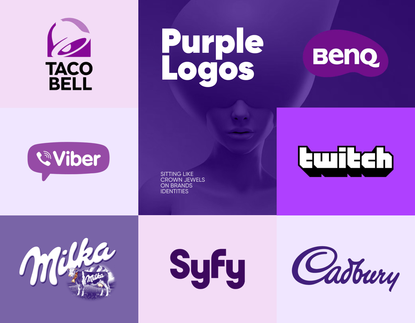
1. Cadbury
The logo for Cadbury, one of the world’s chocolate giants, is based on the signature of William Cadbury, a grandson of the company’s founder. Though it has been slightly refined through the years, it’s almost the same as in 1921 – the year it was introduced. With so much history it has a deep and meaningful personality which is only improved by the rich purple hue of the design, adding sophistication and luxury to it.
2. Hallmark
The Hallmark logo uses a friendly purple color with a classy, custom cursive font, and a crown symbol above. The way the symbol stands on top of the name symbolizes the company being the world’s largest postcard manufacturer. In general, the design exudes elegance and sophistication, aligning well with Hallmark’s brand of high-quality greeting cards and gifts.
3. Yahoo!
The latest Yahoo logo showcases a luxurious purple color with a modern, thick, sans-serif font. In addition, the italicized exclamation mark makes the brand seem more approachable and fun. As a result, the simplicity and boldness of the logo make it easily recognizable and contemporary, fitting for a major internet company wishing to maintain its successful image.
4. Twitch
The current Twitch logo consists of the brand’s name written in white all lowercase letters displayed in outlines with a 3D effect. It is executed in a playful, blocky font that resonates perfectly with the platform’s main focus on content, related to video games. As a result, the logo’s vibrant purple color and the creative font make it seem youthful and dynamic, reflecting the streaming service’s entertaining nature.
5. Avid
Avid, the multimedia technology giant, uses a distinct, deep hue of purple for its logo. It consists of geometric shapes visually resembling and forming the brand name’s letters. This clean and modern design signifies innovation and creativity, perfect for such a company specializing in digital audio and video production tools.
6. Syfy

Syfy is one of the most well-known American sci-fi television channels. Its logo incorporates a bold, modern, and sleek purple sans-serif typeface. The letters’ design and positioning give balance and a smooth transition between the characters. In general, its logo effectively, and harmoniously, communicates the network’s focus on science fiction content.
7. BenQ
BenQ is a Taiwanese company that is one of the global leaders in computer and electronic device production. Its logo features lettering that gives off a strong and bold vibe with its font choice. In addition, the intense hue of purple used for the bean-like background shape heightens its contrast with the text and adds to the overall approachable and modern feel of the brand’s presence.
8. Milka
Milka, one of the world’s most famous chocolate manufacturers, uses a very soft purple for its logo. It perfectly suits the tender lettering in a custom cursive, representing the dessert’s uniqueness and fine taste. The featured teardrop above the “i” character, as well as the name itself, suggests that there’s a lot of milk in the brand’s products. And, in general, the design reinforces Milka’s position as a comforting and beloved chocolate brand.
9. Taco Bell
Taco Bell is a widely-known and liked American fast-food chain. In its current logo design, which has been used for almost ten years now, the brand chose white and two vibrant purple shades to form its iconic bell. Below the symbol stands the text, executed in a neat and approachable sans-serif typeface, which, together with the logo’s icon, creates an effective, modern, and stylish design.
10. The Verge
The Verge is an online media focusing on technology news, science, and entertainment. Their logo is modern and engaging and features only a logotype. The text though is written in a customized sans-serif typeface with some of the letters’ parts missing, thus making it interesting and innovative, mirroring the tech-focused content they share.
11. Craigslist
Craigslist is an American company operating an advertisement website with many various sections. Its logo features the Peace symbol as its icon and a logotype with the company’s name. All the elements included wear a violet-purple color. Meanwhile, the text is depicted in a classic Times New Roman, which along with the chosen color portrays the website’s utility and user-focused approach.
12. Zoopla
Zoopla is a UK website providing an extensive database of property valuations, listings, and market data. Its most recent logo design features a vibrant purple logotype written in a customized, modern, sans-serif font, creating a friendly and approachable look. And, in general, the design is simple yet effective, reflecting the brand’s focus on making property search easy.
13. Wimbledon
The Wimbledon Championships, the world’s oldest tennis tournament, has a logo representing its rich history and traditions. The purple in the design illustrates the event’s exclusivity and excellence, while the green symbolizes the grass courts where the players compete. At the center, it straightforwardly features two crossed lawn tennis rackets and a ball. This sophisticated logo perfectly depicts the prestigious nature of the tennis tournament.
14. Viber
As you probably know, Viber is a secure messaging and calling software app. From its very start, it has employed purple as its color. Its exact hue makes the brand seem approachable and instills a sense of easiness. There’s nothing redundant in the design, which features a chat bubble, a phone handset icon, and Viber’s name, thus emphasizing communication and connectivity and making the friendly design inviting and straightforward.
15. Western Carolina University
Western Carolina University is another example that embraced purple’s symbolism in its classic and formal logo design. The color, smoothly complemented by a touch of gold, beautifully fits the educational institution’s 135-year-old history and heritage. Along with the logotype’s serif font, it conveys a sense of tradition and excellence. In addition, the intertwined capital letters add uniqueness and recognizability to the logo’s overall look.
16. Wizz
Wizz Air is one of the widely recognized low-cost airline companies. Its logo features a stylized version of its name with a playful and attention-grabbing touch – the “i” is switched with an exclamation sign. Using purple and magenta for the catchy, overlapping lettering gives the brand a dynamic and modern look. In conclusion, the playful design reflects the brand’s energy and focus on affordable travel.
17. Vivendi
Vivendi is a French mass-media company that is a global leader in its industry. Its logo uses a violet purple for the logotype-only concept where the text wears a custom, modern font, emphasizing the brand’s professionalism and creativity. As a result, the clean, simple design presents the media conglomerate as confident, accessible, and always moving forward and improving.
Tips to follow when creating purple logos:
- Firstly, you must understand the meaning of purple and choose the right shade for you. For example, purple is often associated with royalty, luxury, and wisdom. Lighter shades can convey a sense of calm and creativity, while darker hues can evoke feelings of luxury and sophistication.
- After that, be careful not to overcrowd the design concept. Focus on clear lines and shapes, for minimalist designs often make a stronger impact. A cluttered logo can certainly be confusing and hard to identify.
- Further, the font you select should complement the purple color and the overall logo design. Try avoiding overly decorative fonts that detract from the logo’s clarity and professionalism.
- If you are choosing complementary colors for your purple logo make sure you balance them wisely. For example, you can use neutral colors like white, black, or grey to achieve a harmonious two-tone look.
- Lastly, always ensure your purple logo is suitable for different sizes, backgrounds, and uses.
Final words:
In conclusion, due to the color’s intense essence, creating purple logos requires a balance between the overall idea and the chosen hue. Moreover, purple is a pretty versatile color, conveying emotions from luxury and power, through creativity and playfulness, and up to innovation and elegance. That’s why you have to think about the overall message you would like your design to communicate to the public.
So, use this knowledge to align the logo with the desired brand message and start your next amazing design!
Still not sure if purple is the right color for your logo? These articles are here to help you with your choice: