We’ve gathered some of the most famous brand logos – extremely popular and instantly recognizable around the world. Turns out, the widely known brands by the mass population are hundreds. The globalization of the world allowed companies to enter and establish on international markets and gain recognition from people of all nations. Well, today we took some of the most famous logos and sorted them out into popular categories.
Although logo design trends don’t fluctuate as much as graphic design trends, they also get influenced by certain design styles that look aesthetical in the current times. Many famous brands can afford to make mild rebranding changes on their logo over time that don’t affect the logo’s recognizability and association with the particular brand. Recently, we are seeing popular brands changing their logos to simpler, flat, one-color versions – a cleaner design with fewer details than their original alternatives. Of course, some brands keep their iconic famous logos for decades and never intend to change them.
Ready to guess who changed their logo style recently, and who hasn’t for decades? In both cases, we are pretty sure you will instantly recognize the brands behind these famous logos. Let’s begin!
1. Famous Beverage & Beer Logos
Some of the most popular company logos belong to the industry of beverages: soft drinks, sodas, energy drinks, and beer. Although there are extremely many beverages brands that sell across the world (boy, are we consumers), here we’ve included just some of the top famous logos in the industry.
Coca Cola Logo
The iconic logo of Coca-Cola is one of the most recognizable across the world. The most famous script logo of all time hasn’t changed at all since 1941 which makes over 80 years of stability and recognition, of course, colored in the iconic red nuance that symbolizes passion and energy.

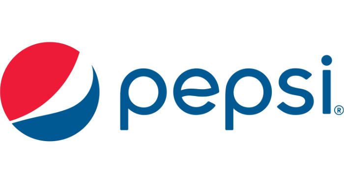
Pepsi Logo
Pepsi also has an instantly recognizable logo, although the new symbol is around since 2008. Although experimenting with shapes and fonts, the design logo of Pepsi still remains absolutely recognizable due to its devotion to the colors blue, white, and red which symbolize the US patriotism.

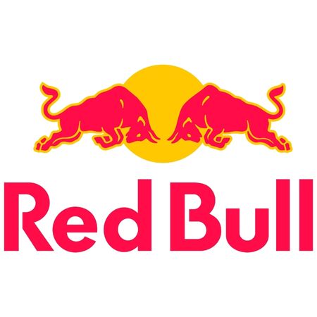
Red Bull Logo
The super famous bulls of Red Bull’s logo design symbolize strength and stamina. They also illustrate the way you feel when consuming the energy drink.

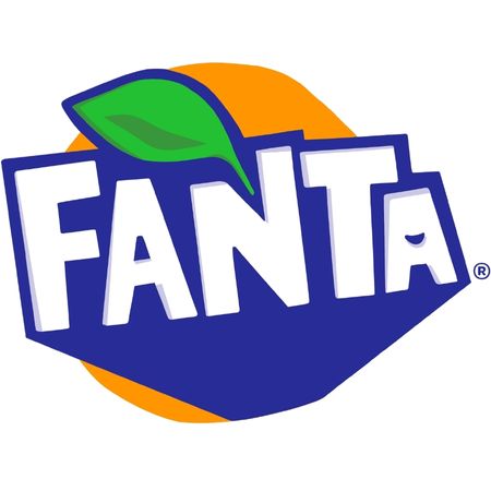
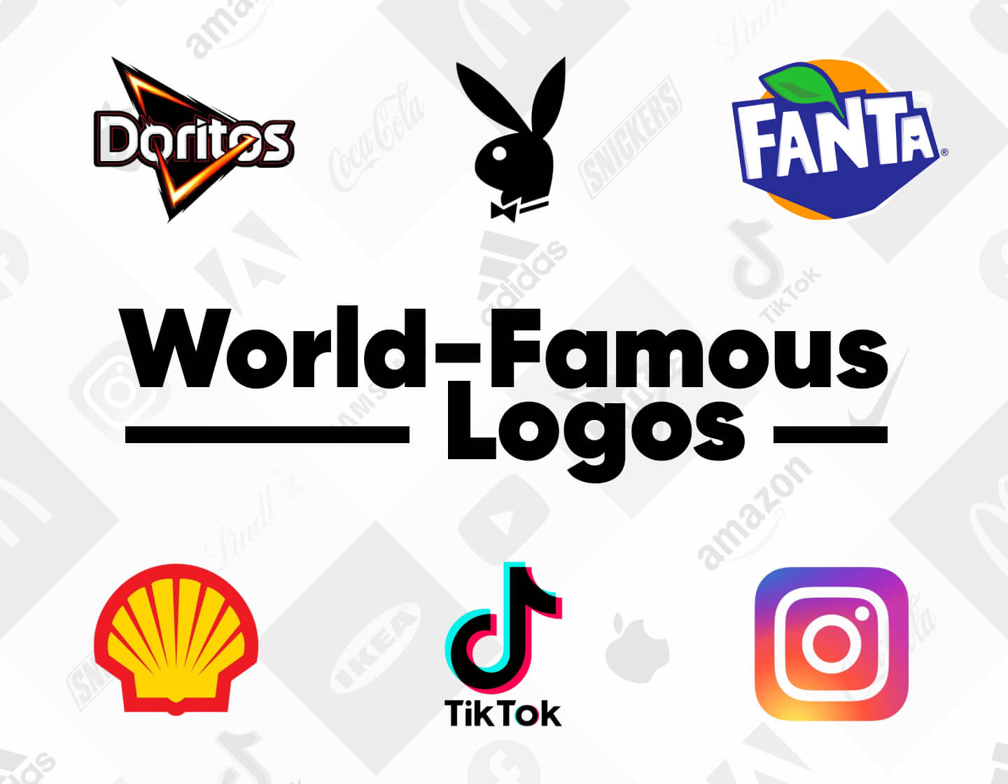
Fanta Logo
Fanta rebranded to this new logo several years ago, keeping the iconic orange and blue color tones. Just like the brand, Fanta describes its logo as irreverent and fun.

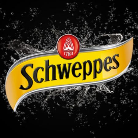
Schweppes Logo
Schweppes often make mild changes to their logo – be it the shape or the style. One pretty distinctive feature is the fountain symbol with the year 1783 which marks the foundation of the original Schweppes company.

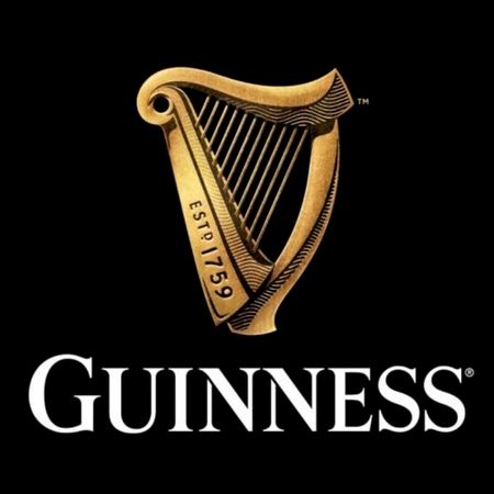
Guinness Logo
While most brands are going flat, Guinness is going 3D in their latest rebrand. The famous harp logo is based on a particular type of a harp, inspired by the official national emblem of Ireland.

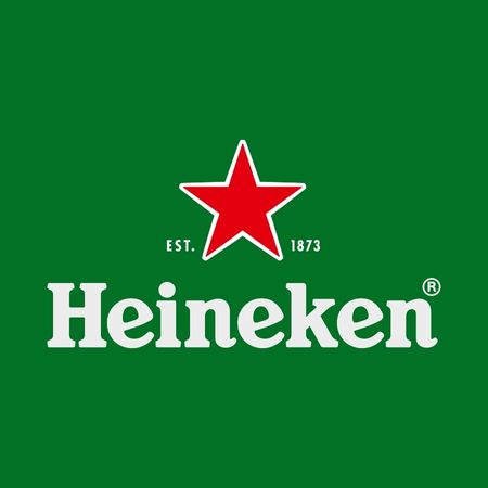
Heineken Logo
Heineken’s famous brand has gone through a lot of changes to become what we know today. The iconic green and bright red colors have been around for several decades and the star symbolizes the brewing process.

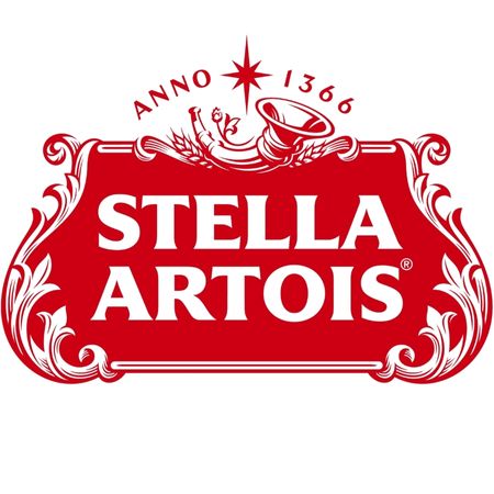
Stella Artois Logo
Stella Artois’ logo is believed to be the oldest logo in the world with the horn symbol dating back to the 14th century. The newest version of the logo presents the well-known shape and ornaments but this time all colored in red.
2. Famous Fast Food Logos
The incredible business model of fast-food restaurants allows them to enter markets all over the globe, thus spreading the popularity of their logos. Here, we’ve gathered the top recognizable fast-food brand logos that many people love.

McDonald’s Logo
The most recognizable golden arches of our days were not initially intended to represent the letter M, rather than the architectural shape of a newly open restaurant back then. Well, now McDonald’s logo is among the most recognizable symbol in the world, and besides standing for the letter M, it conveys stability, power, and hospitality.

KFC Logo
The KFC’s logo is one of the most recognizable brand mascot logos that kept true to its principles to depict the portrait of the founder of the brand, Colonel Sanders. However, during the last rebranding KFC also went for a more minimalist illustrative approach, leaving the portrait in plain black-and-white. They also changed the shape to a trapeze that reminds of a KFC bucket.

Starbucks Logo
Starbucks’ famous symbol of a mermaid has been the foundation of the brand’s logo for over half a century. The idea behind it is to lure customers into the coffee shop just the way mermaids lured sailors.

Domino’s Logo
The world’s most famous pizza chain Domino’s has a logo that literally represents the brand’s name but holds some secrets, as well. The square shapes of the domino piece remind of pizza boxes and the three dots represent the first three opened restaurants of the chain.

Subway Logo
Although Subway changed the appearance of their logo several times in terms of fonts and colors, the main idea behind it remained. The two arrows in the beginning and the end represent how easy it is to enter, order, and take out your food.

Dunkin’ Donuts Logo
Dunkin’ Donuts’ popularity allowed the brand to completely ditch the “donuts” word and the cup of coffee illustration in their last rebranding. The iconic rounded font that reminds of puffy donuts still remains, as well as the color palette duo of vibrant orange and pink.

Pizza Hut Logo
Pizza Hut has been going back and forth with their logo journey, introducing a new version every now and then, then returning to the old. Some details, however, always remain – the energizing color red, and the roof symbol that resembles the restaurant’s roof itself.

Burger King Logo
In their latest rebrand, Burger King presented the well-known burger-shaped logo with the brand’s name in between in a more simplified, flat style and warmer color tones. The idea is to represent a more organic and natural look, as well as refer to their trademark flame-grilling method.
3. Famous Food Logos
Although eating habits differ from one country to another, there are brands that managed to capture the hearts of consumers all over the world. This made them not only extremely recognizable but loved by people. Here are several super famous food logos that you will find on the shelves of stores across the globe.

Toblerone Logo
Inspired and devoted to “the city of bears” – Bern in Switzerland, the logo of Toblerone has been depicting a bear on a snowy mountain for years. Recently, the company presented a brand new logo font and packaging design.

Pringles Logo
As many companies are going more minimalist with their logos, Pringles is too! The iconic mascot logo design of the famous chips has redesigned Mr. Julius Pringle’s head six times already but the brand logo is still instantly recognizable.


Doritos Logo
The most famous brand of tortilla chips Doritos has also gone through several cycles of rebranding. Theirs is one of the most famous triangle logos and it refers to the triangular shape of the famous corn chips.

Snickers Logo
The popular chocolate bar has a wordmark logo that is among the most recognizable across the globe. A curious fact is that the brand Snickers is named after the founders’ favorite horse.

Oreo Logo
Oreo is the most famous brand of cookies worldwide, and one of the brands that still sticks to a 3-dimensional shape with volume and a sense of movement. And the design of the letters really reminds us of milk.

M&M’s Logo
The chocolate-colored double M’s are the initials of the last names of the company founders. The M&M’s logo design hasn’t changed much throughout the years and is as recognizable as their cute candy mascots.

Lindt Logo
A golden-colored nuance, a sophisticated hand-written font, a symbol of a dragon for control, protection, and history heritage – everything about Lindt screams high class, sophistication, and exquisiteness.

Kinder Logo
Completely targeted towards children, the Kinder brand is incredibly famous and loved by children and adults equally. The famous logo is a wordmark of the brand name itself and means “children” in German.
4. Famous Store Logos
The competition among big retailers made some stores incredibly attractive in terms of affordable prices and a diversity of products. As a result, some brands expanded so much that now they have stores in hundreds of locations, making them extremely popular. Here, we’ve gathered famous logos of huge online retailers and merchandisers with dozens of physical stores.


Amazon Logo
The online retailer Amazon has a logo with hidden meaning. First of all, the orange arrow reminds of a smiling face. Secondly, it connects the letter “a” with the letter “z”, referring that here, you can find everything from A to Z.

Target Logo
Target’s logo is instantly recognizable even if the brand name isn’t written. This is one of the famous circular logos – a pictorial mark that illustrates a red target. A symbol of being at the right place and finding exactly what you need.

Walmart Logo
The logo of Walmart depicts a yellow sparkle with 6 sparklets next to the blue logotype. According to the retailer, each of them represents the customer, respect, integrity, associates, service, and excellence, accordingly.

IKEA Logo
IKEA’s brand name is actually an acronym that captures the Swedish heritage of the brand. The blue and yellow color combination of the logo is a symbol of attention and optimism, according to their official statement.

ebay Logo
The famous auction platform has an eye-catching wordmark logo in the colors red, blue, yellow, and green – depicting the diversity of what you can sell and find on eBay. The current version of the logo is clean and minimalist.

Best Buy Logo
The famous American electronics retailer has been widely associated with the yellow tag logo. Well, during their last logo update, Best Buy took out their brand name from the tag and placed it in the bottom right, next to more solid lettering.

Tesco Logo
The logo of Tesco is a combination of the colors red and blue – a symbol of prosperity standing on reliability. Some sources claim that the choice of colors is in direct reference to the colors of the British flag.

The Home Depot Logo
The Home Depot logo is not only one of the most famous square logos out there but also one of the most popular orange logos. According to the founder, this color represents value and energy, and also made staff stand out with their aprons.
5. Famous Tech Company Logos
Technology has always been a leading industry when it comes to recognizable brands. As technology giants have taken over the world with their brands placed on every single product, you cannot stay indifferent – these brand logos simply stick in your mind. Let’s see some of the most famous brand logos in the technology world.
Apple Logo
Of course, starting off with Apple, their iconic pictorial logo is one of the most popular logos in the world. You instantly know the brand even if it isn’t written. The theories behind the symbol are many but in reality, Steve Jobs just liked the fruit. The bite may refer to a digital byte but it could also just be a distinctive mark to avoid confusion with a cherry.
Microsoft Logo
Microsoft’s logo is a clear representation of a window referring to the company’s most famous product – the OS Windows. According to some, the four different colors represent some of the most iconic products of the company – the Office Suite, Windows, Xbox, and the web search engine Bing.

IBM Logo
IBM is one of the most iconic lettermark logos, introducing the stripes more than half a century ago. Although the company presented a solid color design a few years ago, it seems they returned the stripes once again to keep conveying speed and dynamics.

Cisco Logo
The famous logo of Cisco is a combinated logo that includes a lowercase wordmark of the brand’s name, and an abstract arrangement of vertical lines. Well, the brand revealed that these lines actually represent the Golden Gate Bridge.

HP Logo
The initials of Hewlett and Packard have served as a base of the popular brand’s logo since its very foundation. A few years ago, the company presented an even more simplified version with 4 strokes, used on some devices.

Adobe Logo
The Adobe logo which we know today is in use for almost three decades, with minor changes made through the years. Adobe prefers the color of passion – red and depicts its letter A as an open triangle that symbolizes openness and stability.

Samsung Logo
A little-known fact about Samsung is that the name means “three stars” in Korean to represent strength and durability. The color blue conveys reliability, and the removed crossbar of the letter A is an indication of innovation.

Salesforce Logo
Salesforce is the most popular CRM company in the world with an equally popular logo – a cloud acting as a metaphor for cloud computing. The shape of the logo has been left intact since the very beginning but the color and font have changed to a more clean and minimalist style.
6. Famous App Logos
The use of apps to communicate, share, and exchange ideas with the rest of the world has completely changed our lives. Certain apps have become an inevitable part of our everyday routines, and logically their app logos have become extremely famous and recognizable. Here are a few.

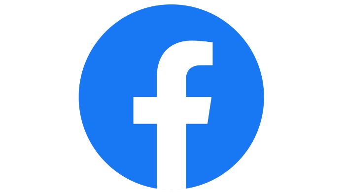
Facebook Logo
The most popular social network across the globe has an easily recognizable blue app logo with the lower space letter “f”, currently used on their web version, as well. Although the design of facebook’s app logo hasn’t changed so much for one to notice, it has gone more minimalist with time, and the circular shape was recently introduced.

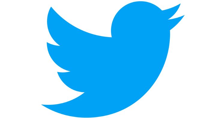
Twitter Logo
Starting off with a wordmark type of logo, Twitter introduced the bird pictorial logo in 2010 and completely removed the wordmark in 2012 to stay with the bird only. It is considered that the tweet of a bird, as well as the carefree spirit and fast speed that it represents, are direct references to the essence of the social media giant.

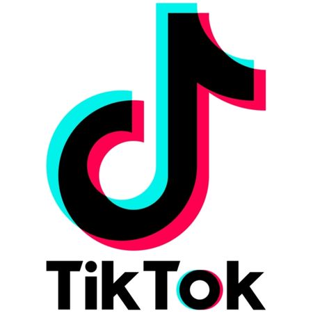
TikTok Logo
TikTok is probably the youngest brand name on this list that gained so much popularity that its logo is now instantly recognizable – a musical note with a double light effect that looks mystical and attractive.

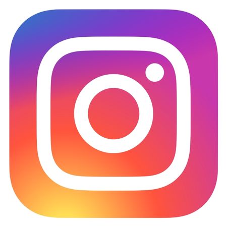
Instagram Logo
The huge redesign of Instagram’s logo in 2016 came as a shock to most people back then. But from today’s perspective, this was the wisest decision the company could have made. Vibrant colors and a minimalist symbol of a camera are exactly in tune with the world’s trendiest art movements.

YouTube Logo
The logo of the popular video-sharing platform has gone through several changes through the years but always kept the red rounded rectangle shape. Once used as a base for the “Tube” part of the brand’s name, now it looks like a play button – a direct indication of the platform’s main purpose.
7. Famous Fashion Logos
The fashion industry is incredibly rich in brands – more or less famous. On this list, we’ve gathered just some of the top famous shoe brand logos, clothing brands logos, designer logos, and even jewelry logos that are incredibly famous across the globe. Some are considered luxury brands while others are popular among mass consumers. Both ways, all these fashion brands are extremely recognizable.

Nike Logo
Nike owns the most popular abstract pictorial logo design, often ranked as the #1 most recognizable brand logo in the world. Their famous swoosh symbol is a metaphor for movement and motivation, precisely in line with their famous motto of “Just do it”.
Adidas Logo
Adidas’s famous three stripes have emerged on different logo designs through the years. The most current version of Adidas’s logo represents the three lines forming a mountain – a symbol of overcoming challenges and achieving goals.
Gucci Logo
One of the most famous luxury brands Gucci has a logo that is almost a century old. The mirrored overlapping double G’s are just the initials of Guccio Gucci’s name, and their shapes imitate the links of bracelets.
Chanel Logo
Chanel owns one of the timeless logo designs of all time that have never been changed since the very beginning, The double overlapping C’s are certainly a reference to Chanel’s name but the design itself is inspired by an ornament seen on a church window.
Louis Vuitton Logo
The high-class famous brand has a monogram logo design presenting the initials of Louis Vuitton. The iconic logo is actually made by his son and is now used without the wordmark. Louis Vuitton does not only have a widely recognized logo but also iconic patterns featuring the logo itself.
Versace Logo
One of the few highly distinctive illustrative logo designs belongs to Versace. The famous fashion brand chose the figure Medusa from the Greek mythology to be a representation of the company, since it is believed that Medusa made people fall in love irreversibly.
Rolex Logo
The top jewelry brand that made it into this list is Rolex – the famous designer watch brand has a golden crown for a logo and a wordmark colored in green. The logo is in direct reference to Rolex’s motto “A Crown for Every Achievement”, symbolizing luxury and prosperity.
Puma Logo
The combination logo of Puma has an equally recognizable wordmark for the brand’s name and a puma symbol. Undoubtedly, the puma symbolizes incredible strength, endurance, and agility and this is what the brand’s founder wants it to be associated with.
8. Other Famous Company Logos in the World
There are so many famous logos in the world that we just can’t fit them all into a category. Here, we’ve listed even more popular logos from various industries, that you will instantly recognize, we bet.

Google Logo
Of course, we start with the iconic logo of the most famous search engine Google. The wordmark logo of Google is famous for being multicolor and also dynamic. It changes its appearance on every special occasion. Colored in the three primary colors with green added to the mixture, Google claim that this just means they don’t always follow rules.

Walt Disney Logo
Disney is famous for its beautiful illustrative logo and unique Disney font for its brand name. The idea behind the magical castle illustrated in the logo is to convey magic, happiness, and dreams, and of course refer to the company’s cartoons, most of which include princesses and princes.

LEGO Logo
The famous Lego brand logo is designed around the red-yellow color palette to convey happiness, energy, and optimism. But did you know that the brand name actually refers to a Danish’ phrase that means “play well”?

FedEx Logo
The famous transportation company has an incredibly famous logo, known for its hidden meaning embodied in the little negative space arrow that forms between the letters “E” and “x”. It symbolizes speed, accuracy, and striving for perfection.

Shell Logo
Shell’s logo is one of the most famous gas station logos worldwide. Not only it illustrates an actual shell but it is shaped as a crown to indicate that the company is a leader in the market of the gas industry.

Airbnb Logo
The famous online marketplace for homestays has become so famous that its abstract logo is not recognizable worldwide. First of all, it stands for A but it also represents a person, a location, and even a heart for love and warm feelings.

Marvel Logo
The comic book publisher Marvel is not famous among fans of comics only but among the mass audience, too. The iconic color red symbolizes power and energy – exactly the qualities of Marvel’s superheroes.

Playboy Logo
For better or worse, Playboy’s logo is one of the most iconic logos worldwide. It features a bunny with a bowtie. According to the founder of the brand, the rabbit raises erotic associations – it is shy but fun-loving and constantly jumping.
9. Famous Car Logos
Some of the most famous brand logos belong to the car industry. Here, we’ve gathered several extremely popular car logos – luxury brands and car manufacturers for the mass audience.

Toyota Logo
Toyota’s logo is made out of two inner ovals forming the letter T, and an outer oval believed to represent the world around Toyota. An interesting fact is that the inner ovals don’t only form the letter T but you can find them forming each letter of the brand name, as well: T-O-Y-O-T-A.

Mercedes-Benz Logo
The famous three-point star logo of Mercedes-Benz has a deep rooted symbolic meaning. The founders believed that one day their engines will dominate on land, sea, and air. Even more, the three-point star is a symbol of the company’s commitment to universal motorization.

Honda Logo
Honda is among top 3 popular car brands in the USA. Its logo represents a stylized version of the letter H but it also looks like an armchair. The idea is to convey safety.

Tesla Logo
The logo and lettermark of Tesla actually look incredibly futuristic. The stylized letter T used as a logomark is actually inspired by a cross-section of an electric motor.

BMW Logo
BMW’s famous logo was first intended to represent the rotating blades of an airplane. But the colors blue and white also represent the home state of BMW – Bavaria.

Ford Logo
The logo of the universal car manufacturer Ford hasn’t changed much in the last century or so. According to Henry Ford, the logo resembles his own handwriting.

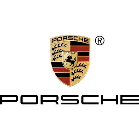
Porsche Logo
The logo of the luxury car brand was inspired by the location of the company’s headquarters. Formarly, there was a horse-breeding farm there. Also, the logo was meant to represent power.

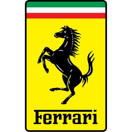
Ferrari Logo
The famous black stallion on a yellow background symbolizes passion and courage. The logo of Ferrari also features the Italian flag above to praise the hometown of Enzo Ferrari – Modena, Italy.
That’s it!
Well, this is just a portion of all famous brand logos in the world. In today’s globalized economy, a person can recognize hundreds of brands in dozens of industries. The logo design is an incredible and extremely important part of every brand identity, as it has to capture the company’s essence and values, and still be memorable and witty.
We hope you enjoyed this selection of famous company logos in various industries. If you want to browse even more exciting logo examples, maybe you can check out our review of types of logos. Enjoy!
Share this article