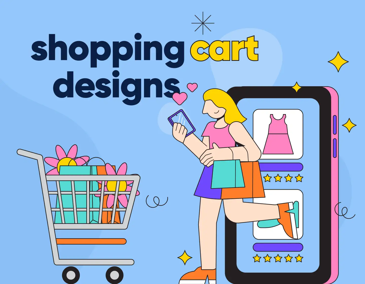

Ever noticed how some online stores have shopping carts that practically nudge you into buying more? It’s like they’re whispering, “Just a few more bucks, and shipping’s on us!” or “Psst, others who bought this also loved these!” For this article, I break down six clever shopping cart designs that hold your items while also strategically encouraging you to add that extra item (or three). In addition, I will also show you some cool shopping card designs by popular stores from all over the web that use one or more of these strategies to turn their carts into persuasive sales tools.
Different Shopping Cart Design Approaches
Here are six design decisions for shopping carts by popular e-commerce businesses that show different marketing tactics you can take ideas from.
1. A top-right mini cart

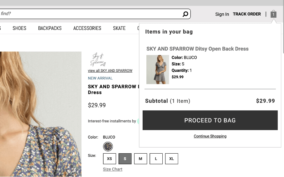
Tilly’s shopping cart is a simple top-right pop-up. What I love about this shopping cart design is that it doesn’t redirect you to a separate page. This means that there are fewer pages to load and fewer steps the users have to take.
Allowing your customers to shop without too many page redirects and with as few steps as possible is a great way to improve your conversions.
2. A side pop-up shopping cart

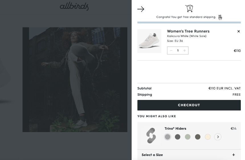
Another great example of shopping cart design is the right-side pop-up that Allbirds uses. This shopping cart design really gives you space to showcase your product and the shopping options. The user can freely access it at any time during their buyer’s journey.
The button for the pop-up to appear also floats so it’s also in view of the customer. I also recommend this shopping cart design because it works really well on mobile where shopping cart abandonment is even higher. According to some researches , mobile users have an even higher abandonment rate of 85.65%.
3. A shopping cart with upsell features

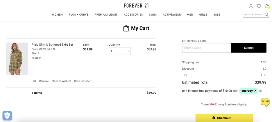
Forever 21’s shopping cart is a great example of a full-page shopping cart. The page puts full focus on the product and the CTA. This ensures that the customer isn’t distracted. Another small feature that I really like is the message on the page that notifies you how much more you have to spend to get free shipping.
If your store has similar free shipping terms it’s good to notify your users as early as possible. This is important because according to studies extra costs are the number one reason why shoppers abandon their products
4. Amount away from Free Shipping

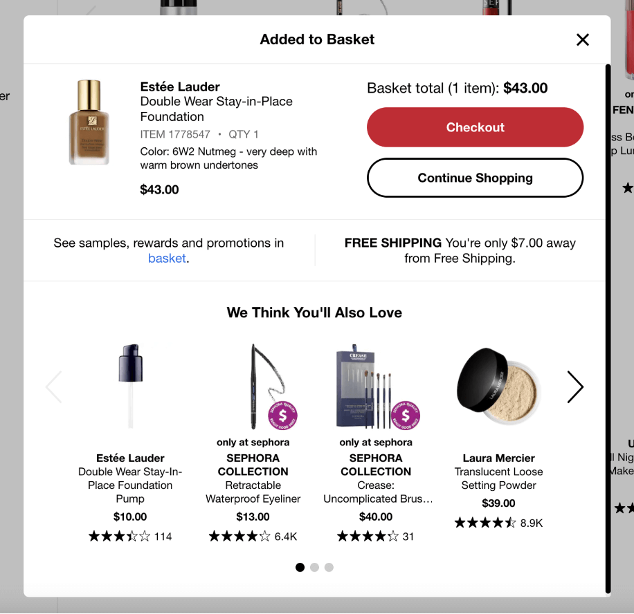
Increasing the overall value of the customer’s shopping cart is a great way to drive more profits. In the long term increasing the average value of your customer’s shopping cart even by a few dollars will make a big impact on your profits. In this case, you are only $7 away from Free Shipping, so why not spend it on another product?
Sephora knows that and this is why they include a “We think you’ll also love” section. This section is a curated list of items that the user might be interested in and would most likely prefer to pay shipping costs.
5. Free items to the shopping cart

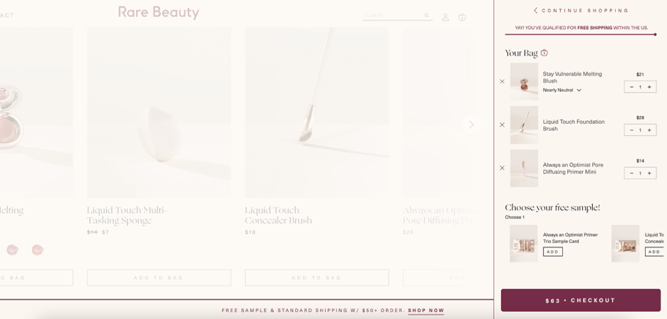
Rare Beauty is an online cosmetics store that has taken a unique approach to shopping cart design. Just like Sephora, they use a full-page shopping cart.
As part of their strategy to encourage customers to buy again from their store, they always throw in free samples of other products in your shopping cart. The whole idea behind this is that when you order something from them they give you additional products you can try and hopefully go back to the store to order them.
I really enjoy this because on the one side you are getting free products at no additional cost on the other side it’s an easy way to get familiar with a wider range of the company’s products.
6. Recommended items that match the ones in the shopping cart

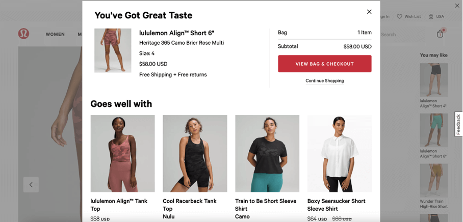
Lululemon is an online clothing store with a great approach specific to the fashion industry. In recent years a lot of clothing stores understood that people are more likely to buy more clothing items if they are part of a curated outfit. This is pretty easy when a customer is in-store and there is a shopping assistant to upsell him.
Online this is a bit more tricky. One possible solution is the one used by Lululemon. When you add a product to your shopping cart you will automatically receive a couple of items that match with the one in your shopping cart.
This approach is so good that some online clothing stores focus their entire selling strategy on offering full outfits to the customer instead of single items.
Awesome Shopping Cart Designs for Inspo
Next, let’s appreciate some cool shopping card designs by popular stores from all over the web and see how each one uses one or more of the approaches from the previous section.
Douglas with multiple gift, packaging, and other options

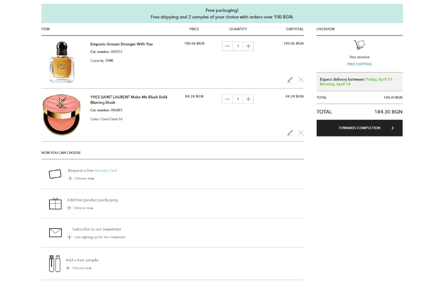
Douglas is a European cosmetics brand and retailer for other brands with generous sales, gifts, and discounts. Its e-commerce strategy is to encourage users to buy more products by offering free shipping, extra products, and gifts if they spend a particular amount of money. The shopping cart instantly shows if you have enough worth of products to get free shipping, free samples and more. But that’s not all, as amongst the options, Douglas also offers a Beauty card and quick subscription to the newsletter, carefully mixed in the list of perks.
List of perks:
- Request a free Beauty Card
- Add free product packaging (it also gives you options to choose the packaging style)
- Subscribe to our newsletter
- Add a free sample (it gives you the choice between different types of product samples: makeup, hair care, spa, etc.)
- Pack in a gift box
- Add a free card
Dollar Shave Club with Delivery Frequency and Shipping Details

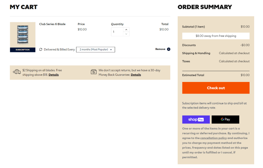
Another cool shopping cart design comes from the Dollar Shave Club which offers subscriptions for shaving materials. Here you can change the frequency of your subscription directly in the shopping cart. There is also info about the particular amount of product value you need for free shipping.
Aura Bora Unlock Perks Bar

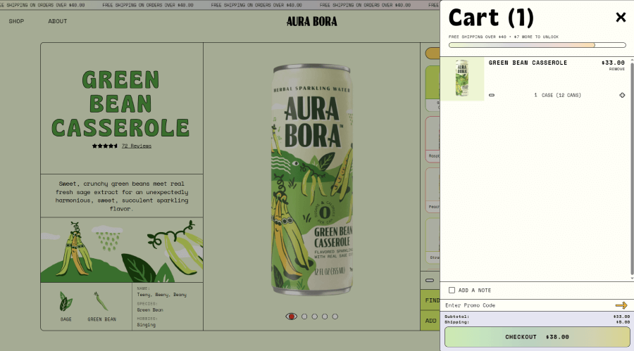
You already saw the ability to unlock free stuff the more money you spend on products in a lot of online stores, but here Aura Bora added a cool colorful progress bar that gives you a visual idea of how much more value you can add to your cart to unlock the next perk.
Sephora Multiple Options Shopping Cart

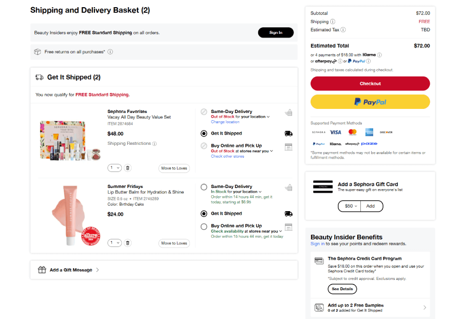
Sephora uses a cart design similar to Amazon and offers a lot of options. Each product in your cart has a delivery type and time options, the option to move to Loves (Wishlist), a message “You qualify for Free Standard Shipping”, and additionally: Add a Gift Message, Add a Sephora Gift card, and benefits.
Topicals Donation Section


Topicals offers good discounts for subscriptions straight in the shopping cart and a section where you can ” Donate to support CCJ’s Women’s Justice Commission in advocating justice reform and empowering incarcerated women for a fresh start” with three options. These options are for a small amount of money compared to the value of your products and it’s so easy and convenient to donate, that it’s hard to say no.
Louis Vuitton Zoom Products Option

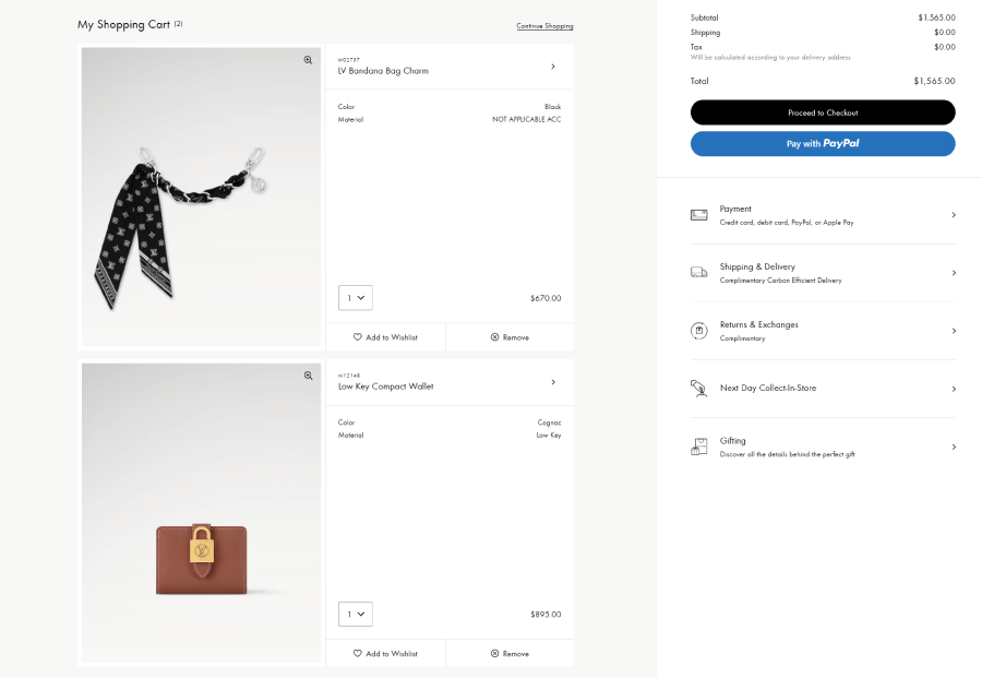
The product zoom option is a rare one in shopping carts, which is weird as it’s very convenient. Often you’d want to check your product in full detail before hitting the Pay button, and Louis Vuitton offers that. In addition, there are a lot of preferences you can check before buying such as payment, shipping and delivery, return and exchanges, next-day collection to store, and gifting.


Speaking of gifting, if you wish to send your Louis Vuitton products to someone, you can add packaging, a gift message, and a branded shopping bag to make sure your gift is fully ready to go.
Asos Recommended Items

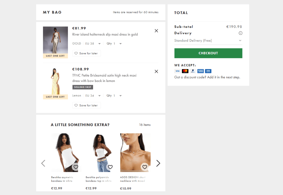
The fashion brand Asos uses a quick A Little Something Exrta section to recommend products that are much cheaper in comparison to what you’ve already put into your cart. This way there’s a much better chance for the buyer to spend $12 for a top if they’re already paying $108 for a dress.
Natory Add Notes

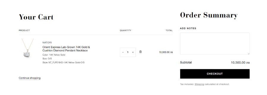
An input for notes is a small but very useful addition, and Natory does great by including it in the design. I, for example, usually have trouble with the address, as it requires more explanations than the pre-coded address form allows me to specify. In such cases, I would use the Add Notes field to write the entire address (and even instructions) for the delivery company. It’s always something good to have on the shopping cart or checkout page.
Smyths Delivery Type Options


Some e-commerce businesses have physical stores as well, so it’s a great idea to give buyers the option to pick their products straight from the store. Smyths does this for their users with a pretty cool section for the delivery options right before you opt to checkout.
Garmentory Saved for Later

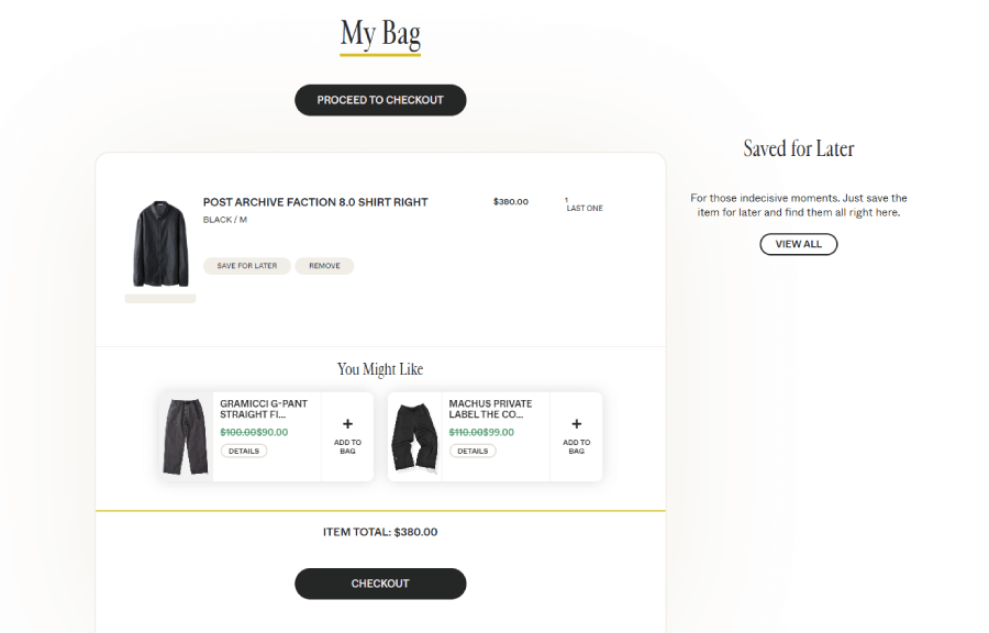
Garmentory uses a very smart tactic to put your wishlist (or encourage you to start adding to it) straight from the shopping cart. If you’re not sure if you need to buy your products now, you can immediately save your picks for later. Or the opposite. Since the wishlist will be visible on the cart page, you can compulsively add items to your cart from the wishlist.
Solo Stove Free Shipping Progress Bar

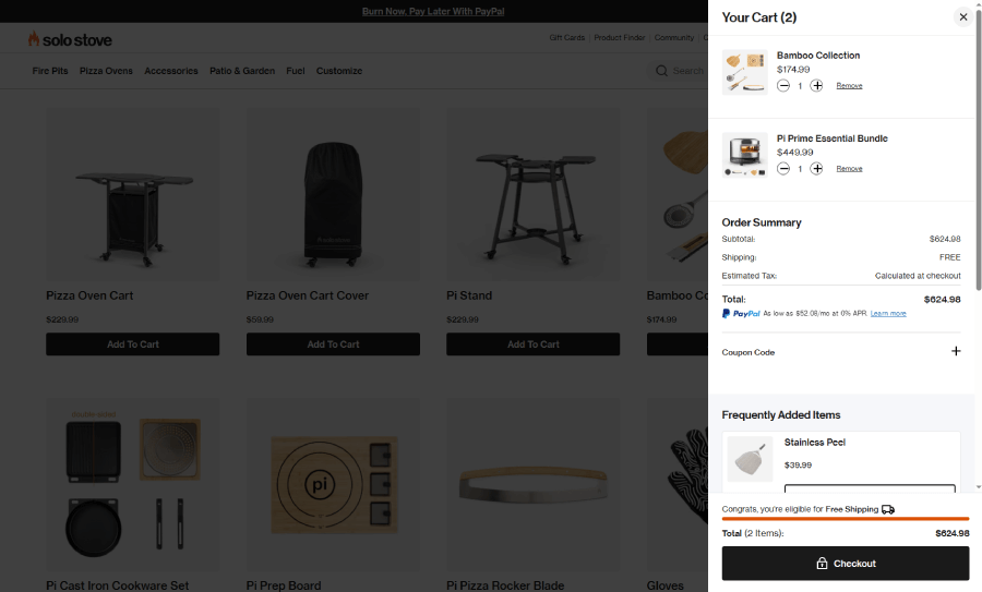
Progress bars are cool, so here’s another example of a great way to use one, by Solo Stove. Here the bar only shows if you’re eligible for free shipping, and you can see it below your summary right before you checkout.
And there you have it! Six powerful shopping cart design strategies that can turn any cart into a conversion machine. Just remember, a good shopping cart is like a good shopping buddy. It’s helpful, friendly, and never pushy. So, go ahead, give your cart a little TLC, and watch those sales (hopefully) roll right in!
If you also want to improve another part of your shopping experience check out our guide on how to design a great checkout page.