


Sometimes, you just need a hit of visual inspiration to get the ideas flowing, especially when you’re putting together a pitch for an eCommerce client. I’ve been there, staring at a blank slide, waiting for that spark. The truth is, a well-designed WooCommerce site can do more than just look pretty, it can show your client what’s possible.
You’re not just presenting and selling a product, you’re shaping a brand experience. And that means design, storytelling, UX, and conversion strategy all need to play nice together. So, I’ve rounded up 24 WooCommerce stores that don’t just work, they impress.
These are the sites I’d happily drop into a pitch deck and say, “See this? This is what great looks like.” Let’s check them out!
1. Heaton Hops – Cozy Boutique Beer WooCommerce Store
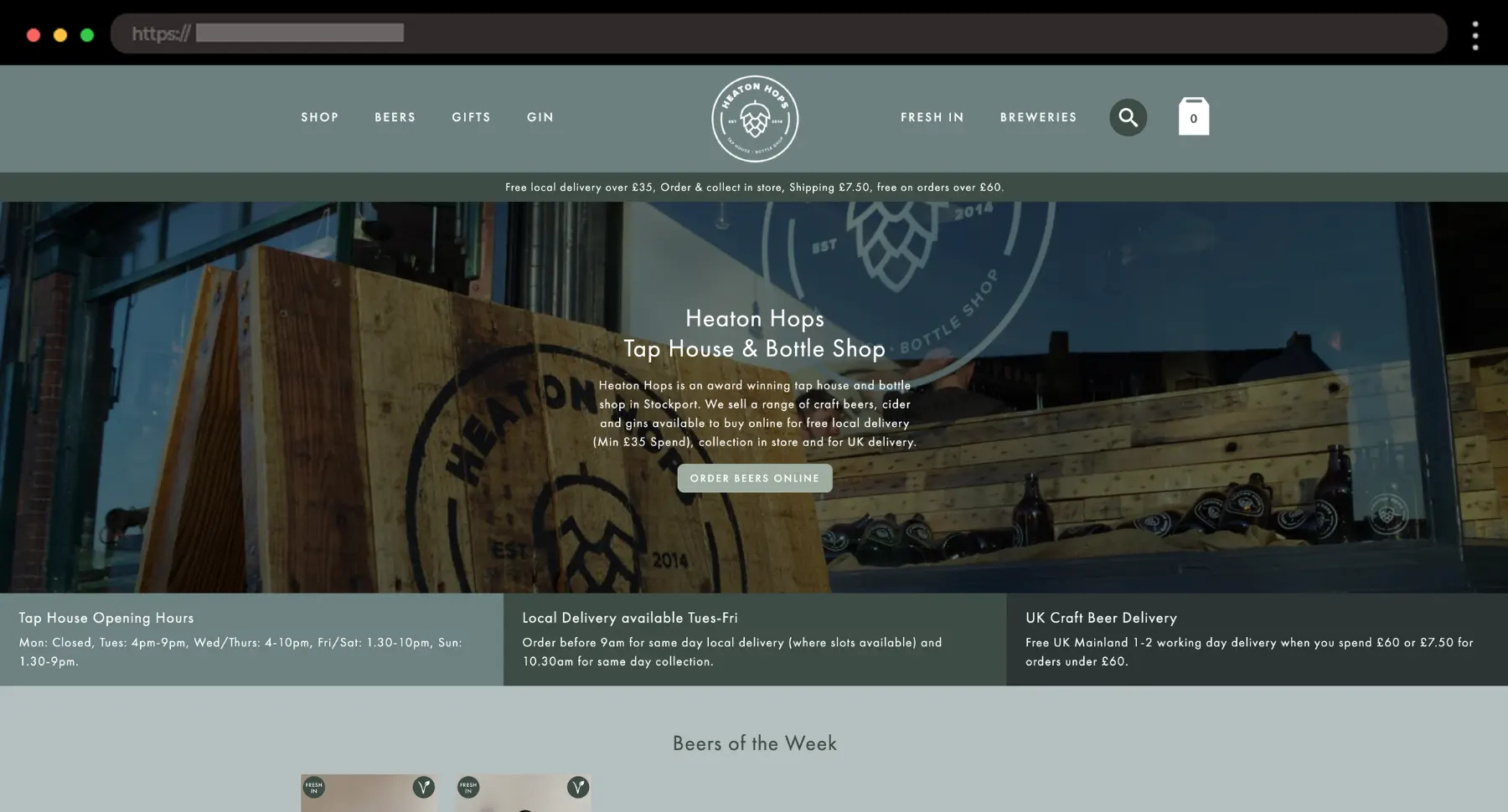
There’s something charming about Heaton Hops. The design feels like walking into your favorite local bottle shop – casual, curated, and warm.
What I like:
- Focus on product storytelling
- Great use of white space
- Strong local-brand identity
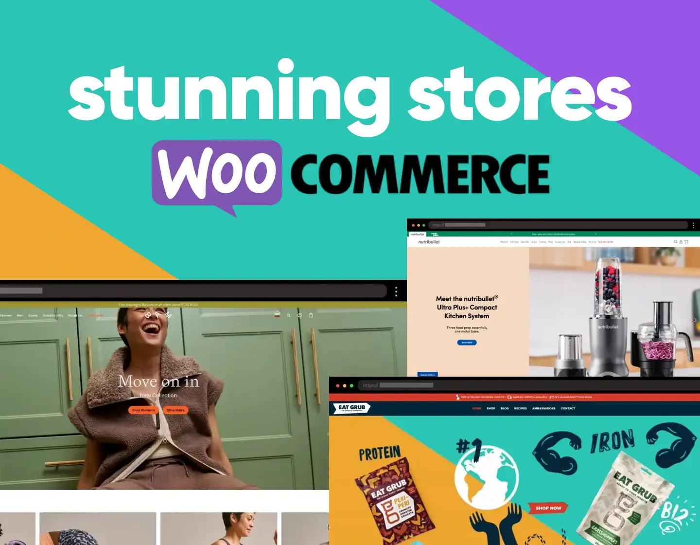
2. Nutribullet – Iconic Blenders with a Clean, Functional Storefront

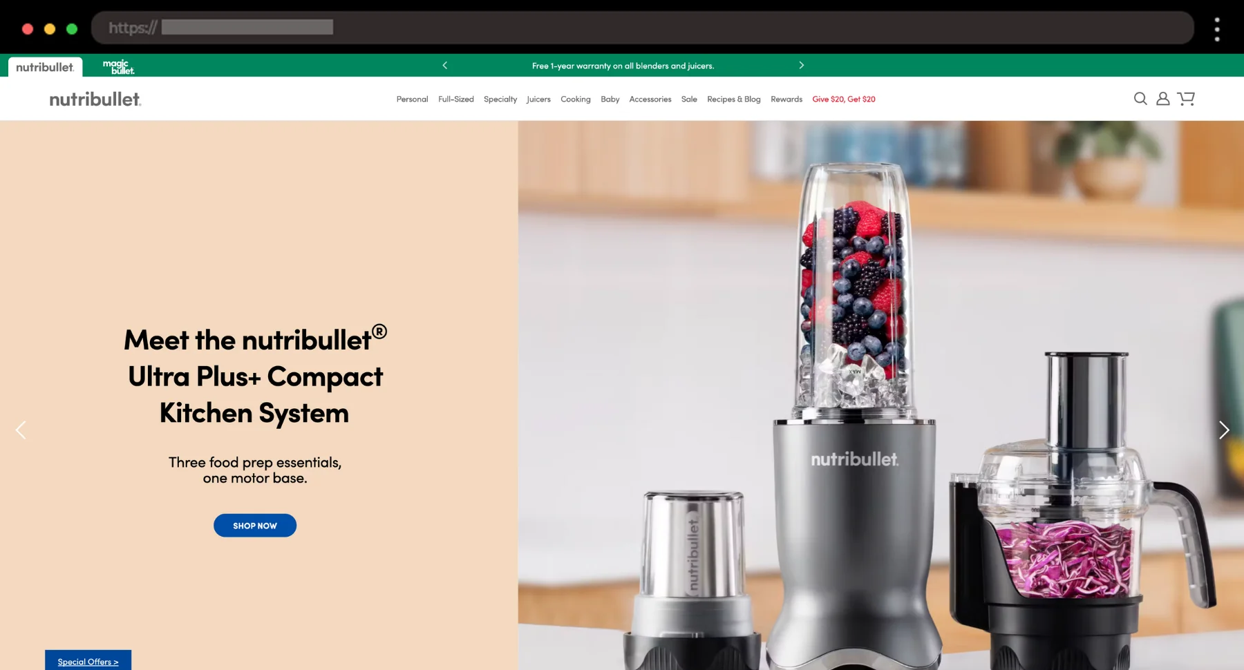
Nutribullet’s site feels as efficient as the blenders they sell. I like how everything is laid out with clarity, just on-point design and fast shopping.
What I like:
- Social media feed with product videos
- Bold CTAs and easy navigation
- Focused product storytelling
3. Eat Grub – Sustainable Edible Insects and Eco-Friendly Foods

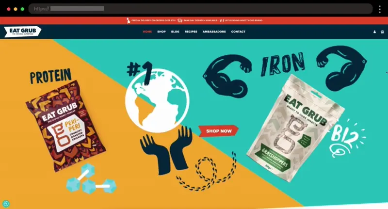
Eating insects isn’t really my thing, and I would personally never try it, but I’ve got to admit that I find the concept super interesting. The site makes a bold topic feel fun, accessible, and surprisingly stylish.
What I like:
- Vibrant, bold visual design
- Clear and appetizing product shots
- Strong sustainability message
4. BAM Clothing – Eco-Conscious Fashion Website with a Soft Touch

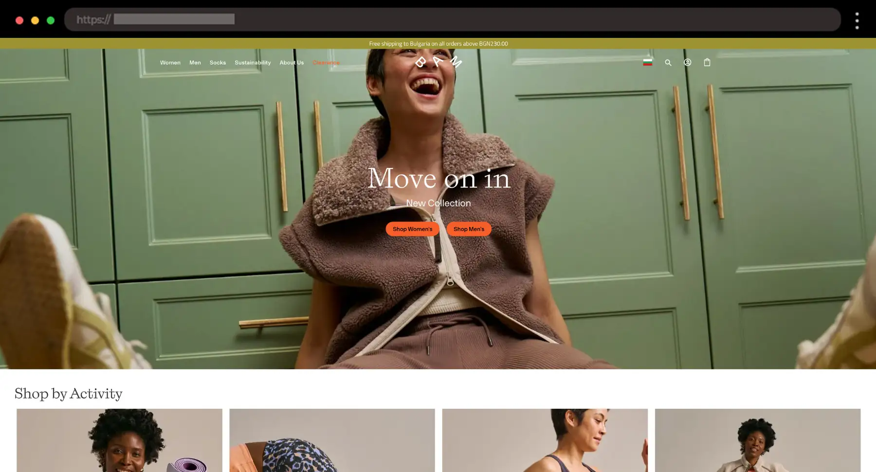
I love the calm, clean feeling of this example. The bold yet gentle design supports their sustainability message perfectly – it feels thoughtful and genuinely kind.
What I like:
- Attention-grabbing color palette and fonts
- Gentle motion and transitions
- Clear value-driven storytelling
5. Amsterdam Vintage Watches – Luxury WooCommerce Website

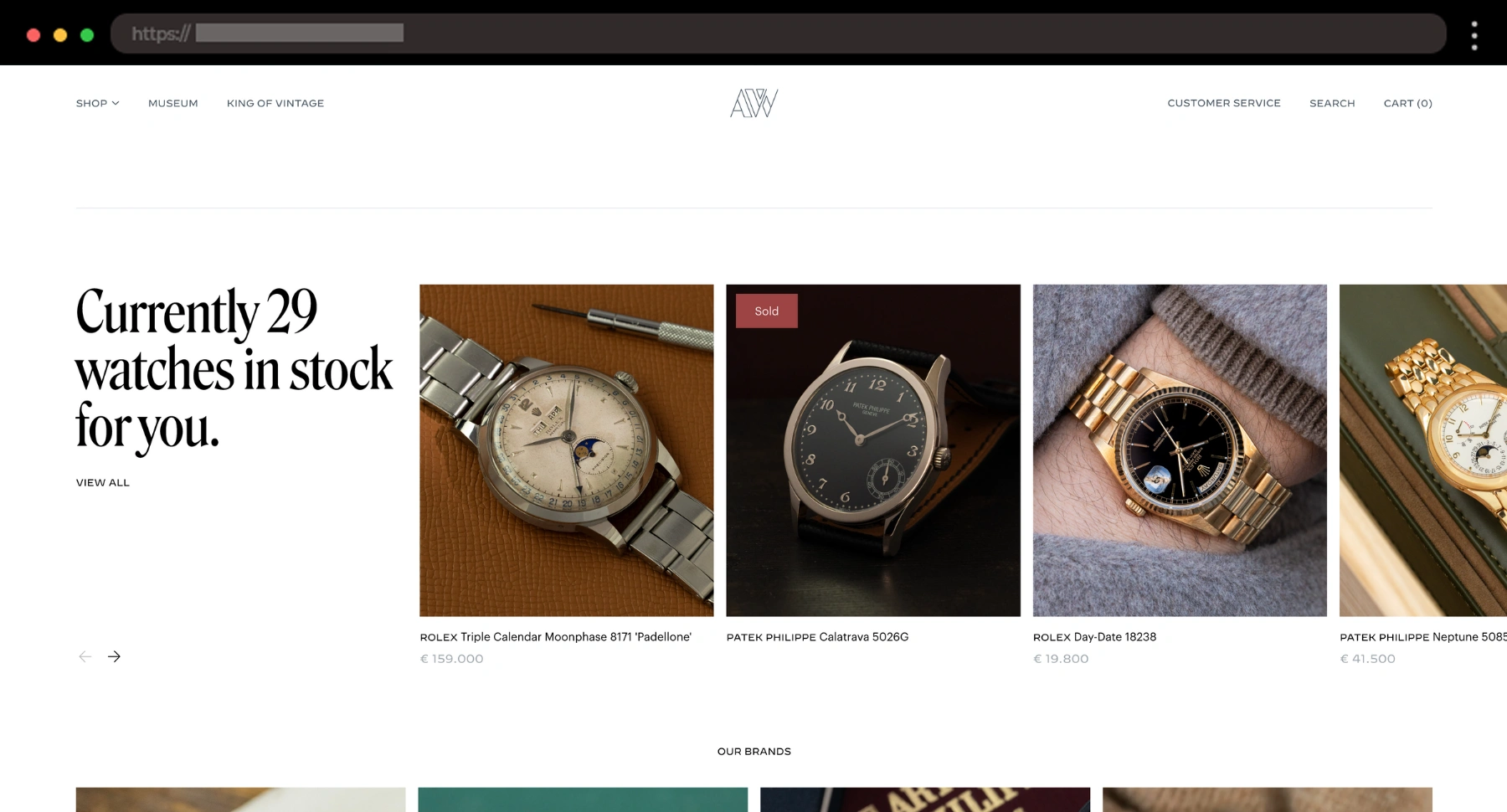
This site sets the tone right away – black and white, no distractions, just elegance. I like the close-up shots and clean layout that feel like they belong in a high-end gallery.
What I like:
- Crisp product photography with details
- Premium typography
- Straight to the point product pages
6. Bellabeat – Polished Feminine Wellness Tech

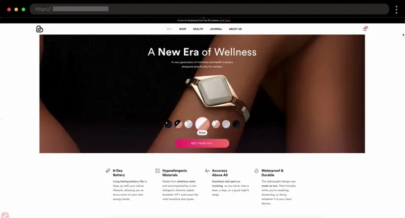
I really think Bellabeat nails the balance between wellness and style. The site feels modern, clean, and effortlessly chic.
What I like:
- Smooth product animations
- Honest testimonials
- Clean, feminine visual style
7. Desi Daru – Premium Vodka WooCommerce Site

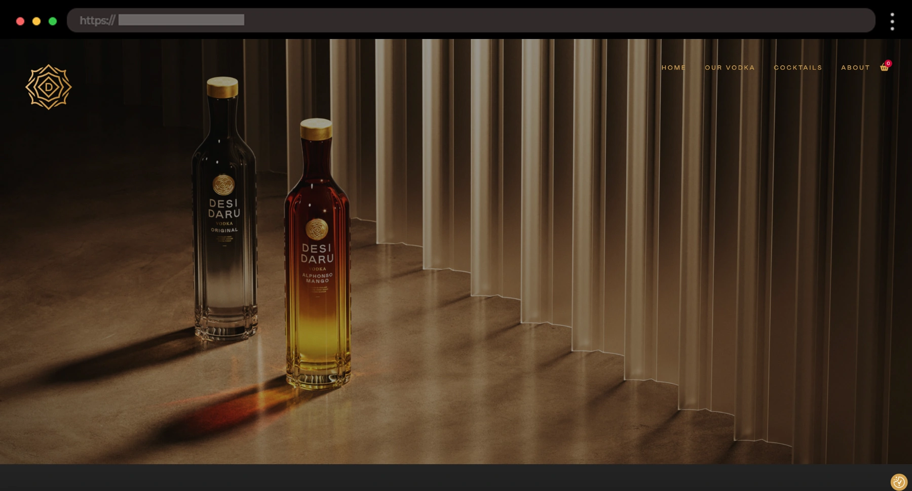
This one really leans into its brand – rich colors, refined fonts, and that gold-on-black styling that just feels confident. For me, the cocktail recipe page is a perfect finishing touch.
What I like:
- Striking black and gold palette
- Editorial-style product photography
- Refined modern typography
8. Razor – Legendary WooCommerce Store for Scooters and Ride-ons

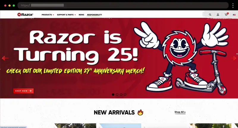
Razor’s site brings back serious nostalgia. The brand mixes fun, movement, and energy with a modern, scrollable store that’s a blast to browse through.
What I like:
- Playful design and colors
- Smooth product filtering
- Great use of action shots
9. Gentleman’s Guru – Bold Men Formalwear WooCommerce Store

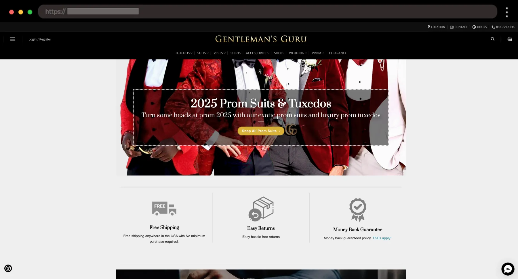
I think Gentleman’s Guru represents well that luxury-meets-flair energy. The site’s full of bold suits and sleek layouts that make formalwear feel exciting and fun.
What I like:
- Sharp photography with attitude
- Easy outfit filtering
- Confident, high-end branding
10. Steffie de Leeuw – Minimal WooCommerce Store for Custom Wallpapers

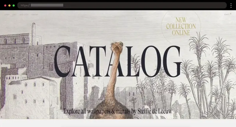
Don’t you think that Steffie de Leeuw’s site does an amazing job of showcasing her custom artwork with its minimal yet captivating design? It really lets the art speak for itself.
What I like:
- High-quality images that capture the details
- Easy product filtering
- Image zoom on product pages
11. Orange Amps – Premier Guitar Amplifiers and Musical Equipment WooCommerce Store

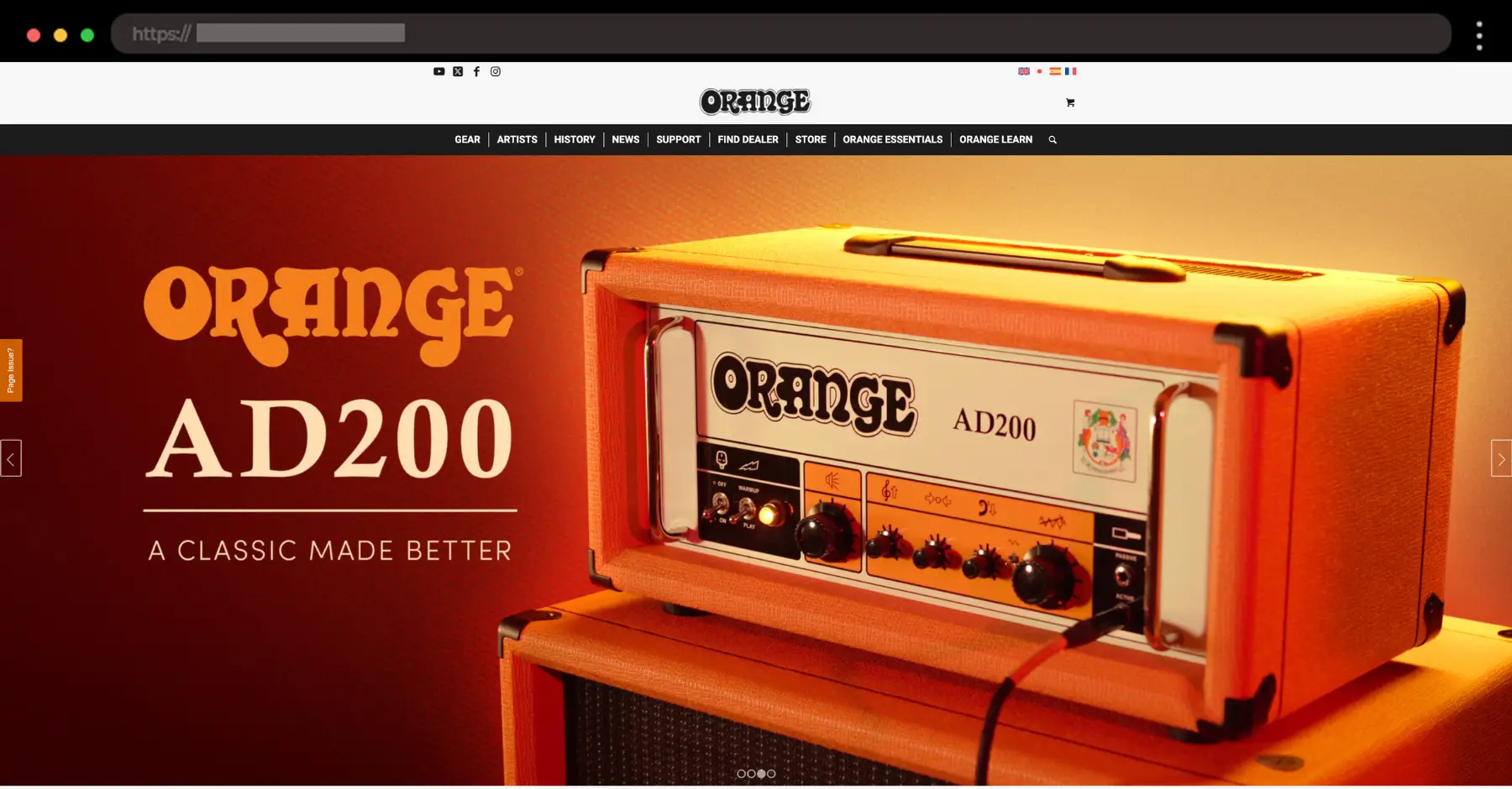
Orange Amps’ site perfectly reflects its bold, legendary brand. The images of their iconic orange amps alongside musicians speak volumes about their rock-n-roll heritage.
What I like:
- Bold, striking visuals with a rock-star vibe
- Clean product pages with clear details
- Hero images that immediately capture attention
12. Terratinta Shop – Modern Porcelain Tile WooCommerce Store

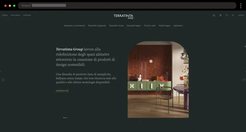
For a site selling tiles, Terratinta Shop is surprisingly sleek and smooth. The clean design and seamless product filtering make browsing feel effortless and enjoyable.
What I like:
- Clean typography with smart spacing
- Subtle use of color and texture
- Helpful product details with visual guides
13. Atlantic Patio – Outdoor Furniture WooCommerce Store with a Breezy Feel

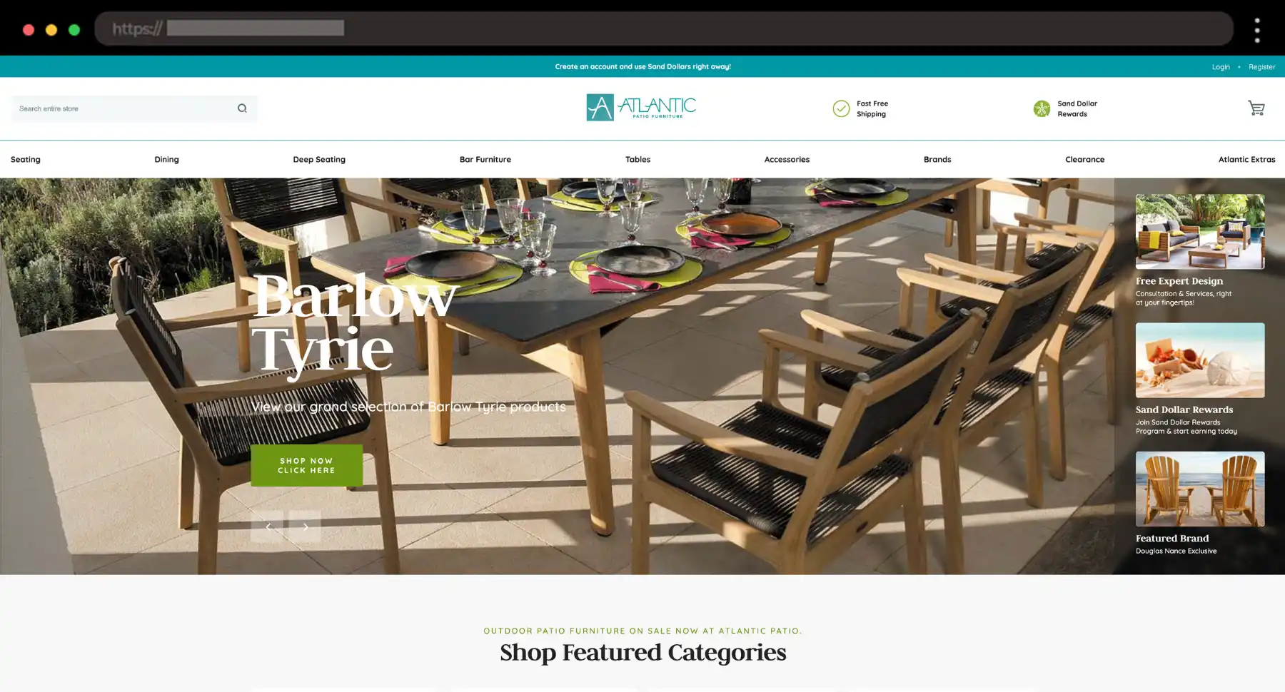
For me, Atlantic Patio feels like stepping into a summer catalog and I love it! The spacious layout and airy visuals create a calm, premium shopping experience.
What I like:
- Bright, breezy design
- Clear furniture groupings
- Soft lifestyle images
14. Bipa – Stylish Online Perfume Store with a Premium Touch

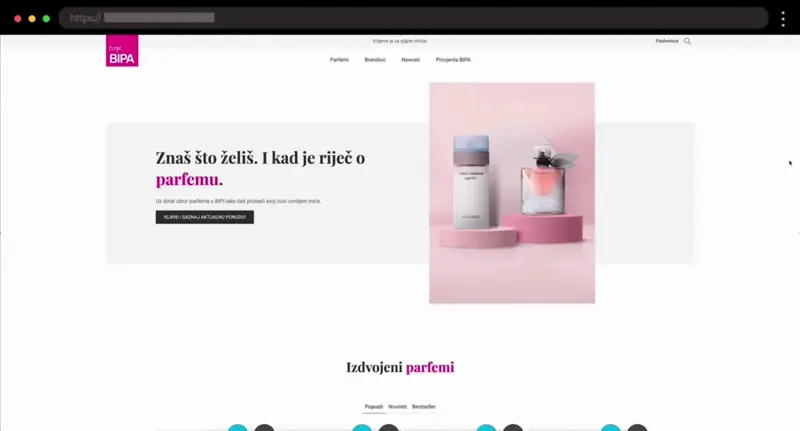
Bipa Parfemi is sleek and polished, with just enough glam. I think the product grid feels high-end without being overwhelming, an overall nice balance!
What I like:
- Easy-to-scan categories
- Clean white space around products
- Soft, luxe visual cues
15. Kawaii Box – Cute and Colorful Japanese Subscription Box

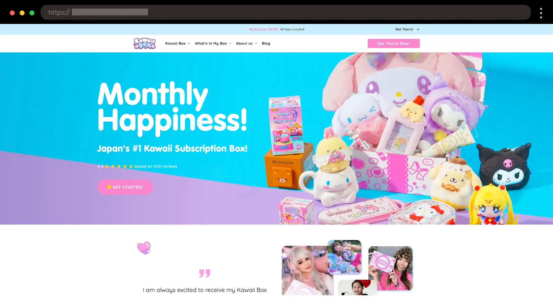
I’m personally drawn to how Kawaii Box captures the essence of “kawaii” culture. The site radiates cuteness from every angle, making it impossible not to like it if you’re fan of pink.
What I like:
- Bright, playful color palette
- Fun, engaging product photography
- Smooth subscription process
16. Reamarie – Stylish Skincare WooCommerce Store

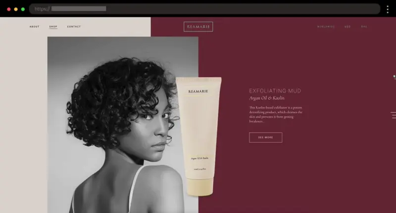
Reamarie’s site feels like a celebration of confidence and beauty. The sleek design and smooth animations create a polished and approachable experience.
What I like:
- Realistic product shots
- Delicate color palette and typography
- Smooth fade effects and subtle animations
17. Due Lune – Elegant WooCommerce Store for High-Quality Shoes

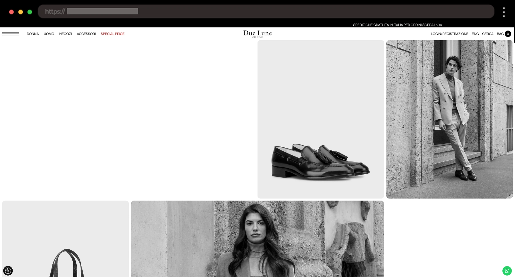
I’m loving how Due Lune combines sleek black-and-white images with subtle interactive features. The hover effect that adds color to the photos is a unique touch!
What I like:
- Well-organized product pages
- Bold, stylish fonts
- Smooth, subtle transitions throughout
18. Create It! Cosmetics – Bright WooCommerce Store for Tweens Makeup

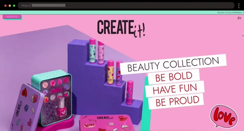
Create It! Cosmetics instantly grabs attention with its bright colors and playful design. It’s fun, energetic, and clearly made for a younger audience.
What I like:
- Bright, bold color scheme
- Fun illustrations, icons, and hashtags
- Youthful, energetic photos
19. Woof & Wiggle – Fun WooCommerce Pet Store with Wholesome Vibes

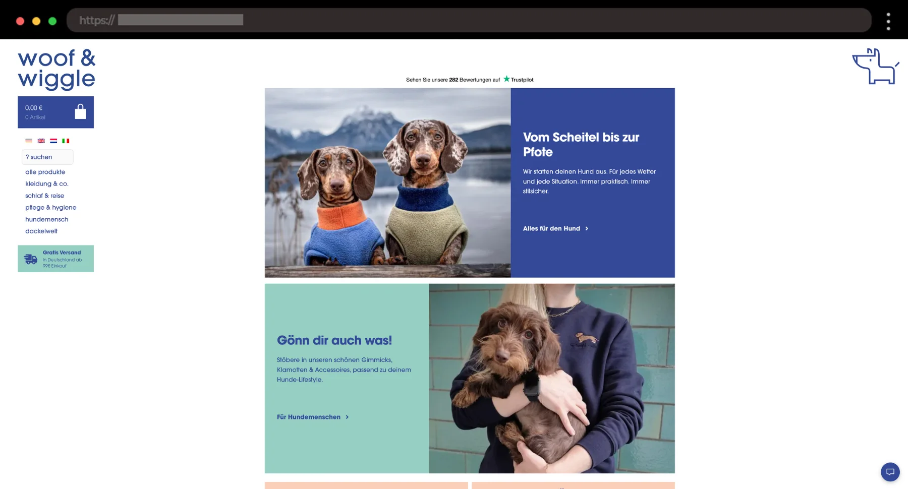
Woof & Wiggle is such a feel-good site. I like how everything feels lighthearted but well-made, just like the brand’s dog gear.
What I like:
- Playful colors, layout and overall branding
- Pet photos full of personality
- Easy-to-browse categories
20. Thermos Malaysia – Clean WooCommerce Site for Everyday Essentials

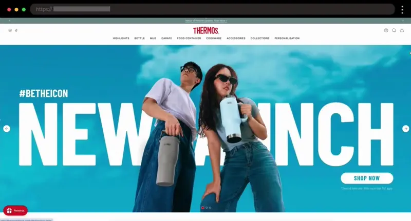
Thermos Malaysia keeps things tidy and practical. For me, the layout that gets the job done without overcomplicating the design with its classic but modern retail look and vibe.
What I like:
- Clear product categories
- Clean lifestyle images
- Familiar e-commerce structure
21. Badeloft – Minimalist WooCommerce Website for Sleek Bathtubs and Bathroom Fixtures

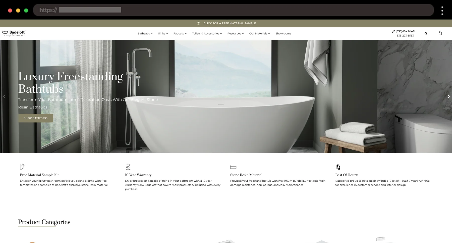
Badeloft feels like browsing a modern architecture magazine. I’m a big fan of how the elegant and clean visuals do most of the talking, with no distractions.
What I like:
- Gorgeous large-format images
- Minimal layout that lets products shine
- Light, spacious feel
22. TimberTech – Built-to-Last Decking Brand with a Professional Branding

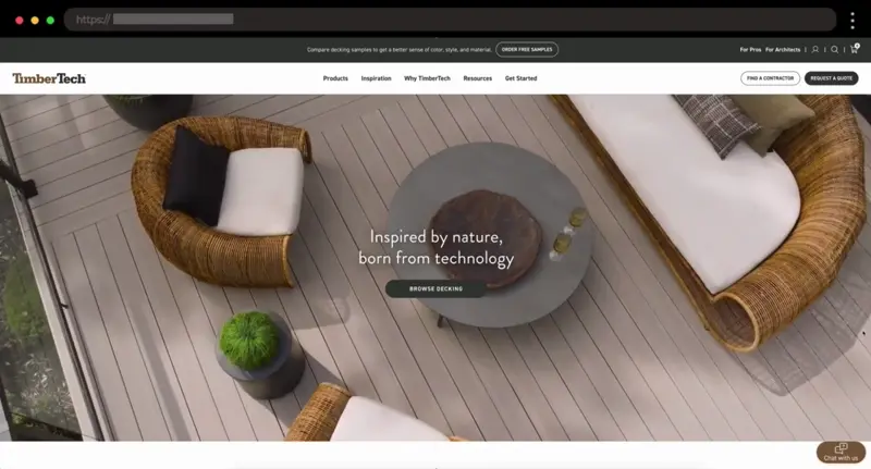
TimberTech’s site gives me serious “do it right the first time” energy. It’s clean, confident, and makes the decking process feel approachable, even inspiring.
What I like:
- Crisp product visuals
- Clear project inspiration sections
- Smart use of 3D Deck Designer
23. Kung Fu Tea – Bubble Tea Brand with Punchy and Urban Vibe

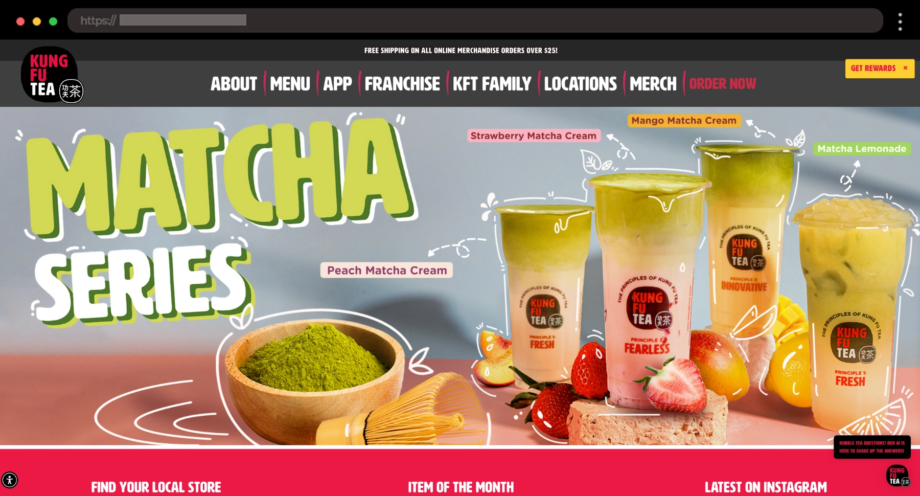
For cold beverage lovers out there, Kung Fu Tea’s website is fun, full of life and personality! I like how they’ve blended cool design with street-style branding.
What I like:
- Punchy colors and bold fonts
- Super clear product visuals
- Seamless store locator and app push
24. DVO Suspension – Performance-Focused Site for MTB Suspension Gear

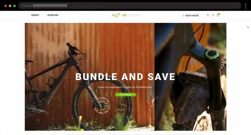
This one feels built for speed. DVO’s site has a gritty, high-performance edge that makes you want to get out and ride right away.
What I like:
- Strong product specs layout
- Rider-focused photography
- Bold use of green brand color
🤩 Design Patterns to Borrow
I’ve seen a few smart design moves pop up again and again in these WooCommerce sites. If I were working on a new store right now, here’s what I’d definitely borrow creatively:
- Oversized typography that makes a brand feel bold without trying too hard (Steffie de Leeuw, Due Lune)
- Black and white with a twist — it’s wild how many luxury brands stick to a strict palette but add richness through texture and photography (Due Lune again 👀)
- Subtle animations that don’t scream “look at me” but just make the site feel alive (Reamarie’s fade effect? So smooth)
- Full-screen menus that feel immersive and editorial – super useful for product-heavy brands that still want an elevated feel
- Image-driven category pages that act more like lifestyle moodboards than ecommerce grids
Final Thoughts
There’s so much creative gold out there, and WooCommerce is clearly powering some seriously good-looking storefronts. For me, the biggest takeaway is that great design doesn’t need to be complicated – just thoughtful.
I hope these examples gave you a little spark of inspiration, whether you’re prepping your next pitch or sketching out concepts for a new brand. And hey, if you ever find a site that makes you stop and scroll, save it. You never know when it’ll unlock your next big idea.