

Visual hierarchy is crucial for any design – when done right, it makes the design stronger and more effective. In today’s article, I’ll review the concept of text hierarchy, the best practices, and explain its impact on the reader. So, let’s hop to it.
What is Text Hierarchy and why is it important?

In short, text hierarchy helps us present the content in an organized way so the audience can have a seamless and intuitive experience with it. When the reader instantly and subconsciously grasps the relation between headings and paragraphs, they can quickly scan the text, sift out the parts that interest them, and focus on that content. In other words, text hierarchy helps the text do its job the way it’s supposed to.
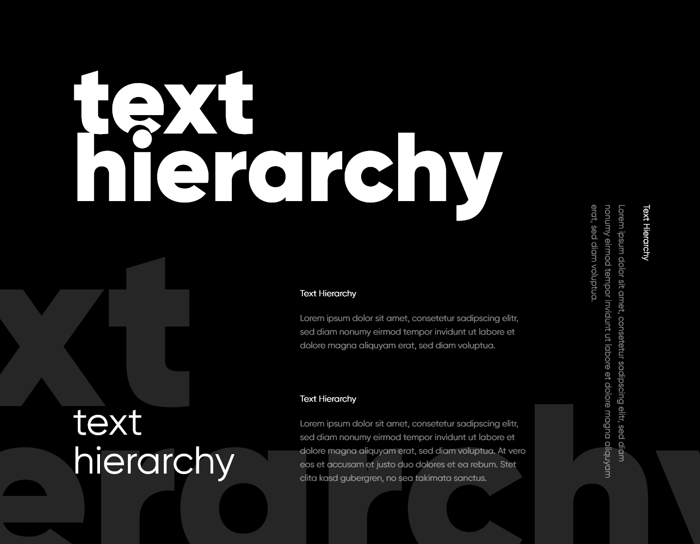
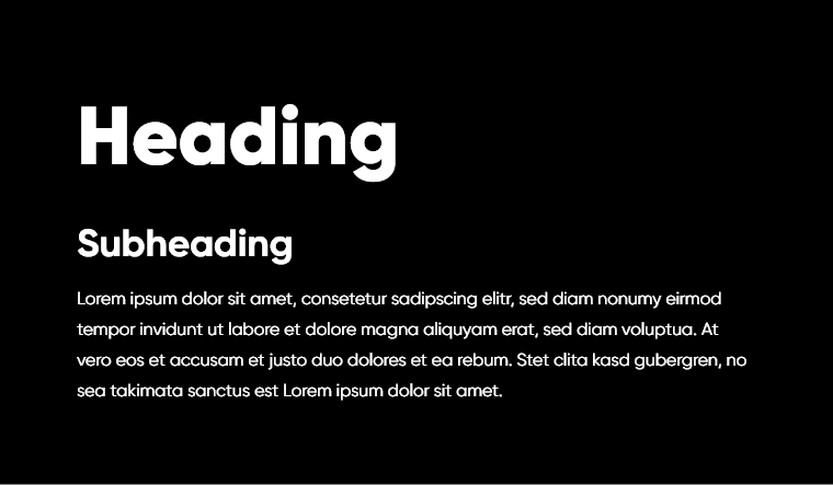
Here is the basic classification of the text hierarchy:
- Heading
- Subheading
- Text body
A text can have multiple headings that are also organized by hierarchy. This hierarchy starts from Heading 1, the heading that usually targets the main headline and topic of the content, and goes through Heading 6. Each heading can have its own subheading followed by a text paragraph.
There are several factors that help establish visual text hierarchy: size, weight, style, color, position, type, and spacing. Two or more of these factors are usually combined. Let’s review each of them.
Text Hierarchy with Font Size

Size is the most natural marker of creating the hierarchy. The bigger the text, the more noticeable and, therefore, the more important it is. Headlines are usually displayed in 20px or bigger and lead before subheadings and paragraph body text. The latter normally gets about 10-12px as a size.
Text Hierarchy with Font Weight

Font weight also organically creates a text hierarchy. Heavier fonts have a stronger presence. That is why they are usually used in the headlines, while regular and thin fonts have a more neutral and elegant appearance. Their thinner strokes don’t draw as much attention, so they are perfect for body text.
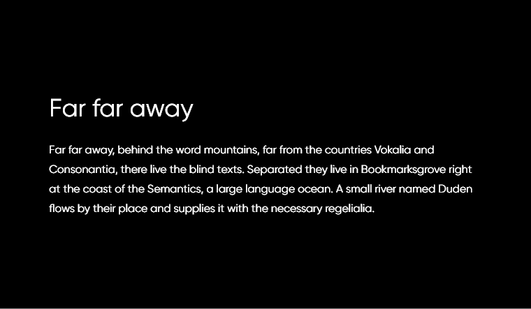
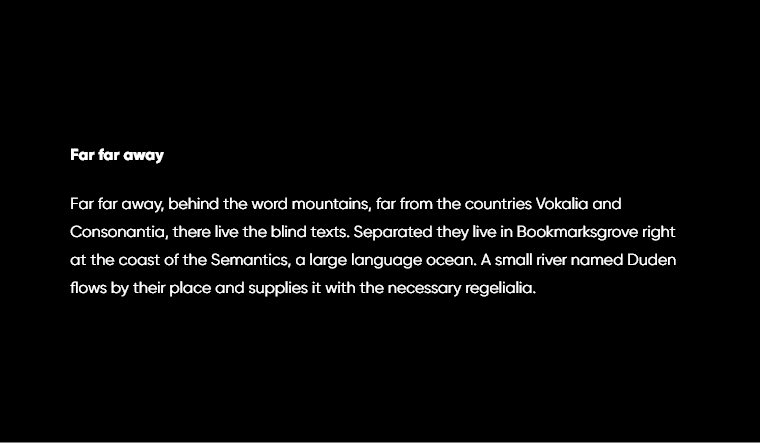
Font Style


When you take advantage of different font styles, you can also create a good hierarchy for your text. For example, an All caps style tends to look stronger and more noticeable which makes it suitable for a headline. This can follow by Italic style for the subheadline and regular style for the paragraph.
Font Color

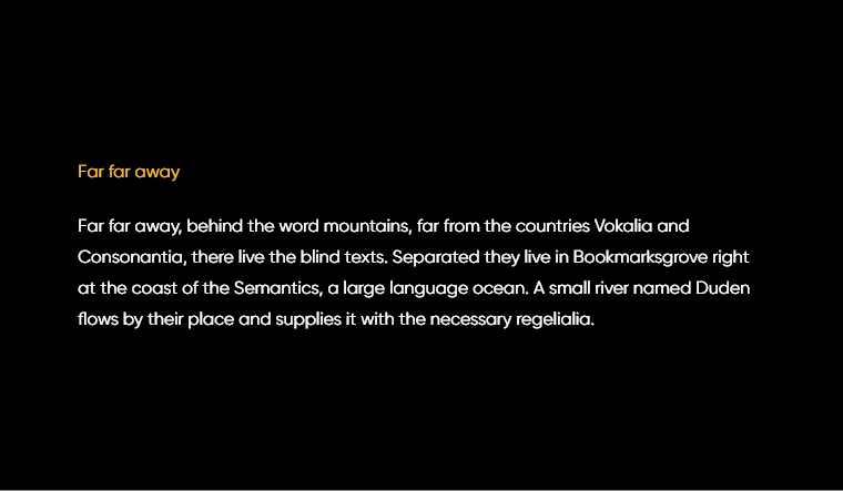
Color can also organize your text. The choice of color matters too and it has a lot to do with the psychology behind colors. On one hand, warm colors are more attention-grabbing than cool colors. On the other hand, the use of brand colors could help you create stronger brand awareness.
Content Position

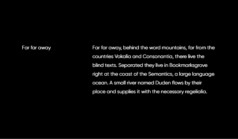
The position of the text itself can also speak a lot about the text hierarchy. Think of the CV layouts. The headlines and main bullet points position themselves on the left, which allows the reader to scan the content easier. Descriptions and text paragraphs stay conveniently on the right, right across its corresponding title.
Typefaces Contrast


A strong display font as a headline with a neutral easy-going thin font for the body text? Absolutely. Such a duo definitely creates high contrast and a hierarchy that’s immediately recognizable. When you use different typefaces in one design, always choose complementing types that maintain that high contrast.
Text Hierarchy with Spacing

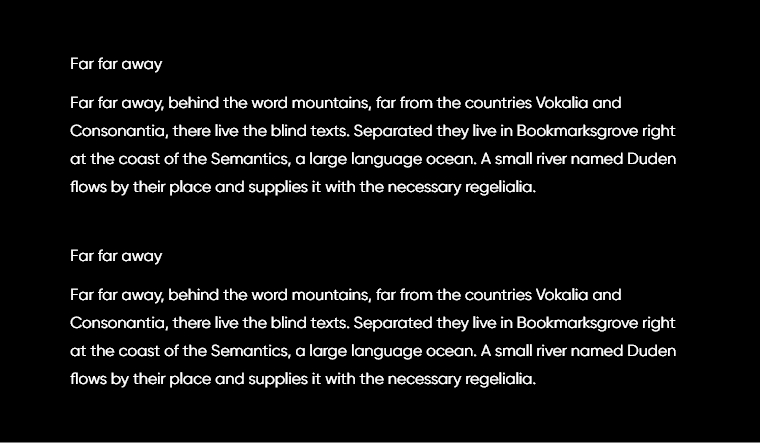
Last but not the least, spacing is a hierarchy indicator that is usually combined with any of the previously mentioned factors. Spacing allows the design to breathe and helps achieve a much more organized look. In general, the closer the spacing, the more related are two sections of the text. On the contrary, bigger spacing suggests a change of topic, context, etc.
Final words
In conclusion, learning and applying the essential rules of text hierarchy is crucial for the legibility of your content and the overall aesthetic of your design. If you are following our learning articles, you might be also interested in learning the basics of color combinations, so make sure you check this out.