

The importance of creating a successful online presence should not be underestimated for any business. Some of the top insurance businesses have websites offering not only comprehensive information about their services but also an intuitive and user-friendly experience. An attractive and functional site is an essential tool for drawing and retaining customers, as it is often the first point of contact between the company and potential clients.
So, in today’s article, we will explore 25 of the top insurance websites we found. Oh, and make sure you stay to the end, where you’ll find our practical tips on creating an effective and engaging insurance agency website. Let’s begin!
1. Lemonade

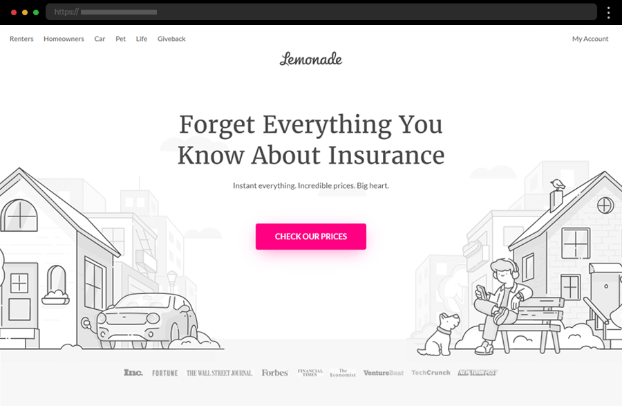
Our first example greets us with a design bursting with lightness and clarity. Its clever color choice helps the vibrant CTA buttons strongly pop out. It also enhances the great impression that the catchy illustration, smartly depicting every insurance service Lemonade offers, makes. Displaying testimonials and press features right below the hero image instantly builds credibility, creating a reliable brand image. In addition, engaging with the CTAs initiates an easy and convenient chat with the bot Maya, showing why Lemonade is the first in our list of top insurance websites.
2. PetleyHare Insurance Brokers

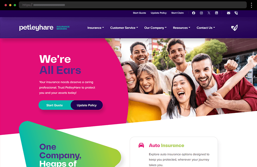
Next, we have PetleyHare, which embraces a super-inviting colorful, modern design with engaging interactive elements. The extensive menus, the comprehensive information, everything here is so clearly structured that hardly any questions remain. While perfectly embodying what a top insurance website means, PetleyHare’s site is also an amazing example of how to employ colors for a greater impact and a delightful user experience.
3. Sanlam

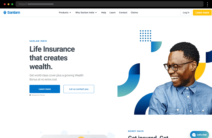
Sanlam, the next top insurance agency website example, amazes us with its modern appeal and well-thought-out design. Its homepage works towards driving conversions with its various CTAs and quick links, guiding the users to the biggest points of interest. All the information provided is easy to follow and comprehend thanks to the smart and uncluttered layout while the anchored navigation at the top satisfies visitors with its convenience. In addition, the color scheme, the displayed metrics, and client reviews depict the brand as trustworthy and approachable.
4. Steadily

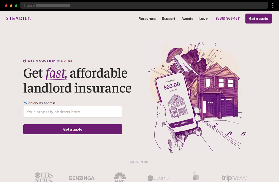
Here, Steadily website’s pastel-colored background exudes calmness while the overall color scheme and design depict the image of a company with a transparent and reliable approach. The visitor’s interest is aroused by clear messages with attractive illustrations, and the displayed press features and high-rating testimonials. Various sections with comprehensibly offered information and catchy sketch-like graphics throughout all the website’s pages satisfy every user’s need. Equipped also with a glossary and a Steadily AI Chatbot, this insurance website is truly a cool example.
5. Bestow

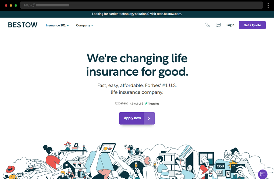
The Bestow website does everything to facilitate users with their choices. With its clean, user-friendly design and easily comprehended presentation of information, it is focused on simplicity and a smooth web experience. The site wins the visitor’s trust by highlighting customer reviews and its overall service clarity. In addition, the modern aesthetic and facilitated navigation turn this example into a visually appealing website that is a pleasure to explore.
6. Stone Insurance Agency

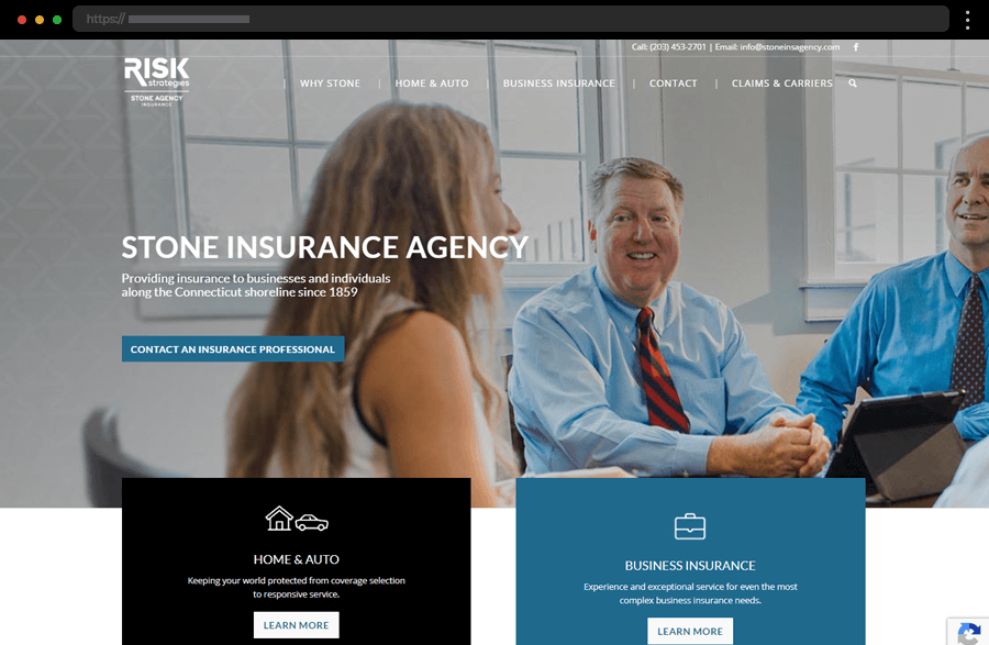
Stone Insurance Agency sports a website design radiating professionalism and reliability depicting a company with years-long traditions in the field. Also, using real-life images of the agency’s founders and team enhances their approachability and greatly shortens the distance between them and potential clients. In addition, navigating the site and taking advantage of what it has to offer is made easy by the clear menus, internal linking, and call-to-action buttons.
7. Ladder

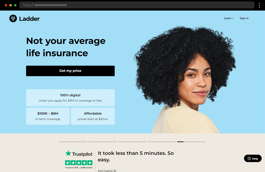
Next comes Ladder, with a website featuring a clean, minimalist layout, muted pastel-colored scheme, and a focus on user-friendly navigation. Employing clarity and simplicity, it displays the insurance offerings with their diverse options. Moreover, appealing visuals and concise text highlight the easiness of the agency’s processes, emphasizing their transparency and simplicity. Additionally, the site further engages its visitors by noting Ladder’s tree-planting initiative for each policy sold.
8. Passport Card

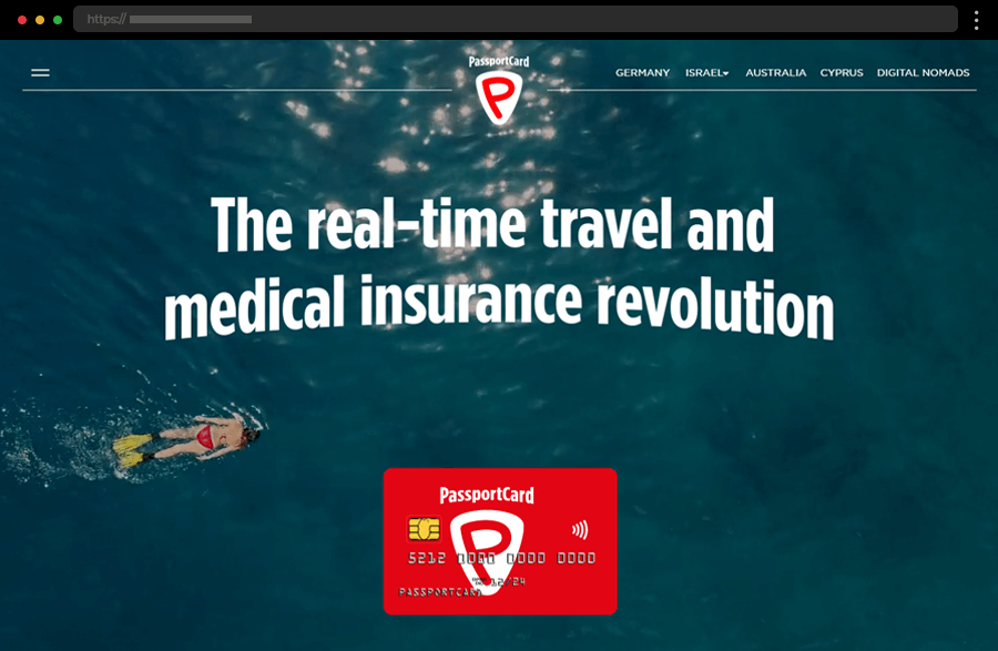
Passport Card’s single-page website greets us with an impactful full-sized video depicting the carefree life of the agency’s clients. With its bright red accent color, clear sectioning, and parallax scrolling the site is engaging and the information is easily absorbed. The well-thought-out, concise copy perfectly describes the company’s innovative product. In addition, the easy navigation provides access to further information and quick links to the insurance agency’s websites categorized by country.
9. Metromile

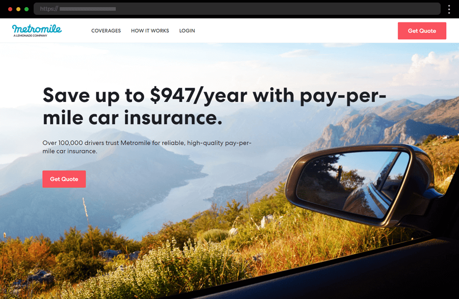
Metromile company sports a website with a clean, modern design strongly focused on providing easy navigation and promoting engagement. Some of the engagement enhancers are the site’s distinct CTAs, clear explanations, customer testimonials, and the description of the agency’s app. Metromile’s application tracks driving habits and the health of the car and sends alerts. In general, this example embodies user-friendliness while depicting the insurance purchasing process as simple and affordable.
10. Liberty Mutual Insurance

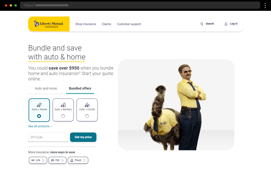
The main features of our next insurance website example are its user-friendly design and the clear focus on Liberty Mutual’s services. Highlighted in their hero section are their bundled offers, attracting customers interested in multiple insurance types and aiming to save from them. The intuitive sticky navigation with a straightforward structure and the facilitated way to file a claim, get a quote, or simply get in touch increase the site’s overall ease of use and improve user experience.
11. Medicare Alex

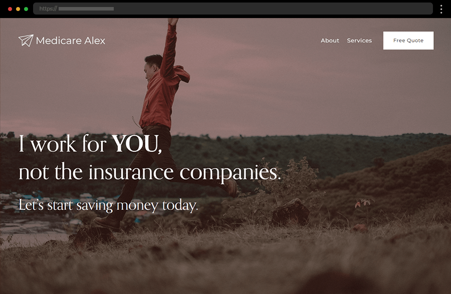
The Medicare Alex stylish website instantly impresses visitors with its full-size background image and overall straightforward design. Clean and simple, the navigation consists of only a few options, thus helping users quickly get the information they need. A distinct call-to-action button urges them to get a free quote while the easily accessible contact information builds a trustworthy and approachable insurance agent’s image.
12. ManyPets

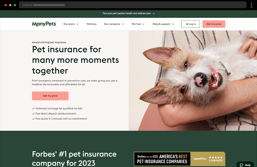
The ManyPets site is certainly appealing to pet owners with its sweet images and color palette evoking harmony and health. With a persuasive copy, attractive offers, and clear CTAs to get quotes or learn more the site ensures further engagement. In addition, with all the testimonials and awards displayed, this website example clearly depicts a trustworthy and reliable insurance agency image.
13. Titan Insurance

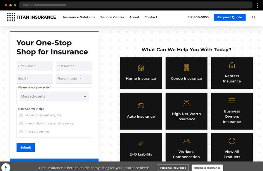
The Titan Insurance website features a modern and professional design with a user-friendly, super convenient navigation menu. The homepage highlights key services and important information, and provides quick access to a contact form, with a bold, straightforward approach. Appealing imagery and highly engaging interactive graphics make exploring the different insurance options become an immersive user experience.
14. Brightway Insurance

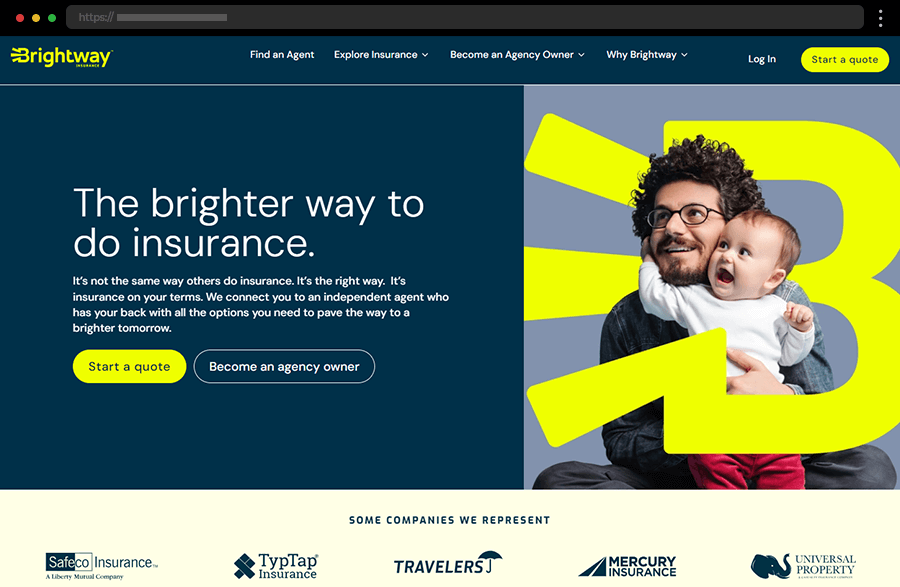
Next, we have Brightway Insurance’s website which comes with a modern and eye-catching design. Its color palette’s dark blue helps the brand be perceived as reliable and professional, while the contrasting bright colors accentuate the CTAs and all the important details. In addition, the facilitated navigation ensures a good user experience. And, with the agency’s services explained in such an accessible way, the site perfectly depicts the company’s user-focused approach.
15. Lumico

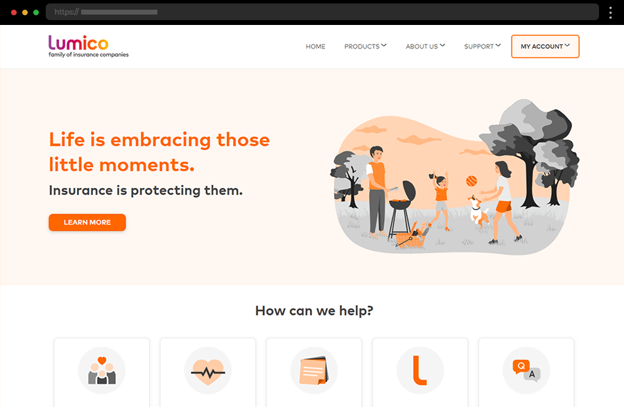
The website of Lumico comes with a simple and clean design focused on lightness, clarity, and transparency. Its homepage features just an impactful, straightforward copy, customer reviews, and quick links, keeping in line with the minimalistic design. Moreover, the vibrant call-to-action buttons and distinct menu options add to the ease of navigation. And, the soothing color palette creates a calm, trustworthy feel, strengthening the company’s position as a reliable insurance partner.
16. Trusted Choice

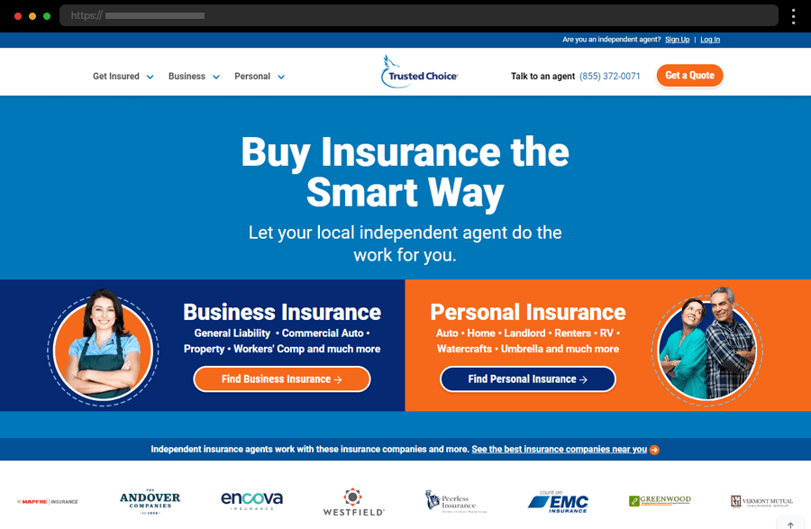
In our next example, the hero image’s intense use of the website’s color scheme grabs the user’s attention to provide a clear and informative company services description. While the longer texts are presented in the easy-to-absorb black-on-white style, the contrasting colors serve nicely for accentuating the CTAs and creating clear sections’ segmentation. The site also offers menus full of extensive information with metrics, graphics, and ratings, helping users with their decision-making process.
17. Oscar

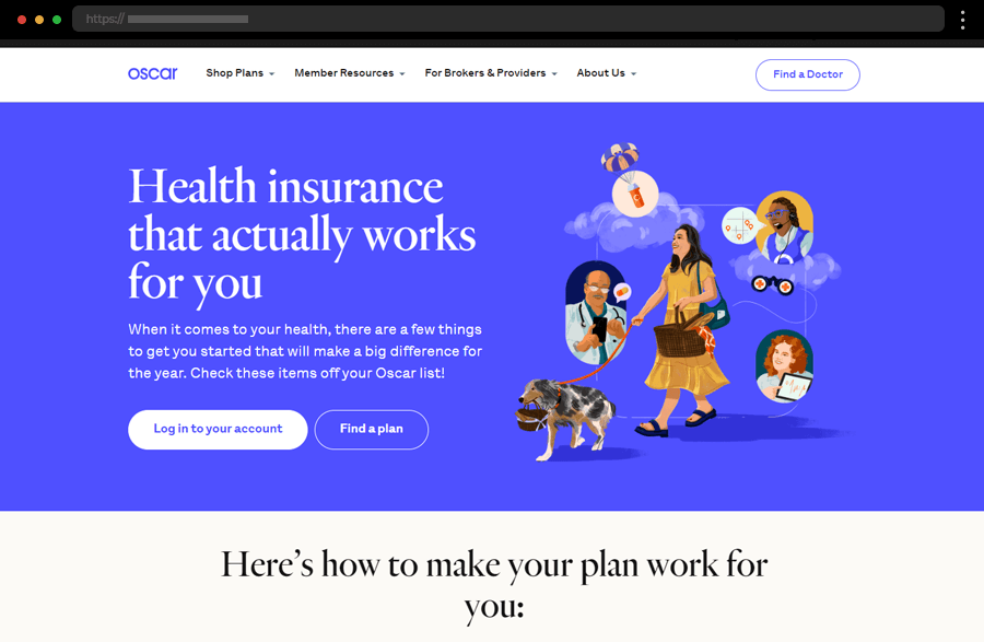
Knowing that Oscar is a health insurance company, it is easy to understand why they have employed blue for their visual branding. Blue exudes professionalism, reliability, and trust, all important qualities for such a company’s image. Smart sectioning, modern, colorful graphics, and call-to-actions ensure the homepage is informative, engaging, and easily comprehensible yet visually appealing. Moreover, the site’s copy, written concisely but with clarity, and the straightforward navigation add even more value to this good insurance website example.
18. Brown & Brown Insurance

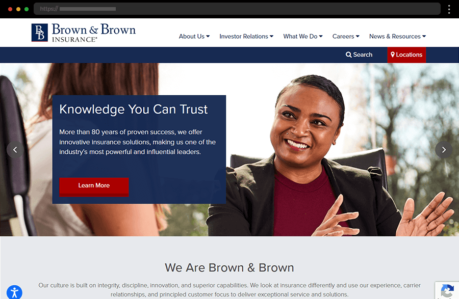
If anything, the Brown & Brown website certainly exudes professionalism and expertise. Embracing a modest, corporate-like design with sharp shapes and a clear structure, the site builds a strong, reliable brand image. The broad menu provides extensive information to satisfy any user interest while the search box ensures no visitor gets frustrated when looking for details.
19. Am Suisse

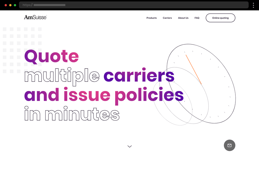
Embracing simplicity Am Suisse has a minimalistic, streamlined, and modern website. And, it is engaging, too – with an appealing hero section, copy with animated gradient, interesting section transitioning, and interactive elements throughout its pages. With limited menu options and a beautifully presented product list, the site is a breeze to navigate and explore. Overall, this website is a successful example of combining a smooth user experience with a design depicting a contemporary and expert brand.
20. Prudential

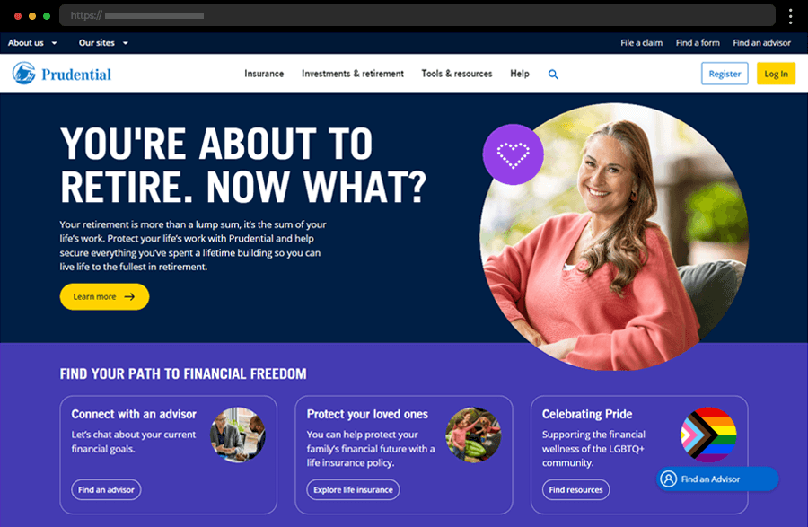
Prudential’s website features a clean design focused on presenting all the information it offers in an accessible way and through user-friendly navigation. With many visuals, interactive elements like the quiz on your personal financial goals, the various calculators, and lots of educational resources, the site enhances user experience and engagement. The overall appearance of this example is contemporary and trustworthy, just in line with the services it offers.
21. Wefox

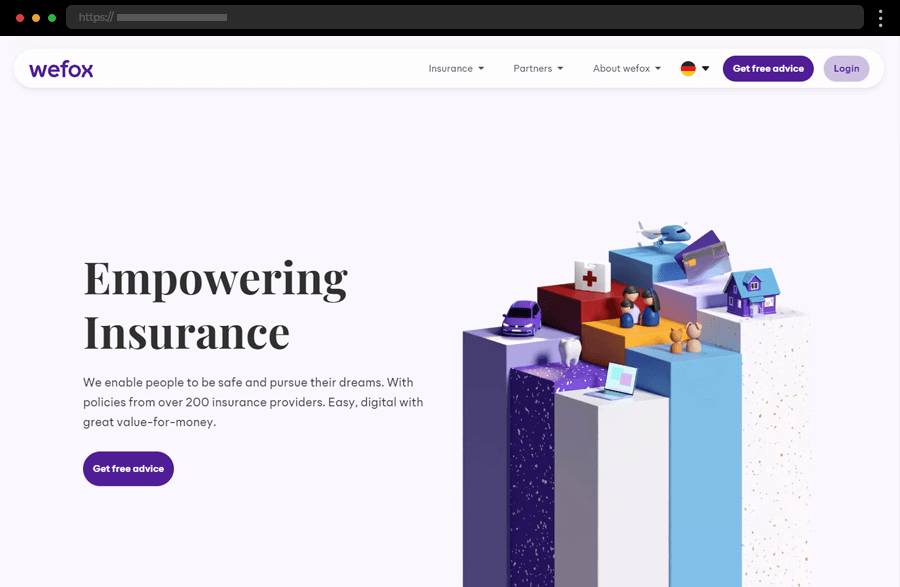
Coming with a clean and modern design, focused on simplicity and ease of use, the Wefox website depicts the company’s customer-focused approach. The anchored top navigation and the services’ highlights further increase the convenience of the users. In addition, the clarity of the descriptions and the overall site’s appearance exude professionalism while also instilling trust and transparency.
22. 123.ie

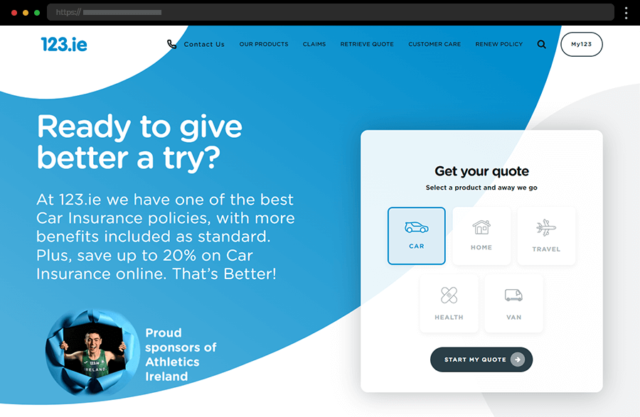
Next comes 123.ie with a website sporting a clean and user-friendly design with easy navigation to key insurance products. Using bright colors to highlight different sections and important information is a clever approach that also increases the site’s appeal. The prominent call-to-action buttons guide users to get quotes or manage their insurance accounts. And, in general, this website is focused on convenience and customer satisfaction, providing a smooth and simple user experience.
23. GradGuard

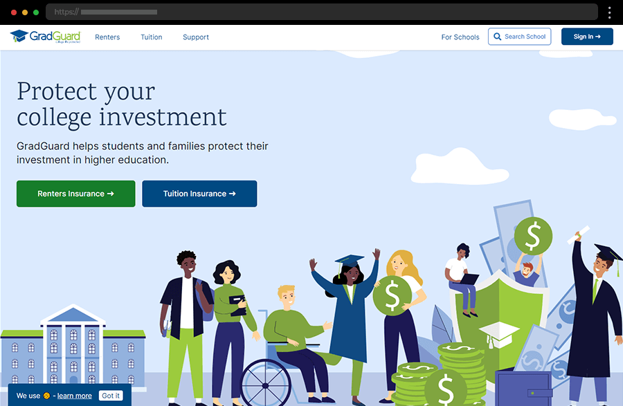
The GradGuard website comes with a clean, simple, student-focused design with straightforward visuals of college life. With clear sectioning, user-friendly navigation, and distinct CTAs, the site emphasizes insurance products in an approachable and comprehensive way. In addition, the showcased customer testimonials highlight the company’s commitment to excellent service and win the user’s trust.
24. Pets Best Pet Health Insurance

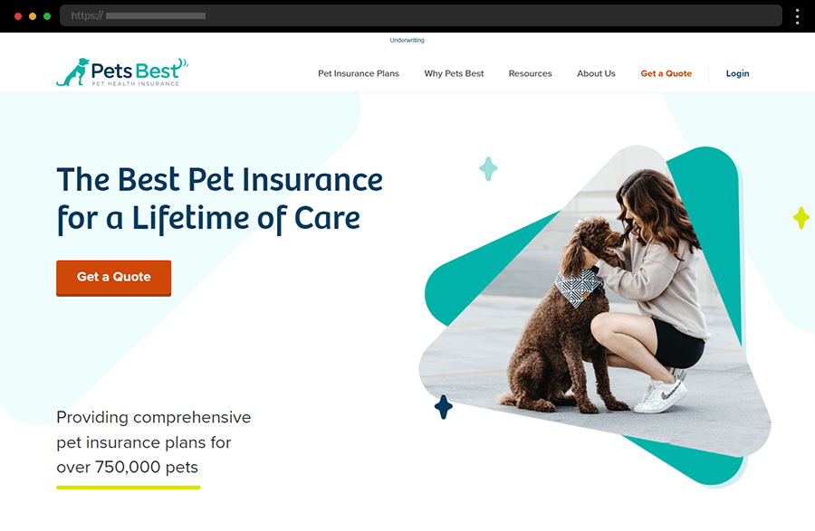
Pets Best, a pet health insurance business, has a website with a welcoming design emphasizing user-friendly navigation and accessibility. It is focused on creating a personal connection with pet owners by featuring engaging visuals and friendly images of pets. The site sports a fresh color palette accentuated by the contrasting red used for the call-to-action buttons. With its overall simplicity and ease of use, Pets Best provides a great example of a pet health insurance website.
25. Erie Insurance

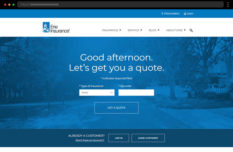
The Erie Insurance website has a professional, clean design embracing a blue and white color scheme focused on instilling trust and reliability. The homepage provides easy access to key sections for the different types of insurance and getting a quote, making it simple for visitors to find relevant information quickly. With clear navigation and a focus on accessibility, the website of Erie Insurance embodies its commitment to customer satisfaction and comprehensive service, thus enhancing the overall user experience.
Tips on how to craft top insurance websites
- Choosing a user-friendly design and ensuring the website is easy to navigate with clear headings, simple menus, and a consistent design throughout the site will greatly contribute to instilling convenience and simplicity, which are so important for an insurance company’s brand image.
- Present the insurance information, like policies and services, clearly and concisely, for it can be complex for many people. Break it down into smaller, easily understandable sections and use graphics to enhance user understanding.
- Incorporate various tools to enhance user convenience. For example, insurance calculators, live chat customer support, and FAQ sections will engage visitors and help them find what they need quickly.
- Remember that many people will visit your website through their phones. So that’s why it must be mobile-friendly and optimized for all devices to provide a seamless experience for every user.
- Showcasing customer testimonials and reviews can quickly build credibility and trust. Also, the positive feedback from satisfied clients significantly influences the decisions of potential clients.
- Ensure your website is optimized for search engines to attract more visitors. Use relevant keywords, create high-quality content, and obtain backlinks from reputable sites to improve your search engine ranking.
Final words
In conclusion, the development and maintenance of top insurance websites are essential for attracting and retaining customers in the insurance industry. The well-designed and functional insurance websites not only provide essential information about policies and services but also offer a user-friendly experience that can convert visitors into customers. By following the best practices and providing a smooth and pleasurable web journey, insurance companies can ensure they have an impactful and memorable online presence.
If you enjoyed this article but still need more inspiration to ignite your creative spark, you may find it here: