


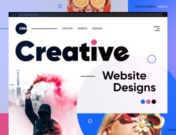
When it comes to creating a memorable website, the header is where it all starts. It’s the first thing your website visitors see, and a well-designed header can set the tone for the entire website. Whether you’re aiming for sleek web design or bold, interactive visual elements, the right header features can elevate your user experience and make your homepage stand out. A strong header ties together your web pages, ensuring seamless navigation and a consistent look. From social media links to dynamic dropdown menus, these essential elements will help you create a header that aligns with your brand identity.
In this article, we’ll showcase 12 eye-catching website header examples that will inspire you to rethink your own website’s first impression. Stick around until the end, when we’ll share some of the best practices for designing an effective header. Let’s dive in!
1. Spatial – Clean and Simple Sticky Header

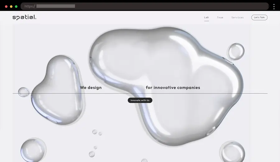
Spatial Innovation offers a sleek and simple design that focuses on its cutting-edge digital services. The sticky header is minimalist, with left aligned logo and the navigation links on the right. The header remains fixed as you scroll, ensuring easy access to important site pages.
What we like:
- Clean and modern design with clear navigation.
- Sticky header for easy access as you scroll.
- Focused on simplicity and functionality.
2. Paul Black Design – Sleek Header with Dynamic Slide-In Menu

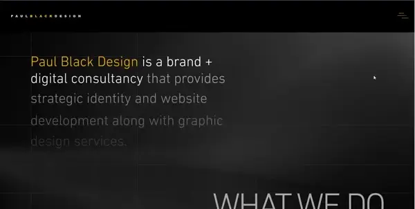
Paul Black Design, a digital consultancy site, nails simplicity with its minimalistic black header. The left side features the logo, while a hamburger menu on the right opens to reveal a bold, square-shaped orange menu. The smooth sliding animation adds a dynamic touch, and the logo’s repetition within the menu reinforces branding while keeping the design creative and cohesive.
What we like:
- Consistent logo placement for strong branding.
- Minimalistic black header with a sleek, modern vibe.
- Smooth sliding animation for the orange menu.
3. James Cropper – Multi-Layered Sticky Header with Prominent CTAs

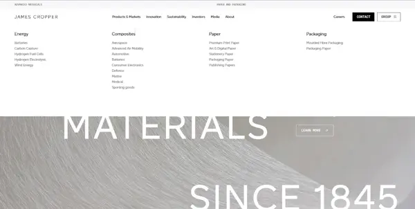
James Cropper, a leader in sustainable materials, features a sophisticated sticky header design that prioritizes functionality and style. The top layer includes direct links to “Advanced Materials” and “Paper and Packaging.” Below it, the second layer houses the logo, a navigation menu with dropdown options, and standout “Contact Us” buttons. A unique “Group” CTA unveils a pop-up menu with additional links and a language selector, ensuring accessibility for global users.
What we like:
- Pop-up menu offering a language switch.
- Bold and effective CTAs.
- A polished design that reflects the brand’s premium identity.
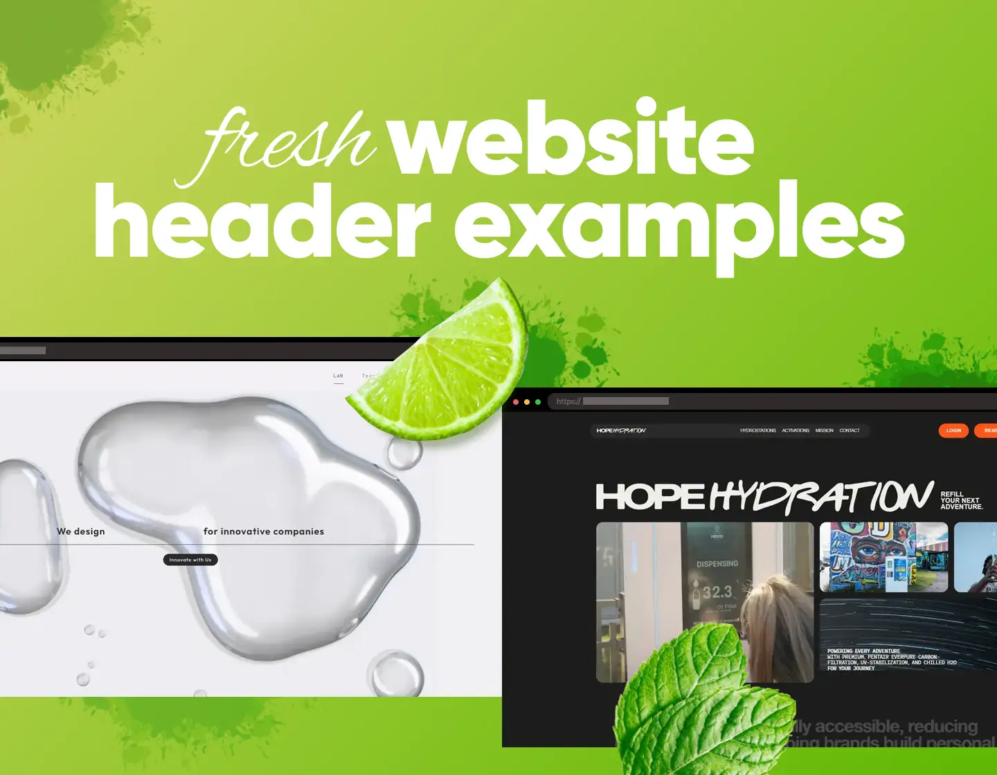
4. Hope Hydration – Vibrant Sticky Website Header Design

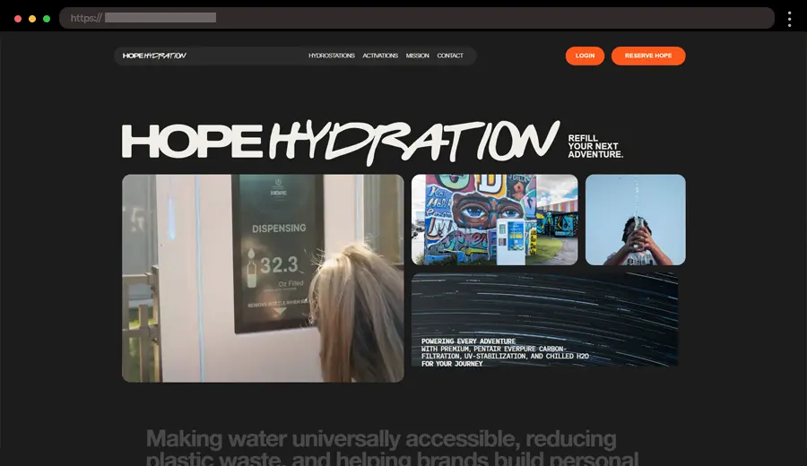
Hope Hydration uses a simple, colorful, and engaging header that reflects its brand’s personality. The full-width header includes links and bold orange CTAs to reserve the product and log in to your profile. The logo and the main links are designed in one section, with the logo on the left and the links in the center of the page, which is a nice design touch
What we like:
- A vibrant color palette matching the brand’s fresh vibe.
- Bold CTA buttons.
- Clean design focusing on product details and user convenience.
5. Inette – Stylish Full-Width Header with Hover Animations

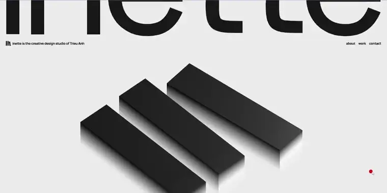
Inette’s website features a full-width header with a minimalist design, perfect for showcasing its professional services. The header includes a logo with additional text on the left and on the right, and links with smooth hover animations that guide users seamlessly across the site. Depending on the section the user is viewing, the header transitions to a sticky format and eventually fades away.
What we like:
- Elegant full-width design with smooth hover effects.
- Subtle animations that improve the user experience.
- Clean typography for better readability.
6. Grow Better Studio – Innovative Sticky Header with Animated Full-Screen Menu

Grow Better, a branding and design agency, showcases a stylish sticky header that balances simplicity and creativity. The logo is positioned on the left, while a sleek hamburger menu on the right reveals an animated full-screen navigation menu when clicked, adding a modern touch.
What we like:
- Subtle, engaging animations for the menu links.
- Strong branding that reflects their creative expertise.
- Minimalist hamburger menu for a clean layout.
7. PEM – Elegant Sticky Header with Interactive Menu

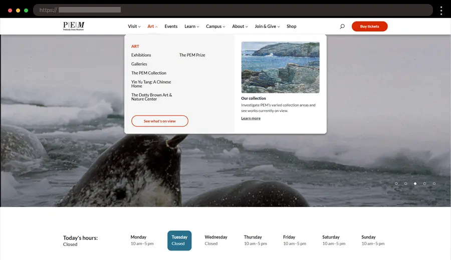
PEM, a museum focused on contemporary art and culture, showcases an elegant sticky header that combines sleek design with user-friendly functionality. The header features a minimal logo on the left, a navigation menu with subtle hover effects, and a prominent search bar on the right. As users scroll, the header remains sticky, ensuring that key navigation options are always accessible. The interactive menu opens with smooth transitions, offering visitors an engaging browsing experience while maintaining the museum’s sophisticated, modern aesthetic.
What we like:
- A minimal logo that highlights the museum’s modern branding.
- Sticky header that keeps key links accessible.
- Search pop-up.
8. Quatre Cent Quatre – Animated Sticky Header Example

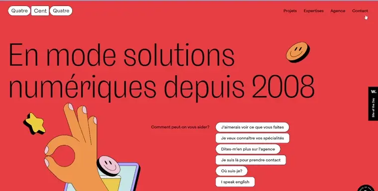
Quatre Cent Quatre, a creative web design agency, makes a striking impression with its animated header. The distinctive logo on the left is designed to resemble three separate buttons stacked together, adding a playful yet sleek touch. On the right, navigation links transform into buttons when hovered over, enhancing interactivity. As the user scrolls, the header becomes sticky, with the logo and links compacting for a more streamlined look. The design beautifully reflects the agency’s focus on innovation and user-friendly experience.
What we like:
- An interactive logo that doubles as a unique design feature.
- Hover-activated buttons that add a dynamic touch.
- Sticky header with compact layout for seamless scrolling.
9. Jamie Oliver – Complex Fixed Header Example with Mega Menu

Jamie Oliver, the famous chef and food personality, brings a clean, functional header that combines ease of use with sleek design. The logo is centrally placed for instant brand recognition, while key links like “Recipes” and “Shop” are positioned on the left, featuring a dropdown mega menu to save favorite recipes. On the right side, users can easily access the shopping cart and profile. Beneath the main header, a search bar displays popular searches, trending recipes, and the “What’s Hot” section, offering an effortless browsing experience.
What we like:
- Accessible shopping cart and profile options.
- Interactive search bar showcasing popular content and images.
- Mega menu that allows saving of recipes.
10. RTR FM – Simple Header with a Search Bar
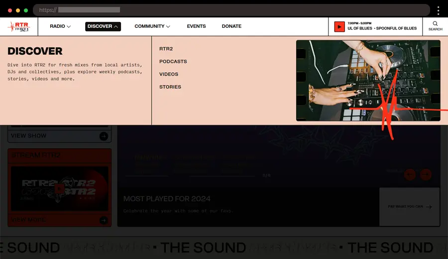
RTR FM, a community radio station, features a minimalist header design for easy navigation. On the left, you’ll find their logo and navigation links with dropdown menus, while the right side prominently displays a “Play” button for quick access to the live stream. There’s also a search button that opens a bar below the header, offering a “Filter by” option. The design is focused on functionality, making it simple for users to connect to the radio stream effortlessly.
What we like:
- Bold “Play” button for quick access to the live stream.
- Clean layout that highlights the station’s main features.
- Search bar with filtering options for better navigation.
11. P448 – Left-aligned Sticky Menu Example

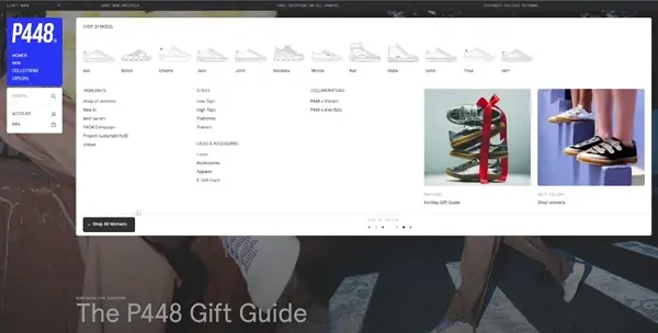
P448 is a fancy Italian sneakers brand that showcases a distinctive left-sided sticky navigation in its header. The clean and modern header text aligns with the brand’s minimalist aesthetic. The mega menu efficiently organizes their product collections, making it easy for customers to explore new models, styles, and more. A strategically placed search bar with extra widget sections adds to the overall functionality.
What we like:
- Sticky navigation on the left.
- Mega menu for product collections.
- Search bar with additional widget sections.
12. Aarke – Minimalist Header with Dynamic Search

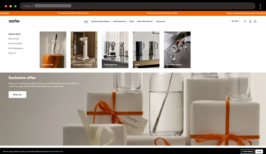
Aarke is a premium Swedish kitchen essentials company and their website showcases a minimalist header. The elegant logo is on the left, the main navigation is centered, while the language, account and shopping cart options remain on the right. When you press the search button, a dynamic search functionality with suggestions and products appears below. The clean design emphasizes the product and makes the browsing experience seamless.
What we like:
- Dynamic search bar functionality.
- Subtle use of animations.
- A modern aesthetic that matches the brand’s products.
← Back to WordPress Website Examples Hub
Best Practices for a Good Website Header Design
By following these guidelines, your website header can create a seamless experience for website visitors and enhance the usability of your web pages.
💡 Keep It Simple and Clean
A well-designed header should avoid clutter by focusing on essential elements like the logo, navigation, and key calls-to-action (CTAs). The use of whitespace is crucial to ensure the header remains visually clear and easy to read.
💡 Make Navigation Intuitive
Navigation should be straightforward, with a clear, hierarchical menu structure that allows users to find what they need quickly. Dropdown menus or mega menus can be included for better organization, especially on websites with extensive content.
💡 Ensure Branding Stands Out
Your logo should be prominently displayed, often in the top-left corner, to reinforce brand recognition. The overall header design should reflect your brand’s identity, incorporating consistent colors, fonts, and style.
💡 Add a Call-to-Action (CTA)
Highlighting key actions such as “Sign Up,” “Shop Now,” or “Contact Us” is essential. To make CTAs stand out, use contrasting colors that draw attention without overwhelming the rest of the header.
💡 Optimize for Mobile Devices
A responsive header design ensures seamless adaptation to smaller screens. Using a hamburger menu for mobile navigation saves space while maintaining functionality, making it easier for mobile users to explore the site.
💡 Include Essential Elements
Important features like a search bar help users access content quickly on larger websites. If relevant to your brand, including social media links can boost engagement and enhance your online presence.
💡 Make It Sticky When Necessary
Sticky headers keep navigation accessible as users scroll down the page. However, they should be designed carefully to avoid overshadowing or distracting from the content below.
💡 Focus on Visual Hierarchy
Using size, color, or placement to highlight important elements ensures users can easily find what matters most. Secondary elements should be more subdued to avoid visual clutter and maintain clarity.
💡 Balance Aesthetics with Functionality
A header isn’t just a design element; it should enhance both the visual appeal and usability of the website. Striking a balance between sleek web design and user experience is key to creating an effective header.
Final Words
Your website header is one of the most essential elements of your website. A well-crafted header not only grabs attention but also guides visitors smoothly through your website. Whether it’s incorporating sleek web design or adding interactive header elements, the examples here will inspire you to create something that enhances your brand identity. So, take these ideas and apply them to your own website – your perfect header is ready to be created!