

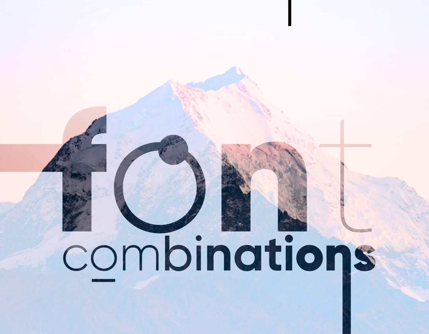
When it comes to font combinations, the rules and best practices in the field focus on aesthetic and functional factors. Since there are thousands of fonts available for use, a skillful designer always takes into consideration the basic rules from the industry. With that, they deliver eye-pleasing font combinations, and from there – develop a sharp eye for this practice. These suggestions below are a good starting point for everybody who wants to learn, so let’s hop to it.
Font Combinations Based on Font Legibility
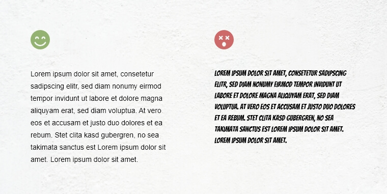
Before you try to mix and match different fonts, you will first have an idea of what fonts maintain good readability. Such fonts are easy to read in big paragraphs of text with usually smaller characters size.
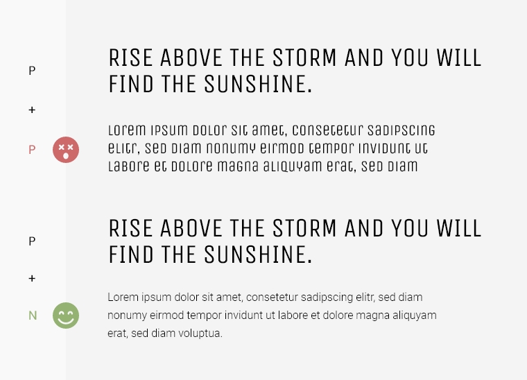
With that being said, some fonts are simply designed to be used for headings and big sizes only. Such are, for example – the display fonts. Other fonts, however, are perfect for paragraph texts, such as most sans serif fonts. They are usually clean, minimalist, and keep great readability when you use them in body text. In the example below, you will see the difference between the two fonts. The first one has high readability, while the second- very poor.

Serif and Sans Serif Font Combination
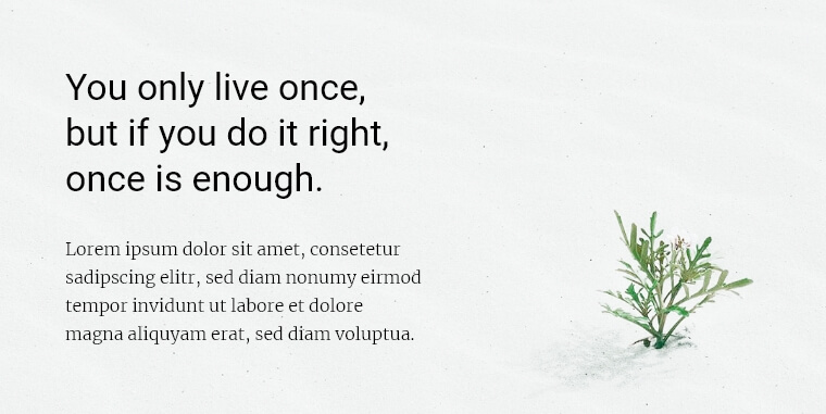
This one is the classic combination. Serif and sans serif fonts are the two most popular types of fonts which harmonize perfectly. For example, the combination of a serif font for a headline and a sans serif font for body text is definitely a safe option if you are a beginner.


Sometimes, although it’s not so commonly encountered, you may see a reverse font combination. Sans for a heading and serif for the body text is an option. However, if you chose this, please note that some serif fonts tend to lose their legibility in big paragraphs of text.

Font Combinations From the Same Typeface
In a related article about the basics of font theory, I mentioned that a typeface can have multiple styles and characteristics that form font families and individual fonts. Fonts from the same type of family usually look good together and complement each other.
In order to achieve an eye-pleasing effect, however, the rules of visual hierarchy still apply. A good practice is to use heavy font for heading, and thin for body text from the same font family.


The practice of using fonts from the same type family especially applies when you combine more than two fonts in one design. You can use a heavy font for a headline, an all caps style for a subheadline, and regular for body text. See the example below.


There is something else that I must mention. It’s risky to combine fonts from different families but with similar characteristics. The combination often looks more confusing than aesthetical. In short, you might want to avoid using different fonts from the same classification. The example below shows such a combo between one serif font for a headline and another for body text.


Font Combinations Based On Font Roles
Sometimes, combining fonts from different families is hard to avoid. For example, when you have a blog, a digital media website, or another design that requires the use of many types of text. If this is your case, combining fonts will be much easier if you assign roles to different fonts.
- Navigation menu;
- Headlines and subheadlines;
- Body text;
- Quoting;
- Sidebar texts, etc.

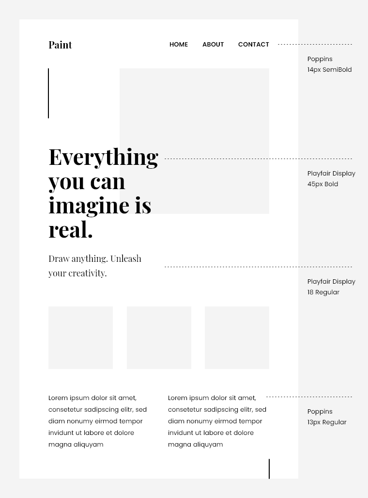
Even in these cases, it’s important to stick to 2-3 typefaces at utmost in order to keep the design in a nice harmony. For example, the heading, subheading, and body text may come from the same font family. While the additional text such as author details, sidebar texts, and other text – from another font family.
Font Combinations Based on Font Sizes and Weights
When combining fonts, keeping the visual hierarchy is essential. This way the reader can clearly understand the relation between the headline, subheadline, and body text at first glance. This rule applies regardless of whether you use fonts from the same type of family or not.
If you are using fonts from the same font family, you can easily create such a hierarchy because fonts usually come in thin, medium or regular, and heavyweight. If, however, you are using the same font for the heading and body text, you can play with the font sizes and still create the hierarchy.

Font Combinations Between Prominent and Neutral Fonts.
Choosing fonts from different classifications is a classic practice that has proven successful throughout the years. The rule is to combine one prominent font with a personality with one neutral font that doesn’t fight for the attention and harmonizes the design.
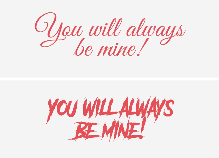
How to recognize prominent fonts? All fonts that are created around a specific theme are prominent, such as display fonts, as well as script fonts and some of the serifs and sans serifs with a strong presence such as slab serifs and others.

Font Combinations Based on the Mood They Create
One of the main tasks of fonts is to communicate a specific message and the appearance of the font can help out with that. The way fonts are designed can add up to the effect of conveying a certain message.
Fonts can look playful and casual, dramatic and mystique, retro, modern or futuristic, elegant and romantic, classic and luxury, and so on. Depending on the character they carry and the mood they create, it’s important to avoid putting two adversative fonts together, as this will only confuse the reader.

Examples of good font combinations
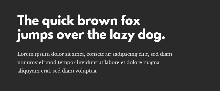
Copernicus and Proxima Nova
A classic combination between a serif and a sans serif font that perfectly complements each other. The serif Copernicus font has a strong presence great for a headline while Proxima Nova can effortlessly display body text.

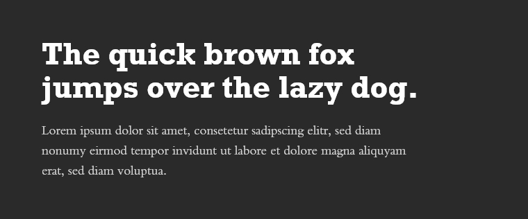
League Spartan and Libre Baskerville
Another combination between a sans serif and a serif font but this time used in reverse roles. А more rarely seen combination but definitely successful. The heavyweight of League Spartan and the elegant thin Libre Baskerville define a strong visual hierarchy.

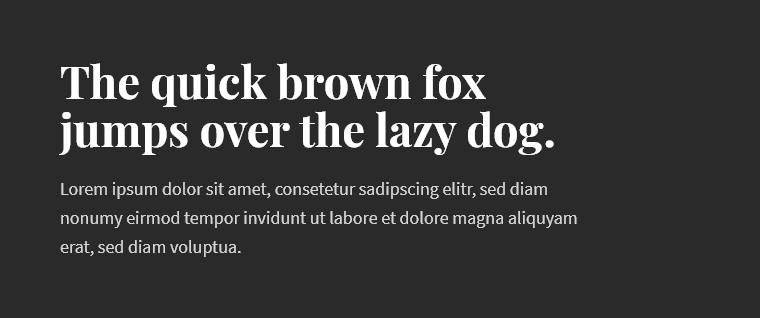
Rockwell Bold and Bembo
A great combination of two serif fonts which create a clear hierarchy and look harmonic. Rockwell Bold is a distinct font that certainly makes a statement. In this font duo, it is nicely complemented by the neutral and elegant Bembo.

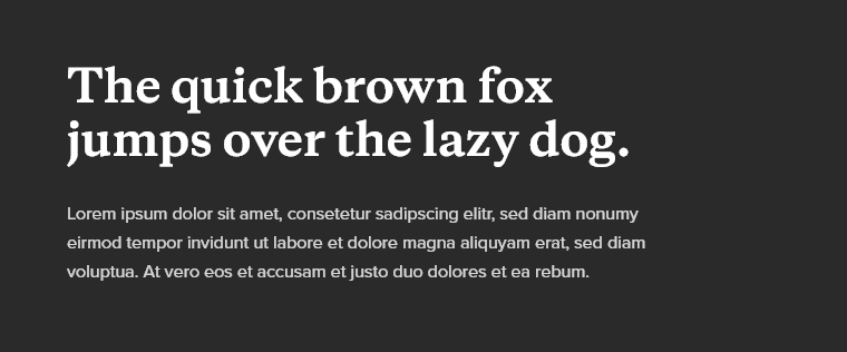
Playfair Display and Source Sans Pro

A beautiful serif display font with exquisite shapes and details that make a strong presence. The font is greatly complemented by Source Sans Pro that allows Playfair Display to flourish. The combo conveys luxury and high class.
A Few Tools for Font Pairing
Font Pair
A site with thousands of font combination ideas. In the menu on the top, you will find different categories to help you narrow down your search. Each suggestion allows you to download the font pairing as a combined archived file.
Font Joy
An easy tool that generates great font pairing ideas within seconds. Simply click the Generate button to visualize different font combinations between a heading, a subheading, and a body text. On the left, you will see the names of the fonts used.
Canva Font Combinations
A tool by Canva that matches your chosen font with a good complementing font. Simply enter a starter font and the tool will generate you different font pairing ideas with the font you’ve chosen.
Final Words
The combination of fonts is a skill that can be mastered by continuous learning and practice. With time, you will be able to develop an eye for good font combinations. We hope with this article, we put a good foundation.
You can continue with some of these related articles:
- The Basics of Text Hierarchy and Readability
- The Best Graphic Design Courses for Beginners in 2025
- 6 Great Design Books That Explain How Design Works
- Types of Fonts: Classification and Popular Examples
- Upcoming Design Conferences You Can Attend
- 20 AI Tools for Designers that Are Actually Helpful
- The 9 Main Principles of Design Everyone Should Know
- The Basics of Fonts Theory: Everything You Need To Know About Fonts
- Color Symbolism: The Meaning Behind Colors and What Messages They Convey