

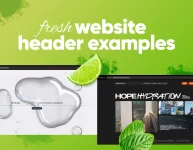
Creating and setting up a website these days is a whole lot easier than it used to be. You don’t need to know how to code or spend hours figuring out the ins and outs of hosting, because there are tons of tools that automate these processes for you. But there’s one tricky part that many people still get wrong: the layout.
A website’s layout can make or break how users experience the site. Especially when you consider how high are the expectations for user experience and design, you’ve got to put some thought into how your site will look and feel. Research even shows that 38% of people will bail if they don’t like how a website’s layout looks. That’s a lot of potential visitors!
This guide breaks down the most popular website layouts and what makes them work. In the end, I’ll also offer practical tips on what to keep in mind when it’s time to choose a layout for your next web design project.
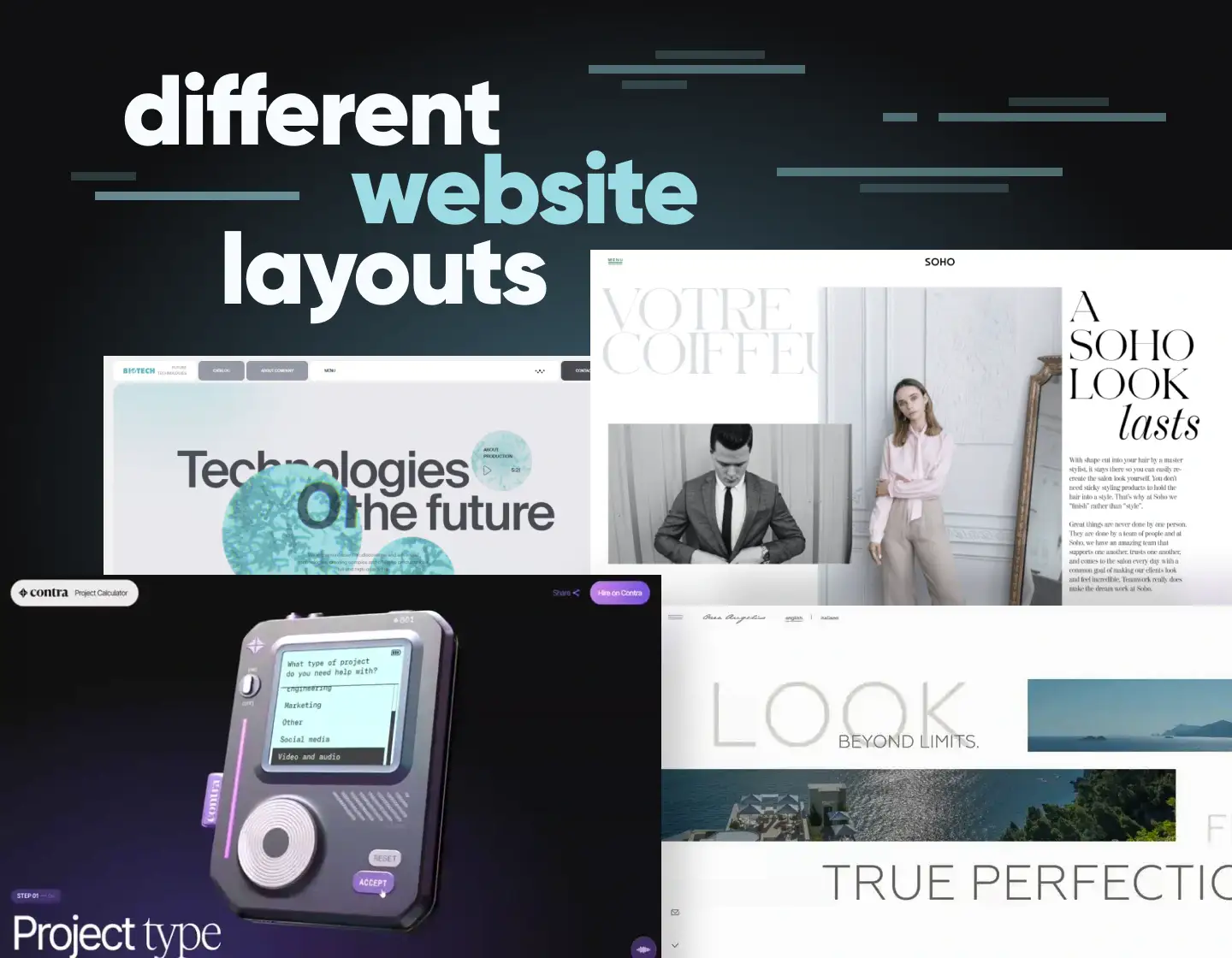
The Asymmetrical Website Layout

I’ll start with one of the most innovative layouts that have been gaining popularity in the last few years. Since the early design, there’s always been the idea that websites should follow some kind of symmetry.
The asymmetrical layout design completely forgets about that idea and instead, lets the designer choose how much space to allocate to the different columns of the website.
This gives designers the freedom to experiment with alternating sizes of different elements. When done correctly this layout manages to point the attention of the user to the most important sections of the website.
The Split-Screen Layout
This layout follows the already established principle that websites be symmetrical. It also manages to point the attention of the users effectively to the two different sections of the website.
The only downside to this layout is that it has limited usage options. Most fashion brands use this layout on their homepage to give the user a choice between 2 options (most commonly men’s apparel and women’s apparel). Other companies use this layout when they want to focus on two important aspects of their business.
If your website fits those criteria then this will undoubtedly be the best choice of layout.
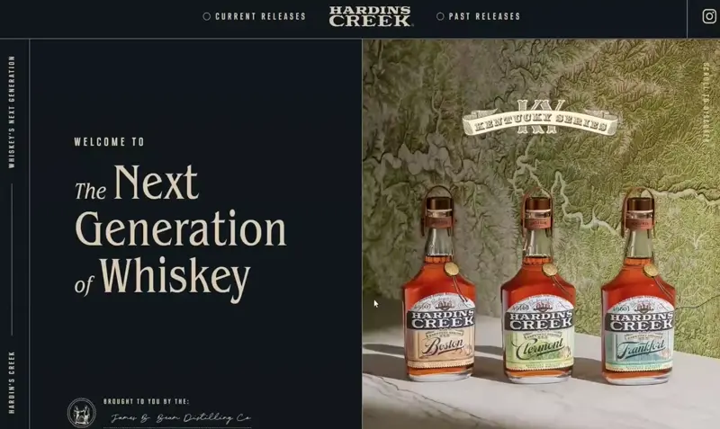
The Hero Layout

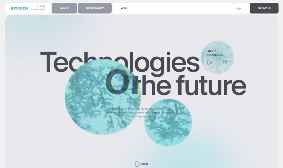
The hero layout comes from the idea of designing your entire website around hero images. Hero images are big attention-grabbing images that take up most of the space on the screen. If you’ve ever been to the Apple website you will see this layout on almost all of their pages.

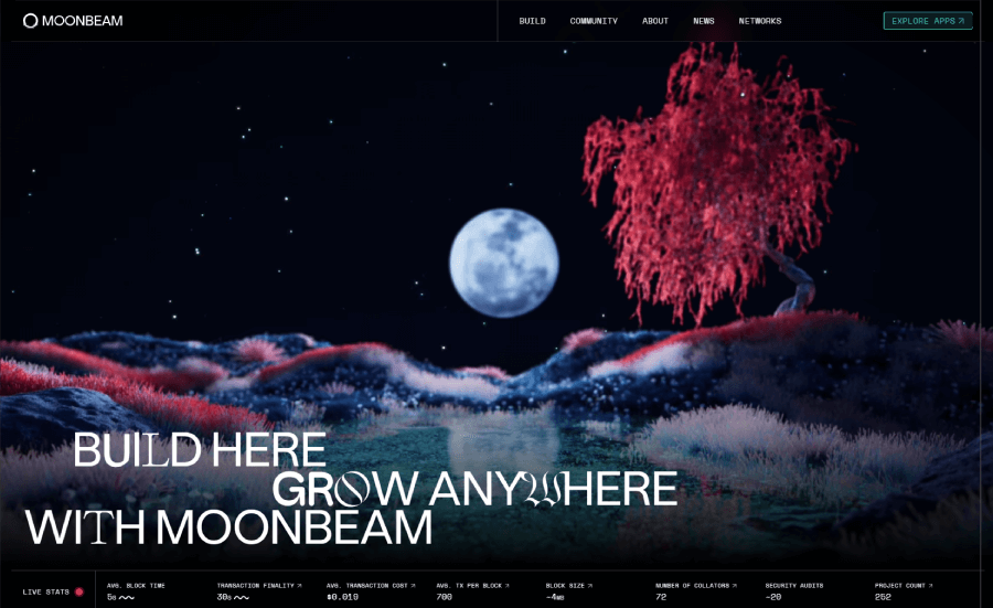
Users really enjoy this layout as it is simple and very clean. Since the image takes up most of the screen space there isn’t really free room to put anything else besides a title and some description text.
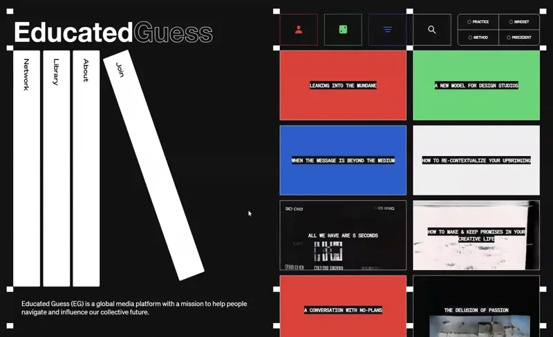
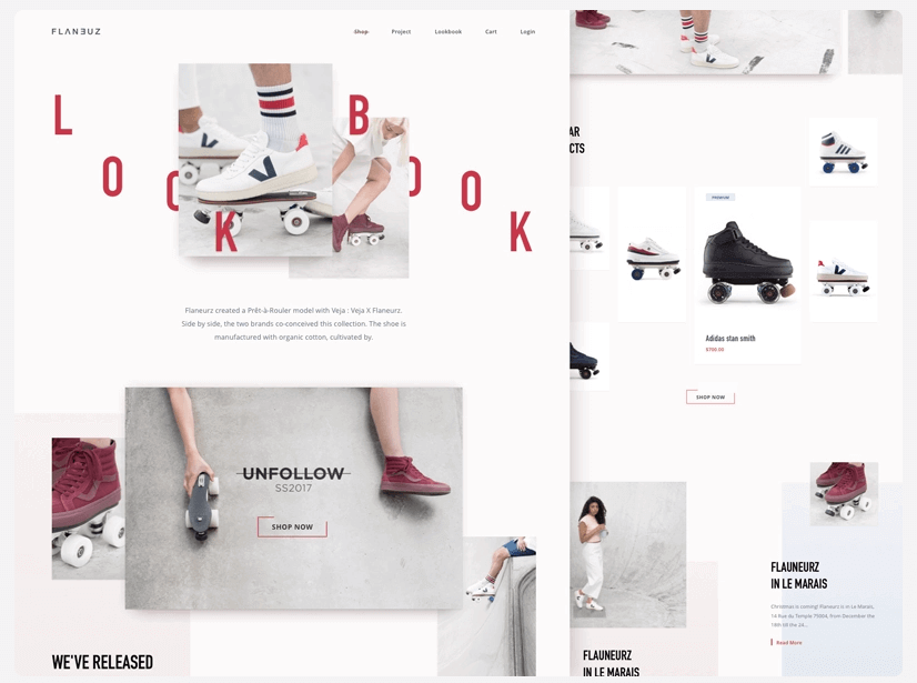
The Card Layout

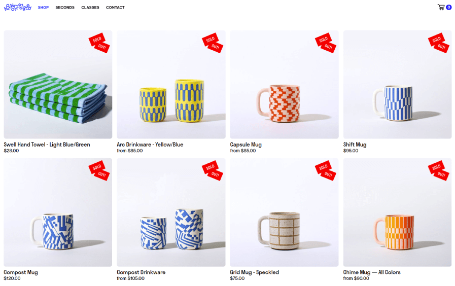
Probably one of the most common layouts used across the internet. The card layout also called a block layout is a simple layout where all of the elements take up their own square.
The widespread popularity of this website layout is mainly due to how simple it is to build. This layout is also very easy to translate to a mobile screen.
If your website is focused on showcasing multiple items from which the user must select this is a great option. You will often find this layout on clothing store websites where there are multiple clothing items. Other uses for this layout include pretty much any type of design that needs to showcase a list of options in a visual way. Some websites use this layout on their blog pages to showcase multiple blogs or on their service pages to list out the services they offer and provide a short description.
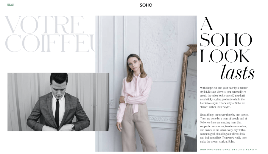
The Alternating Website Layout

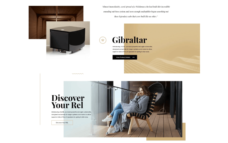
The alternating website layout is another very common website layout seen on the internet. It’s made up of a series of two content blocks that alternate between the type of content they feature.
Usually, one block will have a written copy and the other block will have an image related to the copy. After that, the places of the blocks will switch and first, you will have an image and then some copy.

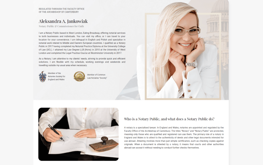
The reason for doing that is to point the user from left to right ensuring that the design isn’t too predictable. This layout is very commonly used by SaaS companies when they are showcasing the features of their software solutions.
In most cases on the left, you will find a headline with a description of a feature, and on the right, you will find the image of the feature. Of course, this design isn’t limited to text and images; you can also use videos, charts, graphics, and gifs to break up the design even more.
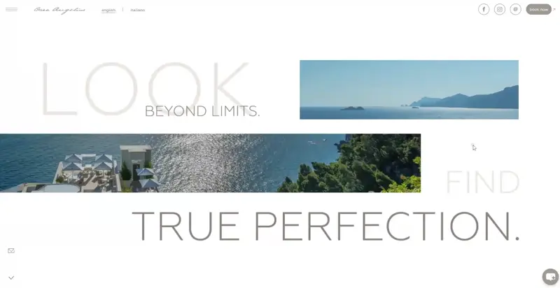
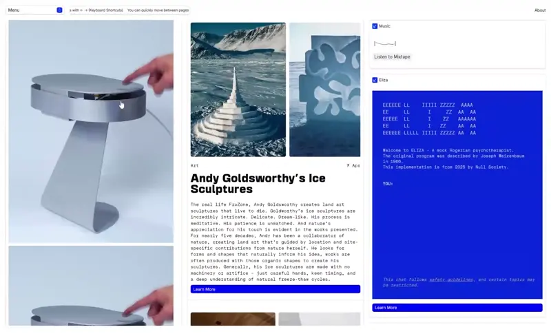
The Full-Screen Layout
The Full-screen layout is a very niche layout design that is used rarely for website design. The whole idea of this layout is for the web page to have no need for scrolling.
Usually, websites that use this layout have a very high level of interactivity and functionality built into them. Oftentimes they feature lots of buttons and options that switch out the content without the need to reload the page.
As you can probably guess by the description this format is reserved for very specific websites. Despite their rare usage I absolutely love these layouts. Often they combine beautiful design with great functionality. They’re pretty hard to pull but if you manage to, the results will be amazing.
The Broken Grid Layout

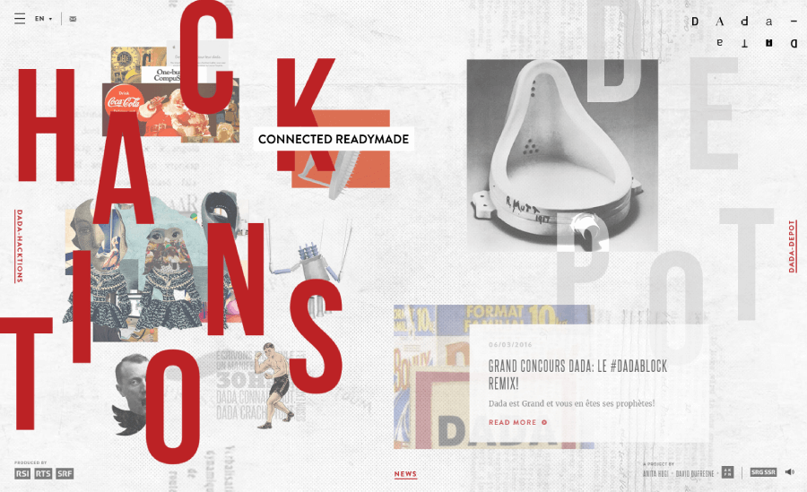
The Grid-break layout is also a relatively new layout. It’s based on the idea that it breaks the “grid” that most websites follow. What you get is a design that feels way more fluent and interesting.
The other big plus to grid-break layouts is the feeling of depth that they give to the user. Since most elements can overlay each other you get a feeling of hierarchy in their placement to the point where they almost look three-dimensional.

The only downside to this design is that it is one of the hardest to pull off. You will need quite a bit of design expertise to get the correct sizing, placement, and overlaying of all the elements. After that, you will run into the problem of mobile optimization.
The Content-Focused Layout

The content-focused layout is one of the most common website layouts used for blogs and resource pages.
This is a very simple layout that almost anyone can pull off. The main content of the page takes the center and the space on the left and the right is used for content control like scrolling, article navigation, additional links, etc.


If you have a website where you need to publish articles, case studies or guides this is a great simple layout that does the job.
The Magazine Layout
The last type of layout on this list isn’t very popular for the web but when done correctly, it works amazingly for experimental websites.
The magazine layout is a website layout that takes the typical print layout that you see in newspapers and magazines put in on a website. The layout is usually divided into 3 or 4 columns each covering a specific type of content. Most of the time these pages are very heavy on text and feature a few small images.

As the name suggests this website layout is exclusively used by newspaper and magazine companies.
Things to keep in mind when choosing a layout
When you pick a website you pick how exactly your site will actually work for users. It should feel natural, easy to get around, and kinda like it was made just for them (because, well, it kinda was). Here are a few things to keep in mind while figuring out what layout makes the most sense for your project:
What’s the goal?
Are you trying to show off a portfolio? Sell some cool stuff? Share your writing? Different goals need different layouts. A store probably needs a grid-style layout with big product photos, while a blog might do better with a clean, scrollable feed. The content and goal determine the layout, not the other way around.
How much content are you putting on there?
If you’ve got loads of content, like blog posts, categories, or services, you’ll want something with solid navigation and a layout that helps people find what they’re looking for fast. On the other hand, if you’re just keeping things simple, then you’ve got way more freedom. A clean, minimalist layout could be perfect. Maybe a single-column scroll that just tells your story or shows off your product with big visuals and a call-to-action that doesn’t scream at people. Less content usually means you can get more creative without worrying about how to cram everything in.
What kind of vibe are you going for?
A layout sets the tone. A full-screen image with a bold headline feels totally different from a tidy, card-style grid. Think about the personality of your brand (or your client’s) and pick something that matches. You wouldn’t dress a punk rock band’s site in a law firm’s layout, right?
How will it look on phones?
People are probably gonna visit your site on their phones while half-watching Netflix or waiting in line for coffee. So yeah, your layout has to work on smaller screens too. A layout that looks amazing on a big screen but turns into a mess on mobile? Big no-no.
Do you want people to actually do something?
If you want clicks, sign-ups, or sales, the layout needs to guide people toward that. That might mean putting a big ol’ button in just the right spot, or making sure your call-to-action doesn’t get buried under too much text.
And there you have it! At the end of the day, your layout should help people get what they came for without making them think too hard. If they feel comfortable and everything just makes sense, you’ve nailed it.