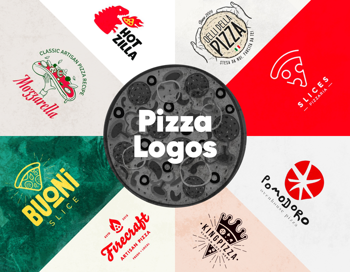
Pizza logos are such an important element in defining a pizzeria’s brand identity and attracting customers! They need to be visually appealing, memorable, and effective in communicating the business’ character. The most important part is, though, that they should work as appetizers and evoke hunger.
Here, we will go through 20 examples of amazing pizza logos, that capture the attention and also work successfully to establish brand recognition and feed the eyes of hungry customers. Let’s go!
1. Minimalist Pizza Logo Design
The first logo example is a minimalist design presenting the pizza restaurant Slices. It features an outlined stylized pizza slice graphic, created by simple lines and circular shapes, that bears a clear and modern aesthetic. Also, the red background attracts attention and displays passion, energy, and excitement, thus strengthening the brand’s presence.
2. Cool Playful Pizzeria Logo Example
This is another example made with a clean and modern approach for a pizza logo. The design focuses on the pizzeria’s catchy name, which is displayed with a custom handwritten font. The final touch comes from the mouthwatering slice of pizza, which is so compelling, despite the simplicity of its illustration.
3. Classy Pizzeria Logo Example
The logo made for the restaurant Da Napoli combines elegant typography with a traditional Italian vibe. The classic font creates an authentic look, while the melting pizza slice arouses the appetite and carries a genuine Italian dining experience association. In addition, the chosen blue color radiates professionalism and wins the client’s trust.
4. Creative Pizza Logo with Tomato
This is such a playful and creative example! Using this vivid red color quickly attracts attention to the double-purposed symbol. Firstly, it depicts a tomato – which in Italian is “pomodoro”, the place’s name, and secondly, it resembles a pizza sliced into uneven pieces. The boldness and the catchy typography convey a sense of fun, making the brand seem approachable and energetic.
5. Italian Restaurant Pizza Logo
Incorporating the Italian national colors and a pizza-sliced shape, this logo effectively communicates its culinary focus while also staying visually appealing. The name’s typography is straightforward, plain, and informative, while the added red text “express” with the tire tracks evokes a sense of urgency, hinting at the pizzeria’s fast delivery service.
6. King Pizza Logo Idea
Designed to serve a pizza place named “King Pizza”, this example plays with the regal theme by coronating the pizza slice. The pizza is also depicted as shining with the help of the rays around it, thus strengthening its royal status. The modern sans-serif typography beautifully complements the decorative design, making it complete.
7. Cartoon Pizzeria Logo Example
Featuring a contemporary design, this logo uses colors, shapes, and modern typography to create a fresh and appealing look. The pizza slice is depicted straightforwardly and the way it’s positioned above the text makes it appear like it’s the shining sun. The clean, creative fonts make the brand appear fresh and playful furthermore.
8. Fun Godzilla Monster Pizza Logo Idea
This logo is so playful and bold! It surely stands out among the crowd of pizza logos. With the modern typography and the use of a vivid red, catchy illustration of a monster eating a hot slice of pizza, it associates with the brand’s name and completes its image. The fun design radiating excitement is perfect for a casual, youth-oriented pizza brand.
9. Hand-Drawn Pizza Logo Design
This is a much more detailed logo design, aiming to make a more traditional impression. It uses a creative combination of classic-looking, narrow typography, and hand-drawn-like imagery, thus ensuring that it is both eye-catching and informative. In addition, featuring the Italian flag ensures a reference to authenticity and trust.
10. Pizza Restaurant Logo Idea
This logo example puts its highlight on a wood-fired-oven pizza with its icon displaying it so clearly – a pizza slice on fire. And, the logotype is also informative! Apart from the fact that it lists the date of establishment and the restaurant’s name, it immediately and clearly emphasizes the brand’s specialty in making high-quality, artisanal pizza.
11. Classic Pizza Logo Design
The next example uses a vintage cartoon-style pizza for its delicious icon. A classic font with an old-time appearance adds to the logo’s nostalgic feel with a rustic vibe. And, the overall design along with the fact that it is executed in Italy’s national flag colors, exudes a sense of tradition and quality.
12. Traditional Pizza Logo Example
With a love for symmetry, this logo stands tight and impactful, but friendly and approachable at the same time. Featuring drawn-like classic elements like basil leaves, tomatoes, and pizza served on a chopping board, it is straightforward and clear. In addition, the used fonts add authenticity and elegance to the restaurant’s image, thus attracting even more customers.
13. Inspirational Pizza Logo Idea
This is a great example of a feminine pizzeria logo design. The circle border of the icon, which also forms the pizza, and the balance of colors, making it look flowery, both add to that feeling. And the decorative, handwritten font beautifully complements this idea and gives it a personal and approachable feel.
14. Minimal Pizzeria Logo Design
This example is all about being vintage and stylish. A classic from the past, the combination of colors instantly sends us back in time. The sharp, non-serif font used for the restaurant’s name brings strength and elegance to the design’s vibe. All elements are balanced and complement each other, and together with the color palette grab the attention and arouse curiosity.
15. Modern Pizza Logo Design
Uniting bold typography with a racing theme, by using checkered patterns and a dynamic design, this logo is unique and memorable. The pizza icon is depicted as a part of an exhaust flame, also following the racecar reference. In general, this logo combines the national colors and two of the most famous associations of Italy, resulting in an effective and attractive design.
16. Lovely Pizza Logo Design Example
Playful and catchy, this example works towards building an approachable and friendly brand image. Using a heart-shaped pizza and a non-serif, simple font creates a fun, personal, and inviting feel. In general, the overall design makes this logo perfect for a family-friendly pizzeria.
17. Great Pizza Logo Illustration Idea
Pizzavista’s logo is truly well done, for it instantly stimulates the appetite with its tempting pizza icon. The symbol design is sleek and modern, and meanwhile with a dose of realism. By combining contemporary, playful typography and a traditional pizza image, this logo example achieves a balance that makes it appealing to a broader audience.
18. Geomerty Pizza Logo Design
Masterfully centering the design around a pizza slice icon the Five Points Pizza’s logo is instantly recognizable. Using the bold, simple but effective, lettering and only two colors, gives the design a classic appearance of a place with traditions. The added star beautifully completes the concept and hints at excellence.
19. Simple Logo for Pizzeria
Pizza Point’s logo is so on point! Its abstract icon depicts a sliced pizza, resembling a target mark, and is executed with a modern, geometric design with clean lines. In addition, the color combination brings a retro feel, and the plain, straight-to-the-point typeface harmoniously complements the logo idea.
20. Great Pizza Logo for Restaurant
From the first moment, the logo for Pete’s Pizza looks inviting and makes it clear that we can expect authenticity and professionalism in pizza crafting. To achieve this, the design uses appealing traditional lettering and the image icon of half a pizza, thus creating a strong resemblance to the aesthetics of classic Italian pizzerias and gaining the client’s trust.
Tips on creating memorable pizza logos:
- Don’t overdo your design – a simple logo is easier to recognize and remember. That is to say, avoid clutter and excessive details that can make the logo look confusing.
- Choose appropriate colors like red, green, white, and yellow, which certainly are often associated with pizza and Italian cuisine. These colors can evoke hunger and warmth, thus using them is ideal for pizza logos.
- Use relevant images that relate to pizza or Italian culture undoubtfully, like pizza slices, ovens, or Italian landmarks for example. Thus this communicates immediately with the customers what your business is about.
- Select fonts that reflect the style of your pizzeria. For example, casual, handwritten fonts can give off a cozy, family-friendly vibe, while modern, clean fonts can convey a more contemporary or classy image.
- Ensure your logo is legible and looks good in various sizes and on all intended uses – signs, packaging, company clothing, etc.
Final Words
Creating pizza logos can be a fun and mouthwatering experience. When designing your own, just keep in mind that you should think of the best way to represent the brand’s personality and keep the design relevant and simple. Whether for a modern pizza place or a traditional Italian restaurant, a well-crafted logo is a key ingredient in your pizzeria’s success. So, think about how you want to be perceived, analyze some successful examples, and start crafting!
If you liked our article on pizza logo design, you may enjoy these, too: