In the world of graphic design, the color yellow carries connotations of happiness, creativity, and vitality. As a result, yellow logos firmly hold their place in branding, often evoking feelings of warmth, energy, and optimism. From the iconic golden arches of McDonald’s, for example, to the vibrant emblem of Ferrari, yellow logos have left a lasting mark on the design world.
In this article, we will explore 24 powerful yellow logos, that have proven to be effective in the market and have also sustained the test of time. Make sure to stay till the end where we offer some practical tips to follow so your brand can stand out amidst the competition.
1. Post-it
The Post-it logo is straightforward and functional, featuring the brand’s signature canary yellow. Meanwhile, the design cleverly mimics the product itself – a simple, sticky note – highlighting the brand’s utility and simplicity.
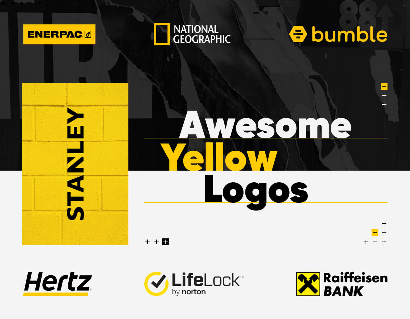
2. National Geographic

The yellow rectangle of the National Geographic logo is a reference to the globally recognizable frame of the magazine’s cover. On the other hand, it symbolizes a window into the world of exploration and science. It also suggests looking deeper, mirroring the brand’s mission to stimulate adventure and knowledge on how to protect the wonders of our world.
3. Bumble
Bumble’s logo is so simple and yet so effective! It features a yellow hive, playing on the theme of a bee’s busy community. This symbol perfectly aligns with the app’s name and purpose of building new connections in dating, friendships, or professional networking.
4. IMDb
Similarly, IMDb’s logo uses a direct approach, featuring a yellow filmstrip which cleverly represents its database for movies, TV series, and celebrities. The contrast between the letters and background makes the yellow pop, emphasizing a sense of importance and focus.
5. McDonald’s
The golden arches of McDonald’s are perhaps one of the most recognized symbols worldwide. This logo’s simplicity and bright yellow color project a feeling of happiness and warmth. As a result, the design is appealing to all ages, symbolizing fast, friendly service and consistent quality.
6. Best Buy
The Best Buy logo consists of a yellow price tag, symbolizing savings and deals. The bold black lettering on top of it ensures high visibility, while also promoting reliability and trust, key attributes for a consumer electronics retailer.
7. Sprint
The Sprint logo uses a dynamic yellow swoosh that signifies speed and connectivity. This modern design with clean, sans-serif typography reflects the brand’s focus on forward-thinking telecommunications services.
8. Shell
Shell’s logo, a yellow and red scallop shell, is iconic and easily identifiable. In other words, that is why it is such a crucial part of the global energy giant’s brand identity. The colors are vibrant and attention-grabbing, symbolizing energy and passion.
9. Hertz
The Hertz logo’s use of yellow radiates progress and energy, which aligns with the brand’s emphasis on speed and efficiency in car rentals. The bold, black text, in a modern sans-serif typeface, provides a strong contrast, enhancing readability and the impact on people’s minds.
10. CAT
The CAT (Caterpillar) logo is bursting with boldness in every way. Certainly, this approach successfully references its heavy machinery and symbolizes durability and reliability. In addition, the triangle shape signifies stability and strength in the construction and mining industries.
11. Stanley
Stanley’s logo also features a yellow and black color scheme. It reflects the brand’s association with caution, care, and precision in hand tools and storage products. This color combination is synonymous with construction, reliability, and utility.
12. DHL
The yellow and red DHL logo is vibrant and visible from afar. The red adds a dynamic energy to the yellow background and, in addition, the design of the letters masterfully promises fast services. All this combined makes it a perfect logo for a logistics brand that promises speed and precision in delivery.
13. The Real Yellow Pages
The Real Yellow Pages logo symbolizes a directory with a wealth of information. It reflects the years-long history of the edition and the old times when people had to flip through the Yellow Pages to search for contacts and ads.
14. IKEA
IKEA’s blue and yellow logo reflects the Swedish national colors, instilling a sense of trust and reliability. In addition, the bold, simple typography is welcoming and friendly, much like the brand itself.
15. NAPA Auto Parts
The National Automotive Parts Association’s logo uses blue and yellow to suggest reliability and efficiency. This effect certainly is essential for NAPA’s brand identity, for the company is a leading supply chain in the automotive parts industry.
16. Ferrari
Ferrari’s logo includes its famous prancing horse on a yellow background, symbolizing tradition, strength, and vitality. The included national flag pays tribute to Ferarri’s country of origin and is equally important. The yellow background color bears another symbolism – to the founder’s hometown (Modena, Italy), thus adding a personal touch.
17. New Holland Agriculture
New Holland is an American production company specializing in agricultural machinery and vehicles. The leaf and yellow in its logo represent the brand’s commitment to agriculture and earth, symbolizing growth and care for the environment.
18. Enerpac
Enerpac’s logo uses a strong, bold yellow that stands out in the industrial sector. As a result, it successfully highlights the brand’s focus on powerful and high-pressure hydraulic tools, services, and solutions.
19. LifeLock
LifeLock’s use of yellow in its logo helps convey a sense of alertness and urgency, which is crucial for a brand that deals in identity theft and threat protection.
20. Yellow Tail
This wine brand smartly uses a vibrant yellow for its labels, helping its products stand out among the others on the shelves. Moreover, this color choice, along with the hopping kangaroo in its logo, suggests joy and ease, which makes the brand approachable and memorable.
21. JCB
The deep yellow in the JCB logo is hard to miss and signifies a robust nature. The use of this color and the bold letters align well with the brand’s heavy-duty equipment used in construction. An interesting fact is that on the left, in the top corner, is featured the previous version of the logo.
22. Lufthansa
Lufthansa’s logo features a crane in flight and a circle frame in deep blue, along with the company’s name, against a yellow background. Thus, combined this way, these elements symbolize excellence and reliability, key qualities for Germany’s largest airline.
23. Commerzbank
The yellow ribbon in Commerzbank’s logo symbolizes flexibility and dynamism, while on the other hand, the defined sharp typeface of the bank’s name instills reliability and strength, essential qualities for one of Germany’s leading banks.
24. Raiffeisen Bank
The logo of Raiffeisen Bank also uses the classic yellow and black color scheme. The main focus of the logotype falls on the bank’s trademark – the gable cross, which has a long history of being a symbol of protection. That’s exactly what people would want for their money, thus it does a great job of instilling trust and reliability in the bank.
Tips to follow when creating yellow logos:
- Firstly, make sure to provide contrast! Yellow can be a bold and attention-grabbing color, but it’s essential to ensure contrast for better readability and visibility.
- Above all, think about brand consistency now and in the future! When choosing yellow for your logo, consider incorporating other colors, that resonate or represent your brand’s identity.
- Don’t forget to test your logo in different sizes, formats, and applications! As a result, you will ensure it stays readable and maintains the impact you strive for.
- After that, try keeping your yellow logo design uncomplicated. Simpler shapes and minimalistic elements ensure clear communication of your brand’s message.
- Lastly, always seek objective feedback to make sure you’re on the right path to creating the most effective and suitable design for you.
Final Words
By following our tips, you can craft compelling yellow logos that capture the brand’s essence and resonate with the audience. Whether you’re seeking to make a memorable first impression with your startup or you’re an established company looking to freshen up your brand’s identity, a yellow logo might be the thing that will set you apart from your competition.
Now embrace the sunny hue of yellow and let your logo shine bright for everyone to see!
If you’re still wondering if yellow is the exact color for you, try looking for inspiration in our other logo collections: