Logo design is often created to be timeless. However, most brands – well-established or new, still want their primary brand image to appear fresh and contemporary. That’s why today we will dip deep into the world of the most modern logo design trends to see which looks are currently on the rise and which have never actually gone off the stage. Let’s begin!
- Trend #1: Wordmark logo design
- Trend #2: Sans serif logotypes
- Trend #3: Minimalist flat logomarks
- Trend #4: Minimalist symbol logos
- Trend #5: Cropped or slit logotypes
- Trend #6: Negative space logos
- Trend #7: Creative letterform logos
- Trend #8: Vivid gradients
- Trend #9: Retro-inspired logotypes
Wordmark Logo Design
In recent years, more and more companies have been ditching the image in favor of their brand name or even initials acting as a solo logo design. It’s quite understandable for new brands who haven’t established their name, yet. But even the famous companies which are widely recognized worldwide are taking this route with their logos. Well, this clearly speaks of a trend.
Dunkin Donuts recently rebranded their famous cup logo design to a simpler version featuring just half the wordmark, following the trend.
Dunkin’ Donuts Logo Design
But many famous brands start off with a wordmark logo design and stay truthful to their roots even after they become extremely famous. The examples in the fashion industry are plenty – Gucci, Prada, Swarovski, Bvlgari, Tiffany & Co, etc. Even more in the tech world – Microsoft, Oracle, Nokia, Canon, Samsung, Sony, and so on. Famous brands know that you simply cannot go wrong with a wordmark logo design which makes it number one in popular logo trends of all time.

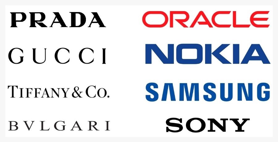
Wordmark logos of famous brands
Inspiration from around the web:
The wordmark logo trend is a great option for start-up companies that are yet to establish their brand names. By following the trends, most prefer to stick to a wordmark logo only but some create a pictorial mark, as well. Here are several brands with wordmark logos that we picked from around the web.
Sans Serif Logotypes
Even more specific trend than the wordmark logo design is the sans serif wordmark logo design. Many brands with wordmark logo designs are switching to a more minimalist and free-of-details sans serif logo designs. Let’s take Google for example. The giant is a real trendsetter, famous with their dynamic logo design. But also, several years ago, they redesigned their famous colorful logo from the iconic serif font to the now-iconic sans serif font. Well, naturally, many brands are now following the trend.

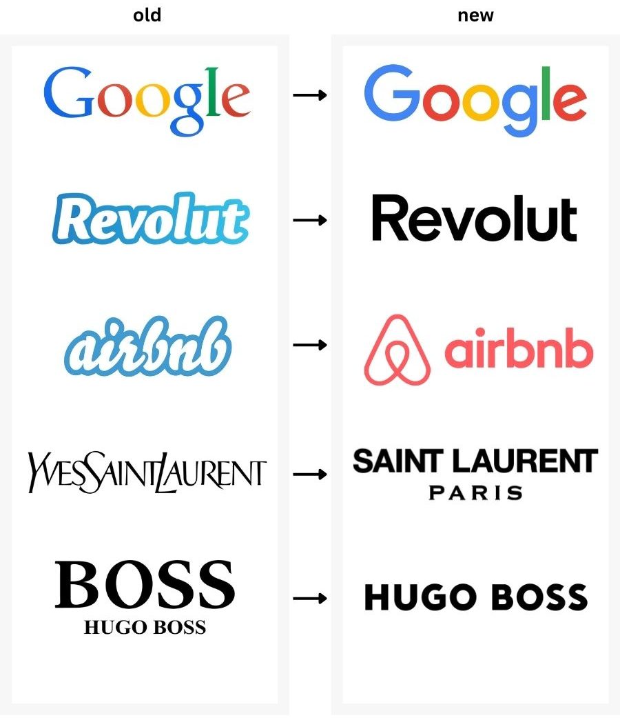
Famous brand logos rebranding to sans serif logotypes
Inspiration from around the web:
For sure, the minimalist sans serif logotypes look clean and modern. Plus, they look great on different scales – from the small sizes on your mobile browser to the large-scaled billboard ads. This is why a lot of newly popped brands are also riding the wave of this tren. Here are several brands with cool sans serif logo designs from around the web.
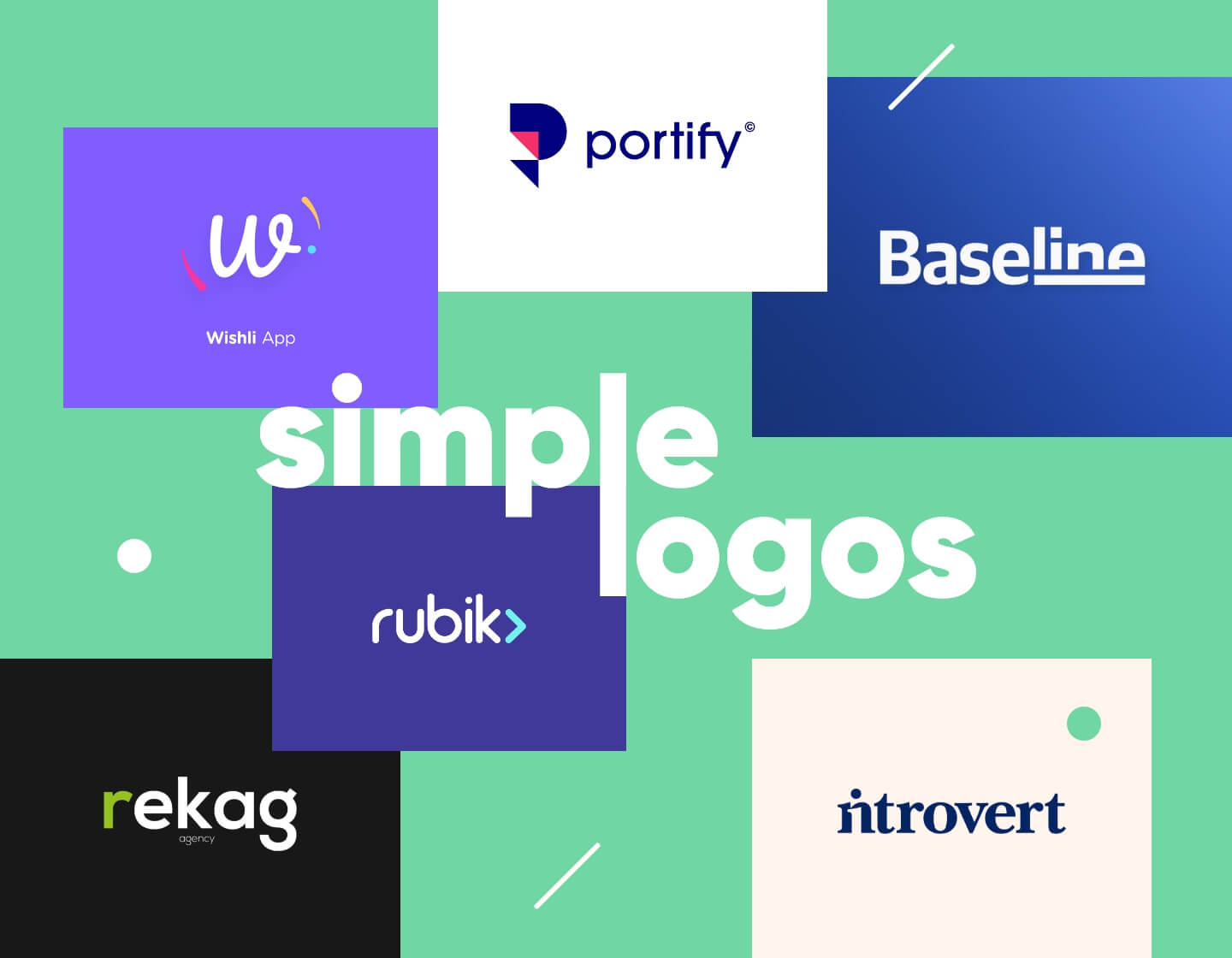
Minimalist Flat Logomarks
The trend with the minimalist logos is not just limited to minimalist logotypes. Brands are remaking their iconic logomarks into less-detailed flat versions and usually switch to just using one color. The reason is simple. The rising demand of all-purpose logos that can be used in big and small sizes equally well makes it difficult for complex illustrative logos to fit in. That is why famous brands are taking this route and making their iconic logomarks simpler and simpler.

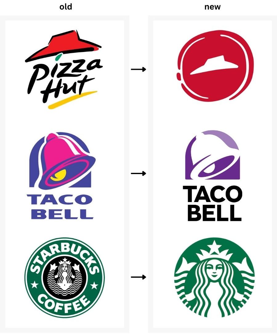
Famous brand logos – Flat logomarks
Inspiration from around the web:
Newly created brands also strive to fit into this popular trend, so the work of graphic designers that specialize in visual brand identity gets harder and harder. First of all, they have to make a simple version of a logo, clean of unnecessary details, in order to fit into this trend. Secondly, it has to capture the essence and purpose of the brand. Last but not least, it needs to stand out from the rest and be really memorable. Here are several examples of newly designed minimalist flat logomarks.
Wanna blab – Flat Logo Design
Drone – Flat Logo Design
MessFist – Flat Logo Design
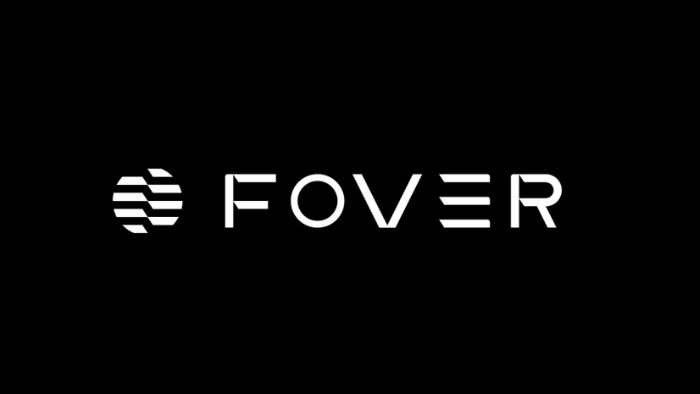
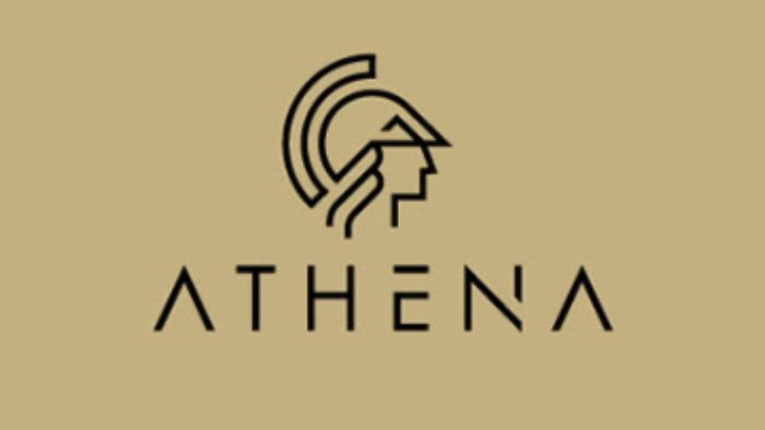
Minimalist Symbol Logos
Even more simplified than that, and trendy as they can be, are the minimalist symbol logos. Abstract or literal, this type of logos demonstrates as less details as possible. In fact, many minimalist symbol logos are often made of a single shape, repeated once or twice. Some may go a little bit further to represent a specific object, while others keep it strictly metaphorical for the user to grasp the hidden meaning behind it. Let’s see several examples of minimalist symbol logos from around the web.
Fundamentei – Minimalist Symbol Logo
Logimind – Minimalist Symbol Logo
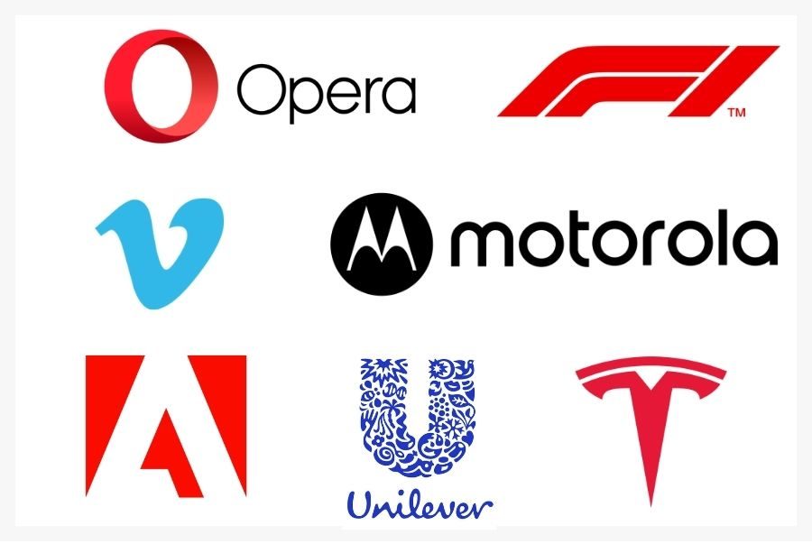
Famous brands love minimalist symbol logos. As simple as they can be, they can radiate a powerful message to the mass audience. Plus, this type of logo design is quite adaptable to various marketing mediums. It looks good in print and digital versions equally well. Even more – once stuck in the consumer’s head, you can use it freely without having to add a wordmark next to it. Want proof? See if you can guess these symbol logos of famous brands.

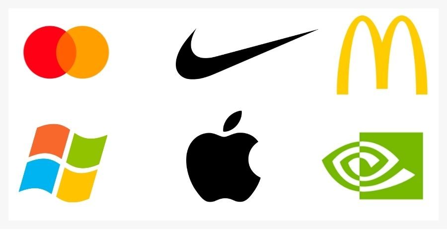
Famous brands – Symbol logos
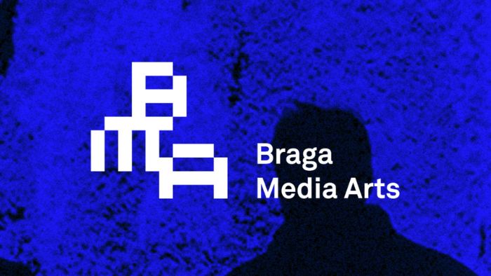
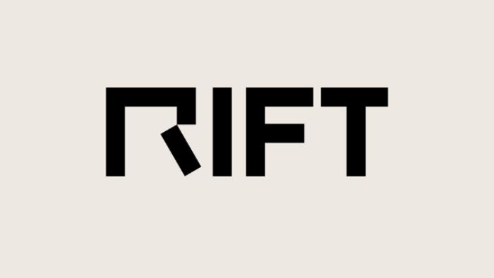
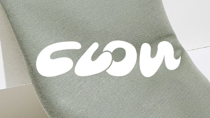
Cropped or Slit Logotypes
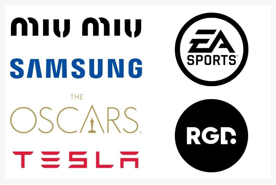
Using cropped and slit logotypes is a big hit in recent years among logo design trends. Usually, this type of effect creates urban and rebellious vibes. Moreover, it may look really futuristic and dynamic depending on how it is used. You will often see logotypes with missing stems, bars, and other components of the letterforms. Graphic designers are removing square-shaped bits, as well, to achieve a highly modern pixelized effect. Let’s enjoy a portion of cropped, slit, and pixelized super trendy logos.


Famous brands of all industries are enjoying this trend, as well. Some examples are the Miu Miu logo from the fashion industry, Samsung (with missing bars on the A’s) from the tech industry, The Oscars’ logo (with a removed bar on the A to make place for the statue symbol) from the entertainment industry, the Tesla logotype from the car industry, the EA sports’ logo from the video game industry, and even our own logo – the Really Good Designs’ letterform logo with a cropped D in the end.

Famous brands – Cropped and slit logos
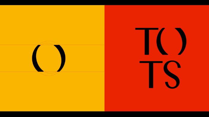
Negative Space Logos
For sure, witty logos catch the attention faster and tend to stick in the customer’s mind for longer. One way to create a witty logo is by using negative space – the empty space that’s left around visible objects. the negative space logo design has been a trend forever and is not dying any time soon. Even if it is not obvious at a first glance, once you see it, you cannot unsee it.
Let’s take the FedEx’s logo, for example. At first, it looks like a simple wordmark logo. But once you see the arrow, shaped between the letters “E” and “x”, you understand how powerful the idea is behind it. The loved-by-all Toblerone bar also has a negative space hidden secret in its logo – a bear standing on a snowy mountain. One of the most beautiful negative space logos we’ve seen is the Bronx zoo’s logo depicting giraffes and the negative space between their legs is shaping the city landscape.

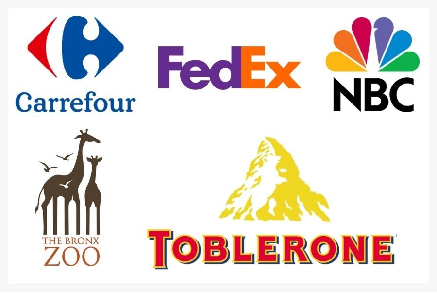
Famous brands – Negative space logos
Inspiration from around the web:
Newly created brands also fall for this trend, trying to make a lasting impression in the audience’s minds. Here are several cool examples of negative space logos:
The Security Conversation logo design depicts four quotation marks that are a clear metaphor for conversation. However, the logo designer wittily made the first two face each other in order to shape a shield symbol with the negative space – a representation of security.
Security Conversations – Negative Space Logo Design
The Bear&Beer logo design is a great example of how you can save space by leveraging negative space. This cool pictorial mark is a literal representation of the brand name itself that shows a bear holding a bottle of beer (negative space) in their hands.
Bear&Beer – Negative Space Logo Design
A cool negative space logo design that perfectly grasps the essence of the brand name. The Eco Service is depicted by using a green leaf as a metaphor for “eco”, and leveraging negative space inside to shape a spanner – a metaphor for “service”.
Eco Service – Negative Space Logo Design
The case is similar with the Penthouse’s hybrid logo. Why hybrid? The logo is a mixture of a letterform (the letter P), a pictorial mark (the little house symbol), and a cool negative space technique that makes the final result attractive and engaging.
Penthouse – Negative Space Logo Design
Creative Letterform Logos
Currently, designers are crazy about type design and visual identity designers are crazy about letterform logos. The trend of using just the first letter of the brand’s name is not merely new but definitely on the rise. Why? Because everything minimalist is a hit right now. And what can be more minimalist than using just one letter? Don’t be fooled, though. The trend provides a field of enormous creativity. A single letter can be depicted in numerous attractive ways, demonstrating plenty of techniques. Check out these great examples.
Cite du Vitral – Letterform Logo Design
Enros – Letterform Logo Design
Famous brands are also into this trend with some of them riding the wave for decades. Letterforms are a great way to create memorable symbols out of the brands’ names first letter. Plus, they help make a stronger association between the brand’s name and its logo.

Famous brand logos – Letterforms
Vivid Gradients
Back when Instagram changed its camera logo to a more stylized multi-color gradient logo, everyone was skeptical and criticizing. Little did they know, that this trend was about to make a blast in the world of logo design and graphic design equally. Recently, Instagram enhanced the color intensity of their new iconic logo even more, proving that the vivid gradients logo trend is not fading away any time soon.
Instagram logo history
Many brands have been following the trend ever since, often in combination with other trendy looks, such as minimalist symbols and letterform logos. Let’s see a few examples that show how the vivid multicolor gradient trend can look really classy and elegant when done right.
Cloudvalley – Vivid Gradients Logo Trend
Zeafix – Vivid Gradients Logo Trend
Retro Inspired Logotypes
It’s pretty obvious that the majority of current trends in logo design run around typography design – be it minimalist, plain sans serif, or creative. Well, some designers even draw inspiration from the colorful past to present us with lovely logotypes that carry retro vibes. You will see newly popped brands with big voluminous and rounded letter forms, decorations and curls in a typical 70s-design style, and even long solid shadows.


Logo design trends in a wrap
Everything about logos nowadays seems to be spinning around minimalism. Brands are remaking their iconic logotypes and logomarks into simpler, cleaner versions without much detail and distraction. If you are about to design a modern logo right now, we are pretty sure it will look very straightforward. And yet, there are techniques like negative space, multi-color gradients, creative letterforms, and witty symbols with hidden meanings that are ready to make your straightforward-looking logo quite extraordinary. Ready to dip into your creativity?
We hope you enjoyed this article, and all the examples included inspired you to open up your favorite design app and start creating the logos of the future. However, if you still need to fuel a little bit more creativity in your brain, why don’t you check out our Get Inspired section? We post amazing graphic design content that will surely boost your inspiration.
Share this article