The 90’s graphic design was a complete mashup of styles, starting from rebellious grunge, the experimental anti-design, pop-culture-inspired sweet designs, along with bold colorful Memphis style. Everything about the 90’s design screamed “Attention!” and boy, it got it! In fact, the 90’s graphic designs were so iconic that even today, we’ve got modern movements inspired by the last decade of that century.
We’ve got brutalism inspired by the grunge style. We have the psychedelic style which was really popular in the rave years. And even more, we’ve got the Memphis style that started off years before the 90’s graphic design but really kept its popularity during that decade and even remains trendy today.
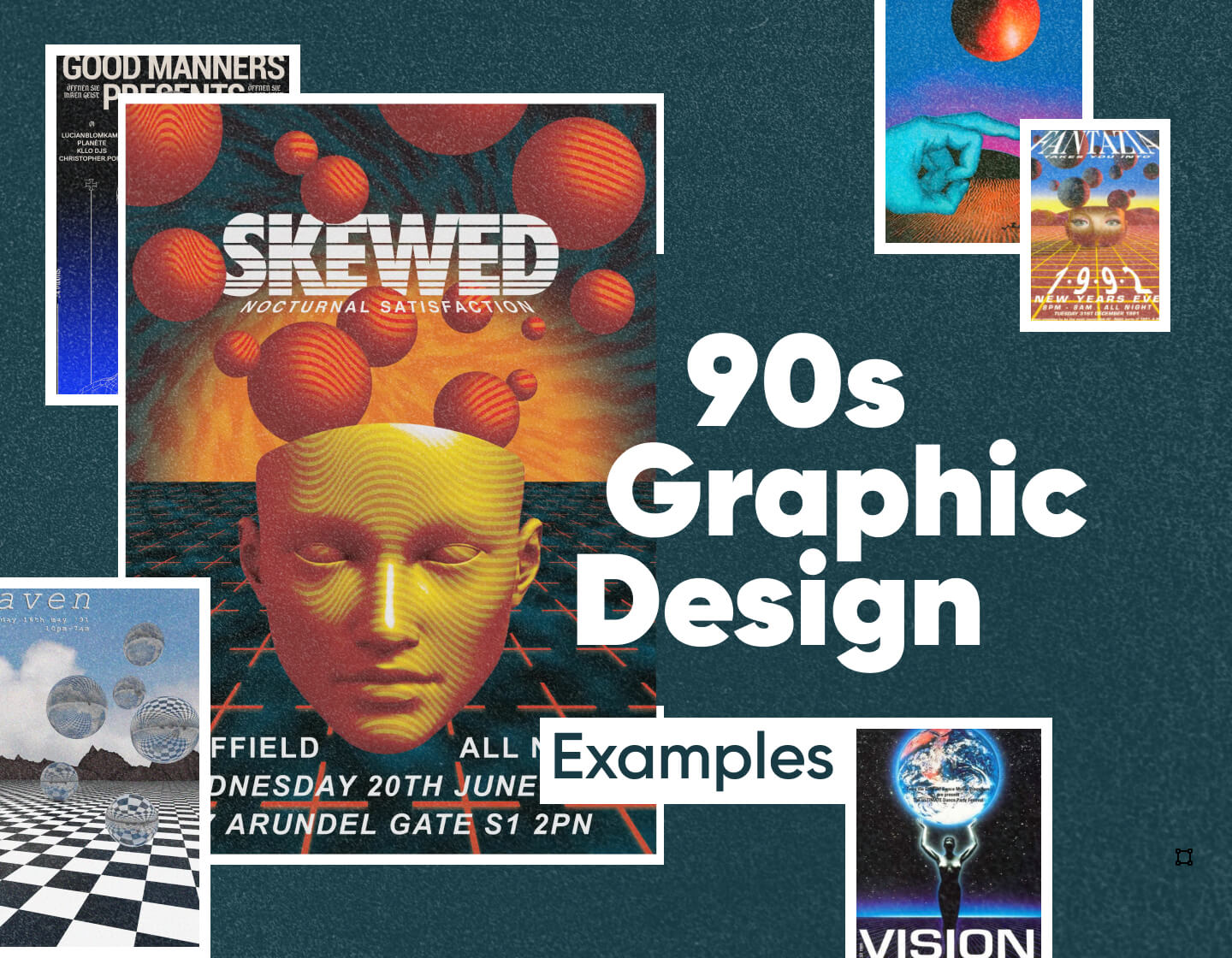
Looking at the 90’s poster design, we can really say it’s a wild experiment with colors, shapes, dimensions, and typography. One reason is that graphic design editing software like Photoshop first emerged exactly in this decade. This allowed designers to experiment with computer modeling combined with traditional graphic design techniques to create absolutely revolutionary looks at the time.

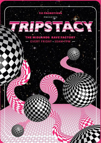

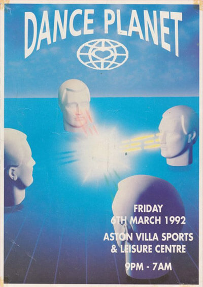

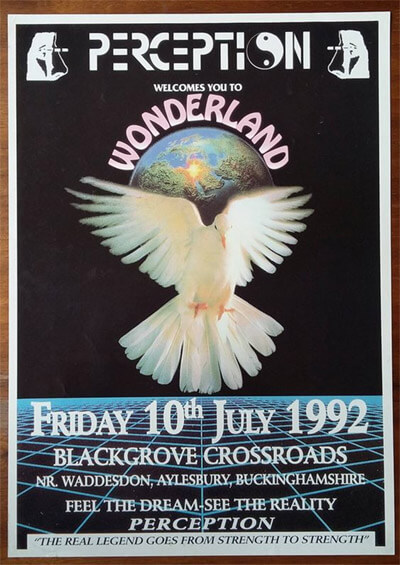
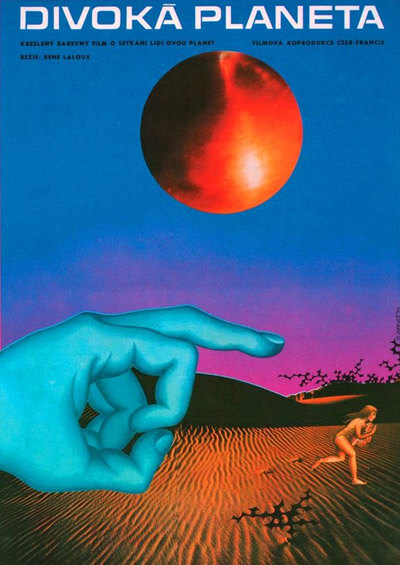
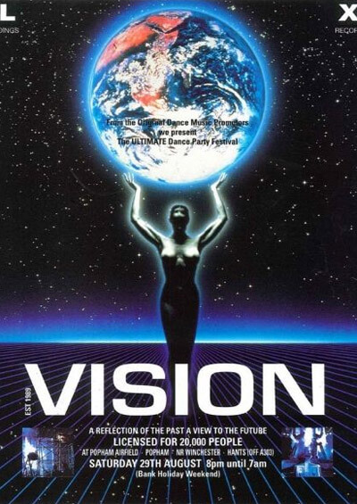
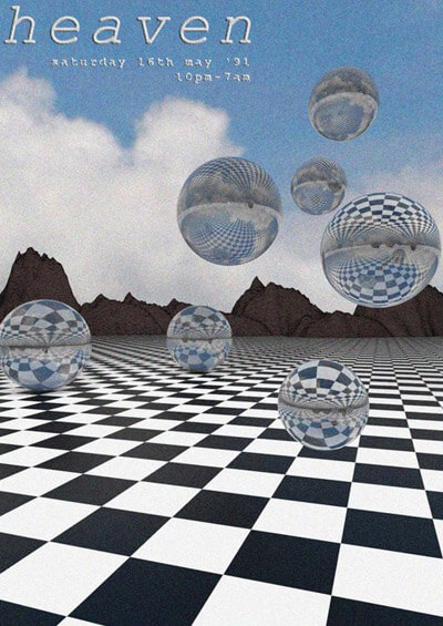
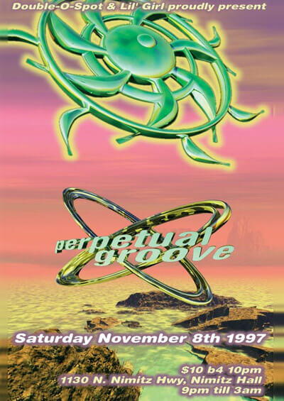
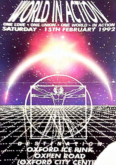
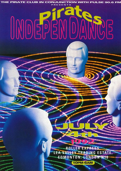
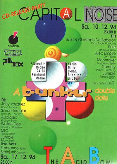
Speaking of poster design, the 90’s rave posters were truly something. The iconic movement was represented visually by psychedelic motifs, bright, even neon colors, and really, chaos and non-logical elements like floating body parts, all referring to fantasy and futurism.


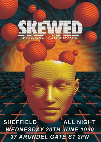

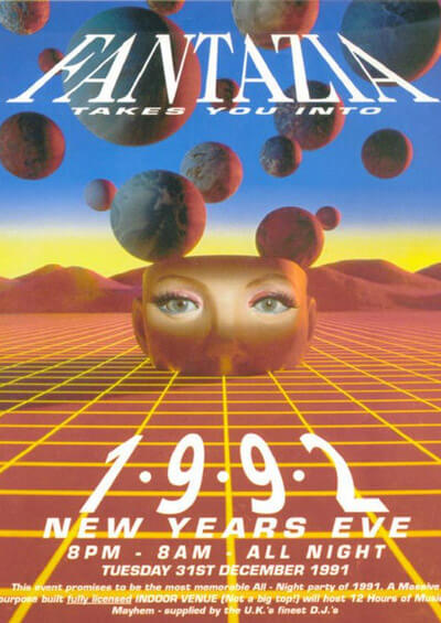
The surrealist approach was quite popular, and the already available to the mass audience graphic editing software made it really easy for designers to experiment by combining 3D with 2D, and even cut-outs in one composition. The themes of fantasy, planets, and the galaxy were very much on the rise and could be seen in poster design, flyer design, album covers, and more.


The experiment with typography design was a big deal. Let’s not forget that this is the decade when the iconic Comic Sans first came out! In terms of typography, all kinds of experiments were allowed: bright borders and glowing around letters, combinations of different fonts, distorted fonts, and even effects like floating 3D text inspired by the iconic Star Wars opening credits.


Back in the 90s, music movements like grunge, jungle and rave parties were a real inspiration and influence on graphic design. We can safely say they defined the way 90s graphic design looked. The grunge and anti-design styles of the 90s completely broke the rules of aesthetics. They were all about looking dirty, stained, ripped, and torn.
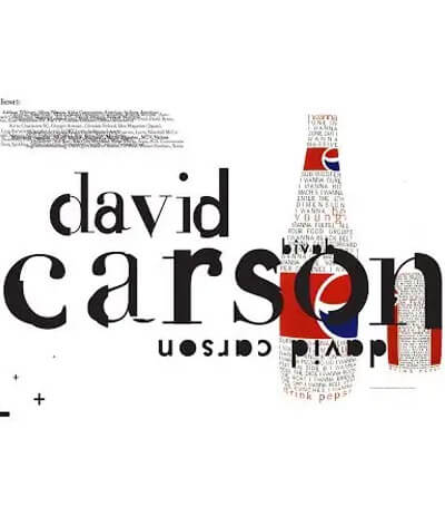
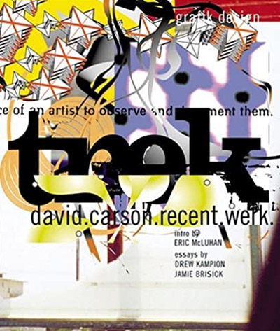
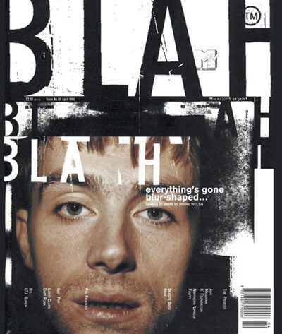
One of the most famous names in 90s graphic design remains one of David Carson. Despite being rebellious and against the rules, Carson got really popular and his clients were big famous companies who wanted to go with the trends no matter how crazy they were.
Here are several pieces of his experimental graphic design – a distressed look that is hardly understandable.


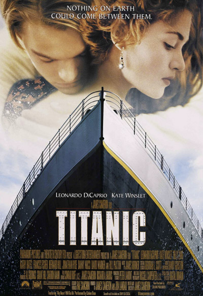
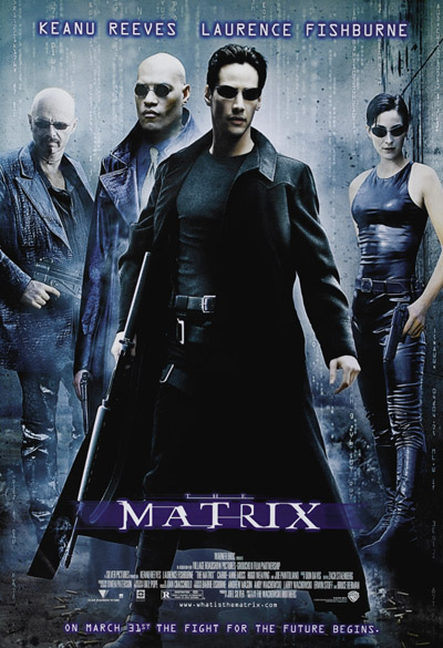
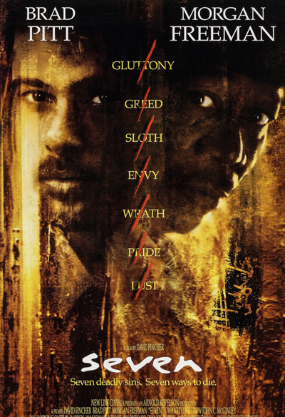
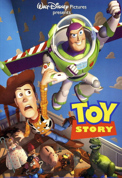
New computer software along with all the exciting possibilities it came with, was the real inspiration behind many iconic movie covers we still recognize today. This was the decade when 2D animations were first produced by using only Computer Animated Production System, too. And the famous Pixar’s Toy Story was the first ever fully computer-animated feature film. What a decade to witness, right?


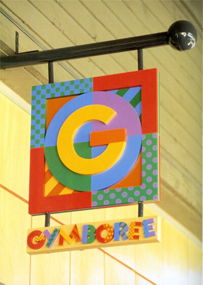
For sure, the Memphis style didn’t emerge in the 90s but it definitely rode the wave of popularity then. Since one side of the 90’s graphic design aimed to spray optimism and euphoria, the Memphis style fit perfectly with its bright cheerful colors, vivid patterns, and simple geometric shapes. By the way, the Memphis style is pretty current today, either. What can we say? Optimism just can’t go, can it?


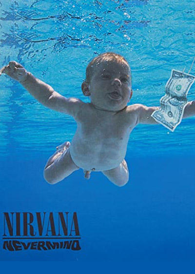
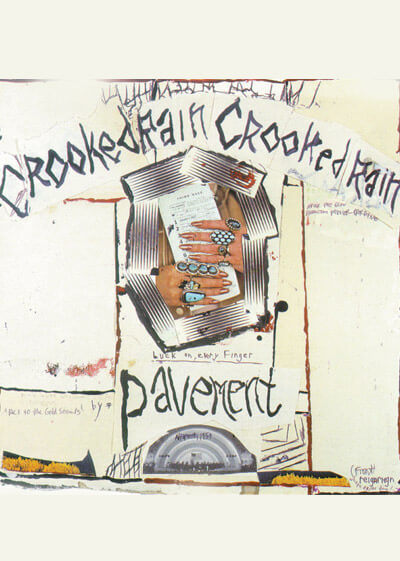
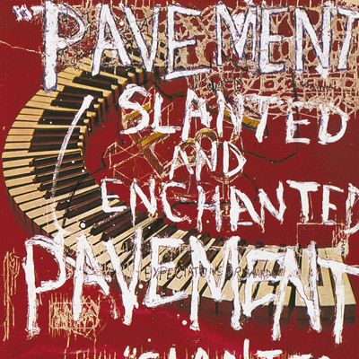
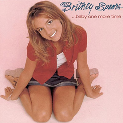
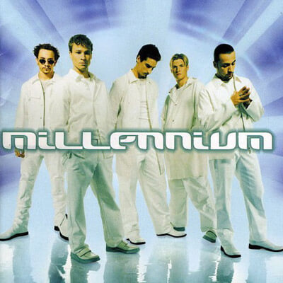
Ad designs and album covers from the 90s captured perfectly the diversity of styles we had back then, of course, all united by the experimentations with typography. Even simple-design album covers like the famous Nirvana “Nevermind” was presented with distortion in typography in order to evoke emotions.

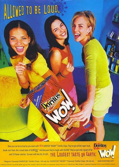


Back in the 90s, many contrasting movements got famous at the same time. On the one hand, we had the underground rock and rave culture influences, and on the other hand – the bright and optimistic pop culture style. One was messy and distressed, and the other one looked neat and sugar-sweet.


And the 90’s video commercials were iconic in every way, too. It was the time when technology allowed for creativity and designers along with animators and directors were not joking about it. The diversity of video ad styles was really insane in the 90s, ranging from short-movie directed ads to completely computed-animated commercials. See for yourself.
Final words
We can firmly say that what happened in the 90s didn’t stay entirely in the 90s but instead, acted as a huge inspiration for graphic design trends that happened in the following two decades. Indeed, the mashup of styles was kind of bothering but still empowering, as it gave freedom to designers to finally break through the rules and express their true emotions.
Fond of 90’s graphic design? We are pretty sure you’ll love to throw a look at these couple of articles, as well: