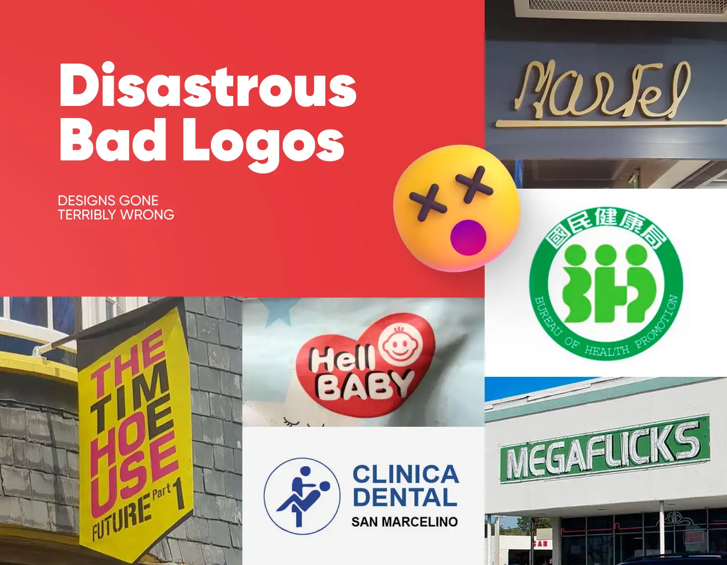
Bad logos can be disastrous for a business! If a logo doesn’t communicate the brand’s identity from the moment people lay eyes on it, then it doesn’t do its job well. Even worse, it can present a wrong impression of the idea behind it, thus signaling incompetence and even driving potential customers away.
In a world where first impressions matter, a poorly designed logo can ruin you before you have started. So let’s look together at this collection of 24 bad logos and take notice of what to avoid!
1. Endrun
If you’re looking for a bad logo, look no further! Someone decided it would be a good idea to copy Paul Rand’s logo, made in 1996 for an electricity company named Enron. And though the original doesn’t stand as one of the famous designer’s great works, this copy takes all the credit for an absolute disaster. So, take a good look at it and its haunting color scheme, and take notice of how it isn’t done.
2. Gap
In 2010 GAP decided to change its logo in an effort to boost the clothing brand’s sales. Switching their recognizable, iconic blue box logo to the new undefinable one was quickly categorized as a mistake. As a result, less than a week later they returned the original logo and lived happily ever after.
3. NYC Taxi
NYC Taxi generously provides another example to our list of bad logos. It is not really clear why the “T” looks like a subway sign when the idea is to sell taxi services. Or was it AXI services? Having in mind that all this happens in multimillion New York, they should have come up with a better idea to try and win clients.
4. Marfel? Martel? Marfed?
Now that’s what you have to do if you want to keep people guessing where they are having their coffee. It is fair to say that it keeps the suspense going, but overall this logo is so confusing!
5. Comprehensive Health Care
Obviously, here the idea intended was that this care home heartily welcomes its residents with a hug. What they achieved, though, is scaring the house in the logo when it came out of the bathroom, for it covers itself up out of shame.
6. Bureau of Health Promotions
If you want to make sure people don’t get any idea of what your logo is about, follow this example. There is some deeper purpose for the confusing “bodies” depicting the abbreviation of BHP. Unfortunately, all the eyes see are figures positioned in a pretty unusual way for a logo design.
7. American Pediatric Center
It remains unsure why and how the American Pediatric Center approved this logo design, but this definitely is one of the top logo fails. It doesn’t instill trust, nor does it manage to represent the idea of the center. And even worse – it probably scares parents off.
8. Dough Boys
There are so many ideas that can go wrong! The icon certainly implements the “d” and “b” from the brand’s name. But please, do tell me, hasn’t at least one person noticed what the complete design reminds of? Let’s hope their food is better than their logo!
9. Clinica Dental
There must be something more than just dental services at this clinic. At least their logo hints so. No one can say exactly what will happen when you sit in the dentist’s chair, but hopefully, it will be what you went there for. Another proof that bad logos can be found everywhere!
10. Hilton Worldwide
Aside from the obvious “H” these elements form, there is not much value in this Hilton logo design. The silver and gold hint at something luxurious, but the lack of adjustment and attention to detail hint at something not really well thought out.
11. The Detail Doctor
The Detail Doctor has clearly forgotten one of the most important details of the car. Apart from the fact that this can hardly be called a sketch logo, with the lack of the car’s tires, it does not inspire confidence in the quality of services at all.
12. The Cleveland Browns
Sometimes using common and obvious objects when creating a logo is a good idea. But you can’t just take a football helmet and expect that it would be enough of a representation of your team. There is nothing personal, nothing to distinguish this team from the others. Oh, except for the big Red lettering saying they are the Cleveland Browns.
13. MasterCard Worldwide
There will never be a good answer to why someone would decide to change their logo from something that works nicely, that the whole world recognizes them for, to something, hm, say questionable. The idea representing that MasterCard International is already MasterCard WorldWide is clear. But why is all this so off-center and what is happening with all the color mishmash?
14. KUMON
The logo for the educational centers for children KUMON is so bizarre, that they even have a dedicated page about it on their official website. They say this was “the thinking face” of children who learn and teachers who think of more ways to initiate progress. Honestly, though, it looks more like the face of someone who is totally lost in confusion about everything in the world.
15. Kids exchange
This example is the greatest lesson on why you should avoid merging words. They could have probably made things better if they switched some of the letters’ colors, but obviously, they were happy with the result. What remains a curious mystery is whether many people were willing to use these Kids Exchange services.
16. Megaflicks

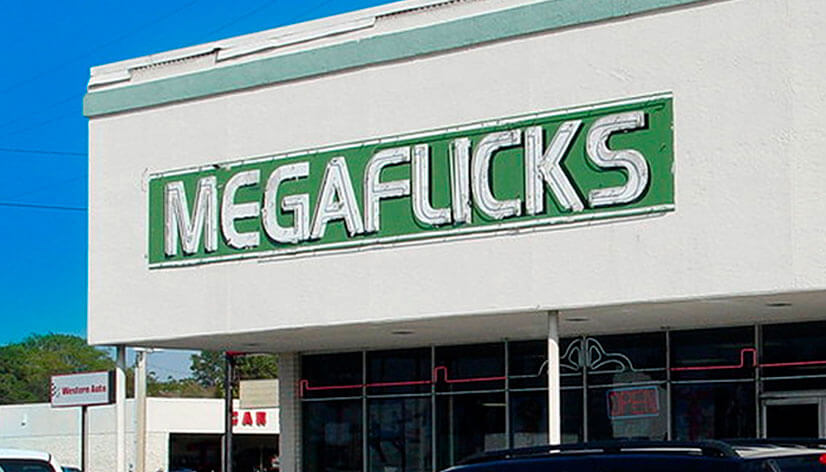
This place probably generated a lot of interest in the past, when it was still operating. If this was the case, it likely wasn’t for the video rentals they were offering, but for the misreading of their logo. Never underestimate the power of the spacing between letters! Or the lack of it…
17. Kraft Foods
Kraft Foods delivers another example of how to lose your brand identity with just a logo change. Though the new logo is much more modern, selling food and promoting flowers with your logo is somewhat confusing. Not that the new logo doesn’t have a good side, it simply seems like the representation of a totally different brand.
18. Kostelecke Uzeniny
This Czech sausage company seems to be very pleased with their products and how much people love them. Choosing to depict a person eating a sausage in this exact way, though, is contradictory. Some may laugh at this logo, some may feel ashamed, and others may love it. In the end, the fact is that it proudly presents the company for over a century, contradictory or not.
19. Seattle’s Best Coffee
There must be some special logic behind the trend to modernify your logo. Otherwise, it would be really hard to explain why a coffee brand that has become one of the largest and recognizable in the US while sporting its old logo, would entirely change it. And though in terms of design, it is a good rendition, if it wasn’t labeled it would be a challenge to guess what exactly this company is offering.
20. Khabarovsk airport
Creating an original logo is important. Making it memorable is also of utmost importance. But a piece of good advice is also to follow some basic guidelines of how things and creatures in the world work. Though the logo for Khabarovsk airport fulfills the first two conditions, and will definitely be remembered, we’re guessing that it will be so because it is one of the bad logos.
21. Peak Medical
At this medical center, they state that they “take care of the entire family’s Health Problems”. Well, looking at the flat line after the peak, we can not be entirely sure if this is a service to turn to when you’re not feeling well, or simply a place that threatens to flat out any patient’s line.
22. Locum
In the 1990s the Swedish property management company Locum decided to change their logo a little bit to match the spirit of their Christmas cards. In Sweden, this may not be read as anything different than Locum, but in English, well, let’s just say that it is not something you want your company to be linked with. To this day it still is confused as their main logo. Well, one wrong step and the world remembers forever.
23. The Time House
What becomes clear from this logo is only that we’re obviously in the Future, part 1. The rest of the lettering can be read in different ways, and surely, the hardest of them all is the intended one. The different colored words don’t really help a lot. And not to mention the indecent meaning it has, if you read it row by row.
24. Hello Baby
There can’t be a way that anyone hasn’t read this as “Hell Baby” the first time they saw it. See, playing around with one of the letters and implementing it in a slightly different way is one thing. But trying to sell goods referring to the tiny, innocent clients as visitors from hell is another game. And another of the bad logos worth remembering as one to avoid.
Tips on how to avoid the bad logos rankings:
- Clarity is everything! Ensure that your logo communicates your brand’s identity clearly and unmistakably. Avoid overly complex designs or ambiguous symbols that may confuse viewers or lead to unwanted associations.
- Consider the spacing between letters. Make sure that if there is any merging of letters, it is due to the effect you are looking for, and not your ticket to the bad logos list.
- Before approving or finalizing your logo, gather feedback. You want to be sure it communicates your brand the right way, plus, other people may see details you didn’t notice.
- Select colors and fonts that reflect your brand’s personality. Avoid using too many colors or conflicting fonts that can create visual confusion.
- Try keeping it simple. Simplicity is often more memorable and versatile. Avoid cluttering your logo with unnecessary elements that can distract from its effectiveness.
Final Words
The importance of a well-designed logo cannot be overstated. It’s the face of a brand, the first thing many customers see, and can make or break their perception of the company. Avoiding the traps of bad logos is challenging, but essential for any business looking to succeed in today’s competitive market. So, please, don’t follow these examples!
If you liked this article, you may also enjoy our other logo collections: