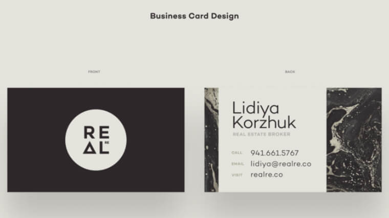
Real Estate agents know that image matters. A successful broker needs to inspire trust, integrity, knowledge, understanding, and attention to detail. Such qualities are not easy to establish certainly. This is why the first impression is crucial to the whole process. It’s how to initially present yourself, and gain attention. How do you get off on the right foot every time you meet a potential client, buyer, or seller. One way to start is to impress your potential clients with your business card. It doesn’t matter if you are specializing in houses, business properties, or land, or more general areas. The business card can succeed in presenting professionalism and style.
This is why in this article, I would love to make a selection of modern professionally-looking real estate business cards. Hopefully, these examples will inspire you. Or make you enjoy how much difference quality design can make to an agency or an agent’s image. So let’s take a trip through some key features.
Article overview:
Real Estate Business Cards with Clean Design
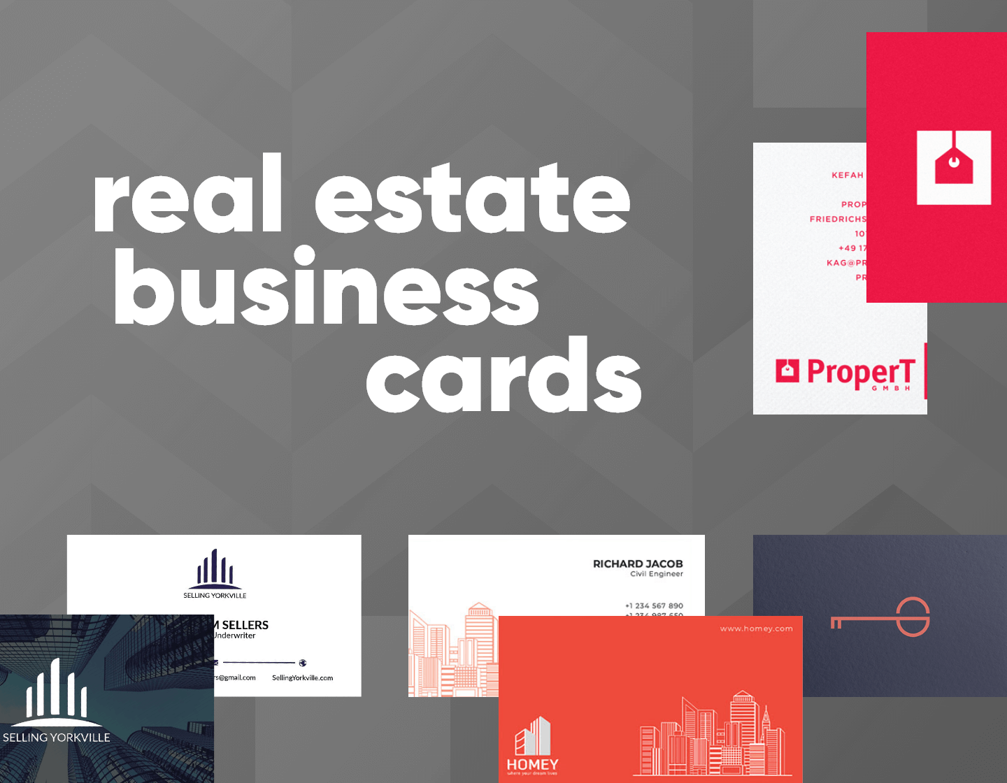
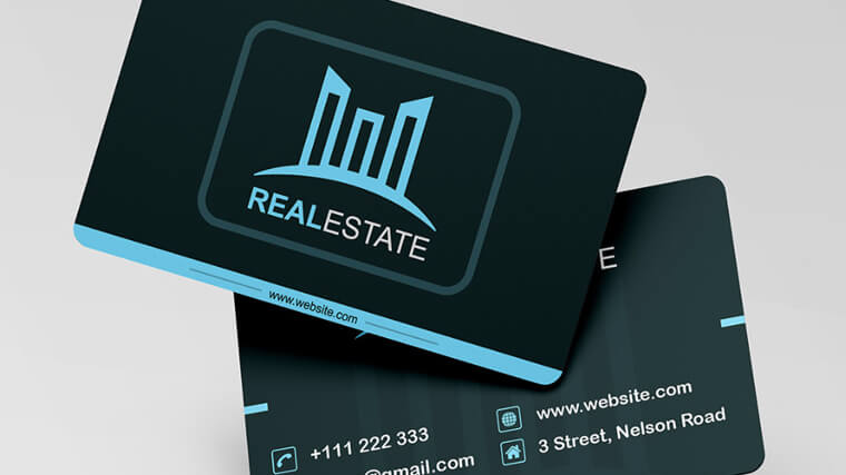
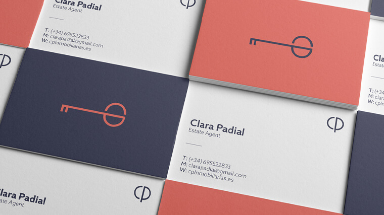
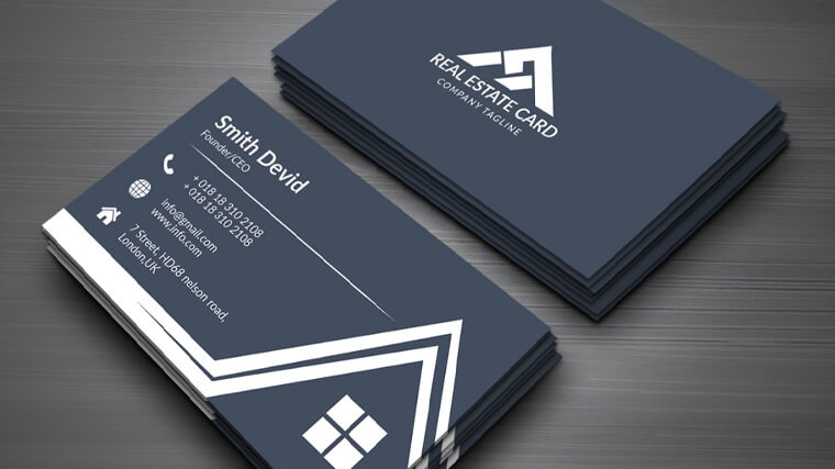
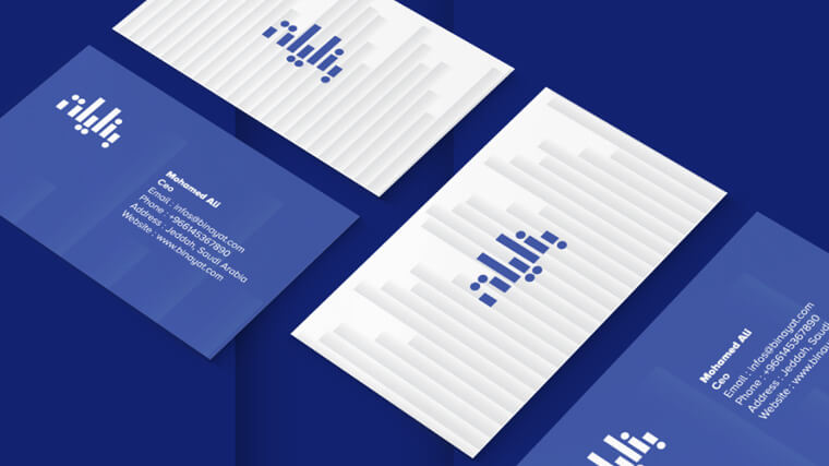
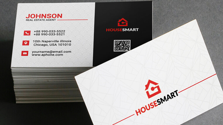
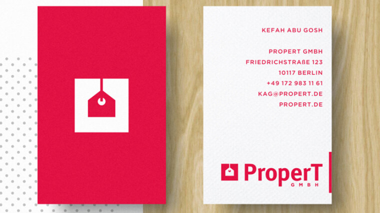
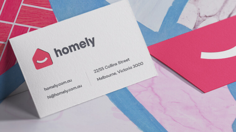
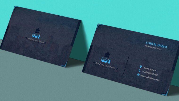
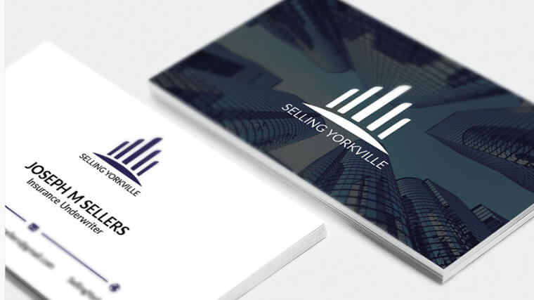
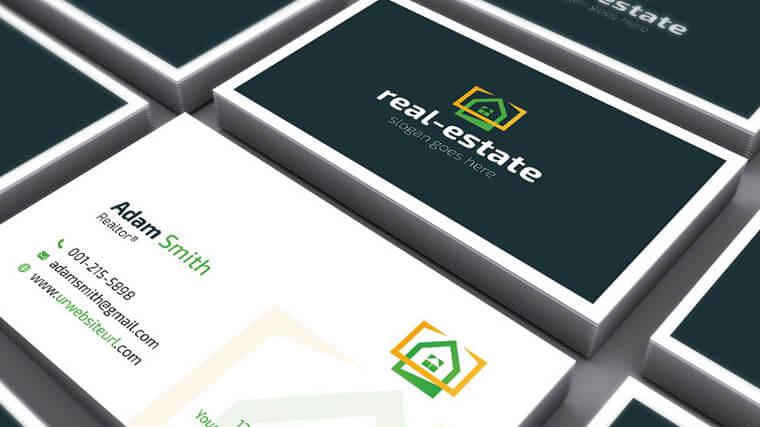
The following business cards don’t use photos of properties or rich designs. Instead, they tend to go more simplistic. The clean design features a logo of the respective agency and no more than three colors. The information usually consists of just the name, address, and phone number, which is very easy to scan at first glance. This is thanks to the huge white space around each element.
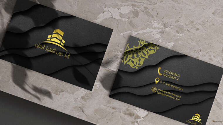
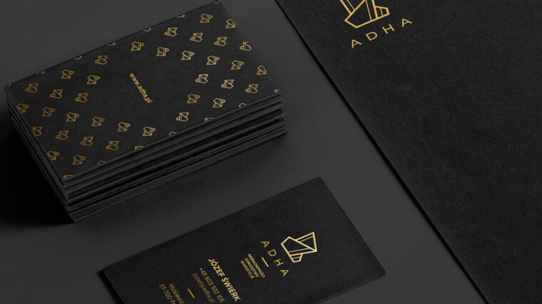
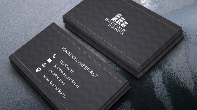
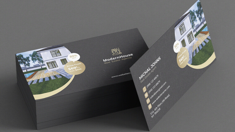
These real estate business cards are also very minimalistic and clean. However, the clever use of textures, granite color background, or golden letters makes them look luxurious and very high-end.
Real Estate Business Cards with Images
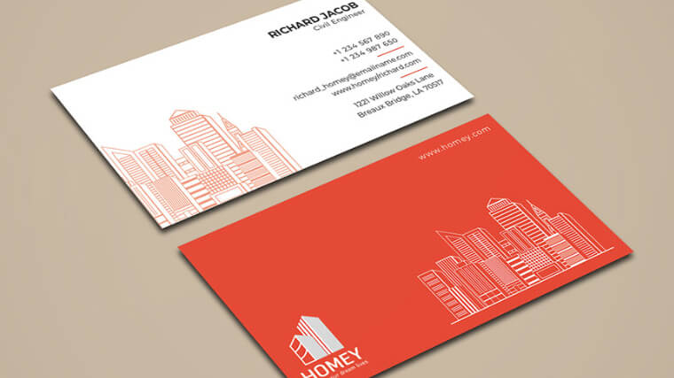
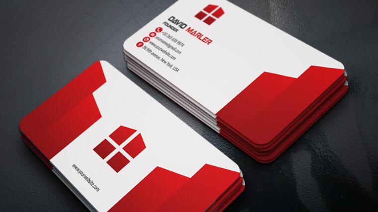
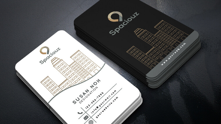
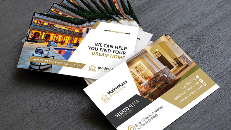
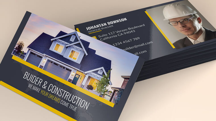
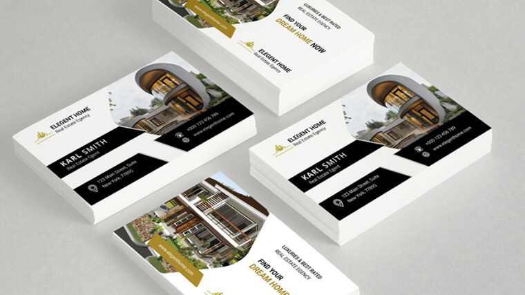
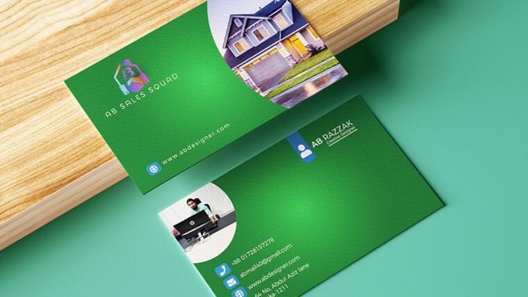
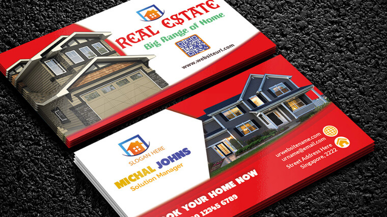
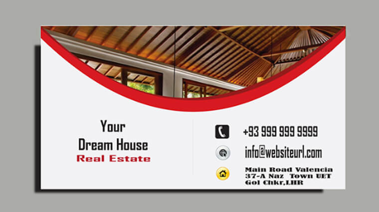
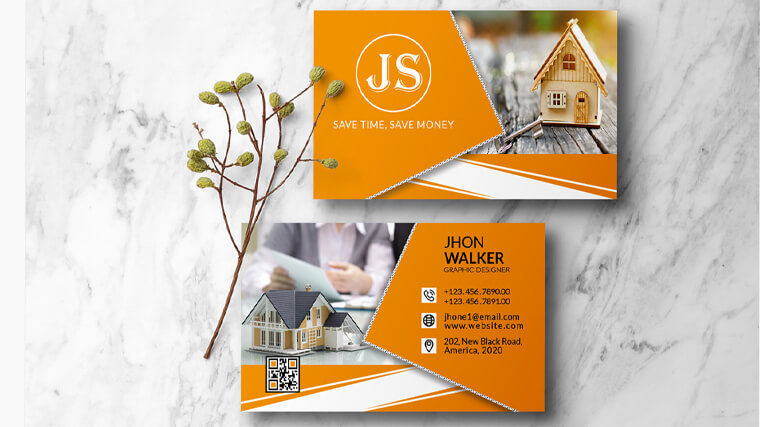
The second category features richer design and the use of estate photos or vector images, suitable for the field. Unlike the more professionally looking cleaner simplistic business cards, these look warmer, more inviting, and sparkle comfort.
Final Words
In conclusion, there isn’t a right answer on what your real estate business card should be. It all depends on the tone of your agency. You can create a simple, cleaner more- professional card. You could go further and choose higher end printing technologies to get yourself a beautifully textured card with golden letters. Or you can give it a more casual tone with photographic images or clipart.
I hope this selection of real estate business cards, crafted by talented designers, captured some essential themes to whet your appetite. Or at least inspired your creative flow and demonstrated just how effective a great piece of design can be when you want to take your business brand to another level. After all, in such a competitive market every little detail matters.
In the meantime, if you’re in need of even more inspiration, why not also check another gallery of creative business cards that mimic whole concepts?
In case you’re more intrigued by the quality of the material, you could also see some really impressive metal business cards.


