Here are the 6 best eCommerce product pages I found in the wild and break down in full detail. Each page brings something different that others don’t have.
Ever stumbled upon a product page that made you think, “Wow, I need this!”? This is almost always the case of not just about the product being awesome, but also how it’s presented. Some pages just get it right with clear images, engaging descriptions, a layout that feels just right, and advanced functionality for variation picking, payment options, and even filtering for the reviews.
With no further ado, I’ve picked out six standout eCommerce product page,s so let’s take a closer look at what makes each one tick, from the design choices to the little details that make the shopping experience great.
1. Master & Dynamic MH40 Wireless Headphones Product Page
About the store: Master & Dynamic sells professional headphones and luxury earphones
eCommerce tools: Shopify; GOAFFPRO Affiliate Marketing; NoFraud Fraud Protection; Klaviyo Email Marketing

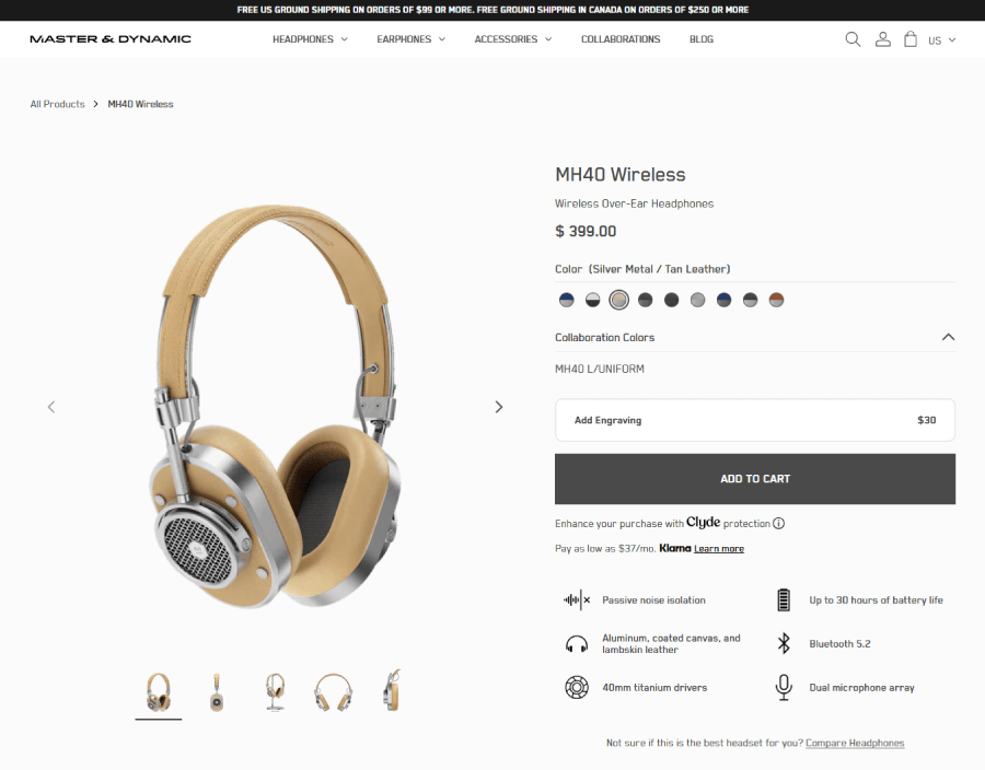
Product eCommerce section
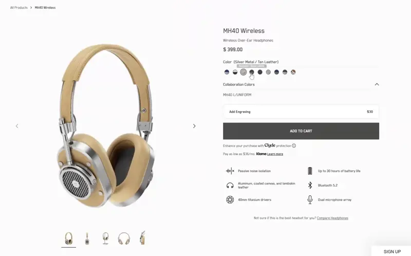
This is a split-screen product section with a product gallery on the left and product purchase options on the right. The gallery offers five high-resolution, detailed images of the headphones from different angles.
Now, the product purchase options give you color options with 9 different swatches. When you select a swatch, it changes the entire gallery to show images of the product in the newly selected color combination.
Another option is to add engraving to your headphones for a fixed additional price. In terms of payment, you also have the option to enhance your purchase with Clyde protection or pay for the product with Klarna at your own pace. Each of these two offers an “info” button that opens a modal window with additional info.
Below the payment options and the ADD TO CART CTA, you can also see a list of important features: Passive noise isolation; aluminium, coated canvas, and lambskin leather; 40mm titanium drivers; up to 30 hours of battery life; Bluetooth 5.2; and dial microphone array. These are all important bits of info that a potential buyer would want to know in advance. Usually, when it comes to buying expensive headphones, users want to know the duration of the battery and the materials most.

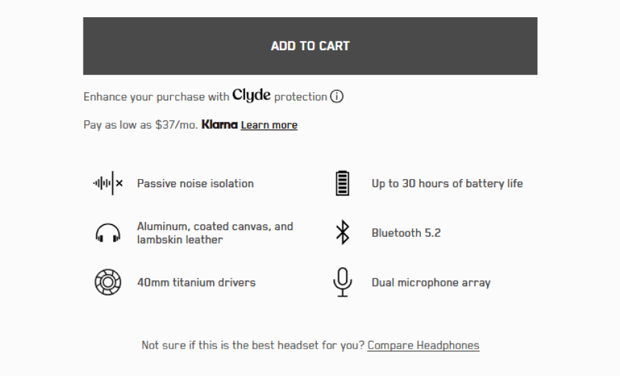
Being helpful, the product purchasing options also offer a small addition to the section with a call to action: “Not sure if this is the best headset for you? Compare Headphones.” This way, the product page focuses more on the user’s needs rather than necessarily selling this particular product.
Product presentation section
This section uses the typical mixed grid layout that landing pages use. It starts with a block section (that serves as “the hero section” for the presentation) with an artistic photo of the headphones at a creative angle and a catchy description promoting it. Above, there are three buttons: Features, Tech Specs, and Support, that serve as anchors for different sub-sections of the presentation. Whichever you choose, the page will autoscroll to the chosen piece of info.

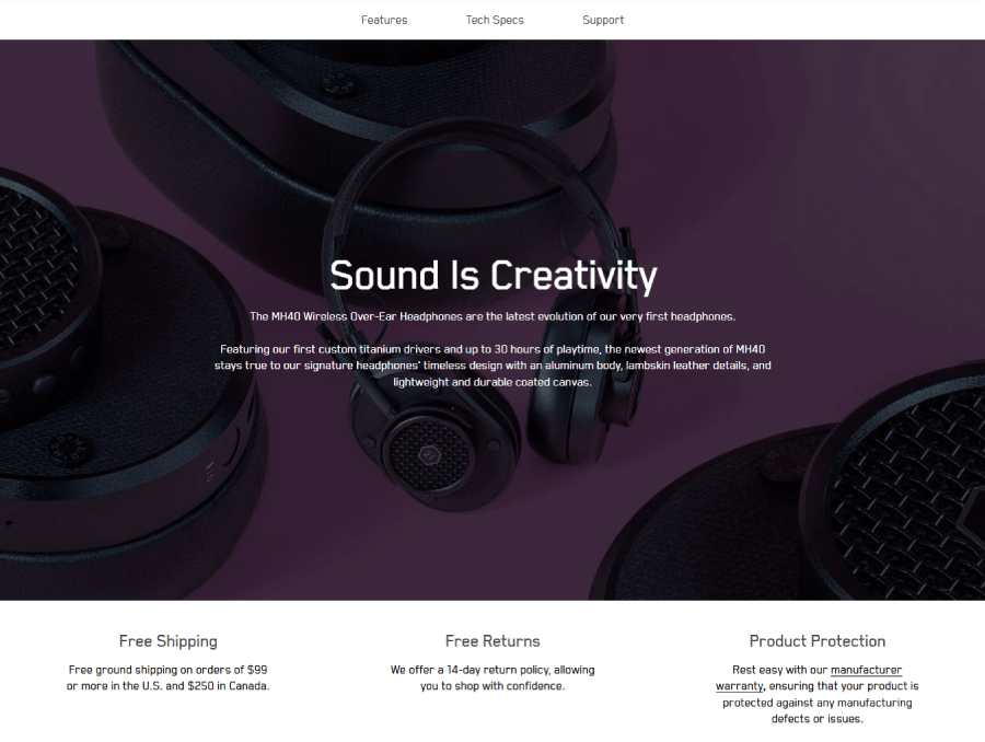
The presentation section gives more important answers to potential questions by users with info about free shipping requirements (in this case, on orders of $99 or more in the US and $250 in Canada); return policy, and product protection.
This is followed by a beautiful two-column grid Z-pattern layout presentation of the product itself, with big, high-quality product photos and listing the benefits of using the headphones. For more dynamism, the presentation is split into different topics with a magazine-style full-screen product image in between.

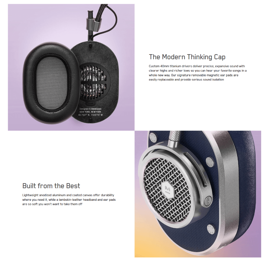
Topics include materials they used for building the headphones and why it matters; why the battery is better than other headphones (it states it has 66% more battery and promises 6 hours of listening after charging for only 15 minutes).
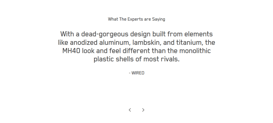
Social proof
This hits hard after the great presentation. The “What the experts are saying” section is a slider with quotes about the product by Wired, The Android Guys, Engadget, iMore, Forbes, and PC Mag.

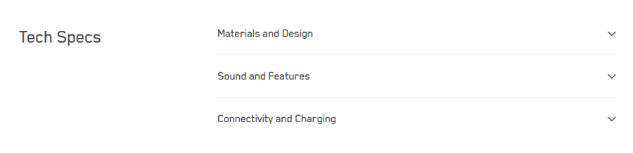
The technical bits
Here, the product page goes into the technical specs of the headphones with an accordion menu for materials and design, sound and features, and connectivity and charging.

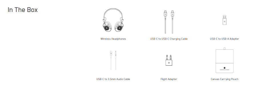
In the box
The specs are followed by what comes in the box when you purchase the headphones, with images and descriptions. You will know exactly what cables and adapters you will get.

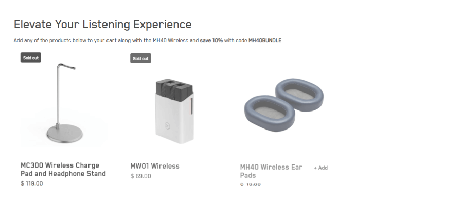
Recommended products
Any great e-commerce product page offers related products that work well with what’s been advertised. In this case, the page offers a wireless charge pad and a headphone stan,d and other adequate products you might need to pair with your headphones.

Product support
This is also a great thing they include on the page. It gives you direct downloads for the quick start guide, the product manual, and support.

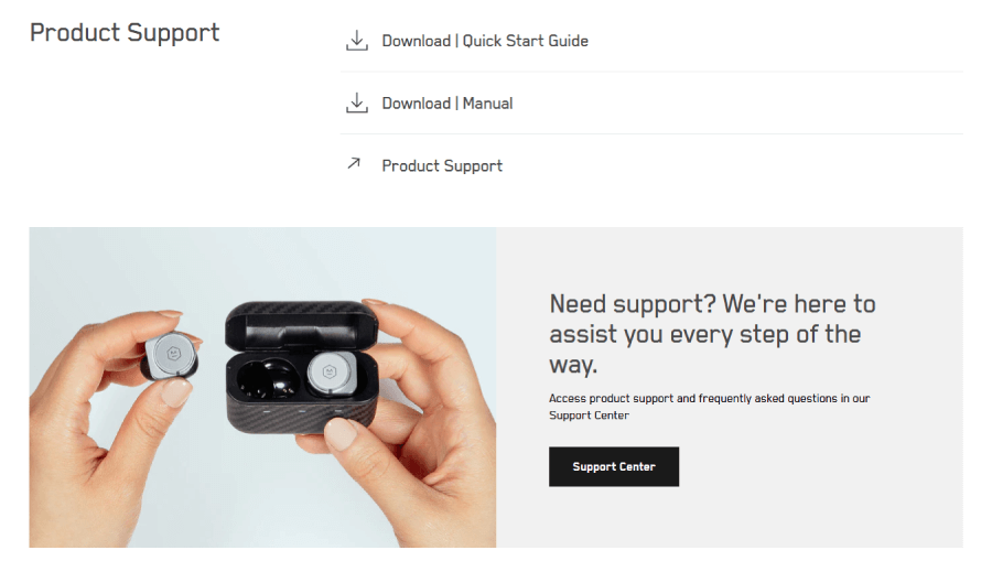
Speaking of support, the page ends up with a support section that gives you quick access to the support center with a button.
What makes this product page awesome:
❤️ Different color options for the product are presented with color swatches. Each color swatch you click immediately changes the product gallery to its respective color combo.
❤️ Installment payment options.
❤️ Quick product benefits are highlighted in the first section. These answer the exact questions users would ask (materials, battery, connection, drivers, etc.).
❤️ Beautiful product presentation with big product photos and specific, provable benefits. The presentation is designed as a mini landing page inside the e-commerce product page.
❤️ Social proof slider with reviews by tech media experts.
❤️ A specific “in the box” section listing everything you will get. This includes what cables and adapters come with the headphones.
❤️ Recommended products that actually make sense to buy to pair with the headphones.
❤️ Downloadable guide. Manual in PDF format.
❤️ Quick access to the Support Center.
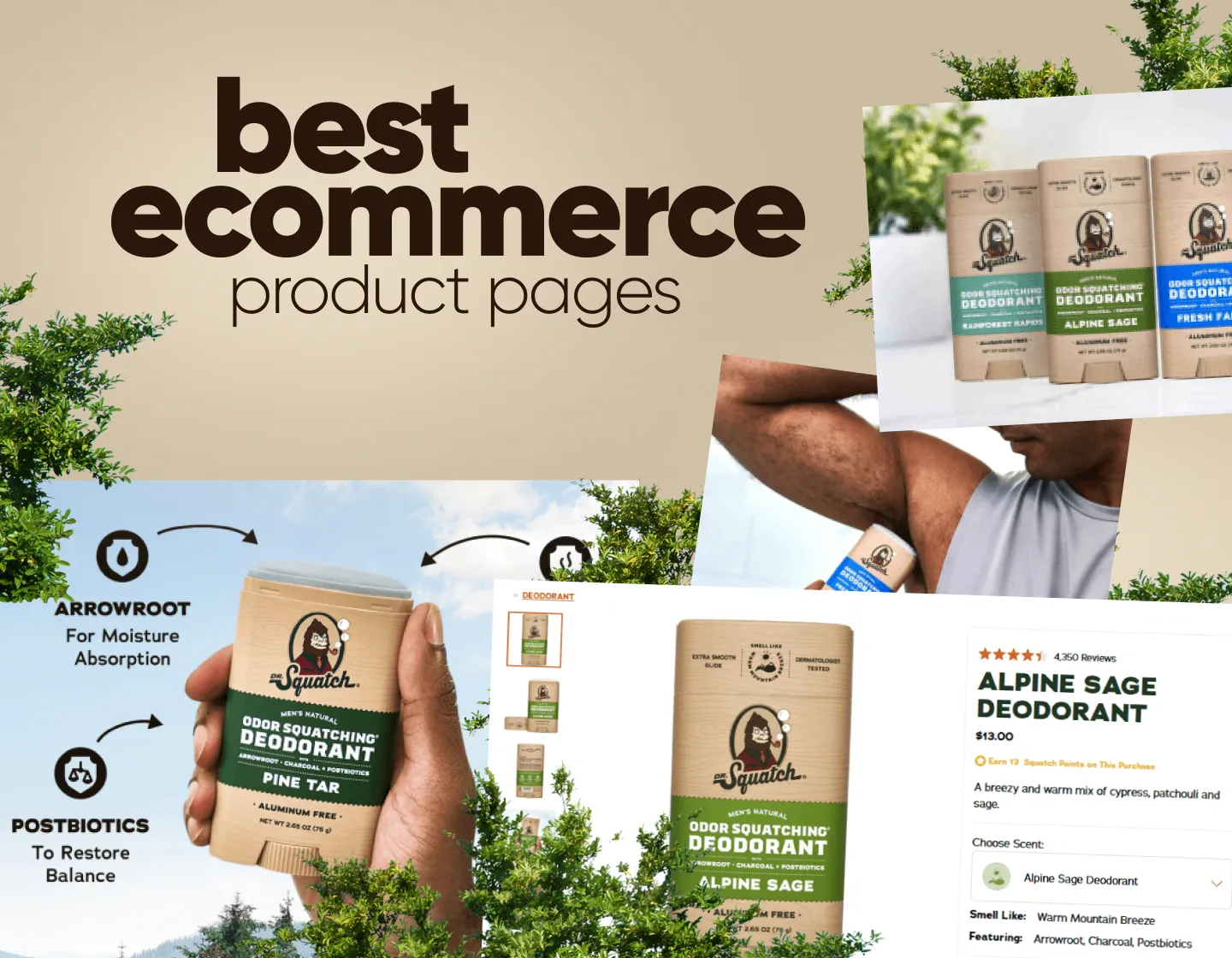
2. Dr Squatch Odor Squatching Deodorant Product Page
About the store: Dr Squatch sells natural, hand-made soap and soap-based products such as deodorants.
eCommerce tools: Shopify; WordPress; Rise AI GIft Cards & Loyalty; Mailchimp Email SMS Marketing; Rebuy Personalization Engine; Store Locator Dealer Locator; Yotpo Product Reviews; Yotta Insights; Rivo Loyalty Program and Rewards,;Yotpo Loyalty Rewards Referral

Product eCommerce section
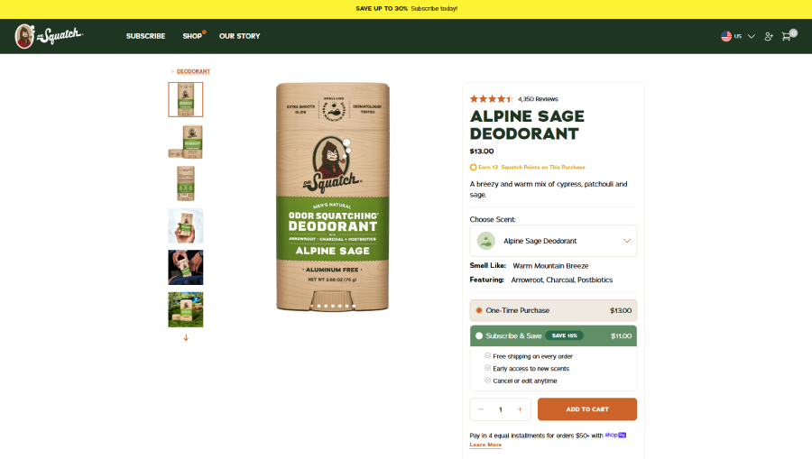
This section is separated into two main sub-sections. The first one is the gallery that offers a vertical thumbnails gallery and the full image preview that showcases the product.

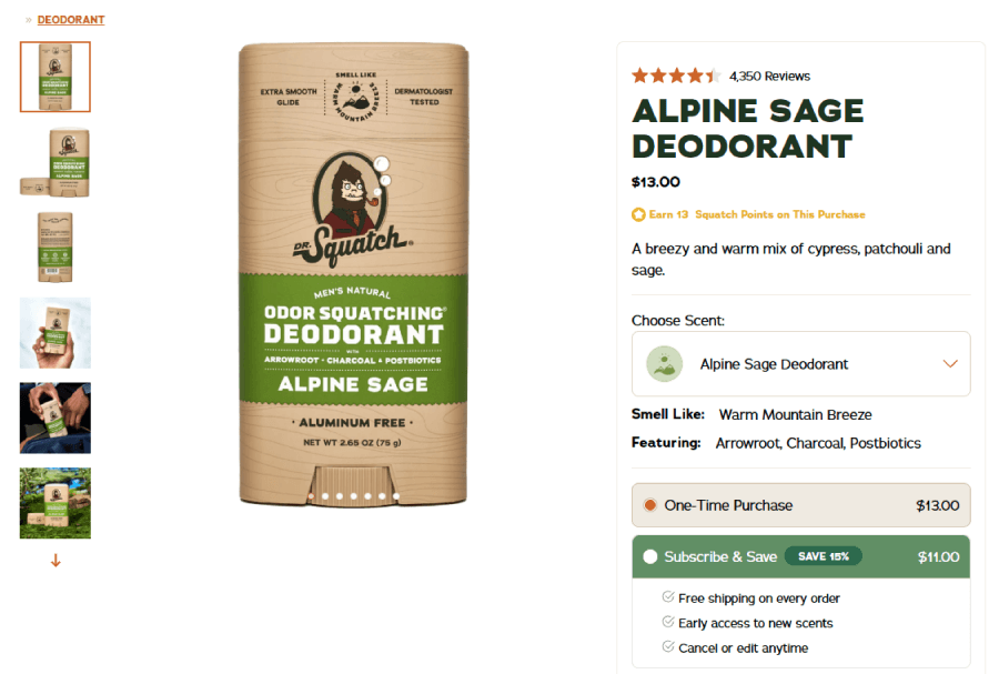
The product ecommerce section, on the other hand, highlights the product rating, the initial price, a brief product description, and a note that points out how many “Squatch Points” you earn if you buy the product. The latter is part of a loyalty program where collecting points can grant you gifts and discounts.
Product variants
Next, there is the Choose Scent option that gives you a drop-down menu where you can choose from a list of signature scents for that type of deodorant. Each scent has a title and a small custom icon. There is also the option for you to build your own 6-pack. What’s awesome about this part is that no matter what you choose, the Smells Like, Featuring (ingredients), and the gallery itself are dynamic, so they change when you select a new scent.
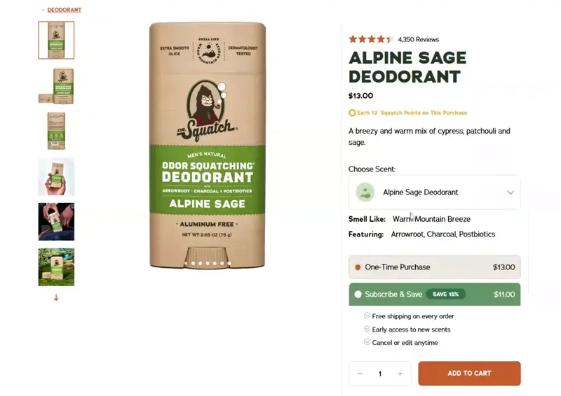
Needless to say, the “Smells Like” bullet gives a small description, such as “Warm Mountain Breeze,” for example, while the featuring gives 3 ingredients. For example, the Warm Mountain Breeze has arrowroot, charcoal, and postbiotics.
Purchase options
Going further in this section, the page gives you two purchase options that you can select with a radio button: One-Time Purchase or Subscribe & Save. The latter elaborates with a percentage of the price you’ll be saving and guarantees free shipping on every order, early access to new scents, and cancel or edit anytime. This is a top-notch tactic that can easily win over one-time buyers into becoming loyal subscribers thanks to the generous perks.

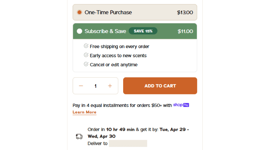
Below the Add To Cart button, there are also info elements that explain the option to pay in 4 equal installments for orders over a particular amount with Shop Pay. Since the store uses locators, it also gives you live info on when exactly the order will arrive at your place if you purchase it now, and confirms your location with “Deliver to (your city, country).
This section continues with custom badges that promise free shipping over a particular amount, a 30-day satisfaction guarantee, and the finest natural ingredients, all illustrated with custom icons.

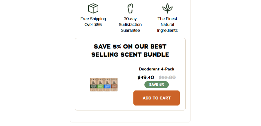
And last, the section includes a small card with a recommended product on discount, which you can immediately add to the cart.
I did list a lot of things here, so it’s easy to imagine and an incredibly long section where you scroll till your fingers are sore. The thing is, this is not the case at all. The design manages to perfectly fit all this info in a small space without cluttering. Top-notch UI work!
Product presentation section
The page separates the eCommerce main section from the rest with a cool animated separator that shows the names of the different scents in motion.
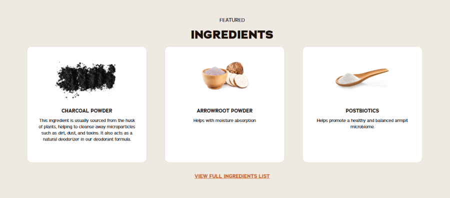
Let’s start with the first part of the presentation. This one offers the featured ingredients with three well-designed square cards that feature the ingredient title, image of that ingredient, and a small description that explains what the ingredient does to benefit you. Below is the option to view the full ingredient list, which opens a small modal window listing every single ingredient in the deodorant.

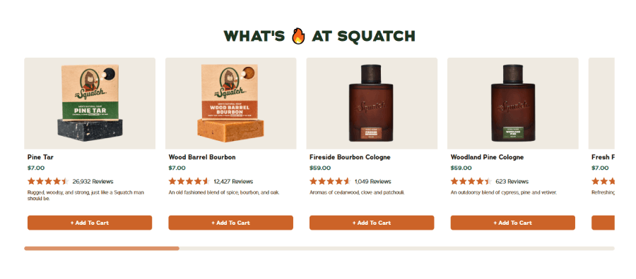
Recommended products section
Next, the page shows a cool slider with “What’s Fire At Squatch,” where you can see the most popular products with a quick view and the option to add them to your cart.

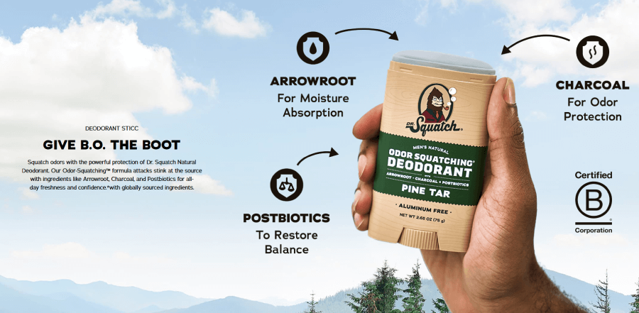
Visual presentation
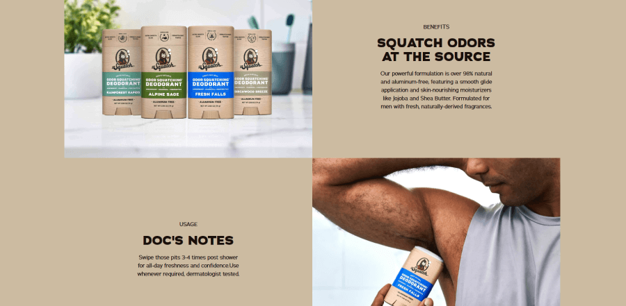
This part looks like a mini landing page with its own hero section, followed by Benefits and Usage sections. The “hero” shows a lovely product photo with arrows that give additional notes.

Benefits and Usage are classic two-column zig-zag layout sections that both fit the screen and are very easy to scan and read.

Real client reviews
The entire product presentation ends with actual client reviews. These ratings are legit since they are never 5 stars. For example, the Alpine Sage deodorant has a 4.4-star rating based on 4,350 reviews.

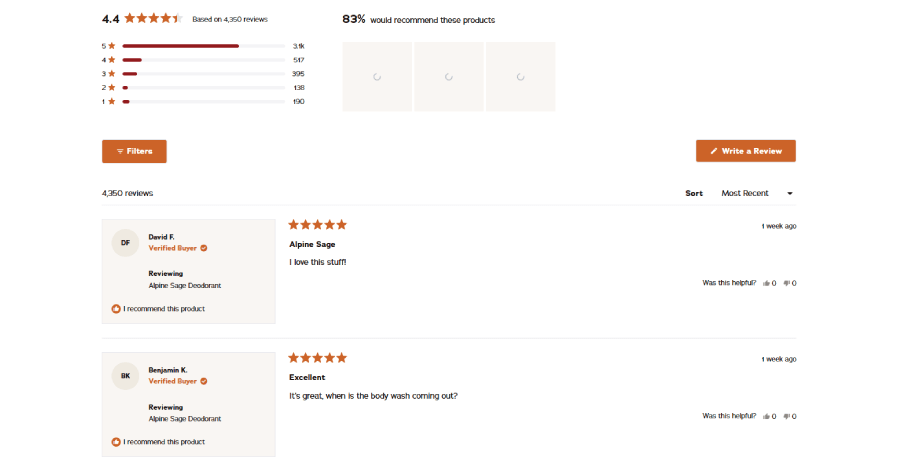
The section shows a dynamic list with numbers based on how many people have selected each star rating option. Although the section shows the last 5 written reviews, you can hit Show More and read all 4,350 reviews if you want to.
What makes this product page awesome:
❤️ The design allows a huge amount of product info to be packed in a small column. Yet the layout doesn’t look cluttered or hard to scan.
❤️ It has a dynamic gallery that changes when you select a different scent.
❤️ A good loyalty program with a generous perk. These perks come if you opt for a subscription instead of a one-time purchase.
❤️ Dynamic “Smells Like” and “Featuring” bullets that change upon selecting a new scent.
❤️ The page allows you to read every single client review ever written on that product and segments the reviews based on star rating, so you can easily click the lowest to learn why someone dislikes it.
3. Hiya Kids Daily Essentials
About the Store: Hiya Health sells essential super nutrients for kids, created by dads and backed by science.
eCommerce tools: Shopify; Blotout EdgeTag; Okendo Reviews & Loyalty; Klaviyo Email Marketing & SMS; Seery Predictive AI Analytics

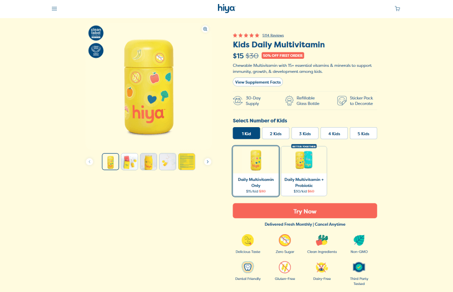
Product eCommerce section
The section above the fold gives you everything you need to know about what you’re buying. On the left side of the screen, there is a product gallery with big, high-quality photos and a horizontal thumbnail gallery slider. What is different here is that you can see the trust badges directly on the mail preview product image for ” Clean Label” and “Purity Award”.
Moving to the right side of the screen, the eCommerce section shows the product’s current rating with a quick link to the real reviews. The text on this link is dynamic as it specifies the number of reviews the rating is based on.

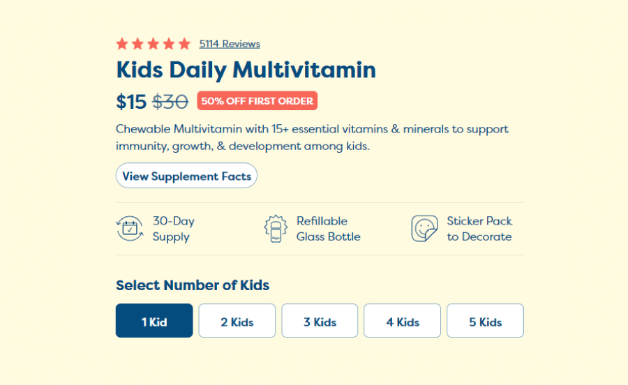
Dynamic price discount for first buyers
Below the product title (Kids Daily Multivitamin), the page shows the current price if you’re a first-time buyer. For example, the product originally costs $30 dollars and if you’re already a client, you will only see that price. However, if you haven’t purchased before, the site detects that and gives you a $15 price for the product and a label “50% off first order”.
Benefits
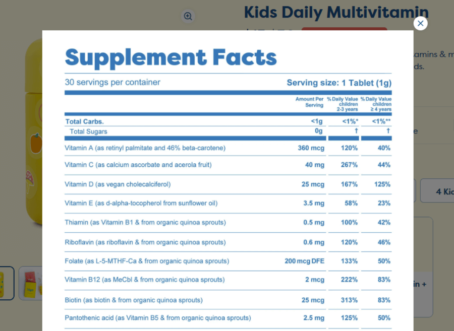
Each product page here offers a quick description with features and benefits, and a cool button ” View Supplement Facts” that opens a modal window with an A4 format document listing everything about the supplements such as servings per container, serving size, total carbs, vitamins included in mg/mcg and their daily values.

Below are three perks bullets with custom icons that guarantee a 30-day supply, and point out that the glass bottle is refillable, and there’s a bonus sticker pack to decorate the bottle just like in the preview image.
Next, the eCommerce section allows you to pick an option for a number of kids that ranges from 1 to 5, and no matter what you pick, it dynamically changes the pricing.
Better together
Below that are two cards with products. The first one shows the product you’re currently viewing, so that card is selected. The next, however, shows “Better together” with the current product + an additional one that the site recommends for better use. This is a smart way to recommend products directly above the purchase option, instead of at the bottom of the page like most product pages do.

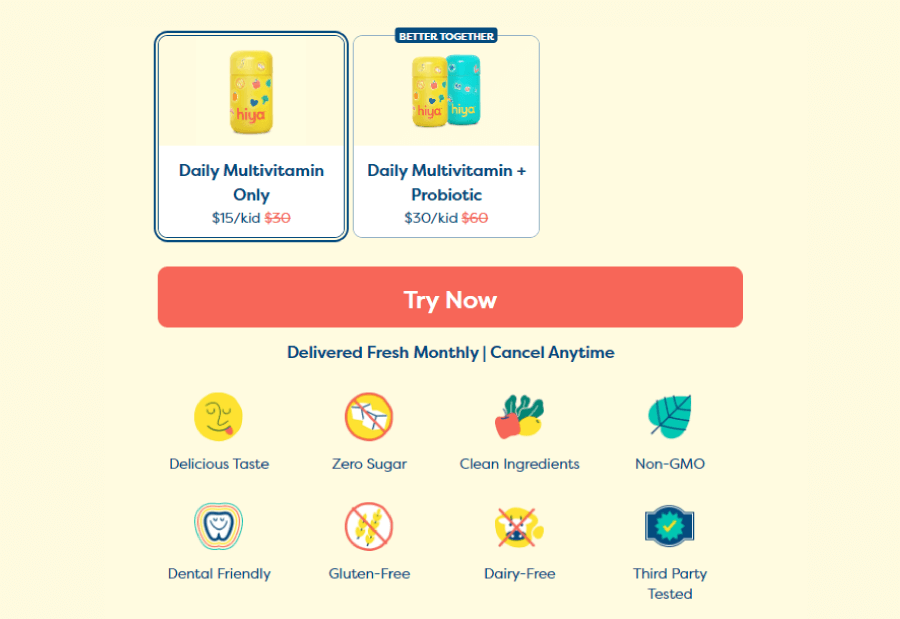
Instead of “Buy Now”, the purchase button prompts the much more friendly “Try Now”. This one is quickly followed by the product benefits with custom fun icons for delicious taste, zero sugar, clean ingredients, and more.
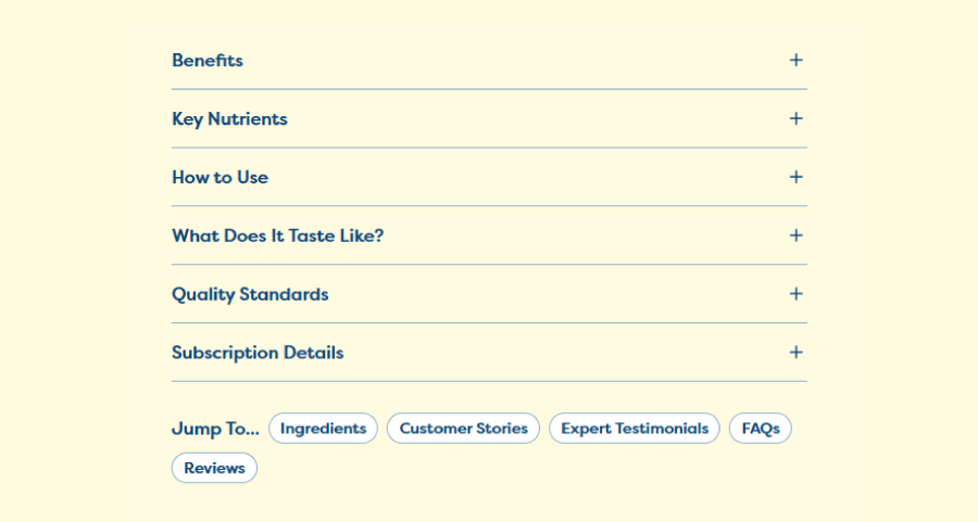
This section also manages to pack the important info well for users to choose exactly what they want to read. For example, the last part of the eCommerce section offers a packed accordion list with topics like: benefits, key nutrients, how to use, what it tastes like, quality standards, and subscription details. You can clearly scan these topics and choose which one to expand and read about.

Product presentation section
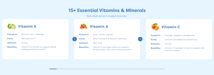
I love this section for the way it shows medical facts in a kid-friendly way. For example, it starts off with a 15+ Essential Vitamins & Minerals section that explains what’s included and why in fun little cards that feature: vitamin name and an image of food that has that vitamin; a bullet list of info such as “found in”, form, amount, and benefits. The best part is that there is no medical jargon but straight-to-the-point facts. The Vitamin K card, for example, explains the benefits of using it is known to support blood clotting and bone health.

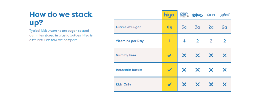
Comparison table
In the next section, you can see a comparison table between Hiya supplements against other brands. The Hiya brand prides itself on not selling sugar-coated gummies stored in plastic bottles and shows it in the table.

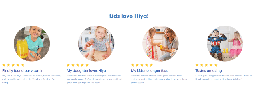
Next, the testimonial section, Kids Love Hiya! shows selected client testimonials with photos of kids and quotes by their parents. This is separated from the reviews section.

Scrolling down, it starts the actual product presentation with a landing page style layout similar to the previous examples. It explains the ingredients, benefits, and gives an accordion FAQ section with important questions such as “If there’s no added sugar, how does your vitamin taste so sweet?” or “How bad is the sugar epidemic?”
The page ends with real client reviews, the percentage of reviewers who would recommend these products to a friend, and a list that segments a number of reviewers against each of the 5 rating options.
What makes this product page awesome:
❤️ Better together recommendation as an option before buying.
❤️ Well-written medical information. It’s understandable and avoids medical jargon.
❤️ Comparison table. It presents how the product is better than similar products from other brands.
❤️ FAQ section
❤️ You can read every single client review. You can also segment the reviews based on star rating.
❤️ Sticky purchase product bar at the bottom.
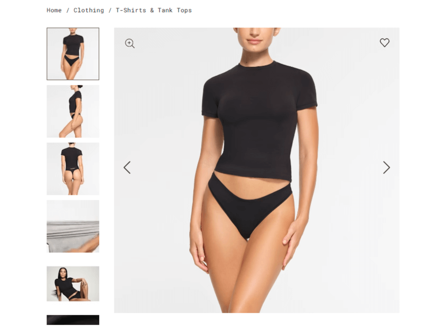
4. Skims Cotton Jersey T-Shirt Product Page
About the store: Skims is a popular brand by Kim Kardashian that sells high-quality, exclusive shapewear for women and men.
eCommerce tools: Shopify; Attentive SMS + MMS Marketing; Klarna On-Site messaging; Okendo Reviews and Loyalty; AMP Back in Stock; Klaviyo Email Marketing; Rise AI Gift Cards & Loyalty; Narvar Return and Exchange; Wrapped Gift Wrap & Messaging

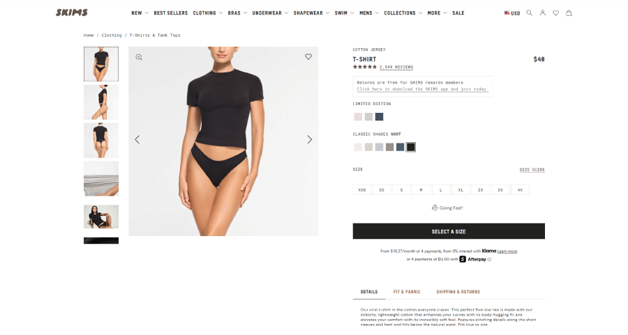
Product eCommerce section
Similar to the previous examples, this product page starts with a split-screen layout section that shows the gallery with a thumbnail slider on the left and the purchasing section on the right. The gallery allows you to zoom the photos and view them full screen for details. As a bonus, every product has at least one photo of Kim wearing it, aside from the models.

SKIMS rewards
For the eCommerce part, the section offers a star rating with a link to real client reviews and a note that ” returns are free for SKIMS reward members”. This tactic immediately gets the attention of new buyers to check out what that program is about and download the store app. Of course, the note provides a link for further info.
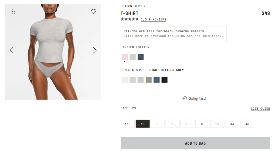
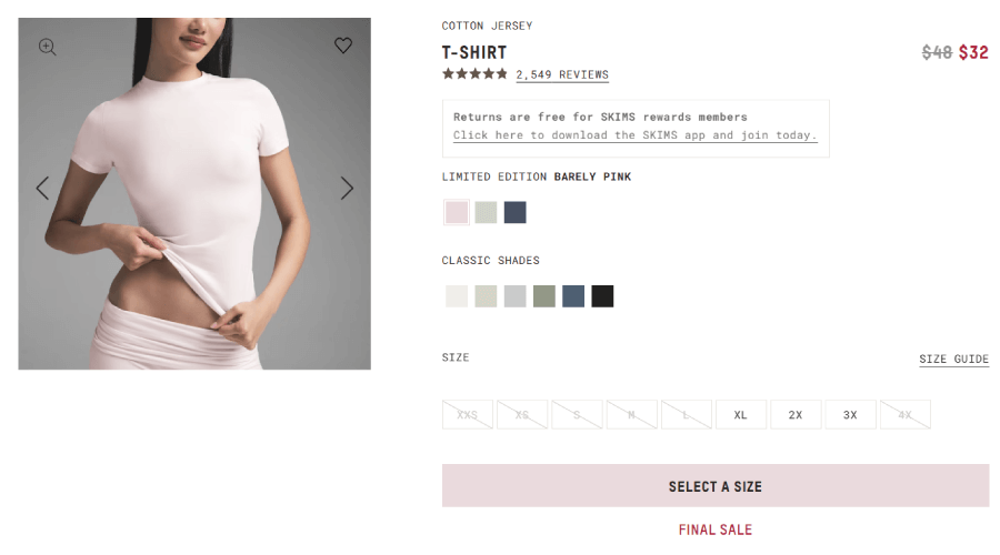
Shades, sizes, and stocks
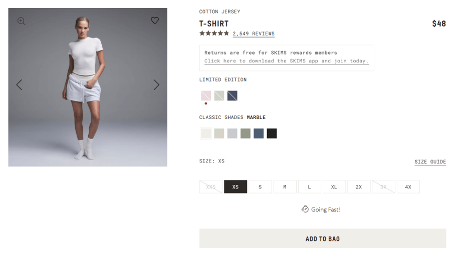
Now, let’s get to what’s different about this page compared to the previous ones. Here you can see two options for color swatches: limited edition and classic shades of soot. Skims is famous for the brand’s exclusivity, so most products have limited shades with very few units available, and they sell out really fast. The classic shades also get quickly out of stock, especially for specific sizes, but not as much as the limited ones.

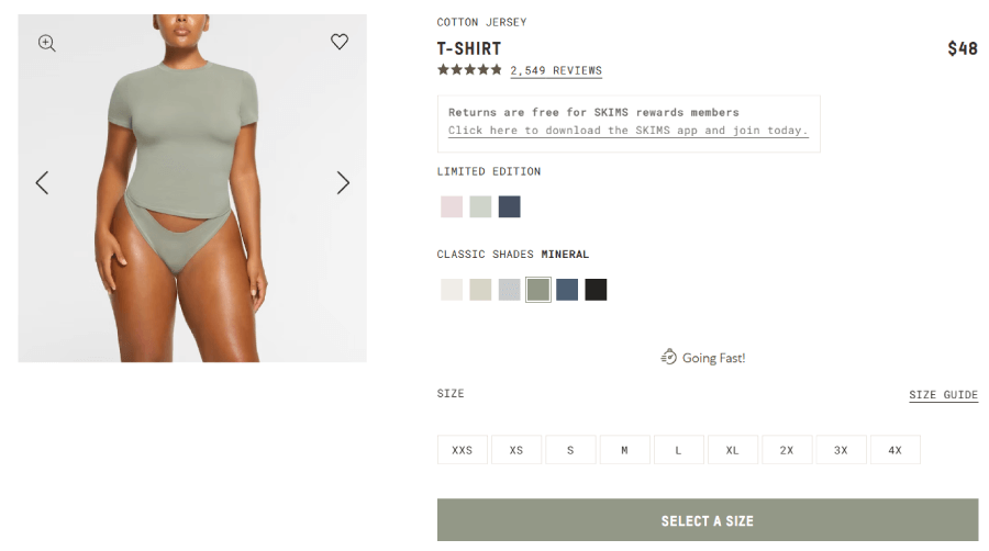
Since this is a shapewear store, and knowing what the different shades look like is very important, every time you select a shade from the color swatches, the entire gallery changes to show models wearing the product in that particular shade.
Of course, below are the size options that clearly indicate which sizes are available. You can see the crossed-out sizes, since they aren’t in stock. Once you select a shade and an available size, it will reveal the “Add to bag” button.

What’s cool here is that the purchase button is missing until you find an item that’s in stock. For example, if you still haven’t selected an available size, the button will show “Check sizes”. If you, however, select a size that is not in stock, the button will say ” Join the waitlist”.

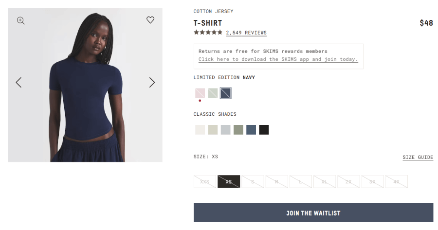
And lastly, about the stock, sometimes you will see a red dot under one of the color swatches.

This happens to products in that shade that have a Final Sale. There are usually only a couple of units in one or two sizes.

I appreciate how a section as small as the color and size options has that much functionality and case scenarios included.
It ends with tabs for product details, fit & fabric, and shipping & returns info.
Huge recommendation section
Now, most product pages will show you a couple of recommended products personalized based on your activity. This, however, is Kim’s brand, so you gotta expect the extras.
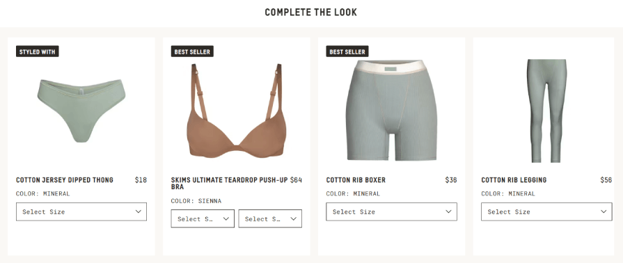
This part starts with the Complete the look section, which shows quick cards of a limited number of products that were meant to be part of an outfit that includes the product of this page. Each card gives you the option to select a size, and depending on the availability of that size, it will reveal an “Add” button.

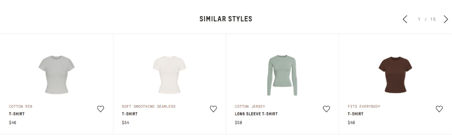
The next section shows Similar Styles. This is great if the product you won’t isn’t available in the shade or size you want. For example, if you want the fit t-shirt but your sizes are out of stock, the slider will show similarly looking fit t-shirts that may have the shades and sizes you need.

Next, More in This Color shows a slider of other items in the same shade you selected for your product.


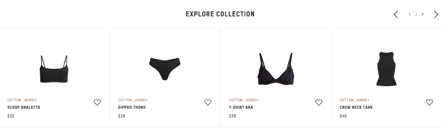
Since the item is always a part of a particular collection, you will see another section, “explore collection,” with a slider that shows off cards of products in the same collection as your chosen product.

And last, comes the actual recommended products section, ” We think you’d like,” that uses personalization to show you products in your exact taste based on what you’ve purchased before.
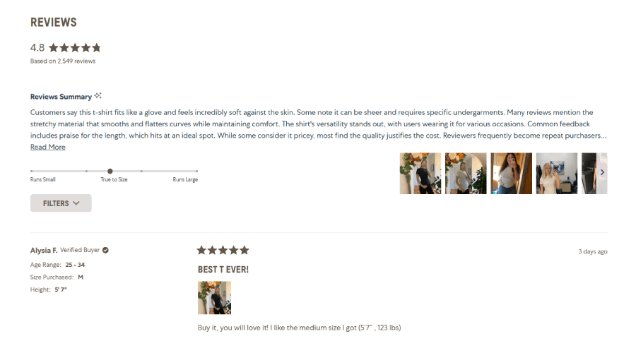
Reviews with filtering options
The page ends with real reviews of clients who’ve bought the product. Most have photos of the clients wearing it. Each review offers an additional column that shows the age range of the client, the size purchased, client’s height.

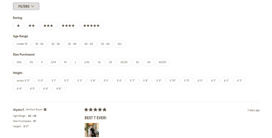
There is also a filtering functionality for the reviews. You can filter reviews by rating, age range, size purchased, and height.
Above the reviews, there is also a Reviews summary that gives a nutshell of how clients like the product, gives featured client photos, and a bar that shows if the clients overall find the product small, true to size, or large.

What makes this product page awesome:
❤️ Dynamic purchase button that changes to “select size” or ” join the waitlist”. This option depends on the availability of item sizes.
❤️ Zoom gallery
❤️ Final Sale indicators for shades with limited sizing options. It brings even more exclusivity to limited items.
❤️ The entire gallery changes depending on the shade you select
❤️ Complete the look dynamic section. It shows specific items from the same collection meant to be worn with your selected product
❤️ Similar styles dynamic section, where you can find a product that looks similar to the product on the current page. Great if the current product isn’t available in your size.
❤️ More in This Color dynamic section.
❤️ Filtering functionality for the reviews section based on rating, age range, size purchased, and height.
5. AirPods Pro 2 Product Page
About the store: This is the official online Apple store for all Apple products.
eCommerce tools: Adobe Experience Manager

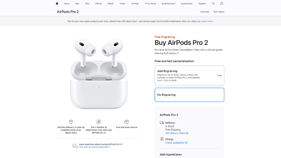
Product eCommerce section
Including any product page from the Apple store in this list was a no-brainer. As expected, there are no weaknesses in the design and functionality here.
Let’s start off with the eCommerce section that follows the split-screen layout, like most. On the left, it includes a professional high-quality product photo, in this case, the AirPods Pro 2, followed by three guarantees with stylish custom icons for free delivery, or pick up available items at an Apple Store; 3 months of Apple Music for free; and free and easy returns. Below these points, the page includes a link to chat with an AirPods specialist if you have questions.

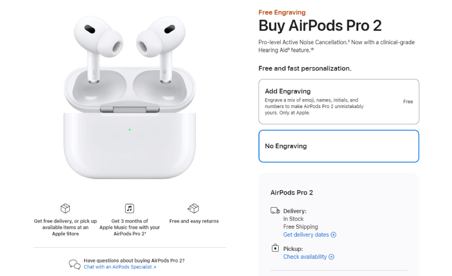
Here are a couple of things you can immediately notice. First, this is a specialist in this particular product and not just an Apple support call center employee. Second, the link is presented in the gallery section instead of at the bottom of the page, so you can access it quickly before scrolling.
No ratings (=
For the eCommerce section, we don’t have ratings. In fact, you won’t find a single client review on the entire page. This may be a huge issue for most eCommerce sites, but this is Apple. The tactic clearly communicates that Apple doesn’t need social proof; everyone knows who they are and what the quality of their products.
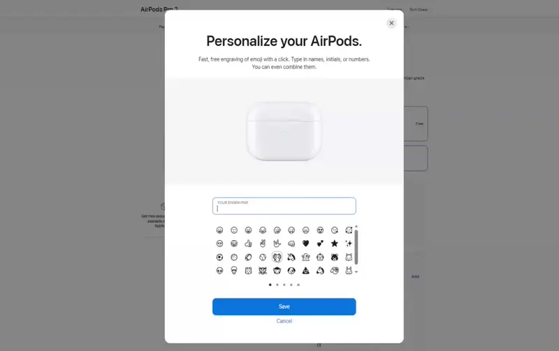
Engraving widget
After the obligatory title and short description, the eCommerce section offers Free and fast personalization for the AirPods. When purchasing, you can choose to add engraving. If you opt for this, it will open a widget where you can personalize your earphones with a mix of emojis, names, initials, and numbers. The widget gives a preview of the box that dynamically changes when you add a personalization element.
Payment options
Once you’re done selecting either of the two options, the section will expand with shipping options for delivery or pickup. Each option has additional buttons that open modals for you to get delivery dates or check availability in stores near you.
Before purchasing, you can also choose to add AppleCare+. It gives you a small description of what it is for and how much it costs.
In terms of payment, the page offers you to pay the full price on the spot or the payment in 6 months. Since Apple is all about creating an ecosystem where ideally their clients would use only Apple products, the latter payment option also offers you to get an Apple Card to receive a percentage of daily cash.

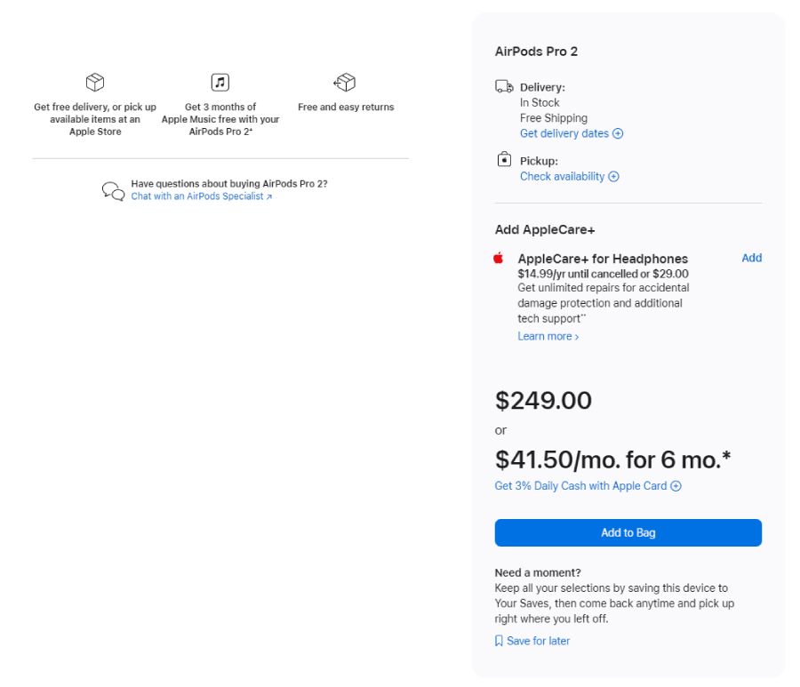
And last, of course, is the Add to bag option. The page has an additional “Need a moment?” element that basically advises you to save the product for later if you’re not sure whether to buy it or not.
Product presentation section
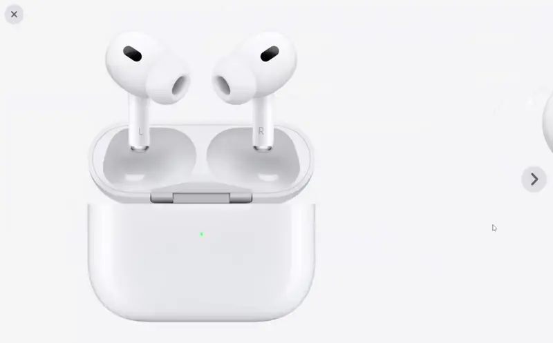
If you thought, ” Wait. The product gallery only showed me one photo of the AirPods.”, this is because the full gallery was moved below the ecommerce section as a part of the product presentation. The gallery is presented in a stylish banner with thumbnails, clicking upon each will open a full-screen modal gallery to enjoy the pods from each possible angle.
Next, the page includes benefits such as explaining the hearing health experience, product information, and a list of exactly what comes in the box.
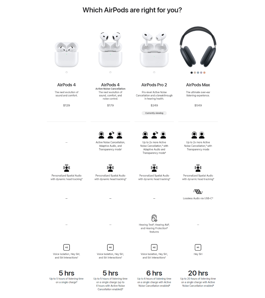
AirPod models comparison table
The last part of the presentation is pretty cool as it compares different AirPods so you can choose which model suits you best. It gives you four different AirPods and their prices, and there is a label “currently viewing” under the AirPods Pro 2. Below starts the comparison table that is styled with icons to give an infographic vibe. It compares the hearing experience for each of those models based on whether the model has active noise cancellation, adaptive audio, hours of listening on a single charge, and many more factors.

Below the product presentation, the page includes a section for the perk “Get 3 months of Apple Music free”.
It ends with an FAQ section with two questions: “Are AirPods Pro 2 covered by insurance benefits?” and “Where are the hearing health features available?”
What makes this product page awesome:
❤️ The option to chat with an AirPods specialist
❤️ Free engraving option with a cool widget. You can personalize your AirPods
❤️ Multiple payment options. This includes AppleCare+ and Apple Card perks.
❤️ Check availability in stores near you for pickup
❤️ A health experience table that compares different AirPods
6. Advance Auto Parts DieHard Platinum AGM Battery
About the store: Advance Auto Parts is an automotive aftermarket parts provider
eCommerce tools: Drupal, HCL Commerce, Salesforce

Product eCommerce section
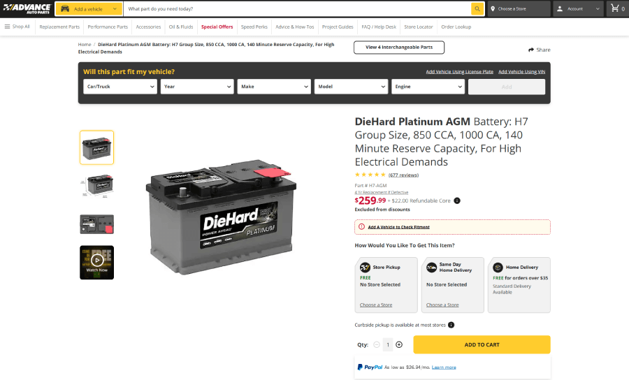
And the last example for this list comes from Advance Auto Parts, which is a very complex and data-heavy eCommerce website built with Drupal. For this showcase, I randomly selected the DieHard Platinum AGM Battery product page.
Will this part fit my vehicle?
What I like is that even before the product content, the page gives you a Will this part fit my vehicle? section where you can select your vehicle type, year, make, model, and engine. After all, it’s the most important thing for people who buy car parts to determine if the part even fits their car or motorcycle, so the page immediately takes that into consideration.

Next, the obligatory product ecommerce section with a split-screen layout where you can see a product gallery on the left and purchase info on the right.
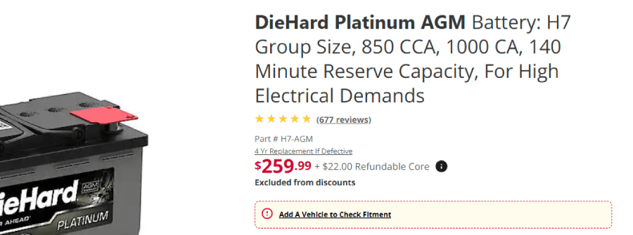
First, you have the full title of the part, which is very detailed and includes the specs. Next comes the rating with an anchor link to read the real client reviews and pricing info. The latter has 4 4-year warranty if defective and a price + refundable core fee.
If you haven’t selected your vehicle info above, this section will give you an error message, “Add A Vehicle to Check Fitment”.

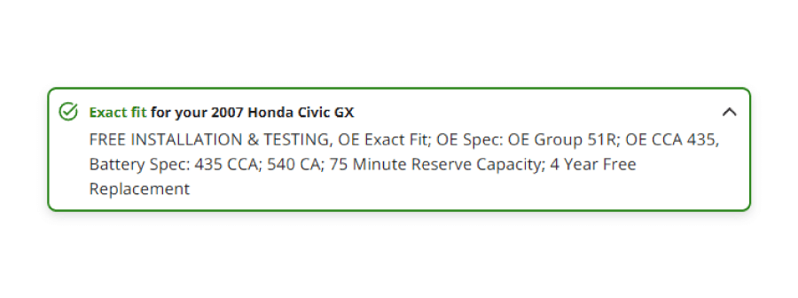
Once you select your vehicle, the message changes either to ” Exact fit for your [vehicle year model engine]” or lets you know the battery “Does Not Fit”.

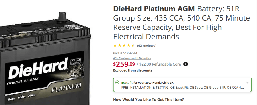

The message is expandable if the part fits your vehicle, and depending on the model, it dynamically gives you info such as if free In-Store Installation may be available for your vehicle and other notes.

In addition, when you select your specific vehicle, a button appears indicating there are other interchangeable parts you can check.
Shipping and payment options
The next section How Would You Like To Get This Item? gives you different options such as store pickup, same-day home delivery, and home delivery. Each option has additional info, such as selecting a store, or a particular amount of money paid required for free shipping.

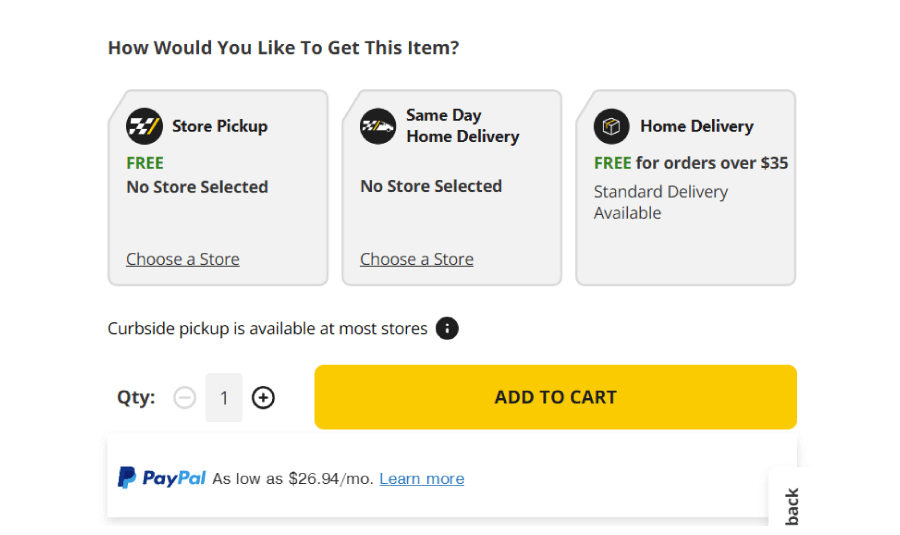
Below the Add to Cart, there is also a PayPal option where you can choose to separate payments for a particular number of months.
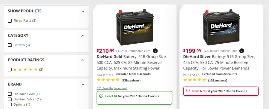
Recommended products section
The recommended products appear right after as a small slider with accessories or similar products you may need.
Product presentation section
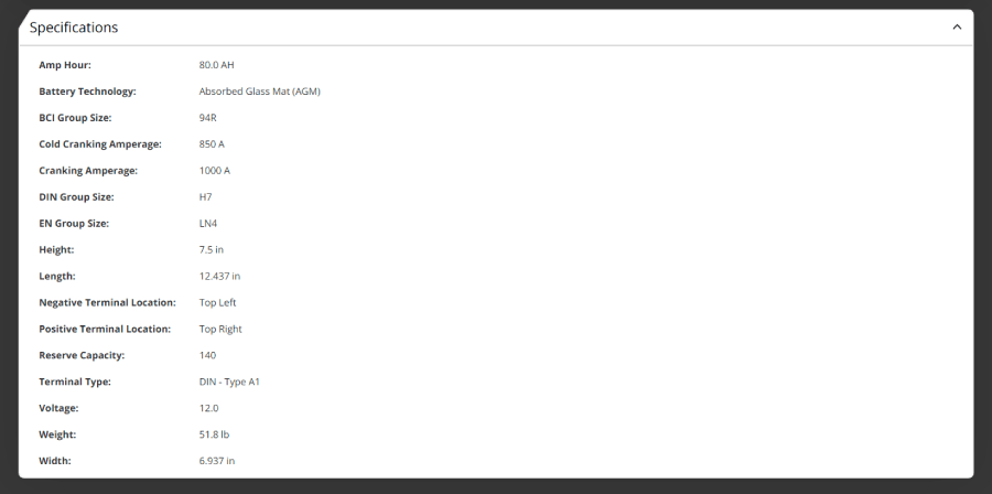
Since this is heavily technical, there isn’t an eye-candy landing page style product presentation with lots of big, high-quality photos. The product information is on point, providing warranty details, product features, and the full specifications list.

Reviews and Questions Section
Next, the customer reviews section first shows a reviews overview with a cool grid gallery of featured photos by customers, the overall rating, and ratings distribution infographic.

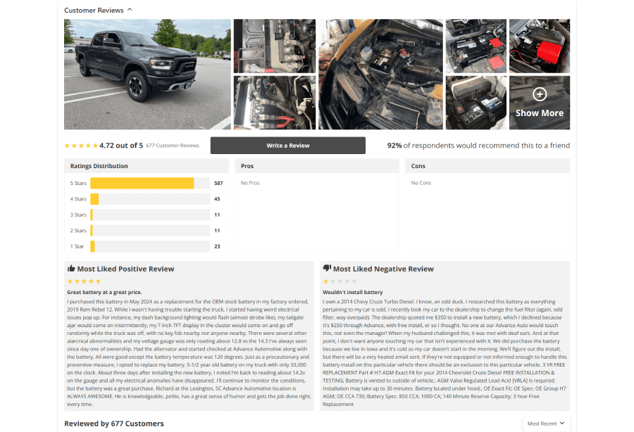
Below, you can also see “Most Liked Positive Review” and “Most Liked Negative Review,” which indicate reviews that most customers agree with.
Customer Questions & Answers
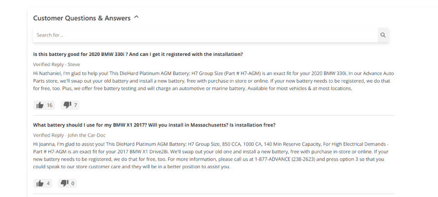
And last, one of the best features of this product page is the Customer Questions & Answers. Here, customers ask anything about the product, and other verified members can reply. The replies have like and dislike buttons so the next user can see if the reply is truly accurate or not. This section even has a search functionality where you can type a particular problem and see if someone has already asked your question.

What makes this product page awesome:
❤️ A widget you can use to add your exact vehicle. Once added, the site shows Exact Fit or Does Not Fit for each part you view.
❤️ Multiple shipping and payment options. Store pickup locator.
❤️ “Most Liked Positive Review” and “Most Liked Negative Review” highlight in the reviews section.
❤️ Questions & Answers section for users with a search bar.
And there you have it! The best eCommerce product pages I could find. Each one brings its own flair, turning casual browsers into committed buyers. If your product pages could use a little extra sparkle, I hope you feel inspired and take some ideas from these examples. After all, a well-crafted page can be the difference between “just looking” and “Shut up and take my money!”
In the meantime, if you want to enjoy more awesome examples and breakdowns for inspo, why not check out these articles:
- 28 Unique Typography Website Examples You Should See
- 24 Minimalist eCommerce Websites With Creative Twist