Email marketing has been one of the oldest digital marketing channels used for promotion, lead, and sales generation. Both marketers and customers hold email in very high regard. 89% of marketers use email as their main marketing channel and 72% percent of customers prefer email as their main channel for business communication.
This is a testament that despite its age email marketing is alive and well. In fact, there are some more stats to prove that.
- Email marketing ROI is 4200% ($42 for every $1 spent).
- 59% of B2B marketers prefer email for lead generation.
- Email is 40% better at converting (in comparison to Facebook and Twitter).
- 40% of B2B marketers claim that email newsletters are the most important tactic in their content marketing strategy.
- 37% of respondents named email as the most effective channel for customer loyalty and retention, while websites were named by 13% and social media by only 11%.
- Marketing and advertising emails influence the buying decision of 50.7% of customers.
- Email marketing is mostly used for lead generation (85%), sales (84%), lead nurturing (78%), and customer retention (74%).
If you want your company to take full advantage of the power of email then you should know the most important aspect of email marketing – the best practices for email design:
Let’s first cover the 3 main ways to go about email design and an overview of the best practices associated with them.
1. Plain Text Emails
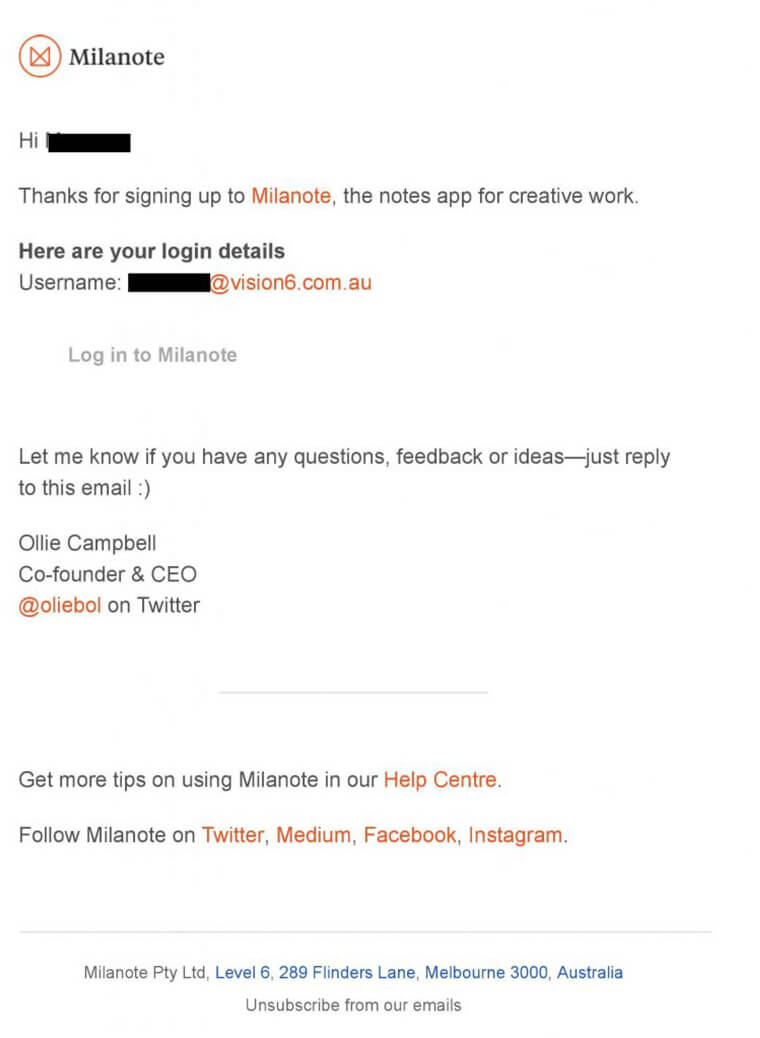
Plain text emails are the most basic form of emails. They don’t include any images or animations and most of the time they are pretty scarce in terms of images or CTA’s.
A plain text email is a great solution for a marketing team that is on a tight budget. Usually, the design of these emails is centered around typography and user-optimized copy. Most of the time these emails are not designed by graphic designers but by the writer who writes the copy.
Despite their barebones design Plain text emails do a good job generating leads and awareness for the company. If your company wants to start with email right away they are a great option but you should be looking to upgrade to our next type of email.
2. Rich HTML emails
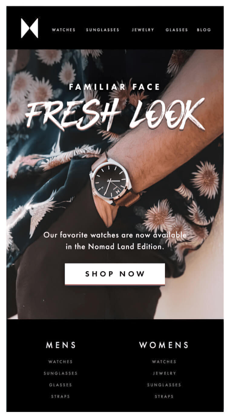
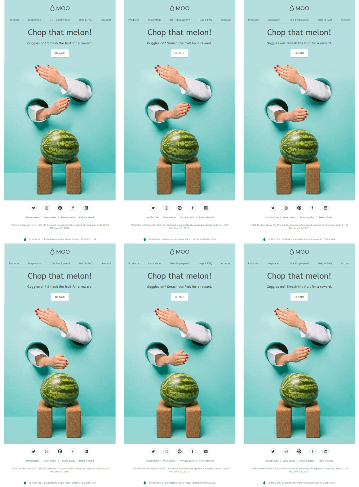
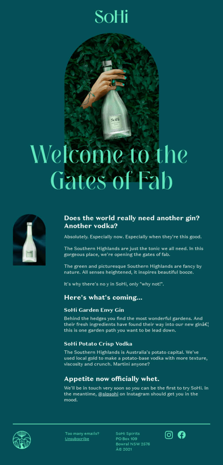
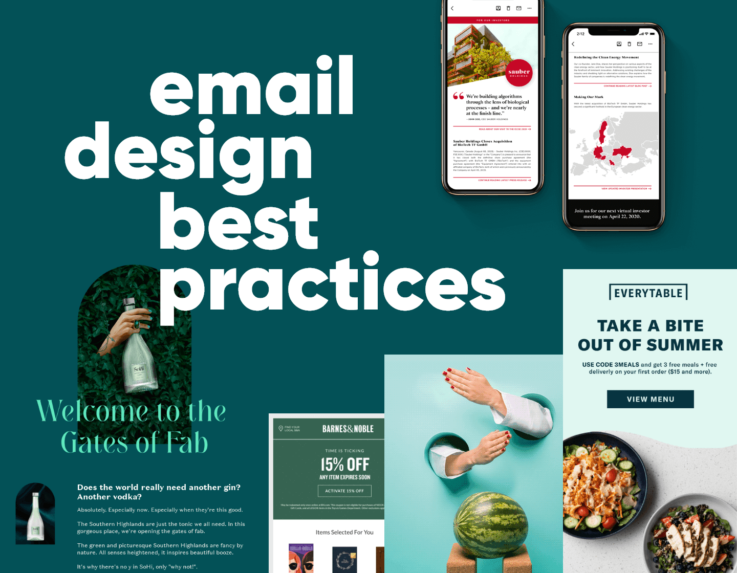
Rich HTML emails are probably the type of emails you’ve seen the most and the type of email you think of when you think of email marketing. These types of emails are a combination of great design and excellent copywriting.
The benefits of Rich HTML emails include:
- They are eye-catching and appealing to the user.
- They offer almost unlimited customization.
- They can include all various types of content like text, images, gifs, CTA’s, and more.
- They have a specific structure.
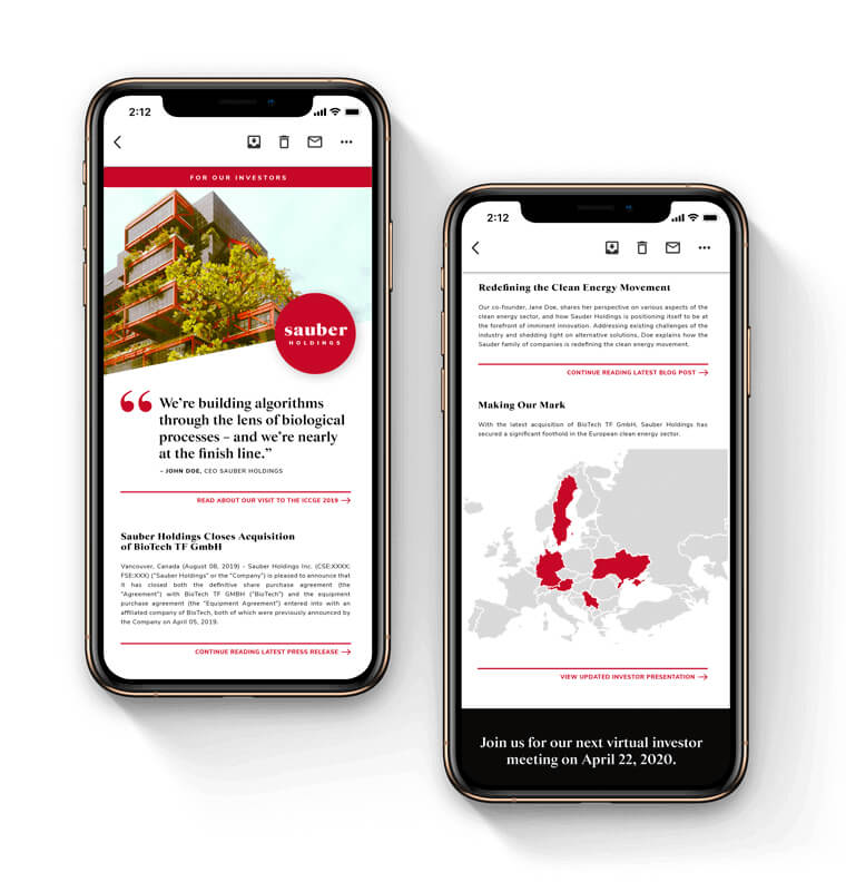
- They look great both on desktop and mobile devices
As you’ve probably guessed there are a lot of moving parts associated with the design of a rich HTML email. Because of that, you will need to delegate a bit more resources to the creation of such emails.
Make sure to avoid these common mistakes when deciding to add Rich HTML emails in your tools for generating leads.
- Not testing on multiple devices to see if your emails display properly
- Overcrowding your emails with design elements to the point where the content feels like an afterthought
- Not optimizing for mobile usability
To help you avoid these issues your team can utilize an email builder. Most email builders allow for freedom of customization without having to worry as much about following best practices of email design.
3. Interactive Emails
Interactive emails are the final form of email design. The difference between them and rich HTML emails lies in the complexity of the technology that drives them. Interactive emails can be quite complex but they can also offer whole new experiences that are simply impossible to achieve with the former 2 email formats.
They do have a major downside though. Most email clients (Gmail, Outlook, etc.) don’t support these technologies. For now, Interactive emails are just a great concept that works well on paper but falls short in the real world.
Keep an eye on them. Once email providers enable their usage you will have a whole new spectrum of email design that you will be able to utilize.
For the rest of the article, we will be focusing on Rich HTML emails as they are the ones that will bring you the most benefit.

4. The Best Practices for Email Design
4.1. The header and the footer.
Header and footer design for emails is what packaging design is for physical products. Headers and footers are the start and end of your email. Here are the best practices you should follow.
- Placing your logo in the header of the email is a great way to brand your marketing campaigns. With time users will get to know your brand and if your content is good users will only need one peek at your banner to know that this is an email they should pay attention to.
- Include useful links in the footer section but don’t go overboard with them. Think about the top 3 most important pages on your website and include links to them in the footer. The footer is also where your email control links should reside (unsubscribe links, email preference settings links, etc.). You don’t need to make them as visible as a CTA but don’t hide them in a way that makes them inaccessible to users.
4.2. Images are a great way to skyrocket engagement.
Using captivating images in your emails is a great way to make your emails engaging and fun to read. To make the best of the image content in your email keep these best practices in mind.
- Utilize high-quality vibrant images. A low-quality image is the quickest way to make a user unsubscribe from your email list.
- Stock images are okay but if you can use original images
- Combine real-life images with graphical content to keep your emails looking too stale
- Be mindful that large images will fill up your CDN (large subscriber lists and heavy images can start getting expensive!)
- Use gifs if possible. Gifs are the best way to incorporate motion in your emails. Since most email providers don’t support videos, gifs are your next best option.
4.3. A great layout is essential to your email design
Massive blocks of text, images that take up 50% of the email, and too many CTA right next to each other – are all things that you may want to avoid when designing your email.
- Make sure that all your elements have enough spacing between them.
- Don’t include paragraphs that are longer than 2-3 sentences.
- Try to fit your content without making the email too long on mobile.
- Ensure that CTAs have enough to stand out.
4.4. Create designs that are viewable on all devices.
Making sure that your emails look great on all devices is one of the most important things you can do. An email that looks crooked and all over the place because of the screen on which is viewed is dead on arrival.
- Get to know what are the most common screen resolutions used and make sure to optimize for them.
- Start designing for the small screen and then expand to the large screen
- Ensure that different email clients render out your email properly
- Make sure your email is visible on both light mode and dark mode as these are now official features on most email clients.
4.5. Optimize your sender name, subject line, and preheader.
If you want users to even get to read your email then the first step is to get them to open it. To optimize your open rate make sure you follow these best practices.
- Give a good sender name to your emails
- Optimize your subject for the highest CTR. Don’t include any baits in the subject such as FW: or RE: these cheap tricks that leave a bad impression on your readers
- Use the preheader to expand on your subject line
Conclusion
By following these best practices you will be able to make the best out of your email marketing campaigns. An email designed with these best practices in mind will be the basis for establishing communications with your customers and generating leads.



![When to Send Emails? [Complete Guide to Success]](https://reallygooddesigns.com/wp-content/uploads/2025/02/when_to_send_emails-193x150.webp)
