Food truck logos are not just some design placed on a colorful vehicle – they’re the face of the mobile restaurant. In other words, they can make all the difference in drawing hungry crowds of people by just driving somewhere. Designing attention-grabbing food truck logos is an art in itself. But, as you know any art can be mastered!
So, let’s browse our selection of 21 attention-grabbing food truck logos and find out how to create one!
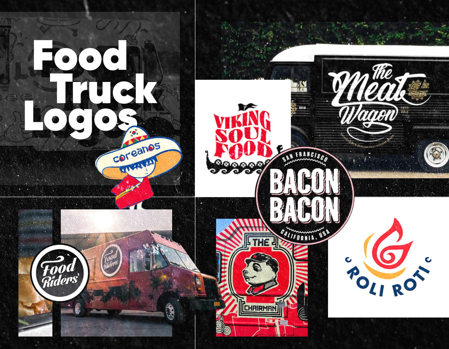
1. The Chairman Food Truck Logo
The Chairman is a food truck that serves delicacies, inspired by the original street food of Asia. So, it’s no surprise that the mascot for their logo is a panda. All details in the design refer to China – the panda’s garments, the ornamented frame around it, and the overall branding of the truck. In addition, the contented panda’s expression promises a delicious experience.
2. The Lobos Truck Logo
The Lobos is a Los Angeles-based food truck that serves high-quality American comfort food. The brand’s name means “the wolves” in Spanish and is the main inspiration for their logo. The depicted wolf seems like it’s breathing fire which refers to their burgers being “on fire”. Adding more to the design is the use of the background color which is associated with fun, happiness, and curiosity.
3. Lucky’s Burger Truck Logo
Lucky’s is an American-style restaurant serving burgers, fried chicken, and other delicious meals in Sydney, Australia. The American diners from the 50s are the inspiration for their cuisine and visual branding. Their logo consists of a logotype written in a retro-looking typeface, and two arcs forming a circle around it. The stamp-like clean design gives an overall feeling of a modern place with traditions.
4. Guac Mexican Food Truck Logo
This is an example that has a much cleaner food truck branding design. The name, guac, is slang for the avocado-based dip guacamole, which originated in Mexico. Presenting the word in all lowercase, customized lettering, and adding the tagline, is enough to communicate the truck’s purpose, The colors of the logo’s highly-decorative letters, and the dot ornaments, all add to the quick recognition of the Mexican Food Truck.
5. The Meat Wagon Logo
This is a design proposal for the visual branding of The Meat Wagon, a food truck serving traditional New Zealand meat pies. The contrast with the matt-black truck nicely highlights the white logotype. The cursive typeface follows a logical and balanced hierarchy, accommodating the icon of a meat pie between the elongated parts of the “t” letter. All the details together create a stylish and memorable design.
6. Sushi & Asian Food Truck Logo
Roll It Up Sushi is a food truck that makes sushi accessible to people on the move. The overall truck design follows Japanese motives, with the stylized waves, rays, and the coy fish with the knife. Moreover, the brand’s logo looks like a sushi roll with two chopsticks in the background. The mountains with the red rising sun, along with the customized “sushi” font, leave a lasting impression of this Asian-inspired logo.
7. Coreanos Food Truck Logo
Coreanos is an award-winning Mexican-Korean food truck service based in Houston, Texas. Their logo mascot smartly represents the brand’s mixed-flavor recipes. It depicts an Asian person in a Mexican poncho, wearing a sombrero. Further, the hat, though being a Mexican classic, has the South Korean flag on it. And, in addition, the mascot wears traditional Korean shoes, thus completing the harmonious look of the Coreanos logo.
8. The Cheese Bar Logo
The Cheese Bar is a British restaurant chain and food truck service, offering irresistible grilled cheese sandwiches. Their wheeled service, The Cheese Truck, as they named it, sports a dynamic yellow and white non-cluttered design. The service’s logo is “stamped” on it in dark blue, featuring the food truck brand’s name written in a cursive typeface with framing and underlining details, adding confidence and positivity to the overall design.
9. Ms Cheezious Street Food Truck Logo
Ms. Cheezious is a brand offering grilled cheese sandwiches from their food truck in Miami, Florida. The street restaurant’s name is a pun on the words mischievous and cheese. And that’s why the logo mascot Ms. Cheezious has this impish look while sitting on top of the grilled cheese sandwich. Also, the vintage pin-up style of the design improves the logo and the business’ good impression even further.
10. Viking Soul Food Logo
Viking Soul Food is a food truck service in Portland, Oregon, offering unique Scandinavian-inspired comfort food. Their name, as well as their logo, pays tribute to the traditional Nordic cuisine, on which their menu is based. The brand’s visual representation is a conventional Viking ship depicted to navigate the waves. The ship’s sail is formed from the restaurant’s name written in bright red, thus adding even more dynamic to the design.
11. Bacon Bacon Food Truck Logo
Based in San Francisco, California, Bacon Bacon is a food truck offering everything from its menu with bacon on it. This logo is an example that cleanly and directly communicates all the important information. From the moment we lay eyes on it we already know where this service is located. And the essence of it is creatively shown with the curly lettering style resembling fried bacon stripes. A beautifully done logo!
12. Senor Sisig Logo
Senor Sisig is a food truck restaurant offering world-famous Filipino fusion flavors in San Francisco, California. Their brand’s logo consists of a pig’s head with a disgruntled expression, along with а saber and а knife. The pig-head choice and the flame behind it come from the original sisig recipe, thus representing the brand’s name and hinting at the slightly spicy flavor of the dish.
13. Roli Roti Truck Logo
Roli Roti is America’s first gourmet grilled chicken food truck. The people behind this rolling rotisserie business are truly passionate about it. This is also implemented in their logo which impresses with simplicity. Besides the business name’s plain sans-serif lettering, it also features an icon. The symbol looks like a flame, referencing the rotisserie, and it also resembles a stylized chicken, thus being right on point.
14. Mei Mei Dumplings Truck Logo
Mei Mei Dumplings is an American-based business serving artisanal dumplings. Their logotype consists of the brand’s name written in a neat, all-lowercase, thin, and elegant typeface, radiating femininity and associating with the women-owned business. The logo also features two fish in yellow and white, radiating positivity and optimism, and also bearing a deeper meaning for in Chinese culture fish symbolize wealth and prosperity.
15. Slidin Thru Food Truck Logo
Slidin Thru is a food truck service, named the best burger and slider food truck catering in Las Vegas. Their logo features a flying colorful burger with the brand’s name on it. The wings and the name depict the mobile restaurant’s specialties and capability to slide through and deliver delicacies everywhere. Meanwhile, the burger’s many colors represent the wide variety of menu options, that Slidin Thru provides.
16. Food Riders Truck Logo
Food Riders is a food truck company in Luxembourg, that serves burgers and homemade fries. Their monochrome logo consists of their brand’s name encircled in a double frame – the inner one being white and wide, while the outer one is thinner and black. Further, the logotype is written in cursive white lettering on a black background, with the letter “F” featuring a swirled arm that seems like steam is coming from the inscription.
17. El Camion Street Food Logo
El Camion is an American-based food truck serving tacos, burritos, and other Mexican specialties. Their straightforward logo is a logotype-only design featuring just the name of the business, which in Spanish means “the truck”. Depicted in all lowercase, easily legible, bright red letters, the logo stands bold and confident radiating excitement, passion, and energy.
18. Kogi Street Food Truck Logo
Kogi is a BBQ Taco truck company in Los Angeles, famous for combining Korean with Mexican food. As they are called Kogi Korean BBQ and mainly cook their dishes on a barbecue, it comes naturally that their logo icon is a fire flame. It also symbolizes the brand’s passion for what they do. Meanwhile, the inscription looks like it was written by hand with a piece of coal, adding creativity and more personality to their image.
19. The Grilled Cheese Truck Logo
This logo example is of a food truck business serving grilled cheese sandwiches. It is pretty straightforward featuring a food truck pressed between two toasts. The vehicle is in motion with fire coming out of its exhaust, thus hinting at the fastness and mobility of the wheeled restaurant. In addition, the brand’s name is also plainly presented, being positioned on a wide spread of melted cheese coming out of a cut sandwich.
20. Waffle Love Logo Street Food Truck
Waffle Love is an American-based company offering a gourmet waffle experience through its food trucks and shops. The brand’s logo is simple and on point, reminding of the popular old-school tattoos of a heart with a ribbon featuring an inscription. It’s a literal representation of the founder’s love for waffles which started from his very first liege waffle bite that inspired his business idea.
21. Moshe’s Coffee & Drinks Truck Logo
This example shows the branding of a mobile coffee business. Here, the logo and the brand’s name are presented in white, with delicate brown borders and accents. The icon, a steaming cup of coffee, looks inviting and tasty, quickly attracting customers. Further, the logotype communicates clearly to the clients what this place is, evoking trust and practicality with the help of its traditional serif all uppercase lettering.
22. The Cow & The Curd Truck
The Cow & the Curd is an American food truck business, selling battered fried cheese curds and other delicacies. Its logo combines all the important details about the brand – an image of a cow, licking its mouth, hinting at the tasty treats offered, and, also, the place where the truck sells its goods. Designed in a circle shape with a ribbon below it, it suggests authenticity, reliability, and quality of the service.
Tips for creating effective food truck logos:
1. Try not to clutter your logo design. Stick to simple, easily recognizable symbols or icons that reflect your cuisine or theme.
2. Embrace the power of colors! Strategic color choices can make your logo pop. Consider using bold, eye-catching hues that stand out in the busy city streets.
3. Ensure your logo is scalable, for it must remain clear and impactful, whether scaled up to billboard proportions, the side of your food truck, or squeezed into a social media avatar.
4. Choose fonts that are legible, distinctive, and aligned with the personality of your food truck. Whether it’s playful, sophisticated, or somewhere in between, let the typeface do the talking.
5. Before finalizing your design get some feedback if needed. This way you can be sure that it sends the right message and makes people crave the cuisine you’re offering.
Final Words
When creating food truck logos, the recipe for success lies in simplicity, color, scalability, and legibility. Following the tips and good practices can ensure your logo stands out among the competition of street food trucks.
So, gather some inspiration and creativity, and start crafting a food truck logo that attracts hungry customers wherever your wheels go!
If you need more inspiration to get you started, try out our other logo collections: