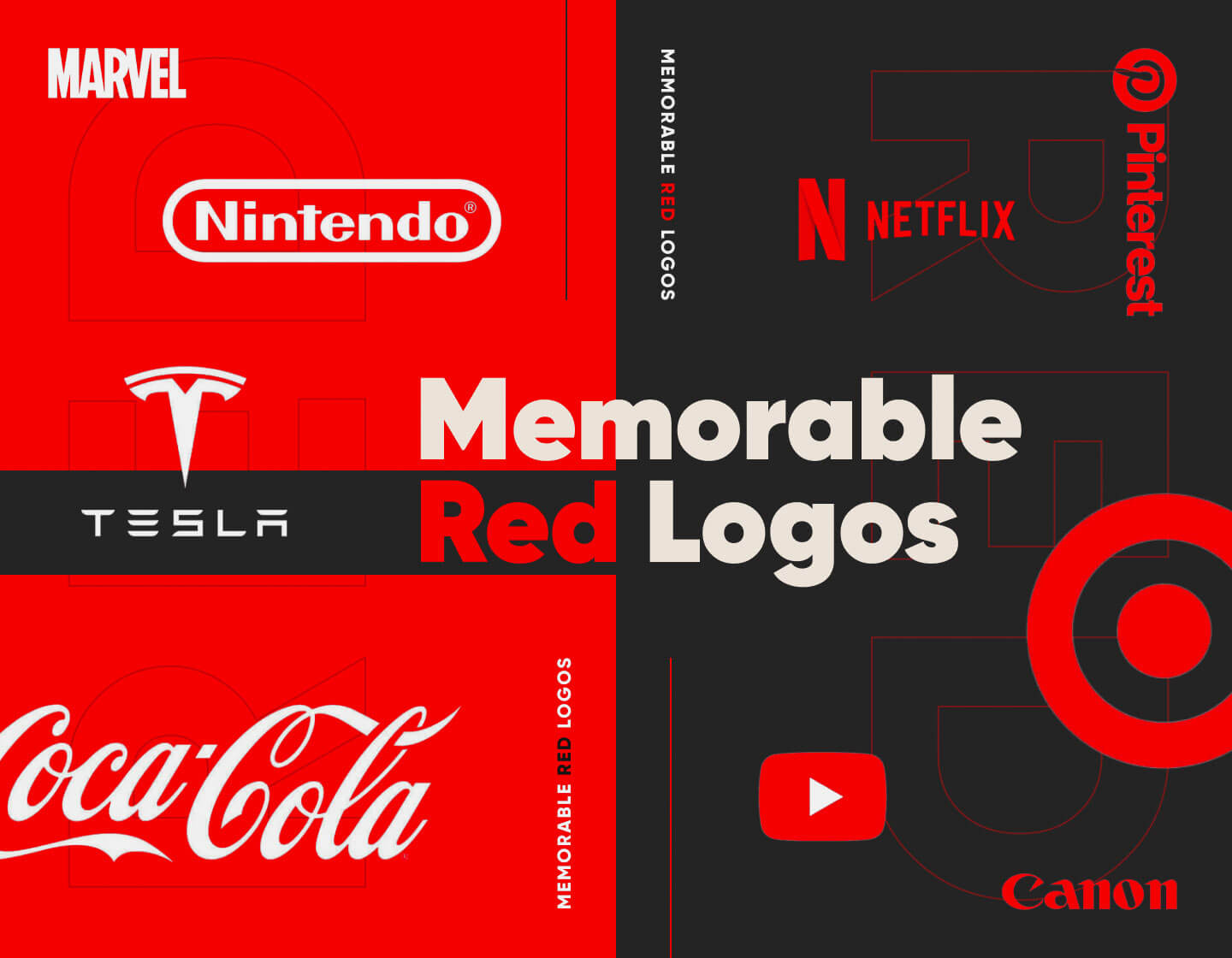
When talking about the image of a brand, first impressions truly matter. Sometimes only a look at one’s logo is enough to win the client over. That’s why red logos are such a popular choice for many companies – they are attention-grabbing and bold. The color red evokes strong emotions, from excitement to passion and power. It also associates with love, energy, and action, and creates a sense of urgency. These qualities make red the perfect color for a distinct and brave logo design.
We’ll look at some of the most famous and recognizable red logos, which have overtaken the world and have proven successful. And love them or hate them, you’ll surely remember them. So, let’s start!
1. YouTube
YouTube is the largest online video-sharing platform in the world. Its logo features an icon shaped like a bright red TV or computer screen with a white “Play” button positioned at its center. The symbol’s red color provokes action and brings a sense of excitement, reflecting the entertaining and informative content of the platform. The sans-serif, straightforward typeface used for the logotype hasn’t changed since YouTube’s beginning in 2005, thus keeping the logo distinctive and memorable.
2. H&M
H&M is one of the biggest retail-clothing companies worldwide and their logo is well-known in almost every country. The famous monogram, standing for “Hennes & Mauritz”, is composed of the names’ first letters with a small ampersand between them. The logo is executed in a bold handwritten-like typeface, adding a personal touch to the brand’s image. And, in addition, the red-colored design represents the retailer’s passion, style, and confidence in affordable clothing production.
3. Levi’s
More than a century ago Levi’s started the evolution of jeans and since then they have been the epitome of this functional attire. The company’s logo reflects its passion and traditions in jean apparel by displaying its name on a red, distinct, geometrical badge-like background. The lettering’s typeface stands strong and bold, with the sans-serif style exuding simplicity and style. Thus, the overall effect is impressive and masterfully represents Levi’s devotion to quality clothing manufacturing.
4. Netflix
Netflix is one of the world’s most widely used and known video streaming services. Their visual identity is built on the streaming giant’s name, written in a modern, simple sans-serif typeface with all letters capitals. The red-colored inscription is slightly curved on its lower side, thus resembling a cinema screen and stimulating excitement and action. Netflix also has a ribbon-like letter emblem which they use for an icon, where the full name doesn’t work well, ensuring recognizability and quick access everywhere.
5. Coca-Cola
Coca-Cola has probably the most iconic and recognized logo ever created. By using the red and white color combination it stands exciting and generates a feel of anticipation and desire, while also reflecting the company’s passion and confidence in its product. The chic and elegant lettering with its handwritten font is probably the logo’s most distinctive feature and is definitive for the brand’s personality. It is fair to say that without the Coca-Cola logo, the world of visual identities would never be the same.
6. KFC
The famous fast-food chain Kentucky Fried Chicken is another one that smartly utilizes the qualities of red color. The icon that its logo features is the stylized image of the company’s founder Colonel Sanders. His face has been a part of the brand’s visual identity for over six decades, thus becoming the symbol of KFC. With the red, white, and black color palette and the italicized capital lettering, the logo exudes passion and power and reflects the years-long history of the restaurant chain.
7. Budweiser
Budweiser is a globally famous American lager beer, a leader in its branch. Its distinctive logo makes it quickly recognizable among the shelves of bottles in the stores. Its current version features its famous red bow-tie background with the beer’s name on it. Further, the classic white cursive lettering represents the brand’s years-old beer-making traditions. In addition, all the design elements are italicized making it appear elegant, classy, and timeless.
8. Canon

Canon is one of the leaders in manufacturing photo cameras, lenses, and equipment. The Japanese brand’s logo consists of only a logotype with the name displayed in a custom, bold typeface. The solid letters, with their deep red hue, and the fact that this exact design has remained unchanged for almost 70 years, make Canon’s image stable, reliable, and decisive. The letters’ sharp elongated details add to the brand’s identity making it seem dominant and powerful.
9. Detroit Red Wings
Not a big fan of experiments, the ice hockey team Detroit Red Wings, hasn’t changed their logo since 1949. The sustainable design features a winged wheel in red and white that represents the players’ fastness, professionalism, and proficiency. Moreover, the decorative typeface of the team’s name nicely complements the symbol. Further, the bright red design represents the team’s confidence and determination to win their games.
10. Marvel
The entertainment media and comics leader Marvel is here to save the day. Or at least that is what its logo exudes. A bright red rectangle background makes the massive, white, interconnected letters inside it pop out. The bold sans-serif all-uppercase lettering evokes a sense of power, strength, and reliability, while the contrasting red color adds excitement and a promise of entertainment, reflecting the essence of Marvel’s productions.
11. Mitsubishi
Mitsubishi’s logo is a literal representation of the company’s name, meaning “three diamonds” in Japanese. Its icon is the result of incorporating the family crests of the founder’s family and that of his first employer. Further, the choice of red for the symbol is considered auspicious, for it is one of the national colors and bears a deep meaning in the culture of Japan. And, in addition, the all-capital lettering looks neat and strict, reflecting the brand’s professional approach to their business and products.
12. Nintendo
Nintendo gives us another strong Japanese example. Given that the brand is one of the leaders in gaming, it seems natural to present its visual identity in red – a symbolic color for Japan and the entertainment industry. The stretched rounded frame around the brand’s name balances the logotype, which stands boldly, written in its white, sans-serif, modern typeface. The overall design evokes a sense of adventure, excitement, and fun while adding power and excellence to Nintendo’s image.
13. Pinterest
Pinterest is a popular, widely used online platform for “pinning” images of interest. The use of red here represents the love and passion for beauty and the entertaining side of photo-sharing through the platform. Above all, the Pinterest icon is so on point – with its circle background in the center of which the contrasting white “P” is shaped like a pin. In addition, the bold sans-serif text, also executed in red, looks modern and reinforces the exciting image of the portal.
14. Target
Target, a chain of American department stores, hits the “bullseye” with its straightforward yet effective logo design. The company’s logo design consists of an icon depicting a red and white target and a logotype placed just below it. Further, the store’s name is set in all-uppercase, bold, classic lettering, leaving the focus on the plain symbol, which is easily recognized by the public.
15. Adobe
Adobe is an American software development company, widely recognized and used by creative professionals. Its logo features Adobe’s signature “A” integrated in a red square, giving the icon contrast and accentuating the brand’s innovative approach and passion in their work. The company’s name wears the same bright red color as the symbol and is depicted in a modern and playful typeface with the characters “d” and “b” mirroring each other.
16. LEGO
The worldwide famous toy manufacturer LEGO has always had its name written in capital letters throughout its logo history. Its current design is logotype-only featuring the company’s name depicted in a rounded, extra-bold typeface, looking playful and catchy. The double border in black and yellow nicely frames the lettering and contrasts with the red square background, adding to the brand’s image as being friendly and fun.
17. Tesla
The American electric car manufacturer Tesla certainly has a modern and memorable red logo. Its sharp symbol looks like a stylized version of the letter “T”, which above all stands for Tesla. But, that’s not all about it, for it also depicts one of the segments of the electric motor. In addition, the logotype with its custom futuristic typeface as well as the brand’s vivid red hue further reinforces the company’s image as being innovative and revolutionizing the car market.
18. KitKat
The famous dessert KitKat is another example of a food manufacturer embracing the red color as an appetite stimulator. Its logo features a diagonally tilted elliptical double frame in which the brand’s name is displayed. With its 3D effect, the lettering looks playful and energetic and goes perfectly with the little almost heart-shaped element depicting the “Nestle” wordmark. Distinct and memorable, KitKat’s logo perfectly illustrates the company’s love and passion for sweets.
19. The Rolling Stones
More than 50 years ago The Rolling Stones had this idea to create a logo for their tour and the design world has never been the same since then. The tongue and lips logo is inspired by the goddess Kali and represents the band’s rebellious nature, while also referencing Mick Jagger’s habit of sticking out his tongue. The red design exudes passion and lust, bringing forth also a sense of excitement and sexual energy. It is an amazing example of a successful commercial logo and probably the most famous band logo in history.
20. LG
The South Korean multinational conglomerate LG sports a very distinctive and easily recognizable logo. Since its debut in 1995, it has undergone only slight changes. The composition of the brand’s initials and a solid white dot shapes the emblem as a stylized smiling face. It also corresponds with the company’s slogan “Life’s good” and shortens the distance from the public. The red color in the visual branding depicts LG’s friendliness and emphasizes its commitment to excellence.
21. Rakuten
The Japanese tech conglomerate gives us another effective red logo example. Consisting of only the company’s name, the design wears a customized typeface that looks professional, practical, and trustworthy. The use of red depicts Rakuten as powerful, reliable, and energetic, honoring its deeper symbolism for the Japanese nation. It also reflects the brand’s progressive approach to growth and its authority in its field.
22. Lenovo
The Chinese multinational technology giant Lenovo has a pretty straightforward logo. It features just the company’s name written in a sans-serif font with an accent on the “e” which is slightly rotated. With its clarity and simplicity, it depicts the brand as approachable and professional. In the meantime, the design’s red-colored background exudes Lenovo’s passion for innovation and excellence, also associating the manufacturer’s image with confidence and reliability.
23. TCL
TCL is a Chinese electronics company that has also adopted a red logo design. TCL’s visual identity is composed of a red rectangle with a rounded upper-left corner, and the company’s abbreviation displayed at its center. The text is executed in all-capital white letters sporting a plain sans-serif typeface, exuding reliability and progressiveness. The modern red design reflects the brand’s passion and energy, as well as its straightforwardness and innovative approach to technology.
Tips on creating memorable red logos:
- Before starting your red logo design, it’s essential to understand what the color represents and decide if you want to be associated with it. Red can signify various emotions and ideas, including energy, love, danger, and importance. In other words, think about how you want your audience to feel and choose wisely.
- Not all reds are the same. Bright reds are bold and energetic, while darker reds convey sophistication and elegance. Select a shade that aligns with your brand’s personality and the message you want to communicate.
- Ensure that your red logo is easily readable and visually appealing with the help of contrasting colors. For example, white, black, and gray are excellent choices for text or background elements. Moreover, high contrast helps your logo stand out and makes it more memorable.
- A simple design is often more effective. That is to say, avoid overcrowding your logo with too many elements. A clean, minimalist concept ensures your red logo is easily recognizable and scalable.
- Further, your logo will appear in various formats – from business cards and websites to large prints and social media. So, test your design in different sizes and backgrounds to ensure it keeps its clarity and message.
Final Words
Red logos can be a powerful tool in creating a strong brand identity, and that’s why some of the globe’s leading brands’ identities have adopted the color. And, as you can see from our list the right shade and design work wonders for a truly unforgettable logo. By understanding the psychology of the color red and following our pieces of advice you can create a design that certainly stands out. So, get ready to catch the world’s attention and start designing your new red logo!
If you enjoyed this article, you may also check our other logo collections: