

Single-product websites are all about keeping things simple and making one product the star of the show. In this article, we’ll take a look at 26 awesome single-product stores that do just that. We’ll check out how they use clean designs, eye-catching visuals, and smooth animations to keep you hooked. These sites focus on making everything easy to navigate, with the product taking center stage. By the end, you’ll see how these websites create a seamless experience that makes you want to check out the product even more. Without further ado, let’s proceed!
1. Heavn One – Futuristic Website for a Smart Lighting System

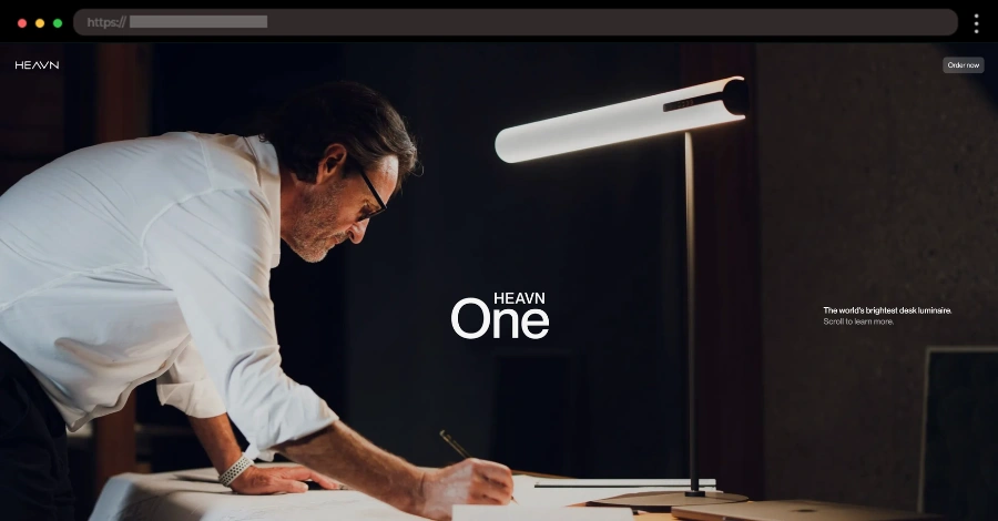
This site feels like stepping into the future. Heavn One’s website perfectly matches its innovative smart lighting system with a sleek, modern aesthetic. The dark theme with yellow accents gives off a futuristic vibe, while smooth scrolling and interactive elements make exploring the product a breeze.
✨ What we like:
- Futuristic, sleek design with yellow highlights
- Engaging interactive elements and smooth animations
- Clean layout that makes learning about the product easy
2. Koffiracha – Bold & Spicy Website for a Coffee-Chili Sauce

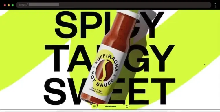
This one’s for the flavor lovers. Koffiracha brings the heat with a website that’s as bold as its coffee-chili sauce. The colorful theme with fiery accents makes the product pop, and playful animations add a dynamic touch. Large, mouthwatering images of food make you want to try it now!
✨ What we like:
- Bold design choice
- Big, high-quality images of food pairings
- Smooth engaging animations
3. Daylight – Minimalist Website for a Paper-Like Computer

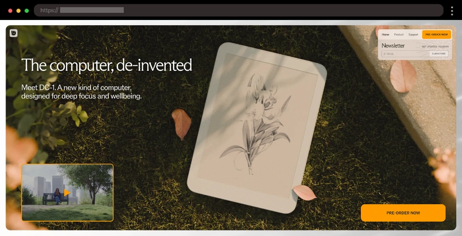
Daylight Computer keeps things fresh and futuristic with a clean, light design that mirrors its eye-friendly screen technology. The layout is simple but effective, with high-quality product visuals, smooth animations, and soft color gradients that give it a modern, airy feel.
✨ What we like:
- Clean, minimalist aesthetic
- Soft, eye-friendly colors
- Sharp, high-resolution product images
- Smooth scrolling animations
4. Vazzi – Playful Lube Single Product Website Design

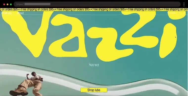
The website is designed to bring Vazzi to life, capturing the brand’s playful energy with vibrant design, seamless navigation, and reliable tech. It features bright colors, bold fonts, and quirky animations, creating a dynamic scrolling experience. The mix of large product images and playful typography makes it feel fresh, exciting, and totally on-brand.
✨ What we like:
- Bold, colorful design with a playful vibe
- Fun energetic animations
- Large product images of the product
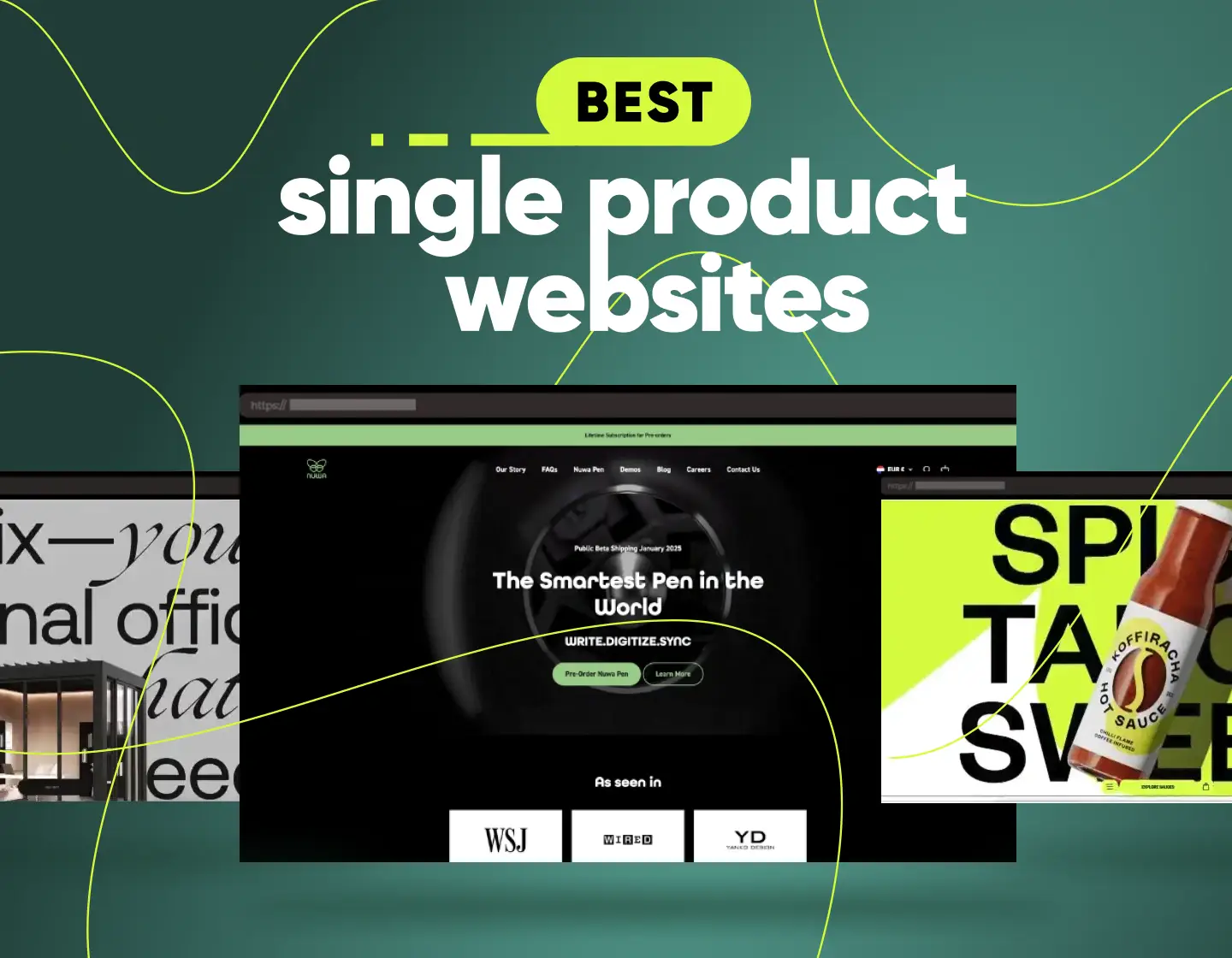
5. Truff – One Product Shopify Store for Truffle-Infused Hot Sauce

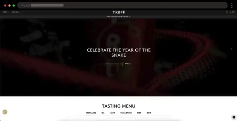
Luxury and bold flavors come together in Truff’s sleek website. Dark, rich colors set the tone for exclusivity, while elegant typography and high-end product shots make everything feel premium. The simple yet striking layout keeps the focus on the sauce and its gourmet ingredients.
✨ What we like:
- High-quality product photography
- Elegant design that feels premium
- Dark, moody color scheme
- Simple but striking layout
6. Clicks – Minimal & Clean Website for a Smart Keyboard Case

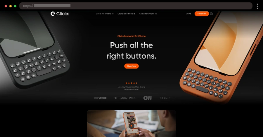
Clicks takes a modern approach to showcasing its sleek smartphone keyboard case. The website keeps things simple and functional, mirroring the product’s design. With a neutral color palette, crisp images, and smooth scrolling, it’s easy to navigate and find exactly what you need. The clean typography and well-structured layout add to the premium feel.
✨ What we like:
- Clean, minimal design that highlights the product
- Smooth scrolling with a well-organized layout
- Crisp, high-quality images of the case from every angle
7. Nuwa Pen – Sleek & High-Tech Website for a Smart Pen

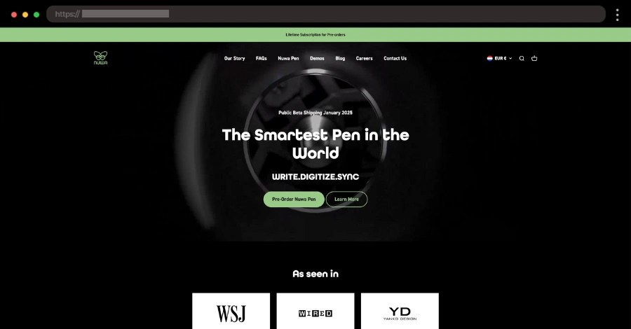
This website totally matches the sleek vibe of the Nuwa Pen. It’s clean, modern, and packed with cool techy vibes, thanks to smooth animations and interactive features that make exploring a breeze. The dark theme with bold white text gives it a premium feel, and the large product images really show off just how sleek the pen is.
✨ What we like:
- Futuristic, high-tech design with a dark theme
- Interactive elements that make the product come to life
- Large, detailed images showcasing the pen’s features
8. Game of Cups – Single Product Website for Game of Thrones-Themed Cups

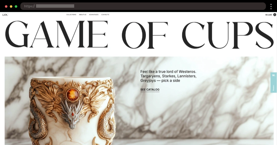
Game of Cups brings the fantasy to life with a sleek black-and-white theme and epic GOT-style fonts. The site keeps things clean while showing off beautiful product images of the cups in various settings. Scrolling feels smooth, and the subtle references to the show make it extra fun for fans.
✨ What we like:
- Stylish black-and-white design
- Game of Thrones-inspired fonts
- Subtle animations for a premium feel
- Stunning product photography
9. Egeon – Sleek Website for High-Performance Footwear

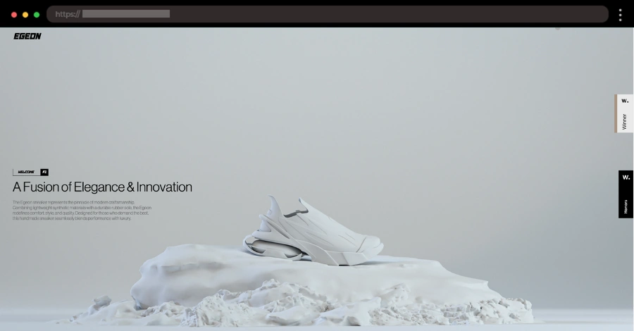
This site brings a futuristic vibe to footwear. With a sleek, minimal design and bold typography, it highlights the product’s unique features and materials. Smooth animations and high-quality product images make the experience feel premium, while a clean layout keeps everything easy to explore.
✨ What we like:
- Sleek, high-tech design
- Smooth scrolling animations
- High-quality images showcasing the footwear’s details
- Minimal yet striking typography
10. Analogue aF-1 – Modern Retro-Style Camera Single Product Website
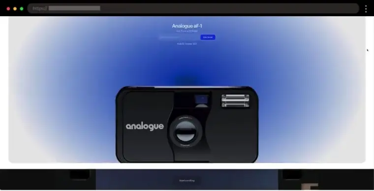
The Analogue aF-1 website keeps things simple and stylish, just like its camera. Smooth animations and transitions give it a high-end feel, while a 360-degree product view lets target audience explore every angle. Big, sharp images and a cool 3D film animation add to the retro aesthetic.
✨ What we like:
- Smooth, engaging animations
- Retro-style 3D film effect
- 360-degree product view
- High-quality product images
11. Boba Ice Cream – Fun and Flavorful Single Product Colorful Website

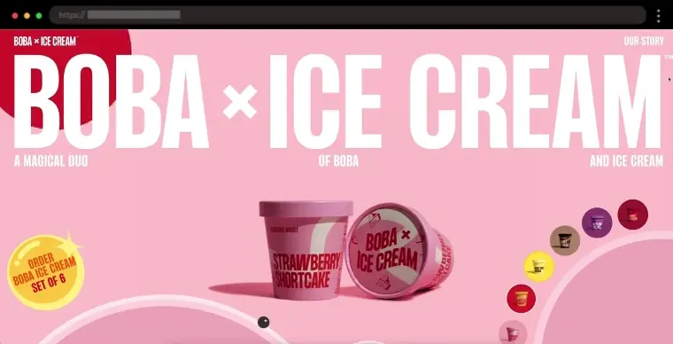
Boba Ice Cream combines the best of bubble tea and ice cream for a one-of-a-kind dessert experience. The website is as playful as the product itself, using bright, bold colors like teal and pink that pop. The whole site feels like a fun adventure with smooth hover effects when you scroll over products and a cool, interactive flavor selection tool. The large images show off their mouth-watering creations, and the layout is simple, so everything is easy-to-find.
✨ What we like:
- Bright teal and pink color combo
- Interactive flavor choice tool
- Smooth hover effects
- Large product photos
12. Pebble Life – Interactive Website for an Electric Travel Trailer

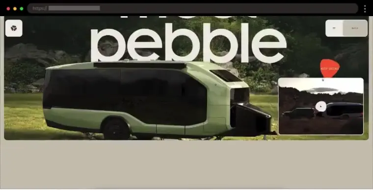
Hitting the road in style has never looked this futuristic. Pebble Flow’s website keeps things minimal yet immersive, using large, high-quality images and smooth parallax scrolling. It’s all about showcasing the trailer’s innovative features while keeping navigation super intuitive.
✨ What we like:
- Large, immersive images of the trailer
- Minimalist, futuristic design
- Smooth parallax scrolling
- Clear sections highlighting smart features
13. Remarkable – Clean and Simple Single Product Website

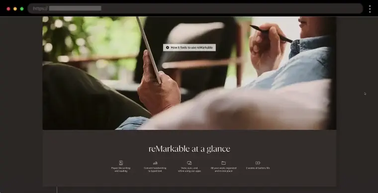
Remarkable’s digital notebooks offer a paper-like feel that’s perfect for anyone who loves writing or drawing. Their website is sleek and minimalist, with plenty of white space and a soft gray background to keep things clean and easy to navigate. The product images are crisp, and the subtle parallax scrolling effect makes the whole experience feel smooth. Everything is designed to keep the focus on the product, making it easy to learn about the strong brand identity behind Remarkable.
✨ What we like:
- Clean white and gray color scheme
- Parallax scrolling effect
- Crisp product images
- Simple, fast checkout
14. Tala – Minimalist One Product Store for a Fruit Snack

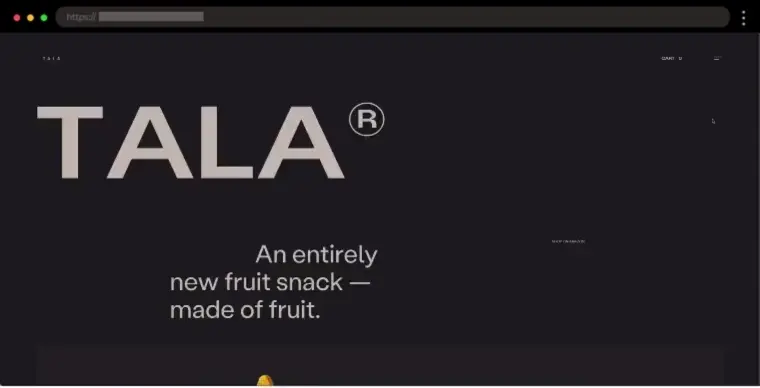
Tala keeps it simple—just like its ingredients. The website is bright and clean, with a soft color palette that lets the fruit take center stage. The layout is easy to navigate, and smooth animations make the whole experience feel fresh and inviting.
✨ What we like:
- High-quality, vibrant fruit images
- Clean and modern design
- Simple and intuitive navigation
15. Nervana – Professional Single Product Website for a Wellness Patch

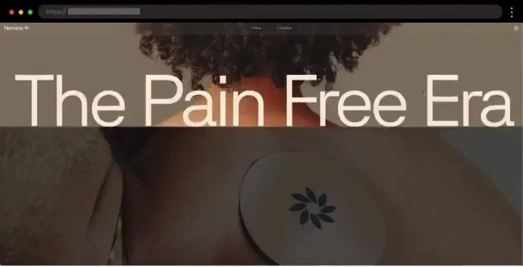
Nervana’s site is just as innovative as its wellness patch. The homepage greets us with a hero image and a remarkable “The Pain Free Era” heading. Earthy tones, large fonts, and simple animations give it a modern but natural feel. Full-screen images highlight the product, while a well-structured layout includes testimonials, FAQs, and science-backed benefits.
✨ What we like:
- Earthy, calming color palette
- Large, easy-to-read fonts
- Subtle animations for a smooth feel
- Clear product benefits and customer testimonials
16. Neebo – Innovative Baby Monitoring Device Single Product Website

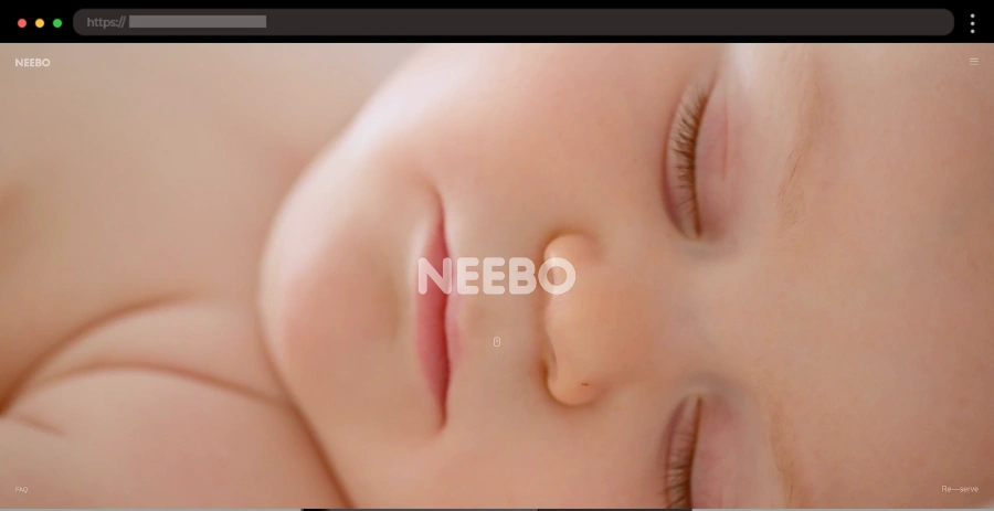
Neebo is a wearable baby monitor that helps parents keep track of their baby’s health and safety. The website has a clean and calming design with soft pastel colors that make it feel gentle and trustworthy. The navigation is simple, and the product’s key features are clearly highlighted. The site uses smooth animations and transitions to create a dynamic experience, making it user-friendly for busy parents.
✨ What we like:
- Soft pastel color scheme
- Simple and intuitive product showcase
- Full-screen sections with smooth animations
17. The Shirt by Matthew – Stylish and Clean Single Product Website

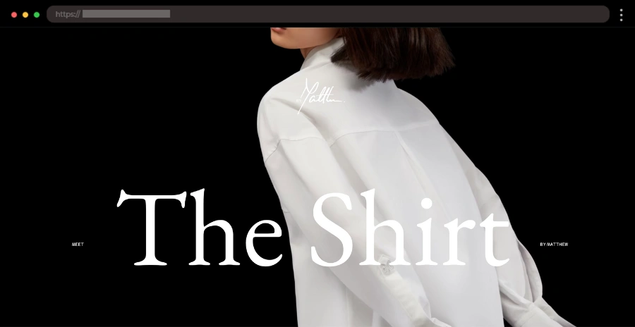
If you’re on the hunt for high-quality, well-tailored shirts, this website offers just that. The design is clean and minimalistic, putting the focus entirely on the shirt. With a neutral color palette and lots of white space, the site exudes sophistication. High-quality images show off the shirts in detail, and the smooth scrolling effects make the experience flawless.
✨ What we like:
- Clean, minimalist design
- High-quality product images
- Neutral color palette with lots of white space
- Engaging scrolling experience
18. Qudrix – Customizable Website for a Modern Office Cabin

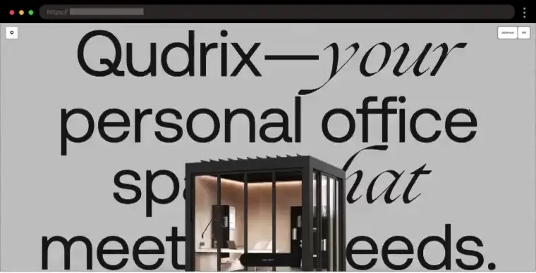
Qudrix offers a modern, long-lasting office cabin, and its website reflects that with a sleek, minimalist design. Big fonts, clean visuals, and a smooth parallax effect make the site feel easy to explore while keeping the focus on the product’s innovative features.
✨ What we like:
- Clean and minimal design
- Bold, oversized fonts
- High-quality product images
- Parallax scrolling for a dynamic experience
19. WRK Timepieces – Bold and Modern Single Product Website

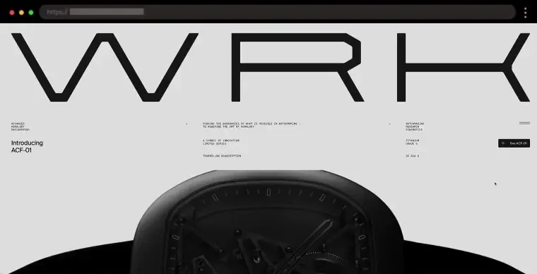
Sleek, modern watches that combine style with function are what this website is all about. The design has a bold, industrial feel with a dark color scheme that makes the timepieces stand out. Large, detailed product photos let you admire every little detail. Smooth animations and transitions give the site a polished, dynamic vibe.
✨ What we like:
- Bold, industrial color scheme
- Large, detailed product photos
- Smooth transitions and animations
- Sleek typography that complements the products
20. Cobfoods – Healthy and Innovative Single Product Website

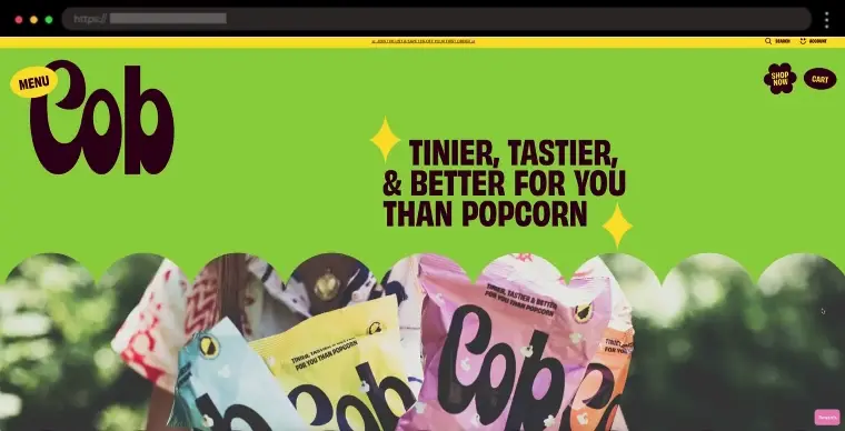
Looking for a healthier snack option? Cobfoods has got you covered with their popcorn made from popped sorghum instead of corn. The website itself is super fresh, with a colorful scheme that feels organic and healthy. The layout is nice and simple, so it’s easy to find everything, and the product images really make the snacks look tasty. Plus, there are some fun animations that make browsing feel a little more exciting.
✨ What we like:
- Fresh, organic green color scheme
- Large, vibrant product images
- Fun animations
- “HAPPY COBSTOMERS” testimonials section
21. Casa Malka – Luxurious Website for a Premium Tequila Brand

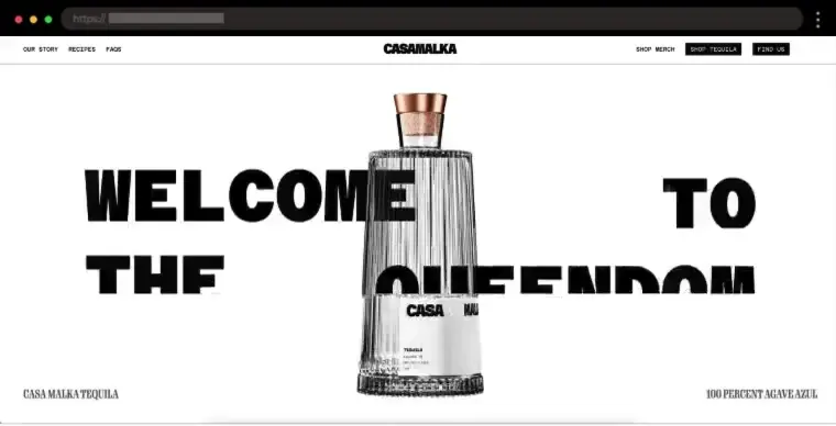
A bold black-and-white aesthetic gives Casa Malka’s website a modern, high-end feel. Large fonts and bold typography add a stylish edge, while smooth scrolling and subtle text animations enhance the browsing experience. Full-screen images showcase the tequila beautifully, making you want to pour a glass instantly.
✨ What we like:
- Premium black-and-white design
- Bold, modern typography
- Stunning product shots in different settings
22. Custo – Smart and Convenient Single Product Website

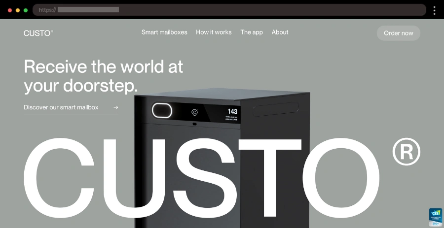
If you’re tired of missing deliveries or hunting down your parcels, Custo’s smart mailbox is here to save the day. The website has a sleek, modern design with a clean monochromatic color palette. It’s easy to navigate, and the product features are clearly laid out. The animations and interactive elements keep things fresh and dynamic, making it fun to explore. Overall, it’s designed to be quick and straightforward, just like their product!
✨ What we like:
- Interactive product demos
- Smooth transitions and animations
- Modern, professional vibe
23. Meadlight – Elegant and Relaxing Single Product Website

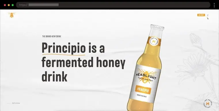
Meadlight is all about offering high-quality mead with a modern twist, and their website feels just as elegant and relaxing as the drink itself. The design features soft tones with yellow accents and a minimalist layout, making it easy to browse their mead product. The whole site has a calm, inviting feel. With smooth transitions and a simple layout, it’s easy to get lost in their world of mead.
✨ What we like:
- Animated 3D bottle of the mead drink
- Clean, minimalist layout
- Smooth transitions and animations
- Calm, welcoming vibe
24. Bugatti Smartwatches – Luxurious and Dynamic Single Product Website

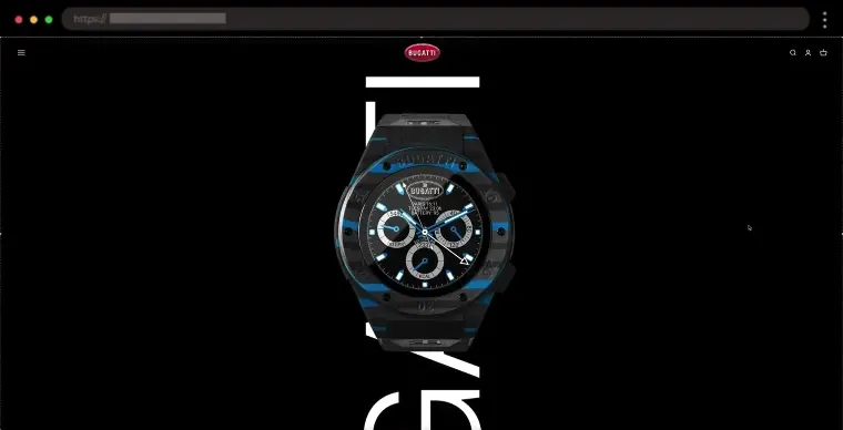
Do you like luxury tech? Bugatti Smartwatches combines both, and their website shows it off perfectly. The design is sleek and modern, with dark tones and metallic accents that give it a high-end, futuristic feel. The product images are stunning, highlighting the premium quality of their watches. There’s also some cool animation as you scroll, which keeps the site feeling dynamic and fresh. It’s an elegant and engaging experience all around.
✨ What we like:
- Sleek, high-end color scheme
- Stunning product images
- Cool animations as you scroll
- Elegant, luxury feel
25. MOOOOR – Bright One Product Store for a Premium Supplement

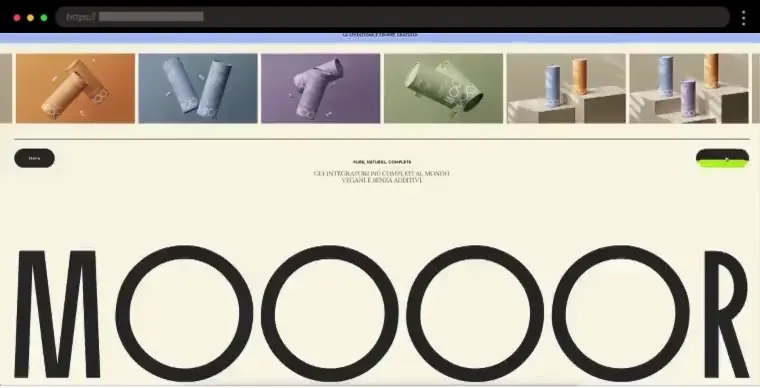
MOOOOR’s site feels fresh and modern, with a warm beige background that lets its colorful product packaging pop. The clean design, large fonts, and full-screen images make everything easy to read and navigate. Plus, there’s a nice parallax effect while scrolling.
✨ What we like:
- Warm, neutral color scheme
- Big, vibrant product images
- Smooth scrolling and parallax effect
- Large, easy-to-read fonts
26. Furbo – Smart Dog Camera to Stay Connected with Your Pet

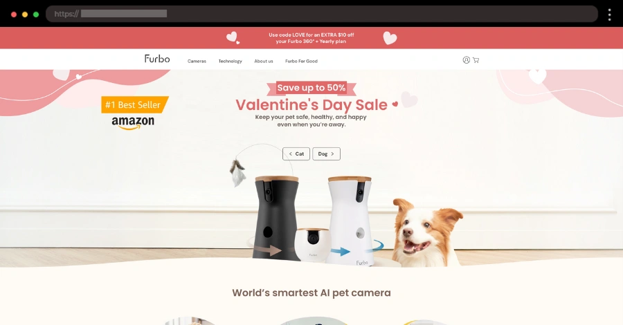
If you miss your furry friend while you’re out, Furbo is an awesome camera gadget for pet lovers that lets you check in and even toss treats remotely. The website is sleek and modern, with a clean design that puts the camera front and center. The color scheme is warm and welcoming, with soft neutrals and pops of yellow that match the product’s fun, friendly vibe. High-quality images show the camera in action, and smooth animations make browsing a breeze.
✨ What we like:
- Warm, welcoming color palette
- High-quality product images and videos
- Fun, pet-friendly vibe
Key Trends in Single Product Websites
Single-product websites are constantly evolving to keep up with design and tech trends. Here are a few key trends that are making waves in the world of single-product e-commerce:
- ✅ Interactive Product Demos
Interactive features like 3D models and AR allow customers to engage with the product before buying. This hands-on experience makes the browsing process more fun and builds confidence in the purchase. - ✅ Minimalist, Clean Designs
Simple designs with plenty of white space keep the focus entirely on the product. Large product images and smooth animations make the site feel sleek and professional. - ✅ Scrolling and Parallax Effects
Parallax effects create a more dynamic browsing experience by adding depth to the website. These smooth visual effects help highlight key features without overwhelming the user. - ✅ Personalized Shopping Experiences
Many single-product websites now offer personalized experiences, like tailored recommendations. This makes the shopping process feel more relevant and engaging for each customer. - ✅ Subscription Option
Subscription models make repeat purchases easy for customers, turning a one-time sale into a steady revenue stream. Auto-replenishment options also ensure customers never run out of their favorite products. - ✅ Video Integration
Including product demo videos or testimonials helps visitors connect with the product on a deeper level. Video content keeps users engaged and adds instant value to the website. - ✅ Bold Typography and Unique Fonts
Bold, oversized fonts are becoming a key design feature, adding personality to the site and making important information stand out. - ✅ Clear and Direct Calls-to-Action (CTA)
Strong, clear CTAs guide visitors through the site and encourage them to make a purchase. Well-placed buttons make the decision process easy. - ✅ Social Proof
Displaying customer reviews, testimonials, or user-generated content adds credibility and trust. Seeing others’ positive experiences helps new customers feel confident in their purchase decisions.
Conclusion
In the end, single-product websites prove that less is definitely more. By keeping things simple and focused, they create a smooth and enjoyable shopping experience that really highlights the product. Whether it’s through sleek designs or clever little details, these sites show how powerful a well-crafted website can be. If you’re looking to create a standout online presence for a single product, these examples are a great place to start for some serious inspiration.
If you’re feeling inspired to start creating your own personal single-product website, here are some more good design examples: