Church logos are truly important for establishing the visual identity of religious communities and institutions. They symbolize the values, mission, and beliefs of the church, providing a recognizable image that can attract and engage both existing members and potential newcomers. And, they are also an effective way to reach out to the audience easily and memorably.
In today’s article, we will look at 20 effective church logos and the different approaches they communicate to the public. And, in the end, we’ll share our tips on creating impactful church symbol designs. Let’s start!
1. Canyon Ridge Christian Church
The logo for Canyon Ridge Christian Church consists of only a logotype executed in a strong uppercase typography that attracts attention. Moreover, the color combination creates a strong contrast making the name lettering stand out. As a result, the straightforward design emphasizes clarity and simplicity and gives the church a professional appearance.
2. First Baptist Dallas Church
The First Baptist Dallas Church logo uses a straightforward symbol design combining a conventional cross with an open Bible. And, the choice of a classic serif font adds a touch of tradition and formality to the overall concept. In addition, the red color conveys energy and passion, making the logo vibrant and eye-catching.
3. Mariners Church Logo
The Mariners Church logo uses a sleek, minimalist design with an encircled monogram, exuding simplicity and modernity. In addition, the black-and-white color scheme enhances the strength of the church’s image. Further, the combination of bold and regular modern typeface and the clean lines of the overall concept gives the logo a contemporary feel.
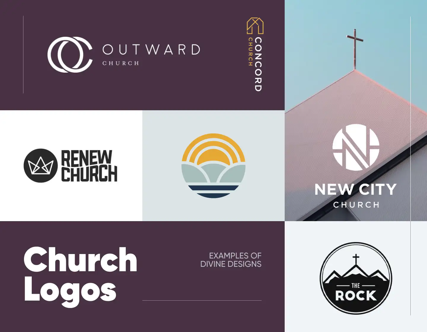
4. Outward Church
The logo of the Outward Church has a balanced and minimalistic design. It features a straightforward, elegant monogram with clean lines, which together with the name’s typeface give the design a sleek, modern, and appealing look. On the other hand, the smaller text and the monochrome color scheme hint at the church’s professionalism and traditions.
5. The Church at RB
This example presents The Church at Rancho Bernardo, in San Diego, California. Their design encapsulates the place’s picturesque setting featuring a stylized image of a sea and a sun shining behind the hills. It also bears a more symbolic meaning with the logo’s circle shape representing the united community, and their commitment and love.
6. Renew Church Logo
The Renew Church is one praising self-acceptance and transformation and these exact values are mirrored in its logo concept. The encircled crown shaped from triangles symbolizes personal action and growth while being in a loving community. After that, the wave smoothly integrated into the modern logotype hints at the easiness and flow with which the church follows its mission.
7. North Point Community Church
The North Point Community Church has also embraced a circular design for its logo icon. It features a double border with four arrow elements in it. Symbolizing the four winds, only the upper one, the North, is colored, thus reflecting the church’s name. The color scheme symbolizes purity and love, which combined with the simple typeface gives the church a trustworthy and approachable look.
8. Cornerstone Church
The Cornerstone Church has a clean and minimalistic visual identity design. Its icon features a monogram with a double-bordered frame looking elegant and exuding a traditional feel. With the logo’s neat serif typeface in which the name is written, the concept also exudes trust and reliability and symbolizes the foundational meaning of a cornerstone.
9. Concord Church Logo
The Concord Church logo also uses a minimalistic approach to achieve its contemporary look. Its single-letter monogram symbol is exuded in a modern and simplistic style aligning with the design’s chosen typeface. In addition, the concept’s color palette associates the image of the church with positivity, purity, and happiness.
10. Elevation Church
The Elevation Church logo is simple and yet attention-grabbing. Its focal point is the symbol composed of a vivid red circle and a white arrow in its upper half. The icon represents the church’s name and its mission to elevate people in their faith. Completing the concept is the simple typeface, which further reinforces the design’s straightforwardness.
11. Fairhaven Church
This example uses a calm, muted blue color for its concept, thus conveying a feeling of trust, reliability, and purpose. Styling the letter “H” as a happy person depicts the church’s confidence in being a haven for people. In addition, the otherwise classic serif typeface hints at the religious institution’s traditions and fair principles.
12. Newspring Church Logo
By choosing the green color for their visual identity the Newspring Church illustrates the principles of safety, harmony, and loyalty of their community. Meanwhile, using this modern, simple, and bold typeface for their name presentation, aligns with the church’s contemporary look and symbolizes its stability and reliability.
13. The Village Church
Using blue and white for its emblem depicts The Village Church as trustworthy and purposeful, and the classical typeface emphasizes its traditions. The logo’s icon features a sign that on a primary look is perceived as a stylized version of the letter “V”, standing for the church’s name. Still, it also resembles a streamlined dove, a powerful symbol in faith representing the Holy Spirit.
14. Whitewater Crossing Church
In this example, the monochrome color palette brings elegance to the design and emphasizes the church’s over-a-century-old history. Plain and direct, the logo’s icon looks like a drop of holy water. At the same time, the bold, straightforward font adds simplicity to the concept and strength and approachability to Whitewater Crossing’s image.
15. The Rock Church
Embracing a circular design this example takes the opportunity to incorporate the church’s name in its graphic presentation. Depicting hills and peaks with a traditional cross standing on top of the highest one, the logo achieves an instant effect, yet its style remains simple. Moreover, the black-and-white color scheme and the bold, contemporary font exude stability and strength.
16. New City Church Logo
In this example, the monochrome palette strengthens the effect produced by the overall concept. The creative logo has an encircled monogram depicting the letter “N” with a modern design giving the church a contemporary look. In addition, the simple sans-serif typeface reflects the approachability and dedication of the holy place.
17. Community Church Nottingham
The Community Church Nottingham also has a visual identity with a contemporary design. Its symbol is created using a pattern of rotating sets of dots forming a star-like shape and evoking a sense of motion and unity, while its colors suggest harmony and safety. The all-uppercase text is set in a neat and sleek modern typeface, which conveys a sense of simplicity and approachability.
18. The Harbor Church Logo
The Harbor Church has an attractive logo with a balanced design, that exudes aproachability and confidence. The color palette of blue and white is associated with the senses of purpose, purity, trust, and faith. And, the encircled icon with a streamlined wave hints at the church’s name, while also embracing the water, a key element in the Bible, as its symbol.
19. Cornerstone Bible Church

This logo example has a circular emblem, too, but here, it has a stylized cross in the center. It also features an abstractly depicted open bible at the base of the cross illustrated by the wavy lines. Meanwhile, the muted color palette adds a calming and trustworthy feel. Completing the logo is the chosen font – a modern sans-serif representing a contemporary and welcoming community.
20. Christ The King Church
Christ The King Church has a logo with an elegantly stylized cross, symbolizing unity and strength, for it is formed by joining four different parts with an angular yet sleek design. The vibrant combination of colors signifies energy and passion with the red, while the blue represents calmness and faith. The text is set in a serif typeface, giving the logo a more traditional and formal look.
Tips on creating effective church logos
- Going for a simple and clear design ensures that the logo is easily recognizable and memorable. So, avoid complex elements that can make the design hard to understand.
- Incorporate symbols that resonate with the church’s identity and mission. For example, commonly used symbols are the crosses, doves, and water representing elements.
- Choose fonts that are readable and reflect the image of the church. Serif fonts often convey tradition and stability, while sans-serif fonts can give a more modern and approachable look.
- Remember that colors play a significant role in conveying emotions and messages. So, use a color palette that resonates with the church’s ideas and values.
- Also, go for a timeless design that will remain relevant and effective with time. Include classic elements that people recognize easily and identify with.
Final Words
To create an effective and memorable church logo you must use a blend of simplicity, symbolism, and a timeless design. The main idea of these emblems is that churches can not only represent their mission, beliefs, and values but also connect with their community. A well-crafted design can be a powerful tool in building a strong and lasting visual identity.
So, if you feel like you have gained enough inspiration, the only thing left to do is start designing the next powerful church logo!
If you enjoyed this article, you may also like: