Display advertising is amongst the most popular methods of digital advertising for raising brand awareness and gaining customers. At first glance, they look incredibly simple and easy to make. But if that was the case, why is it some businesses are getting an ROI out of their display ad campaigns and others are struggling? To answer that question, today I will inspire you with 30 clickable display ad examples and go through the best practices that will bring you leads and fill your inbox.
30 Inspiring Display Ad Examples
With no further ado, let’s look at some awesome ideas for ads that get targeted viewers to stop scrolling and engage with value propositions. After all, the best way to produce something great is by studying how other experts are doing it.
Please, keep in mind that the ads are strictly for educational purposes and to serve as examples and inspiration. I haven’t featured them with the intention to promote any of the services, campaigns, or events the ads promote.
1. Health Equity Explored Display Ad
Here we have an ad sponsored by Harvard Pilgrim Health Care that aims awareness. It pushes to inspire equity and the will to make changes for the good through beautiful imagery and a strong statement.
- Redirects to: Health Equity Explored
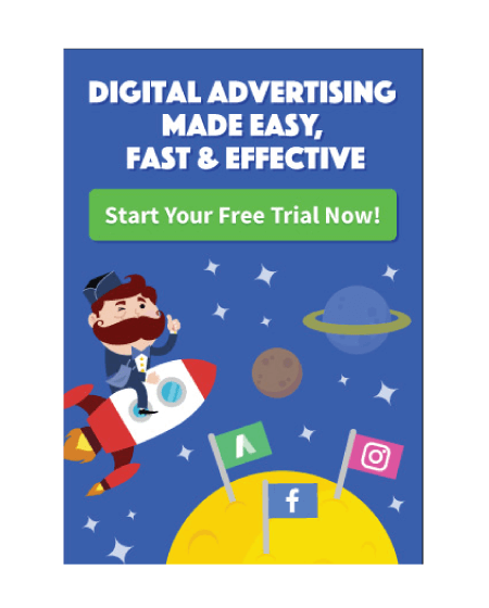
2. AdEspresso Display Ad Example
AdEspresso makes Facebook advertising and targets small businesses and startups who aim to expand their brand awareness. Of course, a brand that claims to be efficient in digital advertising can’t afford a mediocre display ad. This is why what we have here is a textbook example of a great ad design: clean and clutter-free; appealing image; bold readable title with a large bold font; big visible CTA button.
- Redirects to: AdEspresso
3. Kitchen Co Software Banner Ad Example
This feature-focused display ad is clearly directed at digital agencies that can benefit from an efficient ticketing system. The copy even highlights its target segment in a contrasting red color to grab the viewer’s attention. What I like about this design, aside from the cool illustration, is how straightforward and clean it is. It features a brand logo; gives the value proposition loud and clear in a short bold title, and a clear CTA button.
- Redirects to: Kitchen Co
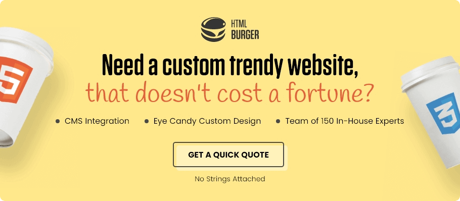
4. HTML Burger Inquiry Display Ad Example
Not all ads need to be flashy to gain attention. Especially if you’re an agency that claims to build trendy websites. Here we have an awesome design by HTML Burger that targets startups and digital agencies who are looking for someone who can deliver a trendy website from design to code and not drain the client’s bank account. The design is clean, modern, and sparkles interest with a catchy copy. In addition, the copy also features three key moments that would interest the target audience: CMS integration, custom design, experts.
- Redirects to: HTML Burger Quick Quote
5. New Chick Hot Sale Display Ad
Nobody does it better than clothing shops. It’s all you need- an appealing image of your hottest product and a Hot Sale stamp. If the viewer likes the model, they will inevitably click to see the offer and read reviews.
- Redirects to: New Chic
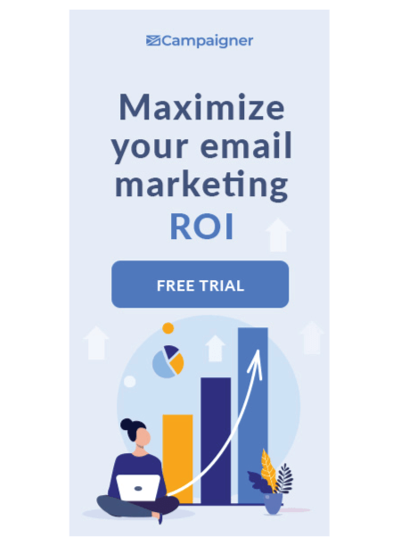
6. Campaigner Free Trial Display Ad
Campaigner is a popular and proven email marketing automation platform. As something that already has a solid reputation and awareness amongst targeted marketers, the ad offers a free trial for its service.
- Redirects to: Campaigner
7. Curiosity Stream Display Ad
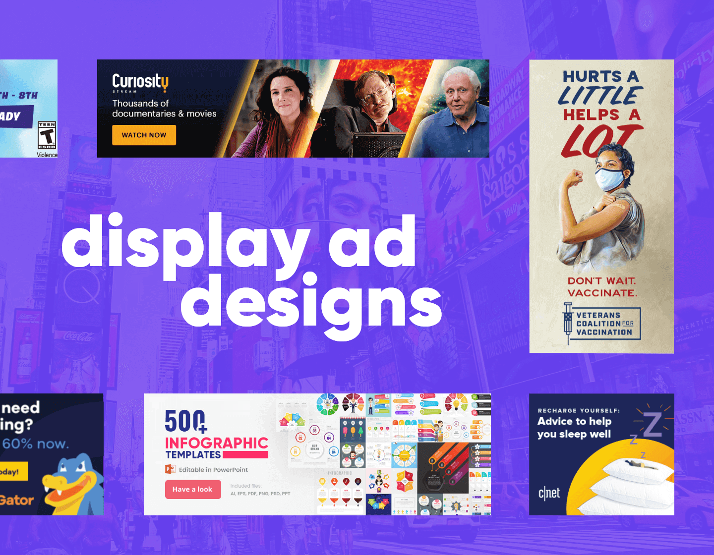
Stream services have surpassed television and with powerhouses like Netflix and Disney +, it’s hard to put your platform out there, unless it’s very niche and targets something specific. With that being said, Curiosity uses a very attractive display ad with modern design and promises to be a niche streaming platform for documentaries with over a thousand names in its collection.
- Redirects to: Curiosity Stream
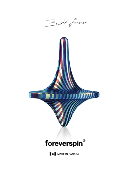
8. Foreverspin Display Ad
A beautiful interesting and incredibly niche display ad that sells spinning tops that spin for minutes. Not everyone is familiar with the beauty of a spinning top, but here we have a chance to learn.
- Redirects to: Foreverspin
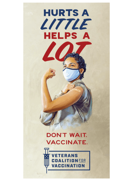
9. Team Rubiconusa
Here we have a banner ad that speaks to veterans to help vaccinate their communities. This is a very strong visual reference to the “We Can Do It!” American World War II wartime poster.
- Redirects to: Team Rubiconusa
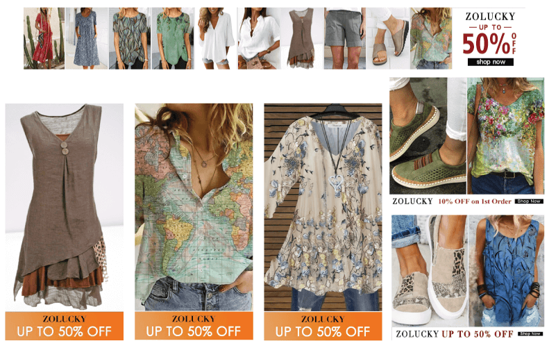
10. Zolucky Woman Clothing Display Ad
So lucky that I found this example by Zolucky. It’s a very cool idea to design a display ad as a moodboard. Here we have exactly that, a fashionable boho chick moodboard that will inspire the specific audience to steal the look.
- Redirects to: Zolucky Women Clothing
11. HostGator Display Ad
This one is easy. Unless you have a subscription to a hosted platform service (ex. Shopify), your website needs hosting. With this ad, HostGator reminds you that you can get one at 60% off. Simple, yet effective.
- Redirects to: HostGator Web Hosting
12. 2021 Top 1000 Report Ad
The 2021 Top 1000 Report claims to include detailed data that businesses can manipulate to their advantage to reach the same level of eCommerce growth. It’s a strong message and puts numbers and facts to the table.
- Redirects to: The 2021 Top 1000 Report
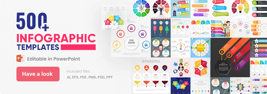
13. GraphicMama Infographic Collection Display Ad Example
This banner ad by GraphicMama is targeted at a very specific segment of users and appears only in the GraphicMama blog for readers who are in need of resources for their presentations. Once they land on the blog that they already trust and see the ad, they will know that GraphicMama offers an enormous collection of high-quality infographic resources for their projects.
- Redirects to: GraphicMama’s Infographic Template Collection
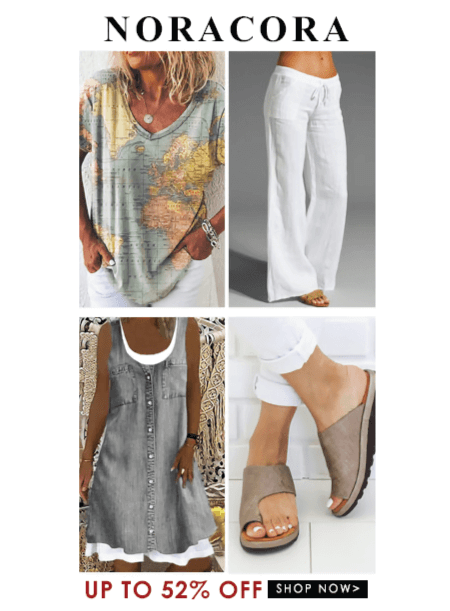
14. NoraCora Display Ad
More good-looking outfits for those who love to buy clothes. One of the best ways to promote your clothing shop is to display your best collection and give it a good sale.
- Redirects to: NoraCora
15. Dermavel Display Ad
This one sparks curiosity because it shows a very high-quality photo of a zoomed product. However, for those who haven’t used it, it’s unclear what exactly the photo is showing. This encourages the viewer to read the copy and makes them even more curious.
- Redirects to: Dermavel
16. Artstation Film and TV Week Display Ad
The popular platform for creators ArtStation uses this ad directly on its homepage to promote an event and welcome the creatives to take part. It’s a very cool way to spread awareness amongst your own user base,
- Redirects to: Artstation Film and TV Week
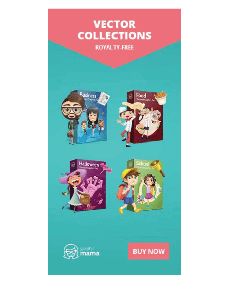
17. GraphicMama Vector Collection Display Ad
Here we have a display ad that showcases vector collections for business, food, Halloween, and school-related design projects. The ad is directed to designers who look for illustrations, as well as educators and speakers who wish to personalize their presentations. As such, it has an attractive clean design with catchy preview images for the four collections and an appealing contrasting color scheme.
- Redirects to: GraphicMama’s Vector Cartoon Characters
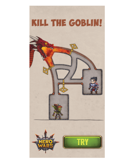
18. Hero Wars Animated Display Ad Example
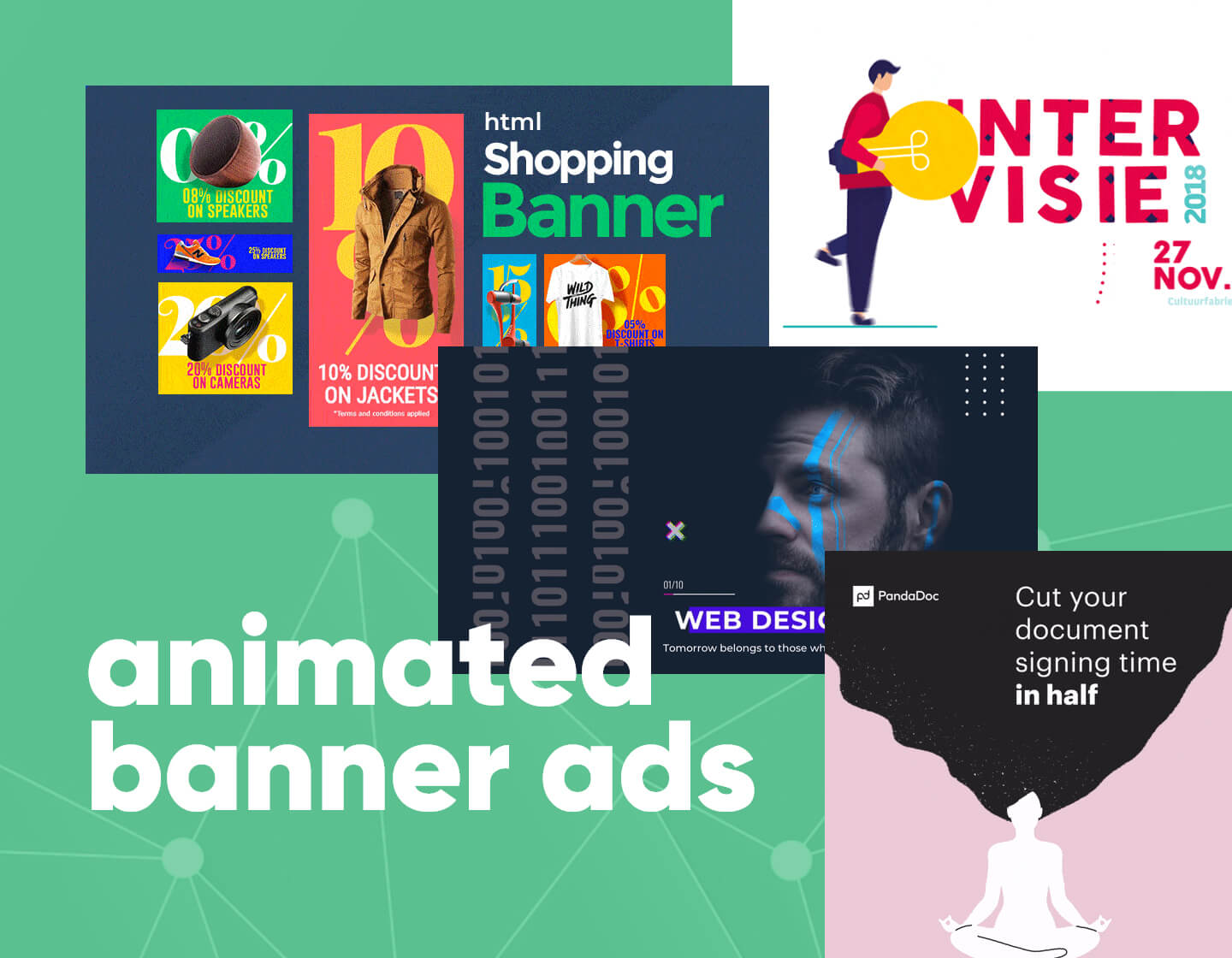
There’s very little chance you haven’t come across this ad while scrolling on Facebook or anywhere really. It aims to promote a browser game by featuring display ads with very clever animations. For example, when Hero Wars shows puzzle gameplay, the one who solves it purposefully makes mistakes to frustrate you. This automatically encourages you to play the game and show how it’s done.
- Redirects to: Hero Wars
19. Shop Greater Newport Display Ad
Here we have two sweet display ads for the same campaign. It’s a platform that helps you find local businesses to support which allows you to make a change in help businesses impacted by Covid and reduce shipping emissions. This is basically a green campaign that captures attention with the promise to become a hero and do something great.
- Redirects to: Shop Greater Newport
20. Mashable Instagram Display Ad Example
Mashable just wants to promote its Instagram account and promises to brighten your day in return. They use a clean design with a welcoming warm gradient.
- Redirects to: Mashable
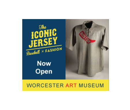
21. The Iconic Jersey Display Ad Example
Worchester Art Museum focuses on one of the most recognizable garments in American culture: the baseball jersey. They do so with appealing imagery and the promise of an iconic experience.
- Redirects to: Worcester Art The Iconic Jersey
22. Rift Tour Display Ad
A collision between Fortnite and Ariana Grande. EpicGames manages to target two giant audiences with this event, however doesn’t elaborate anything on its display ad. Keeping it all mystery for the curious younger audience.
- Redirects to: Epic Games
23. AMG Healthcare Marketing Display Ad
This ad targets a very specific niche of medical practitioners in Alabama who wish to expand their practice and find new patients. The banner promises marketing advice and services.
- Redirects to: Healthcare Marketing Alabama Media Group
24. Future Planet Display Ad Example
Everyone cares about the environment and the future of the planet, so BBC instantly capitalizes on their viewers’ curiosity to introduce the audience to a solution. The Discover CTA is appealing through promising knowledge.
- Redirects to: BBC Future Planet
25. CNet Sleep Display Ad Example
Look at this undisturbed person and how comfy they feel. Cnet’s sleep ad promises a great sleeping experience through visuals and the promise of advice.
- Redirects to: CNet Sleep
26. Software AG Display Ad
Remember when I mentioned catchy titles? What kind of developer wouldn’t instantly recognize themselves as a unicorn among the rest? This ad promises a recruiting program with career benefits for developers.
- Redirects to: Software AG Jobs
27. 123RF Stock Images Display Ad
This one brags with a very cool and modern design by 123RF and aims at people who search for high-quality stock images. It’s pretty simple, yet clear and informs of a new pricing plan.
- Redirects to: 123rf Stock Images
28. HostGator Get Started Display Ad
Another example by HostGator instantly grabs the attention with the high-contrast and beautiful color palette of the brand. The target audience is everyone who needs hosting for their new website.
- Redirects to: HostGator Web Hosting
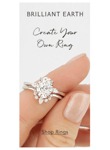
29. Brilliant Earth Ad
Nothing speaks best than an image showing what you offer in its full beauty. This display ad showcases a photo of a custom diamond ring and gives a selected niche segment of future brides and grooms to create their own rings.
- Redirects to: Brilliant Earth
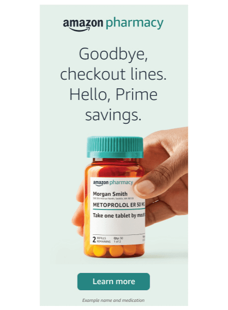
30. Amazon Pharmacy Ad
Amazon is a leading Internet-based eCommerce enterprise, already trusted by millions. With this ad, the platform promotes its new branch and promises to make pharmacy more efficient.
- Redirects to: Amazon Pharmacy
To Ad or Not to Ad?
Ad like the wind! Display ads are a valuable investment for any business for one main reason. They help businesses get targeted exposure across the web while potential customers get familiar with the brand and easily recognize it. It’s a great advertising method to attract an audience to your website, blog, social media platform, or another digital medium.
What all display advertising forms have in common is they all aim to encourage users to perform a certain action: subscribe to a blog, make a survey, make a purchase, visit a landing page, sign up for an event, and so on. To do so, there are a couple of practices that turn a display ad into clickable content.
- Design: Clean compelling and clutter-free design.
- Target: Your display advertising shouldn’t be directed at everyone. All successful campaigns target specific customer segments. Make sure your ad uses the right visuals and language that would appeal to that specific segment and speak to it independently.
- Copy: Visuals are what capture the eye first, however, it’s the copy that really sparks curiosity. A catchy copy can communicate urgency, mystery, bold statements, and whatever suits your brand tone.
- CTA: Internet users recognize CTAs in the shape of a button. This is why a display ad should give them something specific to click on.
Conclusion
That’s it. I hope you enjoyed today’s picks for awesome real-life display ad examples. If we can make key takeaways from these 30 designs, it would be to know your specific audience, stay trendy and keep it clear and simple. Stick to one point of focus and try to advertise an experience rather than a product.
In the meantime, if you feel inspired, there’s more where that came from. You might want to check these out:


