Infographics in general are used to help the viewer visualize information. This works great when you combine icons and charts and it makes the process quicker and easier. It is especially helpful in cases when you compare different products, prices, trends, statistics, and more. Comparison infographics are certainly one of the best ways of presenting such data, which in some cases might be very complex, and visualizing it helps to get a better understanding and, therefore, make a decision.
A text-heavy report no matter how well-written and explained it may be can be met negatively by readers, are people rarely would sit down and read long paragraphs thoroughly unless the topic truly interests them already. In other words, if you wish to interest your audience in what you have to say, you may consider conveying your data through visuals.
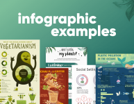
Therefore, in this article, we’ve chosen and gathered infographics from all over the web and brought some of the best examples to the table. The best news is, they are all for free.
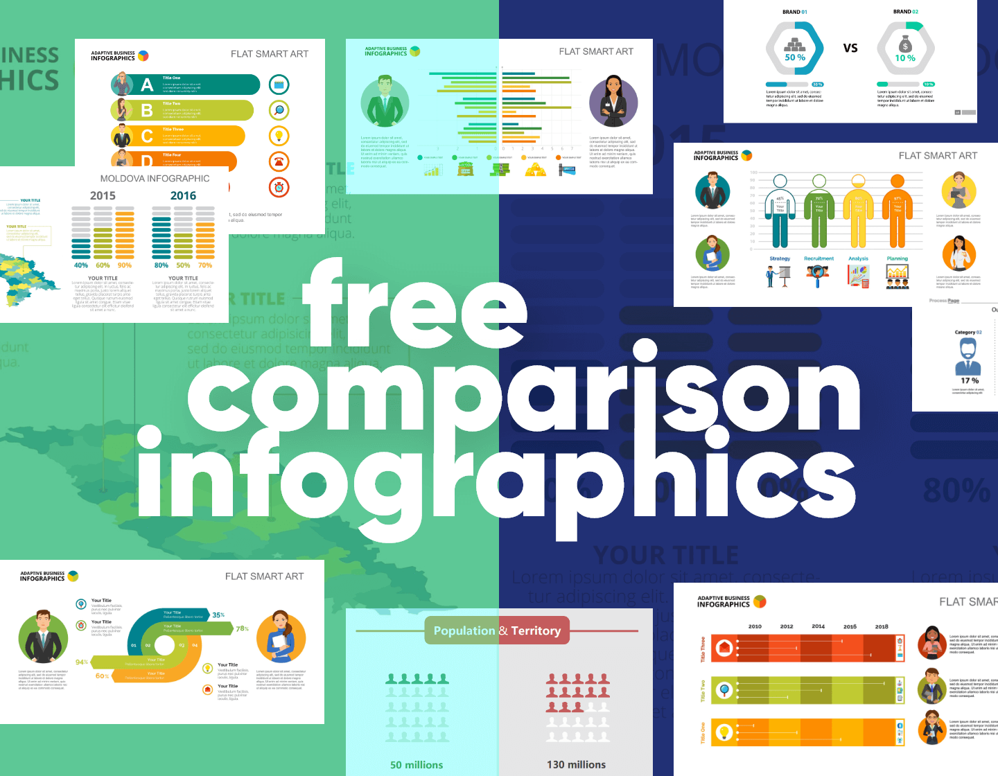
1. Two Brands Comparison Infographic Template
The first template is a simple direct comparison of two brands using graphic icons inside a percentage circle side by side. It’s very direct, simple, and effective. The infographic is also customizable.


2. 4 Options Percentage Chart Comparison Infographic
This template gives you a clear visual comparison of various different selected elements. In addition, it does it in an elegant flowing design.


3. Bar Chart Comparison Infographic
When in doubt, get the bar charts out. This template divides the page and gives it plenty of space for directly comparable data that is illustrated by horizontal bars and a color-coded icon system to keep the graph text free and clean. This also gives room for explanatory detail or text.


4. Comparison Infographic with Slide
This template uses a horizontal bar graph too but allows the scope to compare a greater number of elements. In addition, it has beautiful icons and consistent colors.


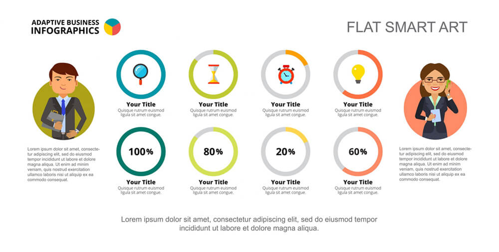
5. 4 Options Percentage Circles Comparison Infographic
The next template is a comparison of four options. The infographic is balanced and symmetrical and presents a well-structured process. It also uses instantly recognizable icons and percentage circles that make the information crystal clear.

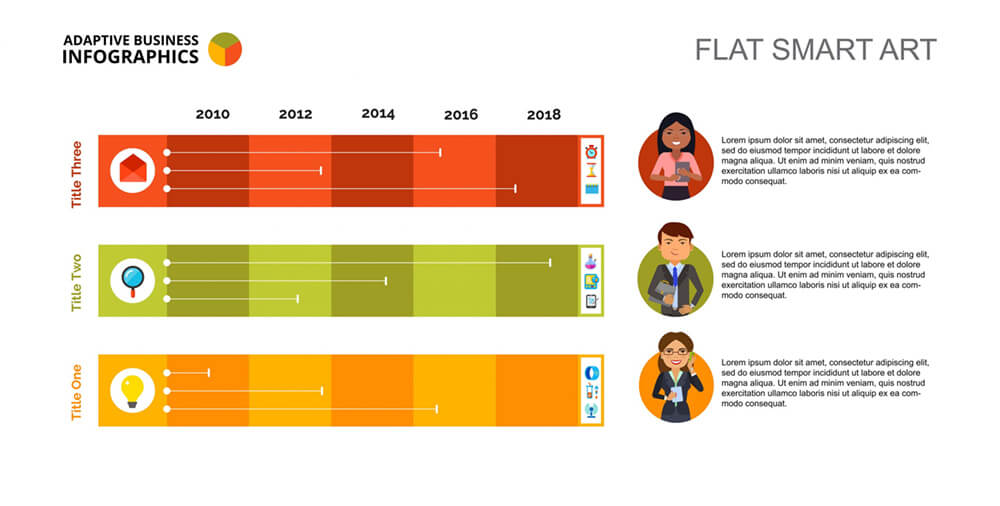
6. Financial Charts Infographic Comparison
The template below is a bar chart with a comparative timeline in the same infographic. It is ideal for comparing elements that run simultaneously. The infographic is pushed towards the right, which leaves additional space for information at the end of each horizontal row.

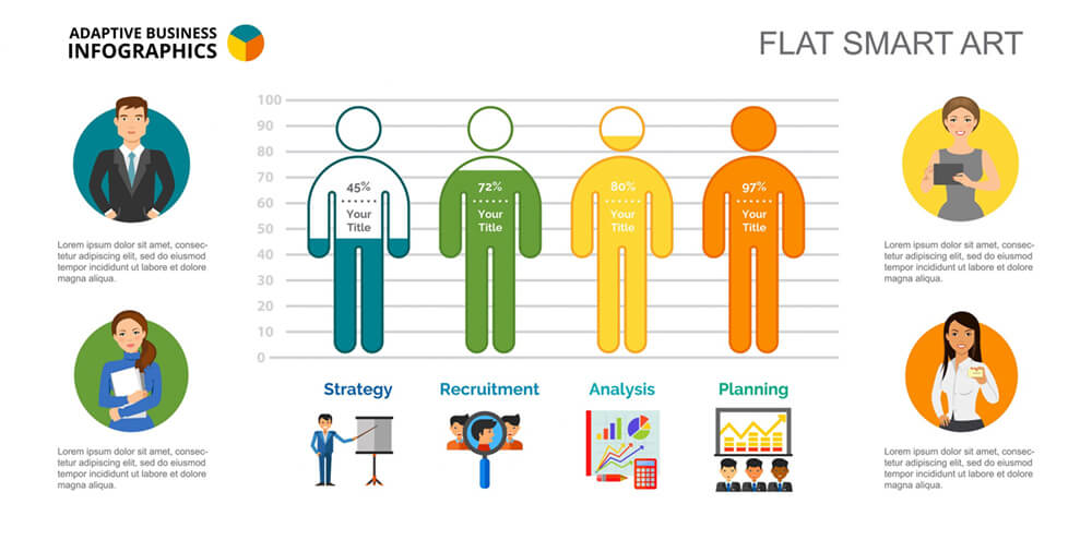
7. Human Bar Charts Infographic Design
This is a bar graph that shows a difference. The bars themselves are outlined human figures that fill with color in terms of percentage. A nice choice for human resources and personnel work. Each bar label is accompanied by a specifically designed icon, interesting, different, and appropriate.

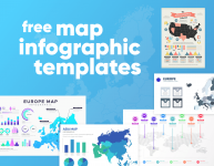
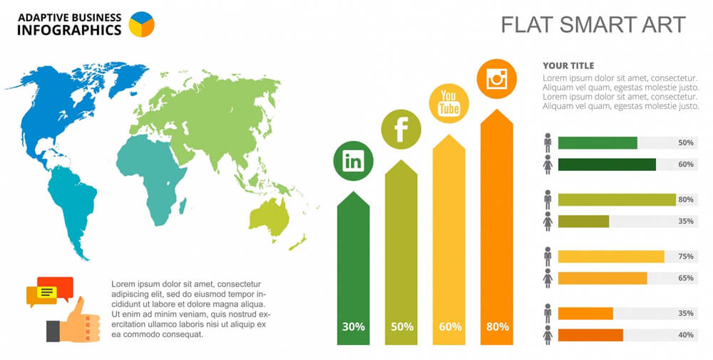
8. World Map Continent Comparison Infographic
Our next choice is a free template that includes a map next to two comparative bar charts. The map is labeled and broken up into geographical areas and color-coded to relate easily with the chart to the side. An interesting option.

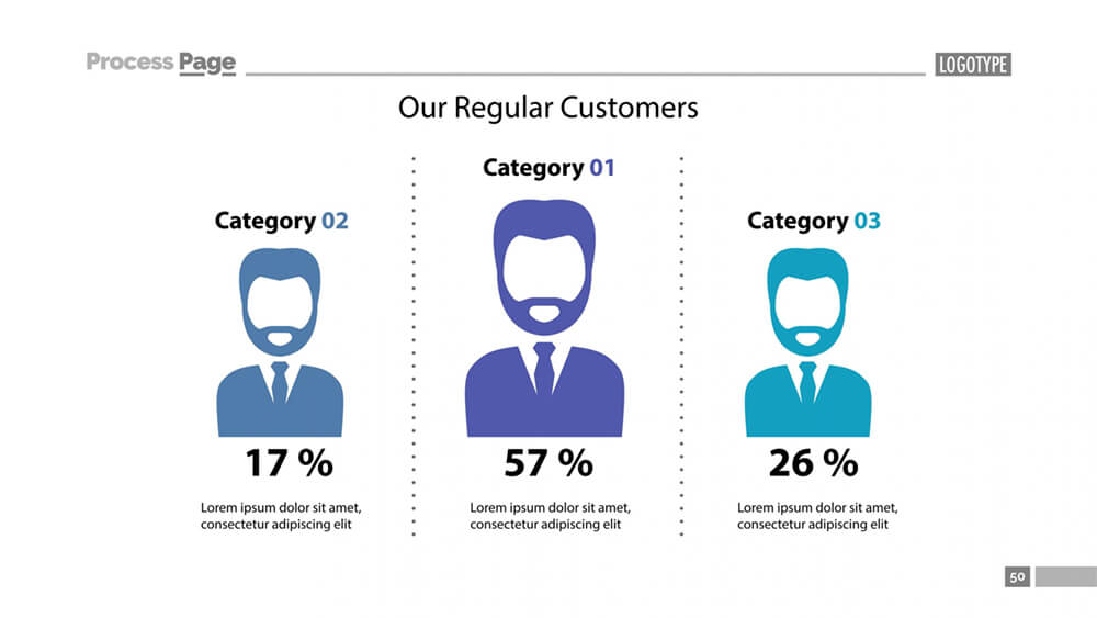
9. People Comparison with Percentage Infographic
This three-way comparison by percentage is well illustrated by an increase in the volume of the icon human head and upper torso. In fact, this is a very physical representation of growth made quite cleverly.

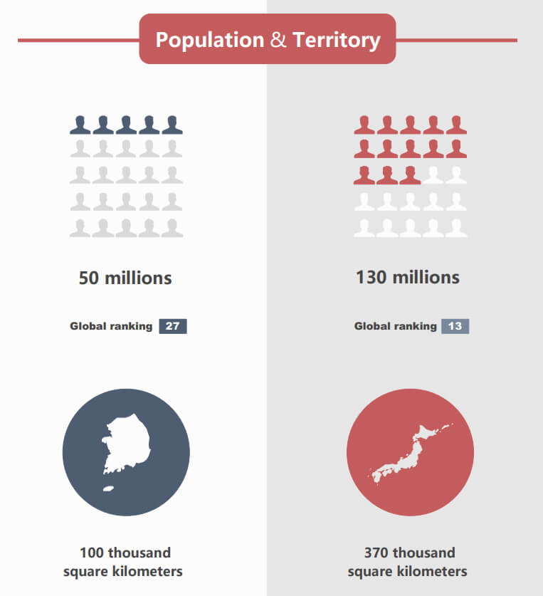
10. People Population Comparison Infographic
Comparison infographics work really well when comparing a lot of different elements side-by-side along with a vertically split page. The template splits different areas of comparison by headings and various types of infographics used with the comparison framework. Therefore, the next template uses a comparison of two countries but why not adapt to two products, brands, services, and anything that suits you.

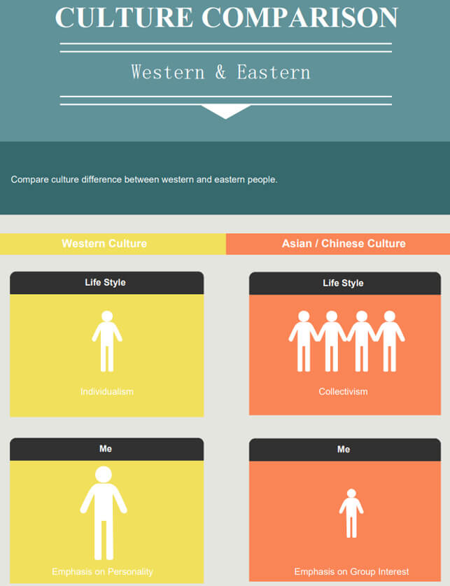
11. (Bonus) Culture Comparison Infographic Design
And last, this free template does a similar job but this time comparing cultures. The difference is the consistent use of a human figure icon that represents each area, makes the infographic even simpler.

Final Words
In conclusion, these free templates of comparison infographics are ideal to customize and adapt to your particular data or information. They provide the reader with visual clarity and ease in a nice- looking entertaining way. There is enough flexibility for you to include your own style and adapt to your brand or business.
In the meantime, why not take a look at the related articles to get some more inspiration or grab a couple of freebies: