
Infographics are getting bigger and bigger. Communicating ideas through charts, visualization, and the minimal text fits perfectly into the increasingly fast-paced, information-guzzling lifestyle of today. Visual, easy-to-understand – yes but more, much more. Good ones can ooze style, reflect who you are, and set the tone of your whole marketing campaign or presentation. We’ve gathered some beautiful infographic examples, full of inspiration. This awesome selection of our favorites aims to inspire you and keep you up with the latest trends.
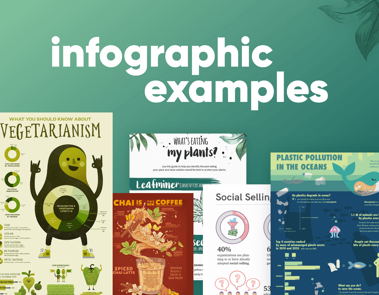
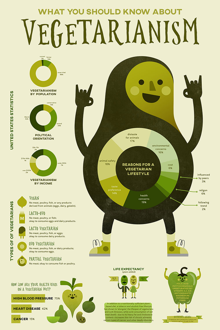
1. Vegetarianism Infographic Example
Vegetarianism is green, it’s obviously the only color you would choose for such a site. Amber Zuniga has cleverly used this to her advantage by blending natural greens, running from almost brown to almost yellow. What could be an overwhelming mass of information is skillfully broken up using a range of different charts. All are clearly labeled in an easy-to-read font. You can find any information you want in a matter of seconds, yet the design grabs you immediately. A beautiful example of design and information complementing each other.

2. How To Tet
Hong Chou’s infographic is a great example of how to make recipes fun. The lovely colors and illustrations follow a step-by-step tutorial and make it look incredibly easy to cook the tet.

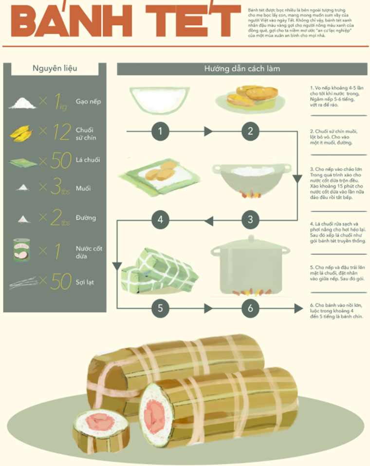
How to tét by Hong Chou
3. Stay Awake Menu Infographic Example
This Infographic example shows that the technique to use infographics is suitable for everything. It’s a fun-made menu of how to stay awake during the night in which Eric Coke uses beautiful blackboard style illustrations.


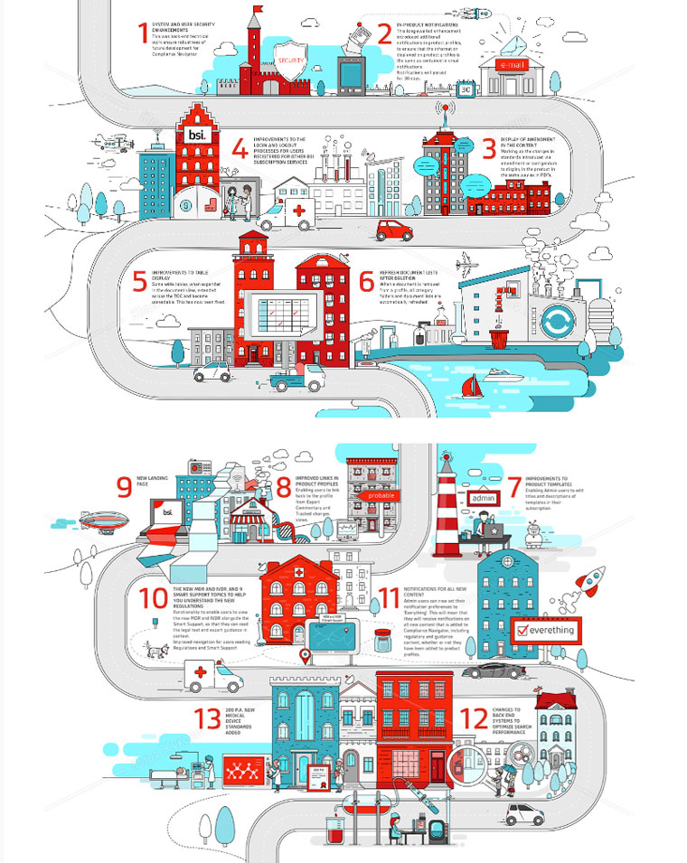
4. BSI Compliance Navigator
This infographic by Julia Zhukova is a compliance navigator scheme that explains how you could use the software for medical devices.

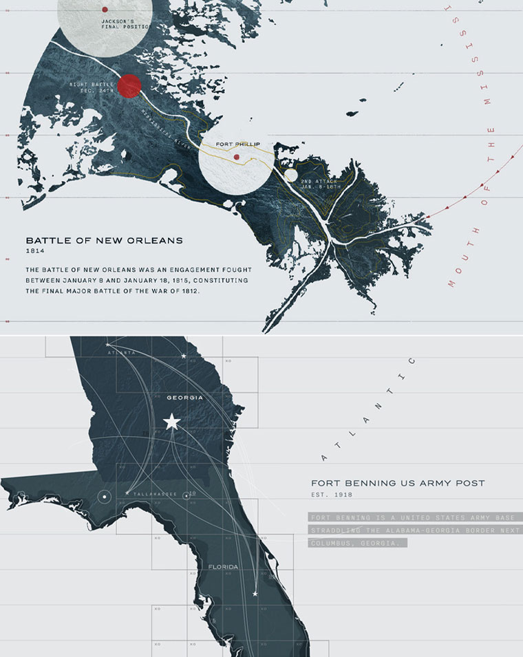
5. National Veteran Museum Infographic Example
This example shows that you could also use infographics for historical data.

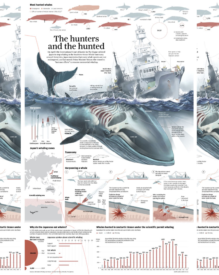
6. The Hunters and the Hunted
This is the type of graphics best suitable for encyclopedias and books. If you follow the link to the original design, you will also see the rough sketches that the author has made in order to visualize the concept.

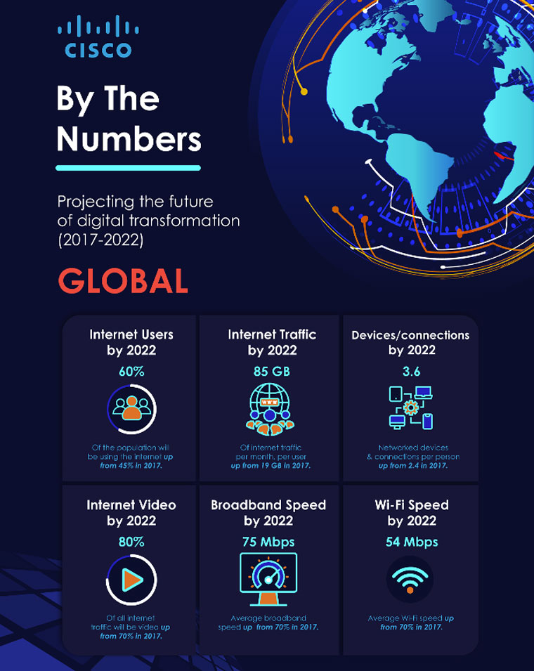
7. CISCO by the Numbers Infographic Example
A very simple yet modern presentation of the digital transformation of the internet in recent years. The graphic is incredibly easy to scan through and quickly get the information.

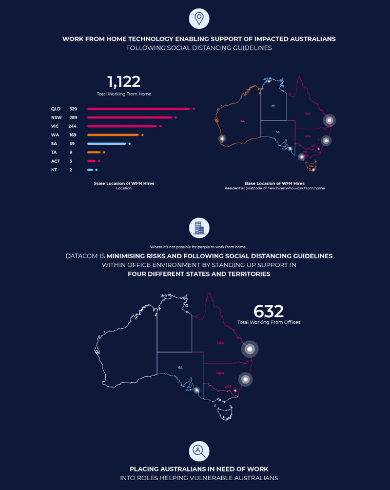
8. Datacom COVID Graphic
Another simple infographic shows the impact of COVID 19 in Australia. It has a very high contrast as it uses light colors for the charts over a dark blue background.

9. Uncomfortable Truths
Dominated by a tearful graphic image dragging us down to the “Uncomfortable Truths” headline, we know the infographics are not going to make pleasant reading. The impressive design spacing of the separate graphics floating around the underlying image means we never lose focus of the overall message. This layout and the simple consistent red/gray color scheme allow the statistics to do the work intended. A serious design for a serious issue.


10. Back It Up
This is a warning, it’s serious, could cause major problems surely we need the graphics to be RED. No! Here we defy convention, with muted, friendly colors. It is a warning but everything about this design tells us we are being advised, it’s for our own good. The brain here is a beautiful example of how a graphic can become an infographic.

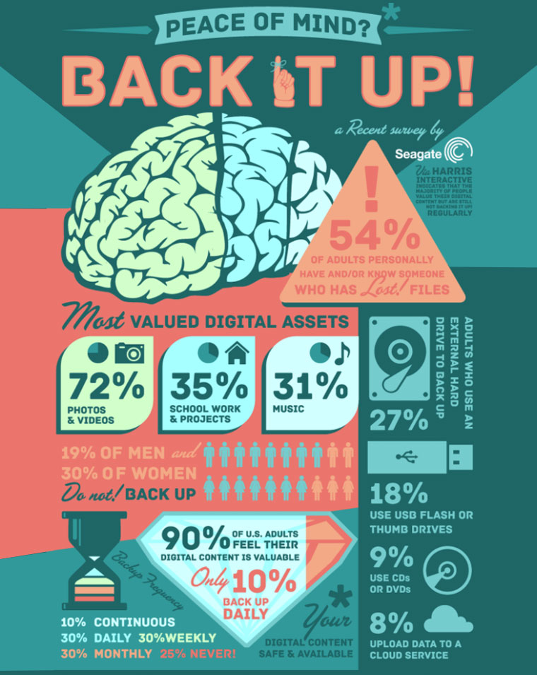
Men Are More Likely to Back Up Their Files Than Women [STUDY]
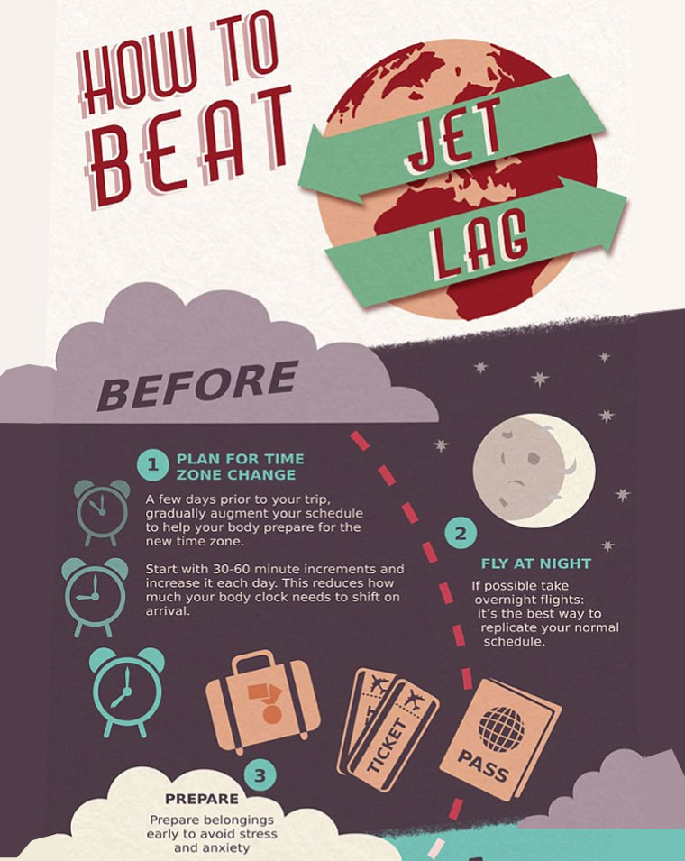
11. How To Beat Jet Lag Infographic Example
Timelines, timelines, and more timelines. So many examples of awesome design it’s difficult to know where to start. This How to Avoid Jet Lag timeline breaks up the design using color to mark out the key elements of the journey, before, during, and after. The simplification of big ideas into edited, accessible chunks make for an incredibly well-organized design.

12. The Monuments At Risk
There are no other words for this piece of Art than awesome. Inspirational use of lifelike art as background provides interest and context. The information markers acting as magnifying focal points could look messy, but not here. It screams science and art.

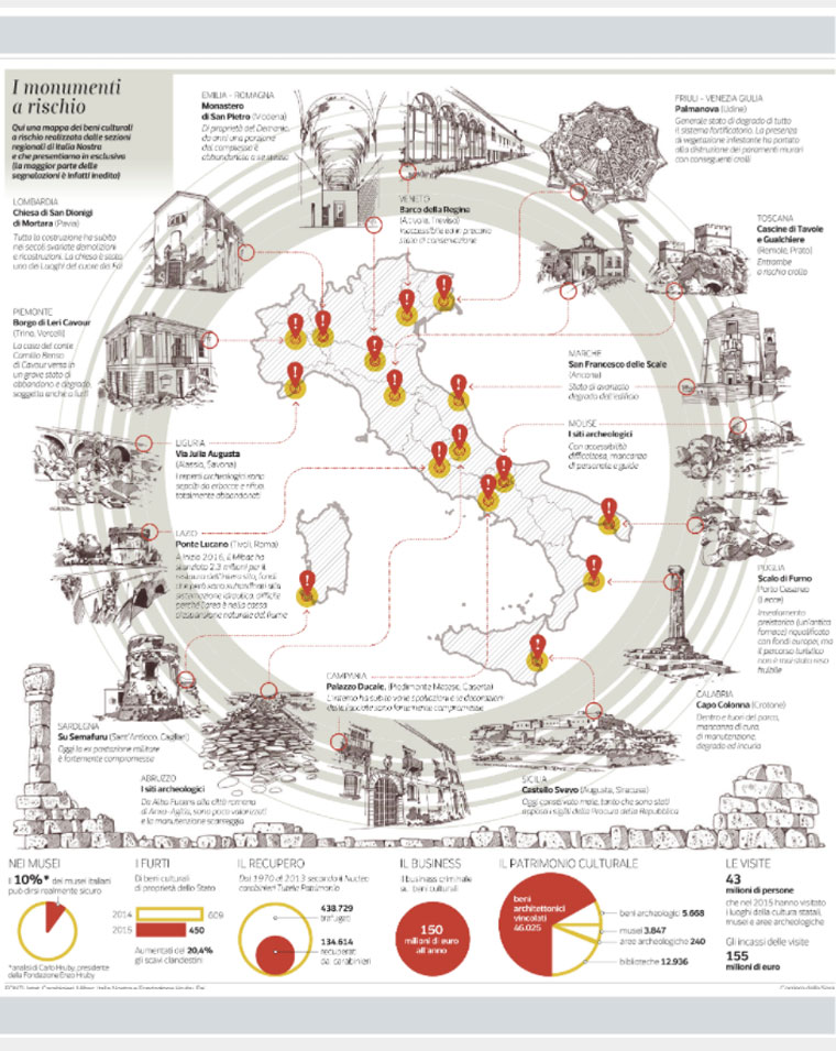
The monuments at risk
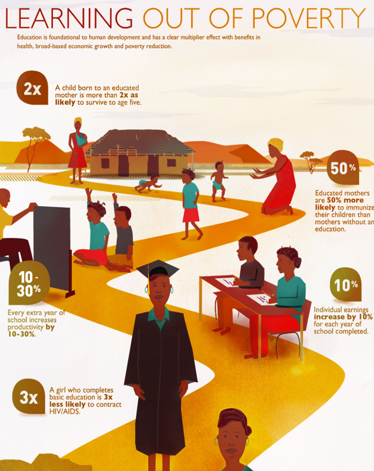
13. Learning Out of Poverty
A timeline concept with no time. A journey path through life with an unmistakable message. Deep reds, ochres, and yellows take us into the African village scene. The contrasting blue/greens highlight the stages of life on the figures. Educational without being heavy-handed, the minimal text under clear unfussy numerical statistics.

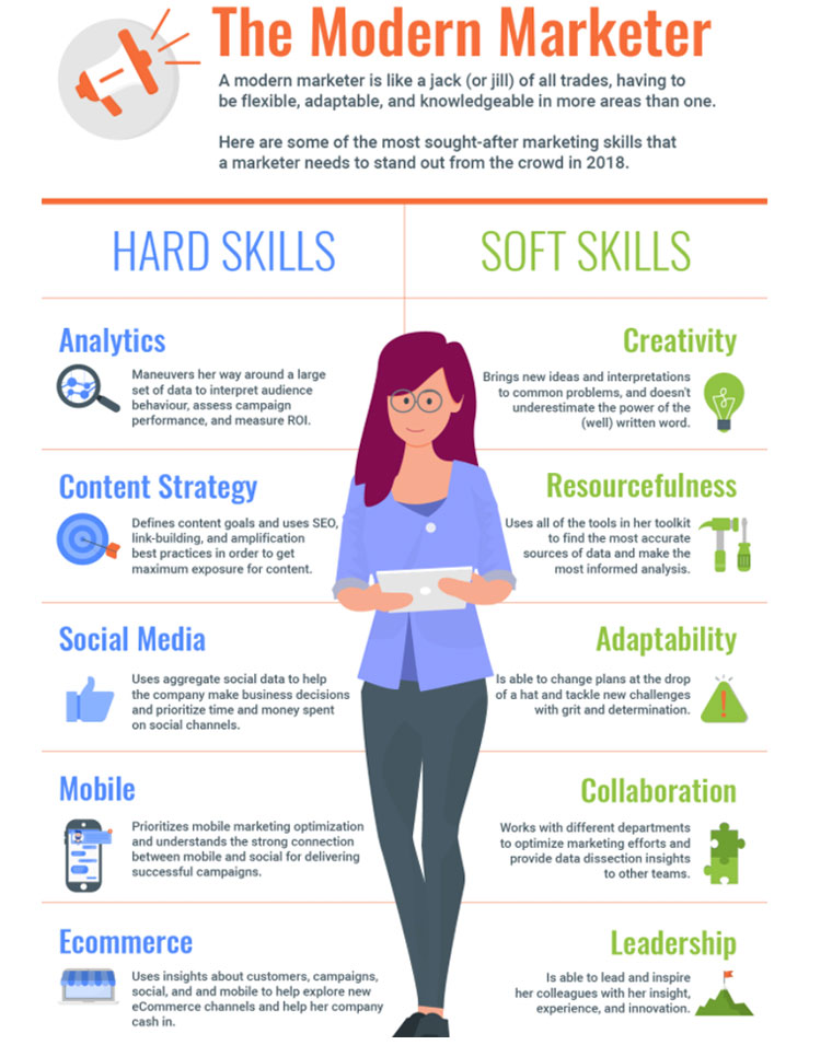
14. The Modern Marketer
Focused marketing infographic, with clear color demarcation. Neatly divided into a beautifully symmetrical design that uses representational symbols and bold fonts to spell out the key message. The addition of the central figure manages to personalize the whole thing and add to the theme.

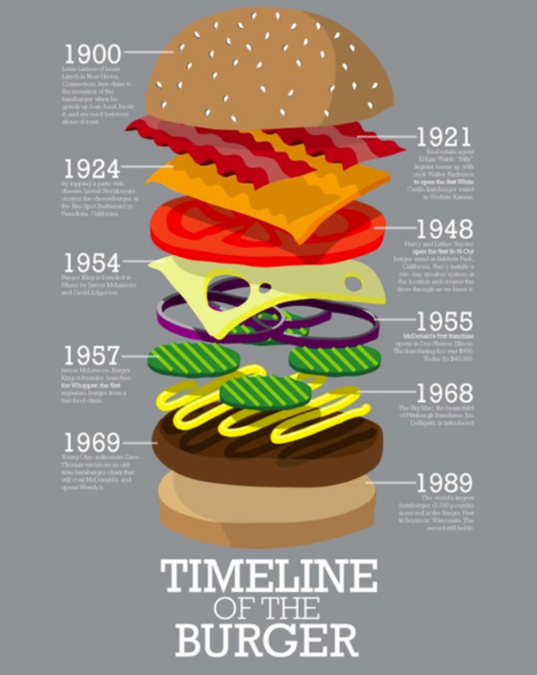
15. Timeline of the Burger
The genius here is the use of the burger as the timeline by deconstructing it and labeling the individual segments. Design-wise the burger rightly takes the center stage with bright bold colors, fully filling the central column. The timeline headings are the dates giving a real sense of chronology.

Timeline of the Burger by Andrew Herzog
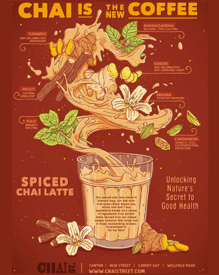
16. Chai is the New Coffee Infographic Example
An unusual graphic using a vintage poster style where the information originally takes the backstage. The lush French Nouveau image fills the graphic making you work to find the text. But as you follow the pour you are drawn outwards from the ingredients to a very brief, succinct name and benefit. There is s stylish use of classic advertising brought right up to date.

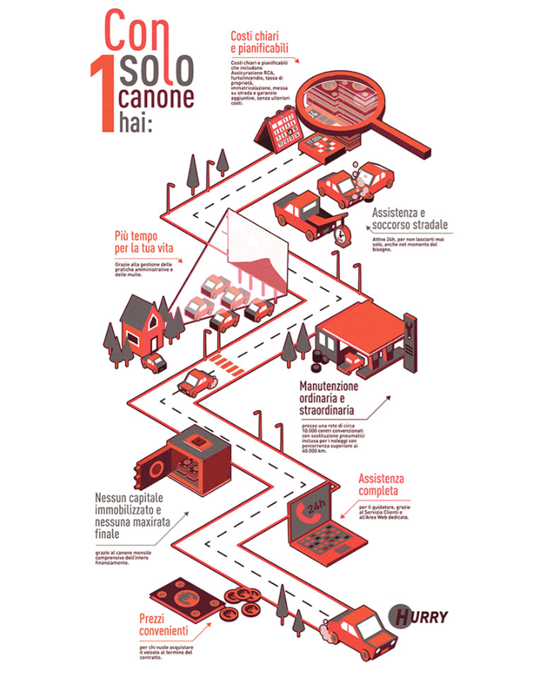
17. Hurry
Tommaso Andreaux has played with the timeline road theme, intelligently taking the viewer on a journey through different elements of the business. The angular design and sparing use of color create a look that is both memorable and dynamic. Each element is carefully constructed to emphasize this idea.

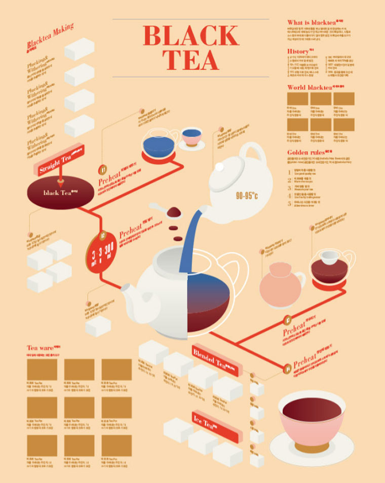
18. Black Tea
Sung Hwang Jang’s homage to Black Tea gives all the information you need and much more. The classic process flow chart combines with history timeline, map, and instructions. What makes this special is how they are all hung around the focus point, Black Tea. The central logo dominates yet pushes you seamlessly to the graphics surrounding it. The concept attractively imitates a box of tea, and you are never allowed to drift.

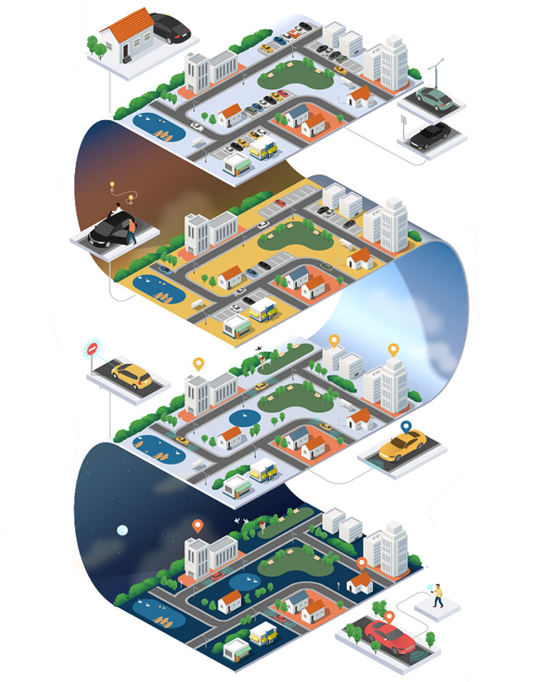
19. Future of the World Infographic Example
Jing Zhang uses the metaphor of a day beginning and ending to take us on a greater journey towards the future. The graphics are inspired by old computer games and transport you to a virtual world. Like in a computer game, you feel you have to complete the journey through all the stages to win. We love how the parts of the day are joined by the sky flowing from dawn to dusk.

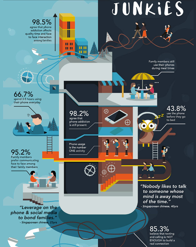
20. Phone Addiction Infographic Example
Phone Addiction by Sabrina Lim starts with a headline “Junkies” implying that this issue is not taken seriously enough. By the end of this graphic, the issue is clear. As we follow this graphic from top to bottom through a building that looks like a building we are hit by percentages dominating each turn. The icons are depersonalized, and there are no facial features which leads to the overall sense of dehumanization. A complete piece of focused design.

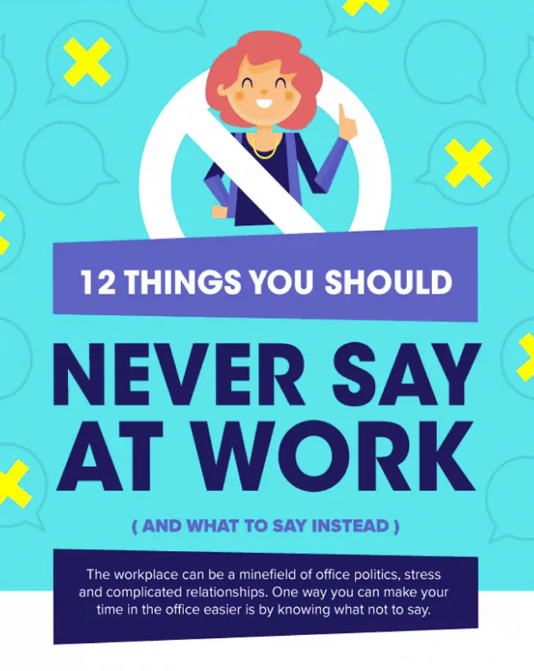
21. Things You Should Never Say at Work
Amusing caricatures in the same style with color matching the angular speech bubbles. A quick scroll down the page allows the reader to scan and then focus on elements of interest. Each element is then accompanied by two standard sections, keeping the same color match. The differentiated colors make the overall design feel like an individual piece of advice.

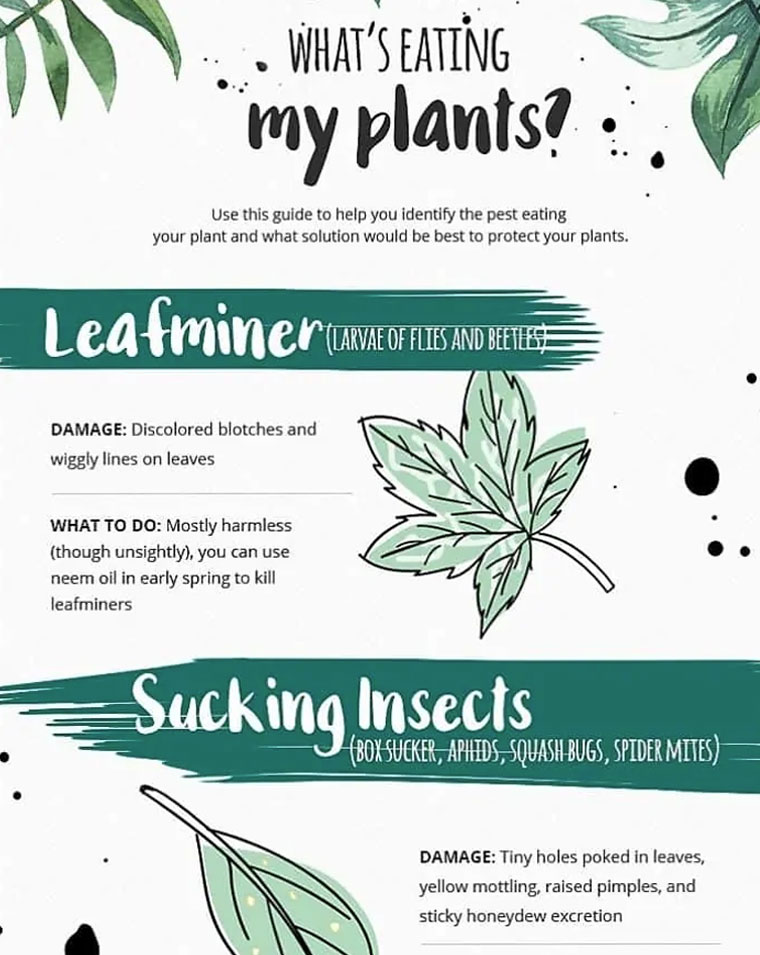
22. How To Stop What’s Eating Your Garden
An intelligent mixture of font styles manages to create the feeling of a spoken problem (handwritten) and a serious scientific response (types). Alongside the sketched style graphics, the overall feel is of a personalized gardeners handbook. Black and subtle shades of green dominate for the obvious association.

23. Social Media Trends Infographic Example
The information is separated into sections with big headlines. You can’t get lost, the fonts are clear, and the texts are well organized and spaced. But what I particularly like about this graphic is the way the designer beautifully and effortlessly combines the icon art with the statistical charts and graphs. A circular icon is incorporated into a pie chart, a bar graph within a calendar.

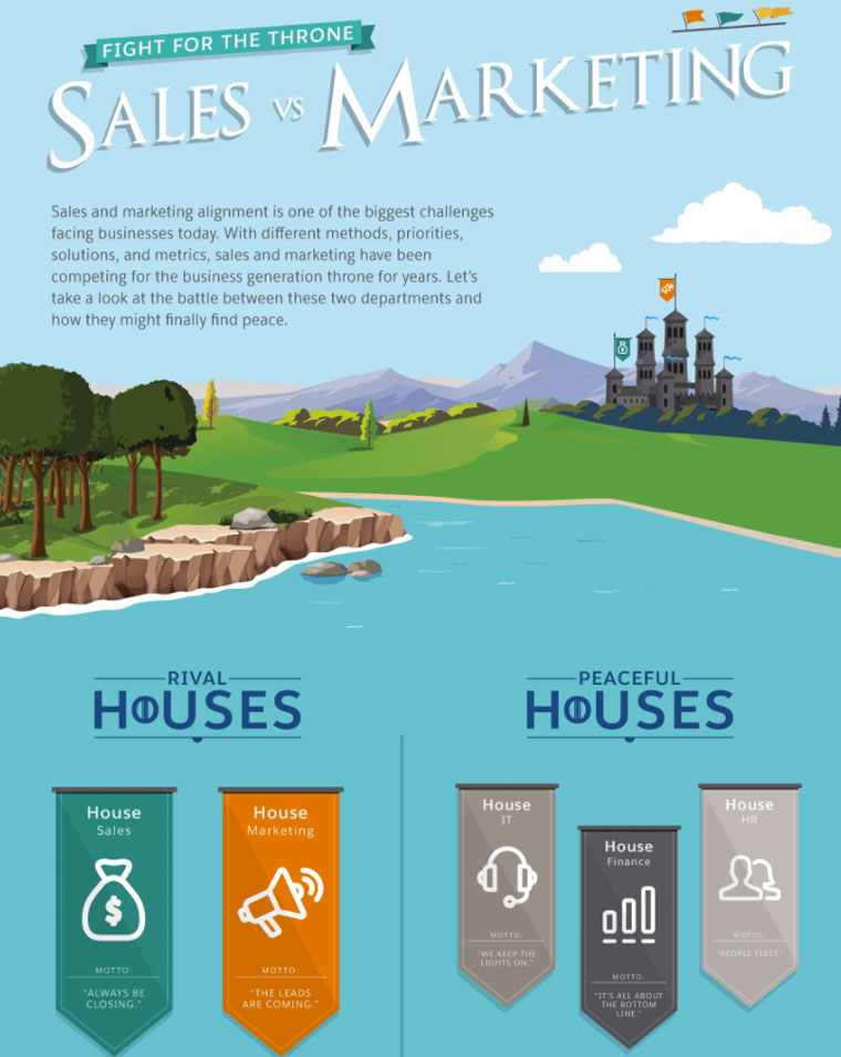
24. Sales VS Marketing
The battle “sales vs marketing” is set in a virtual medieval world with a castle and banners, cool. Each element of the battle is given its own section but the consistent familiarity of the graphic style means that you are totally aware of the need to read everything. Maps, character breakdowns, and flags all work together to complete the theme.

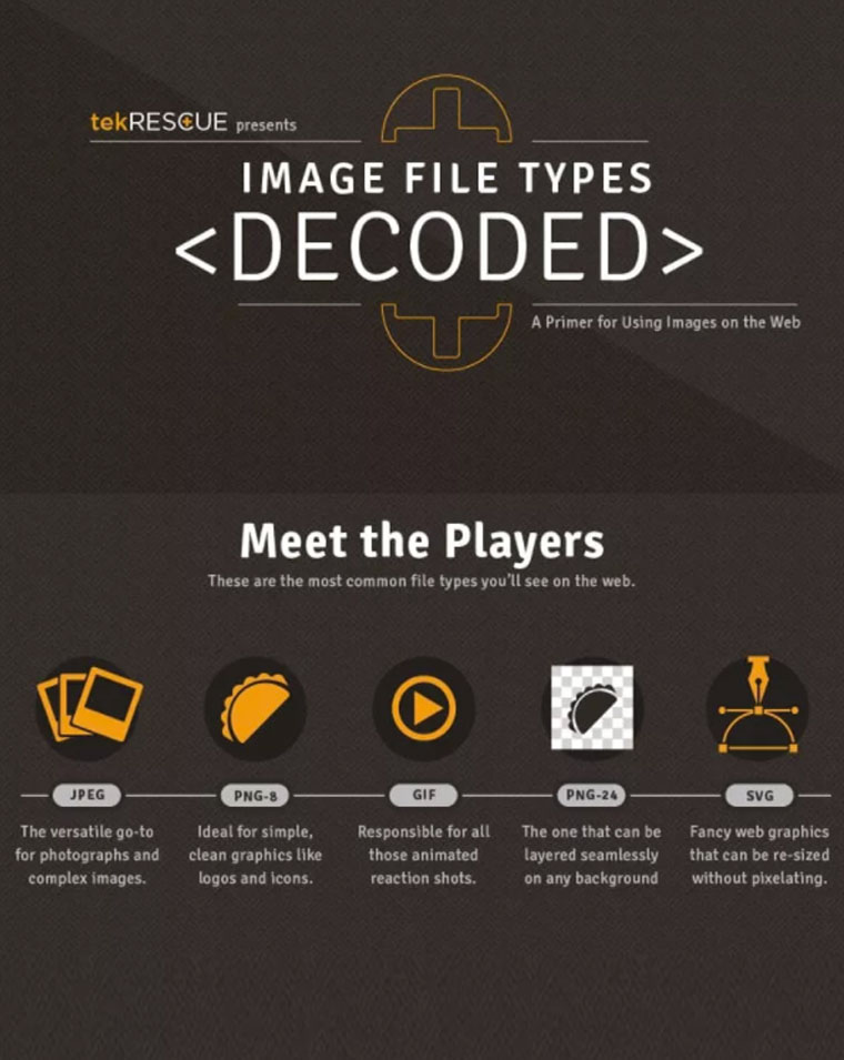
25. Image File Types Infographic Example
Another site comparing two subjects, this time File Types. Using sporting analogies this graphic succeeds in making technical issues accessible to all. An unusable dark brown background serves to complement the brighter images used to support the explanations. The comparisons use a central bar that consists of the 5 file types covered and repeated throughout each individual section.

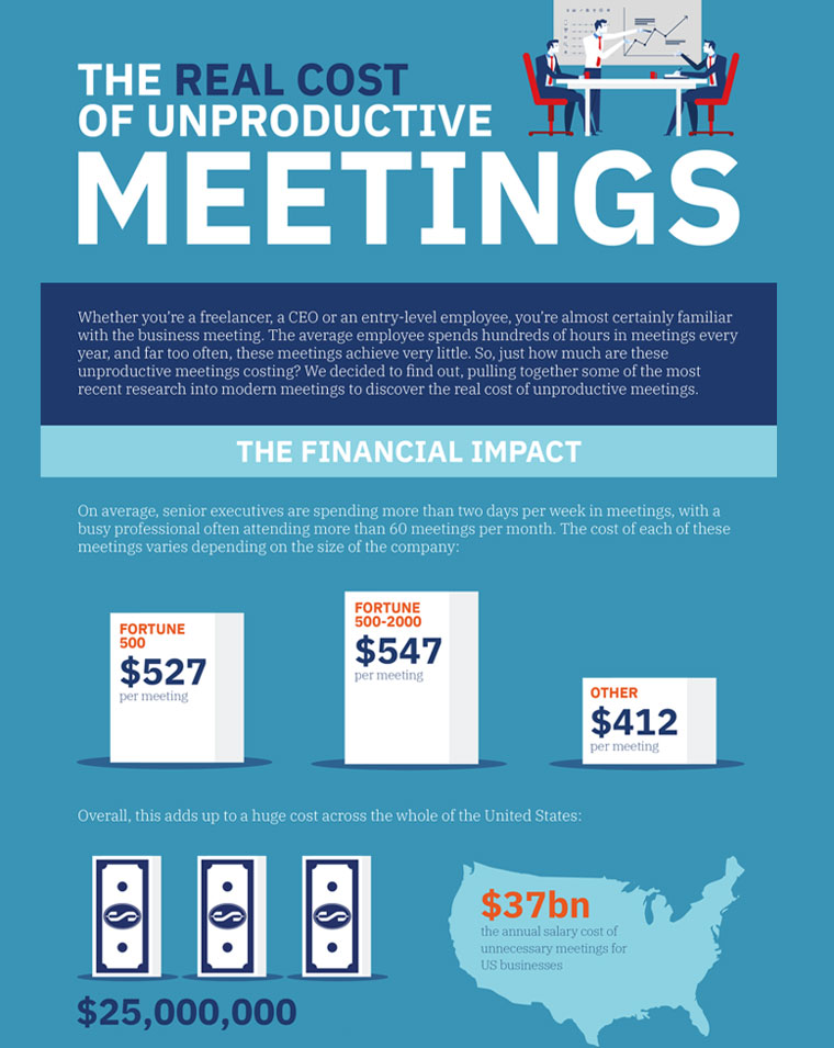
26. The Real Cost of Unproductive Meetings
This infographic breathes business, from the stylized business people to the background setting and layout. A large amount of statistical data is displayed using all the tricks in the infographic book, bar graphs, pie charts, and bold percentage figures.

27. Clickable Social Cards
This infographic leads us through a step-by-step process in a highly entertaining way. The cartoon characters fit well with the comic-style icons. Blues and oranges create a modern, friendly feel.


28. Plastic Pollution Infographic Example
Sathu’s design about plastic pollution in Oceans takes us into the Ocean itself for our answers. Grading blocks of color horizontally draws us deeper into the water on our quest. The illustrations add atmosphere, while the facts and statistics are easy to notice. At the end of this dive, we have bullet points that direct our attention.


Final Words
Feeling inspired? In conclusion, Infographics are a great way to provide vast amounts of information in an engaging, comprehensive way and even to say something about you as a person or your business focus. Everything you show represents you, make it memorable and meaningful.
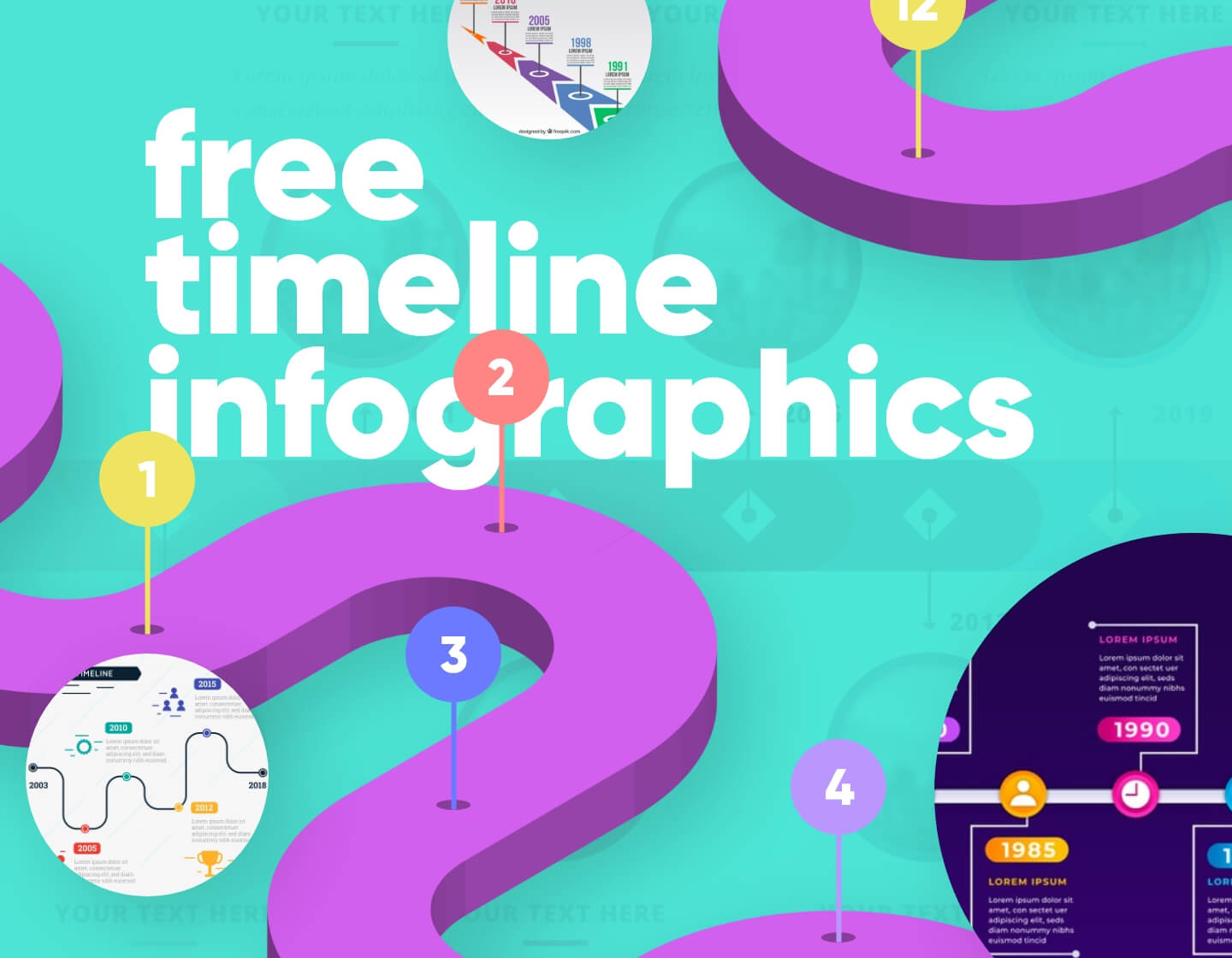
In the meantime, you could also check out our resource gallery for free timeline infographics.
Share this article